10,000 search results
(0.038 seconds)
- Handy Pen by Gassstype,
$23.00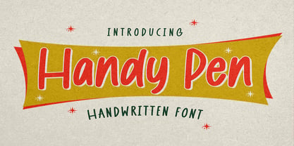 Hello Everyone, introduce our new product Font Handy Pen it is Handwritten Font,This is a Textured Natural Style and classy style with a clear style and dramatic movement. This font Handy Pen is great for your next creative project such as logos, Logotype, Letterhead, Poster, Design this font is great for your creative projects such as watermark on photography, and perfect for logos & branding, invitation,advertisements,product designs, stationery, wedding designs,label ,product packaging, special events or anything that need handwritting taste.
 - Pontiac Inline by S&C Type,
$15.00 Pontiac Inline is a layered Art Deco font designed by Fanny Coulez and Julien Saurin in Paris. This finely balanced inline font can be enhanced to improve your designs and bring an unusual and modern feeling. You could change the inside color, then add a 3D or shadow effect. To do so, you can simply superimpose the elements in compatible softwares (Photoshop, Illustrator...) ; The Regular above, the Inside line below, for example. We hope you will enjoy our work. Merci beaucoup!
 - Donut Know by Gassstype,
$23.00 Hello Everyone, introduce our new product Donut Know is a Unique Display Font.This Playful Kids with a natural feel. This handmade font will make your design has a beautiful natural touch for each details. It is perfect for any design project as Invitation,logo, Kids,book cover, craft or any design purposes. This font is PUA encoded which means you can access all of the magical glyphs. That is Donut Know has charming, authentic and relaxed characteristic more natural look to your text.
 - Kiddiess by Gassstype,
$22.00 Hello Everyone, introduce our new product Kiddiess is a Funny Brush Font Playful Kids with a natural feel. This handmade font will make your design has a beautiful natural touch for each details. It is perfect for any design project as Invitation,logo, Kids,book cover, craft or any design purposes. This font is PUA encoded which means you can access all of the magical glyphs. It also features a wealth of special features including Ligatures glyphs and Alternate glyphs.
 - Throrian Commonface - 100% free

- Lust Stencil by Positype,
$39.00 When you hear that name, you likely ask yourself, ‘why?!’ I did too, but the number of requests could not be ignored. Once I finally decided to move forward with it, the only way to solve the offering would be to adhere to the same theme of indulgence, I planned for the same number of optical weights AND Italics. Yeah, italic stencils… ok, why not? It’s not a new concept. One thing to note and a creative liberty I assumed during the design. Lust Stencil would not be just a redaction or removal of stress to produce a quick stencil. To do that, would just be a cheap solution. Strokes had to resolve themselves correctly and/or uniquely to the concept of the stencil format. And, it had to be heftier. For it it to look correctly, it needed about 8% additional mass to the strokes for it to retain the effervescent flow of the curves and the resolute scalloped lachrymals. The Lust Collection is the culmination of 5 years of exploration and development, and I am very excited to share it with everyone. When the original Lust was first conceived in 2010 and released a year and half later, I had planned for a Script and a Sans to accompany it. The Script was released about a year later, but I paused the Sans. The primary reason was the amount of feedback and requests I was receiving for alternate versions, expansions, and ‘hey, have you considered making?’ and so on. I listen to my customers and what they are needing… and besides, I was stalling with the Sans. Like Optima and other earlier high-contrast sans, they are difficult to deliver responsibly without suffering from ill-conceived excess or timidity. The new Lust Collection aggregates all of that past customer feedback and distills it into 6 separate families, each adhering to the original Lust precept of exercises in indulgence and each based in large part on the original 2010 exemplars produced for Lust. I just hate that it took so long to deliver, but better right, than rushed, I imagine. It would have taken even longer if not for font engineer and designer, Potch Auacherdkul. Thanks Potch.
 - Oxeran by Typodermic,
$11.95 In the realm of graphic design, where the power of typography can make or break a design, selecting the right font can be the difference between a masterpiece and mediocrity. And when it comes to grunge aesthetics, the stakes are even higher, as the right font can mean the difference between an edgy, rebellious message or one that falls flat. Enter Oxeran and Oxeran Z, two fonts that epitomize punk with their grungy, raw, and unabashedly filthy appearance. These fonts aren’t for the faint of heart—they demand attention and command respect with their jagged edges and rough textures. But don’t let their rough exterior fool you—these fonts are also highly functional. Their OpenType-savvy design allows for letter pair ligatures, which break up the monotony of repeating characters and add visual interest to your text. The result is a dynamic, energetic, and impatient message that grabs your audience by the collar and demands their attention. Whether you’re designing a punk album cover, a protest poster, or a rebellious t-shirt, Oxeran and Oxeran Z are the fonts that will take your message to the next level. So, embrace the filth, let your typography speak volumes, and let the world know that you’re not to be trifled with. Most Latin-based European writing systems are supported, including the following languages. Afaan Oromo, Afar, Afrikaans, Albanian, Alsatian, Aromanian, Aymara, Bashkir (Latin), Basque, Belarusian (Latin), Bemba, Bikol, Bosnian, Breton, Cape Verdean, Creole, Catalan, Cebuano, Chamorro, Chavacano, Chichewa, Crimean Tatar (Latin), Croatian, Czech, Danish, Dawan, Dholuo, Dutch, English, Estonian, Faroese, Fijian, Filipino, Finnish, French, Frisian, Friulian, Gagauz (Latin), Galician, Ganda, Genoese, German, Greenlandic, Guadeloupean Creole, Haitian Creole, Hawaiian, Hiligaynon, Hungarian, Icelandic, Ilocano, Indonesian, Irish, Italian, Jamaican, Kaqchikel, Karakalpak (Latin), Kashubian, Kikongo, Kinyarwanda, Kirundi, Kurdish (Latin), Latvian, Lithuanian, Lombard, Low Saxon, Luxembourgish, Maasai, Makhuwa, Malay, Maltese, Māori, Moldovan, Montenegrin, Ndebele, Neapolitan, Norwegian, Novial, Occitan, Ossetian (Latin), Papiamento, Piedmontese, Polish, Portuguese, Quechua, Rarotongan, Romanian, Romansh, Sami, Sango, Saramaccan, Sardinian, Scottish Gaelic, Serbian (Latin), Shona, Sicilian, Silesian, Slovak, Slovenian, Somali, Sorbian, Sotho, Spanish, Swahili, Swazi, Swedish, Tagalog, Tahitian, Tetum, Tongan, Tshiluba, Tsonga, Tswana, Tumbuka, Turkish, Turkmen (Latin), Tuvaluan, Uzbek (Latin), Venetian, Vepsian, Võro, Walloon, Waray-Waray, Wayuu, Welsh, Wolof, Xhosa, Yapese, Zapotec Zulu and Zuni.
 - The font named "Broken Toys" designed by PizzaDude is an intriguing typeface that embodies a playful yet edgy aesthetic, ideal for projects that require a touch of whimsy and rebellion. As its name s...
- Meow Tails by Yumna Type,
$16.00 Meow Tails is a cute, adorable display font inspired by cat theme. All of its letters and characters are designed in flowing and round shapes to express soft and smooth nuances like a sleeping cat. Furthermore, the insertion of additional objects to the letters functions to suggest a cat’s characteristics, such as cute eyes, whiskers, and a long tail. Meow Tails, of which available features and a clipart bonus you can enjoy, will live up and charm your designs in order to attract the audience with the theme you have. In fact, it will also help you build up your brand identity to be unique and memorable, particularly brands related to cats or pets. Features: Alternates Multilingual Supports PUA Encoded Numerals and Punctuations Meow Tails fits best for various design projects, such as brandings, headings, magazine covers, quotes, printed products, merchandise, social media, etc. Find out more ways to use this font by taking a look at the font preview. Thanks for purchasing our fonts. Hopefully, you have a great time using our font. Feel free to contact us anytime for further information or when you have trouble with the font. Thanks a lot and happy designing.
 - Rubrical by Ditatype,
$29.00 Introducing Rubrical, a script font that gives personalized feel to the design with a confident presence. This typeface is characterized by its substantial weight, giving your design a bold and impactful appearance. Rubrical maintains consistent proportions across all its letters, offering a sense of stability. It also adds a sense of warmth and personality. It has flowing and connected letterforms that are embellished with graceful swings that adorn select letters. These decorative elements, which can include ornate initials or elegant swinging flourishes, add a touch of sophistication and artistic flair to your text. They create a visual journey that is engaging, unique, and memorable. In addition, enjoy the features here. Features: Ligatures Stylistic Sets Swashes Multilingual Supports PUA Encoded Numerals and Punctuations Rubrical fits in headlines, logos, posters, flyers, branding materials, print media, editorial layouts, and many more designs. Find out more ways to use this font by taking a look at the font preview. Thanks for purchasing our fonts. Hopefully, you have a great time using our font. Feel free to contact us anytime for further information or when you have trouble with the font. Thanks a lot and happy designing.
 - Playful Garden by Yumna Type,
$25.00 Playful Garden is a display font inspired by garden plants, such as flowers, leaves, and other plants. The letters are round and organic portraying natural shapes of garden views. This font’s unique characteristic is that all of the letters are in capitals to show dramatic, prominent displays. Such big letter sizes help emphasize the messages delivered. Furthermore, such a garden-themed display font is able to create calm, quiet situations to apply for nature designs or organic and eco-friendly products. Overall, it is the right option for you to show unique, interesting displays. Moreover, Playful Garden provides a clipart in accordance with the font theme as a bonus and features you can enjoy. Features: Multilingual Supports PUA Encoded Numerals and Punctuations Playful Garden fits best for various design projects, such as brandings, headings, magazine covers, quotes, printed products, merchandise, social media, etc. Find out more ways to use this font by taking a look at the font preview. Thanks for purchasing our fonts. Hopefully, you have a great time using our font. Feel free to contact us anytime for further information or when you have trouble with the font. Thanks a lot and happy designing.
 - Black Butter by Ditatype,
$29.00 Arranging fonts is a difficult, time-consuming process, especially the handwriting arrangement which needs careful considerations and precisions for a natural-looking font. Because you deserve a unique, real essence-catching font, let us introduce you to the Black Letter, an attention-catching script font. This capitalized font designs with brush details have curvy, infirm lines to make the designs look more artistic and unique. The letters’ proportions are similar, yet it has high contrast to add some visual attractions to the font. However, a brush font lacks legibility in lengthy texts. As a result, it is more suitable to apply for short texts or titles only. You can also enjoy the available features here. Features: Multilingual Supports PUA Encoded Numerals and Punctuations Black Letter fits best for various design projects, such as brandings, posters, banners, headings, magazine covers, quotes, printed products, merchandise, social media, etc. Find out more ways to use this font by taking a look at the font preview. Thanks for purchasing our fonts. Hopefully, you have a great time using our font. Feel free to contact us anytime for further information or when you have trouble with the font. Thanks a lot and happy designing.
 - Bacode by Ditatype,
$29.00 Your design tells who you really are and should represent your personality. Without the right font, it will be hard to be prominent and to impress your audience. Therefore, Bacode is the answer to your necessity. Bacode is a font type to produce manual brush-looking displays to show natural, casual, informal impressions to make people feel close to the brand or design displayed. Its letter proportions are equal, yet high in contrast to be more visually attractive. However, brush fonts are less legible in lengthy texts. As a result, they are more suitable to apply for short texts. You can also enjoy the available features here. Features: Multilingual Supports PUA Encoded Numerals and Punctuations Bacode fits best for various design projects, such as brandings, posters, banners, headings, magazine covers, quotes, invitations, name cards, printed products, merchandise, social media, etc. Find out more ways to use this font by taking a look at the font preview. Thanks for purchasing our fonts. Hopefully, you have a great time using our font. Feel free to contact us anytime for further information or when you have trouble with the font. Thanks a lot and happy designing.
 - Molly Hugs by Yumna Type,
$15.00 Finding out an attractive font regarding your project design can be such hard work as you take risks of either losing your clients or killing your good reputations once you pick the wrong font. However, Molly Hugs is the right solution for you. It is a rounded display font to add warm, fun character touches on every design. Its shapes and geometry are simple and without too many detailed points for a legibility reason. Additionally, Molly Hugs, completed with a clipart as a bonus, is perfectly applied for big text sizes to be legible and you can make use of some available features here. Features: Multilingual Supports PUA Encoded Numerals and Punctuations Molly Hugs fits best for various design projects, such as brandings, posters, banners, headings, magazine covers, quotes, printed products, merchandise, social media, etc. Find out more ways to use this font by taking a look at the font preview. Thanks for purchasing our fonts. Hopefully, you have a great time using our font. Feel free to contact us anytime for further information or when you have trouble with the font. Thanks a lot and happy designing.
 - Unconscious by Pavel Boog,
$18.00 When we fall asleep, we become free in our thoughts, in our judgments, in our choice, we decide on bold actions and words. This font will bring all this to life. UNCONSCIOUS-This font is for brave, free and liberated creators. For people with a good sense of humor and able to derive joy even from bad things.
 - DeLouisville - 100% free

- Andre Drafting by André Design,
$19.95 Developed for use in our design drawings by the renowned museum exhibit design firm André & Associates Interpretation & Design, the André Drafting font is being made available publicly for the first time. Based on the hand drafting lettering of our Senior Designer Andrew Farrell, this neat and tidy font will add a personal touch to CAD drawings, concept sketches and more. This font contains a full character set and is available in regular weight. Visit our website at www.aaid.ca for examples of our exhibit design work.
 - EG Dragon Caps - 100% free

- Analogue Pro by Ingo,
$42.00 very traditional forms strongly slanted italic consistant proportions extraordinary ligatures swashes alternate letters alternate figures lower case l with a hooked “foot” Believe it or not, there are hardly any sans serif fonts in which the lower case letter l also has the hooked form of an l. Instead, we readers have to constantly distinguish whether we are seeing an uppercase I or a lower case l — just take a look at the word “Illinois”... The ingoFont Analogue was developed for exactly this reason. The intent: To create a pretty much »ordinary«, even classical font with its most striking characteristic being the inclusion of the “crooked l.” As a model, I used the »mother of all sans serifs«, Akzidenz Grotesk from Berthold, with its beginnings going back to the 19th century. Analogue is so to say a new interpretation of Akzidenz Grotesk from ingoFonts. All characters — following the model — have been newly designed. And if you want to emphasize the shape of the hooked foot even more, you can also activate the alternate styles for d, h, m, n (Style Set 1). Conversely, the alternate a somewhat softens the “hooked” impression (Style Set 2). The slanted versions — it isn’t truly a real cursive font — are noticeably stronger with 13° than the italics in comparable fonts, and were given a round e with a mind of its own which distinguishes itself considerably compared to the upright characters in the overall appearance of the font. More modern and formal solutions in detail were chosen for some of the characters, for example the M was given lightly slanted sides; the a reflects the curves of the s; the “feet” of a, l and t match; the flared legs of K and R became a “foot”, too. General proportions were carried over almost completely with no changes from Akzidenz Grotesk as well as the slanted trimming on the open forms of a, c, e, s; in comparison, C, G and S were given straight endings. Analogue contains many ligatures, even discretional ligatures, plus proportional, old style as well as tabular figures. All in all, at first sight Analogue brings back memories of the charm of its well-known predecessor; and yet, many small differences give Analogue an unmistakable certain something...
 - Aire by Lián Types,
$37.00 Aire is what Sproviero would call a < big display family >. We recommend seeing its user’s guide. After his success with Reina, Sproviero comes out with this big family of 7 members: Each of them loaded with lots of sophisticated ligatures, alternates and the entire cyrillic alphabet. The overall impression that the font gives is lightness and delicateness; that’s the reason the designer chose to call it Aire, or Air, in English. "Aire was somehow having a rest from my fat face Reina [...] It started as a really thin style of Reina, but it rapidly migrated from it and grew up alone. And how it grew..." The inspiration came from his own past creations: “The heavy strokes of Reina were shouting for a more delicate thing. Something more feminine. More fragile. Something which had a lot of elegance and fresh air inside”. Aire responds to this: Sproviero found that many of the typefaces of nowadays which are used for headlines (best known as display fonts) have almost always just one, maybe two weight styles. This was his opportunity to try something new. Aire makes it easier for the user to generate different levels/layers of communication thanks to its variety of styles. With this font you can solve entire decorative pieces of design with just one font, and that was the aim of it. Aire was designed to be playful yet formal: While none of its alternates are activated it can be useful for short to medium length texts; and when the user chooses to make use of its open-type decorative glyphs, it can be useful for headlines with dazzling results. On March of 2012, Aire was chosen to be part of the most important exhibition of typography in Latinoamerica: Tipos Latinos 2012. TECHNICAL Aire is a family with many members. In total, the user can choose between almost 6,000 (!) glyphs (1,000 per style). Each member has variants inside, which are open-type programmed: The user decides which glyph to alternate, equalizing the amount of decoration wanted. Every decorative glyph has its weight adjusted to the style it belongs to. Exclusively for decoration, Aire Fleurons Pro is an open-type programmed set of ornaments. And last but not least, remember Aire is delicate. What’s my point? It is not recommended to activate all the alternates at the same time. It is typo-scientifically proved: A maximum of 3 or 4 alternates per word would be more than enough.
 - ITC Nova Lineta by ITC,
$29.99The ITC Nova Lineta™ design is the first commercial typeface from Slobodan Jelesijevic. As with many typeface designs, it began as simple sketches. “I was working on a packaging design project,” recalls Jelesijevic, “and wanted an informal, slightly cursive design for the type. I could not find anything that matched my need, so I began sketching.” The preliminary design had an elegant yet fresh quality that, once developed, turned out to be perfect for Jelesijevic’s project. After its first use, however, Nova Lineta lay dormant for over a year. Other projects came and went, and new typeface ideas filled Jelesijevic’s notebook. Although Nova Lineta continued to tickle the creative crevices of his mind, no more work was done on the face. Then, in a period between projects, Jelesijevic began to polish the design – and, in the process, created extended and condensed versions to complement the normally-proportioned original. Born in Gornji Milanovac, Serbia in 1951, Jelesijevic graduated with a degree in graphic communication and lettering from the Faculty of Applied Arts in Belgrade. These days, Jelesijevic is sought out not only as a typeface designer, but also as a graphic designer and illustrator. When not working on design projects, he teaches graphic communication at the Faculty of Art in Niš, Serbia. Although it is a casual and inviting design, Nova Lineta has been carefully constructed and refined. As a result, it performs exceptionally well within a wide range of sizes and in a wealth of applications. An ample x-height, open counters and distinctive character shapes also ensure a high level of legibility. And, although at first glance Nova Lineta may appear to be a sans serif design, subtle serifs make their presence known at large sizes. Nova Lineta emanates warmth when used for extensive text, and it has a fresh quality at display sizes. The small family’s range of proportions also provides added flexibility. The result is a friendly yet powerful communication tool in a remarkably modestly-sized package. - Highshade by Ironbird Creative,
$15.00 Introducing, HIGHSHADE our stunning and unique Organic Blackletter font, hand-drawn with care and precision to capture the essence of strength and power. Every line and curve has been crafted by hand, giving this font an authentic and organic feel that sets it apart from other Blackletter fonts.Suitable for any graphic designs such as branding materials, t-shirt, print, logo, poster, t-shirt, quotes .etc NOTE : Please Check the Help File first and for all the characters are also available, accessible in the Adobe Illustrator Glyphs Panel, or in Adobe Photoshop Character Open Type Panel. We hope you enjoy the font, please feel free to comment if you have any thoughts or feedback. Thanks for purchasing and have fun! Regards, Ironbird Creative
 - Carlony by Keristyper Studio,
$14.00 Carlony is a delicate, elegant, and flowing handwritten font. It has beautiful and well-balanced characters and as a result, it matches a wide pool of designs. Fall in love with its incredibly versatile style and use it to create spectacular designs. This font is good for logo design, Social media, Movie Titles, Books Titles, short text even a long text letter, and good for your secondary text font with sans or serif. Featured: Standard Uppercase & Lowercase Numeral & Punctuation Multilingual : ä ö ü Ä Ö Ü ß ¿ ¡ Alternate & Ligature PUA encoded We recommend programs that support the OpenType feature and the Glyphs panel such as Adobe applications or Corel Draw. so you can use all the variations of the glyphs. Hope you enjoy our fonts!
 - Antique Heritage by Din Studio,
$20.00 Dreaming to make remarkable projects? Wanna travel your audiences or costumers to aged world? Then, this is the path that you looking for. Introducing Antique Heritage- A Monoline Script Font This font is best to add antiques to your projects that have vintage styles and shapes can help bring to a fine new level. Also, to increase a real sense of timelessness. Use it for headings, logos, business cards, printed quotes, invitations of all sorts, cards, packaging, and your website or social media branding. Our font always includes Multilingual option to make your branding globally recognised. Features: Standard Ligatures Stylistic Sets Swashes Multilingual Support (91 languages) PUA Encoded Numerals and Punctuation Thank you for downloading premium fonts from Din Studio
 - Royale Dreams by Din Studio,
$29.00 Ready to enhance your branding? Looking for that “something” that’ll make your audience go WOW and clients get on board immediately? Maybe you’re looking for the perfect font to use on your wedding invitations or branding? Whatever you need - we’ve got JUST the thing for you! Royale Dreams-Script Font Royale Dreams is a elegant script typeface. Designed primarily as a captivating handcrafted with style. This typeface that is easy on the eyes font that excels at captivating headlines, or large branding text, the font oozes that cute aesthetic that just makes you go “aww!” Our font always includes Multilingual Support to make your branding reach a global audience. Features: Ligatures Stylistic Sets PUA Encoded Numerals and Punctuation Thank you for downloading premium fonts from Din Studio
 - Mosang by Twinletter,
$15.00 Do you need a beautiful font with a distinctive shape for your business or other purposes? introduce MOSANG San Serif is a premium font family that comes in 18 different styles. Designed to assist you in creating visually stunning projects of any kind. Mosang has everything you need, whether you’re looking for a logo or an all-in-one font, with a wide variety of font styles to choose from and a simple way to place them on your logos and graphics. of course, your various design projects will be perfect and extraordinary if you use this font because this font is equipped with a font family, both for titles and subtitles and sentence text, start using our fonts for your extraordinary projects.
 - Recoleta by Latinotype,
$29.00 Just like Grandma’s recipe, Recoleta combines a variety of ingredients—from various popular 1970s typefaces—such as the soft and gentle shapes found in Cooper or the fluid, angled strokes in Windsor— mixed into one single design that features familiar, yet fresh, modern flavors. Its variety of weights provide a range of choices that will help you find the best typographic color for your project. Lighter weights are well-suited for body text while heavier ones are ideal for high impact headlines. The available stylistic alternates offer a number of different characters that give your logo or business card a unique look. Recoleta, our best selling typeface; now support russian cyrillic. Made by Jorge Cisterna, the Latinotype Team with the consulting of Vika Usmanova.
 - VLNL Tp Martini by VetteLetters,
$35.00 Our chef Martin Lorenz likes to mix cool and fresh cocktails - shaken, not stirred! You have to taste his awesome Martini or mix it yourself! To make matters more easy, cocktail master Martin reveals his special recipe: “The TpMartini refers esthetically to typefaces drawn with a pointed nib as the Bodoni or Didot, but with the clear distinction that it is obviously constructed by modules. The visual system for the TpMartin is based on a square 5x9-unit grid and three different basic forms with which the font and other elements are designed. The basic forms consist of a straight line and circles of two different sizes. The line can be extended, but the circles retain their related proportions.” One piece of advice: Don’t drink and type!
 - Huxley Alt by HiH,
$8.00 Huxley Alt is just that — an alternative to Huxley Vertical by ATF. It represents one of my earliest efforts. I liked the crispness of Huxley Vertical, but wanted a lowercase and with some modulation of the strokes as in Empire, also by ATF. Huxley Alt is the result. Highly condensed. Set it large or lose it. Huxley Alt is a bargain-priced font with 226 glyphs, covering the usual Western European accents (ref MS Code Page 1252). If you like the style, but would like more glyphs and/or a range of weights, may we suggest our Huxley Amore. Huxley Amore has 379 glyphs and covers the Eastern European, Baltic and Turkish code pages (1250, 1254 and 1257). We also offer Huxley Cyrillic in a single weight.
 - Hontana by Attract Studio,
$12.00 INTRODUCING Hontana is a Stylish Modern Calligraphy Font with Casual Style that is absolutely great for your next creative project such as logos, printed quotes, invitations, cards, product packaging, headers, Logotype, Letterhead, Poster, Apparel Design, Label, and etc. This Versatile Font includes also support a Multilingual Characters. Making this Font a Swiss Army knife in your Font Library. It's extremely fun to use as each word can be transformed to your liking. What are the main Features on This Fonts : Uppercase & Lowercase letters Numbering and Punctuations Multilingual Support Simple Installation Works Well on PC or Mac Support Adobe Illustrator, Adobe Photoshop, Adobe InDesign, also works on Microsoft Word. Please kindly message us for any question or issue about our product. Hope you love it and Happy crafting!
 - Straight Forward by IKIIKOWRK,
$19.00 Proudly present Straight Forward - Mixed Type, created by ikiiko. Straight Forward is a mixed sans serif font type, with wide to condensed characters. Straight Forward has 3 alternative letter shapes that have been mixed and can be played by changing the alternate types. This font is available in 2 types of color for Uppercase and outline for Lowercase. This type is very suitable for making a streetwear brand, poster or magazine layout, fashion design, quotes, or simply as a stylish text overlay to any background image. What's Included? All Caps Glyphs 2 Styles (Color & Outline) Number & Punctuation 3 Type Alternates + Bonus Ligature Multilingual Support Works on PC & Mac Enjoy our font and if you have any questions, you can contact us by email : ikiikowrk@gmail.com
 - Perillock by Keristyper Studio,
$14.00 Perillock font is a clean and modern typeface with a rounded bold design. This font is perfect for headlines, titles, logos, and other design projects that require a bold and attention-grabbing look. Its smooth and consistent curves give it a friendly and approachable feel, making it suitable for a wide range of design applications. Whether you're creating a poster, packaging design, or website, Perillock is sure to make your text stand out. Featured: Standard, Uppercase & Lowercase Numeral & Punctuation Multilingual : ä ö ü Ä Ö Ü ß ¿ ¡ Alternate & Ligature PUA encoded We recommend programs that support the OpenType feature and the Glyphs panel such as Adobe applications or Corel Draw, so you can use all the variations of the glyphs. Hope you enjoy our fonts!
 - Rusted Sabbath by Ferry Ardana Putra,
$99.00 Introducing our brand new black metal font! It is Rusted Sabbath, baby! This savage death metal font can be used for logos or branding and your metal band name without having to pay for expensive logo-making services. You can immediately make your band or brand logo name by buying this font. Combine it with the death metal ornaments and make your death metal design with ease! This black metal typeface is perfect for logotypes, t-shirts, vintage badges, branding, packaging, posters, clothing brands, horror movies, album covers, and many more! ——— Rusted Sabbath features: A full set of uppercase and lowercase Numbers and punctuation Multilingual language support PUA Encoded Characters OpenType Features +295 Total Glyphs +Death Metal Ornaments included! ——— Rusted Sabbath Includes: Rusted Sabbath Regular
 - Moonscape by Sohel Studio,
$13.00 “Moonscape” is a Condensed serif that has 40 Unique Ligatures. Depicted to provide a confident and impressive base headline, while still feeling warm and welcoming. there are 4 different styles that you can apply in your design projects. This typeface is perfect for an book or movie title design, fashion brand, magazine, clothes, lettering, quotes, social media posts and so much more. Moonscape Features: 5 Weights font (Regular,Thin,Italic,Bold,Outline) Uppercase Numerals & Punctuation Accented characters Multilingual Support 40 Ligatures PUA Encoded While using this product, if you encounter any problem or spot something we may have missed, please don't hesitate to drop us a message. We'd love to hear your feedback in order to further fine-tune our products. Thanks and have a wonderful day
 - Caustics by Sohel Studio,
$10.00 Say hi to “Caustics” A serif modern and classic typeface that has own unique style & modern look. there are 4 different styles that you can apply in your design projects. This typeface is perfect for an elegant & luxury logo, book or movie title design, fashion brand, magazine, clothes, lettering, quotes, social media posts and so much more. Caustics Features: · 4 Weights font (Regular,Italic,Bold,Outline) · Uppercase And Lowercase · Numerals & Punctuation · Accented characters · Multilingual Support · Ligature & Alternate While using this product, if you encounter any problem or spot something we may have missed, please don't hesitate to drop us a message. We'd love to hear your feedback in order to further fine-tune our products. Thanks and have a wonderful day
 - Didot Headline by Canada Type,
$24.95 In spite of its name, this font family embodies the ultimate classic modern advertising typeface, rather than concern itself with revivalism or Didone authenticity. Naturally the spirit of the original Didot faces still exists in this family, but over twelve years of work on it have made it more fitting to the luxurious expression of our day and age, rather than nineteenth century Europe. Upscale and stylish, Didot Headline is an essential tool for any designer involved in magazines, books, tasteful music, or overall luxury packaging that requires clean and large classic typography with an unmistakable modern spin. We recommend the use of Didot Headline between 12 and 48 points. For larger display use, check out its sister family, Didot Display.
 - Basking by Din Studio,
$29.00 Dreaming to make your branding sparkle? Or maybe you’re looking for the perfect font to use on your invitations? Whatever you need - we’ve got the thing for you. Introducing Basking- A Serif Font A fabulous and elegant modern serif font that’ll engage your audience and make your branding stand out from the competition. This font can be used for a host of different content needs and projects. Perfect for social media branding projects, fashion designs, printed quotes, packaging, or even as a stylish text overlay to any background image. Our font always includes Multilingual option to make your branding globally recognized. Features: Alternates Standard Ligatures Swashes Multilingual Support PUA Encoded Numerals and Punctuation Thank you for downloading premium fonts from Din Studi
 - Sanggar by Gatype,
$12.00 The newest Sanggar serif font, which is iconic and skilled with many unique alternative styles, based on our experience as graphic designers working in many companies, we are often asked to design logos with a unique style but with an elegant shape. So, we tried to create a Studio type and create this font to get the idea out. It is perfect for BRANDING and LOGO DESIGN. You will get a classy, elegant, and of course unique logo with this font. Important information: To access the alternatives, you must have access to an older version of Photoshop to copy/paste the glyphs from the included PSD, OR the Glyphs Panel, which can be found in Photoshop CC or any Version of Adobe Illustrator.
 - Andalush by Dora Typefoundry,
$18.00 Andalush is a new type of bold script that is modern and elegant designed with a sense of pleasure, Andalush is suitable for use in various media such as; packaging, logos, labels, posters, clothing designs, wisdom quotes, newsletters, typography and many other media. You can mix and match alternatives with the OpenType feature. Andalush comes with uppercase and lowercase Standard Characters, Punctuation, Numbers. And other Glyph variations of OpenType features such as Standard Ligature, Stylistic Alternate, and Stylistic Set, and includes a series of multilingual characters. We really hope you enjoy and are interested in our offer. If you want to upgrade or need a license or ask questions, you can send me a message and you can immediately start your service doratypefoundry@gmail.com. Thank You
 - Didot Display by Canada Type,
$24.95 In spite of its name, this font family embodies the ultimate classic modern advertising typeface, rather than concern itself with revivalism or Didone authenticity. Naturally the spirit of the original Didot faces still exists in this family, but over twelve years of work on it have made it more fitting to the luxurious expression of our day and age, rather than nineteenth century Europe. Upscale and stylish, Didot Display is an essential tool for any designer involved in magazines, books, tasteful music, or overall luxury packaging that requires clean and large classic typography with an unmistakable modern spin. We recommend the use of Didot Display at 48 points and over. For 12-48 pt. use, check out its sister family, Didot Headline.


