10,000 search results
(0.038 seconds)
- Sadigu by Twinletter,
$15.00 Sadigu san serif is a unique font family that can help you stand out from the rest. Every style in this impressive collection is made to help you get the most out of your designs: advertising, posting, and many other creative projects are all made easy with this beautiful typeface. This font can be easily optimized for any project or client thanks to its many OpenType features and 18 different styles. With our newest font family, you’ll be able to create stunning looks in minutes. of course, your various design projects will be perfect and extraordinary if you use this font because this font is equipped with a font family, both for titles and subtitles and sentence text, start using our fonts for your extraordinary projects.
 - The Upstairs by Redy Studio,
$10.00 Dear friends, we are so excited to share with you our brand new font! Just check out this new typeface called the Upstairs Font. Cool looking and unique typeface that gives your work an awesome look. This font is great for books, magazines, logos, branding, photography, quotes, blog header, poster, advertisements, etc. the Upstairs is a display typeface that comes in two styles: Regular and Wide. This typeface gives your work a cool-looking and unique style also this typeface is great for awesome headlines. So take a dive into “The Upstairs”, it’ll be awesome! Feel free to give me a message if you have a problem or question. Thank you so much for taking the time to look at one of our products. ~Redy
 - Kryptic LP by LetterPerfect,
$39.00 Kryptic is based on a design for computer optical character recognition (OCR) from the 1960s developed by Epps & Evans at the National Physical Laboratory. Its pure geometric and elemental shapes create graphic patterns and visual puzzles that only secondarily communicate meaning. Not recommended for extended text, unless intentionally encrypting!
 - Wak Ndjon by Ferry Ardana Putra,
$15.00 Wak Ndjon is modern chick calligraphy font that is made by Ferry Ardana Putra. This font made by natural pen which inspired by natural writing and random scratches. Wak Ndjon is modern calligraphy typeface which has a luxury feels with additional swashes, alternates and ornaments. Combined that precious combos to make your best natural-signature feel on your glamour project! Wak Ndjon is perfect for branding, photography, invitations, quotes, watermarks, advertisements, product designs, social media posts, stationery, labels, and more! Wak Ndjon features: A full set of upper & lowercase characters Numbers & punctuation Multilingual language support PUA Encoded Characters +497 Glyph Ligatures Swashes Ornaments OpenType Features ——— ??To enable the OpenType Stylistic alternates, you need a program that supports OpenType features such as Adobe Illustrator CS, Adobe InDesign & CorelDraw X6-X7, Microsoft Word 2010 or later versions. There are additional ways to access alternates/swashes, using Character Map (Windows), Nexus Font (Windows), Font Book (Mac) or a software program such as Pop Char (for Windows and Mac). ??For more information about accessing alternative, you can see this link: http://adobe.ly/1m1fn4Y ——— ?Important tutorial from the author: Tutorial for Mollusca font trio: https://lnkd.in/d984CQD6 How to use Midway | Retro Script Font on illustrator: https://lnkd.in/eusbZd7s How to use Midway | Retro Script Font on Photoshop: https://lnkd.in/evsYrwgs ——— ??Get in touch with the author: Instagram: https://www.instagram.com/ardana619 Behance: https://www.behance.net/ardana619 ——— ?Thankyou for purchasing our product, hope you like and have fun with our product. If you have any queries, questions or issues, please don't hesitate to contact us directly. If you satisfied with our product, please give 5 stars rating. ——— Happy Designing...?
 - Beauty Club by Cultivated Mind,
$25.00 Beauty Club is a modern font collection that includes four serif weights, a thin signature brush script and free marketing words. Beauty Club Brush is a hand-painted script that includes 7 ligatures and 26 alternates. The brush script works great paired with the serif fonts. Try the Beauty Club free font for beauty marketing and social media. It’s a great font for promoting your beauty brands. Fonts and posters designed by Cindy Kinash. See font details below. VERSIONS: American (US) and Extended Latin Pro (Standard) FREE WORDS FEATURES: 57 free words useful for beauty marketing and social media promoting. Keyword examples include beauty, makeup, free, love and sale. Intended use for: beauty, fashion, apparel, marketing, music, social media, websites, magazines, sales, film and packaging. BRUSH SCRIPT AMERICAN (US) Shorter version Thin hand-painted brush script 7 ligatures and 26 alternates OpenType Includes the common alphabet, numbers, American symbols and punctuation. BRUSH SCRIPT EXTENDED LATIN PRO (Standard) Extended version of the American (US) version. Thin hand-painted brush script 7 ligatures and 26 alternates OpenType Includes Latin Pro characters for Albanian, Basque, Catalan, Cornish, Croatian, Czech, Danish, Dutch, English, Esperanto, Estonian, Feroese, Finnish Scots, French, Gaelic, Galician, German, Greek Transliterated, Hawaiian, Hungarian, Icelandic, Indonesian, Irish, Italian, Latvian, Lithuanian, Maltese, Nynorsk Bokmal Norwegian, Polish, Portuguese, Romanian, Slovak, Slovenian, Spanish, Swedish, Turkish, Welsh. SERIF AMERICAN (US) Shorter version OpenType Includes the common alphabet, numbers, American symbols and punctuation. SERIF EXTENDED LATIN PRO (Standard) Extended version of the American (US) version. OpenType Includes Latin Pro characters for Albanian, Basque, Catalan, Cornish, Croatian, Czech, Danish, Dutch, English, Esperanto, Estonian, Feroese, Finnish Scots, French, Gaelic, Galician, German, Greek Transliterated, Hawaiian, Hungarian, Icelandic, Indonesian, Irish, Italian, Latvian, Lithuanian, Maltese, Nynorsk Bokmal Norwegian, Polish, Portuguese, Romanian, Slovak, Slovenian, Spanish, Swedish, Turkish, Welsh. TIPS: Try the OpenType brush script alternates/ligatures by turning on the feature in your preferred program that supports ligatures. DISPLAY- Pair the Beauty Club brush script with the serif fonts as large headline text for optimization. FONT USE- Use Beauty Club for beauty, fashion, apparel, marketing, music, social media, websites, magazines, sales, film and packaging."
 - Monster Mash by Comicraft,
$19.00 While working on our Macs late at night, Our Eyes beheld an Eerie Type: It's called The Mash! It's called MONSTER MASH!
 - Latim by Ixipcalli,
$26.00 Latim es una tipografia inspirada en el esitlo románico latino La fuente amplía su uso proporcionando 4 pesos desde delgado hasta negrita; mientras que los pesos más delgados han reducido el contraste y las correcciones ópticas para crear una apariencia cálida y suave. Los tamaños de letra grandes, puede apreciar las formas de las letras, mientras que la misma moderación y enfoque crean una textura uniforme para tamaños de letra pequeños y lectura larga. ------- Latim is a typeface inspired by the Latin Romanesque style The font expands its use by providing 4 weights from thin to bold; while thinner weights have reduced contrast and optical corrections to create a warm, soft look. Large font sizes, you can appreciate the shapes of the letters, while the same restraint and focus create an even texture for small font sizes and long reading.
 - Scream Explode by Ditatype,
$29.00 It is crucial to pick a perfect font for your project designs as they should be as great as your fonts to help you deliver your messages and feelings accurately. We would like to introduce you to our display font to help you create dazzling, unique designs. This is the Scream Explode. It is designed in firm characters and unique styles to help you deliver your messages quickly. This capitalized, thick weight font creates a bold, prominent display. Moreover, the uneven edge lines on our display font will give extra creativity touches to show a unique, attractive display. In addition, you can apply this font for big text sizes to be legible and you can enjoy the available features here as well. Features: Alternates Ligatures Multilingual Supports PUA Encoded Numerals and Punctuations Scream Explode fits best for various design projects, such as brandings, posters, banners, headings, magazine covers, quotes, printed products, merchandise, social media, etc. Find out more ways to use this font by taking a look at the font preview. Thanks for purchasing our fonts. Hopefully, you have a great time using our font. Feel free to contact us anytime for further information or when you have trouble with the font. Thanks a lot and happy designing.
 - East Anglia - 100% free

- Renny Hybrid - 100% free

- Gothic Birthday Cake - 100% free

- Anfalas - 100% free

- Hollow Roachian Futhark - 100% free

- Monden by Tour De Force,
$29.00 If you'd like to scream, but you have no self esteem, or you'd love to start a fight, but you're scared of the night, I made this font for you all, whether you're short or tall. Monden is wide, gentle and fun, but it wasn't born under the Sun, it was my intention to make it unique, I surely hope I didn't make some freak, it looks a bit classical, in moments maybe here and there radical, but it surely is really graphical with a dose of something magical. Want a logo, poster or any other design, but you'd rather cry and then run, even this description sounds lousy, at least it isn't so drowsy, so meet Monden family from our hood and keep your spirit in good mood, and do the things on any way you think they should.
 - Maree by Ashton,
$5.00 If you want to write something sincere and genuine but not too formal then this is the font for you. It is based on real handwriting, not some artificial calligraphy made to be either too haphazard or spiky or have loads of elegant flourishes but an ordinary person's writing, and designed to look as natural and as close to the original lettering as possible. Like any person's writing it is individual and distinctive, but so easy going on the eye those differences sit comfortably with you. It is friendly and open with easy to read glyphs both as lowercase and uppercase. The letters are relatively wide with clearly shaped distinct outlines. This font may be ideal for projects where you expect a wide readership with different reading abilities from young to old. When you are using this font a slightly bigger point size usually gives a better result so for a standard letter or similar you should size up to 15 points or more. Maree has been individually crafted to the smallest detail. To create a realistic handwriting font that looks relatively simple but works in a wide variety of languages requires a complexity and attention to detail most fonts will never require. This font in any ordinary business environment would never have been made, the effort required to make it too great, the length of time too long. There have been no shortcuts in this font, no automatic scanning or tracing, no automatic generation, no class kerning. Not only is each glyph individual but the width of letters, the height, the accents and the positions of the accents are all different. Even the line weight of the letters is designed to have natural variation but yet similar enough that the font appears as though it were written effortlessly in the same pen. And in order to keep the spacing consistent even though the letters have different widths, heights, lengths of descenders and so on, there are a vast number of kerning pairs, letter to letter, number to number, letter to number... All kerning has been individually assessed with an eye to proportionality taking in character shape, size and weight. For instance if you write a telephone number the numbers all sit close together but if you write a number before a letter such as in a UK post code or before a unit of measurement an extra little bit of space has been added which makes the number more distinct and therefore readable. That space is so natural to the eye that you don’t even know it is there. However even in the spacing allowance has been made for the fact it can’t be too perfect because when you write by hand the spacing is inconsistent. There have to be some letters which are too close or far apart otherwise the font would look artificial. For similar reasons if you are going to print out this font for a letter, etc, check the print version before you make any letter spacing changes because with the zoom functions in modern applications that uneven spacing and lettering can seem more pronounced than it actually is. When this font is printed out you will find it is surprisingly neat. This font is what it is, simple clear handwriting. You will not go wow. But if you want something unique and different and looks good on the page you won’t be disappointed. This font is not a work of art but it is a work of love. This font has a soul. How many fonts can you say that about?
 - Blackshore by Surplus Type Co,
$18.00 Blackshore is our latest hand painted sans serif font. This bold & attractive font features the natural brush strokes and imperfections of anything hand painted, giving you a truly authentic end result. Presented here in the form vintage badges and branding, this versatile font can be used for many different styles of design. It would be equally suited for headlining an event poster, titling a website or advertising an apparel brand. Blackshore includes multilingual characters and accents.
 - Loven Latte by IKIIKOWRK,
$17.00 Introducing Loven Latte - Handwriting Type created by ikiiko. Loven Latte is a handwriting font style with unique line and a natural feel. This typeface is perfect for an wedding invitiation, magazine layout, love letter, beauty product, packaging product, food & beverages, quotes, or simply as a stylish text overlay to any background image. What's included? Uppercase & Lowercase Number & Punctuation Stylistic Multilingual Support Enjoy our font and if you have any questions, you can contact us by email : ikiikowrk@gmail.com
 - Kommon Grotesk by TypeK,
$39.00 Introducing our foundry with the new Sans Serif typeface, Kommon™Grotesk, a super family with 96 styles. Different width from Extended to Compressed, variety of weights from Thin to Super, made Kommon™Grotesk suitable for multiple usage. The typeface was crafted till clean and simple. It has high legibility with modern and clear look to be use as text or display font. Kommon™Grotesk is effective displaying on many medias, both print and on screen.
 - Fragille by Silverdav,
$18.00 Fragille – Modern serif typeface This font is great for designing elegant logos, quotes, magazine covers, wedding cards, invitations, and brands. Its highly contrasting lines are best used in headlines and projects of a large type. Fragille adds timeless beauty, heavenly curves, and a classic look to any project. It is recommended to use Adobe Illustrator or Adobe Photoshop. Hope you enjoy our fonts and if you have any questions feel free to send a message & I’m happy to help
 - Afrocultures by IKIIKOWRK,
$17.00 Introducing Afrocultures - Exotic Typeface created by ikiiko. A handwriting with unique and exotic line curves typeface with ton of alternatives to choose. This typeface is perfect for an elegant logo, magazine layout, headline font, header page, beauty product, packaging product, quotes, or simply as a stylish text overlay to any background image. What's included? Uppercase & Lowercase Number & Punctuation Alternates & Swashses Multilingual Support Enjoy our font and if you have any questions, you can contact us by email : ikiikowrk@gmail.com
 - Meat And Seafood by Edyta Demurat,
$28.00 This is a modern icon set with geometric shapes. A tasty set for the creation of the visual identity of shops, restaurants or bars. Thanks to its simplicity it will be perfect for printed and online materials. Baobaby Studio prepared an entire delicious set specially for you. Apart from “Meat and Seafood”, our offer also includes Dairy, Bread and Confectionery, Vegetables and Fruits. Everything in one style. Mix and match as you see fit. Bon appetit!
 - Gliteri by Sensatype Studio,
$15.00 A Modern Elegant Luxury font that we created special for elegant branding needs, with unique shape will be ready to add value of your brand. It so nice to leverage designer or product owner that need solutions to make their design look more stylish and modern. Gliteri Modern Elegant Luxury font ready with: Unique Classy Characters Preview as a inspirations that you can do with Gliteri font Ready with Lowercase and Uppercase characters Wish you enjoy our font. :)
 - Antikka by Okaycat,
$9.50Antikka draws some inspiration from the style of the Art Deco movement of the 1920s and 30s. The vision behind making Antikka was to revitalize the style of this bygone era -- making it funky and relevant to our 21st century times. Antikka is a minimal font, clear and geometric, yet highly stylized. Comfortable in a business setting - or just about anywhere. Antikka arrives as the business casual of fonts - giving it a wide range of use. - Vegetables by Edyta Demurat,
$28.00 This is a modern icon set with geometric shapes. A tasty set for the creation of the visual identity of shops, restaurants or bars. Thanks to its simplicity it will be perfect for printed and online materials. Baobaby Studio prepared an entire delicious set specially for you. Apart from “Vegetables”, our offer also includes Dairy, Bread and Confectionery, Meat and Seafood and Fruits. Everything in one style. Mix and match as you see fit. Bon appetit!
 - Fruits by Edyta Demurat,
$28.00 This is a modern icon set with geometric shapes. A tasty set for the creation of the visual identity of shops, restaurants or bars. Thanks to its simplicity it will be perfect for printed and online materials. Baobaby Studio prepared an entire delicious set specially for you. Apart from “Fruits”, our offer also includes Dairy, Bread and Confectionery, Vegetables and Meat and Seafood. Everything in one style. Mix and match as you see fit. Bon appetit!
 - Emelynd by Heinzel Std,
$14.00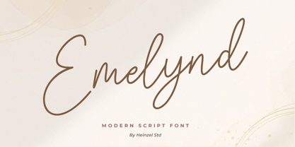 Emelynd Script is a new modern, and fresh script with a handwritten style, looking elegant and natural. It's perfect for any awesome project that need handwriting taste. It includes ligatures, alternates and multi-lingual support. Emelynd Script would perfect for photography, watermarks, social media posts, advertisements, logos and branding, invitations, product designs, labels, stationery, wedding designs, product packaging, special events or anything that need handwriting taste. Thank you for your purchase! Hope you enjoy with our font
 - Dairy by Edyta Demurat,
$28.00 This is a modern icon set with geometric shapes. A tasty set for the creation of the visual identity of shops, restaurants or bars. Thanks to its simplicity it will be perfect for printed and online materials. Baobaby Studio prepared an entire delicious set specially for you. Apart from “Dairy”, our offer also includes Bread and Confectionery, Vegetables, Meat and Seafood and Fruits. Everything in one style. Mix and match as you see fit. Bon appetit!
 - Inhabits by Gassstype,
$23.00 Hello Everyone, introduce our new product Font Inhabits it is Handwritten Brush Font,This is a Textured Natural Style and classy style with a clear style and dramatic movement. This font Inhabits is great for your next creative project such as logos, printed quotes, invitations, cards, product packaging, headers, invitation,advertisements,product designs, stationery, wedding designs,label ,product packaging, special events or anything that need handwritting taste. You can activate 16 Ligatures glyphs and 13 Alternates glyphs OpenType panel.
 - Riot Funky by Beary,
$10.00 Get ready to make a bold statement with our revolutionary font that combines various styles into one. This eclectic, rebellious font is perfect for anyone looking to add an unpredictable touch to their designs. Whether you're creating posters, templates, or any other type of design, this font will help your work stand out and leave a lasting impression. Don't settle for ordinary, upgrade to this bold and daring font today and let your designs do the talking.
 - Bread And Confectionery by Edyta Demurat,
$28.00 This is a modern icon set with geometric shapes. A tasty set for the creation of the visual identity of shops, restaurants or bars. Thanks to its simplicity it will be perfect for printed and online materials. Baobaby Studio prepared an entire delicious set specially for you. Apart from “Bread and Confectionery”, our offer also includes Dairy, Vegetables, Meat and Seafood and Fruits. Everything in one style. Mix and match as you see fit. Bon appetit!
 - Southern Clan by IKIIKOWRK,
$17.00 Proudly present Southern Clan - Retrotype, created by ikiiko. A expressive handwriting type with a 80's street graffiti shape. This type is very suitable for making a poster, t-shirt design, magazine header, brand logo, sleeve cover, party flyer, quotes, or simply as a stylish text overlay to any background image. What's Included? Uppercase & Lowercase Numbers & Punctuation Alternates & Stylistic Multilingual Support Enjoy our font and if you have any questions, you can contact us by email : ikiikowrk@gmail.com
 - Wedding Doodles Too by Outside the Line,
$19.00Wedding Doodles Too is the follow-up font to the popular Wedding Doodles. This font gives you all you need to make your own invitations, announcements, RSVP cards, save your date cards and thank you notes. Font includes 3 sets of hand-lettered words… save our date, thank you and RSVP. Just add a wedding cake, flowers, top hat, wedding bell, heart or flower and you are done. Check out Wedding Doodles, you may need both. - Kaolin Style by Sensatype Studio,
$15.00 Kaolin is a Fancy Retro Serif Font A New Fancy Retro font that we created special for Unique branding needs, . It's so nice to leverage designer or product owner that need solutions to make their design look more unique and vintage. Kaolin Modern Vintage Display font ready with: Lowercase and Uppercase characters Numbers and Punctuations Preview as a inspirations that you can do with Kaolin font Available for PC and Mac Wish you enjoy our font.
 - Olivine by URW Type Foundry,
$35.00 In an era of typographic neutrality, Pria Ravichandran adds spirit and flavour to the humanist sans, a genre that is known for legibility. Introducing Olivine. Olivine is a versatile type family that performs admirably across sizes. It is designed with maximum care ensuring legibility across various sizes, angles and distances. The sturdy shapes and the exaggerated ink traps fade to produce an even typographic colour and a lively texture in smaller text sizes. In larger display settings, the details become self-conscious and highlight the spectacular quality of the design. Olivine is neither experimental nor minimal, striking a balance between formality and friendliness. Olivine is clean as well as organic at the same time. Consisting of seven weights in roman and italics, the type-family address typographic hierarchy for texts of all kinds and sizes. Distinctive, yet neutral letterforms add personality to the type family. The counter-forms are large and open giving the design plenty of internal space which is balanced against the generous spacing of the characters. These features of Olivine make the reading process enjoyable in digital as well as the print medium. No squinting to read this type-family! If you are looking to add some flavour into your design, try Olivine. It is a trend-setting typeface that we predict is going that extra mile. Try before you buy, Olivine Medium and Medium Italic are available free for unlimited commercial usage.
 - Kindersley Sans by K-Type,
$20.00 Many street nameplates in Britain use versions of Kindersley serif capitals designed by David Kindersley in the 1950s. K-Type Kindersley Sans is an unfussy alternative to the signage stalwart, perfectly suited to newer environments and more contemporary tastes. Kindersley Sans is a humanist sans-serif that conserves the Gill-inspired character and some of the calligraphic qualities of Kindersley’s lettering, it retains the Roman proportions and its Britishness, but traditional prettiness and intricacy are discarded in favour of a clean modernity. For purposes where Transport (MOT) is considered too formal and Kindersley too old-fashioned, Kindersley Sans offers an open and amiable up-to-date alternative. The typeface is comfortably spaced and carefully kerned to deliver beautiful results with ease, and although designed with nameplates in mind, it excels as an all-purpose text face in print and on screen. The tail of the uppercase Q has minimal descent to avoid constriction. Kindersley Sans includes a lowercase designed for signage with short descenders to prevent unsightly congestion. A generous x-height assists legibility, and characters are designed for easy reading and distinctiveness. The curved foot of the lowercase L distinguishes it from the uppercase i. The six fonts contain a full complement of Latin Extended-A characters, Welsh diacritics and Irish dotted consonants, so European language nameplates need not be a source of frustration. The ascent and descent of accented characters has been kept to an acceptable minimum.
 - PGF Now by PeGGO Fonts,
$24.00 Geometric Sans with Humanistic proportions Typeface (Roman a.k.a. ‘Capitalis Monumentalis’), Inspired on vintage minimalism, with a subtle Art Déco air, where the configuration of the basic and open shape (long ascenders/descenders and a moderate ‘x’ height) star a crisp and luminous look, manufactured under an analytical and handmade process as used to be in ancient times. Among its graphic virtues are a special focus on relaxed and fluid reading rhythm while looking clear and sophisticated, an upright version representing a formal voice paired with an Italic with a more expressive vocal tone, easily distinguished as a second quoted content in Editorial and Branding communicational contexts. Equipped with generous stylistic options controlled by OpenType features as: 17 glyphs variations stored as stylistic sets Standard and Discretionary Ligatures Lining and Old Style Numeral forms Tabular forms Superior and Inferior Scientific Numeric Notation Numerators and Denominators for fractional compositions Pre-Composed Fractions, ordinals Dotted Zero for alphanumeric contexts Circled numbers An Art Déco style Border Set Bullets set for multiple levels ordered list Arrow set Monetary Symbols Mathematical Operators Publishing and Social Media Markers Wide range of Diacritics allowing you to set contents in more than 200 Latin base languages. The access to all these options is also possible via character set panel. With no hesitation, PGF Now is a highly valuable publishing and Branding tool that deserves to flaunt in the more elegant contexts but also daily situations that need a clear and modern voice.
 - Linotype Aroma by Linotype,
$29.99From the designer, Tim Ahrens... I started designing this typeface about half a year after learning that Frutiger was not a new brand of sweets and that Garamond is not the name of a fragrance. In time it became clear that designing a sans serif must always be considered as a transformation of traditional serifed typefaces instead of deriving it from typefaces that have been derived from others which have been derived from others again. I did not want Aroma to be one of those odourless and tasteless typefaces wich sacrifice a natural feeling and the characteristic shapes of the letters to neutrality. I think that beauty often evolves unintentionally. For example, I am fascinated by the beauty of airfoils, which are actually a careful transformation of a bird's wing. I love their anorganic and abstract shape which still bears the essence and all the complexity of what they are modelled on. This is exactly the formal concept behind Aroma. Many of the outlines are actually parabolics. The small r, for example, consists exclusively of straight lines and parabolics. I decided to give Aroma more stroke contrast than it is usual for sans serif designs. Many strokes are slightly convex, which gives the font an anorganic feeling. The font was intended to have a feel similar to the antiqua. More specifically, it is based on Old Style Faces. The character of those fonts, which were cut during the Renaissance, is still inherent to Aroma. - Aristotelica Pro by Zetafonts,
$39.00 Aristotelica Pro is the 2020 redesign of the rounded geometric sans designed by Cosimo Lorenzo Pancini and Andrea Tartarelli developing the original philosophy of one of the classic and best-selling Zetafonts typefaces, Arista by Francesco Canovaro. Originally conceived as an exercise in restraint and simplicity, Aristotelica is typographic eulogy to the simple beauty of circular shapes, aptly named after the greek philosopher who pioneered formal logic. It shows its strengths mostly in display uses and logo design, with a palette of moods ranging from the stark elegance of the uppercase hairline weights to the playful softness of the lowercase bold weights. True to its universalist calling, it has however been developed in a variant text version that applies slight corrections to design and metrics to allow for better legibility in long body copy. In Aristotelica Pro both the display and the text subfamilies have been complemented with a condensed version, though especially for mobile screens and other situations where space-saving is a concern. Also the original language coverage (extended latin, greek and cyrillic) has been expanded with the inclusion of arabic language glyphs, bringing the typeface to a total of over 1100 glyphs and 200 languages covered. The family is further enriched by the inclusion of Aristotelica Icons, a set of matching variable-width monoline icons that can be used to faultlessly match the typeface line width. OpenType features includes stylistic alternates, old style and lining figures and small caps.
 - Lorenzo by Canada Type,
$24.95 The lifetime of Lorenzo de Medici (1449-1492) coincides with the rise of metal type as it displaced broad pen calligraphy for the production of books. This revolution marked the end of formal Western calligraphy, as the industry employed metalworkers who designed type according to geometric measurement while calligraphers were forced to become secretaries who practiced handwriting systems. Renaissance Florence should have witnessed the marriage of calligraphy and typography, just as all the other arts and sciences flourished as classical learning was applied to technical advances; but the metalworkers and geometricians measured, dissected and recast the calligraphic letters by crude indirect methods, and in the end took all the life out of them. Here they languished until digital type has made it possible to render the precise motion of the broad pen stroke into type. Lorenzo is a confluence of many strains from the Middle Ages, brought together within the classical harmony of the capitals. It attempts to bypass metal type, using calligraphic means to achieve the precision of type while retaining the life of the stroke: a classical font that would be familiar to Lorenzo himself as well as to the modern eye. The Lorenzo family comes in four weights, ranging from light to bold. Two sets of italics, one with swashed caps and ascenders, complement each weight. The family boasts extensive language support and an offering of over fifty calligraphic ornaments/flourishes included within the character set.
 - Distefano Slab by Tipo,
$60.00 Designed from the perspective of a multi-purpose font family, comprehending the slab-serif and humanist-sans subtypes, the Distéfano typefaces were specifically developed and subsequently tested considering the needs of editorial products, for both print and digital media. Includes a comprehensive program where formal, style, thickness and slant attributes are especially indicated for the composition of text and headings in newspapers, journals and magazines. For that reason, in addition to the more traditional weights, others, ranging from Light to Black were added. The identity and systemic criteria of this font family doesn’t fall short on diversity of specific solutions, flair and quirks for each variant, especially noticeable in the contrast of the italics to the roman styles. The original drawings of Distéfano date back to 1983; embodied in pencil on paper, provided only the alphabetical characters and punctuation signs for Spanish, and the Sans Serif family. By digitalizing them, their possibilities of use were widened, the set of characters of each typeface were considerably completed considering the current requirements for the majority of the latin and germanic languages, and the slab-serif family was developed. This type family bears the name of the most notable argentinian designer, and it is a homage to his work, that influenced the youth of the 50’s decade of the 20th century, and especially to him, whom I have always recognized as a friend, and a teacher.


