10,000 search results
(0.03 seconds)
- Wind by ParaType,
$25.00Developed at ParaType in 1995 by Alexander Tarbeev, based on TextBook, 1987, by Emma Zakharova. For use in advertising and display typography. - Amerigo BT by Bitstream,
$29.99 An original Bitstream typeface prepared by Gerard Unger to provide a typeface of tapered stroke that will work well at lower resolutions.
 - Poster Bodoni WGL by Bitstream,
$49.00A slightly more refined revival of the Fat Face, as supervised by Chauncey Griffith at Mergenthaler one year after ATF’s Ultra Bodoni. - Crash by ParaType,
$25.00 Developed at ParaType in 1995 by Alexander Tarbeev, based on Pragmatica, 1989, by Vladimir Yefimov. For use in advertising and display typography.
 - Comenia Sans by Suitcase Type Foundry,
$75.00Comenia Sans was designed in the framework of a unique typographic project for all types of schools. It is a complementary face for Comenia Serif, released by our friends at Storm Type Foundry. Comenia Sans has a lot in common with its serif sister: the height of both upper and lower case, the length of ascenders and descenders, and the general weight. This makes the two perfect partners which work well even when set side by side in a single line of text. Comenia Sans does, however, lack all serifs, ornamental elements and stroke stress variation. All these elements freshen up the feel of long texts, but for shorter texts use, they are not necessary. Despite that, Comenia Sans retains the soft, friendly character of its big sister, as well as a few tiny details which lend it its unique character without compromising legibility or utility. Open counters give all letters an airy feel and permit enough variation in construction. This is why the face works well even in multiple-page texts. All its letters are easily distinguished from each other, so the reader's eyes are not strained. Diacritics and punctuation harmonize with both upper and lower case. As usually, all diacritical marks fully respect conventional shapes of accents and they are perfectly suitable for Czech, Slovak, Polish and other Central European languages, where a lot of diacritics abounds. Similarly to the renaissance italics which refers to the cursive forms, Comenia Sans introduces novel shapes of some characters drawing from the hand-written heritage. This is most apparent in the single-bellied a, the simplified g, and the stem of f which crosses the baseline and ends with a distinct terminal. In the text, emphasized words are thus distinguished not only by the slant of letters, but also by the shapes of the letters themselves. All twelve styles contain set of small caps, suitable for the names, in the indexes or the headlines in longer texts. Legibility in small sizes under 10 points was at the center of designers' attention, too. This is why the counters of a, e and g are large enough to prevent ink spread in small sizes, both on-screen and in print. After all, the font was specifically optimized for screen use: its sober, simple forms are perfectly fit to be displayed on the computer screen and in other low-resolution devices. When used in the context of architecture, the smoothness of all contours stands out, permitting to enlarge the letters almost without limit. A standard at the Suitcase Type Foundry, each style of Comenia Sans boasts a number of ligatures, an automatic replacement of small caps and caps punctuation, a collection of mathematical symbols, and several types of numerals which make it easy to set academic and other texts in an organised, well-arranged way. For the same purpose, fractions may come in handy, too. Apart from the standard emphasis styles, the family also contains six condensed cuts (each set has the same number of characters), designated for situations where space is limited or the need for striking, poster-like effect arises. Comenia Sans is the ideal choice for the setting of magazines, picture books, and navigation systems alike. Its excellent legibility and soft, fine details will be appreciated both in micro-typography and in poster sizes. Although it was designed as a member of a compact system, it will work equally well on its own or in combination with other high-quality typefaces. - Ghastly Panic - Unknown license

- Delvon Family by madeDeduk,
$15.00 Delvon is a modern sans serif font family. It is suitable to create text for branding, product packaging, invitations, quotes, t-shirts, labels, poster, logos and more. Features: Uppercase Lowercase Numbers & Symbols International Glyphs Ligatures If you need anything else just shoot me on email at: dedukvic@gmail.com or find more previews on my Instagram here : https://www.instagram.com/acekelgondolayu/ Hope you enjoy it.
 - Sweeper by Gustav & Brun,
$12.00 Sweeper is a font with several personalities; it’s friendly and scary at the same time, almost like Santa Claus, but nicer. Sweeper has got a handy touch with a lot of different possibilities. You can use it in several occasions. Sweeper is suitable in any environment: the business district in London or the shores of Oxelösund. It’s hella wide and hella fun!
 - Charta by Studio K,
$45.00 The Charta family of fonts draws its inspiration from the letter styles used in early manuscripts and printed books. Charta is also remarkably versatile: it’s equally at home in a traditional or modern context and can be used for a wide range of applications from an automobile badge to a newspaper masthead and from a fashion label to a candy bar wrapper.
 - Mandalika by Sarid Ezra,
$17.00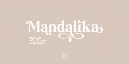 Mandalika is a bold and elegant serif with a bunch of ligatures and alternates that will make your presentation or logo even more stunning and stand out! Mandalika also contains multi-lingual support and PUA encoding. Features: Uppercase & Lowercase Numbers & Symbols Multi-Lingual Support Ligatures Alternates for each characters PUA Encoded Don't hesitate to send me an email at saridezra@gmail.com
 - Uberschrift by FDI,
$25.00 Uberschrift is an elegant display font for creating expressive headlines or logos. The font contains only capital letters, but comes with 200 discretionary ligatures and several alternate characters. Check out the type specimen PDF for more details and a closer look at the typeface. To access the ligatures you need to use an OpenType-savvy app that supports discretionary ligatures.
 - Quelia by Piotr Łapa,
$30.00 Quelia is an experimental, display, all-caps typeface inspired by nature and organic shapes. It has a very expressive character. The letterforms are extraordinary but also elegant at the same time. Quelia is a great choice for fashion projects, branding, headlines, titles, posters, packaging, covers, and logotypes but it can also add a distinct character to your website or app.
 - Stymie by Linotype,
$40.99In 1931, Morris Fuller Benton created the Stymie typeface for the American Type Founders (ATF). Stymie is a reworking of a slab serif type that was popular in Europe at that time, Memphis. For the past one hundred fifty years, slab serif types (sometimes called Egyptian or Egyptienne-style faces) have been a popular choice for headline text in newspapers, magazines, and advertising. - Les Folies JNL by Jeff Levine,
$29.00An early 20th-Century French lettering book displayed at an online image sharing site stood out with a hand-lettered version of a classic Victorian font. The lettering - a spur serif top and a split serif (or "Western-style") bottom is the basis for Jeff Levine's Les Folies JNL. All of the nuances and idiosyncracies of hand-lettering are left intact. - Cycles by Stone Type Foundry,
$49.00 Cycles was designed for use in books and other publications with lengthy texts and/or complex typography using different sizes of type. Different versions of Cycles have been designed which are optimized for setting at specific point sizes as was the practice in the days of metal type. Together with Stone Print, SFPL, and Arepo it makes up a superfamily of typefaces.
 - Parties by Monotype,
$29.99Parties Pi is a symbol font designed by Carolyn Gibbs. With a collection of 37 images, this is a versatile set of artistic elements great for instant illustrations, icons, or bullet points. Choose from opera masks, party hats, balloons, trumpets, candy, birthday cakes, martini glasses, and more! The icons in the Parties Pi are best used at larger point sizes. - Parity Sans by Shinntype,
$19.00 The Parity concept takes the minimalist unicase alphabet and expands it in another dimension, that of the megafamily encompassing a variety of weights, optical sizes and styles (roman/italic, serif/sans, proportional/monowidth)—of benefit whether fine tuning a single, quite specific font for the task at hand, or harmoniously combining several in the hierarchy of a multi-formatted page layout.
 - Eerie Lake County by The Design Speak,
$100.00 This is another scary font by the good fellows at The Design Speak. Meant to be eerie but also had a stylistic rock and roll vibe. We have you covered for things like thriller book covers and movie posters. Or anything you want to have an eerie feel. This was a hand-crafted font using a Wacom tablet and adobe illustrator.
 - Purefell Script by Letterhend,
$14.00 Purefell Script is a natural handwritten made script which is suitable for anyone who needs a typeface for headlines, logotype, apparel, invitations, branding, packaging, advertising and more. This typeface is comes with uppercase, lowercase, punctuation, symbols, numerals, stylistic set alternate, ligatures, as well as multi-lingual support and PUA encoding. We hope you enjoy the font, please feel free to comment if you have any thoughts or feedback. Or simply send me a PM or email me at letterhend@gmail.com Thanks for purchasing and have fun!
 - Inversi by Hanken Design Co.,
$30.00 Inversi is a reverse-stress typeface that may be used as a display or text-face font for a wide range of subjects. Compared to other reverse-stress/reverse-contrast typefaces, Inversi's linear contrast is much lower which, at lower sizes, makes it a good options for text or captions. It has good language support, unique design, fractions, and three different widths. Inversi pairs well with HK Requisite. Use the narrow or condensed style when mixing with HK Requisite to give more contrast to the composition.
 - Bright Peony by Nathatype,
$29.00 Bright Peony is a lovely display serif font to show friendly, feminim, modern nuances. It is truly legible due to its high contrast and simply noticeable forms. Therefore, you can apply this font for any text sizes and lengths. You may also enjoy various features available in this font. Features: Stylistic Alternates Ligatures Multilingual Supports PUA Encoded Numerals and Punctuations Bright Peony fits best for various design projects, such as posters, banners, logos, magazine covers, quotes, headings, printed products, invitations, name cards, merchandise, social media, etc. Find out more ways to use this font by taking a look at the font preview. Thanks for purchasing our fonts. Hopefully, you have a great time using our font. Feel free to contact us anytime for further information or when you have trouble with the font. Thanks a lot and happy designing.
 - Illustrissims by Typephases,
$-76 illustrations of vintage-inspired characters, most of them drawn from imagination, in the tradition of metal stock cuts or woodtype vignettes. Illustrissims is offered as a free sampler of our illustration style. Its themes are futher developed in the Absurdies, Bizarries, Genteta, Ombres and Whimsies series, also available from MyFonts! These illustrations are ready to use at any size and in any application (their vectorial format ensures they can be scaled to any size with no loss of sharpness). They can be used out of the box, or easily customized in any graphics program, adding colour or texture, resizing, combining... The variety of suggested uses is huge, from small spot illustrations to full-page layouts. Use them to great effect in magazine spreads, advertisements, stationery, packaging, bulletins or poster creative designs. Illustrissims combines three formerly separate dingbats (the Illustries 1-2-3 series), which have been unavailable for quite a few years. - Albertsthal Typewriter - Personal use only

- Bohemian typewriter - Personal use only

- Neuropol X Free - Unknown license

- MB NOIR by Ben Burford Fonts,
$30.00 MB NOIR is a 4 weight with italics font family that visually has different layers of style, at first glance its a modern clean geometry based face with some nice retro touches, it also has hints of the vintage about it, with a nod to the art deco style, with alternates and ligatures it gives a lot of scope for its uses and works very well at large and small sizes.
 - Temporal by E-phemera,
$20.00Temporal is one in a series of fonts designed for use in creating replica vintage newspapers. It is inspired by the nameplates of major metropolitan newspapers from the 1920s. Its rough character is apparent at headline sizes, and it remains nicely legible at small sizes. In addition to a complete international character set, it contains east and west coast variations for some letters, along with extra ligatures traditional for blackletter typesetting. - Charriot Deluxe by Jelloween,
$-Charriot Deluxe was released in early 2006 at deviantArt.com - where it received a Daily Deviation frontpage feature - and daFont.com. It has already been downloaded over 20.000 times and now it's your turn to try this sexy pixelfont, absolutely free of charge! Charriot Deluxe has all letters, numbers, punctuation and (currency) symbols to suit your needs and is best used at (any multiple) of size 10pt without anti-aliasing. - Loading Dock NF by Nick's Fonts,
$10.00This typeface is patterned after the lettering produced by the Marsh Stencil Making Machine, which was an indispensable part of industrial shipping departments in the mid-twentieth century. The font is unicase, but includes a “this side up” pointing hand at the section mark position, and a recycle symbol at the German double-s position. Both versions of the font include 1252 Latin, 1250 CE (with localization for Romanian and Moldovan). - Gillies Gothic by ITC,
$40.99Gillies Gothic font was originally designed by William S. Gillies for Bauer'sche Schriftgiesserei. The Extra Bold Weight was designed by Freda Sack at Letraset Design Studio and later the Extra Bold Shaded was designed by Phillip Kelly at Letraset. The extravagant capitals should be used as initials with the more reserved lowercase, and the lowercase should be set closely, overlapping where possible, to reproduce the look of true handwriting. - Tarweed by Matteson Typographics,
$19.99 Tarweed is based on a Gothic Tuscan style wood type. Its floral decorative stem endings are similar to the buds of the pungent Tarweed flower found at elevation in the Rockies. Useful for any 19th century-looking typographic design Tarweed’s style can be useful for flower shops, billiard halls, music venues, restaurants and more. Expertly crafted to be used at large sizes these fonts also work well in digital applications.
 - Comenia Serif Pro by Storm Type Foundry,
$69.00Comenia was developed as typographic system for use on all levels of schools and universities. It introduces new aesthetic standards aimed at improving reading and writing skills and the perception of texts for pupils, students, teachers, office and IT staff at schools. It offers a clear, intelligible and universal graphic tool for layout of primers, textbooks, educational texts and materials, for electronic typography and for the information systems. - Kymmera Deco NF by Nick's Fonts,
$10.00The dreams that you dare to dream really can come true when you perk up your headlines with this re-imagining of Saul Bass's 1982 glitzy Deco classic, Rainbow Bass. For best results at large sizes, choose the TrueType version, rendered at a full 2,048 UPM. Both versions include the complete Latin 1252, Central European 1250 and Turkish 1254 character sets, as well as localization for Moldovan and Romanian. - Flood by Adobe,
$35.00Flood was designed by Joachim M�ller-Lanc� and is not just another handwritten face. At smaller point sizes it exhibits the natural, dynamic, and spontaneous flow of felt tip marker writing. At larger sizes Flood is immediate, urgent, and provocative in its stylized detailing, without being overly dramatic. Flood�s energetic rhythm is well suited for informal menus, logos, and brief ad copy, as well as personal correspondence. - Sunday Popice by Nathatype,
$29.00 Sunday Popice is a delightful display font that brings a dose of cuteness and whimsy to your designs. With its rounded shapes and high contrast, this typeface exudes a unique charm that is perfect for adding a touch of playfulness to any project. Designed with love and attention to detail, Sunday Popice captures the essence of childlike joy and innocence. Each character is carefully crafted with rounded edges, creating a friendly and approachable appearance. The high contrast between thick and thin strokes adds a dynamic and lively quality to the font, making it truly stand out. This font's rounded and soft shapes evoke a sense of warmth and coziness, reminiscent of a Sunday afternoon spent in the company of loved ones. Because of the unique style, for the best readability use this font at large text sizes. Enjoy the available features here. Features: Multilingual Supports PUA Encoded Numerals and Punctuations Sunday Popice fits in children's books, product packaging, greeting cards, headlines, logos, and any design project that requires a touch of whimsical elegance. Find out more ways to use this font by taking a look at the font preview. Thanks for purchasing our fonts. Hopefully, you have a great time using our font. Feel free to contact us anytime for further information or when you have trouble with the font. Thanks a lot and happy designing.
 - LiebeLotte by LiebeFonts,
$29.90 Forget that hipster coolness for a minute and design something cute and charming with LiebeLotte! Go ahead and make beautiful things with her: birthday cards, wedding invitations, love letters, new signage for your deli—so many things look sweeter when you use this well-crafted handwriting font. We’ve put all of our heart and soul into this typeface—it took us a whole year to draw, refine, and interconnect all these loopy letterforms. We hope it’s really hard to tell that this is a typeface at all—the perfect connections and many swash variations make it look like you actually sat down with a pen. A pretty good pen in fact. LiebeLotte comes with a state-of-the-art character set. She also sports a variety of ligatures and alternative forms, available through OpenType features. (Please make sure your software supports ligatures for the letter connections and OpenType if you wish to use the advanced features.) Advanced designers, please take a look at our best-sellers LiebeErika and LiebeKlara: the all-new LiebeLotte makes a great companion for these popular fonts. We do think you’ll have plenty of fun with this versatile package of loopy letters for letter lovers. Or lovely letters for loop lovers. And hey, you can absolutely use LiebeLotte to make happy hipster designs, too! Promise!
 - Feisty by Fauzistudio,
$20.00 Feisty (2020) is a straight script bold using magic OpenType automatically at mimic real hand lettering. Use it for magazine, fashion, invitations, greeting cards, bussines card, logo, t-shirt, web banner, book cover, campaign and watermark photography. Feature Presents an advanced OpenType to automatically choose the appropriate letter shape as you type based on whether the letter appears at the beginning, middle or end of a word. The width of the bar in the lowercase "t" can be changed as desired. Has two different styles of caps: Normal caps, which are the same style as the lowercase; and a type of Comic font, plain caps for setting acronyms, roman numerals or any other case that calls for all caps. With extended language support for most Latin-based Western and Central European languages. Automatic all fractions. *Requires an application with support for OpenType advanced typography, such as Adobe Creative Suite and QuarkXPress.
 - VLNL Beatbox by VetteLetters,
$30.00 VLNL Beatbox is a solid tech heavy straight stencil-face with a lot of character. It was originally designed as a logo for dj Markus Schultz back in 2004, who rejected it. His management couldn't read it, or thought people wouldn’t be able to read it. But Chef Donald DBXL found the concept interesting enough to finish it and has used it in many projects since. It was the identity font for the Battle of Amsterdam, a talent showcase in beat boxing and other skills. Beatboxing is a style of hiphop music (beats) made with the mouth and a microphone. A box is a handy container to store stuff. Like food, or fonts. We use a lot of boxes at the VetteLetters office. VLNL Beatbox is best deployed big, like in logos or headlines. Or flyers, album covers, posters and signage. As a display and headline typeface it’s got a lot of character. We could definitely see it painted on the side of a tank, or an airplane. It’s heavy, but not at all dangerous. Use it without risk. VLNL Beatbox comes in two variations; Regular and Small (smallcaps)
 - Shiny Ink Display by Lloyd David Designs,
$14.99 Hi there, thanks for looking at my first typeface. It began as one of my original sketches back in 2019 as a freelance graphic designer trying to create unique letterforms that I could use for posters or websites with other possible use cases in mind for commercial use. The sketches were then passed on to and worked on with Vladimir Tsagolov who has more experience in creating professional typefaces, the experience for me was invaluable, and I have many more typefaces I'm now working on. Shiny Ink Display is a collection of hand drawn fonts based on the flow of reflective viscous ink with 7 styles, some styles can be interchangeable and used on top of each other. For example, Shiny Ink Display Plain, can be used with Shiny Ink Display Plain Lined to create shadows underneath it, at angles not available with the Shadow styles you'll see in the font collection. Shiny Ink Display has various use cases, maybe even infinite, but more specifically for posters or websites with large text, though it bodes quite well at smaller sizes, and is visually appealing to its viewers as long as it's at a legible font size. When it comes to font pairing, Shiny Ink Display works especially well with Monospace and sans-serif fonts. You can check the poster examples on this page to help you imagine what you could do with the font styles. I also had in mind manufactured products, but I could leave that to you to create your ideas with the available font styles. In regards to languages or typing on a keyboard, most of the English/European latin or cyrillic language keys are supported, so you'll have lots of glyph characters to play with for a number of ideas you may have. All the best with your projects using my fonts, if there are any issues, don't hesitate to contact me for support: lloyddaviddesigns.co.uk - Lloyd David
 - Power Breakfast by Hanoded,
$15.00 I am a firm believer in the fact that breakfast is the most important meal of the day. So, for the last 10 years (ever since I became a father), I have been serving my family a healthy breakfast. I live in The Netherlands, so the main portion of breakfast is bread, but I try to serve something ‘nice’ every day. Like strawberries, yoghurt with banana and brown sugar (not too much sugar!), oatmeal porridge or granola. I myself like Indonesian fried rice (nasi goreng) for breakfast, but I am afraid my kids won’t eat that in the morning… Power Breakfast is a handmade display font. Yes, it is wobbly, yes, it is uneven, but that’s what’s so darn good about it!


