10,000 search results
(0.027 seconds)
- Bogem Style by Sensatype Studio,
$15.00 Bogem is a Historical Vintage Serif. A New Vintage font that we created special for Unique branding needs, with extra ligature in unique style that ready to add value of your brand. It's so nice to leverage designer or product owner that need solutions to make their design look more unique and vintage. Lowercase and Uppercase characters Numbers and Punctuations Preview as a inspirations that you can do with Bogem font Available for PC and Mac Wish you enjoy our font.
 - Luxery by Prestigetype Studio,
$19.00 Luxery Font, A classy handwritten font with authenticated character. With natural strokes and a stylish signature style, Luxery is perfect specifically for brand visual identities such as brand's visual identity, logo, or display materials. This font has made carefully to make sure it's premium quality. We highly recommend using a program that supports OpenType features and Glyphs panels like many Adobe apps and Corel Draw so you can see and access all Glyph variations. We hope you enjoy our font!
 - Texas Chili by FontMesa,
$29.00 Texas Chili is a modified version of our Philadelphian font family. With Texas Chili we've squared the curved inside brackets from the Philadelphian font which helps open up the inside of some letters for a sharper appearance. The Texas Chili font family also includes a Unicase i that's balanced to the weight of the uppercase. You need an application such as Adobe Creative Suite or any other Opentype aware program to access the alternate Unicase i in the Chili font family.
 - Radiant Kingdom by Timurtype,
$14.00 Introduced by Timurtype Studio! Radiant Kingdom is a Quotable Handwritten Font This font enhances your words with a font that is not just handwritten but also a charming masterpiece. Each stroke weaves a story of intrigue, making each quote a journey through the art of expression. Quotable and irresistible – let your writing leave an indelible mark. Radiant Kingdom Font also supports multilingualism. Enhance your designs with our original fonts, feel free to comment or provide feedback, Enjoy the fonts 😊 Thank You
 - Vlanity by Sensatype Studio,
$15.00 A Modern Stylish Fancy Luxury font that we created special for elegant branding needs, with unique shape will be ready to add value of your brand. It so nice to leverage designer or product owner that need solutions to make their design look more stylish and modern. Vlanity Modern Stylish Fancy Luxury Font ready with: Unique Classy Characters Preview as a inspirations that you can do with Vlanity font Ready with Lowercase and Uppercase characters Wish you enjoy our font. :)
 - Invocation AOE by Astigmatic,
$19.95 Made from a simple font incantation, the Invocation typeface was born. Inspired by an old Atari game called Necromancer where trees uprooted and came after the wizard, or something like that. The end result, a thematic typeface spawning roots. On darkened night, the moon eclipsed, a cryptic verse does pass my lips, from ancient parchment, edges worn, this Invoctation font is born... Sometimes we need an evil look for our designs, so why not summon this typeface into your hands today!
 - Hannah Style by Sensatype Studio,
$15.00 A new Serif font that we created special for logo and branding needs, with extra unique shape that will add your brand value. I. And specially for Hannah font, We prepared any alternate characters to help you create unlimited variations for your creative needs specially for logotype or wordmark. Hannah Cute Serif font ready with: Any options to get creative variations Preview as a inspirations that you can do with Hannah font Ready with Lowercase and Uppercase characters Wish you enjoy our font. :)
 - The Untold Story by Invasi Studio,
$17.00 Introduction our Quotable All-caps Font, The Untold Story is an All-caps Quotable font with Brush style font and extends kerning, special for your quote Display Design, which puts a bold on your projects and will inspire you to create something unique or playful design. The Untold Story will help you to create special and touching typographical designs for your display quote projects, It is perfect for headings, flyers, greeting cards, product packaging, book cover, printed quotes, logotype, apparel design, album covers.
 - Sungar by Twinletter,
$12.00 Introducing Sungar sans serif font. Your customers will be captivated by the unique combination of inspiration, craftsmanship, and style that comes with this new typeface. You’ll get the full power of professional design without the hard work or hefty price tag. Of course, your various design projects will be perfect and extraordinary if you use this font because this font comes with a font family, both for titles and subtitles and sentence text, start using our fonts for your extraordinary projects.
 - Brishia Jodie by sizimon,
$25.00 Introducing our product Brishia Jodie! Connecting script, designed to convey elegance and style. It is slender, feminine and friendly. Brishia Jodie is perfect for fashion, e-commerce brands, trend blogs, or any business that wants to appear classy and chic. Brishia Jodie Includes: Uppercase, lowercase, numeral, punctuation & Symbol Stylistic alternates Stylistic Set01 - Stylistic Set02 Ligatures PUA Encoded Characters Fully accessible without additional design software. If you have any question please do not hesitate to contact me : info@sizimon.com. Thank You!
 - Shorthair by sizimon,
$25.00 Introducing our product Shorthair Signature! signature with which you can achieve a Cursive lettering feeling. It is slender, feminine and friendly. Shorthair Signature is perfect for fashion, e-commerce brands, trend blogs, or any business that wants to appear classy and chic. Shorthair Signature Includes: Uppercase, lowercase, numeral, punctuation & Symbol Stylistic alternates Stylistic Set01 - Stylistic Set02 Ligatures PUA Encoded Characters Fully accessible without additional design software. If you have any question please do not hesitate to contact me : info@sizimon.com. Thank You!
 - Shilling by Gassstype,
$23.00 Hello Everyone, introduce our new product Font Shilling - Handmade Script Font with a natural handwritten feel. This handmade font will make your design has a beautiful natural touch for each details. It is perfect for any design project as Invitation,logo, book cover, craft or any design purposes. photos, photography overlays, signs, window art, scrapbooking, tags and so much more! That is has charming, authentic and relaxed characteristic more natural look to your text You can activate 6Ligatures glyphs OpenType panel.
 - Tulisans by RGB Studio,
$14.00 Tulisans is a simple sans serif typeface, with semi-rounded edges for a smooth, clean look. It's perfect for logo designs, titles or subtitles, branding, and small amounts of text. Fonts include uppercase alphabet, numbers, and common symbols, and multilingual support. Files Include : Basic Latin A-Z and a-z Numbers Symbols PUA Encode Multilanguage Support Thanks and have a wonderful day, If you have any questions, please get in touch with us Don't forget to check out our other products.
 - 1590 Humane Warszawa by GLC,
$38.00 This family was inspired by a font carved circa 1590 for a Polish editor. We don't know who was the punchcutter, nor the printer's name. We have added the special East European diacritics (Czech, Hungarian, Romanian, Croatian, Slovak, Slovenian, Sorbian )as the original font has only the Polish accents. It is a Garamond type, like our 1592 GLC Garamond or 1589 Humane Bordeaux, rough and a little approximate, but attractive. We recommend using OTF version with Windows Vista, providing a best compatibility.
 - Corsham by Greater Albion Typefounders,
$14.00 Corsham was inspired by traditional stonemason's engraved lettering designs. Designed to be used alone, or in combination with our Corton family, it has wonderfully lively air, with distinctive lively serifs and beautifully swashed downstrokes. Four faces are offered-regular bold and black weights as well as a condensed form. All faces include a range of Opentype features, including ligatures and old-style numerals. The Corsham faces merge 'olde-worlde' charm with fun character, yet remaining clear and legible for text use.
 - Kaylie Diary by Reyrey Blue Std,
$16.00 Introducing, Kaylie Diary. It is the new serif typeface with classy, playful, cute and feminine look. It consisting of several kinds of alternative variations that can make your design more unique and trendy. Kaylie Diary is perfect for an elegant & luxury logo, book or movie title design, fashion brand, magazine, clothes, lettering, quotes, poster designs, branding, magazines, merchandise, logos and so much more. Features : · All Uppercase and Lowercase · Number & Symbol · Supported Languages · Alternates and Ligatures · PUA Encoded Hope you enjoy with our font!
 - Handy Pen by Gassstype,
$23.00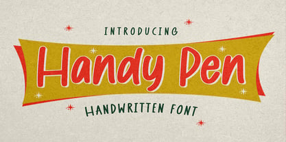 Hello Everyone, introduce our new product Font Handy Pen it is Handwritten Font,This is a Textured Natural Style and classy style with a clear style and dramatic movement. This font Handy Pen is great for your next creative project such as logos, Logotype, Letterhead, Poster, Design this font is great for your creative projects such as watermark on photography, and perfect for logos & branding, invitation,advertisements,product designs, stationery, wedding designs,label ,product packaging, special events or anything that need handwritting taste.
 - Pontiac Inline by S&C Type,
$15.00 Pontiac Inline is a layered Art Deco font designed by Fanny Coulez and Julien Saurin in Paris. This finely balanced inline font can be enhanced to improve your designs and bring an unusual and modern feeling. You could change the inside color, then add a 3D or shadow effect. To do so, you can simply superimpose the elements in compatible softwares (Photoshop, Illustrator...) ; The Regular above, the Inside line below, for example. We hope you will enjoy our work. Merci beaucoup!
 - Donut Know by Gassstype,
$23.00 Hello Everyone, introduce our new product Donut Know is a Unique Display Font.This Playful Kids with a natural feel. This handmade font will make your design has a beautiful natural touch for each details. It is perfect for any design project as Invitation,logo, Kids,book cover, craft or any design purposes. This font is PUA encoded which means you can access all of the magical glyphs. That is Donut Know has charming, authentic and relaxed characteristic more natural look to your text.
 - Kiddiess by Gassstype,
$22.00 Hello Everyone, introduce our new product Kiddiess is a Funny Brush Font Playful Kids with a natural feel. This handmade font will make your design has a beautiful natural touch for each details. It is perfect for any design project as Invitation,logo, Kids,book cover, craft or any design purposes. This font is PUA encoded which means you can access all of the magical glyphs. It also features a wealth of special features including Ligatures glyphs and Alternate glyphs.
 - Tropicane by Heyfonts,
$18.00 Tropicane - Stylish Typeface refers to a font that possesses a distinct and attractive aesthetic, often characterized by unique design elements, creative flair, and an overall fashionable or contemporary look. Stylish typefaces are crafted to make a visual impact and are frequently chosen for design projects where the typography plays a crucial role in conveying a specific mood, personality, or brand identity. Here's an in-depth explanation of the characteristics and significance of a stylish typeface: - Distinctive Design Elements: Stylish typefaces stand out due to their distinctive design features. This may include unique letterforms, creative ligatures, elegant serifs, or modern sans-serif shapes. The goal is to create a visually appealing and memorable set of characters. - Contemporary Aesthetic: The term "stylish" implies a modern and fashionable design. Stylish typefaces often incorporate contemporary design trends, keeping up with current aesthetics to ensure that they remain visually relevant and appealing. - Versatility: Stylish typefaces are often versatile, suitable for a variety of design applications. Whether used for branding, editorial design, websites, or marketing materials, these typefaces maintain their stylish appeal across different contexts. - Attention to Detail: A stylish typeface is characterized by meticulous attention to detail. Designers pay close attention to the shapes, proportions, and spacing of individual characters to create a harmonious and visually pleasing overall appearance. - Expressive Characters: Stylish typefaces can convey a sense of expressiveness and personality. This expressiveness can be achieved through unique letter shapes, playful elements, or the incorporation of design features that evoke a particular mood or emotion. Applicability to Branding: Brands often use stylish typefaces to create a distinctive visual identity. A stylish font can contribute to the overall brand image, helping to communicate the brand's values, tone, and style to the target audience. - Innovative Typography: Stylish typefaces are often at the forefront of typographic innovation. They may push the boundaries of traditional letterforms, experimenting with new shapes, styles, and arrangements to create a sense of novelty and creativity. - Readability and Functionality: Despite their emphasis on style, these typefaces generally maintain a balance between visual appeal and readability. Clear and legible letterforms are crucial, ensuring that the text remains accessible while still making a stylish statement. - Adaptability to Trends: Stylish typefaces are often designed with an awareness of design trends. This adaptability allows them to stay relevant over time, making them a popular choice for designers who want their projects to reflect a contemporary and stylish aesthetic. - Customization Options: Some stylish typefaces come with additional features, such as alternative characters, ligatures, or stylistic sets, offering designers the flexibility to customize the appearance of the text for specific design needs. In summary, a stylish typeface is a carefully crafted font that goes beyond mere functionality, aiming to enhance the visual appeal and expressiveness of the text.
 - Costa Std by Typofonderie,
$59.00 A mediterranean style sanserif in 4 styles The original idea of Costa was to create a contemporary mediterranean typeface style. Costa is a synthesis of the purity, as found on Greek capitals, and softness, found in Renaissance scripts. First thing was the design concept that take its roots on the Chancery script. Such writing style appeared during Italian Renaissance. Later few typefaces have been developed from such cursive models. Today most serifed typeface italic take their roots on such triangular structure we can find on gylphs like the n, p, or d. The Costa capitals remains close to pure sanserif models when the lowercases features an ending serif on many letters like the a, n, d, etc. This ending serif being more like a minimal brush effect, creating a visual contrast and referencing the exoticness of the typeface. Knowing that the Costa typeface family began life in the 90s as a bespoke typeface for Costa Crociere, an Italian cruise company — it suddenly makes sense and explains well why Jean François Porchez focused so much on Italian Chancery mixed to a certain exotism. The curvy-pointed terminals of the Costa n can obviously get find on other glyphs, such as the ending of the e, c and some capitals. So, the sanserif looks more soft and appealing, without to be to pudgy or spineless. The general effect, when set for text, remains a sanserif, even not like Rotis Semiserif. Costa is definitly not a classical typeface, or serif typeface which convey past, tradition, historicism as Garamond does beautifully. Because of the Costa crocieres original needs, Costa typeface was designed to be appropriate for any uses. Anytime you’re looking for good mood, qualitative effects, informal tone, cool atmosphere without to be unconvential or blowzy, Costa will convey to your design the required chic and nice atmosphere, from large headlines sizes, brands, to small text sizes. It’s a legible typeface, never boring. A style without neutrality which doesn’t fit comfortably into any typeface classification! Does it proves the novelty of its design and guarantees as well as its originality? Its up to you to be convinced. Barcelona trip Originally not planned, this need appeared because of a trip to Barcelona at the time of the project, where Jean François was giving a lecture. He wanted to pay an homage to that invitation to create something special. So, he designed during his flight some variations of the Spanish Ch, following ideas developed by the Argentinian type designer Rubén Fontana for his typeface called Fontana ND (published by the Barcelona foundry Bauer). Then, he presented during his lecture variations and asked to the audience which design fit the best to their language. They selected the design you can find in the fonts today. Read more about pairing Costa Type Directors Club 2000 Typographica: Our Favourite Typefaces 2004
 - Unconscious by Pavel Boog,
$18.00 When we fall asleep, we become free in our thoughts, in our judgments, in our choice, we decide on bold actions and words. This font will bring all this to life. UNCONSCIOUS-This font is for brave, free and liberated creators. For people with a good sense of humor and able to derive joy even from bad things.
 - Fleischmann Gotisch PT by preussTYPE,
$29.00 Johann Michael Fleischmann was born June 15th, 1707 in Wöhrd near Nuremberg. After attending Latinschool he started an apprenticeship as punchcutter in the crafts enterprise of Konstantin Hartwig in Nuremberg, which ought to last six years. For his extraordinary talent Fleischmann completed his apprenticeship after four and a half years, which was very unusual. 1727 his years of travel (very common in these days) began, during which he perfected his handcraft by working in different enterprises as journeyman. First location was Frankfurt/Main where he worked for nearly a year at the renowned type foundery of Luther and Egenolff. Passing Mainz he continued to Holland, where he arrived in November 1728 and stayed till he died in 1768. In Amsterdam he worked for several type founderies, among others some weeks for Izaak van der Putte; in The Hague for Hermanus Uytwerf. Between 1729 and 1732 he created several exquisite alphabets for Uytwerf, which were published under his own name (after his move to Holland Fleischmann abandoned the second n in his name), apparently following the stream of the time. After the two years with Uytwerf, Fleischmann returned to Amsterdam, where he established his own buiseness as punchcutter; following an advice of the bookkeeper and printer from Basel Rudolf Wetstein he opened his own type foundery 1732, which he sold in 1735 to Wetstein for financial reasons. In the following Fleischmann created several types and matrices exclusively for Wetstein. In 1743 after the type foundery was sold by Wetstein’s son Hendrik Floris to the upcoming enterprise of Izaak and Johannes Enschedé, Fleischmann worked as independent punchcutter mostly for this house in Haarlem. Recognizing his exceptional skills soon Fleischmann was consigned to cutting the difficult small-sized font types. The corresponding titling alphabets were mostly done by Jaques-Francois Rosart, who also cut the main part of the ornaments and borders used in the font examples of Enschedé. Fleischmann created for Enschedé numerous fonts. The font example published 1768 by Enschedé contains 3 titling alphabets, 16 antiquacuts, 14 italic cuts, 13 textura- and 2 scriptcuts, 2 greek typesets (upper cases and ligatures), 1 arabic, 1 malayan and 7 armenian font systems, 5 sets of musicnotes and the poliphonian musicnotesystem by Fleischmann. In total he brought into being about 100 alphabets - the fruits of fourty years of creative work as a punchcutter. Fleischmann died May 27th, 1768 at the age of 61. For a long time he was thought one of the leading punchcutters in Europe. A tragedy, that his creating fell into the turning of baroque to classicism. The following generations could not take much pleasure in his imaginative fonts, which were more connected to the sensuous baroque than to the bare rationalism of the upcoming industrialisation. Unfortunately therefore his masterpieces did not survive the 19th century and person and work of Fleischmann sank into oblivion. The impressive re-interpretation of the Fleischmann Antiqua and the corresponding italics by Erhard Kaiser from Leipzig, which were done for the Dutch Type Library from 1993 to 1997, snatched Fleischmann away from being forgotten by history. Therefore we want to place strong emphasis on this beautiful font. Fleischman Gotisch The other fonts by Fleischmann are only known to a small circle of connoisseurs and enthusiasts. So far they are not available in adequat quality for modern systems. Same applies the "Fleischman Gotisch", which has been made available cross platform to modern typeset-systems as CFF Open Type font through the presented sample. The Fleischman Gotisch has been proved to be one of the fonts, on which Fleischmann spent a good deal of his best effort; this font simply was near to his heart. Between 1744 and 1762 he created 13 different sizes of this font. All follow the same principles of forms, but their richness of details has been adapted to the particular sizes. In later times the font was modified more or less sensitive by various type founderies; letters were added, changed to current taste or replaced by others; so that nowadays a unique and binding mastercopy of this font is missing. Likewise the name of the font underwent several changes. Fleischmann himself probably never named his font, as he did with none of his fonts. By Enschedé this textura was named Nederduits, later on Nederduitsch. When the font was offered by the german type foundery Flinsch in Frankfurt/Main, the more convenient name of Fleischmann-Gotisch was chosen. In his "Masterbook of the font" and his "Abstract about the Et-character" Jan Tschichold refered to it as "Duyts" again. To honour the genious of Johann Michael Fleischmann we decided to name the writing "Fleischmann Gotisch PT" (unhyphenated). Developing the digital Fleischman Gotisch I decided not to use one of the thirteen sizes as binding mastercopy, but corresponding to the typical ductus of the font to re-create an independent use of forms strongly based on Fleischmann´s language of forms. All ascenders and descenders were standardised. Some characters, identified as added later on, were eliminated (especially the round lower case-R and several versions of longs- respectively f-ligatures) and others were adjusted to the principles of Fleischmann. Where indicated the diverse characters were integrated as alternative. They can be selected in the corresponding menu. All for the correct german black letter necessary longs and other ligatures were generated. Through the according integration into the feature-code about 85% of all ligatures in the type can be generated automatically. Problematic combinations (Fl, Fk, Fh, ll, lh, lk, lb) were created as ligatures and are likewise constructed automatically. A historically interesting letter is the "round r", which was already designated by Fleischmann; it is used after preceding round letters. Likewise interesting is the inventive form of the &-character, which is mentioned by Tschichold in his corresponding abstract. Nevertheless despite all interpretation it was very important to me to maintain the utmost fidelity to the original. With this digital version of a phantastic texturfont of the late baroque I hope to contribute to a blossoming of interest for this genious master of his kind: Johann Michel Fleischmann. OpenType features: - Unicode (ISO 10646-2) - contains 520 glyphes - Basic Latin - Latin-1 Supplement - Latin Extended-A - Latin Extended-B - Central European Glyhps - Ornaments - Fractions - Standard ligatures - Discretionary ligatures - Historical ligatures - Kerning-Table
 - Norwich Aldine ML by HiH,
$12.00 Norwich Aldine ML is a all-cap typeface with enlarged serifs, designed and produced in wood by William Hamilton Page of Norwich, Connecticut in 1872. Norwich Aldine ML is a fine example of the strength of decorative wood types: large, simple type forms that provide the visual boldness sought by advertisers of the Victorian period. While our marketing has gotten so very sophisticated, there is always a place for a simple, visually strong typeface. Although about 14 miles inland, Norwich, Connecticut lies at the head of the Thames River. The river is both wide and deep, and therefore was not bridged in the early 20th century. Until then, if you wanted to get from Groton on the west bank to the whaling port of New London on the east bank by land, you had to go by way of Norwich. Because of its size, the Thames is navigable all the way from Norwich to New London. Docks were built in Norwich around 1685 and the city became Connecticut’s 2nd largest port by 1800. With the construction of the Norwich & Worcester Railroad in 1835, Page could easily ship his wood type north by rail or south by coastal schooner. Included with our font, Norwich Aldine ML, are two 19th century printer’s ornaments of sailing ships similar to those that sailed up the Thames to Norwich. Reference: Moon’s Handbooks, Connecticut 2nd Edition (Emeryville CA 2004) The family has expanded from one to four fonts: 1. Norwich Aldine ML: the concept font, computer-sharp corners and smooth curves, as we imagine it was designed. 336 Glyphs including some reduced-width alternatives for better letter spacing. 2. Norwich Aldine Worn ML: the way actual wooden type would look after have been used for a while. 332 Glyphs 3. Norwich Aldine Distressed ML: the way the wooden type would look after it had really been used, perhaps abused. Alternatives to the more popular letters reflect the damage that typically occurs on a well-wormn font, with nicks, cuts and scratches and the overall wear that reduces the overall height and leads to uneven inking due to varying heights in the chase. A couple of bullets look like bullet holes. 345 glyphs. 4. Norwich Aldine Cyrillic: Cyrillic includes alll English and Cyrillic letters for MS Windows Code Page 1251, ISO 8859-5 and MacOS Cyrillic. 235 glyphs. We did Cyrillic because is was fun and we felt the basic design cried out for Cyrillic. While obviously subjective, we hope you will agree.
 - Reina Neue by Lián Types,
$29.00 Hey! See Reina Neue in action here! INTRODUCTION When I designed the first Reina¹ circa 2010, I was at the dawn of my career as a type designer. The S{o}TA, short for the Society of Typographic Aficionados, described it as complex display typeface incorporating hairline flourishes to a nicely heavy romantic letterform². And it was like that; that’s what I was pursuing at that time since I was very passionate about ornaments and accolades of Calligraphy. Why? I felt that Typography, in general, needed more of them. These subtle flourishes could breathe life into letters. Maybe, I thought it was the only way I could propose something new into the field of type. However, after some years, I came across a very interesting quote: –Beautiful things don’t ask for attention– Wow! What did this mean? How could something be attractive if it’s not actually showing it. Could this be applied to my work? Sure. I think every type-designer goes through this process (aka crisis) regarding his or her career. At the beginning we love everything. We are kind of blind, we only see the big picture of a project. And that’s not because we are lazy. We actually can’t see the small mistakes nor the subtleties that make something simpler beautiful. We are not able. But, the small subtleties… They are actually everything: With experience, one puts more attention into the details and learns that every single decision in type has to be first meticulously planned. Here I am now, introducing a new Reina, because I felt there was a lot of it that could be improved, also the novelty of Variable Fonts caught my attention and I had to take that to my type library. THE FONT A thing of beauty is a joy forever Now, a decade later, I’m presenting Reina Neue. This font is not just an update of its predecessor: –A thing of beauty is a joy forever– is the first line of the poem ‘Endymion’ by John Keats, and despite the meaning of “beauty” may vary from person to person, and even from time to time (as read in the last paragraph), with Reina I always wanted to bring joy to the eye. In 2010, and now, in 2020. I believe the font is today much better in every aspect. It was entirely re-designed: Its shapes and morphology in general are much more clean and pure. The range of uses for it is now wider: While the old Reina consisted in just one weight, Reina Neue was converted into a big family of many weights, even with italics, smallcaps and layered styles. The idea behind the font, this kind of enveloping atmosphere made out of flourishes, is still here in the new Reina. This time easier to get amazing results due to the big amount of available alternates per glyph and also more loyal from a systemic point of view. However, and as read in the introduction -Beautiful things don’t ask for attention-, if none of the flourishes are activated the font will look very attractive anyway. Reina Neue is ready to be used in book covers, magazines, wedding cards, dazzling posters, storefronts, clothing, perfumes, wine labels and logos of all kind. Like it happened with the previous Reina, I hope this new font satisfies every design project around the world if used, and can be a joy forever. SOME INSTRUCTIONS Before choosing the right style for your project, hear my advice: -Reina Neue Display was meant to be used at big sizes. If you plan to print the font smaller than 72pt, I suggest using Reina Neue, not Display. Otherwise, if the font will be BIG or used on a digital platform, Reina Neue Display should be your choice. For even smaller sizes, use Reina Neue Small. This style was tested and printed in 12pt with nice results. (Note for variable fonts: Print them in outlines) -Reina Italic is not a slanted version of the roman, and this means some flourishes are different between each other. The Italic version has other kind of swirls. More conservative, in general. -All the styles of Reina Capitals have Small Capitals inside. -Reina Capitals Shine should be used/paired ONLY with Reina Capitals Black. The engraved feeling can be achieved if Reina Capitals Black and Reina Capitals Shine are used as layers, with the same word. Variable fonts instructions: -For more playful versions, choose Reina Neue VF, Reina Neue Italic VF or Reina Neue Capitals VF: With them you can adjust between 3 axes: Weight (will change the weight of the font) – Optic Size (will thicken/lighten the thin strokes and open/close the tracking) – Accolades (will modify the weight of the active flourishes). SOME VIDEOS OF REINA NEUE VF https://youtu.be/8cImmT5bpQM https://youtu.be/1icWfPmKAkg https://youtu.be/YC9GkJDL1a8 NOTES 1. The original Reina, from a decade ago: https://www.myfonts.com/fonts/argentina-lian-types/reina/ 2. In 2011, Reina received an honourable mention by S{o}TA. “Great skill is shown in the detailing, and an excellent feel for the correct flow of curves and displacement of stroke weight.” https://www.typesociety.org/catalyst/2011/ Reina was featured in the “Most Popular Fonts of the year” in MyFonts in 2011 https://www.myfonts.com/newsletters/sp/201201.html In 2012, the font was also selected in Tipos Latinos, the most prestigious competition of type in Latinoamerica. https://www.tiposlatinos.com/bienales/quinta-bienal-tl2012/resultados Also, chose as a “Favorite font of the year” in Typographica. https://typographica.org/typeface-reviews/reina/
 - Ongunkan Archaic Etrusk by Runic World Tamgacı,
$50.00 Etruscan was the language of the Etruscan civilization, in Italy, in the ancient region of Etruria (modern Tuscany, western Umbria, northern Latium, Emilia-Romagna, Veneto, Lombardy and Campania). Etruscan influenced Latin but was eventually completely superseded by it. The Etruscans left around 13,000 inscriptions that have been found so far, only a small minority of which are of significant length; some bilingual inscriptions with texts also in Latin, Greek, or Phoenician; and a few dozen loanwords. Attested from 700 BC to AD 50, the relation of Etruscan to other languages has been a source of long-running speculation and study, with its being referred to at times as an isolate, one of the Tyrsenian languages, and a number of other less well-known theories. The consensus among linguists and Etruscologists is that Etruscan was a Pre–Indo-European,and a Paleo-European language and is closely related to the Raetic language spoken in the Alps, and to the Lemnian language, attested in a few inscriptions on Lemnos. Grammatically, the language is agglutinating, with nouns and verbs showing suffixed inflectional endings and gradation of vowels. Nouns show five cases, singular and plural numbers, with a gender distinction between animate and inanimate in pronouns. Etruscan appears to have had a cross-linguistically common phonological system, with four phonemic vowels and an apparent contrast between aspirated and unaspirated stops. The records of the language suggest that phonetic change took place over time, with the loss and then re-establishment of word-internal vowels, possibly due to the effect of Etruscan's word-initial stress. Etruscan religion influenced that of the Romans, and many of the few surviving Etruscan language artifacts are of votive or religious significance.
 - Rahere Sans by ULGA Type,
$18.98 Rahere is a humanist sans with subtle features that give the typeface a distinctive, warm appearance without distracting the reader. Legible at large and small sizes, Rahere is a versatile family suitable for a wide range of applications such as annual reports, advertising, brochures, catalogues, information signage, screen text and visual identities. For projects that need to convey a sense of authority or credibility, this is the ideal sans serif to use. The family consists of six weights ranging from light to extra bold with corresponding italics and the character set covers most of the major European languages. Each weight contains lining & non-aligning numerals in both proportional & tabular spacing. The tabular numerals share the same width across all weights and styles – a must for financial tables in annual reports. Spirited and lively, the italic lowercase is more cursive and calligraphic than the roman, although it harmonises perfectly, displaying enough character to create emphasis without looking out of place. When used on its own, for pull-out quotes or poetry, the italic exudes a charm that draws attention to the text. The typeface is named after Rahere, a 12th-century Anglo-Norman priest, who founded St Bartholomew's Hospital, London in 1123. I will always be indebted to Barts (as it is now commonly known) because in 2007 I was successfully treated for relapsed testicular cancer. Way back in 1992 I designed my first sans serif, Charlotte Sans, and although it was relatively successful, I was never really satisfied with the end result: not enough weights & italics, a small character set, lack of accented characters, and my design skills were still in their infancy. Whilst Rahere shares many common elements with Charlotte Sans, it is much more than just a reworking; it represents over 20 years of accumulated knowledge and experience as a designer.
 - First Ladies by Celebrity Fontz,
$24.99 First Ladies is a unique collection of signatures of almost all of the First Ladies of the United States plus the First Lady of the Confederacy in a high-quality font. A must-have for autograph collectors, desktop publishers, lovers of history, or anyone who has ever dreamed of sending a letter, card, or e-mail “signed” as if by one of these famous women. This font includes 45 signatures for the following First Ladies: Martha Dandridge Custis Washington, Abigail Smith Adams, Martha Wayles Skelton Jefferson, Dolley Payne Todd Madison, Elizabeth Kortright Monroe, Louisa Catherine Johnson Adams, Rachel Donelson Jackson, Anna Tuthill Symmes Harrison, Julia Gardiner Tyler, Sarah Childress Polk, Margaret Mackall Smith Taylor, Abigail Powers Fillmore, Jane Means Appleton Pierce, Harriet Lane, Mary Todd Lincoln, Eliza McCardle Johnson, Julia Dent Grant, Lucy Ware Webb Hayes, Lucretia Rudolph Garfield, Ellen Lewis Herndon Arthur, Frances Folsom Cleveland, Caroline Lavinia Scott Harrison, Frances Folsom Cleveland, Ida Saxton McKinley, Edith Kermit Cardow Roosevelt, Helen Herron Taft, Ellen Axson Wilson, Edith Bolling Galt Wilson, Florence Kling Harding, Grace Anna Goodhue Coolidge, Lou Henry Hoover, Anna Eleanor Roosevelt, Elizabeth Virginia Wallace Truman, Mamie Geneva Doud Eisenhower, Jacqueline Lee Bouvier Kennedy, Claudia Taylor (Lady Bird) Johnson, Patricia Ryan Nixon, Elizabeth Bloomer Ford, Rosalynn Smith Carter, Nancy Davis Reagan, Barbara Pierce Bush, Hillary Rodham Clinton, Laura Welch Bush, Michelle Obama, and Varina Howell Davis (First Lady of the Confederacy). This font behaves exactly like any other font. Each signature is mapped to a regular character on your keyboard. Open any Windows application, select the installed font, and type a letter, and the signature will appear at that point on the page. Painstaking craftsmanship and an incredible collection of hard-to-find signatures go into this one-of-a-kind font. Comes with a character map.
 - English Monarchs by Celebrity Fontz,
$24.99 English Monarchs is a unique font collection with accurate digital replicas of 84 signatures of English and British monarchs from Richard II through Elizabeth II, including many of the royal consorts. Also included in this font are the Stuart pretenders and Mary Queen of Scots and her consort. A must-have for autograph collectors, desktop publishers, history buffs, fans, or anyone who has ever dreamed of sending a letter, card, or e-mail "signed" as if by one of these famous nobles. This font behaves exactly like any other font. Each signature is mapped to a regular character on your keyboard. Open any Windows application, select the installed font, and type a letter, and the signature will appear at that point on the page. Painstaking craftsmanship and an incredible collection of hard-to-find signatures go into this one-of-a-kind font. Comes with a character map. This font includes signatures from the following noble figures: Richard II, Henry IV, Henry V, Henry VI, Margaret of Anjou, Edward IV, Elizabeth Woodville, Edward V, Richard III, Henry VII, Elizabeth of York, Henry VIII, Catherine of Aragon, Anne Boleyn, Jane Seymour, Anne of Cleves, Catherine Howard, Catherine Parr, Edward VI, Lady Jane Grey, Mary I Tudor, Elizabeth I, James I, Charles I, Henrietta Maria of France, Oliver Cromwell, Richard Cromwell, Charles II, Catherine of Braganza, James II, William III, Mary II, Anne, Prince George of Denmark, George I, George II, George III, George IV, William IV, Victoria, Prince Albert, Edward VII, George V, Edward VIII, Wallis Warfield Simpson, George VI, Elizabeth II, Prince Philip, Prince Charles, Princess Diana, Camilla Duchess of Cornwall, Prince James Edward Stuart, Prince Charles Edward Stuart, Mary Queen of Scots, Henry Stuart Darnley, Francis II of France.
 - Nexusbold Sans by Ferry Ardana Putra,
$14.00 Introducing Nexusbold, a modern condensed sans font that redefines typographic excellence. With its sleek and contemporary design, Nexusbold is the epitome of elegance and functionality, enhanced by an extensive array of meticulously crafted ligatures. Nexusbold's condensed form is carefully crafted to optimize space without compromising legibility. Whether you're creating headlines, logos, packaging, or web designs, this font's compact structure ensures a visually striking impact that commands attention. But what truly sets Nexusbold apart is its vast collection of expertly designed ligatures. With an abundance of ligatures at your disposal, Nexusbold empowers you to create seamless connections between characters, infusing your typography with a sense of fluidity and artistry. These ligatures add a touch of sophistication, taking your designs to new heights and captivating viewers with their visual allure. Nexusbold is a versatile font suitable for a myriad of design applications, including editorial layouts, branding materials, advertising campaigns, and digital interfaces. Its modern condensed sans style exudes a sense of professionalism and contemporary aesthetics, making it the perfect choice for projects that demand a refined and sleek visual identity. Whether you're pursuing a minimalistic, high-tech, or cutting-edge look, Nexusbold provides the ideal canvas for your creativity. Its modern condensed form, coupled with a plethora of ligatures, empowers you to create captivating and memorable designs that stand out from the crowd. In summary, Nexusbold is an exceptional modern condensed sans font that combines functionality, elegance, and a wealth of ligatures. Unlock the full potential of your typographic endeavors with NexusBold—a font that seamlessly merges form and function, enabling you to craft visually stunning and harmonious designs. Nexusbold features: A full set of uppercase Numbers and punctuation Multilingual language support PUA Encoded Characters OpenType Features Condensed Style +400 of Total Glyphs +156 of Total Ligatures ———
 - Night Train by FontMesa,
$19.95 Night Train is a new font built from the ground up; while Night Train may resemble an old classic wood type there are a few lines that make this font a little more modern setting it apart from other wood type revivals. If you're a railroad enthusiast you're sure to enjoy the steam locomotive graphic located on the less than and greater than keys on all versions of this font, due to the fine detail of this train illustration the best printing results will be at 600dpi or higher on a laser printer. An alternate K and R are within the Night Train fonts, for Win Type1 these alternates are on the left and right bracket keys, for Truetype and OpenType you may access the alternates by using the Character Map in Windows or Adobe Illustrator, for OpenType you may also find them on the stylistic alternates page of the glyph map in Illustrator. There's something new with Night Train that the sign making people will love, for the first time FontMesa is pleased to offer a block shadowed version in four directions. One fill font is all that is needed for all four open faced fonts, you'll need an application that works in layers in order to use the fill font with the open faced fonts, simply place the fill font in its own layer then move it behind one of the open faced fonts of Night Train. The Night Train name has been on my list to use as a font name for a few years, a friend from years ago used to sail his boat in the Mackinac race from Chicago to Mackinac Island, the name of that boat was the Night Train. Watching the 2010 Olympic four man U.S. bobsled team win gold with their sled also called Night Train has inspired me to complete this font.
 - Generis Slab by Linotype,
$29.00The idea for the Generis type system came to Erik Faulhaber while he was traveling in the USA. Seeing typefaces mixed together in a business district motivated him to create a new type system with interrelated forms. The first design scheme came about in 1997, following the space saving model of these American Gothics. Faulhaber then examined the demands of legibility and various communications media before finally developing the plan behind this type system. Generis’s design includes two individually designed styles; each of with is available with and without serifs, giving the type system four separate families. Each includes at least four basic weights: Light, Regular, Medium, and Bold. Further weights, small caps, old style figures, and true italics were added to each family where needed. The Generis type system is designed to meet both optical criteria and the highest possible measure of technical precision. Harmony, rhythm, legibility, and formal restraint make up the foreground. Generis combines aesthetic, technical, and economic advantages, which purposefully and efficiently cover the whole range of corporate communication needs. The unified basic form and the individual peculiarity of the styles lead to Generis’ systematic, total-package concept. The clear formal language of the Generis type system resides beneath the information, bringing appropriate typographic expression to high-level corporate identity systems, both in print and on screen. The condensed and aspiring nature of the letterforms allows for the efficient setting of body copy, and the economic use of the page. A range of accented characters allows text to be set in 48 Latin-based languages, offering maximal typographic free range. This previously unknown level of technical and design execution helps create higher quality typography in all areas of corporate communication. Optimal combinations within the type system: Generis Serif or Generis Slab with Generis Sans or Generis Simple. - Sweet Sans by Sweet,
$59.00 The engraver’s sans serif—strikingly similar to drafting alphabets of the early 1900s—has been one of the most widely used stationer’s lettering styles since about 1900. Its open, simple forms offer legibility at very small sizes. While there are digital fonts based on this style (such as Burin Sans™ and Sackers Gothic™, among others), few offer the range of styles and weights possible, with the versatility designers perhaps expect from digital type families. Sweet Sans fills that void. The family is based on antique engraver’s lettering templates called “masterplates.” Professional stationers use a pantograph to manually transfer letters from these masterplates to a piece of copper or steel that is then etched to serve as a plate or die. This demanding technique is rare today given that most engravers now use a photographic process to make plates, where just about any font will do. But the lettering styles engravers popularized during the first half of the twentieth century—especially the engraver’s sans—are still quite familiar and appealing. Referencing various masterplates—which typically offer the alphabet, figures, an ampersand, and little else—Mark van Bronkhorst has drawn a comprehensive toolkit of nine weights, each offering upper- and lowercase forms, small caps, true italics, arbitrary fractions, and various figure sets designed to harmonize with text, small caps, and all-caps. The fonts are available as basic, Standard character sets, and as Pro character sets offering a variety of typographic features and full support for Western and Central European languages. Though rich in history, Sweet Sans is made for contemporary use. It is a handsome and functional tribute to the spirit of unsung craftsmanship. Burin Sans and Sackers Gothic are trademarks of Monotype Imaging.
 - Expline Variable by Formatype Foundry,
$140.00 Expline typeface finds its roots in modernist design but subtly pays homage to early Modern Industrial Grotesks. This fusion creates a font that encapsulates the essence of tradition while embracing the contemporary. The font incorporates sharp details in select characters and curves, imparting a delicate sweetness while preserving the robust character associated with Grotesk fonts. This unique blend allows Expline to strike a perfect balance between display and text usage, making it a versatile choice for a variety of design projects. Expline's flexibility shines through its extensive weight options. The font family offers eight distinct weights, each thoughtfully crafted to establish a clear typographic hierarchy. Designers can easily choose the right weight to suit the specific needs of their projects, whether it's a bold headline or a refined body text. This variety ensures that your typography will always make the right visual impact. Expline typeface doesn't stop at weights. It provides expansive character sets across each weight, encompassing all Western European diacritics, Punctuation, Mathematics, and Numerics. This ensures that your typography will seamlessly support various languages and punctuation marks, making it a global choice. In addition, the font boasts OpenType features, granting the flexibility to explore multiple subsets. This includes alternate capital letterforms, tabular and lining numerals (both proportional and old-style), enabling endless typographic possibilities. Whether you're designing for print or web, these features allow you to fine-tune your typography for a perfect fit. Expline is a font that bridges the gap between modernist design principles and early industrial influences, resulting in a Neo-Grotesk font with a contemporary twist. Its comprehensive weight options, expansive character sets, and OpenType features make it a versatile choice for any medium between print and screen.
 - Expline by Formatype Foundry,
$39.00 Expline typeface finds its roots in modernist design but subtly pays homage to early Modern Industrial Grotesks. This fusion creates a font that encapsulates the essence of tradition while embracing the contemporary. The font incorporates sharp details in select characters and curves, imparting a delicate sweetness while preserving the robust character associated with grotesk fonts. This unique blend allows Expline to strike a perfect balance between display and text usage, making it a versatile choice for a variety of design projects. Expline's flexibility shines through its extensive weight options. The font family offers eight distinct weights, each thoughtfully crafted to establish a clear typographic hierarchy. Designers can easily choose the right weight to suit the specific needs of their projects, whether it's a bold headline or a refined body text. This variety ensures that your typography will always make the right visual impact. Expline typeface doesn't stop at weights. It provides expansive character sets across each weight, encompassing all Western European diacritics, Punctuation, Mathematics, and Numerics. This ensures that your typography will seamlessly support various languages and punctuation marks, making it a global choice. In addition, the font boasts OpenType features, granting the flexibility to explore multiple subsets. This includes alternate capital letterforms, tabular and lining numerals (both proportional and old-style), enabling endless typographic possibilities. Whether you're designing for print or web, these features allow you to fine-tune your typography for a perfect fit. Expline is a font that bridges the gap between modernist design principles and early industrial influences, resulting in a Neo-Grotesk font with a contemporary twist. Its comprehensive weight options, expansive character sets, and OpenType features make it a versatile choice for any medium between print and screen.
 - Generis Serif by Linotype,
$29.00The idea for the Generis type system came to Erik Faulhaber while he was traveling in the USA. Seeing typefaces mixed together in a business district motivated him to create a new type system with interrelated forms. The first design scheme came about in 1997, following the space saving model of these American Gothics. Faulhaber then examined the demands of legibility and various communications media before finally developing the plan behind this type system. Generis’s design includes two individually designed styles; each of with is available with and without serifs, giving the type system four separate families. Each includes at least four basic weights: Light, Regular, Medium, and Bold. Further weights, small caps, old style figures, and true italics were added to each family where needed. The Generis type system is designed to meet both optical criteria and the highest possible measure of technical precision. Harmony, rhythm, legibility, and formal restraint make up the foreground. Generis combines aesthetic, technical, and economic advantages, which purposefully and efficiently cover the whole range of corporate communication needs. The unified basic form and the individual peculiarity of the styles lead to Generis’ systematic, total-package concept. The clear formal language of the Generis type system resides beneath the information, bringing appropriate typographic expression to high-level corporate identity systems, both in print and on screen. The condensed and aspiring nature of the letterforms allows for the efficient setting of body copy, and the economic use of the page. A range of accented characters allows text to be set in 48 Latin-based languages, offering maximal typographic free range. This previously unknown level of technical and design execution helps create higher quality typography in all areas of corporate communication. Optimal combinations within the type system: Generis Serif or Generis Slab with Generis Sans or Generis Simple. - Serling Galleria by Mans Greback,
$39.00 Serling Galleria is a classy, classic serif font that exudes an air of fine art and high-end creativity. With its clear, legible letterforms and modernist inventiveness, Serling Galleria brings a touch of strict creativity to your designs, making them stand out in sophistication. This versatile font family is perfect for projects that require a refined, elegant aesthetic. With its variable font feature, you have the flexibility to fine-tune the font to your specific needs and create a truly bespoke typographical experience, or use the pre-defined font styles: Thin, Thin Italic, Extra Light, Extra Light Italic, Light, Light Italic, Regular, Regular Italic, Medium, Medium Italic, SemiBold, SemiBold Italic, Bold, Bold Italic, Extra Bold, Extra Bold Italic, Black, Black Italic The diverse styles in the Serling Galleria font family provide unmatched versatility, allowing you to adapt your typography to various design contexts and moods seamlessly. With this array of weights and styles at your fingertips, you can effortlessly create a visual hierarchy, emphasize key elements, and establish a cohesive, engaging design language across your creative projects. Also includes a variable font! Only one font file, but the file contains multiple styles. Use the sliders in Illustrator, Photoshop or InDesign to manually set any weight and width. This gives you not only the predefined styles, but instead more than a thousand ways to customize the type to the exact look your project requires. Built with advanced OpenType functionality, Serling Galleria ensures top-notch quality and provides you with full control and customizability. It includes stylistic and contextual alternates, ligatures, and other features to make your designs truly unique and tailored to your needs. Serling Galleria offers extensive lingual support, covering all Latin-based languages, from Northern Europe to South Africa, from America to South-East Asia. It contains all the characters and symbols you'll ever need, including all punctuation and numbers.
 - El Fonte Angelia by Gilar Studio,
$16.00 Hello Everyone.. Introducing a new Font " El Fonte Angelia " Beautiful Serif Type Family is inspired by the serif typefaces used in editorial media in the 70s and 80s.such as the soft and gentle shapes found in Cooper or the fluid, angled strokes in Windsor— mixed into one single design that features familiar, fresh, modern flavors. Designed to reflect nature, it creates a sense of natural softness and expressiveness. We pushed the concept into a usability focused direction, to work as a bold tool and beautiful communicator. El Fonte Angelia variable allows fluid design across 5 weights The font broadens its use by supplying weights all the way from Light to Bold. The natural curves, swells and sloping trunks, grow in character as the font gains weight. Whilst the thinner weights have lowered contrast and optical corrections to create a warm and gentle appearance. El Fonte Angelia character set incorporates additional symbols, stylistic alternates, unique ligatures and case sensitive punctuation - producing a stable workhorse family ready to tackle projects of any size.The type family melds organic curves and gentle repetition into powerful and harmonious type. At large point sizes you can appreciate the letter shapes, whilst the same restraint and focus creates an even texture for small point sizes and long reading. Its variety of weights provide a range of choices that will help you find the best typographic color for your project. Lighter weights are well-suited for body text while heavier ones are ideal for high impact headlines. The available stylistic alternates offer a number of different characters that give your logo or business card a unique look. Check my other Font here : https://gilarstudio.com/ Thank you Regards, Gilar Studio
 - Materia Pro by Elsner+Flake,
$79.00 Minimal, modular, modern—at first glance, Materia shows a contemporary flair, combining pure, strong geometrical form with a subtle, distinct appearance. Actually, the design was inspired by lettering from the turn of the 19th to the 20th century that still can be found in the East of France. While its formal origins date back as far as this, revived e. g. by the constructivists into the nineteen twenties and later on by Dutch information designer Wim Crouwel in the nineteen-sixties, the visual language of Materia still speaks of the »future«. Following a minimalistic concept the font is formally built on a grid. Wherever optical curves are needed for a smoother, more comfortable shape of letters than a simple rectangular block, diagonals cut off the egdes – like a diamond is cut to achieve more beauty. Thus headlines and texts set in Materia are given a certain »egdy« feeling, whereas their tonality is still kept well-balanced, keeping concentation all on information in a nonconfomist way. Materia comes in eight styles, from elegant Thin to attention-forcing Ultra. Even a regular Italic is available, following the classic type-set-principle. Two of the styles are explicitly designed for display use, Shadow and Code. Both are ready for combinations with Bold or each other respectively, the layering of Shadow and Code e. g. allows astonishing effects or highlighting within the letters. For OpenType-users Materia is a real Pro, containing accented Latin letters for over 70 languages, small caps, old style, tabular and lining figures and special condensed titling all caps for cases in which space is all that counts. How useful all of the above mentioned is may be seen in the book David Lynch – Lithos, designed by Koma Amok, published in 2010 by item éditions, Paris, and Hatje Cantz, Germany, which was typeset completely in Materia.