10,000 search results
(0.044 seconds)
- Voltdeco V02 by Owl king project,
$29.00 Finally, voltdeco V02 is basically capital letters (all-caps) for display, then to complement various needs for body text and headline layouts, it is developed into a font family. Voltdeco is an art deco uppercase font with a modern style, Voltdeco works great in short sentences or words, but the (20 weight) fonts allow for more options for exploration. Voltdeco can also work well for medium or regular text. Explore with voltdeco for creative works, whether printing the final design or digital design, happy exploring with voltdeco.
 - Bunken Tech Sans Wide by Buntype,
$49.00 The Bunken Tech Sans superfamily: A reminiscence of constructed fonts of the modern age designed with considerably cleaner forms. •See other members of the Superfamily: Bunken Tech Sans •For further details, view the Specimen PDF. Bunken Tech Sans Wide follows in the best tradition of the straight-lined and somewhat angular structures of its predecessors while offering a much more open and mild design. The shapes of the letters are therefore reduced to the most essential elements: The spurs on a, b, n and other lower case letters occur just as little as decorative or style details, the lightly rounded inside edges are more pleasing to the eye than certain historic role models and make for a harmonic, flowing style. Use In particular Bunken Tech Sans Wide stands out as an easy, distinctive headline font with its straight-lined, technical design. Open counters and large x-height make it equally suited for use in shorter texts. It is also perfectly complemented by Bunken Sans or Bunken Slab in longer texts (available soon). Features Available in 16 styles with widths ranging from Light to Heavy with associated Italics. All of the styles are very extensive: Support for at least 58 languages, Small Capitals, 9 number sets (e.g. Lining, Oldstyle, Tabular and Small Cap Figures), ligatures, alternate characters, numerous Opentype functions, and lots of other small features that make it more pleasant to work with the font on a daily basis as well as fulfilling typographic desires. Each style contains more than 870 characters! Each style is available in a professional (Pro) standard (Std) and Small Caps (SC) edition with a different range of functions. (Language support, OpenType features and number of glyphs). Details can be found on the respective pages. Bunken Tech Sans Wide is part of the Bunken Tech superfamily and is available in Condensed, Normal and Wide. Also of interest: The slab serif variation Bunken Tech Slab Features in Detail: 16 Weights: -Light -Book -Medium -SemiBold -Bold -ExtraBold -UltraBold -Heavy and corresponding Italics 3 Widths: -Condensed -Normal -Wide Alternate Characters: A, E, F, L, S, e, f, t, s, y, etc. Small Capitals 5 Sets of Figures: -Lining Figures -Old Style Figures -Tabfigures -Old Style Tabfigures -Small Cap Figures Automatic Ordinals Automatic Fractions Extended Language Support and more...
 - Maiden Orange Pro by Stiggy & Sands,
$29.00 Our Maiden Orange Pro is a light and festive slab serif font inspired by custom hand lettered 1950's advertisements. Clean and legible, while also being offbeat and friendly, this font lends itself to a wide variety of uses. The SmallCaps and extensive figure sets offer a slightly more serious tone as well as a wider range of design use. Opentype features include: - SmallCaps. - Full set of Inferiors and Superiors for limitless fractions. - Tabular, Proportional, and Oldstyle figure sets (along with SmallCaps versions of the figures). - Stylistic Alternates for Caps to SmallCaps conversion.
 - Englebert Pro by Stiggy & Sands,
$29.00 Our Englebert Pro draws inspiration from the title screen of the 1930's film entitled, "Der Blaue Engel", starring Marlene Dietrich. Playful but subdued, yet striking enough to catch the eye, this casual sans has a distinct signature look to it. The offbeat letterforms engage the reader, while the SmallCaps and extensive figure sets lend a wider versatility to the typeface. Opentype features include: - SmallCaps. - Full set of Inferiors and Superiors for limitless fractions. - Tabular, Proportional, and Oldstyle figure sets (along with SmallCaps versions of the figures). - Stylistic Alternates for Caps to SmallCaps conversion.
 - Spicy Rice Pro by Stiggy & Sands,
$29.00 Our Spicy Rice Pro has a festive flair to it that works through winter holidays to summertime jams. Casual and exciting, the extra heavy letterforms are imbued with a little exotic flair and flavor to spice up the party. The SmallCaps and extensive figure sets only offer Spicy Rice Pro an even wider range of creative options. Opentype features include: - SmallCaps. - Full set of Inferiors and Superiors for limitless fractions. - Tabular, Proportional, and Oldstyle figure sets (along with SmallCaps versions of the figures). - Stylistic Alternates for Caps to SmallCaps conversion.
 - Autobats by Canada Type,
$24.95 Autobats is a set of over 100 different car and truck icons, minimal silhouettes that can be adapted to whatever context your design flings at them. The mystery of why this font has been so popular was solved when one of our customers said, “I always use this thing, because the name starts with A, so it’s one of the first fonts I see in my slap-a-logo collection”. To see all the icons available, a glyph palette would be come in handy while using the font. Honk if you like convenience. Beep beep!
 - Rathery by Scratch Design,
$15.00 Please welcome, Rathery Rathery is a textured handwritten script font made by Love. This font is detailed and has a beautiful shape. It will give you a summer vibe in your design. This font will be perfect for posters, invitations, branding, social media content, headlines, body text in magazines, logos and many more. What you'll get : Uppercase and lowercase Numbers & punctuation Multilingual support Alternates for lowercase Ligatures Please make sure you have your OpenType Ligatures turned on to see the magic of ligatures. Thank you for your purchase! Hope you enjoy our font!
 - Nautical Fabulous by Letterhend,
$14.00 The Nautical Fabulous font features a perfect blend of boldness and condensed letterforms. Its clean lines and sharp edges give it a catchy look that is ideal for modern branding, striking headlines, and impactful displays. With its commanding presence, this font effortlessly stands out in any design composition. This font perfectly made to be applied especially in logo, and the other various formal forms such as invitations, labels, logos, magazines, books, greeting / wedding cards, packaging, fashion, make up, stationery, novels, labels or any type of advertising purpose. Features : Uppercase & lowercase Numbers and punctuation Alternates & Ligatures Multilingual PUA encoded We highly recommend using a program that supports OpenType features and Glyphs panels like many of Adobe apps and Corel Draw, so you can see and access all Glyph variations.
 - Raclette by Linotype,
$29.99Raclette grills are an ingenious Swiss invention. This tabletop grill is used to cook raclette cheese, a unique sort of cheese produced by the happy cows of Valais. Swiss designer Michael Parson created a typeface in 2002 that speaks endearingly to his hearty homeland tradition - endearingly enough, he named it Raclette. Raclette most likely started out as a bold, condensed sans serif. But then, just as one pulls little trays off of a raclette grill, Parsons quickly removed many rectilinear bits from the edges of each letter. Text set in Raclette looks like an old brick wall, or perhaps like a raclette party for several hundred people, that ended an hour ago! Raclette is one of ten of Michael Parson's experiments in type design featured in the Take Type 5 collection from Linotype GmbH." - Sprout by The Northern Block,
$25.99 Sprout is a low-contrast sans serif, slightly condensed for economy of space, and complete with 6 weights in Roman and Italic. It has open apertures and a generous x-height for clarity of reading. It also comes with a weight balanced italic, which can be used for differentiation or as a standalone typeface in itself. The defining feature of the family is the taut curve, where the inner counter pushes out toward the outer contour, creating a feeling of tension in the curve. In the italic this shape language is pushed further, with a playful looped g and cursive form of the f. Sprout also comes with Old Style figures. Its range of weights makes for a versatile family suitable for branding, on-screen publishing and long-form reading.
 - Rita by Latinotype,
$29.00 The publication of this more mature design is the result of a previous 1-style project which was developed in 2010. Rita, the new design, has increased from one single style to a full font family, with a strong personality, ideal for short text for high impact designs. Rita is a slab serif typeface that offers a wide range of weights and widths—from a thin, ultra condensed font to a heavy variant for poster design. Its variety of weights and widths allows users to create a number of different compositions such as titles and text for impact or high impact graphics. Rita comes in 10 styles and includes a set of 400 characters that support over 200 languages. Rita was designed by Daniel Hernández with the collaboration of Rodrigo Fuenzalida.
 - CA Zentrum by Cape Arcona Type Foundry,
$40.00 CA Zentrum is a compelling mix of conciseness and pragmatism. Bold, distinct and original, contemporary and versatile. At a closer look, it reveals rounder reading-friendly forms. The choice of weights aims at an easy, straight forward use. A set of five well-balanced weights and three widths ranging from light to black and from condensed to wide. This variety ought to be enough to cover most needs without throwing the typographer into questions. The family’s glyph set supports over 100 Latin languages. With its blend of timelessness and modernity, the type-family is uniquely suited for modern corporate visual languages, websites, corporate design, editorial design and advertising. Careful spacing and a great choice of OpenType features make it especially well suited for text copy and/or editorial design.
 - Mesca by S6 Foundry,
$39.00 Mesca is a distinctive multi-language font with characters (Latin, Greek, Cyrillic) for industry and digital, with elegant, high-quality typographic responses to the complex technological needs for different media and digital uniforms: TV screens, computers, and mobile phones, smartwatches also editorial fields such as print or digital magazines, books. Furthermore, its multifunctional character goes far beyond editorial and digital use. It promises great performance in terms of branding, advertising, signage, mobile app, etc. Mesca is a contemporary humanist sans-serif font with a generous x-height and slightly condensed proportions. Which offers a combination of good readability and space-saving. Built on rational lines of pure geometry, which presents a notable inclination in the terminals of the letters with external and internal acute angles that create a strong contrast.
 - Renault MN - Unknown license

- Astronauts In Trouble by Comicraft,
$49.00 AiT/Planet Lar publisher and writer, Larry Young loves The Space Program. Next time you see him at a comic convention just ask him about any one of the Moon Landings and you'll see.
 - Tuscaloosa by Greater Albion Typefounders,
$7.00 Tuscaloosa is a classic American 'Wild West' Tuscan typeface-we thought it would make a suitable Independence Day tribute to our many American clients. It's ideal for wherever that 'Western' feel is wanted. Posters, signage, the sides of stagecoaches etc... Three faces are offered, a pristine and sharp regular form, a somewhat distressed 'Rustic' face and the rather more distressed 'Extremely Rustic'. So why not mosey on down the saloon with Tuscaloosa!
 - Yellow Party by Attype Studio,
$8.00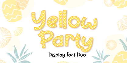 Yellow Party is display font with the texture of pineapple and includes two styles: Regular and Display. Yellow Party is perfect for branding, logos, invitations, stationery, social media posts, product packaging, merchandise, blog designs, game titles, cute style designs, Book/Cover Titles and more. What's Included : - Multilingual Support (Afrikaans, Albanian, Catalan, Danish, Dutch, English, Estonian, Finnish, French, German, Icelandic, Italian, Norwegian, Portugese, Spanisch, Swedish, Zulu) - 6 ligatures --- Hope you enjoy with our font! Attype Studio
 - Panderman by theulum studio,
$10.00 panderman is a simple modern san serif font with 4 font styles. Simplicity and modernity are the basis for making this font. Perfect for branding, logos, invitations, mastheads, and more. The panderman also includes the full set: Uppercase and Lowercase Multilingual Symbol Number Punctuation Alternative multilingual 4 font styles (Regular, Italic, Bold, & Bold Italic) Hope you enjoy our fonts and if you have any questions feel free to message & I'm happy to help. Thank you.
 - Modern Love Slanted by Resistenza,
$39.00 Modern Love has been one of our most popular fonts during last year, so we decided to create a new version of this sweet character set. Modern Love Slanted is a new casual slanted brush-handwritten family. It has the effortless hand-painted feeling and keeps a high density of contrast like Modern Love Regular and It also includes a set of ornaments, swashes and alternates accessible through Opentype features. Check out also ‘Modern Love’
 - Pariphoom Compressed by Jipatype,
$27.00 ขอแนะนำ Pariphoom Compressed ส่วนเสริมของฟอนต์ Pariphoom ด้วยอักษรอันโฉบเฉี่ยวและทันสมัย เหมาะสำหรับงานออกแบบหลากหลายประเภท ด้วยอักษรแบบ sans-serif condensed และมุมโค้งมน แบบอักษรนี้ให้ความสมดุลที่ระหว่างความเป็นทางการและความเข้าถึงได้ง่าย ชื่อปริภูมิมาจากภาษาไทย แปลว่า “Space” และเช่นเดียวกับชื่อของมัน ฟอนต์นี้สามารถให้พื้นที่มากขึ้นในงานออกแบบของคุณ ไม่ว่าคุณกำลังสร้างสื่อสำหรับสร้างแบรนด์ พัฒนาแคมเปญการตลาด หรือออกแบบเว็บไซต์ Pariphoom Compressed มอบความยืดหยุ่นและความอเนกประสงค์เพื่อให้ได้รูปลักษณ์ที่คุณต้องการ Pariphoom Compressed มาพร้อมกับรูปแบบที่แตกต่างกันถึง 18 รูปแบบ สิ่งนี้ทำให้คุณมีตัวเลือกมากมายและมีความยืดหยุ่นในการใช้งานในหลากหลายบริบท นอกจากนี้ ฟอนต์นี้รองรับหลายภาษาสำหรับภาษาต่างๆ มากมาย แต่นั่นไม่ใช่ทั้งหมด Pariphoom Compressed มาพร้อมกับฟีเจอร์ Opentype เจ๋ง ๆ เช่น Small Caps และ Tabular ซึ่ง Small Caps เป็นวิธีที่ยอดเยี่ยมในการเพิ่มความหลากหลายให้กับงานออกแบบของคุณโดยใช้ตัวพิมพ์ใหญ่แทนตัวพิมพ์เล็ก ในขณะเดียวกัน Tabular ก็สมบูรณ์แบบสำหรับการสร้างตารางและจัดตำแหน่งตัวเลขเพื่อให้ดูเป็นระเบียบมากขึ้น โดยรวมแล้ว Pariphoom Compressed ทำให้เป็นตัวเลือกที่ยอดเยี่ยมสำหรับนักออกแบบที่ต้องการสร้างผลงานการออกแบบที่น่าจดจำและมีประสิทธิภาพ Introducing Pariphoom Compressed, a extended of Pariphoom with sleek and modern typeface that is perfect for a wide range of design projects. With its condensed sans-serif design and rounded corners, this font offers a unique balance of professionalism and approachability. Derived from the Thai language, the name Pariphoom means "Space" and just like its name suggests, this font can give you more space in your design. Whether you're creating branding materials, developing marketing campaigns, or designing websites, Pariphoom Compressed offers the flexibility and versatility you need to achieve your desired look. Pariphoom Compressed comes with 18 different styles. This gives you plenty of options to choose from and the flexibility to use it in various design contexts. Additionally, this font offers multi-language support for a wide range of languages. But that's not all – Pariphoom Compressed comes with some cool Opentype features such as Small Caps and Tabular. Small Caps are a great way to add variety to your design by using small capital letters instead of lowercase letters. Meanwhile, Tabular is perfect for creating tables and aligning numbers for a more organized look. Overall, Pariphoom Compressed making it a great choice for designers who want to create memorable and effective design projects.
 - yum - 100% free

- NewMedia - Unknown license

- Lichtner Ex - Unknown license

- Elwood - Unknown license

- Lichtner Wd - Unknown license

- Mayday - Unknown license

- KG Blank Space by Kimberly Geswein,
$5.00 A chunky fat font perfect for titles in both a chalkboard sketch style and a regular solid version.
 - Menim Elim by Michael Browers,
$25.00MenimElim, meaning "my hand" in Azeri, is a handwriting-based font available in two weights: regular and bold. - Indigo Sky by Fenotype,
$25.00 Indigo Sky is a bold and plush rounded serif with plenty of nostalgia and a touch of psychedelia. With its large x-height and wide characters Indigo Sky makes striking headlines taking over the space. Indigo Sky is great for any display use from posters to products and from online to print. Indigo sky is equipped with large arsenal of OpenType features - Try Swash, Stylistic or Titling Alternates for less conventional letterforms. Turn on Discretionary Ligatures for ck, sk, ri or rj -ligatures. Keep on Standard Ligatures to prevent f colliding poorly on other letters. Try combining Discretionary Ligatures and Swash for special versions of ck, sk, fk or fh -ligatures.
 - Ultine by insigne,
$- No frills. No fluff. Still friendly. Keep your look clean and simple with the utilitarian but gentle Ultine. This font with a slightly extended geometric architecture gets straight to the point without pushing your reader away with too firm an approach. Ultine covers a large set of multi-Latin languages. It includes a wide range of other OpenType features, too, including ligatures and contextual alternates. Moreover, small caps of Utline and titling alternates are available for deepening your design capabilities with this basic face. The Ultine family consists of 42 fonts with three different widths and italics counterparts for every style. The design is well suited for graphic design and any use of the screen. It can easily operate as a webfont, as text for banner ads and for branding as well as editorial design. And just to show you how simple and friendly the font can be, the regular weight is free, so you can use it to your heart's content.
 - Monarcha by Isaco Type,
$45.00 Monarcha is a serifed type family, with a strong influence of the baroque style, for extended texts. Its roman versions are slightly skewed, in the sense of reading, and its italics have unusual calligraphic features. Moreover, the contrast between thick and thin strokes is relatively smaller than in conventional serif fonts. These characteristics, coupled with its rounded shapes, give Monarcha a delicious fluidity and texture. Monarcha innovates and brings an exclusive OpenType feature to convert Arabic to Roman numerals up to 3999. It also has several other professional features - small caps, fractions, old style-, lining-, tabular numbers, scientific superior/inferior figures, stylistic sets and more than 40 different ligatures (standard + discretionary). The family consists of 8 styles, 4 weights - Book, Regular, SemiBold and Bold - plus their respective italic versions. The fonts are available in OpenType PS format and have extended character set to support CE, Baltic, Turkish as well as Western European languages.
 - Armature Neue by fontBoy,
$15.00 Armature Neue is an extension and clarification of the original Armature family released in 1997. We made the distribution of weights more even, and added italics extra light and black weights. Originally consisting of four fonts, Armature Neue has twelve: six weights with accompanying italics. Although conceived as a display face, a number of alternate characters are included that can be used to regularize the type for text setting. Armature is one result of my interest in typefaces that are constructed, rather than drawn. Although it is basically a monoline design, there are subtle details throughout that compensate for a monoline’s evenness. As with all fontBoy fonts, there are dingbats hidden away in the dark recesses of the keyboard. When I first started designing this face in 1992, I called it Dino-I thought I would name all my fonts after famous pets-so the dingbats for Armature are dinosaurs. Designed by Bob Aufuldish with editing and production by Psy/Ops.
 - Balinese Culture by Graphicxell,
$19.00 Balinese Culture Condensed Sans Font Typeface inspired by the famous minimalist logo perfect for the purposes of designing templates, brochures, videos, advertising branding, logos, invitation, layout design, elegant crafting, beauty design and other What's Included : Standard glyphs International Accent Works on PC & Mac Simple installations Accessible in the Adobe Illustrator, Adobe Photoshop, Corel Draw. PUA Encoded Characters - Fully accessible without additional design software. Fonts include multilingual support Image used : All photographs/pictures/vector used in the preview are not included, they are intended for illustration purpose only. Thank You
 - Ardone by Hackberry Font Foundry,
$24.95Ardone is a well-modulated humanist serif font family with Garalde roots. A distant ancestor is Minister (a German font designed by Fahrenwaldt in 1929) through my first font, Diaconia Old Style. This first style, book, is slightly condensed and very elegant with thin bracketed serifs. There are many OpenType features with over 600 characters: Caps, lower case, small caps, ligatures, discretionary ligatures, swashes, small cap figures, old style figures, numerators, denominators, accent characters (including CE), ordinal numbers (1st-infinity: lining and oldstyle), and so on. Ardone is designed for text use in body copy. - Congress by Monotype,
$29.99Congress from Adrian Williams was shown for the first time at the Association Typographique International Congress, which proved to be so popular in 1980 at Kiel; designed to present a style equally appealling in European languages. Many characters are more condensed than is usual, while others have had certain elements exagerated, bringing notice to new elements of certain letters. The concept being to bring an equality of importance to the whole, producing a collection of International characters working together in harmony on the page -- a common aim that Europeans wish of any Congress. - Handbills And Posters JNL by Jeff Levine,
$29.00 At first glance, Handbills and Posters JNL bears a strong resemblance to Classroom JNL. True, they both share the visual qualities that are based on Franklin Bold Condensed, but this is where the similarity ends. Handbills and Posters JNL is a refined re-draw of the classic design, based largely on vintage typographic examples. There are also some character variances. Classroom JNL is a rougher alphabet with varying curves and lines, and resembles such letters traced and cut out of construction paper for a bulletin board display at school.
 - Pinguino by Sudtipos,
$49.00 Angel Koziupa's familiar brush goes upright and narrow with Pinguino. Koziupa's approach to condensed brush fonts makes use of the same elements that have always distinguished his calligraphy from any other. With Pinguino, however, we see him softening his corners and adding a distinctly feminine touch to his exotic brush. Pinguino would feel at home on sobering coffee packaging just as it would on a bouncy mixed-fruit juice bottle. Try Pinguino for your next packaging project, and tell your client an Angel told you to use it.
 - Trade Gothic by Linotype,
$42.99 The first cuts of Trade Gothic were designed by Jackson Burke in 1948. He continued to work on further weights and styles until 1960 while he was director of type development for Mergenthaler-Linotype in the USA. Trade Gothic does not display as much unifying family structure as other popular sans serif font families, but this dissonance adds a bit of earthy naturalism to its appeal. Trade Gothic is often seen in advertising and multimedia in combination with roman text fonts, and the condensed versions are popular in the newspaper industry for headlines.
 - Tecnica Slab by Graviton,
$20.00 Tecnica Slab font family has been designed for Graviton Font Foundry by Pablo Balcells. It is a modular, geometric, slab serif typeface with a slightly condensed design and subtle rounded angles. It has been conceived to be most suitable for all sized headlines, as well as short and middle length text blocks. The standard styles give texts a classic appearence while alternate styles give texts a playfull one. Tecnica Slab consists of 4 styles, 2 weights plus alternates, each containing small caps and glyph coverage for several languages.
 - Belle Sans by Park Street Studio,
$25.00 Belle Sans is a clean, straightforward sans serif typeface family, and a very large family at that! It has seven widths, from Ultra Condensed to Extra Wide, and seven weights, ranging from Light to Black, all with Oblique companions. Belle Sans offers up great legibility for on-screen usage, and the breadth of width and weight make it very usable for text applications as well. The heavier weights, especially the Black, are exceptional for creating visual impact! Each font supports Western and Central European languages, ligatures, tabular figures, unlimited fractions, superiors & inferiors, and ordinals.


