10,000 search results
(0.026 seconds)
- Lenkay by MC Creative,
$10.00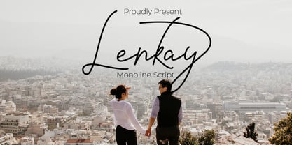 Lenkay is monoline script font which natural movement and elegant for signature style. is perfect for branding projects, logo, wedding designs, social media posts, advertisements, product packaging, product designs, label, photography, watermark, invitation, stationery and any projects that need handwriting taste. What’s Included : Standard glyphs Ligature Works on PC & Mac Accessible in the Adobe Illustrator, Adobe Photoshop, Adobe InDesign, even work on Microsoft Word. PUA Encoded Characters – Fully accessible without additional design software. Fonts include multilingual support for; ä ö ü Ä Ö Ü ß ¿ ¡ for questions and usage license please contact us Mohamadcandirah@gmail.com
 - Banery by Arterfak Project,
$28.00 Banery is a minimalist serif in modern style. Made with geometric shapes and high contrast of strokes, also accompanied by alternates characters with unique shapes, and full of beautiful twists which give a pretty, elegant, and exclusive impression. Banery is very suitable for use on various media such as posters, magazines, catalogs, logos, logotypes, labels, flyers, and branding. You can use this font, especially on minimalist themes such as furniture, invitation, wedding, fashion, beauty, real estate, perfumery, and many more. What you'll get : Uppercase & lowercase Numbers & punctuation Accented characters Stylistic sets Ligatures. Thank you!
 - Retrofit by Vanderfont,
$29.00 The evocative and original Retrofit is based on typefaces of the 1940s and 50s, which extolled the virtues of American products in glossy magazines for the new suburban consumer. Oversized terminal bulbs and occasional slab serifs lend a rhythm and a bouncing baseline provides just the "zing" to spice up that bland typographic treatise. Retrofit's easy familiarity can be seen on children's books, games, food packaging, and other places where a kid friendly note is needed. Retrofit has been adapted by Quickutz for their punched letter cutting tool, and re-named "Maggie".
 - Anji by MC Creative,
$15.00 Anji is a font with a modern Calligrapy look and energetic. With extra attention to quick strokes and sharp details, is ready and perfectly fit for your logo designs, music projects & social media posts, event poster, brand imagery, product packaging, handwritten quotes, merchandise, etc. What’s Included : Standard glyphs Ligature Works on PC & Mac Simple installations Accessible in the Adobe Illustrator, Adobe Photoshop, Adobe InDesign, even work on Microsoft Word. PUA Encoded Characters – Fully accessible without additional design software. Fonts include multilingual support for; ä ö ü Ä Ö Ü ß ¿ ¡
 - Fuel Uni Extended by VersusTwin,
$39.00 The Fuel Uni Extended typefaces are a modern update on the techno sans extended for stronger impact, adding further versatility with unicase design complete with soft rounded corners as well as decorative inktraps. Stylistic Alternates included within all styles are alternates for the capital B, E, and R, as well as lowercase g characters, as well as all of their accented siblings. The Fuel Complete package bundles all of the dynamic styles of the Fuel, Fuel Extended, Fuel Uni, Fuel Uni Extended, and Fuel Script typefaces into one powerhouse of a collection.
 - Chivertta by Eurotypo,
$38.00 Chivertta combines elements of casual and modern aesthetics. The font is inspired by a logo discovered on the streets of Buenos Aires. One of Chivertta’s distinctive features lies in its careful design and its wide repertoire of ligatures and stylistic alternatives. This extensive collection offers a wealth of options, allowing designers to enhance their creative output, imbuing their designs with a greater sense of authenticity and realism. In essence, Chivertta transcends convention, offering a powerful tool for designers and resulting in designs that come out with authenticity and contemporary style.
 - Coffeeshop by Vozzy,
$10.00 Introducing the new 2024 font "Coffee Shop"! This is a strict and at the same time playful serif font. It will look great on any of your designs - T-shirts, posters, promotional materials. Introducing the new font "Coffee Shop"! This is a strict and at the same time playful serif font. It will look great on any of your designs - T-shirts, posters, promotional materials. The font contains many additional characters, there is multilingual support, as well as styles with support for layers - Shadow FX and Scratch Shadow FX.
 - Federico by Olga Umpeleva,
$30.00 Federico is a typeface based on the handwriting of Federico Garcia Lorca, the eminent Spanish poet and playwright (1898-1936). Original version was designed for a book about Lorca. The face has two styles. One looks like an original poets writing, the second looks like if Lorca would write with a ball pen. Federico includes many alternative glyphs and ligatures, which make it look like a real writing of an emotional, negligent, creative man. Despite the fact that Garcia Lorca has written in spanish, the font has western and eastern european, cyrillic, turkish letters.
 - Moochio by Brothergrounds Studio,
$9.99 Introducing Moochio - Display Craft Font with strong and challenging nuances. very suitable for the title, typography, magazines, brochures, packaging and much more for your design needs, making your designs more modern and professional What's Included : + Standard glyphs + Web Font + Works on PC & Mac + Simple installations Accessible in the Adobe Illustrator, Adobe Photoshop, Adobe InDesign, even work on Microsoft Word. PUA Encoded Characters - Fully accessible without additional design software. Fonts include multilingual support Image used : All photographs/pictures/vector used in the preview are not included, they are intended for illustration purpose only. Cheers! Thank You
 - Frakto by Linotype,
$29.99Frakto is a two-weight family of calligraphic Fraktur-style typefaces designed by Julius de Goede. One of the main categories of Blackletter typefaces, Fraktur was developed around 1517, and was used throughout Germany and Northern Europe well into the 20th century. With Frakto, Julius de Goede has re-applied the written element of the script back into the Fraktur style, rejuvenating and reinvigorating it for 21st century display use. Frakto is the perfect fit for certificates and newsletter headlines. We recommended using it in point sizes from 12-pt on up. - Westack by Almarkha Type,
$35.00 Introducing Westack – Modern Display Serif inspired by the famous minimalist logo, perfect for the purposes of designing templates, brochures, videos, advertising branding, logos and more. What’s Included : Westack (OTF/TTF) Standard glyphs Ligatures Web Font International Accent Works on PC & Mac Simple installations Accessible in the Adobe Illustrator, Adobe Photoshop, Adobe InDesign, even work on Microsoft Word. PUA Encoded Characters – Fully accessible without additional design software. Fonts include multilingual support +Image used : All photographs/pictures/vector used in the preview are not included, they are intended for illustration purpose only. Cheers! Thank You
 - ASTYPE Ornaments Accolades C by astype,
$40.00 Accolades C and C2 share the same main ornaments but differ in finishing. Accolades C uses pearls and diamonds, C2 does not. Accolades CX is an additional fitting set of borders. All fonts are available in two variations. A clean one and a distressed, grungy version (old). The layout samples from the PDF-specimen are included in the font packages and stored in InDesign CS3 format. Mostly all of the featured fonts of the specimen are available on MyFonts, too. Have a look at Secca Art Std, Secca Saloon Std, Gracia, Battista and Prillwitz.
 - Qonqueror by Wacaksara co,
$18.00 Qonqueror Typeface is a font inspired by writing on a blackboard. This font is very cool and can be mixed and matched with any ornament you like. this font is great for your next creative project such as blackboard menu design, book menus, sign boards, logos, printed quotes, invitations, cards, product packaging, headers, Logotype, Letterhead, Poster, Apparel Design, Label, and etc. Qonqueror Typeface comes with uppercase, lowercase, numerals, punctuations and so many variations on each characters include opentype alternates, and also ligatures to let you customise your designs.
 - Retrouvailles by Hanoded,
$15.00 Retrouvailles is a French word, which means ‘the feeling one gets after reuniting after a long time’. This script font was based on a couple of handwritten letters and postcards and my own imagination. I used a drawing tablet for the ligatures and the connecting strokes. Retrouvailles comes in 3 distinct styles: the slightly slanted regular style, an Italic style and a back slanted style. Retrouvailles has an abundance of goodies under the hood: it comes with a lot of ligatures and all the diacritics you could poke a stick at.
 - Jus Hangin PB by Pink Broccoli,
$16.00 Jus Hangin was inspired by the lettering on the cover of the 1999 Counting Crows album, “This Desert Life”. It was one of those child-like lettering styles that was just begging to be fleshed out and made into a typeface that was as wild and carefree as the lettering inspiration. With an open spacing format, and an exuberant baseline bounce, Jus Hangin is fun to typeset with, while alternates and double letter ligatures keep things from getting repetitive. You’ll find Jus Hangin is ready and waiting to announce your festivities.
 - Culinary by Latinotype,
$39.00 Culinary is a typographic system inspired by the art of cooking. This family comes with 2 subfamilies: one Regular Family of 4 weights plus a Sans Line font and a set of Borders, and one 4-weight Script Family that also includes Sans Line and Borders. Culinary is well-suited for packaging, restaurant and cafe branding, bakeries, logos, magazines, menus, recipe books, invitations and much more. The OpenType features allow access to a wide set of characters, including ligatures, swashes, endings, initial and terminal forms, and lots of alternates.
 - Bearskin by Hanoded,
$15.00 NO! I don’t have a bearskin rug, nor a fur collar on my jacket. I believe fur should only be worn by its first owner. I have no idea why I called this font Bearskin: maybe I was influenced by one of the Viking novels I am reading - they’re full of Berserkers - but that name was already taken. Anyhoo, Bearskin font is a nice handmade all caps font. A little rough here and there, but with a lot of character as well. Bearskin comes with swashes, so you can have a ball!
 - Due Credit by Wing's Art Studio,
$6.00 A versatile compressed font for film posters, credit blocks and trailers, Due Credit is a display font specifically designed for the film and television industry. A versatile typeface that’s suitable for bold headline titles and small credit blocks, with an additional horror genre inspired extra style. Watch Due Credit in action in this showreel: https://youtu.be/2XeoqG17wo8 Contents: Due Credit Version One and Two Uppercase Characters Lowercase Capitals Light, Regular, Bold and Extra Bold Weights Additional Cast and Crew Glyphs (simply drop in crew titles in one click) Additional "Horror" genre style with Alternatives
 - Banret by Ryzhychenko Olga,
$12.00 Banret is built using simple geometric shapes. It is mostly the result of my experiments on the other font I made earlier in 2016, called Inventor. Font is inspired by old fonts of the beginning of the 20th century. Capital letters are built with one to four proportions. The font has four weights: normal, and bold, and two alternatives: ribbon, and flag. As far as it is a decorative font, it is not designed for large amounts of text. But it is perfect for creating branding elements, logos, slogans and posters.
 - CLIMAXED - Personal use only

- Adelle Mono by TypeTogether,
$36.00 The Adelle family continues its stylistic expansion with the release of Adelle Mono and Adelle Mono Flex by Veronika Burian and José Scaglione. Monospaced typefaces are the default choice for developers and programmers and are also an aesthetic choice for many designers and communicators. The Adelle Mono font family has two widths to serve both breeds and a variable font for the flexible spectrum in between. Monospaced typefaces are born of necessity rather than purely aesthetic values. Each glyph is constrained to a strict box, making the naturally smaller ones the same width as the naturally wider ones. While this serves the functional purpose of keeping text aligned in vertical and horizontal rows, it is completely unnatural in terms of readability. A monospaced ‘l, i’ are overblown compromises while ‘m, w’ become compressed mutations. The Adelle Mono family was therefore designed with both the developer and the aesthete in mind. Adelle Mono respects its necessary constraints while still being visually appealing and easily read. Activate it for use in Sublime, Swift, Terminal, or your IDE of choice and see how well it performs. Clarity will lead to less developer mistakes, and its aesthetic appeal will make your work enjoyable. Adelle Mono Flex is the proportional width version that works for any kind of normal text reading or a design intended to invoke “system or information aesthetics”. Opposite the demands of the monospace family, Flex is reader friendly and intended for branding, annual reports, paragraphs, UI, logos, posters, screens, tables, captions, and more. Employ the Mono version where monospace is needed and the Flex version where reading or coherence is priority. Adelle Mono’s experimental 20-style design explores the space between proportional and monospaced types. It boosts creativity and coherence by providing flexible options in the same family, including italics and the variable font format with an axis of weight and a spectrum axis between multi-width and monospaced characters. Combining Adelle Mono with either Adelle or Adelle Sans adds more layers and adaptability to your work.
 - Schuss Slab Pro by typic schuss,
$42.56 I was working about 10 years exclusively for a type company. Based on my experiences, I built this superfamily. Schuss™ Sans PCG is a humanistic sans-serif with a little contrast. Small Caps, greek and cyrillic are included. Also tab, prop, lining, old style and small cap figures. It's a typeface with clear and open characters. All complicated shapes are cleaned and simplified with a bit elegance. Schuss™ Slab Pro is a slab serif, based on the Schuss™ Sans. Schuss™ News Pro is the modeled style between Schuss™ Slab Pro and Schuss™ Serif Pro. Schuss™ Serif Pro is the antiqua shape. Additionally all serifs are cleaned up. There is just one-side-serif in the "n" for example. Tab figures (except small caps), mathematical signs and currency symbols have a width system accross all styles and weights.
 - Atherosser by Mokatype Studio,
$18.00 Atherosser is elegant classic serif font inspired from old formal roman, built with modern nuance, and still looks vintage, unique design with rounded on the tip of serif and lots of alternates and ligatures. This font is suitable for any purposes of design like headlines, typography, Poster, magazines, brochures, packaging, websites, and much more for your design needs, making your designs look like luxurious nuances. And still, this font can be used for long text design. What's you get : Standard glyphs Ligatures (Opentype features) Alternates (Opentype features) Web Font International Accent Works on PC & Mac Simple installations Accessible in Adobe Illustrator, Adobe Photoshop, Adobe InDesign, and even work on Microsoft Word. PUA Encoded Characters - Fully accessible without additional design software. Fonts include multilingual support Image used: All photographs/pictures/vectors used in the preview are not included, they are intended for illustration only. Thank You
 - Verdana by Microsoft Corporation,
$49.00The Verdana™ Family of fonts was created specifically to address the challenges of on-screen display. Designed by world renowned type designer Matthew Carter, and hand-hinted by leading hinting expert, Tom Rickner, these sans serif fonts are unique examples of type design for the computer screen. The generous width and spacing of Verdana's characters is key to the legibility of these fonts on the screen. Despite the quality of the Verdana font family at small sizes it is at higher resolutions that the fonts are best appreciated. In the words of Tom Rickner, ‘My hope now is that these faces will be enjoyed beyond just the computer screen. Although the screen size bitmaps were the most crucial in the production of these fonts [their] uses should not be limited to on screen typography. Character Set: Latin-1, WGL Pan-European (Eastern Europe, Cyrillic, Greek and Turkish). - Superfont by CozyFonts,
$20.00 Superfont type family, created by Tom Nikosey, California Typographic Designer/Illustrator is based on his design and illustration for the title art for the 1984 movie Supergirl. 'I've always felt someday I would design a complete font with variations, including Euro Glyphs and dingbats and numbers based on that logo and letters'. Cozyfonts Foundry is the manifestation of a career-long desire to create fonts in 2011 with his release of Aladdin Bold font family. Superfont is the 22nd font family release. Superfont has a 1960s superhero feel and movement. The entire font family is italic by style. There's a hint of Retro-Moderne in it's overall look. The 1960s ushered in the supersonic era in travel and technology with the jetset look in fashion, product design, fabric design, and type design. Superfont is Cozyfont's take on that era with the innocent future-forward attitude in it's glyph's personality.
 - VVE Giallo by vve.type,
$39.99 VVE Giallo brings simplicity, elegance and a certain warmth wherever a contemporary geometric typeface is needed. The balanced characteristics, clear and legible silhouette and simultaneously vivid appearance of VVE Giallo makes it perfect for any needs. VVE Giallo’s characteristic high x-height does not only give perfect legibility but also perfect matching for strong headlines, outstanding logos and also for long texts. By keeping the “o” and “a” perfect circles gives VVE Giallo the minimalist and modernist looking. VVE Giallo has six weights, thin to heavy, give it a full range of expression for branding; in print and on screen. Matching true italics, carefully slanted 10º, are perfectly designed one by one. The family totally consists of 16 styles. lt supports many OpenType features, such as tabular numerals, inferiors & superiors, numerators & denominators, fractions, discretionary ligatures, arrows and etc. It combined more than 500 glyphs.
 - Pluto Sans by HVD Fonts,
$40.00 Pluto Sans - the straight companion of the Pluto Family - was designed by Hannes von Döhren in 2012. This clear Sans Serif family is based on the Pluto architecture and it still has a hint of the friendly feeling the quirky Pluto conveys. With its geometric forms and its large x-height it is perfect for long texts in small sizes and usage in print & on screens. Both Pluto Sans and Pluto have the same range of weights and styles and can perfectly be used together. Pluto Sans is equipped for complex, professional typography. The OpenType fonts have an extended character set to support Central and Eastern European as well as Western European languages. Each font includes alternate letters, fractions, lining-, tabular numbers, scientific superior/inferior figures and a set of arrows. The fonts are manually hinted to deliver the best performance on all screens.
 - San de More by Kereatype,
$12.00 San de More is a Variable family Serif font. A Hype of summer-themed brings us to express a thirst for creating a product that can help you to choose fonts for your creations. Like as we are on the preview above, how the fonts can "stand" within your design. San de More is created on a 5 weight with italics style. You won’t be worried about which one fits your creative design. Also, You can Mix it up all of it without worrying about design collision. No special software is required to type out the standard characters of the Typeface. To access the Opentype Ligatures and Alternates you will need software that supports Opentype features in fonts. San de More Features: Multilanguage Alternates PUA Encoded Ligatures Very easy to use in any software (Instructions included). If you have any questions, please feel free to get in touch. Thank you
 - Terrapin by Missy Meyer,
$12.00 Introducing Terrapin! I named this after listening to a song called "Terrapin on a Tightrope." Considering the fact that a terrapin is a kind of turtle, it makes that song title seem pretty harrowing! This font has heavy roots in one of my favorite lettering styles. It's rough, scrappy, and likes to do its own thing. It has a full uppercase and lowercase set, numbers, punctuation, and lots of extended Latin characters for language support. It also includes alternate versions of 17 lowercase letters. Where Terrapin really shines is in the ligatures. I've written separate two- and three-letter combined forms for some of the most common letter combinations, and a few uncommon ones to boot. There are almost 100 ligatures in here, all PUA-encoded so everyone can access them (and also coded so if your software does automatic ligature replacement, they'll pop right in).
 - Violia by HandletterYean,
$10.00 Violia from HandletterYean is a simple, elegant and authentic signature font with a contemporary feel. It will add a sophisticated spark to any design idea. This font is suitable for your creative work on greeting cards, branding materials, business cards, quotes, posters, wedding cards, logo design, blog design, stationery, marketing, magazines and more! What’s included: 1. Violia (OTF) 2. Style in this font include: Regular, Bold, Italic, Bold italic 3. Works both on Mac & PC 4. Simple installations 5. Accessible in the Adobe Illustrator, Adobe Photoshop, Adobe InDesign, CorelDraw, even work on Microsoft Word. 6. Support multilingual; ä ö ü Ä Ö Ü ß ¿ ¡ To access the alternate glyphs, you need a program that supports OpenType features such as Adobe Illustrator CS, Adobe Photoshop CC, Adobe Indesign and CorelDraw. More information about how to access alternate glyphs, check out this link ( http://goo.gl/ZT7PqK )
 - Schuss Serif Pro by typic schuss,
$42.56 I was working about 10 years exclusively for a type company. Based on my experiences, I built this superfamily. Schuss™ Sans PCG is a humanistic sans-serif with a little contrast. Small Caps, greek and cyrillic are included. Also tab, prop, lining, old style and small cap figures. It's a typeface with clear and open characters. All complicated shapes are cleaned and simplified with a bit elegance. Schuss™ Slab Pro is a slab serif, based on the Schuss™ Sans. Schuss™ News Pro is the modeled style between Schuss™ Slab Pro and Schuss™ Serif Pro. Schuss™ Serif Pro is the antiqua shape. Additionally all serifs are cleaned up. There is just one-side-serif in the "n" for example. Tab figures (except small caps), mathematical signs and currency symbols have a width system accross all styles and weights.
 - Cal Uncial Rough by Posterizer KG,
$19.00 Cal Uncial Rough is a calligraphic font based on sketches written with cane calligraphy pen and ink on coarse-textured paper. Because of the fact that the Uncial don't have lowercase letters, there are small capitals instead of the lowercase. As the Latin version of the Uncial was created from the Greek Uncial script (translating the Bible from Greek into Latin), in addition to the standard Latin graphemes, the font contains the Greek alphabet (and also the Cyrillic letters (Ustav), derived from the Greek Uncial too). Regardless of the stylistic connection, there is a difference between the morphology of related Greek, Latin and Cyrillic letters. Most of the graphemes are based on traditional roman and insular uncial calligraphy. Cal Uncial Rough is suitable for the preparation of calligraphic sketches as well as an application in typography that should bring us closer to historical topics (European literature, quotes, history, film ...).
 - Core Deco by S-Core,
$20.00 Core Deco is font family inspired by Art Deco posters from 1920s, '30s, and '40s. The font family is anchored by two fonts: Core Deco, an elegant monolinear update of Art Deco lettering, and Core Deco C1, a vivacious weighted counterpart. Both channel the era's affinity for geometry and are accompanied by a host of alternate styles. Three variants of Core Deco (A1–A3) offer drop-shadow options on the monolinear style. Eight variants of C1 (B1–B6 and C2–C3) offer contemporary takes on Art Deco outlining and shading of weighted strokes. One variant (C4) offers a drop-shadow only option that may be layered with any of the weighted fonts. The Core Deco family supports complete Latin 1252, Central European 1250, and Turkish 1254 character sets. If you are looking for an Art Deco–style style font which is modern and immediately usable in various artworks, get this family!
 - Verdana Ref by Microsoft Corporation,
$29.00The Verdana™ Family of fonts was created specifically to address the challenges of on-screen display. Designed by world renowned type designer Matthew Carter, and hand-hinted by leading hinting expert, Tom Rickner, these sans serif fonts are unique examples of type design for the computer screen. The generous width and spacing of Verdana's characters is key to the legibility of these fonts on the screen. Despite the quality of the Verdana font family at small sizes it is at higher resolutions that the fonts are best appreciated. In the words of Tom Rickner, ‘My hope now is that these faces will be enjoyed beyond just the computer screen. Although the screen size bitmaps were the most crucial in the production of these fonts [their] uses should not be limited to on screen typography. Character Set: Latin-1, WGL Pan-European (Eastern Europe, Cyrillic, Greek and Turkish). - Timesquare by Campotype,
$25.00 The initial idea of timesquare typeface inspired by Helvetica when presenting the board information on a subway escalator in Time Square, Manhattan, New York. This confirms strength the legend of Helvetica is not lost amid rampant nice fonts in the site. Therefore it should not appropriate that this timesquare fonts come to rival the greatness of Helvetica. Fonts timesquare thrive (since 2008 for self used) of the basic forms of Helvetica to timesquare born in different shapes and sizes. The greatest challenge during development timesquare is both shape similarity to Helvetica directly, as well as to other fonts inspired by Helvetica. Timesquare's main characteristics are the wide character, modern touch and individually, can work well on a wide variety of applications in books, brochures and magazines as well as applications in advertising. This typeface has been developed on the Latin character sets. Hopefully useful.
 - Blood Beast by Comicraft,
$19.00 Darkness Falls… beware the Moon and stick to the road. Keep clear of the moors, for there you will only find a bloody, UNNATURAL death. Tonight, as every night there is a Full Moon, the Blood Beast stalks the village. It is ready to catch the unwary one, the show-off, the FOOL! It walks the Earth in limbo from one month to the next and only one who is loving in spirit can bring an end to its Carnivorous Lunar Activities! Blood Beast arrives in three weights, Regular, Bold and Heavy, but we recommend you don’t tackle any of them unless you are brave of heart and prepared to save the soul of the poor victim who was left with the Mark of the Blood Beast! Features: Three weights with alternate upper and lowercase characters Languages: Western & Central Europe Automatic alternates & Crossbar I Technology™
 - Garibaldi by Harbor Type,
$50.00 🏆 Selected for Tipos Latinos 6. 🏆 Selected for the 12th Biennial of Brazilian Graphic Design. 🏆 Typographica Favorite Typefaces of 2015. Garibaldi is a text typeface based on humanist calligraphy. It has an organic look and feel, while preserves the traditional construction of roman typography. It all started with a desire to learn more about the origin of the strokes on humanist typefaces. To accomplish that, Garibaldi features a 20° axis, medium contrast based on translation and expansion, asymmetric serifs, and terminals related to the broad nib stroke. Garibaldi Regular was nominated for Tipos Latinos 2014. Since then, the family was expanded with more weights and matching italics, making it a solid choice for setting books, magazines and documents. Among many OpenType features, each font contains small caps, ligatures and contextual alternates, totalling more than 750 glyphs and supporting at least 80 languages.
 - Fastpen by Ndiscover,
$13.90 Fastpen is a script typeface based on fast handwritten pen strokes. It has 4 weights, each emulates a pen/brush thickness (0.5mm, 1mm, 2mm and 4mm). It is meant to create a realistic handwritten look with a lot of contextual alternates that capture the quirks of writing. There are many substitutions happening automatically (make sure you activate “contextual alternates”) to give you the most seamless workflow. Collision fixes, initial and medial glyph substitution, happen automatically, terminal forms are also available but need to be activated separately. The fonts also have a built in stylistic set (ss01) if you want to type uppercase only text. Energetic, joyful, with long elegant ascenders and extravagant swash capitals. Each thickness can give slightly different feelings, from the thinest (0.5mm) very delicate one to the more impactful one (4mm). Fastpen has an extensive language support, so pretty much every European language is covered.
 - Deadwax by Prioritype,
$166.00 Deadwax - Death Metal Fonts This is it, the death metal font you are looking for with a brutal impression on each character. There are 3 styles where each letter is drawn one by one accompanied by loud music to get the feel. Very cool and suitable for design projects such as logos, clothing brands, posters, horror movies, album covers and many more and ready to be typed. Features: Uppercase, Lowercase, Numeral, Punctuation, Multilingual. Multilingual contained: Afrikaans, Albanian, Asu, Basque, Bemba, Bena, Breton, Catalan, Chiga, Cornish, Danish, Dutch, English, Estonian, Filipino, Finnish, French, Friulian, Galician, German, Gusii, Indonesian, Irish, Italian, Kabuverdianu, Kalenjin, Kinyarwanda, Luo, Luxembourgish, Luyia, Machame, Makhuwa-Meetto, Makonde, Malagasy, Manx, Morisyen, North Ndebele, Norwegian Bokmål, Norwegian Nynorsk, Nyankole, Oromo, Portuguese, Quechua, Romansh, Rombo, Rundi, Rwa, Samburu, Sango, Sangu, Scottish Gaelic, Sena, Shambala, Shona, Soga, Somali, Spanish, Swahili, Swedish, Swiss German, Taita, Teso, Uzbek (Latin), Volapük, Vunjo, Zulu. Thanks.
 - The Roletta by Almarkha Type,
$29.00 Introducing The Rolleta – Handbrush Signature is a brush script that is written casually and quickly. Letters are made with brushes on paper. Then scanned and carefully drawn into vector format. That is why The Rolleta has charming, authentic and relaxed characteristic,has 4 styles of regular, slant, Alternate , and Alternate Slant variations with a more natural look to your text with a more natural look to your text. The Rolleta is perfect for homeware designs, branding projects, Logo, design, Quotes, Product packaging, Photography, Watermark What’s Included : + Standard glyphs + Ligatures + Web Font + Works on PC & Mac + Simple installations Accessible in the Adobe Illustrator, Adobe Photoshop, Adobe InDesign, even work on Microsoft Word. PUA Encoded Characters – Fully accessible without additional design software. Fonts include multilingual support Image used : All photographs/pictures/vector used in the preview are not included, they are intended for illustration purpose only. Cheers! Thank You
