10,000 search results
(0.014 seconds)
- Archee by KaryAmo Studio,
$4.99 Introducing Archee™ - Display Sans Serif Font Archee™ is a typeface that inspired by modern architecture. Designed for screen and medium sizes. It has 3 different weights and this font also featured with ligatures. Archee cover more than 20 languages including russian and greek. **FEATURES** - Uppercase & Lowercase letters - Numbering and Punctuations - Ligatures - Multilingual Support - Works on PC or Mac - Simple Installation - Support Adobe Illustrator, Adobe Photoshop, Adobe InDesign, also works on Microsoft Word. **All images on the demo is just for preview purpose only and not actually included on the files** Hope you Like it. Thanks.
 - Fox Wizard by Fox7,
$12.00 Fox Wizard is a vintage and cool slab serif font. this font is perfect for publications, logos, business cards, or printed on t-shirts, this font will look outstanding on everything, no matter the topic. This font will be an incredible asset to your fonts’ library, as it has the potential to elevate any creation.
 - Olbrich Display NF by Nick's Fonts,
$10.00Based on lettering on a poster for an 1907 art exhibition by Joseph Maria Olbrich. Use uppercase characters for headlines, and lowercase letters for text use. For “dotted” spaces, use the underscore, and brackets or braces for framing characters. Both versions of the font include 1252 Latin, 1250 CE (with localization for Romanian and Moldovan). - Scribbler by Hanoded,
$15.00 Scribbler, like Double Quick (another one of my fonts), is a handwritten typeface, designed to look like a quick grocery list, a hasty 'I Love You' note penned down on a Post-it or a home improvement to-do list. Scribbler is a little messier than Double Quick, but this may be just your style!
 - Semiautonomous Subunit Clade by Megami Studios,
$34.95 Based on a weird thought of medieval monks hunched over PCs in an abbey on the moon, Semiautonomous Subunit Clade (SSC) is an attempt to find a medium between blackletter and sci-fi fonts. SSC is ideal for those looking for a unique touch in their typography...or who just want that cyber goodness.
 - XXII Grober Bleistift by Doubletwo Studios,
$21.99 Handwritten Pencil Capitals You need a simple pencil written look? There you go. Maybe the Bleistift fulfills your needs. It’s perfect to use on notes or handwritten lookalike products. The font uses the calt-OpenType-feature to replace every second lowercase with an alternate. This makes the look way more handwritten. Extended detail on behance.net.
 - Caesar Dressing Pro by Open Window,
$19.95 Caesar Dressing is a 'Markers' take on a Greek alphabet. Open Window fonts gravitate towards more experimental or spontaneous renderings and this one doesn't look out of place next to the most experimental of those. It also maintains the geometric balance of a classic Greek-font quite effectively. Designed by Dathan Boardman of Open Window.
 - Bandoleer by MADType,
$24.00 The inspiration for this versatile typeface came from both Art Deco and Military sources. It comes with both a clean geometric and hand drawn version so you don't have to get carpal tunnel sketching it out yourself. This typeface is equally at home stenciled with paint on a wall or used on a music poster.
 - philson block by chris philson,
$25.00 Philson Block is a family with upright and oblique versions. The structure of each character is based on a square divided into simple fractions. Each letter has at least one variation, with angled corners, increased widths, or altered shapes. This font is recommended for display lettering, headlines, and blocks of type that mask images.
 - Cal Beneventan Minuscule by Posterizer KG,
$16.00 Calligrapher Beneventan Minuscule Font, is one of the calligraphic group of fonts called “21 alphabets for Calligraphers“. All graphemes are taken from calligraphic pages written on traditional Beneventan Minuscule calligraphic stile. This font is ideal for calligraphic sketches or for imitation of ancient manuscripts. Font contains all the Latin glyphs and plenty of ligatures.
 - Presidential Dingbats by Loaded Fonts,
$15.00The presidents busts in a typeable format. Use a Glyph palette or Character Map for quick navigation. Who knows, one day it may come in handy. - Levarolls by Jehansyah,
$9.00 this is a cool sans serif font with a casual and complete with unique icons that you can make a logo or decoration on your design
 - Cheltenham by Wooden Type Fonts,
$15.00 A revival of one of the popular text fonts of the 19th century, suitable for text or display, short descenders, tall ascenders, the regular text version.
 - Nouveau Chic JNL by Jeff Levine,
$29.00 Nouveau Chic JNL is based on vintage source material, and offers an elegant, condensed Art Nouveau typeface with a hint of Arabian or Middle Eastern influences.
 - Bilibin by Scriptorium,
$12.00Ivan Bilibin was one of the best artists and designers of the Russian folk art movement of the early 1900s. His posters and his illustrative work are exceptional, and like many of the artists of the period he did a lot of hand lettering in various old-fashioned and modernistic interpretations of traditional Russian folk calligraphy. Our first Bilibin font is based on his lettering from an illustrated folk story by Alexander Pushkin. - Tuesday Jingle by Attype Studio,
$13.00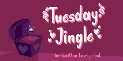 Tuesday Jingle is an exquisite font for Valentine theme design, with dingbats heart on character "{}[]" Fall in love with it and bring your projects to the highest levels! Tuesday Jingle is perfect for branding, logo, invitation, stationery, social media post, product packaging, merchandise, blog design, game titles, cute style design, Book/Cover Title and more. What's Included : - Tuesday Jingle.otf - Heart dingbats on character "{}[]" - Multilingual Support --- Hope you enjoy with our font! Attype Studio
 - Funny Society by NonaNova,
$20.00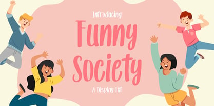 Funny society is a unique handwritten font that has a beautiful touch. This font is perfect for kids designs, branding, invitations, svg designs, logos, birthdays, parties and much more. What's Included : Ligature Uppercase, Lowercase, Numeral and Punctuation, Symbol International Language Works on PC & Mac Simple installations Accessible in the Adobe Illustrator, Adobe Photoshop, Adobe InDesign, even works on Microsoft Word. Thank you for your purchase! Hope you enjoy with our fonts! "NonaNova"
 - MPI Headline Modified by mpressInteractive,
$5.00 Headline Modified, also called "Modified Gothic" by some type manufacturers, has a large stroke contrast and very small, pointed serifs. Curved characters feature a brushstroke appearance. Our version is based on a typeface designed by the Hamilton Manufacturing Company around 1897.
 - Sweety Pie by LePine Studios,
$10.00 Originally designed as a companion font to a series of illustrations by Phillip LePine, this font stands beautifully on its own. Featuring letterforms with curls and varied line weight, it captures a feeling of the carefree days of our youth.
 - Zahariel by Scriptorium,
$18.00Zahariel is a stylish script font based on samples of turn of the century calligraphy. It has a different, cleaner look in comparison with many of our other script fonts, and features alternate versions of many of the lower case characters. - Mr Dog Dog by Hipopotam Studio,
$20.00 We’re children’s book illustrators and Mr DogDog is a set of our 96 unique hand-drawn pictures (61 animals, 20 dialogue balloons and 15 other symbols). You can use it on invitations, mugs, posters, pillows, wallpapers, balloons and so much more.
 - Gatteway Signature by Bluestype Studio,
$16.00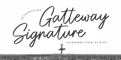 Hello ! This is our newest product font called Gatteway Signature. Gatteway Signature is a stunning script with a bold vibe. Get inspired by its cool feel. This font is suitable for use on photography, business cards, weddings, t-shirt designs, logos, magazines, quotes, fashion, watermarks, invitations, signatures. What's include: - Gatteway Signature Thank you, and don't forget to check out our other products.
 - Rainbow Saturday by Bluestype Studio,
$16.00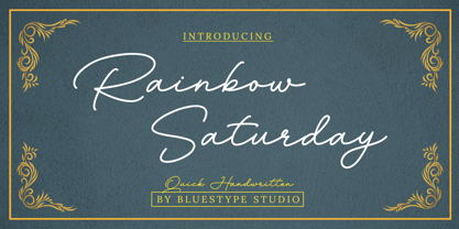 Hello ! This is our newest product called Rainbow Saturday. Rainbow Saturday is a stunning signature font with a modern twist. Get inspired by its modern simplicity! This font is suitable for use on business cards, weddings, t-shirt designs, logos, magazines, quotes, fashion, watermarks, invitations, signatures. What's include: - Ligature Thank you, and don't forget to check out our other products.
 - Hiragino Sans by SCREEN Graphic Solutions,
$210.00 Mindful that Hiragino Sans (Kaku Gothic) would be used in conjunction with Hiragino Serif (Mincho), SCREEN developed a font that anticipated today’s world where most people do their reading on displays and yet still has an orthodox letterform that does not blur when printed on paper. In short, our goal with this font was to create a new concept that responds to the demands of today’s times. This font offers weight variations from W0 to W9 and is extremely versatile. This makes it well-suited to all visual expression media including paper, metallic textures, resins, cloth, television, movies, broadcasting, websites, and electronic displays. One of the design’s strongpoints is that it elides serif on the right side of each stroke, thus delivering more spacious counters and a comfortable appearance. Thanks to this, the typeface not only delivers a contemporary, lively impression same as Latin sans serif typefaces, but also heightens the natural continuity and readability of text whether it is set vertically or horizontally. As a result, it makes it possible to bring a strong appealing power to text. Without a doubt, this is typeface that above else embodies the role of Sans Serif.
 - Action Is, Shaded JL - Unknown license

- Elephant by Alias Collection,
$60.00 A contemporary interpretation of grotesque (historic) typestyle, relying on geometric shapes applied to a grid. Idiosyncrasies within the typeface are based on how this grid is constructed and applied rather than those inherent in drawing type with a pen or cutting from a block of wood. Other grot types retain the quirks of original woodcut typefaces. Elephant has a different vocabulary of quirks that remove it from being too reverential or constrained to a historic context.
 - Stuph by Tail Spin Studio,
$25.00Stuph Light is a collection of drawings pulled from one of the many sketch books Steve Zafarana is always doodling in. Because they are in a font, the drawings can be used in font format or opened and manipulated in vector programs like Freehand or Illustrator. Stuph Light continues to inflict upon an unsuspecting public Steves’ cockeyed outlook on the world that was started with ITC Fontoonies, ITC Gargoonies and ITC Backyard Beasties. Will this lunacy ever end? - Fresh Garden by Epiclinez,
$18.00 Fresh Garden is an elegant, cursive font. It's a great fit for any project you have in mind! Use it as your wedding invitation text or to create a logo design with a feminine touch. Whether you're taking on a fun project or tackling something serious the script font will always please and soothe your senses. So what’s included : Basic Latin Uppercase and Lowercase Numbers, symbols, and punctuations Ligatures Multilingual Support. Simple Installations Works on PC & Mac
 - Adriane Lux by Typefolio,
$49.00 Adriane Lux is the decorative, "inline" or "openface" titling companion to Marconi Lima's acclaimed Adriane Text family. This single weight offering is modeled after the Regular weight of the primary family. While Adriane Text is intended for thoroughly classical book design, Adriane Lux enters the fold as an equally traditional display face. Have it foil-stamped on your next faux-leather book cover design or embossed on your personal calling card for a touch of well-behaved, regal formalism.
 - Fineprint by Monotype,
$29.99The script typeface named Fineprint is based on its designer's own handwriting, or at least as Steve Matteson saw his handwriting on a really good day. Unlike many digitizations of handwriting, Fineprint maintains a consistent harmony and balance across its letters in a line of text. The Fineprint family includes a number of swash and alternate letterforms, which helps pull this quirky personal nature off. Use Fineprint whenever you want to make something appear personal, friendly, or informal! - Blank Manuscript by Aah Yes,
$14.95Blank Manuscript allows you to produce sophisticated musical scoresheets even on basic Word Processors - anything from simple plain staves to complex full-page orchestral scores of your own design, to write in the notation yourself. The basic stuff is really easy and straightforward, but there's some quite advanced things you can do as well. So Copy and Save these Instructions. • The main stuff is simple and tends to follow the initial letter. Treble, Bass and Alto clefs are on upper case T B A (there are more clefs, below). The 5 Lines for the clefs are on L or l. • A small v will give a small vertical line (like a bar line) and a Big U will give a Big Upright - these can start or end a line or piece. • Time Signatures - type the following letters: Think of W for Waltz and it's easy to remember that 3/4 time is on W. Then from that they go up or down together like this: V=2/4 W=3/4 X=4/4 Y=5/4 Z=6/4 Compound Times are on H I J K like this: H=3/8 I=6/8 J=9/8 K=12/8 Common Time and Cut Common symbols can be found on semi-colon and colon respectively (all begin with Co- ). 2/2 3/2 are on lower case a and b, 7/4 and 7/8 are on lower case c and d, 5/8 is on small k (think POL-k-A) • Flat signs are on the numbers. Flat signs on LINES 1 to 5 are on numbers 1 to 5. Flat signs on SPACES 1 to 5 are on numbers 6 to 0 (space 1 being above line 1, space 5 being above the top line of the stave). Sharp signs are on the letters BELOW the long-row numbers. Which is q w e r t for the sharp signs on Lines 1 to 5, and y u i o p for sharp signs on spaces 1 to 5. Doing it this way means it works the same for all clefs, whether Treble, Bass, Alto, Tenor or any other. Sharp and Flat Signs always go in this order, depending on how many sharps or flats your key signature requires: Treble Clef Sharps t i p r u o e Flats 3 9 7 4 2 8 6 Bass Clef Sharps r u o e t i w Flats 2 8 6 3 1 7 = Alto Clef Sharps o e t i w r u Flats 7 4 2 8 6 3 1 • Guitar Chord Boxes are on G and g (G for Guitar) Upper Case G has a thick line across the top Lower case g has an open top, for chords up the fretboard TAB symbols are available: Six-string Tablature is on s & S for Six. Four-string Tablature is on f & F for Four. (Lower case has the "TAB" symbol on it, Upper Case has just the lines to continue.) Five-string tablature, is on lower case "j" (as in BAN-j-O) and of course L or l will continue the 5 lines. •RARE CLEF SIGNS including Tenor Clef, are on various punctuation marks, i.e. dollar, percent, circumflex, ampersand & asterisk, above the numbers 4 to 8. NOTE: The important symbols were kept on the letter and number keys, which are fairly standard all over, but some of the less important symbols are on various punctuation keys, which in different countries are not the same as on my keyboard. If it comes out wrong on your system, all I can say is it's right on the systems we've tried, and they'll be in here somewhere, probably on a different key. CLOSING THE ENDS OF THE LINES and BAR-LINES is done with the 3 varieties of brackets - brackets, brace and parentheses - Left/Right for the Left/Right end of the line. Parentheses L/R () which are above 9, 0 give a clef with a small vertical upright (the same as a bar line). Brace L/R and Brackets L/R (both on the 2 keys to the right of P on my keyboard) will close off a staff line with tall upright bars. Brace gives a double upright - one thick, one thin. Brackets give a single tall upright. A Big Upright is on Big U, (Big U for Big Upright) and a small vertical line is on small v (small v for small vertical). The Big Upright is the maximum height, and the small vertical is exactly the same height as a stave. And there's a tall upright Bar, on Bar (which is to the left of z on my keyboard, with Shift,) which is the same height as the bar on upper case U but twice as broad. • There's a staff intended for writing melodies, which is a little bit higher up than an ordinary treble clef giving a space underneath to put lyrics in - on m and M for Melody line. Lower case has the Treble Clef on, Upper case M has just the higher-up staff lines with no clef. (Use mMMMMMMM etc.) However this clef will be in the wrong place to put in sharp and flat signs, key signatures and so on, so if you use this clef you'll have to write the sharps, flats and key signature yourself. There's also a clef that's smaller (less tall) than the ordinary clef, but with the same horizontal spacing so it will align with other standard-sized clefs - on slash (a plain clef) and backslash (with a Treble Clef). • There are some large brackets for enclosing groups of staves, such as you'd use on large orchestral scores, on Upper Case N O P Q R, which can aid clarity. N and O on the left, Q and R on the right. P is a Perpendicular line to be used on both sides to increase the height of the enclosure, in this way but with the staff lines in between: N Q P P P P P P O R OTHERS —————————————— • Repeat marks are on comma (left) and period/full stop (right). • Hyphen is left as a sort of hyphen - it's a thin line like a single staff line, with the same horizontal spacing as ordinary staff lines - in case you want to draw a line across for a Percussion Instrument, or a Title or Lyric Line. • Space is a Space, but with HALF the width or horizontal spacing as ordinary staff lines, so 2 space symbols will be the same width as a clef symbol or line. • Grave (to the left of 1 on the long row, or hold down Alt and type 0096 then let go) gives a staff line that is one eighth the width of an ordinary staff line. • If you want manuscript in a clef and key which requires a flat or sharp sign in the space underneath the 5 lines, they’re on = equals and + plus . SYMBOLS • Many of these symbols will only be useful if you have worked out in advance which bars will need them, but they are here in case you've done that and wish to include them. • Symbols for p and f (piano and forte) are on 'less than' and 'greater than' < > (above comma and full stop) and m for mezzo is on Question, next to them. They can be combined to make mp, mf, ff, pp, etc. These signs -- and other signs and symbols like Pedal Sign, Coda Sign and so on -- can be found on various punctuation mark keys, including above 1, 2, 3 in the long row, and others around the keyboard. There's a sort of logic to their layout, but in different countries the keys are likely to give different results to what is stated here, so it's probably best to just try the punctuation and see if there's any you might want to use. (But on my keyboard a Coda sign is on circumflex - because of the visual similarity. Pedal sign is on underscore. A "Sign" symbol is on exclamation mark.) They were only included in case you really need them to be printed rather than handwritten. • However, a Copyright symbol is deemed necessary, and also included are a "Registered" symbol and a TradeMark symbol. They are found in the conventional places, and can be accessed by holding down ALT and typing 0169, 0174 or 0153 respectively in the numberpad section and letting go. • Staff lines with arco and pizz. above are on capital C and D respectively ---C for ar-C-o. • An empty circle above a staff line (to indicate sections by writing letters A, B, C or 1,2,3 inside for rehearsal marks) is on n. The actual signs for an A, B, C and D in a circle above the staff line can be produced by holding down ALT and typing 0188, 0189, 0190 and 0191 respectively and letting go. • The word "Page", for indicating page numbers, is on the numbersign key. • The two quotes keys, (quote single and quote double) have symbols representing "Tempo is", and "play as triplets", respectively. • INSTRUMENT NAMES There's a whole lot of Instrument Names built in (over a hundred) which can be printed out above the clef, and you do it like this. Hold down Alt and type in the given number in the numberpad section, then let go. For Piccolo it's 0130, for Flute it's 0131, Cornet is on 0154, Violin is on 0193, and the numbers go up to over 0250, it's a fairly complete set. There's also a blank which is used to align un-named clefs on 0096. Put them at the very beginning of the line for the best results. Here they are: WOODWIND Piccolo 0130 Flute 0131 Oboe 0132 Clarinet 0133 Eng Horn 0134 Bassoon 0135 Soprano Sax 0137 Alto Sax 0138 Tenor Sax 0139 Baritone Sax 0140 Saxophone 0142 Contrabassoon 0145 Recorder 0146 Alto Flute 0147 Bass Flute 0148 Oboe d'Amore 0149 Cor anglais 0152 Pipes 0241 Whistle 0242 BRASS Cornet 0154 Trumpet 0155 Flugelhorn 0156 Trombone 0158 Euphonium 0159 Tuba 0161 French Horn 0162 Horn 0163 Tenor Trombone 0164 Bass Trombone 0165 Alto Trombone 0166 Piccolo Cornet 0167 Piccolo Trumpet 0168 Bass Trumpet 0170 Bass Tuba 0171 Brass 0172 VOICES Vocal 0175 Melody 0176 Solo 0177 Harmony 0178 Soprano 0179 Alto 0180 Tenor 0181 Baritone 0182 Treble 0183 Bass 0197 (see also PLUCKED STRINGS) Descant 0184 Mezzo Soprano 0185 Contralto 0186 Counter Tenor 0187 Lead 0206 BOWED STRINGS Strings 0192 Violin 0193 Viola 0194 Cello 0195 Contrabass 0196 Bass 0197 Double Bass 0198 Violoncello 0199 Violin 1 0200 Violin 2 0201 Fiddle 0252 PLUCKED STRINGS Harp 0202 Guitar 0203 Ac. Gtr 0204 El. Gtr 0205 Lead 0206 Bass 0197 Ac. Bass 0207 El. Bass 0208 Slide Gtr 0209 Mandolin 0210 Banjo 0211 Ukelele 0212 Zither 0213 Sitar 0214 Lute 0215 Pedal Steel 0216 Nylon Gtr. 0238 Koto 0239 Fretless 0244 KEYBOARDS + ORGAN Piano 0217 El. Piano 0218 Organ 0219 El. Organ 0220 Harpsichord 0221 Celesta 0222 Accordion 0223 Clavinet 0224 Harmonium 0225 Synth 0226 Synth Bass 0227 Keyboards 0228 Sampler 0249 PERCUSSION and TUNED PERCUSSION Percussion 0229 Drums 0230 Vibes 0231 Marimba 0232 Glockenspiel 0233 Xylophone 0234 Bass marimba 0235 Tubular Bells 0236 Steel Drums 0237 Kalimba 0240 OTHERS Harmonica 0246 Mouth Organ 0247 FX 0251 Intro 0243 Verse 0245 Refrain 0248 Chorus 0250 un-named 0096 (this is a small spacer stave for aligning clefs without a name) ALSO copyright 0169 registered 0174 TradeMark 0153 Rehearsal marks 0188-0191 (giving A, B, C, D in a circle, an empty circle is on n ) Clef signs for Treble Bass Alto without any staff lines 0253-0255 An Alphabetic List of all signs: a 2/2 time b 3/2 time c 7/4 time d 7/8 time e sharp sign, centre line f Tab sign for 4-string tab g Guitar Chord Box, no nut h half-width stave I sharp sign, third space up j Tab sign for 5-string tab k 5/8 time l Lines - 5 horizontal lines for a stave m Melody Clef - a standard clef but placed higher up, with Treble sign n Stave with an empty circle above o sharp sign, fourth space up p sharp sign, space above stave q sharp sign, bottom line r sharp sign, fourth line up s Tab sign for 6-string tab t sharp sign, top line (fifth line up) u sharp sign, second space up v vertical line (bar-line) w sharp sign, second line up x Fretboard, four strings y sharp sign, first space up z Fretboard, five strings A Alto Clef B Bass Clef C “arco” above stave D “pizz.” above stave E Double Vertical Lines F Four Horizontal lines (for 4-string tab) G Guitar Chord Box with nut H 3/8 time I 6/8 time J 9/8 time K 12/8 time L Lines - 5 horizontal lines for a stave M Melody Clef - a standard clef but placed higher up, plain N Bounding Line for grouping clefs - top left O Bounding Line for grouping clefs - bottom left P Bounding Line for grouping clefs - Perpendicular Q Bounding Line for grouping clefs - top right R Bounding Line for grouping clefs - bottom right S Six Horizontal lines (for 6-string tab) T Treble Clef U tall, thin Upright line V 2/4 time W 3 / 4 time X 4/4 time Y 5/4 time Z 6/4 time 1 flat sign, first line up (the lowest line) 2 flat sign, second line up 3 flat sign, third line up 4 flat sign, fourth line up 5 flat sign, fifth line up (the top line) 6 flat sign, first space up (the lowest space) 7 flat sign, second space up 8 flat sign, third space up 9 flat sign, fourth space up 0 flat sign, space above stave - Andre Drafting by André Design,
$19.95 Developed for use in our design drawings by the renowned museum exhibit design firm André & Associates Interpretation & Design, the André Drafting font is being made available publicly for the first time. Based on the hand drafting lettering of our Senior Designer Andrew Farrell, this neat and tidy font will add a personal touch to CAD drawings, concept sketches and more. This font contains a full character set and is available in regular weight. Visit our website at www.aaid.ca for examples of our exhibit design work.
 - Hello Monday by Fenotype,
$25.00 Hello Monday is a bold and wide vintage style serif font with a friendly charm and a reminiscence of a warm nostalgic feeling. Hello Monday is a great typeface for contemporary graphic design with that certain feeling of familiarity. It works well on logos, packaging, restaurant graphics, or any display use, as well as in headlines or shorter texts. Try Hello Monday with reduced tracking for tighter word images, or if you want to use it in really small sizes add some tracking. Hello Monday is equipped with Contextual, Swash, Stylistic and Titling alternates as well as Discretionary Ligatures and even more extra alternates. All these features can be accessed by OpenType controls or straight from Character or Glyphs window. Swash Alternates are the most exaggerating ones while Stylistic Alternates do smaller changes. In addition Hello Monday has 15 ornaments that can be accessed from 0-9 and punctuation by clicking on Titling Alternates.
 - FabFours by Ingrimayne Type,
$5.00 A tessellation is a pattern in which a shape or tile fits together with copies of itself to fill the plane with no gaps or overlaps. One type of tessellation is formed with sides of center-point rotation, that is, one half of an edge is rotated 180 degrees to form the other half. If a square template is made with sides of identical center-point rotation, there are exactly four shapes that are possible. If these shapes or tiles are fit together not edge to edge but vertex to vertex, the result is a checkerboard-like pattern of tiles and voids. However, the voids have four edges formed by the four possible shapes that the tiles can have, so the voids are limited to the same four shapes that that make up the tiles. The FabFours have 22 tile families that allow a wide variety of fascinating patterns. They form one, two, three, and four tile tessellation. Eleven of the seventeen symmetry groups can be formed with these patterns. In each tile family two of the shapes have two possible orientations, one shape has four possible orientations, and one has eight, for a total of 16 tiles. Each font has two families, one on letters A-P the other on a-p. For some of the families there are also other tiles using the same edge but using triangular and hexagonal templates. To get proper results, the leading must be set equal to the point size of the font. I discovered these fabulous families and their decorative possibilities as I was working on a book about tessellations. I have not been able to find anyone else who has written about these families of four and their decorative possibilities when arranged vertex to vertex.
 - Thinna Bell by Allouse Studio,
$16.00 Proudly PresentingTinna Bell, a Bold Script Font. Tinna Bell is perfect on any tittle, product packaging, branding project, megazine, social media, wedding, or just used to express words above the background. Enjoy the font, feel free to comment or feedback, send me PM or email. Thank You!
 - Yes Dear by HiH,
$8.00 Yes Dear is a hopefully humorous acknowledgement that men and women communicate differently — one of those Mars-Venus things. Women tend to talk about their feelings. Men hide in the cave. It sounds funny, but it can have serious consequences in people’s lives and their relationships. T. D. Jakes deals with the subject effectively in his DVD, He-Motions. We guys need to find our way out of the cave. Our women need to recognize what is going on and gently help us emerge from the cave. Men and women were certainly never meant to be identical, but it would be useful if we could learn to communicate our feelings in more healthy and effective ways. Yes Dear has a full character set, including accented caps. Two empty frames are provided at positions 135 & 137. The Gallery includes a PDF file showing some text and the full character set and a JPG looking out from the cave. A lot going on outside the cave. Be sure and take a look.
 - Sonny Gothic by W Type Foundry,
$25.00 Sonny Gothic is our most rational-geometric typefamily until so far. It’s inspired by the geometric style of the 70s, specifically by Herb Lubalin’s work. Since we were students, we have been gazing Lubalin’s logos, typefaces and magazines as inspiration that still lives in our subconscious. At first, we made a pure geometrical typeface with modern caps proportion, then we combine those proportions with the 70s traditional caps ligatures. It was at that point that we knew Sonny Gothic was ready to arise. Even though Chile is not the origin of a modern visual culture, for us geometric typefaces and Lubalin’s work are one of the most attractive aesthetics of the creative realm, and therefore, this is our homage. Designed with powerful opentype features, each weight includes alternate characters, ligatures, fractions, special numbers, arrows, extended language support and many more… Perfectly suited for the several areas of graphic design. Learn about upcoming releases, work in progress and get to know us better! On Instagram W Foundry On facebook W Foundry wtypefoundry.com
 - Naive Inline Sans by S&C Type,
$8.00 Naïve Inline Sans is a layered sans serif handwritten font designed by Fanny Coulez and Julien Saurin in Paris. Our goal was to draw a font with finely irregular lines that give a human and whimsical feeling. We designed three weights to assure a good readability whatever the size. They can be enhanced with five different interior patterns and three shadows to improve your designs and bring a charming and unusual feeling. To do so, you can simply superimpose the layers with a compatible software like Photoshop, the weight above and the pattern(s) below, then choose a color for each. This font is part of our Naïve superfamily that contains lot of variations: Line, Inline, Serif, Sans Serif, and a special Art Deco one. Just click on our foundry name to see them all! We hope you will enjoy our work. Merci beaucoup!
 - Grindel Milk by Nathatype,
$29.00 Looking for a font that’ll make your branding radiate playfulness? Something that’s versatile, stylish, and eternal? If you need to create a big, bold logo for your business, work on a poster for an event, or whatever your project may be. You only need to change one element to engage and convert your clients. Then this is the perfect font for you. Grindel Milk-A Display Font Grindel Milk is a display font designed to bring your branding to life and add a touch of elegance, cheerful, and style. We are hoping that through this playful font, you can maximize your designs! In turn, you’ll communicate the perfect idea to your audiences or clients. The best choice for branding projects, book/magazine cover, fashion designs, quotes, packaging, or even as a stylish text overlay to any background image. Our font always includes Multilingual Support to make your branding reach a global audience. Features: Ligatures Stylistic Sets Swashes PUA Encoded Numerals and Punctuation Thank you for downloading premium fonts from Nathatype
 - Highriser by Nicolas Deslé,
$19.90 Highriser is a highly legible, uppercase-only bold condensed sans. Designed to be used for headlines, or visual identities, both digital and print. One weight, fits all.
