10,000 search results
(0.009 seconds)
- Xspace by Artyway,
$14.00 I'm thrilled to present you a new futuristic typeface. Smooth humanistic forms and elongated proportions, modern trends dictate a new fashion in type design. Perfect for science research posters, modern futuristic logos, automotive type design and more. Check how it works and let me know, I am always glad to hear your opinion.
 - Bodoni Classic Ad by Wiescher Design,
$55.00 I became interested in designing Bodoni Classic because of a lazy graphic designer at Jacques Damase publishing house. He had to change a single letter on a bookcover about J. B. BODONI. The French call him Jean Baptiste instead of Giambattista! And that unknown graphic designer just took any old “J” from some newly cut Bodoni. All the new Bodoni cuts have square serifs, whereas the originals had rounded serifs and slightly concave feet. The single letter “J” with the squared off serif was for me like a road sign to start redesigning the entire Bodoni family. That’s exactly what I started in 1993 and a dozen years later I am finished. Okay, I am still adding new Bodoni Classics, but those are my personal additions. Yours very retro, Gert Wiescher
 - Bodoni Classic Initials by Wiescher Design,
$55.00 I became interested in designing Bodoni Classic because of a lazy graphic designer at Jacques Damase publishing house. He had to change a single letter on a bookcover about J. B. BODONI. The French call him Jean Baptiste instead of Giambattista! And that unknown graphic designer just took any old “J” from some newly cut Bodoni. All the new Bodoni cuts have square serifs, whereas the originals had rounded serifs and slightly concave feet. The single letter “J” with the squared off serif was for me like a road sign to start redesigning the entire Bodoni family. That’s exactly what I started in 1993 and a dozen years later I am finished. Okay, I am still adding new Bodoni Classics, but those are my personal additions. Yours very retro, Gert Wiescher
 - Bodoni Classic Chancery by Wiescher Design,
$55.00 I became interested in designing Bodoni Classic because of a lazy graphic designer at Jacques Damase publishing house. He had to change a single letter on a bookcover about J. B. BODONI. The French call him Jean Baptiste instead of Giambattista! And that unknown graphic designer just took any old “J” from some newly cut Bodoni. All the new Bodoni cuts have square serifs, whereas the originals had rounded serifs and slightly concave feet. The single letter “J” with the squared off serif was for me like a road sign to start redesigning the entire Bodoni family. That’s exactly what I started in 1993 and a dozen years later I am finished. Okay, I am still adding new Bodoni Classics, but those are my personal additions. Yours very retro, Gert Wiescher
 - Bodoni Classic Text by Wiescher Design,
$55.00 I became interested in designing Bodoni Classic because of a lazy graphic designer at Jacques Damase publishing house. He had to change a single letter on a bookcover about J. B. BODONI. The French call him Jean Baptiste instead of Giambattista! And that unknown graphic designer just took any old “J” from some newly cut Bodoni. All the new Bodoni cuts have square serifs, whereas the originals had rounded serifs and slightly concave feet. The single letter “J” with the squared off serif was for me like a road sign to start redesigning the entire Bodoni family. That’s exactly what I started in 1993 and a dozen years later I am finished. Okay, I am still adding new Bodoni Classics, but those are my personal additions. Yours very retro, Gert Wiescher
 - Bodoni Classic Hand by Wiescher Design,
$55.00 I became interested in designing Bodoni Classic because of a lazy graphic designer at Jacques Damase publishing house. He had to change a single letter on a bookcover about J. B. BODONI. The French call him Jean Baptiste instead of Giambattista! And that unknown graphic designer just took any old “J” from some newly cut Bodoni. All the new Bodoni cuts have square serifs, whereas the originals had rounded serifs and slightly concave feet. The single letter “J” with the squared off serif was for me like a road sign to start redesigning the entire Bodoni family. That’s exactly what I started in 1993 and a dozen years later I am finished. Okay, I am still adding new Bodoni Classics, but those are my personal additions. Yours very retro, Gert Wiescher
 - Getaway Car by Hanoded,
$15.00 When I am working on a new font, I usually play some music, or have a song in my head. When I was working on this font, an Audioslave song called Getaway Car was playing in my head. Again: naming a font is not that difficult! Getaway Car was made with a cheap brush and expensive Chinese ink. It is an all caps font, ideally suited for posters, book covers and designs that need a bold, rough & ready look.
 - Bravado NF by Nick's Fonts,
$10.00 This growing family of friendly faces is based on the typeface Bravour, designed in 1913 by Martin Jacoby-Boy for the D. Stempel AG foundry in Frankfurt am Main. The wide stance and very large x-height shared by the family members makes them warm and inviting, and equally suitable for use in headlines or text blocks. All versions of this font include the Unicode 1250 Central European character set in addition to the standard Unicode 1252 Latin set.
 - Blastiks by Maulana Creative,
$14.00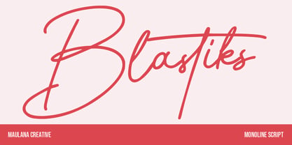 Blastiks is am expressive casual signature script font. With slanted mono-line stroke, fun character with some of ligatures. To give you an extra creative work. Blastiks font support multilingual more than 100+ language. This font is good for logo design, Social media, Movie Titles, Books Titles, a short text even a long text letter and good for your secondary text font with sans or serif. Make a stunning work with Blastiks font. Cheers, Maulana Creative
 - Bero by Lucywho,
$16.00 BERO – An elegant sans serif font BERO is clean and modern. This typeface provides a timeless look for any design. Use BERO for branding, magazine design, logo design, headlines, posters, packaging, cards or your wedding invitation. Regular, Bold & Extreme Multilingual support Numerals & Punctuation Recommended to use in Adobe Indesign, Illustrator or Adobe Photoshop. ___ Follow my shop in order to receive notifications for the latest updates including additional glyphs and more languages. Do not hesitate to message me if you want your language included or if you have any requests regarding features or glyphs. I am happy to assist you.
 - Brainstroke by Typotheticals,
$9.00 Brainstroke is a collection of twelve variations on a typeface. This release was supposed to be a much larger set, but due to a medical issue, where I recently suffered a stroke, I am releasing only those that I managed to complete. The name is a reminder to me to take care of my health.
 - MEME by Robert Petrick,
$19.95 “MEME” Regular is a work in progress designed in a square format. It is all Caps with small caps in the lower case. With over 80 design glyphs for you to use creatively. “MEME” is also a great font to add to your futuristic headline fonts, I am adding new characters all the time.
 - Grocers Script by Wiescher Design,
$39.50 I discovered GrocersScript on the market Cours Saleya in Nice. I always buy my foodstuff there when I am in the area. I developed the whole font from some fragments. If you ever come to Nice, you must absolutely visit that market as well as the one in Cannes. Yours very hungry Gert Wiescher
 - Display Patrol by Hanoded,
$15.00 I have always liked handmade display fonts - maybe that’s why I have so many of them! Display Patrol is a rather fat, in your face font. It is completely handmade and comes in two distinct styles: regular and dots. Use it for your posters, books and product packaging. I am sure it will stand out!
 - Genki Desu by Hanoded,
$15.00 Genki Desu is one of those Japanese expressions that are used a lot and don’t really mean what you think they mean. You can use it as a greeting: O Genki Desu Ka? (お元気ですか - how are you), or to say you’re feeling fine (元気です - Genki Desu). The word Genki also means ‘energy’ or ‘vigor’. I am not an expert, in fact, there’s so much Japanese I can actually speak (shame on me), but Genki Desu is one of my favourites. Maybe just because it sounds so nice!
 - Spekulatus by Bogstav,
$18.00 Spekulatus is a made up name, and that was what I needed for a font like this. I am not sure which category it fits in: grunge, square, handmade, rough or maybe even graffiti? Well, let's just say that it fits in all 5 - or perhaps even more? All letters are handdrawn, and messed up a bit with a thin fine white liner, leaving a gentle grungy and worn effect. I've added 5 different versions of each letter, which is quite nice - not having the same letters repeating all the time!
 - Artificial Flavour by Kitchen Table Type Foundry,
$15.00 I do groceries a couple of times a week. When I am shopping for food, I always read the ingredients list; I don’t want too much sugar, nor palm oil, trans fats or a lot of E numbers. It used to be quite hard finding products that didn’t contain artificial flavours or colouring, but it is getting better. Artificial Flavour is an anti-ode to the time we couldn’t get enough of the stuff - it is a handmade, all caps font which comes with extensive language support and a sweet set of alternates.
 - Urban Tour by Roland Hüse Design,
$10.00 -This font has been basically designed for poster display in black weight and big size (mostly for capital letters). The rest of the family is a derivative work of it. I can’t guarantee if it works well on small size print. -Future updates may follow in the near future or on request. Please feel free to contact me via rolandhuse@aol.com about the following: -This family does not contain all the language extensions, but I am willing to create any extensions (including Cyrillic) on request; - Discovering kerning problems while using; Or any other question.
 - Bommer Slab by dooType,
$15.00 Bommer project started in January of 2014 and I am happy to announce the first family - Bommer Slab - is now ready for release. This family includes 14 weights - being seven uprights and seven italics. This font has a strong personality, that makes it perfect for use in headline sizes but means it also works gracefully within text blocks.
 - Dance Moderne JNL by Jeff Levine,
$29.00 A small book entitled “Portfolio of Alphabet Designs for Artists, Architects, Designers & Craftsmen” [published in 1938 by Irene K. Ames] contained a number of pages displaying hand lettered alphabet examples. One sample in particular stood out for its bold Art Deco look and unusual design. This is now available as Dance Moderne JNL, in both regular and oblique versions.
 - Spring Chicken by Hanoded,
$15.00 The other day I discovered that, regrettably, I no longer am a Spring Chicken. Time flies when you’re making fonts… So, after I recovered from that shock, I created this font and called it Spring Chicken! Spring Chicken is a handmade cartoon-ish, script-ish, dunno-how-to-label-it-ish font. Use it and be rad.
 - Samira by CastleType,
$29.00 I must admit that I am not a big fan of the Art Nouveau style. However, I found this particularly beautiful alphabet and decided to use it as the basis for this new font. Very graceful, elegant, and dare I say, organic. Includes some intertwined ligatures. Complete uppercase, numerals, basic punctuation. Supports most Western European languages.
 - Adieu Mon Ami by Hanoded,
$15.00 No, I am not leaving and none of my friends or relatives have packed up and left. I needed a more ‘letter-like’ name for this font and I found Adieu Mon Ami (farewell, my friend in French). Adieu Mon Ami is a handmade pencil font that will add that extra ‘je ne sais quoi’ to your designs. It comes with joie de vivre, un petit peu de vilain, but can be doux comme de la soie as well. Bonne chance!
 - Revolte by Wiescher Design,
$39.50 Whenever I see clippings on TV of demonstrations, protesting against this or that, with people holding up signs, I am surprised about the signs being professionally printed or plotted in Helvetica or Futura condensed. I've even seen signs in Zapfino! That doesn't really cut it, it doesn't look much like a real protest. So I decided to give the protesting world a real good font for the occasion. In German a Revolte is an uprising, I thought that was a good name for the font. Hasta la victoria siempre from your revolutionary type designer Gert Wiescher.
 - Bestlady by Dhan Studio,
$19.00 Bestlady is a romantic textured brush font suitable perfectly for invitations, brand projects, logos, greeting cards, news, product packaging, posters blogs, everything including personal charm etc. This font is alternates all lowercase,also have equipped with 69 ligatures unique and beautiful: zz yy ww vv uu tt tl th st ss sh rr qq pp oz oy ow ov ou ot os or op oo on om ol ok oj oi og of od oc ob nt nn nl ng mm lt ll lh kk is ii id hh gg ff et el ee cl ck ch cc bl bb aw at ap an am al ah af ab aa
 - YT Just Latin by Yangtype,
$9.00 The reason you purchase this font is because it is ‘special’. The creator of this font was born with a love for geometric patterns. I am fundamentally attracted to forms that have a sense of order and freedom of dispersion. This is a font that I came up with accidentally while working. I think that coincidence combined with consistent effort is ‘special'.
 - Goldie Sans by Blythe Green,
$15.00 Goldie Sans is a clean sans serif that is perfect for logos, quotes, long-form copy, and more. Both uppercase and lowercase are included in light and bold, but I am particularly fond of using it as an all caps font for logos, headlines, and short quotes. INCLUDED uppercase letters lowercase letters numbers & punctuation light and bold fonts foreign language characters
 - Monem by Wiescher Design,
$39.50 Monem is the word for the smallest significance-carrying part of a language. I thought that was a good name for a clean, straightforward Sans typeface. Monem is very sturdy and usable for lots of occasions. I am using this font myself for those of my clients that want to convey a clean unobtrusive image. Your very restrained Gert Wiescher
 - Vega by Linotype,
$29.99For Vega antikva, too, 16th and 17th century typefaces stood models. I made a free interpretation of them, with a nice result, if I am allowed to express myself. Vega antikva makes a beautiful impression in books, but even as a web typeface it behaves well. The name Vega can be traced down to a constellation, a mathematician, a writer, a movie character, or a research ship, as you like. Now there is a typeface with that name, too. Vega antikva was released in 1994. - Along Sans Rasoe by Brenners Template,
$19.00 Along Sans Rasoe is a pretty unique font family. It only tried to connect with lines, and it didn't use curves at all. And the equalization of stems was arranged irregularly. Various attempts have been applied to the glyphs to showcase the designer's feeling more sensibly. 9 Weights, 18 Styles Discretionary ligatures (Ac, Ad, Ae, Am, At, Ca, Ce, Ch, Co, Cr, Ra, Re, Ro, cc, ee, ll, mm, nn, oo, pp, rr, ss) Stylistic Sets Circled Glyphs. Multilingual support And various OpenType Features.
 - All Is Quiet by Kitchen Table Type Foundry,
$15.00 The year 2022 went and 2023 came. I can honestly say that last year was a horrible year and I am happy it ended a couple of days ago. The first week after New Year’s Eve always fills my head with the U2 song ‘New Year’s Day’ - so I named this font after a line from the lyrics. I also happened to watch a fantastic movie called ‘Im Westen Nights Neues’, directed by Edward Berger, but based on a book by Erich Maria Remarque, which, in English, was published as ‘All Quiet On The Western Front’. So there you have it: naming a font in 2 easy steps! ;-) All Is Quiet is a lovely brush font, which I created using my father in law’s Chinese pencil and ink. I can suggest some uses here, but I am convinced you can come up with that yourself.
 - Identity Check by Hanoded,
$15.00 Every time I bring my youngest son to his swimming lessons, I need to show my Covid Vaccination Pass; a QR code on my phone. I thought that I would be off the hook after I showed it the first time, but no, not at the swimming pool! It feels a bit like a bad comic book, so I decided to name this comic book style font Identity Check. Of course, I should have called it Covid Vaccination Check, but that is just too much and it probably won’t sell. Who wants a font called Covid?? ;-) Identity Check is a comic book style font. The glyphs are wider than I am used to (it seems I AM capable of learning new tricks), but the effect is rather nice. Identity Check comes with extensive language support, including Cyrillic and Vietnamese. Plus two sets of alternate glyphs, that cycle as you type.
 - Bodoni Classic by Wiescher Design,
$55.00 I became interested in designing Bodoni Classic because of a lazy graphic designer at Jacques Damase publishing house. He had to change a single letter on a bookcover about J. B. BODONI. The French call him Jean Baptiste instead of Giambattista! And that unknown graphic designer just took any old “J” from some newly cut Bodoni. All the new Bodoni cuts have square serifs, whereas the originals had rounded serifs and slightly concave feet. The single letter “J” with the squared off serif was for me like a road sign to start redesigning the entire Bodoni family. That’s exactly what I started in 1993 and a dozen years later I am finished. Okay, I am still adding new Bodoni Classics, but those are my personal additions. Recently I designed a family of seven »Bodonian Script« fonts, that can be mixed with most of my Bodonis. Yours very retro, Gert Wiescher
 - Gobsmacked by Hanoded,
$15.00 Gobsmacked is a rather new English word. It has been around since 1959 and was used mostly around Liverpool at that time. The word means: ’astounded’, ‘flabbergasted’ (another nice word!) or ‘speechless’. Gob could be of French or Scottish Gaelic origin and means ‘mouth’. Gobsmacked font was created using a brush and black gouache. The result is a very eroded, very legible and quite unique brush font. I have created alternates for the lower case letters, plus two double letter ligatures (oo and ss). Use it for any design that needs a little brushwork; I am sure the result will leave you gobsmacked!
 - Quincy by Wiescher Design,
$12.00 »QUINCY« started as an art project. I was stitching roughly cutout letters together on a piece of wooden board, but I didn’t like the result! So I ended up with a font in three cutout styles. I thought it was so unusual and really beautifully ugly, that I finished it, adding flashes here and there. Now I am offering this absolutely unusual font as a packet of three for you to enjoy. Have at least as much fun working with it as I had designing the packet. The font is great for packaging or posters, or whatever comes to your imaginations.
 - Mira by HiH,
$10.00 Mira is a playful, decorative Art Nouveau font, released by Roos & Jung Foundry in Offenbach AM, Germany about 1902. The exaggerated serifs and the sharp contrast between the thick and thin strokes gives the page a whimsical “salt and pepper” look that is very distinctive. Mira uses our new encoding. The Euro symbol has been moved to position 128 and the Zcaron/zcaron have been added at positions 142/158 respectively. Otherwise, MIRA has our usual idiosyncratic glyph selection, with the German ch/ck instead of braces, Western European accented letters, lower case “o” and “u” with Hungarian umlaut and our usual Hand-in-Hand symbol. In addition, black-letter-style upper case “H” and “T” characters are included. Download the PDF Type Specimen for locations.
 - Vingo by Poole,
$32.00Vingo is an understated, elegant, sans serif face. This font is among the first in a series of alphabets I am creating that are dignified and sophisticated. I wish these fonts had been available when I was designing wine labels. These fonts are rooted in "old world" tradition, but are more utilitarian. Some of the funky aspects are downplayed, some are enhanced and updated. Any job that requires understated sophistication is perfect for this face. The name comes from the French for wine, "Vin", and "Go" from gothic-wine gothic or Vingo. - Nefarious by Hanoded,
$15.00 A few fonts ago I mentioned the fact that I like posh English words; words you don’t really use in conversation. As I am busy expanding my ‘halloween’ font collection, I came across the beautiful word Nefarious. It means wicked or evil and when you say the word, it even sounds evil! Fantastic! Nefarious is a halloween/witches font. It looks like my Griezelig font, but it is rougher and spikier. Use Nefarious for your halloween invitations, posters and books about evil geniuses. Comes with all diacritics and a bunch of swashes as well.
 - Gravitational Pull by Hanoded,
$15.00 My 9-year old son Sam asks a lot (a LOT!) of questions. Like: ‘what killed the dinosaurs?’ (probably an asteroid), ‘what is the distance to Pluto’ (about 7.5 billion km), ‘how big is space’ (93 billion lightyears - give or take). I am pretty sure he asked me about gravity as well. Gravitational Pull is a messy pencil script font. It comes with a whole bunch of double-letter ligatures and some really wonky glyphs. And no, in its virtual form, this font is not subject to the Earth’s gravitational pull.
 - RMU Koralle by RMU,
$25.00 Koralle was an abundant family of grotesque font styles which had been released by Schelter & Giesecke in the first quarter of the previous century. Out of this family four of the most impressive styles were revived, whereby I stuck as close to the original as possible. All styles contain even the weird-looking capitalized German double-s of which I am a strong opponent.