10,000 search results
(0.299 seconds)
- Montreal Architect Px by Letradora,
$15.00 Inspired from blueprints of old Montreal buildings, this font is a hand lettered, all caps face with influences from the arts & crafts movement.
 - Decorative Panels JNL by Jeff Levine,
$29.00Decorative Panels JNL is a collection of twenty-six border design panels inspired by old decal and rubber stamp catalogs of the 1940s. - Zura by Caoni Studio,
$19.00 Zura’s font family design draws its inspiration from nature and a tribal style. The use of geometrical expression emotes a technological undertone. Opentype features include: Old style numerals Case sensitive forms
 - Rubbish JNL by Jeff Levine,
$29.00Rubbish JNL from Jeff Levine is simply letters scribbled from an old stencil as if made by a child... But the look takes on a form of "stencil grunge" as well! - DejaVu Sans Condensed - Unknown license

- DejaVu Sans - Unknown license

- Averia Serif - 100% free

- Pecita - 100% free

- News Cycle - 100% free

- Pfennig - 100% free

- nineveh - 100% free

- Justus - Unknown license

- Averia Sans - Unknown license

- Averia - 100% free

- Aurulent Sans - Unknown license

- Nibby - 100% free

- Rambat Campotype - Personal use only

- Aurulent Sans Mono - Unknown license

- LT Stopwatch - 100% free

- LT Sonoma - 100% free

- LT Wave - 100% free

- LT Superior - 100% free

- LT Superior Serif - 100% free

- LT Renovate - 100% free

- LT Makeup - 100% free

- Rafaella by Lián Types,
$37.00 To Rafaella, a menina dos cachos. We, designers, have grown accustomed to seeing that lowercase letters—not only in calligraphy but also in typography (1)—may be very playful and decorative. Almost every part of them can become a potential swash, ligature or decorative accolade (2) if the designer has some expertise regarding this matter. However, since we are living in an era that elevates the status of handcrafts, lettering has gained a lot of ground in different kinds of mediums, and with it there’s a sort of overuse of capitals. This may be due to the reason that lettering pieces need a high impact to convey their messages and many times why big capitals are the only solution. With this in mind, I started Rafaella: A font consisting entirely of capitals which go from unadorned to very decorative. Rafaella has ductus and forms vaguely based on the 1970s Bookman-like styled fonts. The presence and behaviour of serifs and ball terminals in this style were the perfect excuse to make really attractive aternates which the user can choose from the glyphs panel. The result is a font full of life. Able to be both very playful and formal due to its roman style which can be combined with (and between) a wide range of other styles of expressive scripts or geometric fonts with nice results (3). Also try Rafaella Shade Solo combined with Rafaella or Rafaella Bold for a layer effect to emphasize any given word or phrase. NOTES (1) See my fonts Erotica from 2013 or Dream from 2014. (2) Accolades is a wonderful word that refers to the ornaments made around the words in the spencerian style of calligraphy (3) Combinations often seen in different pieces of lettering were usually a contrast of style is wanted.
 - Burgstaedt Antiqua by Linotype,
$29.99At first glance, Burgstaedt Antiqua looks like an old typewriter face, or rather like a typeface from a typewriter that has gone hopelessly wrong! Only after your second glance will you see this font for what it really is - a thoroughly new text face. Several features of Burgstaedt Antiqua, and its companion italic face, are worth special attention: First, the terminal styles of the letters vary throughout the alphabet. This gives text set in Burgstaedt Antiqua a slightly jittery feeling. A second interesting feature is the lowercase q", which takes the form of a shrunken-down uppercase "Q". Burgstaedt Antiqua Regular and Burgstaedt Antiqua Italic may be used in both text and headlines. For use in text, we recommend employing a slightly larger point size (12 pt or 14 pt and above). British designer Richard Yeend designed this family in 2002. - Edith by Dominik Krotscheck,
$12.00 Edith is a handmade serif typeface that can be used for long texts. To make it even better suitable, it is equipped with all the major features you’d expect from a traditional text-font, such as case sensitive forms, old style figures (lining figures are accessible via an opentype feature), fractions and good kerning. To keep up the handwritten appearance, two versions of each letter (A-Z & a-z with diacritics) and number are available and substituted automatically if the same ones meet. Edith is also nice to look at in larger sizes and therefore a great fit for any packaging, advertisement or headline. Edith is for you, if you plan on doing childish things, DIY things, traditional things, illustrated things, nautical things, grungy things or any handmade related things.
 - Zodor JNL by Jeff Levine,
$29.00Zodor JNL is modeled from the packaging for injection-molded plastic letters used as a teaching toy for youngsters in the early 1960s. The hand-drawn alphabet on the sides of the package was quirky enough to merit being made into a digital font. - Deck by Turtle Arts,
$20.00Deck is a font inspired by old decks of playing cards and even some old tarot decks. Deck is an all caps font; the lower case letters and the punctuation are actually different playing card and tarot symbols like: hearts, diamonds, spaces, clubs. This font is great for designing your own deck of cards. - Fox by profonts,
$41.99 Fox was originally designed by W. Rebhuhn for the former German Genzsch & Heyse foundry. In reminiscence of the good old times, Ralph M. Unger redrew and digitally remastered this font in 2007. His work is based on artwork taken from old font catalogues. Fox is a very lively script, quite typical for the 50s
 - Minnesota by Solotype,
$19.95Another of the “must have” wood types for those doing poster work with an old-time flavor. Very readable, therefore very useful. We did ads for an old western tourist railroad, and used this often. William Page was a prolific designer of wood types, and his fonts were at every poster print shop we visited. - Maverick's Luck by FontMesa,
$20.00 From a few letters found on an old bank document from 1876, Maverick's Luck was born, and born again to give your projects that old western appearance. Maverick's Luck comes with multiple fill fonts, you will need an application that works in layers in order to use the fill fonts that come with FontMesa fonts.
 - Verlint by Keristyper Studio,
$14.00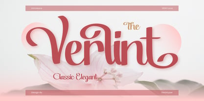 Verlint is a classic and elegant serif font that adds a touch of sophistication to any design project. Its clean and refined lines make it perfect for luxurious branding, editorial work, or any other application where a sense of timeless elegance is required. Featured: Standard, Uppercase & Lowercase Numeral & Punctuation Multilingual : ä ö ü Ä Ö Ü ß ¿ ¡ Alternate & Ligature PUA encoded We recommend programs that support the OpenType feature and the Glyphs panel such as Adobe applications or Corel Draw, so you can use all the variations of the glyphs. Hope you enjoy our fonts!
 - Night Train by FontMesa,
$19.95 Night Train is a new font built from the ground up; while Night Train may resemble an old classic wood type there are a few lines that make this font a little more modern setting it apart from other wood type revivals. If you're a railroad enthusiast you're sure to enjoy the steam locomotive graphic located on the less than and greater than keys on all versions of this font, due to the fine detail of this train illustration the best printing results will be at 600dpi or higher on a laser printer. An alternate K and R are within the Night Train fonts, for Win Type1 these alternates are on the left and right bracket keys, for Truetype and OpenType you may access the alternates by using the Character Map in Windows or Adobe Illustrator, for OpenType you may also find them on the stylistic alternates page of the glyph map in Illustrator. There's something new with Night Train that the sign making people will love, for the first time FontMesa is pleased to offer a block shadowed version in four directions. One fill font is all that is needed for all four open faced fonts, you'll need an application that works in layers in order to use the fill font with the open faced fonts, simply place the fill font in its own layer then move it behind one of the open faced fonts of Night Train. The Night Train name has been on my list to use as a font name for a few years, a friend from years ago used to sail his boat in the Mackinac race from Chicago to Mackinac Island, the name of that boat was the Night Train. Watching the 2010 Olympic four man U.S. bobsled team win gold with their sled also called Night Train has inspired me to complete this font.
 - We The People by K-Type,
$20.00 This typeface is extrapolated from the ‘We the People’ calligraphy of the handwritten US Constitution Preamble which employed a style based on German Text and Square Text exemplars from George Bickham’s penmanship copy-books, the most celebrated being The Universal Penman published in 1743. The original Constitution document was transcribed onto parchment by Jacob Shallus, a Pennsylvania Assistant Clerk, over a weekend in 1787. Shallus’s biographer, Arthur Plotnik (The Man Behind the Quill, 1987), notes that he was paid $30, a modest monthly wage at the time. He also suggests that the calligraphic headings, ‘We the People’ and ‘Article’, may have been inserted by Shallus’s 14 year old trainee son, Francis, “The manner in which the ‘Article’ headings are squeezed into the space Shallus allowed for them suggests a second hand—and perhaps not a very experienced one.” The unconventional backslant of the headings would seem to support this contention, and at the end of the document there is perhaps a novice’s inconsistency in the structure of the letter n between that used for ‘done’ and those used for ‘In Witness’. However, one has to admire the elegant swagger of the wavy t, h and l which the K-Type font extends to the b, f and k. Also, the simpler, Schwabacher-style W, an enlarged version of the lowercase w, is a little less flamboyant than the capital W from the German and Square texts in Bickham’s manuals. For designers using OpenType-aware applications, the typeface includes some Alternates, including a Bickham-style W, the letters t, h and n with added flourishes, two simpler forms of the A, and a few roman numerals for numbering articles. Also some ornamental flourishes and a round middle dot/decimal point. Punctuation marks are drawn in square, calligraphic style, but an alternative round period/full stop, for use with currency and numerals, is available at the period centered position (though placed on the baseline), accessed by Shift Option 9 on a Mac, or Alt 0183 on Windows. The full phrase, ‘We the People’, has been placed at the trademark keystroke and can be accessed by Option 2 (or Shift Option 2) on a Mac, or Alt 0153 on Windows. For designers who find the backslant awkward or unpleasant, the licensed typeface also includes two additional fonts which have a vertical aspect that may be more conducive to graphic design layouts. ‘We The People Upright’ and ‘We The People Upright Bold’ both retain the distinctive style, and the heavier weight is only slightly emboldened, just enough to add some punch.
 - Clumsy by Gaslight,
$15.00 Clumsy is a two weight all caps handcrafted awkward font with alternates for all characters and digits. The font was inspired by a few lines of text from an old soviet book about vine. Clumsy is a good choice for small amounts of text. When Clumsy is used in OpenType applications, its Contextual Alternates feature produce a striking random-like effect on glyphs distribution, achieved by cycling through alternates. When not using the Contextual Alternates feature, you can still pick the alternates in the Glyphs palette or use the alternates available from the keyboard upper and lower case.
 - Interrupt Display Pro by T4 Foundry,
$21.00Torbjörn Olsson's Interrupt is a salty dog of a sanserif, harboring memories of freighters unloading their cargo in a run-down port. Interrupt works great for signs, and looks just fine painted on the side of a wooden crate or stencilled on an old tarpaulin. Interrupt is recommended for use over 36 points. You have run out of packing crates and would like to use it on paper? Sure, Interrupt can add its sturdy sailor's gait to any medium... just don't set any novel in Interrupt. Not even Melville. Interrupt is an OpenType typeface for both PC and Mac. - Regional News JNL by Jeff Levine,
$29.00 A roughened and worn version of Daily Tabloid JNL was originally created as a non-exclusive custom font for a client. The design emulates the look of old letterpress wood type and has now been released commercially as Regional News JNL; available in both regular and oblique versions. A special acknowledgement goes to Michael Hagemann of Font Mesa Fonts who partnered with Jeff Levine Fonts for the original project. His creativity and skill resulted in the textured look needed for the typeface. For some beautiful antique typefaces or fine text face collections, please visit Font Mesa Fonts.
 - Kapra Neue Pro by Typoforge Studio,
$39.00 Kapra Neue Pro is a younger sister of Kapra Neue – he was the #1 bestselling Grotesque Sans released in 2017 on MyFonts and grandson of Kapra. Now you really have a lot of options to choose! New family is full of everything – 96 weights contain a wide range of instances, from Condensed to Expanded, everything with rounded corners or with sharp ones. Now, font has also: small caps, cyrillic script, and old-style figures. Kapra Neue Pro is inspired by a “You And Me Monthly” magazine, published by National Magazines Publisher RSW "Prasa” in Poland, from May 1960 till December 1973.


