10,000 search results
(0.043 seconds)
- Royal Grande by Subqi Studio,
$20.00 Introducing our first old english black letter Royal Grande. Quite basic anatomy not the contemporary style. With this not too complicated black letter that make this font good for general display projects. We also make it a black letter family because we rarely see this kind of option in the market. Another good news , we also offer the variable format this time for the new font enthusias community.
 - European Soft Pro by Bülent Yüksel,
$19.00 EUROPEAN SOFT PRO ABOUT FAMILY: What makes "European Soft Pro" elegant, friendly and contemporary is its very rounded curves with very open terminals. "European Soft Pro" has been designed with a higher "x-height" than other fonts in its class to make tiny readability more obvious in any use situation. It will be ideal for use in small sizes such as business cards or mobile applications. This typeface is also equipped with powerful OpenType features to satisfy the most demanding professionals. It has solid features like case sensitivity, small, true capitals, full ligatures, tabular figures for tables, old style figures to elegantly insert numbers into your sentences and more alternative characters to give personality to your projects. The extended, "European Soft Pro" supports around 85 languages in the Latin, Cyrillic and Greek scripts, and its non-Latin components were developed with native consultants. With over 1200+ glyphs per style, "European Soft Pro" cares about localised letterforms and has the OpenType features to match. FEATURE SUMMARY: - 9 weights: Thin, ExtraLight, Light, Book, Regular, Medium, Bold, ExtraBold, and Black. - 4 widths: Normal, Narrow, Condensed, and Extra Condensed. - Matching italics (12º) for all weights and widths . - Matching small caps for all weights and widths. - Lining and old style figures (proportional and tabular). - Alternate characters (A, G, M, N, R, U, a, g, l, m, n, u, y). - Unlimited fractions. - Automatic ordinals (1st, 2nd, 3rd, etc.). - 24 Dingbats + 19 Social Media and Block Chain icons. - Extended language support: Most Latin-based scripts (including Vietnamese), Cyrillic, and Greek. - Extended currency support. You can contact me at buyuksel@hotmail.com, pre-purchase and post-purchase with questions and for technical support. You can enjoy using it.
 - European Sans Pro by Bülent Yüksel,
$19.00 EUROPEAN SANS PRO ABOUT FAMILY: What makes "European Sans Pro" elegant, friendly and contemporary is its very rounded curves with very open terminals. "European Sans Pro" has been designed with a higher "x-height" than other fonts in its class to make tiny readability more obvious in any use situation. It will be ideal for use in small sizes such as business cards or mobile applications. This typeface is also equipped with powerful OpenType features to satisfy the most demanding professionals. It has solid features like case sensitivity, small, true capitals, full ligatures, tabular figures for tables, old style figures to elegantly insert numbers into your sentences and more alternative characters to give personality to your projects. The extended, "European Sans Pro" supports around 85 languages in the Latin, Cyrillic and Greek scripts, and its non-Latin components were developed with native consultants. With over 1200+ glyphs per style, "European Sans Pro" cares about localised letterforms and has the OpenType features to match. FEATURE SUMMARY: - 9 weights: Thin, ExtraLight, Light, Book, Regular, Medium, Bold, ExtraBold, and Black. - 4 widths: Normal, Narrow, Condensed, and Extra Condensed. - Matching italics (12º) for all weights and widths . - Matching small caps for all weights and widths. - Lining and old style figures (proportional and tabular). - Alternate characters (A, G, M, N, R, U, a, g, l, m, n, u, y). - Unlimeted fractions. - Automatic ordinals (1st, 2nd, 3rd, etc.). - 24 Dingbats + 19 Social Media and Block Chain icons. - Extended language support: Most Latin-based scripts (including Vietnamese), Cyrillic, and Greek. - Extended currency support. You can contact me at buyuksel@hotmail.com, pre-purchase and post-purchase with questions and for technical support. You can enjoy using it.
 - Stratham by insigne,
$21.99Stratham is vigorous sans-serif inspired by the slab serif Clarendon. It is a heavy display face, and has a tangible modern British feel to it. The italic is especially dynamic and forward moving. Stratham includes OpenType titling and swash alternates, old style figures and small caps. Stratham is useful for headlines, highly legible signage or posters and works well in conjunction with the always popular Clarendon. - Farson Family by Garisman Studio,
$20.00 Proudly Present Farson - Vintage Typeface Farson born from an inspiring vintage display. This font gives a feel of a vintage, classic, old, and based on handmade. Already PUA Encoded and I think this font is perfect for people looking for vintage aesthetic or logo-type. Suitable for any graphic designs such as branding materials, t-shirt, print, business cards, logo, poster, t-shirt, photography, quotes .etc.
 - Techno Retro JNL by Jeff Levine,
$29.00 Techno Retro JNL looks like a design straight out of the 1980s, but it actually appeared as hand lettering on a sheet music cover for the circa-1940s edition of the song "To You Sweetheart, Aloha", proving the old saying that "everything old is new again".
 - Shields BKL by Bakeel Studio,
$30.00 Shields is a unique and versatile typeface that can be used for a variety of applications, from branding to editorial design. Its bold and modern look makes it a great choice for titles and headlines. Its letterforms have been carefully crafted to ensure a consistent look across all sizes, while its open counters provide a unique, yet subtle touch. With its refined details and balanced shapes, Shields is the perfect typeface to create an eye-catching presence.
 - Bionzhe by Maulana Creative,
$14.00 Bionzhe is a strong and power vibes font. With ultra bold stroke, fun character with a bit of ligatures and alternates. To give you an extra creative work. Bionzhe font support multilingual more than 100+ language. This font is good for logo design, Social media, Movie Titles, Books Titles, a short text even a long text letter and good for your secondary text font with script. Make a stunning work with Bionzhe font. Cheers, Maulana Creative
 - Cine Miroir NF by Nick's Fonts,
$10.00This bold yet elegant script is patterned after the logotype lettering from a 1927 issue of the French film magazine named, not surprisingly, Ciné Miroir. Ornate without being fussy, this font’s large x-height gives it a strong color, a commanding presence and a remarkably contemporary feel, even after more than three-quarters of a century. Both versions of this font contain the Unicode 1252 Latin and Unicode 1250 Central European character sets, with localization for Romanian and Moldovan. - Ribbonloops by Joe Hewitt Design,
$12.99 Ribbonloops is a sans-serif display typeface. The design has a far-reaching appeal by mixing a subtle elegance with clean lines. Perfect for branding, titles, logos, packaging and much more. Ribbonloops is available in Light, Regular and Bold weights. The outline style provides a light and airy alternative. Both Regular and Outline are also available in Oblique. The glyph set includes all languages covered in Basic Latin, Latin-1 Supplement and Latin Extended-A scripts.
 - Virus Cursed by Maulana Creative,
$14.00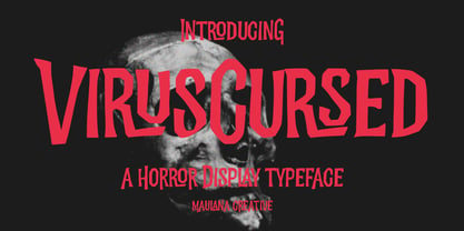 Virus Cursed is a Horror Vibe Decorative display font. With Bold Sharp stroke, Upright and fun character with a bit of ligatures. To give you an extra creative work. Virus Cursed font support multilingual more than 100+ language. This font is good for logo design, Social media, Movie Titles, Books Titles, a short text even a long text letter and good for your secondary text font with Script. Make a stunning work with Virus Cursed font. Cheers, Maulana Creative
 - Agency FB by Font Bureau,
$40.00 ATF Agency Gothic was designed by Morris Fuller Benton in 1932 as a lone titling typeface. In 1990, David Berlow saw potential in the squared forms of the narrow, monotone capitals. He designed a lowercase and added a bold to produce Font Bureau Agency, an immediately popular hit. Sensing its potential to be than just a useful condensed face, Font Bureau developed Agency into a major series offering five weights in five widths; FB 1990-95
 - Fairdate by Maulana Creative,
$15.00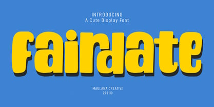 Fairdate is a unique cute handwritten display font. With Bold stroke, upright and fun character with a bit of ligatures and lowercase alternate. To give you an extra creative work. Fairdate font support multilingual more than 100+ language. This font is good for logo design, Social media, Movie Titles, Books Titles, a short text even a long text letter and good for your secondary text font with script. Make a stunning work with Fairdate font. Cheers, MaulanaCreative
 - Decima+ by TipografiaRamis,
$29.00 Decima+ is a subfamily addition to Decima, a new face by TipografiaRamis. Decima+ is an upright variation of Decima italics and is built in three weights. The unique difference of this typeface is that it presents a softer and more human look, while retaining the condensed geometric structure of its counterpart. Decima+ is a display face, with bold weight most suited for titling use. Decima+ is released as OpenType single master with a Western CP1252 character set.
 - Kasepi Sans by Yukita Creative,
$15.00 Kasepi Sans Display Typeface is a font that combines a modern style with a classic touch. With bold lines and balanced proportions, this font gives off an attractive and classy impression. Great for use in titles, headers and headline designs that need a strong visual appeal. This font style is a font that combines strength, clarity, and elegance. With its modern style and classic touch, it is ready to give your design an attractive and classy impression.
 - White Capel by Putracetol,
$24.00 White Capel - Modern Display Font is a bold, distinctive, and thoroughly contemporary typeface that exudes a trendy and up-to-the-minute vibe. Its soft, rounded letterforms lend it a unique and easily recognizable appearance, ensuring it stands out in any design. This font is perfectly suited for a wide range of applications, including logos, quotes, posters, branding, business names, and more. With its modern, sleek aesthetics, White Capel brings a touch of current style to your creative projects.
 - Golger Sans by Maulana Creative,
$16.00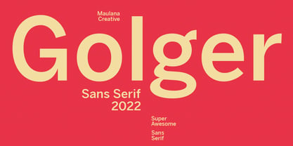 Golger Sans is a Classic Contemporary Sans serif. With bold weight stroke and fun character with a bit of ligatures. To give you an extra creative work. Golger Sans font support multilingual more than 100+ language. This font is good for logo design, Social media, Movie Titles, Books Titles, a short text even a long text letter and good for your secondary text font with script. Make a stunning work with Golger Sans font. Cheers, Maulana Creative
 - Dopestar by 38-lineart,
$15.00 Street art has become so inspiring that it's been featured on a range of mediums from advertising to album art. Thanks to the emergence of street art in the mainstream media. Dopestar is a heavy font that has a bold grafitti feel whilst being super clear to read, Dopestar is certainly versatile. Dopestar is a great typeface for display and it comes with a full set of characters with loads of variants and all the punctuation you'll need.
 - Sanford by Flawlessandco,
$9.00 Introducing "Sanford" - A Modern Display Sport Font. Sanford is the ultimate choice for designers seeking a bold and contemporary display font to make a lasting impact. There's some connected letters and some alternates that suitable for any graphic designs. This font support for some multilingual. Also contains uppercase A-Z and lowercase a-z, alternate character, numbers 0-9, and some punctuation. If you need help, just write me! Thanks so much for checking out my shop!
 - Bakewell by Kimmy Design,
$25.00 Bakewell is the 4th typeface of the Winslow Type System. It's a low contrast sans-serif with ball terminals and a sweet disposition. The typeface includes a wide range of styles, widths and weights that make it a great addition to any type collection. From Narrow to Wide and Hairline to Bold, the font family offers extended optionality. Packed with Opentype Features, users can create one-of-a-kind designs perfectly tailored to their specific needs!
 - Muray House by Flavortype,
$19.00 Muray House is a bold serif font with a rough, balanced look, with beautiful curves and alternate characters. A style that we choose was the natural look hand made, Muray House ha a unique identity. Muray House also comes with alternative characters that are carefully created for adding a minimalist decor of the letters. Stylistic alternates allows versatile design options and works perfectly for Headlines, Posters, Logos Packaging, Branding, T-shirts, Greetings, Presentations and much more.
 - Armont by HansCo,
$15.00 Armont is a Vintage typeface font, it will add an old-time charm to any design project. This collection of font is perfect for everything your project with vintage, retro, wild or organic style. Features : Uppercase & Lowercase ( in All Caps ) Numbers & Punctuation Multilingual Alternate character & ornament How to access alternate / ornament ? : https://hanscostudio.com/tutorial/ Enjoy!
 - Meritage by Aerotype,
$29.00 OpenType users benefit from alternate lowercase characters, crossbar ligatures for common letter pairings, case sensitive quotes and smart apostrophes. Other goodies include optional old style numerals and a few clip-on swash elements, accessible by keyboard or supporting application’s OpenType glyph menu. Meritage Pro extends the character set to support Eastern European and Baltic languages.
 - Easy Tiles by Intellecta Design,
$21.00 A nice mix of 62 decorative tile images. Designs are reminiscent of rubber stamps of architectural tiles found in historical homes and other buildings through the ages and printed devices from old catalogues. Generic enough to add interesting detail to just about any design. From invitations and greeting cards to book jackets, labels or fabric.
 - Ghost Sign JNL by Jeff Levine,
$29.00 Ghost Sign JNL is a spurred serif type design based on the faded lettering of an antique brick wall sign for Homer Hardware [located in Homer, NY] and is available in both regular and oblique versions. From Wikipedia: “A ghost sign is an old hand-painted advertising sign that has been preserved on a building for an extended period of time. The sign may be kept for its nostalgic appeal, or simply indifference by the owner. Ghost signs are found across the world with the United States, the United Kingdom, France and Canada having many surviving examples. Ghost signs are also called fading ads or brickads. In many cases these are advertisements painted on brick that remained over time. Old painted advertisements are occasionally discovered upon demolition of later-built adjoining structures. Throughout rural areas, old barn advertisements continue to promote defunct brands and quaint roadside attractions. Many ghost signs from the 1890s to 1960s are still visible. Such signs were most commonly used in the decades before the Great Depression. Ghost signs were originally painted with oil-based house paints. The paint that has survived the test of time most likely contains lead, which keeps it strongly adhered to the masonry surface. Ghost signs were often preserved through repainting the entire sign since the colors often fade over time. When ownership changed, a new sign would be painted over the old one.”
 - Brevier by CAST,
$45.00 Compact sans, ideal for setting long texts in small or very small type sizes: for packaging, instruction booklets, drug information leaflets and anything else that has to be legible at very small sizes. Lean and rhythmical, designed ideally to be used at less than 8 points (Brevier was the old typefounders’ name for 8-point type), Brevier holds up well even under adverse printing conditions. The apparently geometric letterforms hide Renaissance characteristics, the x-height and openings are very generous and the strokes slightly modulated. In order to offset ink spread – which is inevitable when printing very small sizes of type – Brevier has large white spaces between the letters. All internal angles have deep ink traps and many connections have been left open.
 - KG Flavor And Frames Five by Kimberly Geswein,
$5.00 Fun frames and borders in a variety of styles. The binder tabs can be printed, folded, and adhered to binder page dividers.
 - Turia by Eurotypo,
$48.00 Turia is a casual script font with a lot of OpenType features, which let you create your own design logo or lettering artwork. This font contain 768 glyphs: discretional and standard ligatures, stylistic and contextual alternates, small caps, titling, swashes, old style figures, ornaments and support CE languages. The Turia font has been thought especially for an expressive and dynamic design. Its glyphs are carefully drawn without loosing readability for use in a large text. This font could be used in a advertising, booklets, children books, labels, packaging, logotypes, cards or whatever your imagination wants to fly.
 - OTC Eugen by Ograda Type Company SRL,
$29.00 OTC Eugen is a geometric grotesque with industrial socialist aspect. It is a somewhat brute interpretation of the graphic environment and old era typography found around cities or in the country side in Romania. It works best as a display typeface used in big titles, in branding projects for clear wordmarks, or around the house where you can just go wild and make your own mark with the stencil version. Two styles: Display & Stencil. Various stylistic and contextual alternates, and a considerable amount of ligatures, arrows and more. Language support for: Basic Latin, Western, Central & Eastern European languages.
 - Linotype CMC-7 by Linotype,
$29.00Linotype CMC-7 is a MICR barcode font. It contains machine-readable numbers, letters, and punctuation. These characters are used on checks and for other banking needs in several countries. Linotype CMC-7 can also be used like any other font in visual graphic work; like the Universal MICR Pi or OCR A and B typefaces, this is a real" computer fonts, carrying all of the connotations of the days of early technology." - RF Barbariska by Russian Fonts,
$19.00 Handcrafted typeface with a friendly character. Two weights in three styles. Weights: Regular and Oblique. Styles: normal, rough1, rough2. Weight and shape of the letters allows using the font to solve any graphical problems. Package design for food or cosmetic products. Posters or music cover. Logos. Prints on sweatshirts or t-shirts. Children’s books or comics. Barbariska could be used in all sorts of projects. Features: ligatures, contextual alternates, old style numbers, fina and init for capitals letters. Support: cyrillic, cyrillic extended, latin, latin extended (Western European, Central European, South-East).
 - Fletcher Typewriter by Ana's Fonts,
$15.00 Fletcher Typewriter font and extras is an authentic vintage typewriter font, perfect to add an extra retro look to your designs. Use it in long or short texts, in digital collages, branding and packaging, social media posts, logotypes, etc. What you’ll get: 1 font family with 3 weights (regular, bold, black - each weight drawn individually), 2 styles (regular and jumpy); an extra set of stamps, misprints, underlines and overlines.
 - Torah by Masterfont,
$59.00 Based on ancient scribal texts, useful for Jewish education. Useful at text sizes and large scale applications. Bold, high contrast typeface. Pro version- Excellent support for Niqqud (Vowels). All marks are programmed to fit each letter's shape and width. Best used with apps that support right to left Hebrew text, like Adobe InDesign CC or MS Word. Please check these advanced features in this link: https://tinyurl.com/ybgdsxme
 - Kiddie Stencil JNL by Jeff Levine,
$29.00 At one time, the Hampton Publishing Company of New York specialized in producing reading and activity books for children. The “Letters and Numbers Stencil Book” (probably from the late 1940s or early 1950s) was the basis for Kiddie Stencil JNL. This bold sans serif type style replicates the handmade steel rule dies used for cutting the stencil pages of the book, and is available in both regular and oblique versions.
 - Topsy Turvy by Krafted,
$10.00 Looking for a fun and versatile font to captivate your audience, clients, or guests? Trying to create the perfect contrast between your titles/headings and body copy? Maybe you’re a Beauty Influencer, Interior Designer, or run a Cooking YouTube channel - looking for a way to stand out from your competition. Maybe you feel like your birthday e-cards are missing that “something”. If you can say “yes” to any of these then hold on to your seats and get ready for a modern, fun, and delightful experience! Introducing Topsy-Turvy - A Modern Calligraphy Font. This gorgeous, fun, and elegant font can be used for a host of different content needs and projects. Use it for your headings, logos, business cards, printed quotes, invitations, packaging, resumes, and even your website or social media branding. Delight your audience, clients, or guests with this versatile, elegant font. What you’ll get: - Multilingual & Ligature Support - Full sets of Punctuation and Numerals Compatible with: - Adobe Suite - Microsoft Office - KeyNote - Pages
 - Shaletta by Gloow Studio,
$16.00 We introduce our new product called Shaletta Font. Shaletta Font is a bold script font which has two styles, Clean and Textured. With those kind of styles, Shaletta Font will looks more vintage and classic. Shaletta Font is great for Logotype, Branding Design, Logo Design, Digital Lettering Arts, T-Shirt/Apparel, Poster, Magazine, Signs, Advertising Design, and any vintage design needs. What you get: Shaletta.otf Shaletta includes capital and lowercase letters, Alternates, and Ligatures Numbers + punctuation Foreign language support I highly recommend using a program that supports OpenType features and Glyphs panels such as Adobe Illustrator, Adobe Photoshop CC, Adobe InDesign, or CorelDraw, so you can see and access all Glyph variations. This font is encoded with Unicode PUA, which allows full access to all additional characters without having special design software. Mac users can use Font Book, and Windows users can use Character Map to view and copy one of the extra characters to paste into your favorite text editor/application. Thanks for purchasing and have fun!
 - Sevenfold by Letterara,
$21.00 Introducing "Sevenfold," a modern sans serif font that effortlessly blends bold with a touch of uniqueness. With its distinctive serifs and clean lines, this font achieves a perfect balance between contemporary style and classic aesthetics. It is a versatile choice for any design project that requires a hint of sophistication, be it editorial design, branding, or advertising. Sevenfold shines equally in both digital and print media, adapting seamlessly to various platforms and applications. With its PUA encoding, accessing a wide range of glyphs and swashes is a breeze, allowing for easy customization and adding a personal touch to your designs. Experience the legibility and international appeal of Sevenfold, ensuring that your messages resonate with audiences across the globe. Elevate your designs with the modern charm of Sevenfold and unlock its potential to enhance your visual communication.
 - Conestoga by FontMesa,
$20.00 Conestoga was a challenge that I took on which was to take a logo from an old antique vegetable crate label and create a complete font based on its design. The original logo was curved on a path and was caps only. The new letters were drawn straight and a matching lowercase was created to turn this old custom logo into a working font.
 - Kamber by Studio Buchanan,
$24.00 Kamber is a playful and approachable, neo-grotesque sans-serif with a handful of humanist flourishes. Subtle convex terminals and a curved structure create it's friendly personality and bouncy rhythm. If you're looking for a warm typeface that's affable without straying into cliché, then Kamber is your new best friend – like the labrador of typefaces. Kamber's balanced yet quirky nature makes for a fun and interesting display face, without compromising on legibility at smaller sizes. The lowercase letters have an elevated x-height, sitting at around 70% of the cap height – this means running copy remains clear and readable. Available in 8 weights, each with a corresponding italic, Kamber is a widely functional typeface that can hold it's own, regardless of the use case. It includes all the usual open type features for further adaptation and variation, including small caps, ligatures, stylistic alternates and more. The primary numerals are lining figures, but tabular figures, old style figures, and a combination of both are also included. If you're looking for something to stand out from the sea of overly geometric faces and soulless helvetica variants, then Kamber is ready and waiting. Perfect for editorial design, branding or anywhere you use text – Kamber is the typeface that smiles.
 - Caniste by Ilham Herry,
$20.00 The vintage typeface returns with the Caniste typeface family. My passion for something with a vintage aesthetic is one reason I created Caniste. Inspired by antique ephemera such as cigar box labels that were common in the 19th century, it harkens back to the beauty of typographic design at that time. The Caniste font family is an all-caps serif font with uppercase titling. It comes in 6 weights: Extra Light, Light, Regular, Semibold, Bold, and Ultra Bold. It also has very user-friendly Extras, such as scrolls, ornaments, and panels, and allows you to create beautiful ornamentation to suit your needs. I hope you enjoy using the Caniste fonts. Thank you!