10,000 search results
(0.061 seconds)
- Freehand 471 by Tilde,
$39.75 - Freehand 575 by Tilde,
$39.75 - Hey Its Red - Unknown license

- EDB Sweatin' It - Unknown license

- Doggone It JNL by Jeff Levine,
$29.00 The hand lettering for the movie posters and collateral items for the 1962 film "Mondo Cane" inspired Doggone It JNL, which is available in both regular and oblique versions. "Mondo Cane" loosely translates into "A Dog's World", and the subject of the travelogue documentary consisted mainly of unusual cultural practices around the world that many would find perverse, depraved or shocking.
 - Linotype Paint It by Linotype,
$29.99Jochen Schuss designed Linotype Paint It in 1997 with exclusively capital letters and in two weights. The best way to describe the weight Paint It might be to compare it with a labyrinth in which the figures only become clear to the reader dedicated to finding them. The second weight, Paint It black, is almost the solution to this puzzle. The characters are black and stand out strikingly from the background. Linotype Paint It is particularly good for headlines in large point sizes or wherever a text should display a playful character. - Yule Love It by Just My Type,
$25.00 YuleLoveIt or Yule not. What else can be said about holiday toys that are also letters? We just said it.
 - Do It Again by Thinkdust,
$10.00 Do It Again is a new stencil based rounded sans serif with great language support, designed by Thomas Averin.
 - I Heart It by Joanne Marie,
$40.00 Welcome to swash heaven! Since it’s been a few years that I made the very first heart swash font (featherly), I thought its time to create a new one and boy, this is massive! Made with love, I Heart It has over 2600 glyphs, is extremely smooth and is packed full of romance. There are 25 different swashes which connect to, not only, the lowercase alphabet but also on the left of the uppercase letters and the ligatures too. That’s not all! I’ve added 26 ornaments which will come in very handy for that additional touch of elegance and creativity in your designs. It’s all about the love, making this beautiful script font perfect for wedding stationery, engagements, and baby, family and friends orientated themes. Not only that - it can be used for logos, tattoos, delicious food and drink, mugs, clothing, the list is endless! They say that love conquers all and I Heart It will go a long way in expressing that through it’s illustrative design versatility, making it the perfect addition to your font collection. Once you’ve used it you’ll wonder how you’ve ever managed without it!
 - Play It Cool by PizzaDude.dk,
$17.00 Play it cool with your designs - especially if you do something handcrafted! This font has 4 different versions of each letter - enough to make it look random and handcrafted!
 - Easy Does It by Bogstav,
$15.00 I started making this font with a few days left at work before my 4 weeks vacation. I managed to finish the font on the day my vacation started - but with no stress. Now I can look forward to 4 good weeks at the summerhouse, and look back at the release of this laid back, handmade and somewhat quirky font. Personally I’d use it for anything that needs an organic handmade look - perhaps packaging, posters, flyers or maybe even clothes or toys for kids!
 - Stitch It Up by Studio Indigo,
$17.00 Stitch it up is a bold sans-serif cross-stitch font. It is intended for headings, advertisements and signs rather than continuous body text. It has multilingual support for all European languages.
 - Donaire It Black - Personal use only

- KG When Oceans Rise by Kimberly Geswein,
$5.00 A neat handwritten font in an upright, feminine style. The bar key | contains a cute slice of cake.
 - Museo 300 - 100% free

- lelim 300 - Personal use only

- John 315 - Unknown license

- Freeform 710 by Bitstream,
$29.99 - 210 MGothic by Design210, Korean Fonts,
$300.00
- Venetian 301 by ParaType,
$30.00 Venetian 301 is the Bitstream version of the Centaur type family. Centaur was designed by the American book designer Bruce Rogers on the basis of Venetian typefaces of 1470 of Nicolas Jenson. Beautiful Italic based on a face by Ludovico degli Arrighi was developed by Frederic Warde who was an American calligrapher and typography researcher was added as Italic to Centaur. Adapted for mechanical composition by English Monotype in 1929. Its lettershapes owe much to pen-drawn letters of Italian humanist minuscule and cursive. This elegant humanist face is useful for the finest typography both for book text and display matter. Cyrillic version included small caps was developed for ParaType in 2003 by Dmitry Kirsanov.
 - Zoo 300 by Green Type,
$37.00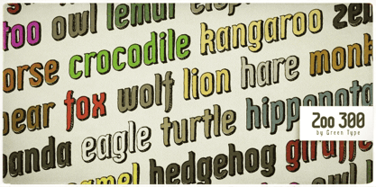
- Egyptian 710 by Bitstream,
$29.99 - 210 Gulim by Design210, Korean Fonts,
$300.00 A round was added to a neat straight line to express a soft sensibility. It is a neat and flexible font using a clean and stable type of module.
 - Calligraphic 810 by Bitstream,
$29.99 - Venetian 301 by Bitstream,
$29.99 - 210 Jamak by Design210, Korean Fonts,
$300.00 It is a font designed in a balanced manner by optimizing the width and spacing of letters to make use of readability. Serif was treated as a curve to emphasize a soft and comfortable feeling. The serifs of the letters gave a distinct impression and gave it a natural look by adding inclination.
 - 1475 Bastarde Manual by GLC,
$38.00 This script font was inspired by the type called “Bastarde Flamande”, a much appreciated one in the Duke of Burgundy’s court at the end of 1400s for handwritten books. A book titled Histoire Romaine (Roman history), from Roman author Tite Live, translated in French by Pierre Bersuire, circa 1475, was our main source for drawing the lower case characters and many of the upper case. Each character was written by hand with a quill pen on rough paper so as to look like the originals as much as possible. This font includes “long s”, naturally, as typically medieval , also a few ligatures, final and initial characters but there aren't any abbreviations because the text was written in French rather than Latin. Instructions for use are enclosed in the file and identify how to keyboard these special characters. This font can be used for web-site titles, posters, fliers, ancient looking texts, greeting cards, indeed for many types of presentations as it is a very decorative, elegant and luxurious font. Large type size shows this font at its best.
 - LTC Bodoni 175 by Lanston Type Co.,
$39.95 Giambattista Bodoni created this modern typeface in 1790 which served as the structural model for Sol Hess’s faithful rendition. Hess made necessary adjustments for mechanical typesetting on Lanston’s Monotype composition system. Remastered in 2006 by Paul Hunt.
 - It Ain't Rocket Science - Personal use only

- Zany Whatever It Means - Unknown license

- Do It Yourself JNL by Jeff Levine,
$29.00 Do It Yourself JNL was modeled after self-adhesive vinyl letters and numbers manufactured by Duro Art Industries of Chicago - formerly the Duro Decal Company. The hand-drawn look of the original lettering was retained by Jeff Levine to stay true to the design, and the rectangles that border each glyph represent the pieces of self-adhesive vinyl onto which the characters were silk screened. Limited character set.
 - KG Shake It Off by Kimberly Geswein,
$5.00 Hand-drawn by my 10-year-old daughter, this font comes in 4 whimsical styles- chunky, 3D, regular, and outline.
 - 45 Degrees by Identikal Collection,
$23.00 - Kruti Dev 010 - Unknown license

- A10 STAR Black by Mogtahid,
$90.00 As a former typographer / lino and calligrapher, Abdallah NASRI had recourse to the nature of the idea of an "INTERCHANGEABLE" collection for types who in reality offer a police collar parallel to the complex typeface of the variable. Our fashion is outlined by a simple calculation defined by superimposed geometric circles where we used only its ¼ to fill the need for the angles of each of our letters. Always with the idea of having in the same allocated space, the same letter nested as many times as fat example from Hairline to Ultrabold. It was in this way that I was able to obtain a large number of styles, with a very interesting kerning which prompted me to extend the font to other languages with +1000 characters and +600 glyphs. I have always been treasured by the all in "1". I assure you that I sought to obtain the maximum of Visibility for a use S / Titling TV, WEB Pages and Typography Typo; once the difficult thing was done, I was rewarded by a font that has countless typographic openings for the world of graphics with 10 styles of weights in hand, and again I am happy to have personalized the charm of each letter by new details; I do not regret the time spent on thinking about it so that it is useful and at the same time pleasant as a working tool, finally profitable in all sectors and more multilingual, without forgetting that it is a family of inter change c ' is to say: All the types occupy the same height of the body and it is their fats which differs in the same space width of each of the letters, therefore no interference in spacing. Here, an additional alternative, a participation of a septuagenarian in the service of the love of modern digital typography. • TEST: At 50% screen in a body of 12 pixels, the A10 STAR Alphabet subjected to a test, has a clear Readability / Visibility. • P.S: A10 STAR integrates Diacriticism in all its forms. Texte d'origine : Abdallah NASRI a eu recours en étant ancien typographe/lino et calligraphe à la nature de l'idée d'une collection "INTERCHANGEABLE" pour les types qui en réalité offre un collier de police parallèle à la fonte complexe du variable. Notre mode est esquissé par un calcul simple défini par des ronds géométrique superposés où on a utilisé seulement son ¼ pour garnir le besoin des angles de chacune de nos lettres. Toujours dans l’idée à avoir dans le même espacement alloué, la même lettre imbriquée autant de fois de graisse exemple du Hairline à Ultrabold. C’est de cette manière que j’ai pu obtenir un grand nombre de styles, avec un crénage très intéressant ce qui m’a incité à étendre la police à d’autres langues avec +1000 caractères et +600 glyphes. J’ai toujours été prisé par le tout en « 1 ». Je vous assure que j’ai cherché à obtenir le maximum de Visibilité pour une utilisation S/Titrage TV, Pages WEB et Maquette typo ; une fois le difficile fait, j’ai été récompensé par une police qui possède d’innombrable ouverture typographique pour le monde du Graphisme avec comme atout en main 10 styles de graisses, et encore je suis content pour avoir personnalisé le charme de chaque lettre par des détails nouveaux ; je ne regrette pas le temps passé dessus à réfléchir pour qu’il soit utile et à la fois agréable comme outil de travail, enfin profitable tous secteurs confondus et en plus multilingue, sans oublié que c’est une famille d’inter change c’est-à-dire : Tous les types occupent la même hauteur du corps et c'est leurs graisses qui diffère dans un même espace largeur de chacune des lettres, donc aucune interférence dans l’espacement. Voilà, une alternative supplémentaire, une participation d’un septuagénaire au service de l’amour de la typographie numérique moderne. • TEST : A 50% d'écran dans un corps de 12 pixels, l'Alphabet A10 STAR soumise a un test, présente une nette Lisibilité / Visibilité. • P.S : A10 STAR intégre la Diacritique dans toutes ses formes.
 - MPI No. 510 by mpressInteractive,
$5.00 No. 510 is a friendly, slim gothic face. Strokes have a gentle inward curve at the median with the tops and bottoms of the letters slightly wider and thicker. The design was first introduced by William H. Page & Company around 1887.
 - FM Christmas 3.0 by The Fontmaker,
$20.00 FM Christmas 3.0 consists of 26 hand-lettered Christmas greetings. All the words and phrases are original and handwritten - a high quality calligraphy for your holiday projects. Check our portfolio for the rest of our Christmas collection and more holiday related hand-lettered fonts.
 - American Advertise 010 by Intellecta Design,
$13.90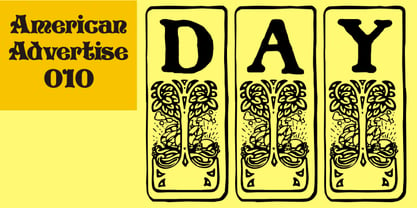
- Hall Fetica Upper Decompose It - Unknown license

- Mikey Likes It Corpulent NF by Nick's Fonts,
$10.00Fat and sassy, this ultrabold brush font is based on the works of lettering legend Mike Stevens as seen in his book, Mastering Layout. A natural choice for can't-miss headlines, this typeface also works surprising well for short blocks of body copy. Both the OpenType and Truetype versions of this font contain the complete Latin language character set (Unicode 1252) plus support for Central European (Unicode 1250) languages as well.


