10,000 search results
(0.015 seconds)
- Alt Gotisch by HiH,
$12.00 Alt-Gotisch Verzierte is a typeface of decorative initials that is Victorian in style and bears a close family resemblance to the many ornamental tuscans cut throughout the nineteenth century by British foundries. Instead of the bifurcated terminals of the archetypical tuscan (see Figgins Tuscan by HiH or Stereopticon by Dan X. Solo), these letters display what Nicolete Gray might call a “wedge and bite” design -- as if they started with the wedge serif of a latin form and someone came along and took a perfectly round bite out of the wedge. We need not dwell on the lack of teeth marks. The calligraphic curls and flourishes are often graceful, sometimes a bit contrived, but always complex. There is a busyness that marks the style of the period. If you ever see an old photograph of a well-appointed Victorian parlor, you will recognize that same quality of busyness. Overdone is a word that frequently comes to mind. Alt-Gotisch Verzierte means “adorned or decorated old gothic.” The typeface is attributed by Alexander Nesbitt to an unidentified German foundry of the nineteenth century (Decorative Alphabets and Initials, Dover, New York 1987, plate 92). The designer is unknown. Our font is supplied with a lower case that is similar to the upper case, but is 15% shorter and is simplified by the omission of the decorative vines. For the lower case, alternate letters A, E, & T; and ligatures LE, OT & LY have been supplied. In addition, a few small decorative vines were planted here and there for optional use. An accented upper case is not part of the original design and is not here supplied. This design is also seen under the name “Sentinel” -- as always, it is worthwhile to compare the completeness of the character set and the faithfulness of the rendering. We believe you will agree that we provide a balance of quality and value that is unmatched in the contemporary marketplace. Alt-Gotisch Einfach is a simplified version of Alt-Gotisch Verzierte. The vine-less lower case of the Verzierte font is the upper case in Einfach. For a lower case for Einfach, the letters were further simplified by stripping away the three-dimensional outline, down to the bare bones and bites, as it were. Einfach, in fact, means “simple” or “plain.” It is interesting to note that this bare bones & bite lower case bears (I have a special license to use two homonyms in the same sentence) a striking resemblance to the 15th & 16th century ornamental letters from Westminster Abbey shown in Plate 47 of Alexander Nesbitt’s Decorative Alphabets and Initials (Dover, New York 1987).
 - Genie by Canada Type,
$24.95The flower children of Canada Type are at it again. This time we went above and beyond the call of duty and right into the land of reconstruction in order to make this font. When we saw a few letters from an early 1970s film type called Jefferson Aeroplane, we had the sudden urge to bring their beauty to digital life. But since further research revealed no more letters or information, we just had to "wing" the rest of this Aeroplane. Now this Genie is out of the lava lamp, and it's nothing short of groovy. A few symbols and alternates come within the font, so make sure to check out the very full character set. We love this font so much that we couldn't help but play with it for a week. Some of the Wes Wilson-inspired results are in this page's gallery, so check them out for a flashback. Keep on trucking! - Blank Manuscript by Aah Yes,
$14.95Blank Manuscript allows you to produce sophisticated musical scoresheets even on basic Word Processors - anything from simple plain staves to complex full-page orchestral scores of your own design, to write in the notation yourself. The basic stuff is really easy and straightforward, but there's some quite advanced things you can do as well. So Copy and Save these Instructions. • The main stuff is simple and tends to follow the initial letter. Treble, Bass and Alto clefs are on upper case T B A (there are more clefs, below). The 5 Lines for the clefs are on L or l. • A small v will give a small vertical line (like a bar line) and a Big U will give a Big Upright - these can start or end a line or piece. • Time Signatures - type the following letters: Think of W for Waltz and it's easy to remember that 3/4 time is on W. Then from that they go up or down together like this: V=2/4 W=3/4 X=4/4 Y=5/4 Z=6/4 Compound Times are on H I J K like this: H=3/8 I=6/8 J=9/8 K=12/8 Common Time and Cut Common symbols can be found on semi-colon and colon respectively (all begin with Co- ). 2/2 3/2 are on lower case a and b, 7/4 and 7/8 are on lower case c and d, 5/8 is on small k (think POL-k-A) • Flat signs are on the numbers. Flat signs on LINES 1 to 5 are on numbers 1 to 5. Flat signs on SPACES 1 to 5 are on numbers 6 to 0 (space 1 being above line 1, space 5 being above the top line of the stave). Sharp signs are on the letters BELOW the long-row numbers. Which is q w e r t for the sharp signs on Lines 1 to 5, and y u i o p for sharp signs on spaces 1 to 5. Doing it this way means it works the same for all clefs, whether Treble, Bass, Alto, Tenor or any other. Sharp and Flat Signs always go in this order, depending on how many sharps or flats your key signature requires: Treble Clef Sharps t i p r u o e Flats 3 9 7 4 2 8 6 Bass Clef Sharps r u o e t i w Flats 2 8 6 3 1 7 = Alto Clef Sharps o e t i w r u Flats 7 4 2 8 6 3 1 • Guitar Chord Boxes are on G and g (G for Guitar) Upper Case G has a thick line across the top Lower case g has an open top, for chords up the fretboard TAB symbols are available: Six-string Tablature is on s & S for Six. Four-string Tablature is on f & F for Four. (Lower case has the "TAB" symbol on it, Upper Case has just the lines to continue.) Five-string tablature, is on lower case "j" (as in BAN-j-O) and of course L or l will continue the 5 lines. •RARE CLEF SIGNS including Tenor Clef, are on various punctuation marks, i.e. dollar, percent, circumflex, ampersand & asterisk, above the numbers 4 to 8. NOTE: The important symbols were kept on the letter and number keys, which are fairly standard all over, but some of the less important symbols are on various punctuation keys, which in different countries are not the same as on my keyboard. If it comes out wrong on your system, all I can say is it's right on the systems we've tried, and they'll be in here somewhere, probably on a different key. CLOSING THE ENDS OF THE LINES and BAR-LINES is done with the 3 varieties of brackets - brackets, brace and parentheses - Left/Right for the Left/Right end of the line. Parentheses L/R () which are above 9, 0 give a clef with a small vertical upright (the same as a bar line). Brace L/R and Brackets L/R (both on the 2 keys to the right of P on my keyboard) will close off a staff line with tall upright bars. Brace gives a double upright - one thick, one thin. Brackets give a single tall upright. A Big Upright is on Big U, (Big U for Big Upright) and a small vertical line is on small v (small v for small vertical). The Big Upright is the maximum height, and the small vertical is exactly the same height as a stave. And there's a tall upright Bar, on Bar (which is to the left of z on my keyboard, with Shift,) which is the same height as the bar on upper case U but twice as broad. • There's a staff intended for writing melodies, which is a little bit higher up than an ordinary treble clef giving a space underneath to put lyrics in - on m and M for Melody line. Lower case has the Treble Clef on, Upper case M has just the higher-up staff lines with no clef. (Use mMMMMMMM etc.) However this clef will be in the wrong place to put in sharp and flat signs, key signatures and so on, so if you use this clef you'll have to write the sharps, flats and key signature yourself. There's also a clef that's smaller (less tall) than the ordinary clef, but with the same horizontal spacing so it will align with other standard-sized clefs - on slash (a plain clef) and backslash (with a Treble Clef). • There are some large brackets for enclosing groups of staves, such as you'd use on large orchestral scores, on Upper Case N O P Q R, which can aid clarity. N and O on the left, Q and R on the right. P is a Perpendicular line to be used on both sides to increase the height of the enclosure, in this way but with the staff lines in between: N Q P P P P P P O R OTHERS —————————————— • Repeat marks are on comma (left) and period/full stop (right). • Hyphen is left as a sort of hyphen - it's a thin line like a single staff line, with the same horizontal spacing as ordinary staff lines - in case you want to draw a line across for a Percussion Instrument, or a Title or Lyric Line. • Space is a Space, but with HALF the width or horizontal spacing as ordinary staff lines, so 2 space symbols will be the same width as a clef symbol or line. • Grave (to the left of 1 on the long row, or hold down Alt and type 0096 then let go) gives a staff line that is one eighth the width of an ordinary staff line. • If you want manuscript in a clef and key which requires a flat or sharp sign in the space underneath the 5 lines, they’re on = equals and + plus . SYMBOLS • Many of these symbols will only be useful if you have worked out in advance which bars will need them, but they are here in case you've done that and wish to include them. • Symbols for p and f (piano and forte) are on 'less than' and 'greater than' < > (above comma and full stop) and m for mezzo is on Question, next to them. They can be combined to make mp, mf, ff, pp, etc. These signs -- and other signs and symbols like Pedal Sign, Coda Sign and so on -- can be found on various punctuation mark keys, including above 1, 2, 3 in the long row, and others around the keyboard. There's a sort of logic to their layout, but in different countries the keys are likely to give different results to what is stated here, so it's probably best to just try the punctuation and see if there's any you might want to use. (But on my keyboard a Coda sign is on circumflex - because of the visual similarity. Pedal sign is on underscore. A "Sign" symbol is on exclamation mark.) They were only included in case you really need them to be printed rather than handwritten. • However, a Copyright symbol is deemed necessary, and also included are a "Registered" symbol and a TradeMark symbol. They are found in the conventional places, and can be accessed by holding down ALT and typing 0169, 0174 or 0153 respectively in the numberpad section and letting go. • Staff lines with arco and pizz. above are on capital C and D respectively ---C for ar-C-o. • An empty circle above a staff line (to indicate sections by writing letters A, B, C or 1,2,3 inside for rehearsal marks) is on n. The actual signs for an A, B, C and D in a circle above the staff line can be produced by holding down ALT and typing 0188, 0189, 0190 and 0191 respectively and letting go. • The word "Page", for indicating page numbers, is on the numbersign key. • The two quotes keys, (quote single and quote double) have symbols representing "Tempo is", and "play as triplets", respectively. • INSTRUMENT NAMES There's a whole lot of Instrument Names built in (over a hundred) which can be printed out above the clef, and you do it like this. Hold down Alt and type in the given number in the numberpad section, then let go. For Piccolo it's 0130, for Flute it's 0131, Cornet is on 0154, Violin is on 0193, and the numbers go up to over 0250, it's a fairly complete set. There's also a blank which is used to align un-named clefs on 0096. Put them at the very beginning of the line for the best results. Here they are: WOODWIND Piccolo 0130 Flute 0131 Oboe 0132 Clarinet 0133 Eng Horn 0134 Bassoon 0135 Soprano Sax 0137 Alto Sax 0138 Tenor Sax 0139 Baritone Sax 0140 Saxophone 0142 Contrabassoon 0145 Recorder 0146 Alto Flute 0147 Bass Flute 0148 Oboe d'Amore 0149 Cor anglais 0152 Pipes 0241 Whistle 0242 BRASS Cornet 0154 Trumpet 0155 Flugelhorn 0156 Trombone 0158 Euphonium 0159 Tuba 0161 French Horn 0162 Horn 0163 Tenor Trombone 0164 Bass Trombone 0165 Alto Trombone 0166 Piccolo Cornet 0167 Piccolo Trumpet 0168 Bass Trumpet 0170 Bass Tuba 0171 Brass 0172 VOICES Vocal 0175 Melody 0176 Solo 0177 Harmony 0178 Soprano 0179 Alto 0180 Tenor 0181 Baritone 0182 Treble 0183 Bass 0197 (see also PLUCKED STRINGS) Descant 0184 Mezzo Soprano 0185 Contralto 0186 Counter Tenor 0187 Lead 0206 BOWED STRINGS Strings 0192 Violin 0193 Viola 0194 Cello 0195 Contrabass 0196 Bass 0197 Double Bass 0198 Violoncello 0199 Violin 1 0200 Violin 2 0201 Fiddle 0252 PLUCKED STRINGS Harp 0202 Guitar 0203 Ac. Gtr 0204 El. Gtr 0205 Lead 0206 Bass 0197 Ac. Bass 0207 El. Bass 0208 Slide Gtr 0209 Mandolin 0210 Banjo 0211 Ukelele 0212 Zither 0213 Sitar 0214 Lute 0215 Pedal Steel 0216 Nylon Gtr. 0238 Koto 0239 Fretless 0244 KEYBOARDS + ORGAN Piano 0217 El. Piano 0218 Organ 0219 El. Organ 0220 Harpsichord 0221 Celesta 0222 Accordion 0223 Clavinet 0224 Harmonium 0225 Synth 0226 Synth Bass 0227 Keyboards 0228 Sampler 0249 PERCUSSION and TUNED PERCUSSION Percussion 0229 Drums 0230 Vibes 0231 Marimba 0232 Glockenspiel 0233 Xylophone 0234 Bass marimba 0235 Tubular Bells 0236 Steel Drums 0237 Kalimba 0240 OTHERS Harmonica 0246 Mouth Organ 0247 FX 0251 Intro 0243 Verse 0245 Refrain 0248 Chorus 0250 un-named 0096 (this is a small spacer stave for aligning clefs without a name) ALSO copyright 0169 registered 0174 TradeMark 0153 Rehearsal marks 0188-0191 (giving A, B, C, D in a circle, an empty circle is on n ) Clef signs for Treble Bass Alto without any staff lines 0253-0255 An Alphabetic List of all signs: a 2/2 time b 3/2 time c 7/4 time d 7/8 time e sharp sign, centre line f Tab sign for 4-string tab g Guitar Chord Box, no nut h half-width stave I sharp sign, third space up j Tab sign for 5-string tab k 5/8 time l Lines - 5 horizontal lines for a stave m Melody Clef - a standard clef but placed higher up, with Treble sign n Stave with an empty circle above o sharp sign, fourth space up p sharp sign, space above stave q sharp sign, bottom line r sharp sign, fourth line up s Tab sign for 6-string tab t sharp sign, top line (fifth line up) u sharp sign, second space up v vertical line (bar-line) w sharp sign, second line up x Fretboard, four strings y sharp sign, first space up z Fretboard, five strings A Alto Clef B Bass Clef C “arco” above stave D “pizz.” above stave E Double Vertical Lines F Four Horizontal lines (for 4-string tab) G Guitar Chord Box with nut H 3/8 time I 6/8 time J 9/8 time K 12/8 time L Lines - 5 horizontal lines for a stave M Melody Clef - a standard clef but placed higher up, plain N Bounding Line for grouping clefs - top left O Bounding Line for grouping clefs - bottom left P Bounding Line for grouping clefs - Perpendicular Q Bounding Line for grouping clefs - top right R Bounding Line for grouping clefs - bottom right S Six Horizontal lines (for 6-string tab) T Treble Clef U tall, thin Upright line V 2/4 time W 3 / 4 time X 4/4 time Y 5/4 time Z 6/4 time 1 flat sign, first line up (the lowest line) 2 flat sign, second line up 3 flat sign, third line up 4 flat sign, fourth line up 5 flat sign, fifth line up (the top line) 6 flat sign, first space up (the lowest space) 7 flat sign, second space up 8 flat sign, third space up 9 flat sign, fourth space up 0 flat sign, space above stave - 1538 Schwabacher by GLC,
$38.00 This 1538 Schwabacher was based on a font used by Georg Rhau in Wittemberg (Germany) to print Des Babsts Hercules [...], a German pamphlet against roman catholicism written by Johannes Kymeus. The original font has a relatively complete set of characters including “long s”, but also the special german types like k, fl or ‰, ˆ, ¸.... A few omissions were remedied, and accented letters were added. A render sheet, enclosed with font files, help to identify them on keyboard. It can be used as web-site titles, posters and fliers, editing ancient texts, menus or greeting cards as a very decorative font... Although this font remains clear and easy to read from 8 or 9 points on screen, it is clearly designed for print works.
 - Pure Love by Fidan Fonts,
$23.00 Pure Love is a handwritten script font inspired by the romantic stories and wedding trends. It includes full set of uppercase and lowercase basic characters, multilingual symbols, numerals, punctuation, ligatures and alternates(check the previews in order to see them all). It's works perfectly for wedding stationery, elegant branding, book cover designs, packaging, album covers, handwritten quotes, greeting cards, social media posts, and many more. Latin-based Language Support (You can check your language typing characters in text box below). If you want to type with stylistic ligatures and alternates make sure you have them turned on (use a capable software like Photoshop, Illustrator, InDesign, Word, Pages etc). Note: If you don't use this font with these programs stylistic ligatures won't work. Happy creating!
 - Deathstroke by Letterhend,
$18.00 Death Stroke is a organic slab serif typeface which is purposely made for headline, display or logotype. It comes with illustration & logo extras. This type of font perfectly made to be applied especially in logo, and the other various formal forms such as invitations, labels, logos, magazines, books, greeting / wedding cards, packaging, fashion, make up, stationery, novels, labels or any type of advertising purpose. Features : Uppercase & lowercase Numbers and punctuation Illustration extras Alternates & ligatures Multilingual PUA encoded We highly recommend using a program that supports OpenType features and Glyphs panels like many of Adobe apps and Corel Draw, so you can see and access all Glyph variations. PLEASE READ THIS: To use alternate charactter/swash you have to use opentype. For accessing opentype feature, kindly check this link letterhend.com/tutorials/using-opentype-feature-in-any-software/ Email us to letterhend@gmail.com if you need something! Happy Designing!
 - The Stegris by Letterhend,
$20.00 Introducing, The Stegris - Modern Serif Family. A pack of serif typeface with 5 weights : Light, Regular, Semi bold, Bold Black ready to choose according to your needs. This typeface also has special feature with its ligatures which make it unique even more. This type of font perfectly made to be applied especially in logo, and the other various formal forms such as invitations, labels, logos, magazines, books, greeting / wedding cards, packaging, fashion, make up, stationery, novels, labels or any type of advertising purpose. Features : uppercase & lowercase numbers and punctuation multilingual ligatures alternates PUA encoded We highly recommend using a program that supports OpenType features and Glyphs panels like many of Adobe apps and Corel Draw, so you can see and access all Glyph variations. How to access opentype feature : letterhend.com/tutorials/using-opentype-feature-in-any-software/ Email us to letterhend@gmail.com if you need something! Happy Designing!
 - Bellanny by Krafted,
$10.00 Looking for a stylish serif font to spice up your book, magazine, or newspaper? Introducing Bellanny - A Modern Serif Font. A perfect blend of elegance and style with just the right touch of creativity, Bellanny looks great on both web and print. Give it a go and see how a great font reshapes your work. What you’ll get: Multilingual & Ligature Support Full sets of Punctuation and Numerals Compatible with: Adobe Suite Microsoft Office Keynote Pages Software Requirements: The fonts that you’ll receive in the pack are widely supported by most software. In order to get the full functionality of the selection of standard ligatures (custom-created letters) in the script font, any software that can read OpenType fonts will work. We hope you enjoy this font and that it makes your branding sparkle! Feel free to reach out to us if you’d like more information or if you have any concerns.
 - Frainky by Krafted,
$10.00 Looking for a perfect brush stroke that ties your design together? Introducing Frainky - A Brush Font. Trendy and artsy, Frainky makes your brand memorable. It’s an excellent choice for ads, banners, printed cards, packaging, web pages, apps, and anything else your project needs. Give it a shot and see for yourself! What you’ll get: Multilingual & Ligature Support Full sets of Punctuation and Numerals Compatible with: Adobe Suite Microsoft Office Keynote Pages Software Requirements: The fonts that you’ll receive in the pack are widely supported by most software. In order to get the full functionality of the selection of standard ligatures (custom-created letters) in the script font, any software that can read OpenType fonts will work. We hope you enjoy this font and that it makes your branding sparkle! Feel free to reach out to us if you’d like more information or if you have any concerns.
 - Faither by Zeenesia Studio,
$15.00 Introducing Faither Handwritten Faither is a thin lettered and graceful script font. Fall for its ravishing style and use it to create gorgeous wedding invitations, beautiful stationary art, eye-catching social media posts, and much more! Natalie is PUA encoded which means you can access all glyphs and swashes with ease! What’s Included : - Standard glyphs - Multilingual - Web Font - Works on PC & Mac Simple installations Accessible in the Adobe Illustrator, Adobe Photoshop, Adobe InDesign, even work on Microsoft Word. PUA Encoded Characters – Fully accessible without additional design software. Fonts include multilingual support Image used : All photographs/pictures/vector used in the preview are not included, they are intended for illustration purpose only. We hope you enjoy the font, please feel free to comment if you have any thoughts or feedback. Or simply send me a PM or email me at zeenesia@gmail.com. Thanks for purchasing and have fun!
 - Kaglia by Letterhend,
$17.00 Kaglia is a font duo package contain a hand drawn bold script and sans serif which looks great to be paired especially for vintage and adventure theme! This font duo is purposely made for headline, display or logotype, and signature which need a standout appearing. This font is also suitable to be applied especially in logo, and the other various formal forms such as invitations, labels, logos, magazines, books, greeting / wedding cards, packaging, fashion, make up, stationery, novels, labels or any type of advertising purpose. Features : Kaglia Script Regular and Rough Kaglia Sans Regular and Rough uppercase & lowercase numbers and punctuation multilingual alternates & ligatures PUA encoded We highly recommend using a program that supports OpenType features and Glyphs panels like many of Adobe apps and Corel Draw, so you can see and access all Glyph variations. How to access opentype feature : letterhend.com/tutorials/using-opentype-feature-in-any-software/
 - Asper Crown by Letterhend,
$17.00 Asper Crown a strong and bold sans serif with a touch of vintage look and feel. Comes with 38 bonus hand drawn illustration in vector and free 12 premade logo. This type of font perfectly made to be applied especially in logo, headline, signage and the other various formal forms such as invitations, labels, logos, magazines, books, greeting / wedding cards, packaging, fashion, make up, stationery, novels, labels or any type of advertising purpose. Features : Regular & Stamp version 38 hand drawn illustration 12 premade logo uppercase & lowercase numbers and punctuation multilingual alternates / swashes and ligatures PUA encoded We highly recommend using a program that supports OpenType features and Glyphs panels like many of Adobe apps and Corel Draw, so you can see and access all Glyph variations. How to access opentype feature : letterhend.com/tutorials/using-opentype-feature-in-any-software/ Email us to letterhend@gmail.com if you need something! Happy Designing!
 - Typex by Device,
$39.00 Based on the lettering used on Alan Turing’s famous code-breaking machine at Bletchley Park, the “Bombe”, and the subsequent British answer to the German Enigma machine, the Typex. Research done at Bletchley Park on their restored and antique machines provided the inspiration. The unusual shapes for the capitals have all been retained - the square O, the monospaced characters and other eccentricities that make it unique. This reference material was then extended to the numerals (which did not exist in the original) and a full international character complement. The initial design of the bombe was produced in 1939 at the UK Government Code and Cypher School (GC&CS) at Bletchley Park by Alan Turing, with an important refinement devised in 1940 by Gordon Welchman. It was based on a device that had been designed in 1938 in Poland at the Biuro Szyfrów (Cipher Bureau) by cryptologist Marian Rejewski, and known as the "cryptologic bomb" (Polish: bomba kryptologiczna). The Bombe was used to break the German Enigma code on a daily basis, and was a vital part of the Allied war effort. The British “Typex" (alternatively, Type X or TypeX) machines were an adaptation of the commercial German Enigma with a number of enhancements that greatly increased its security. It was used from 1937 until the mid-1950s, when other more modern military encryption systems came into use.
 - Bodrum Sweet by Bülent Yüksel,
$19.00 Bodrum Collection: 1- Bodrum Sans 2- Bodrum Sweet 3- Bodrum Stencil 4- Bodrum Slab 5- Bodrum Styte 6- Bodrum Soft "Bodrum Sweet" is a sans serif type family. Designed by Bülent Yüksel in 2018/19. The font, influenced by style serifs, popular in the 1920s and 30s, is based on optically corrected geometric forms for better readability. "Bodrum Sweet" is not purely geometric; it has vertical strokes that are thicker than the horizontals, an “o” that is not a perfect circle, and shortened ascenders. "Bodrum Sweet" some corner is rounded. These nuances aid in legibility and give "Bodrum Sweet" a harmonious and sensible appearance for both texts and headlines. Bodrum Sweet provides advanced typographical support for Latin-based languages. An extended character set, supporting Central, Western and Eastern European languages, rounds up the family. The designation “Bodrum Sweet 14 Regular” forms the central point. "Bodrum Sweet" is available in 10 weights (Hair, Thin, Extra-Light, Light, Regular, Meduim, Bold, Extra-Bold, Heavy and Black) and 10 matching italics. The family contains a set of 650+ characters. Case-Sensitive Forms, Classes and Features, Small Caps from Letter Cases, Fractions, Superior, Inferior, Denominator, Numerator, Old Style Figures just one touch easy In all graphic programs. Bodrum Sweet is the perfect font for web use. You can enjoy using it.
 - Pacioli by MADType,
$29.00 This font is based on an alphabet published by Luca Pacioli in his 1509 mathematical treatise De divina proportione. In this book, Pacioli describes how to build the Roman alphabet geometrically using lines, squares and circles. Pacioli was not the first or the last man in his era to describe the building of letters mathematically. Felice Feliciano did this before Pacioli, and Albrecht Dürer further developed these forms years after. According to Pacioli, the thick strokes should be 1/9th of the height, and the thin strokes should have 1/2 the weight of the thick strokes. I felt that this beautiful alphabet needed to be restored to its full geometric glory and set out to construct an accurate replica using Pacioli's instructions. Included in the font you'll find the letters that have the grid overlay and also the letters without the grid. The letters J, W, U, and Z were not included in the book, so I have created my own versions of these characters that fit into Pacioli's grid. Pacioli shows two different Os in the book, so I have included the second O as well as a second J, Q, and Z as OpenType stylistic alternates. Also included in the font are border patterns and a fleuron taken from the cover of the book.
 - Maiers Nr 21 Pro by Ingo,
$42.00 A handwritten ”font for technicians“ from ca. 1900. Very geometrical, rigid forms borrowed from the typical characteristics of Jugendstil / Art Nouveau. This script is found in a magazine from the Otto Maier publishing house, Ravensburg, which was issued sometime in the years shortly before WWI. The magazine is entitled ”Schriften-Sammlung für Techniker: Verkleinerte Schriften der wichtigsten Alphabete“ (Collection of scripts for technical specialists: reduced scripts of the most significant alphabets) and published by Karl O. Maier. The original copy, produced by means of a galvanized plate, is just 7 centimeters wide. It served as the model for technical professions in which, at that time, the captions of drawings were still done by hand. The characters have been scanned, digitized and greatly magnified. Special attention was given to ensure the ”uneven“ edges, typical of handwritten script, remained effectively noticeable even in the digitized form. As a result, this ”technical“ font retains a handmade touch. Especially worthy of note are the Jugendstil forms characteristic at the turn of the19th century. In comparison, many alleged ”ultramodern“ font types of today suddenly look quite old-fashioned. Maier’s Nr. 21 Pro is suitable for all European languages. It includes ”Latin Extended-A,“ for Central and Eastern Europe incl. Turkish, and even Cyrillic and Greek, too. The font includes several stylistic alternates as well as a number of ligatures.
 - Taka Sans by FSodic.com,
$15.00 Taka is a font that can be used in all situations, be it Articles, News, Titles and so on. We will be adding variants of the font in the coming weeks which will make this font even more complete. This font is only sold by Monotype and its subsidiaries, make sure you get the original only here!
 - Corradine Handwriting Italic by Corradine Fonts,
$19.95 Few fonts reach the goal of simulate properly the hand writing aspect. Based on the hand writing of Manuel Corradine, Corradine Handwriting fonts have a lot of automatized alternates and ligatures that give them a natural hand writing feeling. Initially we were offering just the upright version of Corradine Handwriting but now here is the nice italic version.
 - Brigned by Krafted,
$10.00 Want to give your brand image a modern and chic twist? Whether you're a trendsetter or a conventional, we have what you need. Introducing Brigned - A Modern Serif Font. From logo design to digital and print media, Brigned creates a lasting impression and charm. Give it a try and see how a beautiful font can make all the difference.
 - England Reality by Aldedesign,
$15.00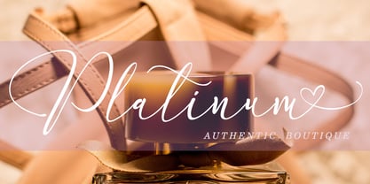 England Reality is a script font with awesome and classy taste, a natural touch, and many ligatures. We feel this font looks classy, readable, elegant, stylish, catchy and absolutely easy to use. This font is a great choice for a watermark on branding, design, wedding, photography, signature, logo design, album cover, business card, quotes, and many other design projects.
 - Bright Clones by Letterhend,
$17.00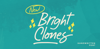 Introducing, Bright Clones! this handwritten font is perfect for branding, packaging, headline, title, etc. Features : uppercase & lowercase numbers and punctuation multilingual alternates and ligatures PUA encoded \We highly recommend using a program that supports OpenType features and Glyphs panels like many of Adobe apps and Corel Draw, so you can see and access all Glyph variations.
 - Messy Linocut 2D by 2D Typo,
$24.00 Don't try to find logic in this font, nor the harmony of the forms. It is meant to be crank. All the letters were first cut in linoleum and then digitized. Hence, everything is alive. You will find no uniform elements. We think this font will find its use in the hands of a brave designer.
 - Slug by FaceType,
$18.00 Slug is a clean, geometric font, like those that were widely used in the 1970s. To give the user a wide range of possibilities, we made not only a half, a single and a double version, but also provided a bicolor solution: by combining Bicolor A and B you will create astounding multicolored pieces of typography.
 - Fauna by Del Alma,
$14.99 Fauna is the set of cute animals you were looking for! We know these animals will give their best in order to give a lovely touch to your work. With a total of 108 characters; the font family is divided into two styles of 54 each: Fauna Blanca and Fauna Negra. Choose one of them... or better, choose both!
 - Balaghat by Dharma Type,
$19.99 Balaghat is a decorative but natural hand letter script. The distinctive feature of this font is its cursive shape and It’s like written with a brush with smooth strokes. We recommend this font for high-end logotypes and magazine headlines, let alone greeting cards, invitations, posters, book covers, ads and the various web and screen usages.
 - VLNL Bleek by VetteLetters,
$35.00 Bleek started its life as a logo for a rock band with the same name. This makes sense as it has distinct roots in classic rock logo design. Any rock band name set in VLNL Bleek looks instantly cool – profi logo quality! Of coarse Bleek will serve an awesome purpose as a headline font as well. Or gig flyers and posters. Or band backdrops. Just turn it up to 11! DBXL expanded the original logo into the full Heavy weight and added Light and Medium cuts. VLNL Bleek is an all caps font with uppercase and lowercase variations for maximum effect. It has a number of Open type features, like and alternate F, mirrored A and O and a TT ligature to spice up your designs. VetteLetters says: Rock on!
 - Mosherif by HansCo,
$12.00 Mosherif is a type of sherif font created with the aim of using for logo branding and print media. This font has three style that can be combined manually with one another in one word / text so that it looks unique and interesting. One example is in the first preview ( cover ), where the word "MOSHERIF" was made using three font styles ( Mosherif Regular, Mosherif Tall and Mosherif Short ). You can make it manually by making a space and remove some characters between words "MOSHERIF" becomes "M HE F" with using the font "Mosherif Tall" and fill it with "Mosherif Regular" in character "O" and "R" and "Mosherif Short" in character "S" and "I" by stacking them. By bringing the concept of vintage, clean, thick and sharp, hopefully Mosherif can provide choices for designers. Enjoy!
 - Coal Soul by LomoHiber,
$18.00 I'm so excited to present my Coal Soul typeface. It has been inspired by underground music video and hand drawn with Sharpie marker. Coal Soul has very unique minimalistic low poly letter form, 3 styles, and illustrations which will allow you to create really outstanding designs. It's perfect to use in logos, posters, music covers, clothes prints and other stuff which needs crazy visual style. Coal Soul Features: Uppercase font Full set of alternates for each letter and number to create a more realistic look Bonus wide alternates for letters "B, C, D, E, F, G, O, Q R" Wide language support (Western European, Central European South Eastern European) Carefully tuned kerning Extra illustrations font If you have some issues or questions, please let me know: lhfonts@gmail.com Hope you'll enjoy using Coal Soul!
 - Adonis Old Style SG by Spiece Graphics,
$39.00 Willard T. Sniffin deserves the credit for this charming little stationery and greeting card typeface developed for American Type Founders in 1930. Capital letters show an occasional hint of ornamentation and lowercase letters are of the linking variety. The original set of exquisite alternate characters (A,B,G,T,V, W, o, s) has been included in this digital version. Adonis Old Style is ideal where a 1920s or 30s script-like lettering look is required. Adonis Old Style with Alternates is also available in the OpenType Std format. Some new characters have been added to this OpenType version. Advanced features currently work in Adobe Creative Suite InDesign, Creative Suite Illustrator, and Quark XPress 7. Check for OpenType advanced feature support in other applications as it gradually becomes available with upgrades.
 - Esteric by Flavortype,
$19.00 Esteric, originally created with a concept of happiness, fun and playful. Designed initially as an all-caps font. Lowercase are just slightly lower than Capitals. Also, Esteric is created with some OpenType features, such as stylistic alternates, interlocks, and tons of ligatures. Joy and Playful guaranteed! What is interlock? When you are using the stylistic of a rounded letter O and meet another letter with stylistic rounded forms like C and G, glyphs define the space and merged like a ligature. Best scene for using Esteric place like a Party, Happy Events, Fun projects. Any media is suitable based on the concept. But Esteric won’t fit with an serious type of project. Please note that OpenType features are only available in programs that support them, such as Illustrator, Indesign, Quark or Photoshop.
 - Hargloves by Heypentype,
$17.99 Hargloves is a modern sans serif font family. The overall design shapes taken from advance engineering technology themes in various industries like motorsports, biotech, games, architecture, robotics, and aerospace tech. A distinct visual characteristic of this font family can be found on 'G','O','P','Q', and 'R' letter. Each glyph design combined a geometric shapes and stylished ink-traps with parabolic curves. The design of the glyph curves taken from fast corner often found on motorsports circuit, when diagonal glyph shapes taken from aerodynamic in machine engineering and kinetic movement on sports. Hargloves consist of 12 font with 6 weight: From thin to Bold with each matching italics.It also contains extras 4 Icons designed specifically for sports entertainment. Hargloves support for most western languages and several opentype features.
 - Armin Grotesk by W Type Foundry,
$25.00 As a graphic designer, sometimes it’s impossible not to be inspired by the Swiss Style, specifically the work of Armin Hofmann, who is one of its best exponents. Grids and grotesk and neo-grotesk typefaces are a fundamental part of the tools that make this aesthetic possible. A visual language that has caused full admiration since we were students. Therefore, we decided to design Armin as an homage to Hofmann’s work. Technically, we added stylistic sets applied to the letters –G, R, a, g, h, l, m, n, r, t, u, y– to make Armin more eclectic and suitable for the creation of any visual language.
 - Caride Script by Krafted,
$10.00 Look back to learn how to look forward - Joe Girard Find yourself and share your purpose with the Caride Script. With its bold vintage script type, sometimes you need to remind others that we must look to the past to pave a better way for our future. It’s time for you to unleash the old school retro trend again. Leather jackets? Making a comeback. Pompadour hairdos? Definitely cool. 70s music? They’re sampled in the music all over our radio stations! The magnificence of the past will surely help you give a new and fresh breath of life to your projects. This font was designed for you to use in any kind of projects that you might have! They were specifically designed to fit in anywhere you want them to be. We assure you that there will be no awkwardness in the relationship between your text and your designs, they’ll get along well like old-timey partners! The Caride Script is the perfect addition to bring your perspective to the world. Have the world see you and your encompassing view of the human experience with your creations!
 - Leaden Skies by Kitchen Table Type Foundry,
$16.00 A ‘Leaden Sky’ is a dark grey sky without clouds. We don’t see too many of them here in Holland, as we usually have lots of clouds. Yesterday, however, the sky turned a sinister greyish green and it spewed out an an enormous amount of hailstones the size of walnuts. Leaden Skies is a handmade, all caps display font. I made it with a brush and Chinese ink. It comes with extensive language support and a set of alternates for the lower case glyphs.
 - Alfatih by PojolType,
$14.00 This Alfatih font is inspired by calligraphy writing, with modern classic characters. We can use this font for calligraphy book writing, Quran cover writing, film titles, t-shirt designs, magazine titles, web, posters, book titles, logos, country names, brands, billboards. Alfatih font, offers you: 1. Uppercase characters (All uppercase letters, 4 models) 2. Ligature (22 two-letter characters) and Alternate Styles 2. Ligature (8 characters three letters) with alternative styles, we can use it for logos 3. Multilingual Support (Europe Latin West), Numbers and Punctuation
 - Block Atella by Scratch Design,
$12.00 Block Atella is a retro, vintage and playful typeface that has a quirky and cute characteristic. This font will be suitable for logos, labels, packaging, invitations, branding, advertising and other designs that need stand-out typeface for the design. What you'll get: Uppercase and lowercase Numbers and punctuation Multilingual support Unique Ligatures We highly recommend using a program that supports OpenType features and Glyphs panels like many Adobe apps so that you can see and access all Glyph variations. We hope you enjoy our font!
 - Sacred Bridge by Bombastype,
$35.00 Sacred Bridge is an old fashioned display typeface, inspired by vintage signage combined with ornaments that were inspired by certain Indonesian tribe ornament feels, because our little type foundry is focused on vintage display fonts. Till now at least. Sacred Bridges offers a layered system, with regular, rough and slant versions from each style. And don't forget about the Extras (ornaments) we offer. You'll get separate ornaments and objects that you can mix and match. We also give you most of our ornaments seen in our display.
 - Lithium by FSD,
$40.00Lithium is a set of symbols coming from different communicative context but designed to be used together. It's like turning on 5 radios trying to understand the mixture of sounds. Lithium was created, above all, to present this kind of sensation using images. Obviously, the result is chaos in lowercase text. Lithium represents the overload of images we are subjected to. With advertising no longer working like in past years, we end up seeing nothing but noise. FF Mode 01 is created with similar concept. - Allison Dream by Rochart,
$15.00 Hello! We introduce our product called Allison Dream. The Allison Dream font is a modern Hand lettering. We give you a swash to make your design look more awesome. Allison Dream font is great for logotype, Branding Design, Logo Design, Digital Lettering Arts, T-Shirt/Apparel, Poster, Magazine, Signs, Advertising Design, wedding invitation and any hand lettered needs. Allison Dream font Features : Upper and Lowercase Standard Characters, Punctuation, Numerals and Multilingual. PUA Encoded Characters – Fully accessible without additional design software. Ligatures and Stylistic Alternates.
 - Belanga by Gatype,
$10.00 Balanga is a smooth, elegant and flowing handwritten font. It has a beautifully balanced character, goes well with many designs. Balanga features varied baselines, smooth lines, beautiful glyphs, and stunning alternatives. Hand-drawn design elements allow you to create many beautiful typographic designs in an instant such as branding, web and editorial designs, prints, crafts, quotes, It's great for logo types, wedding invitations, romantic cards, labels, packaging, name spelling and other . Add to your most creative ideas and see how they make it happen! Balanga includes OpenType style alternatives, ligatures, and International support for most Western Languages. To enable the OpenType Stylistic alternative, you need a supporting program such as Adobe Illustrator CS, Adobe Indesign & CorelDraw X6-X7, Microsoft Word 2010 or a later version. Balanga is coded with PUA Unicode, which allows full access to all additional characters without having to design special software. Mac users can use Font Book , and Windows users can use Character Map to view and copy any additional characters to paste into your favorite text editor/application.