3,399 search results
(0.008 seconds)
- Magenta Basket by Balpirick,
$15.00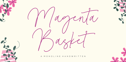 Magenta Basket - a Monoline Handwritten that's clean, elegant and perfect for a range of design projects! With its smooth, effortless lines and understated sophistication, this font is the perfect choice for those who want a modern look that's still timeless in its appeal. Crafted with precision and care, this font is incredibly versatile and can be used for a range of design projects, including logos, branding, invitations, packaging, and more. With its simple yet refined aesthetic, it's sure to make a lasting impression on anyone who sees it. - also multilingual support Enjoy the font! Feel free to comment or feedback! Thank you!
 - Amagusi by Miracledsign,
$15.00 Amagusi is a font that is inspired by Japanese culture with all its uniqueness and beauty that makes the bamboo curtain country very loved by many people, as well as in the art of writing kanji which has its own aesthetic value. The amagasi font is formed and made by combining the contours and anatomy of kanji letters so that it has a very beautiful value when used in a sentence and is very attractive to readers who see it and of course it will make your product more elegant and appreciated by everyone who sees it.
 - Roseline by Balpirick,
$15.00 Roseline - a Monoline Handwritten that's clean, elegant and perfect for a range of design projects! With its smooth, effortless lines and understated sophistication, this font is the perfect choice for those who want a modern look that's still timeless in its appeal. Crafted with precision and care, this font is incredibly versatile and can be used for a range of design projects, including logos, branding, invitations, packaging, and more. With its simple yet refined aesthetic, it's sure to make a lasting impression on anyone who sees it. - also multilingual support Enjoy the font! Feel free to comment or feedback! Thank you!
 - Laberintia by Rodrigo Navarro Bolado,
$30.00 "And she, Pasiphae, gave birth to Asterion, who was also known by the name of Minotaur, since he had the face of a bull and the rest of a man. Minos wanted to beware against certain oracles by locking him in a maze. It was the labyrinth, the work of Daedalus, a construction of tangled revolts that strayed from the exit.” - Apollodorus from Atenas. LABERINTIA is a font inspired by Daedalus' masterpiece, The Cretan Labyrinth, an experimental, display typeface that creates textures, plays with the mind and loses anyone who dares to take a walk inside it.
 - Wildfire Dreams by Balpirick,
$15.00 Wildfire Dreams - a monoline calligraphy that's clean, elegant and perfect for a range of design projects! With its smooth, effortless lines and understated sophistication, this font is the perfect choice for those who want a modern look that's still timeless in its appeal. Crafted with precision and care, this font is incredibly versatile and can be used for a range of design projects, including logos, branding, invitations, packaging, and more. With its simple yet refined aesthetic, it's sure to make a lasting impression on anyone who sees it. - also multilingual support Enjoy the font! Feel free to comment or feedback! Thank you!
 - VLNL Brokken by VetteLetters,
$35.00 'Brokken’ is the Dutch word for ‘chunks’. They are the hearty specialty of the house, prepared by the ship’s cook Donald DBXL Beekman. Nice'n'greasy and monospaced, you'll always find a decent way to cram the letters in. Brokken is straightforward, straight-lined with beveled corners, and all caps. For the ones who have to watch their weight, or who simple don’t like their fonts to be too fatty, DBXL designed a diet version called Brokken Light. With their big contrast, both weights combine very well and are great for making ultra-compact ribbon headlines or stacking vertically.
 - Bocfer by Brenners Template,
$19.00 Designed by Ryul Davidson, this typeface is a special style for designers who prefer a sense of space and differentiation in the layout system. It applies a design concept that continues the modern and contemporary grotesque lineage. And, It adopts a somewhat low x-height system and has a classic and sophisticated balance. As the height of lowercase letters is lowered, more differentiated and rhythmic typography can be realized, and it showcases a wide range of coverage from offline publishing to display areas. The elaborately optimized kerning system is a good choice for designers who prefer more professional logos and editorial designs.
 - Ornata F by Wiescher Design,
$39.50 Ornata F is the sixth of a series of old ornaments that I am trying to save from oblivion. I am completely redesigning the ornaments from scratch. These ornaments have been designed around 1910, I could not find out by whom. This set is perfect to design flowery frames. Your digitizing typedesigning savior, Gert Wiescher
 - Athenaeum by Monotype,
$29.99Athenaeum was released in 1945 by Alessandro Butti and Aldo Novarese, probably for the Niebolo foundry in Turin, for whom this duo designed many successful types. Athenaeum is an Old Style face with strong calligraphic influence. The Athenaeum font family includes a set of decorative initials illustrated with a symbol beginning, resembling early paper watermarks. - KR Crowd Surfer - Unknown license

- Cypheral by Volcano Type,
$19.00 A type between letter and number. Cypherals' fresh typeface is a mix-up of number parts and lines that reveal to be letters. So who is to say that numbers and letters don't have much in common?
 - Hero by Roman Polishchuk,
$20.00 Hero is an eccentric, handwritten font. It features high detail and natural forms. Support for ligatures allows you to create a truly unique typography that resembles lettering. Each designer should have a hero who inspires him. Enjoy!
 - KG Neatly Printed by Kimberly Geswein,
$5.00 This neat, handwritten font is intended for educators who create teaching resources for children. It is highly legible for new readers and is thin enough to be used for the body of text on student-read documents.
 - Royal Wedding by Nirmana Visual,
$22.00 Introducing our new gorgeous calligraphy font, Royal Wedding A beautiful script for those who wish to enhance their designs with elegance and style. Royal Wedding suitable for many projects related to the wedding industry (stationery, logo, etc.)
 - Haakke by Dawnland,
$13.00 Haakke (or Håkke) - a casual, hand drawn (Stabilo OH pen, Fine) font with 4 alternates to all upper and lower case letters (a-z + å ä ö) as well as numbers for a realistic hand written look and feel! “Ligatures” have been created for double letters (TT, tt, ff, ll & LL (open type version of the font and open type compatible layout application required). Of course it holds all(?) the special characters that you will ever need. 451 glyphs... Haakke also includes symbols. Zodiak signs (letter a-l, upper case A-L write the corresponding name of the sign), planet signs (m-z, upper case M-Z write the corresponding name of the planet) triangles, squares and stars (from pentagrams (5 pointed) to Dodecagrams (12 pointed). (Write a 4, or shift-4 ("euro-sign", european keyboard, or "dollar sign", american keyboard) before your star or triangle and you will get a circle around it).
 - Komet Pro by Jan Fromm,
$65.00 Komet is a sturdy typeface with a calm and upright feel. Although it derives inspiration from classical English sans-serifs, it’s not too closely related to that model. Komet, instead, feels rather more lively and contemporary. Its compact spacing, low stroke contrast and heavy dots and accents give it an almost monolinear quality. The diagonals are slightly curved and the counters of the round letters such as b, o and q are generously wide. The muted, understated middle weights are built for extended body copy, while Komet’s thin and dark weights look brisk and assertive and make for subtly expressive headlines. Komet is an ideal choice for editorial design, branding and corporate design. The Komet Pro family comes in eight weights with matching italics, from Thin to Black. Each font contains around 850 glyphs, including a rich repertoire of OpenType features. Small caps, ligatures, ten different figure sets with matching currency symbols, stylistic alternates and arrows make Komet Pro a comprehensive toolkit for ambitious typography.
 - Komet by Jan Fromm,
$45.00 Komet is a sturdy typeface with a calm and upright feel. Although it derives inspiration from classical English sans-serifs, it’s not too closely related to that model. Komet, instead, feels rather more lively and contemporary. Its compact spacing, low stroke contrast and heavy dots and accents give it an almost monolinear quality. The diagonals are slightly curved and the counters of the round letters such as b, o and q are generously wide. The muted, understated middle weights are built for extended body copy, while Komet’s thin and dark weights look brisk and assertive and make for subtly expressive headlines. Komet is an ideal choice for editorial design, branding and corporate design. The Komet family comes in eight weights with matching italics, from Thin to Black. The glyph set of each font contains around 520 glyphs and provides good everyday support for most Latin-based languages. For a wider range of advanced OpenType features, Komet Pro is also available.
 - Gallinari by Jehoo Creative,
$18.00 Modern Grotesk with attractive Display set Gallinari has it. . Gallinari is an attractive Grotesque suitable for all kinds of design needs. Starting from the Heading - Body font is reliable, Has a humanist and geometric character makes it a universal grotesque. Gallinari is equipped with very complete size variants, thin to black, not only that, this font has a condensed style which is paired with Oblique style for a total of 36 fonts in a complete family. What makes it interesting Gallinari has the Uppercase Display set on ss05 bold and sharp, for the letters C, G, O, Q, S, Z completely changed from their basic shape to meet the wild and cool type of display, ss01 ss02 ss03 ss04 is used to give alternative forms of the basic letters (A, P, R, Q, W, Y, a, w, y). Each Gallinari style has more than 680 glyphs and supports various Western European and Cyrillic languages.
 - Bilcase by Ilham Herry,
$20.00 The Bilcase font family is a layered condensed font family that comes from vintage logos, labels, packages, and signage. This collection of styles has 5 type layers and vintage scrolls, panels, and ornaments. Combine these to create label designs, headlines, logotypes, signage, posters, greeting cards, letterheads, T-shirts... the applications are endless. This font family is available in 2 styles. Bilcase has font layers with contextual, stylistic alternates and ligatures. You will get special capital letters when you activate the contextual alternate feature. Bilcase Extras is the expanded version of the main font with panels, ribbons, and ornaments. You can access the ornaments by activating the ligature feature. Type the letter “p” for the panel, “r” for ribbon and “o” for ornament and add numbers to each code, e.g. “p1, p2, p11, r2, o2”. Complete information is in the pdf file. http://bit.ly/2OClGjY. You can also try it in the font tester below.
 - Impending Distaster by Hanoded,
$15.00 There's nothing really disastrous (impending or not) going on in my life right now, but I have always liked the expression. I thought about it when I watched a news item about the recent storm we had in Europe. The news showed footage of a person narrowly escaping a huge falling tree. Impending Disaster font is certainly no disaster. I created it using my fantastic Chinese ink and a broken tapas skewer (I seemed to have run out of my regular satay skewers). The result is a slightly rough, comic book kinda font. It comes with two sets of alternates for the lower case letters (which cycle as you type), one set of stylistic alternates for the 'O' glyph (and all accented O's), an alternate ampersand, asterisk, question mark and exclamation mark and a set of alternate numerals. Impending Disaster comes with extensive language support, including Vietnamese, Greek and Sami - so don't come running and say you didn't have any options! ;-)
 - Utroligt by Hanoded,
$15.00 I am (trying to) learn Danish using an app on my phone. The grammar and vocabulary are not that difficult, as the Danish language is very close to the Dutch language. The pronunciation, however, is quite tricky. Words look simple when written down, but when pronounced, they sound very different. Take ‘pige’ (‘girl’) - it reads ‘pee-guh’, right? Well, it is pronounced ‘pee-uh’. Or how about ‘brød’ (meaning bread)? If you keep in mind that the o-slash is pronounced as the ‘i’ in bird - almost like ‘uh’, it should be br-uh-d, right? Wrong again. It is pronounced br-uh-l. Aaargghh! I will succeed, hopefully! Utroligt is a Danish word meaning ‘incredible’. It is a nice, uncomplicated all caps font. I made it with a cheap rollerball pen and some nice French paper. Comes with double letter ligatures and all the diacritics you’d like - including the danish ones.
 - Black Stanky by Artisan Studio,
$18.00 Black Stanky a work that is purely a result of handwriting, has a natural characteristic. this is perfect for invitations, signatures, blogs, social media, business cards, product brands. Black Stanky has Stylistic standard, Stylistic Initial, Stylistic Teminal and ligatures. and includes uppercase and lowercase letters, numbers and punctuation marks. Accessed by using : OpenType smart programs such as Adobe Photo Shop, Adobe Illustrator, Adobe Indesign, Corel Draw and Microsoft Office. A Total of 362 Glyphs: Multilingual Support : ŠŒŸÐÀÁÂÃÄÅÆÇÈÉÊËÌÍÎÏÑÒÓÔÕÖØÙÚÛÜÝ àñáâåäãçæìíîïòóôõöøùúûüýÿèéê뢚ߞ Ligature accesed :St dd th gg pp ff wh mm of ck on we are all wr en ex ee ve oo ox ax ss so rr ot al tt ch ll rl ct ol rt at cl az 4 alternative setst accesed : a b c d e f g h i j k l m n o p q r s t u v w x y z special greetings for all, all of us all smoothly in running the routinen
 - Probeta by deFharo,
$11.00 Probeta is an exclusive Sans Serif typeface family, condensed in proportion into three styles: Regular, Italic & Small Caps. Each family consists of 7 weights (Extra Light, Light, Regular, Medium, Semi Bold, Bold and Extra Bold). Plus three bonus fonts: Circle, Cube & arrows • Includes a bonnus font with the purchase of each style! After defining all the proportions of the new typeface, and starting from the drawing of the lowercase letter «o», in an exercise of minimalist construction, I have built all the characters, contributing with this technique, morphological coherence and a balanced reading. I have put special interest in defining the width of each character, depending on the relationship with others, then the configuration of the metrics and the exhaustive definition of Kerning, provide maximum readability in paragraph texts and titles. The use in graphic design, editorial or advertising guarantees originality and difference. Very versatile fonts for billboards, video games, movie titles, logos, publications, etc. They include the symbol of Bitcoin and other Cryptocurrencies.
 - Horror Graffiti Cholo by Biroakakarati,
$10.99 This handwritten font is inspired by the cholo calligraphy of graffiti artists. It has a scary design, which is suitable for horor film posters and at the same time for signs and tattoo designs. It has an original style an effect font also available in a color version with drops of blood or paint to give a more lively touch. Try using it for your halloween party invitations or for your tattoo designs, for scary greeting cards. I used the word "Cholo" because this lettering in inspired by cholo-graffiti culture in Los Angeles in 70's years. The one of the best rappresent is Charles "Chaz" Bojorquez the father of cholo-lettering. Cholo because i think that in 70's in Los Angeles neighborhoods where graffiti-culture grow up there was a persons whit a mixed multicultural connexion and Chaz is one of them. Cholo-graffiti or Cholo-lettering is a specifing style o lettering. I think this is a good keyword for this lettering.
 - Monocle by Reserves,
$39.99 Monocle is a clean and contemporary monospaced geometric sans that excels in titling, data and numerical settings due to its clear and systematic design. The capitals-only format increases the harmony between letter pairings, opposing the irregularity of mixed case fixed-width typefaces. Stylistically, Monocle has the feel of a neutral sans, yet its underlying structural finish exudes a strong sense of order and authority. Its geometric foundation is especially pronounced in the constructed round forms. With multiple stylistic sets, individual letters can be exchanged to fine-tune text settings for a unique custom type solution. Features include: -Basic Ligature set including ‘f’ ligatures (ae, oe, fi, fl, ff, fh, fj, ft, tt, th, ct, st) -Alternate characters (O, I, S, G, R, Q, _, $, ©, #, •, %) -Slashed zero -Full set of numerators/denominators -Automatic fraction feature (supports any fraction combination) -Extended language support (Latin-1 and Latin Extended-A) *Requires an application with OpenType and/or Unicode support.
 - Worthington Arcade by Device,
$39.00 Worthington Arcade is a classically-proportioned capitals-only type incorporating a selection of ligatures and alternates. It loosely resembles the hand-painted architectural lettering of the 30s to the 50s, exemplified by the likes of Percy Smith’s interior signage for the BBC or George Mansell’s lettering for the University of London and the signs found on London’s bridges. However, rather than a slavish copy of any historical model, it is more an examination and evocation of certain idiosyncratic quirks of civic lettering of the period, and an attempt to create a peculiarly English titling typeface. The round letters, for example the O, Q and C, are wider than the perfect circle usually found in such designs, while the straight-sided characters, usually drawn on a square, are narrower. This lends the whole a subtle elegance that is also emphasized by the raised crossbars on the H, E and F and extended lower leg of the E. Includes old-style numerals.
 - ITC Abaton by ITC,
$29.00 ITC Abaton, by Argentinian designer Luis Siquot, is an exercise in geometry and simplification. “It is done,” says Siquot, “with few elements, with modules of only straight lines (horizontals, verticals and diagonals of almost 45 degrees). Drawing the I and the O, I got the basic elements, and so started the fight between strict geometry and optical impression, until I obtained the rest of the characters.” The basic rectangular form is characterized by wedge-shaped serifs, almost like caps on the heads and feet of the letters. “Abaton has the 'spirit' of 19th-century faces used on money bills or postage stamps, but the realization is totally different,” Siquot explains. Abaton is a “shaded” typeface of caps and slightly smaller caps, upright and slightly condensed in form. Although the letterforms are legible at small sizes, the shading tends to clog up if it gets too small, so Abaton is happiest as a distinctive display face.
 - Jabberwub by Sentinel Type,
$30.00A fresh new decorative display face bubbling with life & spontaneity, Jabberwub belongs to a rare genus of creature fonts that time forgotócasual animated. A fun & bouncy eye-catcher that crosses into the land of the zany, dancing a whacky line between discord & rhyme, Jabberwub packs tons of fun into a state-of-the-art OpenType font loaded with 270 extra glyphs, including stylistic alternates, discretionary ligatures, word ligatures and capitalized ligatures, allowing creative typographers to achieve a custom hand-lettered look without all the mess & spilt glue of a manual paste-up job. Just like using rub-down type but it never cracks or splits, and it never runs out. The moment you start using Jabberwub you'll be laffing! Jabberwub is ideal for whatever zany stuff springs to mind. It takes an outline with no problem-o, and you can squish & squoosh it as the occasion takes your fancy. Optimal results are achieved by hand setting each individual glyph. Available in OpenType only. - Morgan Font Duo by Silverdav,
$15.00 Introduce “Morgan” is a duo font, consisting of Serif and Script fonts, a very fitting combination, of course making your design more elegant and very charming Morgan was created to fulfill your need to create a charming and cool design. Equipped with many unique ligatures in serif fonts that will make your designs different from other designs, and also equipped with many Alternates in Script Fonts that will add a luxurious impression to your designs. How to use special characters in serif fonts for the letters “A, I, U, E, O” please select one of the letters above then use the dot 2 times (A..), then you get a special character, and to get a special character on letters K, R & L, use one of the letters above, then add a hyphen (-) once or twice. What's Includes: Morgan Serif Morgan Script Special Ligatures in Serif Font Special Alternates in Script Font Multilingual Support If you have any questions, please contact us
 - Sansduski Mono by Ingrimayne Type,
$9.00 SansduskiMono is a sans-serif decorative/display family that is monospaced. Its very high x-height and tight spacing make it more suitable for use at large point sizes than small point sizes. (There are better options if one wants a readable text font.) The letter O is a rectangle with rounded corners and this shape motif is carried over to other characters that are usually rounded. The origin of this face is in a previous typeface, BigStripesMono. That family was designed to use the OpenType feature Contextual Alternatives (calt) to put stripes on letters. It had only upper-case letters in one weight. SansduskiMono adds lower-case letters and eight more weights plus italics and outline styles for the black weights. For a proportional rather than monospaced version of this design idea, see Sansduski. SansduskiMono is appropriate for titles, posters, advertising, and other uses that benefit from simple letter forms that are geometric and clean.
 - Runista by Struvictory.art,
$14.00 We would like to introduce our new Thin Line Geometric Font Runista. Runista is a linear font in folk style, lowercase is decorated with geometric elements. The typeface includes a Decorative and a Symbol version. Letters and symbols are perfectly combined with each other. The font is easy to use in various design programs or without any program. Runista Typeface is suitable for lettering posters, music albums, tattoos and photo overlays in hipster style. The font works great for both printing clothes and craft products branding and packaging. Also use individual letters and symbols to create logos and monograms. Runista Decorative contains stylistic alternates for letters O, Q, C, D, G and the most popular ligatures: bb, cc, dd, ee, ff, gg, ll, mm, nn, oo, pp, rr, ss, tt, zz, ty, ly, ct, sp, st, in, ch, ck, sh, ou, qu, th, ph, ge, ng, gn, gh, au QU. The font has extensive language support.
 - KR For Baby B - Unknown license

- Ecentric by Redy Studio,
$21.00 Ecentric is a bold font inspired by the vintage style of letters on posters, bagde, packaging, labels from antiquity. The classic feel is really perfect you who needs a vintage typeface for logotype, apparel, branding, packaging, quote etc.
 - Dolce Gargia by Hishand Studio,
$15.00 Introducing Dolce Gargia, a classic modern sans serif with aesthetic look. Perfect for who needing a touch of elegancy, stylish, classy, beautiful thin, and modernity for their design. Complete with ligatures alternates regular italic icon kerning multilingual support
 - Claude Sans by ITC,
$40.99Claude Sans is the work of British designer Alan Meeks. The conservative roman weight is complemented by a more extravagant italic. The proportions are based on those of the original Garamond typeface of Claude Garamond, from whom this type gets its name. Claude Sans can be used alone or combined with Claude Sans italic and bold weights. - LD Werewolf by Illustration Ink,
$3.00Who says Werewolves don't exist? Well, they do here! LD Werewolf looks like it was clawed and scratched into the very paper it's printed on. Adds a nice touch to a spooky Halloween Party invitation or accompanying fun memories! - Renedetta by Bale Type,
$15.00 Renedetta is a lovely script font with modern touch. This font will suitable for you who want to use for various purposes, such as headline, wedding invitation, logotype, apparel, invitation, letterhead, branding, packaging, advertising, label, news, posters, and more.
 - Strezed by Gholib Tammami,
$14.00 This font is for anyone who wants to give a touch of pain and horror to their project. This handwritten font is suitable for display use, titles, and some designs with the theme of sadness, fatigue, or anything alike.
 - Cape Horn by Palmer Type Company,
$30.00 Cape Horn is a typeface inspired by seafarers who have perished by navigating the treacherous seas surrounding Cape Horn, which is at the southern-most tip of South America. A-Z Numbers Multi-language support Symbols Special Characters Uppercase
 - Roundhead by Solotype,
$19.95A surprisingly modern looking condensed sans serif issued by Mackellar, Smiths & Jordan foundry in 1887. Its narrow width makes it useful for long copy headlines. Designed by the freelance type cutter Charles Beeler who did many fonts for Mackellar.

