10,000 search results
(0.015 seconds)
- Whatnot 22 by Hanoded,
$15.00 In 2014 I made a font called Whatnot. I think I made with with a roller ball pen, but I am not sure, as it was a long timer ago. I have always liked Whatnot font and I think it deserves a second lease on life, so I made a new (and improved) version of it, called Whatnot 22. Not Catch 22... It now comes with better kerning, multilingual support (including Vietnamese, Sami and Greek) and a cool set of contextual alternates that cycles as you type.
 - Konecya by Gatype,
$12.00 Konecya Featuring Display totality and elegance. One of my most recent first releases, naturally drawn with pinpoint accuracy. Konecya has the perfect amount of simplicity and subtlety for your next project. It perfectly represents the retro and vintage aesthetic. I recommend this font for your next logo, invitation, and home decor project that needs a succinct alternative combination touch! Include Formats: Konecya appears with strong characters available: Get inspired by the image above and feel free to share with me what you get by using this font.
 - Smack by ITC,
$29.99Smack, from American designer Jill Bell, is oriented toward a young generation who does not want to mind the rules. The font invites unconventional and playful use. The figures seem to be almost coincidentally shaped. Letters alternate between thin and thick strokes alternate and are accompanied by fine dots which almost look like accidental drops of ink on the paper. Smack is an illustrative font with unmistakable handwriting character and is perfect for cartoons, comics and anything else which is not supposed to take life too seriously. - Bong God by Loaded Fonts,
$7.50Following rules, perhaps too closely. The first full font created by Ray Mullin who strongly believes a font need not be pretty to be valid. Each capital shares similar angles, as does each lowercase, making for a typeface only a mother could love. The rounded style was the true inspiration for the original, but logically it had to come second. Based entirely around Bong God but losing the harsh edges to become a usable futuristic type. Legible, but not readable, recommended in small doses. - Azarosa by Trifásica Studio,
$9.00 Azarosa (a.sa.ˈɾo.sa) is a display font inspired by the work of the urban artist Arkano in Bogotá (Colombia). The orthogonal shapes of a continuos line adapt themselves pretty well to the architecture of the city, and the not common ductus of the letters gives a very attractive visual texture, which is always seen before read. Visually, Azarosa is related to the graffiti movement pichação in Brasil and with some nordic runes; this is why this visually "encrypted" font is not easy to read, ideal for underground purposes.
 - Cheesy Quote by Bogstav,
$16.00 I’m not trying to be sarcastic or ironic. But after looking at fridge magnets, postcards, posters and stickers with clever words about love and happiness, I suddenly found them all cheesy. You may have guessed it by now: I’m not into clever words like those…but I do respect if they brighten someones’s life. This font, however, was made to brighten people’s life by being great as a soft, handmade and organic headline font! Use for your favourite quotes, or whatever needs a legible and clear presentation!
 - Sticky Love by Bogstav,
$17.00 The name "Sticky Love" is taken from a song by Kate Bush. Perhaps not one of Kate Bush' most famous songs, but nevertheless, the song is about love (Which I think is what Kate Bush sings a lot about!) The Sticky Love font is also about love - that kind of love you just can't control. In this case, the love is about wacky letters! :) Sticky Love is handmade and just a tiny bit cleaned up. Not much though. The font has kept the handmade love!
 - Paddy Wagon NF by Nick's Fonts,
$10.00The typeface which inspired this offering was originally called "Chaucer", not because it is typical of lettering of Chaucer’s time (which it is not) but, more likely, because it’s pretty funny, even if the humor is low. Another purveyor of low humor, Mack Sennett and his Keystone Kops, suggested this version’s name. Both versions of this font include the complete Unicode Latin 1252 and Central European 1250 character sets. - Pastrami by Font Kitchen,
$9.99 Enjoy Font Kitchen’s all-natural Pastrami! This rounded geometric sans is served with a tall glass of ligatures, a heaping portion of all kinds of fractions, and your choice of stylistic alternates. Inspired by warm, whimsical typefaces of 70s American diners, Pastrami is perfect for adding a stylized charm to your next piece. Available in seven weights, Pastrami is sure to add a dash of flavor to your next project.
 - Stencil Gothic BE - Unknown license

- Hey Its Red - Unknown license

- Fantasy Clipart - Unknown license

- P22 Aragon by IHOF,
$24.95 A whimsical font with robust curlicues. Designed for display lines on show programs, posters, print ads etc. Many—but not all—of the letters are based on rounded Lombardic medieval forms.
 - Gothic Extended by Wooden Type Fonts,
$15.00Based on a revival of one of the popular wooden type fonts of the 19th century, suitable for display, lower case missing but not always designed for this type of face. - FE Blacking Out by Egor Stremousov,
$50.00 A bunch of OpenType features to blacking out of texts. The font does not contain glyphs. Only black blocks that replace your text with OpenType features. Watch demo: https://youtu.be/qUQgUV0PIT0
 - Friandise by JBFoundry,
$19.90 Do not believe that Friandise is reserved for the chocolate enthusiasts. It’s a pair of fonts which will allow you to ally simplicity and frivolity, sweetness and hardness, discretion and show.
 - Gazeta Stencil Ds by Vanarchiv,
$31.00 This display stencil typeface is extension from Gazeta font family, where the letterform cuts are more mechanical without loosing their own natural structure. Italic versions are not available, only roman characters.
 - Duesenberg by Zang-O-Fonts,
$25.00Duesenberg was designed to be similar to turn of the century fonts used primarily in newspapers. It has roman characteristics, yet is clearly not, and really doesn't fall under any category. - Threva by GlyphStyle,
$15.00 Threva is a stylish sans serif font with 2 styles, solid and outline. You can combine the two into something creative. The shape is not too stiff, looks modern and elegant
 - Bebas Neue - 100% free

- Gladifilthefte - 100% free

- Brewsky - 100% free

- Tasmin - Unknown license

- Alpenkreuzer - 100% free

- Fighting Words by Comicraft,
$19.00 Hulk mad. Hulk so mad, Hulk broke font. Puny Comicraft no like mashed up font! Hulk no care. Hulk like to talk like Hulk has mouth full of marbles. Hulk smash! Get FightingWords and Hulk promise not punch your lights out.
 - The Heista Killer by Almarkha Type,
$29.00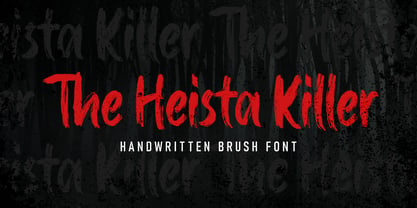 The Heista Killer – Handwritten Brush font with a clear style and dramatic movement this font is great for your next creative project such as logos, printed quotes, invitations, cards, product packaging, headers, Logotype, Letterhead, Poster, Apparel Design, Label, and etc.
 - Super Monogram by MonogramBros,
$10.00 Super Monogram is a perfect shaped monogram font consisting of 26 letters. With just a single font file you will be able to create beautiful monograms in just a matter of minutes after the purchase! Numbers and special characters not included.
 - Baksoda by Wacaksara co,
$15.00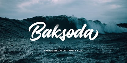 Baksoda is a handlettering script font with a clear style and dramatic movement this font is great for your next creative project such as logos, printed quotes, invitations, cards, product packaging, headers, Logotype, Letterhead, Poster, Apparel Design, Label, and etc.
 - Kids Chalk by Sakha Design,
$10.00 Kids Chalk is a cute and friendly handwritten display font. Take your kid-friendly designs to the next level with this captivating font! Use it to create unique t-shirt designs, baby onesies, nursery decorations, digital designs, cards, and many more.
 - Stavol by DonyaDesign,
$19.00 Stavol is a rough brush script font with a clear style and dramatic movement. This font is great for your next creative project such as logos, printed quotes, invitations, cards, product packaging, headers, Logotype, Letterhead, Poster, Apparel Design, Label, and etc.
 - The Blackheads by Almarkha Type,
$35.00 The Blackheads - Authentic Bold Script font with a clear style and dramatic movement this font is great for your next creative project such as logos, printed quotes, invitations, cards, product packaging, headers, Logotype, Letterhead, Poster, Apparel Design, Label, and etc.
 - Notice2Std - 100% free

- Librum by Hackberry Font Foundry,
$24.95 This is the serif text family for the book design group of font families which David designed in the process of writing "Practical Font Design With FontLab 5". The letterspacing is set wide for body copy use. The main purpose is readability and reading comfort. There are several whimsical graphics, plenty of OpenType features: oldstyle figures [tabular and not], small cap figures, lining figures [tabular and not], discretionary ligatures, small caps, and so on. The feature set is limited for the italic and bold versions. It produces an exceptional book. See Librum Book Design Group for a package containing all fifteen fonts,
 - Sombre by VP Creative Shop,
$30.00 Introducing Sombre - stretched negative space font Sombre is super easy to use and advanced skills are not needed Sombre is stretched, innovative font loaded with ligatures and multilingual support. It's a very versatile font that works great in large and small sizes. Sombre is perfect for branding projects, home-ware designs, product packaging, magazine headers - or simply as a stylish text overlay to any background image. Uppercase, numeral, punctuation & Symbol Innovative Alternates Ligatures Multilingual support Feel free to contact me if you have any questions! Mock ups and backgrounds used are not included. Thank you! Enjoy!
 - Dear Penpal Script by Giaimefontz,
$6.00 This is a fully connected script font, not calligraphic, but entirely designed to follow handwritten cursive ligatures rules as teached in schools. In order to correctly visualize it, you have to enable OpenType features (Contextual Alternates, Discretionary Ligatures, Standard Ligatues and Kerning). Trying to write All Capitals will generate Block Letters writings, since cursive style doesn't allow more than the first uppercase per word, however this font is not meant to be a Block Letters font. Using specific type combinations will generate special glyphs. All of these features are intended to reproduce a classic schoolboy or schoolgirl notebook.
 - KillSwitch by Comicraft,
$19.00 Not all our font releases come with an emergency full stop triggered by a BIG RED BUTTON. And not all font releases come with a Caution: NEVER TOUCH THAT SWITCH! Even if you really want to. You're going to touch it, aren't you? Be advised: even an untrained user with impaired executive function can operate KILLSWITCH, so we've hidden the BIG RED BUTTON where it can NEVER BE FOUND. This Comicraft mechanism may cause injury or death; please study all literature regarding the safe handling of Comicraft fonts posted in your workplace or adjacent cyberspace. KillSwitch
 - FacetsNF - 100% free

- JunebugStompNF - 100% free

- UppenArmsNF - 100% free

- Zhang QA - Unknown license


