10,000 search results
(0.343 seconds)
- Stovepipe Stencil JNL by Jeff Levine,
$29.00 Stovepipe Stencil JNL was not directly designed from a vintage source, but it does draw its influences from classic sans serif lettering of the past. Even its name borrows (somewhat gratuitously) from the "stovepipe" lettering so popular with sign painters. True stovepipe letters tend to be squarer with rounded corners, but the name has also been loosely associated with some tall, condensed type styles. The typeface is available in both regular and oblique versions.
 - Misky by Graphicxell,
$19.00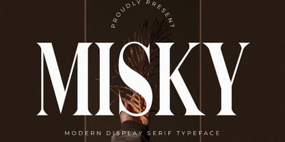 is a unique and very elegant font for branding and logo designs Elegant serif typeface combined with a classy and modern style. This type of font is very suitable for your various needs such as branding projects, logos, wedding designs, social media posts, advertisements, product packaging, product designs, labels, photography, watermarks, invitations, stationery, and any project, created with high level of readability. you will not be disappointed if you buy this font!!
 - Mahendra by BBA Key,
$12.00 Mahendra Script is a new fresh and modern font in handmade calligraphy, with decorative characters and dancing lineage! So wonderful on invitations, greeting cards, branding material, business cards, quotes, posters, and more. If you do not have programs that support OpenType features like Adobe Illustrator and CorelDraw X Versions, you can access all alternates using Font Book (Mac) or Character Map (Windows). If you have any questions, please feel free to contact me via email.
 - ZenoPotion AOE by Astigmatic,
$19.95ZenoPotion is a geometric styled typeface influenced by alien stories and nostalgia. It carries a techno look with a regular lined top and dipped thick bottom throughout, highly readble, though not best for large bodies of text. Use the alien technology, let ZenoPotion be the type for your designs and stories. From the far reaches of space, another lifeform sent a message, now you can use their typestyle to convey your own! - Vekta Sans by Positype,
$22.00 The Vekta Type System is part of a larger, interconnected grouping of 3 families: Neo, Sans and Serif. The goal was to develop a family designed along a common skeleton and matrix that would allow for interchangeable usage along a cohesive visual system. It's About The Personality. Interchange type families to be as expressive as you want to be. Let the piece you are designing constrain your usage and not the typeface.
 - The PUNCHER by PAC Font Corner,
$120.00 ThePuncher typeface is made exactly for the book, poster, flyer or any type of titles, and for customers who wants to have bold and eye-catching final product. It can be used as a single letter for a logo or for numbering of anything you want. It is not made for long sentences. ThePuncher typeface purpose is to make big bang from your short and specific messages you want to share with the world.
 - Typograph Pro by Aleksandar Aleksandrov,
$19.00 Note: The 'Pro' in the name of this font should not be interpreted as having OpenType features. It has none. What was the inspiration for designing the font? Inspired from the basic shapes like circle, cube and triangle. Closer to basics means more useful in various projects. What are its main characteristics and features? Clean graphic shapes. Usage recommendations: Graphic design, Motion design, 3D, Posters, Magazine covers, Outdoor. See Typograph Pro in action:http://www.amateurmedia.net/typographpro/
 - Vincenzo by CastleType,
$29.00 Vincenzo is based on a beautiful condensed typeface from the 1920s or earlier; original designer unknown. This is a "Modern" style with fine slab serifs, vertical stress between thick and thins, and high contrast. What is unique about this design is that the triangular serifs (e.g., E, F, L, T, etc.) do not gradually taper as they join the rest of the letter, as would be the case in Bodoni and similar designs. Uppercase only.
 - DT Hand Draft by Dragon Tongue Foundry,
$9.00 Hand Draft is hand crafted to emulate both the early printer’s serif font and/or a hand-drawn version of an early Serif font, using either a felt or round nibbed pen. Carefully designed to recreate a sturdy Sans Serif font with just the right amount of artistic imperfection, in three styles: outlined, hatched, and solid. A little funky and slightly grungy, this hand-drawn font is intentionally not quite perfectly rendered.
 - Nouveau Semi Stencil JNL by Jeff Levine,
$29.00 The cover on the sheet music for the 1922 song "If She Comes from Dixie" had the title hand-lettered in an Art Nouveau style with a semi-stencil effect. It's now available as Nouveau Semi Stencil JNL in both regular and oblique versions. The typeface is not considered a "pure" stencil because many of the letters were made solid; lacking the classic stencil "breaks" at key points found in more traditional stencil designs.
 - Castanea by Hanoded,
$20.00 The chestnut ("castanea") is one of my favorite trees. I used to collect the chestnuts and made chestnut-figurines out of them, using bamboo sate skewers. Castanea font is a calligraphic typeface with an uneven baseline and some messy characters - not unlike the tree. It is a highly legible, highly enjoyable font and could be used for children's books and postcards. Castanea comes with various alternate glyphs and speaks most Roman-based languages!
 - Heavitas Neue by Graphite,
$20.00 Heavitas Neue is versatile and flexible all caps font family, with most of the upper case characters different from the lower case ones. By using either only upper case, or only lower case, or a mixed combination of upper and lower characters, a totally different look of the font can be achieved. Heavitas Neue has a strong and distinct character, suitable for, but not limited to, logotypes, headlines, branding, books, signage, motion graphics and packaging.
 - Operapolitan by E-phemera,
$20.00 Operapolitan is inspired by a hand-lettered list of board members to a major metropolitan opera company in the 1920s. The font features special ligatures and a complete alternative glyph set meant for use with OpenType contextual alternates to help create the feel of real hand lettering, along with a complete international character set and built-in small capitals. Elegant but not stuffy, the font has rough edges to capture a vintage, slightly-used vibe.
 - Secca Art Std by astype,
$36.00 Secca Art recovers some of the expressive forms of early art nouveau and art deco grotesques — not copying it, but carefully adapting it for today. Secca Art is based on the Secca typeface family and is full interchangeable. Both are equal in weights, widths and word spacing, so you can decide to give your layout a more expressive or serious look. If you need Italic styles just use the Italics from Secca .
 - Insigne Abstractions by insigne,
$21.99Insigne Abstractions is a break from working with letterforms and a chance to play with pure abstraction. These ornaments are purely nonrepresentational, and are not letterforms. The abstractions are organic, and some would describe them as magnifications of microorganisms in black and white. There are 72 different ornaments this package. Some potential uses for these ornaments include alien alphabets, navigation buttons for a website, decorative elements, inspiration for logos or background textures. - Brother Garage by Edignwn Type,
$18.00 Introducing Brother Garage, the ultimate vintage motorcycle-inspired font collection designed to bring the spirit of the garage to your designs. This combines the best of stencil serif and sans serif fonts. With three unique styles - regular, rough, and stamp - Brother Garage offers authenticity, allowing you to effortlessly bring your designs with the rustic and classic looks. But that's not all! Alongside the Brother Garage fonts, you'll receive a fantastic bonus of 13 crafted illustrations.
 - Asian Imports JNL by Jeff Levine,
$29.00 Sheet music for the 1939 Hoagy Carmichael composition "Hong Kong Blues" features the Far East-influenced hand lettered title that was the basis for Asian Imports JNL; available in both regular and oblique versions. Carmichael performed the song in the 1944 Warner Brothers film "To Have and Have Not", (which first paired Humphrey Bogart and Lauren Bacall). The sheet music was a reissue to capitalize on the song's use in the film.
 - Now Appearing JNL by Jeff Levine,
$29.00Now Appearing JNL is a digital version of some hand-lettering spotted on an early 1960s ad for a Miami Beach night club. Its fun, casual appearance makes it perfectly suitable for any project that conveys a relaxed atmosphere. The font was intentionally not kerned, so the free-flowing form of the lettering is at its best, but it can be set tight by hand if a more compact look is desired. - SF Solo by Sultan Fonts,
$19.99 Solo is a renovation of an Arabic font designed by Sultan Maqtari in 2012 Solo is distinguished by its single and unconnected letters, as is the case with other Arabic fonts. Its letters are contemporary and do not dispense with the features of Arabic letters that are clear, legible and simple. But it gives user different creative possibilities, This font can be used in all artistic and creative projects in print and screen.
 - Branch by Peliken,
$15.00 Branch font with Cyrillic support is perfect for branding, Slavic motives, Russian menu design and many more Font includes a full set of gorgeous uppercase and lowercase letters, numbers, a large selection of punctuation. You can use this font for design logos, quotes prints on t-shirts and other. Ethnic serif font. Authentic slavic stylized alphabet bold symbols. Creative minimal latin character set. Please NOTE - Mock ups and photo are NOT included.
 - Resistance Is Lowered by Comicraft,
$19.00 Lower your shields and surrender your ships. You will talk to your central world authority in upper AND lower case, and order global surrender. Your culture will adapt to serve us in sentence case. You will not shout in UPPER CASE as before. You will be upgraded. You will become like us. Upgrading RESISTANCE IS FUTILE to RESISTANCE IS LOWERED is compulsory. There is no escape. Artwork from Monster Truck by Shaky Kane
 - Materhorn NF by Nick's Fonts,
$10.00This is a new and improved version of an old freeware font named Materhorn, hased on a design originally called Fanfare, designed by Louis Oppenheim in 1927 for H Berthold AG. The outlines have been completely redrawn, the entire font has been thoughtfully hand-kerned, and OpenType features have been added. Additionally, the font contains not only the complete Latin language character set (Unicode 1252) plus also support for Central European (Unicode 1250) languages - JollyGood Sans by Letradora,
$18.00 Finally, a serious alternative to that other comic font. After years of mocking the font that shall not be named, I decided to create an alternative. I wanted to keep the fun feel and the comic book roots, but have a more polished look. The result? JollyGood, a complete font family, with great language support, a big range of weights and styles, and a friendly look. Check out the other members of the JollyGood family
 - Coreta by Wasabib Type Foundry,
$13.00 Coreta is an elegant serif font that combines classic charm with modern flexibility. With its smooth curves, this font creates stunning visual harmony. Perfect for a variety of projects, from wedding invitations to corporate designs. Thoughtful letter proportions ensure optimal readability at any size. Coreta is not just a font, it's an impressive statement of art. With its unique capabilities, it elevates the appeal of every design with a versatile touch of elegance.
 - FourJuly by Ingrimayne Type,
$7.95 FourJuly contains three patriotic fonts that might be fun to use in July. They are also very hard to read, but perhaps not as hard as the somewhat similar letters in the fonts of FlagDay. FourJuly A has square, blocky letters with star interiors. FourJuly G and FourJuly H add diagonal stripes. FourJuly G and FourJuly H can be layered on top of FourJuly A to create bicolored letters. See the example here.
 - Masky by Graphicxell,
$19.00 Masky is a unique and very elegant font for branding and logo designs Elegant serif typeface combined with a classy and modern style. This type of font is very suitable for your various needs such as branding projects, logos, wedding designs, social media posts, advertisements, product packaging, product designs, labels, photography, watermarks, invitations, stationery, and any project, created with high level of readability. you will not be disappointed if you buy this font!!
 - 21 Cent by Letterhead Studio-YG,
$45.00 21 Cent - not Century or Clarendon. This is an original font family designed from scratch. 21 Cent is named after a magical coin that brings good luck. And well, in honor of the 21st century, of course. 21 cent family is used in the almanac of the State Hermitage Museum, St. Petersburg, Russia. All members of 21 Cent family include the expanded character set of with support of Cyrillics, Central European and Baltic languages.
 - Los Muertos by Just My Type,
$25.00 Happy Halloween (and All Souls Day and Day of the Dead)! I’ve seen other fonts made up of bones of various kinds, but none with this variety. Henry Gray’s Anatomy of the Human Body (the book, not Grey’s Anatomy, the TV series) was heavily scoured to find more unusual bones shaped like letters. You’ll find Los Muertos both fun and appropriate for the up-coming holidays. (Uppercase is Solid, lowercase is Outline).
 - Ornata B by Wiescher Design,
$39.50 Ornata B is the second of a series of old ornaments that I am trying to save from oblivion. I am not just scanning these, I am completely redesigning the ornaments from scratch, thereby eliminating imperfections. These ornaments have been first designed by the Elzevier printer family from the Netherlands. The designs date back til the 17th century and I think they just had to be saved. Your digitizing type-designing savior, Gert Wiescher
 - Zold by EMME grafica,
$9.90 Zold is the first font designed by EMME Grafica. It's a simple, statuesque, architectural, eye-catcher, tough yet elegant font, particularly suitable for titling, subtitling, branding and typographic amusements. The solemnity of Zold does not affect the the elegance of the curves of the font, but gives it the right visibility and temper, like that of Zold, the surly character who will be the antagonist of a multimedia project currently under development at EMME Grafica.
 - Infectious Halloween by Ardyanatypes,
$20.00 Infectious is a Halloween themed font with unique shapes that invite curiosity. Each letter is inspired by ancient magical symbols, with sharp strokes and curved lines that create a mysterious atmosphere. The font is not only visually appealing, but also interactive thanks to its advanced OpenType feature. Users can combine letters, slashes, and ligatures to create creative and unexpected looks. Features: A – Z Character Set a – z Characters set Numerals & Punctuations OpenType Multilingual
 - Patrol Car Stencil JNL by Jeff Levine,
$29.00 Comic books based on popular characters have been around pretty much since the advent of comic books themselves. An edition of the "Car 54 Where Are You?" series published by Dell (and based on the hit TV show created by Nat Hiken) displayed "Car 54" in a bold hand lettered stencil design on the cover. These few characters became the inspiration for Patrol Car Stencil JNL, which is available in both regular and oblique versions.
 - Pixel Promise by PizzaDude.dk,
$18.00 Pixel Promise is my wannabe pixel font. Yes, it is not a pixel font…but it is handmade and the “pixels” are deliberately off here and there. Nevertheless, when typing with Pixel Promise, you get that retro gaming feeling, and before you know it, you feel like you just want to insert another coin, press 1 or 2 players and complete that level! :) I have added 5 different versions of each letter and multilingual support
 - FF Info Pict by FontFont,
$62.99 Erik Spiekermann, working in collaboration with Ole Schäfer, originally designed FF Info® Display for use in the context of wayfinding systems. The variants FF Info™ Text and FF Info™ Correspondence were developed later for text setting and office communication. FF Info Display The sober and clear forms of the sans serif FF Info Display have been deliberately molded to make them perfect for use on wayfinding systems. The font by Ole Schäfer and Erik Spiekermann not only takes the problem of lack of space into account - it is some 15% narrower than comparable typefaces - the characters have also been designed to ensure they remain legible even in adverse conditions for reading. As text on signs often contains words with which readers are unfamiliar and which are thus deciphered letter for letter rather than perceived as whole words, it is essential to provide for a clear differentiation between glyphs. Additional serifs on the lowercase "i" and uppercase "I" and a small arch on the terminal of the lowercase "l" ensure that it is possible to readily discriminate between these particularly problematic letters. Moreover, sharp corners on glyphs can also make it difficult to read signs with backlighting or when driving past. The rounded corners of FF Info Display counteract this effect and make sure that the character forms remain well defined.FF Info Display is available in five carefully coordinated weights, from Regular to Bold. In the corresponding italic variants, the letters appear overall more rounded while the lowercase "a" has a closed form and the "f" has a descender. Also included among the glyphs of FF Info Display are several ligatures and arrow symbols. Pictograms with different themes that complement the typeface are also available in four weights. FF Info Text Thanks to his know-how gained through designing other typefaces, Erik Spiekermann became aware that fonts created for use in problematic environments can be used in many different situations. In smaller point sizes, FF Info Display cuts a fine figure when used to set longer texts. So Spiekermann carefully reworked FF Info Display to produce FF Info Text, a font perfected for use in this context. Not only can the characters be more generously proportioned, certain features, such as additional serifs to aid with the differentiation of problematic letters, are also no longer necessary in textual surroundings. The upright styles have a double-story "g" while Spiekermann has added oldstyle figures and small caps. FF Info Correspondence FF Info Correspondence has also been designed for setting block text although it recalls the style of old typewriter characters and is specifically intended for use in office communication. The characters of this third member of the family are thus more formal, without rounded terminals but with rectangular punctuation marks. The narrower letters are provided with large serifs to give them more space although, at the same time, this reduces the differences in terms of letter width among the alphabet. In contrast with its two siblings, FF Info Correspondence has only three weights, each with corresponding italic.The three styles of the FF Info super family cover an extensive range of potential applications. If the different kerning is adjusted manually, the three styles harmonize happily with each other and can be readily used in combination to set, for example, headlines and texts and also creative display options.
 - The font named "Broken Toys" designed by PizzaDude is an intriguing typeface that embodies a playful yet edgy aesthetic, ideal for projects that require a touch of whimsy and rebellion. As its name s...
- Xiomara - Personal use only

- Yacimiento - Personal use only

- Kastella Script by Mans Greback,
$79.00 Kastella Script is essentially an artist's dream tool. It feels as if you're not just typing but crafting a visual narrative, almost like putting the finishing touches on a piece of design art. It's not about the text; it's about the story it tells. The font is equipped with heavy letterforms and a range of stylistic swashes, providing a versatile toolset for modern design projects, from branding to editorial layouts. Use underscore _ to make an underline. Example: Bea_uty Use multiple underscore for different swashes. Example: Super____human Kastella Script is built with advanced OpenType functionality and has a guaranteed top-notch quality, containing stylistic and contextual alternates, ligatures, and more features; all to give you full control and customizability. It has extensive lingual support, covering all Latin-based languages, and includes all the characters and symbols you'll ever need. Behind this exquisite creation is Mans Greback. Known for pushing the boundaries of type design, Greback has ventured into the intricacies of aesthetic diversity with Kastella Script. His portfolio is a testament to his versatility and daring, turning simple alphabets into powerful visual narratives.
 - TessieSpinners by Ingrimayne Type,
$13.95 A tessellation is a shape that can be used to completely fill the plane—simple examples are isosceles triangles, squares, and hexagons. Tessellation patterns are eye-catching and visually appealing, which is the reason that they have long been popular in a variety of decorative situations, such as quilting. Most of the shapes in TessieSpinners suggest a spinning motion. Most do not resemble real world objects. The TessieSpinners fonts contain shapes that can be used to construct tessellation patterns. It has two styles, an outline style and a filled or black style. The black style can be used to construct colored patterns. To see how patterns can be constructed, see the “Samples” file here. Most or all of these shapes were discovered/created by the font designer during the past twenty years in the process of designing maze books, coloring books, and a book about tessellations.(Earlier tessellation fonts from IngrimayneType, the TessieDingies fonts, lack a black or filled version so cannot do colored patterns. Make sure the leading is the same as font size or the rows will not line up.)
 - Varietta by Sudtipos,
$39.00 Varietta is the result of my fascination with photographing the type designs of some marquees in Spanish markets. In them you can see many letter designs with reversed contrast and in different widths, probably based on the possibilities of photocomposition. At the same time I was working on the expansion of the Hastile typeface designed by Alessandro Butti for the Nebiolo foundry in Italy in the late 1930s, of which I had not seen any digitization. As I am not a fan of perfect revivals, I thought it could be interesting to connect Spain and Italy in a single typeface. The first step was to expand Butti's design to 27 styles, ranging from thin condensed to black expanded. To look for the Spanish connection and its characteristic inverse contrast I took advantage of the current technology that allows variable typefaces with many axes. From this, three scenarios of horizontal contrast were incorporated (top, bottom and mixed) which allows infinite possibilities of use. The final result is a collection of 108 static typefaces or a single variable file.

