5,971 search results
(0.03 seconds)
- Sancoale Slab by insigne,
$32.00 The contemporary feel of the Sancoale superfamily takes a bolder turn with this futuristic slab. Built from Sancoale's successfully simple geometry, Slab's serif elements and tall x-height give the face an energetic, yet clean figure that easily complements its cousins: Sancoale Softened--a sans with blunted terminals; Sancoale Narrow; and, of course, the original Sancoale itself. The weights of each member have been balanced carefully to ensure compatibility with the others, and when used together, the combination creates a powerful design that is easy to identify. With weights ranging from the classier Thin to the authoritative Black, Slab opens the door to a range of applications. Used in different text sizes, its tech image is legible and neutral enough for longer bodies of copy--both in print and on the web. Have a more prominent need? The web font also stands out well in a headline or even as a display face. Slabís great personality puts a strong foot forward without giving its reader a kick in the teeth. Whatever the task, this font's one to capture the Zeitgeist into your work. All Insigne fonts are fully loaded with OpenType features. Sancoale Slab is also equipped for complex professional typography, including alternates with stems, small caps and plenty of alts, including "normalized" capitals and lowercase letters. The face includes a number of numeral sets, including fractions, old-style and lining figures with superiors and inferiors. OpenType-capable applications such as Quark or the Adobe suite can take full advantage of automatically replacing ligatures and alternates. You can find these features demonstrated in the .pdf brochure. Included are small caps, fractions, old-style and lining numbers, scientific superior/inferior figures, complete ordinal and inferior alphabet, and a set of symbols and arrows. The Sancoale family also includes the glyphs to support a wide range of languages, including Central, Eastern and Western European languages. In all, Sancoale Slab supports over 40 languages that use the extended Latin script, making the new addition a great choice for multi-lingual publications and packaging.
 - Barbou by Besnowed,
$19.99 Barbou was originally cut in 1925 by Monotype as a counterpart to Fournier, siblings that were different in design but both based on the work of Pierre-Simon Fournier. Whether by choice, accident or oversight, Fournier was preserved digitally, and Barbou was lost to history. Barbou was notably used by Stanley Morrison, in particular as the face of The Fleuron. I fell in love with Barbou when I saw it, and knew that I wanted to bring it to a new generation of designers and readers. This is a revival of Barbou, a faithful recutting with new weights, characters and many of the best features that modern font technology brings. Particular attention was paid to the original Monotype Barbou 178 specimen sheet. Originally only available in a single weight, Barbou has been recut with a variable weight, providing a large degree of flexibility between Regular and Bold. Barbou excels as a comfortable reading face for books, and the variable weight allows you to fine tune the darkness and texture of the page in a way never before possible. Barbou has a distinctive softness, and this revival of Barbou preserves much of the effect the medium of metal type had on the letterforms. This results in a subtly rounded yet defined type, elegant not worn, with the utmost attention and respect to the smallest of details. Barbou was originally cut with disparate x-heights for roman and italic, and this revival of Barbou features both the original italic, as well as a new italic redesigned at the same height as the roman. In Fournier’s time, roman and italic would not be mixed on the same line, but the type must change to meet the needs of a new generation. Barbou also features unique ligatures and alternates, old style numbers, small caps and a full Greek alphabet. Barbou is perfect for books and anywhere a comfortable reading face is required, and excels in flexibility.
 - ATF Franklin Gothic by ATF Collection,
$59.00 ATF Franklin Gothic® A new take on an old favorite Franklin Gothic has been the quintessential American sans for more than a century. Designed by Morris Fuller Benton and released in 1905 by American Type Founders, Franklin Gothic quickly stood out in the crowded field of sans-serif types, gaining an enduring popularity. Benton’s original design was a display face in a single weight. It had a bold, direct solidity, yet conveyed plenty of character. A modern typeface in the tradition of 19th-century grotesques, Franklin Gothic was drawn with a distinctive contrast in stroke weight, giving it a unique personality among the more mono-linear appearance of later geometric and neo-grotesque sans-serif types. Franklin Gothic has been interpreted into a series of weights before, most notably with ITC Franklin Gothic. But as the original type was just a bold display face (later accompanied by a few similarly bold widths and italics), how Benton’s design is expanded to multiple weights and styles as a digital type family can vary significantly. Benton designed several gothic faces that harmonize with one another, including Franklin Gothic, News Gothic, and Monotone Gothic, that can serve as models for new interpretations of his work. With ATF Franklin Gothic, Mark van Bronkhorst looked to Benton’s Monotone Gothic—originally a single typeface in a regular weight, and similar to Franklin Gothic in its forms—as the basis for lighter styles. ATF Franklin Gothic may appear familiar given its heritage, but is a new design offering a fresh take on Benton’s work. The text weights are wider and more open than some previous Franklin Gothic interpretations, and as a result are quite legible as text, at very small sizes, and on screen. ATF Franklin Gothic maintains the warmth and the spirit of a Benton classic while offering a suite of fonts tuned precisely for contemporary appeal and utility. The 18-font family offers nine weights with true italics, a Latin-extended character set, and a suite of OpenType features. Download the PDF specimen for ATF Franklin Gothic.
 - Tinderbox by Device,
$29.00 16th and 17th century formal handwriting forms the basis for Tinderbox, an antique script. Preserving the rough impression of a quill pen on parchment, Tinderbox evokes old manuscripts, ecclesiastical texts, gothic inscriptions, faded tattoos and horror literature; spooky calligraphy for the digital age.
 - HK Requisite by Hanken Design Co.,
$- HK Requisite™ is a sans serif typeface inspired by the compactness of Neue Haas Grotesk and the strong character of Akzidenz Grotesk. The name came from the fact that fonts are elements that are necessary for the achievement of a specified end.
 - Stainless by Gassstype,
$27.00 Here comes a New Font,Introducing Stainless is a Race Theme Display Font.This Handmade Display Font with a stylish touch inspired by the famous minimalist logo . Stainless has is perfect for the purposes of designing templates, brochures, videos, advertising branding, logos and more.
 - Kunstler Grotesk by HiH,
$12.00 Künstler Grotesk ML is one of a number of typeface designs that attempts to reconcile Germany’s blackletter tradition with the international familiarity of roman letterforms in a simple, robust design suitable for meeting the demands of a modern industrial economy, while rejecting the extraneous ornamentation of the departing Victorian era. It is an all-cap design with a number of playful ligatures. It has an appealing boldness that reverses well. Künstler means ‘artist’ in German. I had always assumed it was a person’s name until I came across the translation. Lesson: conjecture is not fact. Grotesk refers to a sans serif letterform tradition. Kunstler Grotesk was originally released by Bauer'sche Giesserei of Frankfurt am Main circa 1900. Künstler Grotesk ML represents a major extension of the original release, with the following changes: 1. Added glyphs for the 1250 Central Europe, the 1252 Turkish and the 1257 Baltic Code Pages. Added glyphs to complete standard 1252 Western Europe Code Page. Special glyphs relocated and assigned Unicode codepoints, some in Private Use area. Total of 350 glyphs, 260 kerning pairs. 2. Added OpenType GSUB layout features: pnum, salt, dlig (19) and hist. 3. Revised vertical metrics for improved cross-platform line spacing. 4. Redesigned mathematical operators. 5. Included tabular (std) & proportional (opt) numbers. 6. Refined various glyph outlines. 7. Made CcNnOoSsZz-kreska available (salt). 8. Incorporated alternate glyphs in lower case.
 - Schotis Text by Huy!Fonts,
$35.00 Schotis Text is a workhorse typeface designed for perfect reading on running texts. Its design is based in Scotch Roman 19th-century style but designed from scratch, with a more contemporary and not nostalgic look. It has seven weights plus matching italics, with 1100 glyphs per font, with a very extended character set for Latin based languages as well as Vietnamese, and shows all its potential with OpenType-savvy applications. Every font includes small caps, ligatures, old-style, lining, proportional and tabular figures, superscript, subscript, numerators, denominators, and fractions. The Scotch Romans were one of the most used letters during the 19th and early 20th century, but they don’t have their own place in the main typographical classifications. They appeared at the beginning of the 19th century with Pica No. 2 in the catalog of William Miller (1813) and assumed the British route towards high contrast and vertical axis modern Romans. In fact, they were called just Modern. In opposition to the continental route of Fournier, Didot, and Bodoni, the English way opted for a wider, more legible letter also resistant to bad printing conditions. The name Schotis comes from the misspelling of Scottish that gave the name to a popular dance in Madrid in the 19th-century. It first was called Schotis and today is knows as Chotis.
 - Able by T-26,
$39.00The history of Able’s connection with the Harry Potter phenomenon is really up in the air. It’s a catch-22 in this business - you either promote your own work and negotiate expensive exclusive licenses, or you work with a promoter and sell your designs to anyone and everyone. It could have been an in-house designer at Rowling’s publisher, Scholastic, or a freelancer who proposed Able for the headings and such. The responsible party licensed it from T26, and JK Rowling’s storytelling made it a star. (I suppose it’s ironic that there’s a whole lot of unwritten history in the typography business.) Able’s rise to fame really is a classic love story between reading and type design. If the books weren’t so popular, Able might still be waiting for some Mexican fast food chain to pick it up for packaging design. The movie deal certainly made the font all the more recognizable, what with its merchandising campaign. Popularity can also cripple a great decorative face. It’s always being recognized as “The Harry Potter Font.” It might just have to wait a few decades for the Potter phenomenon to subside to be freed from the “Chamber of Pigeonholed Fonts.” In the meantime, I’m sure that a lot of fledgling graphic design apprentices are reading their new Potter books, being charmed by the idea of type design when they’re not turning the pages too fast to notice. - Lincoln Electric by Canada Type,
$30.00 Lincoln Electric started its life as an in-house experimental film type Thomas Lincoln drew shortly after concluding his work as part of Herb Lubalin’s famed crew in the late 1960s,. The master alphabet was drawn on illustration boards using pen and ink and press-type lines. The typeface was initially made for use in the branding and promotional material of Lincoln’s new design outfit. This alphabet’s forms are a spin on Bifur, the all-cap deco face designed by Adolphe Mouron (known as Cassandre) in 1929, and published by the Deberny & Peignot foundry in France. Lincoln Electric evolves Cassandre’s idea further by constructing new shapes more in line with minimalist principles rather than art deco geometry — something clearly evident in Lincoln’s minuscules, which exhibit a clear connection to Bauhaus ideas More than 50 years after the typeface’s design, Thomas Lincoln found the original film alphabet tucked away in his archives and brought it over to Canada Type for digital retooling. The result is a modern and thoroughly elaborate set of fonts that belonging prominently in a 21st century designer’s toolbox. The following features are included in Lincoln Electric: • Three fonts for chromatic layering. • More than 1900 glyphs in each font. • Expanded Latin and Cyrillic character sets. • Small caps and Caps-to-small-caps. • Six different sets of stylistic alternates. • Ordinals and case-sensitive forms. For a showing of the stylistic set variations and a sample of demonstration of chromatic layering, please consult this PDF.
 - Serena by Canada Type,
$24.95The story of Serena is a unique one among revivals. Serena was neither a metal face nor a film one. In fact it never went anywhere beyond Stefan Schlesinger’s 1940-41 initial sketches (which he called Saranna). A year later, while working with Dick Dooijes on the Rondo typeface, Schlesinger was sent to a concentration camp where he died, along with any material prospects for the gorgeous letters he'd drawn. The only sketches left of Schlesinger’s Saranna work are found in the archives of the Drukkerij Trio (the owner of which was Schlesinger’s brother-in-law). The sketches were done in pencil and ink over pencil on four sheets of paper. And now Hans van Maanen revives Schlesinger’s spirit as closely as the drawings permit, and elaborately expands the work to cover a multitude of codepages and languages. It took more than 65 years for Schlesinger’s drawings to see the light, so van Maanen made sure to bring them to life stylishly and respectfully. Serena embodies the peace and calm rarely ever found in mainstream calligraphy or other genres of display type. With upright elegance and a slight Eastern touch, this typeface expertly bridges the gracefully casual with the deeply spiritual. The light and soft letter forms add a pleasant, breezy element to anything they touch. When used sparingly in titling or display, Serena is like a sigh of desire, rare but quite memorable and very appreciated. - Gimbal Egyptian by AVP,
$19.00 Gimbal Egyptian is a richly-featured font family providing many style options across a broad range of languages. It is twinned with Gimbal Grotesque, a sans-serif family with an identical range of weights and features. Originally conceived as a small webfont family, the letterforms have been revitalised to put a spring in their step and the family has been extended to create a versatile multi-script text face equally at home on the printed page. Carefully crafted at all weights, Gimbal also lends itself to headlines and display applications such as posters, exhibitions and signage while resolving well on-screen for general document creation and web-based applications. The letters are spaced for best readability on-screen and in the usual printed body text ranges but are tolerant of tracking adjustment to suit other uses. The styles are divided by width into four families (Compressed, Condensed, Normal, Extended), each family possessing six weights plus corresponding italics. Within each family, the 'regular' and 'bold' weights are style-linked, and all upright forms have an italic counterpart. The full opentype character set includes latin, greek and cyrillic scripts with appropriate local variants (also as stylistic sets) for Turkish, Polish and Romanian (latin) and Russian, Bulgarian and Serbian (cyrillic). All fonts contain small capitals for all scripts, superscript for latin and commonly used greek together with the usual numeral style, size and positioning options. The default numerals are 'proportional lining'. Other opentype features include case-sensitive marks, fractions, and some discretionary ligatures. A set of circled numerals and circled latin capitals is included, along with an unusual feature that composes 2-character country codes.
 - Gimbal Grotesque by AVP,
$19.00 Gimbal Grotesque is a richly-featured font family providing many style options across a broad range of languages. It is twinned with Gimbal Egyptian, a slab-serif family with an identical range of weights and features. Originally conceived as a small webfont family, the letterforms have been revitalised to put a spring in their step and the family has been extended to create a versatile multi-script text face equally at home on the printed page. Carefully crafted at all weights, Gimbal also lends itself to headlines and display applications such as posters, exhibitions and signage while resolving well on-screen for general document creation and web-based applications. The letters are spaced for best readability on-screen and in the usual printed body text ranges but are tolerant of tracking adjustment to suit other uses. The styles are divided by width into four families (Compressed, Condensed, Normal, Extended), each family possessing six weights plus corresponding italics. Within each family, the 'regular' and 'bold' weights are style-linked, and all upright forms have an italic counterpart. The full opentype character set includes latin, greek and cyrillic scripts with appropriate local variants (also as stylistic sets) for Turkish, Polish and Romanian (latin) and Russian, Bulgarian and Serbian (cyrillic). All fonts contain small capitals for all scripts, superscript for latin and commonly used greek together with the usual numeral style, size and positioning options. The default numerals are 'proportional lining'. Other opentype features include case-sensitive marks, fractions, and some discretionary ligatures. A set of circled numerals and circled latin capitals is included, along with an unusual feature that composes 2-character country codes.
 - Martian Grotesk by Martian Fonts,
$35.00 Martian Grotesk is a large typeface family originally designed for the screen which consists of a variable font with 2 axes of variation and 63 styles: Condensed to Ultra Wide, Thin to Ultra Black. Aesthetics The font style is characterized by some brutality and assertiveness. Overhanging terminals, a closed aperture, and an almost complete lack of contrast lead to this effect. Additionally, some elements of the letters are especially enlarged. This font gives any text the impression of being a “signature” style. Nevertheless, we still maintain the golden mean between its rebellious nature and readability. Perfect for web development We created Martian Grotesk for the web and digital project world. When laying out web pages, frontend developers are constantly faced with the fact that uneven metrics do not allow text to be evenly placed on some design element, for example, on a button. Instead, they have to compensate in some way, like making the top padding smaller and the bottom padding larger in CSS. This little deal really hurts. Also, if your project adheres to design system principles, you might be unable to stand a lack of systematic approach when working with fonts. We researched and calculated vertical metrics and set them up in a way that guarantees equal space above the cap height and under the baseline. This enables the text labels to be evenly placed on buttons, inputs, lists, and forms. In addition, we found a proper ratio of the letter heights, so, with commonly used font sizes—10, 15, and 20 pixels—the glyph heights stick to the pixel grid. As a result, the letter shapes become sharper, which reduces the load on the reader's eyes and simply looks much better. The typeface also comes equipped with OpenType and TrueType hinting, and Martian Grotesk appears legible on most platforms, even when being rendered in small sizes. When coupled together, all the above features make Martian Grotesk a reasonable choice for any user interface design. Roadmap Martian Grotesk right now is a work-in-progress product. The font is completely ready for professional use, however, many great features are still ahead! For example, support for Extended Cyrillic characters, and italics. Pricing Purchasing an early version of the font presents the opportunity to get it at a very attractive price! That’s because with every new version, costs will go up to reflect the additional value that comes with every release. But after purchasing Martian Grotesk, all its future updates are included for free!
 - Alyrak by Konstantine Studio,
$16.00 ALYRAK is born from the anxiety of the future dystopia of the human race. The fear of Artificial Intelligence, robots, and technology that potentially invade living things. Represented in a font and visual to emulate the vibe every time you type it from your keyboard.
 - Horror Metal by Letterara,
$14.00 Horror Metal is a brush font with a bold weight font that’s perfect for any horror or metal designs! As its name suggests, Horror Metal is not a font for the faint-hearted. In fact, using this metal-style display font requires courage and bravery.
 - Digby by Atlantic Fonts,
$26.00 Digby is friendly, honest and active. Digby family includes twelve hand-drawn fonts. They work well together, in fact Digby Line Thin fits nicely over Digby Regular. All have a generous set of double letter ligatures and are designed to work great as all-caps.
 - Donaldina by Solotype,
$19.95This came from an early-1900s lettering book. Never was an actual font, but it has a quaint look that should be useful. We hate to see alphabets just fade away, which is why we make fonts like this. We added a few touches. - Village by Font Bureau,
$40.00 David Berlow undertook the revival of Frederic W. Goudy’s Village family in the early ’90s as the first real step in the successful redesign of Esquire magazine. Goudy originally cut Village No. 2 in 1932 to bring early ideas up to date, adding the italic a year or two later for his own satisfaction. Font Bureau expanded Village, the model for Goudy’s mature style, into a ten-part series designed for Esquire’s use in text and display; FB 1994
 - FF Ropsen Script by FontFont,
$47.99 German type designer Jürgen Brinckmann created this script FontFont in 2001. The family contains 2 weights: Regular and Bold and is ideally suited for advertising and packaging, festive occasions, editorial and publishing as well as poster and billboards. FF Ropsen Script provides advanced typographical support with features such as ligatures, small capitals, alternate characters, and case-sensitive forms. It comes with a complete range of figure set options – oldstyle and lining figures, each in tabular and proportional widths.
 - Contender by Viaction Type.Co,
$17.00 Font Contender with a stamp effect gives a vintage feel and is suitable for adding a vintage feel to your design. There are 2 regular and oblique styles, complete with multilingual characters and stalistic alternatives. It is suitable for quotes, clothing designs, vintage logos, labels, posters, packaging designs and other designs. File Include (Font Family) : - Contender - Contender Slant Features : - Uppercase. - Lowercase. - Multilingual. - Punctuation & Symbol. - Stylistic Set. Thank you for buying. I hope you enjoy and thank you.
 - Astrone by Skinny Type,
$10.00 Astrone - Classic Retro Font, with very soft curves and lines making this font look beautiful and realistic. With 301 Characters, Astrone is perfect for all your design projects, such as invitation cards, product logos, food brands, logos and more. Astrone is also supported by Ligatures, Stylistic Set 1, Stylistic Set 2, Stylistic Set 3, Stylistic Set 4, Stylistic Set 6, Stylistic Alternate, and Swash which will help you get a beautiful style with your own creations.
 - Moret by The Northern Block,
$49.50 Moret is a serif display type family inspired by 20th century European sign painting. It blends several calligraphic concepts to create a unique, dynamic and emphatic typeface. Available in 5 weights and 2 styles (upright and oblique), Moret is well equipped to provide clear solutions for a variety of situations and settings such as editorials and headlines. With 466 glyphs per font, Moret supports 94 different languages. Opentype features include inferiors, superiors, fractions, tabular figures, and ligatures.
 - Dreambeach by Scratch Design,
$9.00 Introducing Dreambeach Signature! It's a modern script font with a signature style. very recommended for you who want to make some designs with natural and authentic signature designs. This font will work for invitation design, wedding design, poster, packaging, book cover title, quote, social media post, etc. Just open your Opentype features while using the script font to use the ligatures and stylistic alternate 1 & 2. As you type, your text will look like a natural signature or handwriting.
 - Kutaraja by BaronWNM,
$14.00 Kutaraja is a hand-drawn script font that gives a natural-looking impression that is perfect for those of you who want to use script-style fonts, very suitable for writing product labels, printing t-shirts, greeting cards, invitation cards, etc. Kutaraja family has 2 choice models, namely regular and italic. both have several ligatures, alternate, swash at the beginning and end of lowercase letters to give a sweet touch to the written word or sentence.
 - Aremic by Graptail,
$15.00 Aremic is a bold display font created to be used for bold headings coming in 2 shapes Regular and Rounded including Oblique. This font is inspired by the shape of the letters on sports posters. This type of font perfectly made to be applied especially in logo, headline, signage and the other various formal forms such as invitations, labels, logos, magazines, books, greeting / wedding cards, packaging, fashion, make up, stationery, novels, labels or any type of advertising purpose.
 - MC Haltto by Maulana Creative,
$17.00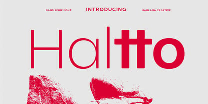 Haltto is a geometric based sans serif font. 2 weights stroke, fun character with a bit of ligatures and alternates. To give you an extra creative work. Haltto font support multilingual more than 100+ language. This font is good for logo design, Social media, Movie Titles, Books Titles, a short text even a long text letter and good for your secondary text font with script or serif. Make a stunning work with Haltto font. Cheers, Maulana Creative
 - Clintone by Jinan Studio,
$12.00 Hello World, Introducing, Clintone! a display font with 2 style (textured & solid) suitable for your design project needs, such as; logotype, branding, packaging, social media posts, quotes, overlays on images, tagline logos, posters, print needs, website banners, and more. Features A set of uppercase and lowercase glyphs Number, symbol, and punctuation Multilingual Support Alternates Thank you a million times for downloading and using this font for your projects. Enjoy this font and happy creating! Jinan Studio
 - Capital Ideas NF by Nick's Fonts,
$10.00A new series of eclectic decorative initials, Capital Ideas 1 NF features numbers and uppercase letters rendered in nixietube displays, along with a whimsical walk through the alphabet patterned after Milton Glaser's Hologram. Capital Ideas 2 NF features K. H. Schaefer's eponynmous Versalien for Schriftguss AG in 1927, and Walter Haettenschweiler's Breitfette Unziale from 1958, along with a fancy nine-element box border. Dressing up your next projects with these snappy caps is, indeed, a capital idea. - Ruling Script by Linotype,
$29.99Prof. G. Pott’s Ruling Script first appeared in 1992 with Linotype-Hell. The font is a part of the package Calligraphie for Print, which also contains Sho and Wiesbaden Swing. Calligraphie for Print 2 completes the set. These packages offer modern calligraphy fonts particularly well-suited to use in posters, magazines and advertisements. Ruling Script looks like the zestful handwriting of a calligrapher but its legibility even in longer sentences set it apart from others of its type. - FF Elementa Rough by FontFont,
$47.99 Lithuanian type designer Mindaugas Strockis created this display FontFont in 2002. The family contains 2 weights: Regular and Bold and is ideally suited for advertising and packaging, film and tv as well as software and gaming. FF Elementa Rough provides advanced typographical support with features such as alternate characters, case-sensitive forms, and stylistic alternates. It comes with tabular lining figures. This FontFont is a member of the FF Elementa super family, which also includes FF Elementa.
 - Boundary by Larin Type Co,
$15.00 Boundary This is a vintage display font inspired by signage, logos in the style of the old time. This is a great find for creating logos, various kinds of designs in vintage style. This font includes 2 font styles: regular and rough style, also it includes alternates for uppercase and lowercase. Try changing them and see how diverse it can be. Font includes: Full alphabet A-z Numbers, fractions Punctuation and symbols Alternates for Uppercase Alternates for Lowercase
 - Gelly by Abbasy Studio,
$15.00 Gelly Script is a modern calligraphy script . Inspired by the modern calligraphy lettering and watercolor brush. This fonts have 2 version Regular and Stipple also dancing baseline to ensure that is modern calligraphy lettering style. The basic principle of creation is striping of thick and thin lines. This fonts is also have alternative characters, contextual alternates, when meets the same letter. Those all will make you work easily to create : Posters, Logos, Print, Quotes, Headers, Clothing, etc.
 - Rossanova by Eko Bimantara,
$21.00 Rossanova is a complete semi-serif font family. Its consist of 36 fonts; 2 optical sizes, 8 weight from thin to black with each matching italics. Rossanova is enriched with beautiful personality, it's shaped in high contrast strokes for the normal optical style and moderate contrast strokes for the text styles which fit for reading. Contains more than 470 glyphs with some OpenType features e.g, stylistic alternates, ligature, discretionary ligature, old number, variation of figures etc.
 - Sometimes by Almarkha Type,
$30.00 Sometimes is a fancy signature font with 2 styles: regular and slant. It is inspired by luxury and branded items. It is perfect for logos, branding, photography, invitations, watermarks, advertisements, product designs, stationery, wedding designs, labels, product packaging, special events or anything that need hand-writting taste. Thanks for checking it out, and feel free to drop me a message if you had any queries! Oh, and come and say hello over at email : almarkhatype@gmail.com ~ Almarkha Type
 - Marxis by Juru Rancang Studio,
$15.00 Introducing a retro condensed font called "Marxis". Best font to use as a headline to bring back the propaganda era inspired by Soviet posters, movie titles and book covers. The letterforms are straight and condensed and come in 2 styles: uppercase and small caps with the ligatures. This font will suited well for titles, poster design, web design, branding and packaging works, illustrations, badges and other typography works. Thank you, I hope you like it as I do!
 - Riky by Eurotypo,
$28.00 Riky is a heavy sans typeface carefully hand-drawn made, with different letter shapes, full of ligatures, and stylistic alternates that will provide great flexibility for your designs. Ricky's typeface is lively, dynamic and energetic. This font has an informal and decorative style. Riky fonts come in 2 versions: Shadow and solid. These fonts are quite perfect for packaging design, posters, children books and many other purposes. Play with them, be creative with them and enjoy them.
 - Voguer Sans by NREY,
$19.00 Voguer Sans is an elegant high-contrast sans-serif font inspired by the fashion glossy magazines typography. It perfectly represents modern and vintage esthetics. The font have 2 weights: regular and bold and includes uppercase and smallcase letters, alternate characters and multilingual support. The font is perfect for wedding elegant invitation cards, beauty and fashion package design, glossy posters. It have supporting for many european languages and perfect cyrillic! Thank you and have a great day!
 - Triump Rough by Latinotype,
$20.00 The Triump Rough typeface comes with 2 different subfamilies: Blur, a soft, delicate font with a vintage and hipster feel that gives your design a breath of fresh air; and Rock, a strong, hard font in upper and lower case well-suited for high-impact headlines. This version provides a wide variety of OpenType features, such as ligatures, alternates and catchwords as well as a series of ornaments and extras, which help give your artwork a different look!
 - Kneehole by Ahmad Jamaludin,
$13.00 With two styles available for each type - Regular and Script, KNEEHOLE is your ideal choice for crafting logos, signboards, or elegant wordmarks. This font draws inspiration from the iconic typography trends of the late 60s and throughout the 70s, adding a touch of nostalgic flair to your creative projects. Features: Kneehole Main File Has 2 Families: Regular and Script Instructions (Access special characters, even in Cricut Design) Unique Letterforms Works on PC & Mac Enjoy Designing! Dharmas Studio