5,971 search results
(0.013 seconds)
- Quincey by AdultHumanMale,
$20.00 Quincey is a display font with the feel of old style signpainter’s works with a hint of hand drawn elements too. It has over 350 glyphs and several variations on the standard alphabet with all those €xtra pesk¥ foreign characters too. Some extra Glyphs in there too. It is available in 2 weights regular and medium.
 - Entuista by Azzam Ridhamalik,
$10.00 Introducing Entuista, a squary and chunky typeface with a touch of unique retro style. It has 2 style font, regular and oblique with extra Extruded Font version on each style. So you won't need extra effort for create an extrude effect for this fonts, that means it will save your precious time to make amazing stand out designs.
 - OL Hebrew Formal Script With Tagin by Dennis Ortiz-Lopez,
$30.00 This font contains every variant found in the Hebrew Bible such as the “mutilated” Waw in Numbers 25: verse 12, the small Heh in Genesis 2: verse 4 and the Nun Inversum before Numbers 10: verse 35 and after verse 36 and elsewhere as well as oversized consonants and various double-wide consonants used in inscriptions.
 - Gumok by Linecreative,
$14.00 Gumok - Ultra Condensend font and Minimalis Character, It's Perfect for logo, name card, magazin layout,headers, or oven large scale artwork What you get dear, you will get : 1. Gumok- A clean San serif font including Upper & Lowercase characters(ALL CAPS), 2. Stylistic alternates Character (9 Character) 3. Supports Multi linguage (Latin Western Europe), Numbers and Punctuation
 - Boucle2 by TipografiaRamis,
$39.00 Bouclé.2 – an upgraded edition of Bouclé fonts (2009), with careful refinements to glyph shapes and extension of glyph amounts, which enabled support of more Latin languages. New edition consists of eight styles: Light, Regular, Bold weights for plain and round fonts respectably, plus Regular and Light italics. Typeface is released in OpenType format with some OpenType features.
 - Grimnotes by Allouse Studio,
$16.00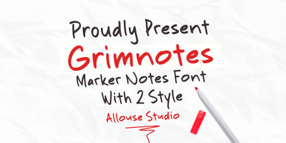 Proudly Presenting, Grimnotes a Marker Notes Font with 2 styles Grimnotes is perfect for any titles, logo, product packaging, branding project, megazine, social media, wedding, or just used to express words above the background. Grimnotes also come with Multi-Lingual Support. Enjoy the font, feel free to comment or feedback, send me PM or email. Thank You!
 - Radugo by Twinletter,
$10.00 Radugo is a san serif font family designed with light strokes that make up a vintage style with a rustic touch and a stamp with 2 fonts, as the ribs in your design work, and able to beautify and strengthen your work in the form of logotypes, typography, hand lettering, packaging, t-shirts, labels, and many more.
 - PR Swirlies 01 by PR Fonts,
$10.10 This font is a collection of simple calligraphic ornaments suitable for invitations, gift tags, and anything that can benifit from a “spoonful of sugar” visually. The "Sand Drift" version combines well with: PR Bramble Wood 1, PR Bramble Wood 2, PR Hallow Doodles 01, PR Hallow Doodles 02, PR Cauldron, PR Swirlies 01], PR Swirlies 05.
 - Resonant Chilliner by Lemonthe,
$9.00 Resonant Chilliner is a spectacular duo font (Serif and Script). Perfect for product packaging, branding project, magazine, social media, and much more. Add this font to your favorite creative ideas and notice how it makes them come alive! NOTE: Quick access beginning and ending swash with ligature, add (2-3)x underscore before or after lowercase a-z.
 - XLaserTrain by Ingrimayne Type,
$14.95 The first release of XLaserTrain, a toy train font, was constructed by taking bits from the four LetterTrain fonts. Version 2, released in late 2010, added a great many cars with holiday and party themes. The bold version has smoke over the cars and you may have to adjust line spacing (leading) to have it display properly.
 - Fd Twist by Fortunes Co,
$9.00 The Twist font is a bold typeface with a playful appearance. I tried to combine 2 fonts inspired by TV broadcasts, mid-century storybooks. It is suitable for broadcast, labels, logos, magazines, clothing and other commercial purposes. You can choose from three styles, regular, round, and rough, so you can get the retro/modern look you want
 - FF Inkling by FontFont,
$30.99 American type designer Joel Decker created this script FontFont in 1997. The family contains 2 weights: Regular and Bold and is ideally suited for advertising and packaging, poster and billboards as well as software and gaming. FF Inkling provides advanced typographical support with features such as ligatures and case-sensitive forms. It comes with proportional oldstyle figures.
 - FF Beadmap by FontFont,
$41.99 British type designers David Crow and Ian Wright created this display FontFont in 2002. The family contains 2 weights and is ideally suited for advertising and packaging, editorial and publishing as well as poster and billboards. FF Beadmap provides advanced typographical support with features such as ligatures and case-sensitive forms. It comes with tabular lining figures.
 - Ohex by kome.studio,
$12.00 Contemporary geometric typeface. Ohex™font family consists of 5 unique font styles — thin, light, regular, bold and black + VARIABLE version. Opentype features including stylistic alternates, ligatures and kerning pairs. Currency glyphs and stylish digits. Capital letters are designed on the shape of a hexagon. Lowercase letters to cooperate with them, refers to the street style look. Great for logos, posters, magazine layouts, headers, apparel and prints. - Multilanguage support covering Western, South and Central Europe. 1256 Latin 1 / 1250 Latin 2: Eastern Europe / 1254 Turkish / 1257 Windows Baltic / Macintosh Character Ser (US Roman) 1256 Latin 1: Afrikaans, Basque, Catalan, Danish, Dutch, English, Faeroese, Finnish, French, Galician, German, Icelandic, Irish, Italian, Norwegian, Portuguese, Scottish, Spanish, and Swedish. 1250 Latin 2: Eastern Europe / 1254 Turkish / 1257 Windows Baltic : Czech, Polish, Hungarian, Croatian, Romanian, Estonian, Latvian , Lithuanian, Turkish, Slovak and Slevenian -
 - Sweet Frosting by Danielle Eneh,
$18.00 Sweet Frosting is a cute script font designed to be reminiscent of a script from a handwritten menu or sign. It will add a quirky, fun but still elegant touch to your designs. The smooth edges create a clean look for your modern design projects. It’s perfect for branding projects, social media posts, product packaging, product designs, labels, and invitations. Sweet Frosting comes with 297 glyphs- including 2 uppercase sets, lowercase, numerals, punctuation and includes 16 ligatures for a more natural handwritten feel. OPENTYPE: Sweet Frosting is an opentype font and recommended for programs that support opentype features such as Adobe Illustrator, Adobe Photoshop, Adobe Indesign, Pages, Word. Please make sure you know how to access these features before purchasing. ➤ What’s Included ❤ 297 glyphs — 2 Uppercase sets, lowercase, numbers, symbols, punctuation, 16 styled ligatures ❤ Multilingual Support : AÀÁÂÃÄÅCÇDÐEÈÉÊËIÌÍÎÏNÑOØÒÓÔÕÖUÙÜÚÛWYÝŸỲŸÆŒßÞþ
 - Kompot Sans by VP Creative Shop,
$20.00 Kompot typeface with 2 styles Kompot Sans is swirly, vintage typeface with 2 styles to enchant your next project. They are loaded alternate glyphs and multilingual support. Very versatile fonts that works great in large and small sizes. Basic latin, advanced latin, basic Cyrillic and advanced Cyrillic character sets are supported! Kompot Sans is perfect for branding projects, home-ware designs, product packaging, magazine headers - or simply as a stylish text overlay to any background image. Uppercase numeral, punctuation & Symbol Regular Outline Alternate glyphs Multilingual support Basic and Advanced Cyrillic support How to access alternate glyphs? To access alternate glyphs in Adobe InDesign or Illustrator, choose Window Type & Tables Glyphs In Photoshop, choose Window Glyphs. In the panel that opens, click the Show menu and choose Alternates for Selection. Double-click an alternate's thumbnail to swap them out.
 - Al Murberry by Aluyeah Studio,
$90.00 Bonjour! Murberry a fashion chic display font. This font was carefully crafted and inspired by one of leading fashion brand in the world. In general, it creates a luxurious and elegant look in design. Coming to you with 50+ luxury ligature and 30+ alternate in 4 weight – light, normal, medium and bold – to create a perfectly beautiful, classy, chic, elegant, and luxurious design. Use this font for your fashion brand, resort, cosmetics, invitations, wedding, branding, packaging, magazines, boutique, social media, restaurant, spa, greeting cards, headers, headline and many more. Features: OpenType support Multilingual support (15 languages) PUA Encoded Super Easy to Use alternates – It’s OpenType support but you can easily call alternates character using special combination like a.2 c.2 e.3 etc so you don't need special software. To get results like the preview just type Mu.2RBe.5RRY
 - Prostir Sans by Kobuzan,
$25.00 Prostir Sans is a powerful typeface of the humanistic sans serif. He strives to be a "workhorse" that does almost any job without unnecessary problems, while remaining expressive enough. Has large x-heights and small ink traps. The typeface looks emotional and feels free, combining smooth curves and contrasting connections. It consists of 2 conditional parts — Basic and Display, which differ in the thickness of diacritical symbols and additional elements. This contrast adds unusual rhythm and liveliness. It has 7 grades in weight and and supports variable, adjustable on two axes, which allows you to fine-tune the desired style with sliders. Features: – Total glyph set: 753 glyphs; – 14 styles (7 weights x 2 widths); – Support 210+ languages; – Latin Extended; – Cyrillic Basic + Bulgarian letters; OpenType features: – Proportional, oldstyle, circled, tabular numerals, superiors, fractions; – Punctuations and symbols; – Arrows; – Stylistic sets; – Ligatures; – Case-sensitive forms.
 - White Stork by Almazova Dolzhenko,
$12.00 White Stork is a handwritten font family which contains two versions Serif and Sans. So you can combine them to get a more interesting design. The font has simple shapes so it will be versatile to use. It will look great for logotypes, quotes, greeting cards, prints, branding design and much more. Hand-drawn font White Stork contains 2 sets of uppercase (serif and sans), 2 sets of lowercase (serif and sans), alternate set of lowercase letters for serif font, ligatures for double f and t letters. Multilingual support is included. Features: Uppercase & Lowercase Serif Uppercase & Lowercase Sans Alternate set of Lowercase Serif Numerals & Punctuation Ligatures (watch preview) Multilingual support Serif and Sans I hope this font will help you to create you unique design. If you have any question, feel free to contact me! Thanks! Lena (instagram @almaz_dolzhe)
 - Al Gracheva by Aluyeah Studio,
$120.00 Grace and Cheval, the inspiration for the name Gracheval. The word "cheva" comes from Old French cheval (horse) and literally means "horsemanship". Gracheva gives the impression of elegance and powerful like a horse galloping on the shore. Gracheva is a premium display typeface that conveys a charming elegance but powerful like a graceful wild horse that can be applied to many areas of design. Coming with 130+ stunning and super easy to use alternates and ligatures. Very suitable for apps, magazine, headline, website, ads, product package and all type of design project you have. Features: OpenType support Multilingual support (15 languages) PUA Encoded Super Easy to Use alternates - You can easily call alternates using special combination like A.2 S.2 A.E R.A etc. To get results like the preview just type G.3R.AC.HE.2V.2A.4
 - Sweet Tooth by Almazova Dolzhenko,
$15.00 I am happy to introduce my new handwritten script font Sweet Tooth. This font is bouncy and cheerful. It will look perfect for branding, package and menu design. Hand-drawn script font Sweet Tooth contains 2 sets of uppercase and 3 sets of lowercase letters and a big set of ligatures helping to imitate handwriting. Multilingual support is included. No special software is required to use Sweet Tooth font, it is PUA encoded. For designers who do have OpenType capable software: you can access alternates by turning on 'Ligatures' buttons on in Photoshop's Character panel or via any software with a glyphs panel, e.g. Adobe Illustrator, Photoshop CC, Inkscape. Features: 2 sets of Uppercase 3 sets of Lowercase Numerals & Punctuation Ligatures Multilingual support I hope you love it and if you have any question, feel free to contact me! Thanks! Lena (instagram @almaz_dolzhe)
 - Kaizen by Colllab Studio,
$9.00 Presenting Kaizen! A Bold Handbrush Font in 2 Versions. This font made with the perfect combination of each character. You can combine with Extra to get a unique combination. It looks original and can be used for all your project needs. Each glyph has its own uniqueness and when meeting with others will provide dynamic and pleasing proximity. This font can be used at any time and in any project. You can see in the presentation picture above, Kaizen looks unique and Japanese style on design projects. So, Kaizen can't wait to give its touch to all your design projects such as quotes, poster design, personal branding, promotional materials, website, logotype, product packaging, etc. WHAT'S INCLUDED? 1. Kaizen Version One (Solid) • The first version comes with uppercase, lowercase, ligatures, numeral, punctuation, symbols, and Standard Latin Multilingual Support (Afrikaans, Albanian, Catalan, Danish, Dutch, English, French, German, Icelandic, Indonesian, Italian, Malay, Norwegian, Portuguese, Spanisch, Swedish, Zulu, and More). 2. Kaizen Version Two (Inline texture) • The first version comes with uppercase, lowercase, ligatures, numeral, punctuation, symbols, and Standard Latin Multilingual Support (Afrikaans, Albanian, Catalan, Danish, Dutch, English, French, German, Icelandic, Indonesian, Italian, Malay, Norwegian, Portuguese, Spanisch, Swedish, Zulu, and More). 2. Extra Swashes • Included 6 Underline Swashes. You can feature all with typing c_1 until c_6 (in both versions) A Million Thanks Colllab Studio
 - Delirian by Andrey Sharonov,
$35.00 Delirian Script & Ornaments Delirian is elegant script with contemporary mood and perfect forms, inspired by immortal classic calligraphy. Not too thin and not too thick, good balanced and variable, born for luxury and beauty. In my examples I show how this script can be used. It's great for logotypes, branding, wedding invitations, romantic cards, alcohol labels, packaging, spelling of names and others. Delirian Script comes with beautiful Uppercase and Lowercase letters, numbers and punctuation. In addition to the main character set, there are 158 alternates characters, 36 ligatures and 10 lengths of end-swashes. You also get Ornament set of 26 elements which harmoniously complements original script. Multilingual Support Script support Western European characters and works with following languages: English, Croatian, Danish, Dutch, Estonian, Faroese, Filipino, Finnish, French, German, Hungarian, Icelandic, Irish, Italian, Norwegian, Polish, Portuguese, Slovenian, Spanish, Swedish, Turkish. OpenType Stylistic Alternates works on the principle of simple combinations with activated Standard Ligatures option in OpenType panel (Adobe Photoshop, Adobe Illustrator). To get alternate just add for example number 2 (two) after any letter. Every Uppercase has 1-2 variations and Lowercase about 3-4 alternate characters. For example: A2 A3 - Uppercase; a2 a3 a4 - Lowercase; a.1 a.2 - Lowercase with underline. _1 _2 _3 - End-swashes Ligatures works with activated Discretionary Ligatures option in OpenType panel. This special features don't work in Microsoft Word.
 - Brokson by Andrey Sharonov,
$25.00 This font pair was crafted by hand under inspiration of old-fashioned typography on different vintage labels, packages, sighs and others. It’s will be a godsend for those who want to add vintage mood to design project. Collection includes Script, Serif and it’s variations like Regular, Rough and Aged. This pair perfectly cooperating with each other. Brokson can be used in different purposes: lettering and logotype, labels, t-shirts, product packaging, advertising and many others. In addition to the basic set, Brokson Script has beautiful alternatives of Uppercase characters, variations of the end for Lowercase and some ligatures. Also, there are two types of end-swashes and eight lengths of each style. Brokson Serif was designed as a secondary and additional font after Script, but in the process of their use I realized it also look great as a priority. Quick combinations for Opentype features: Uppercase Alternates - just add for example «2, 3, or 4» after Uppercase; End-letter - just add «2» at the end of the word; End-swashes (tails) - just add _1, _2, _3… or /1, /2, /3…up to 8, where number is length of tail. This combinations works only with activated Standard Ligatures option in Opentype panel (Adobe Illustrator / Photoshop). Multilingual Support Danish, Dutch, English, Estonian, Faroese, Finnish, French, German, Hungarian, Icelandic, Italian, Norwegian, Polish, Portuguese, Slovene, Spanish, Swedish, Turkish.
 - Mr Robot by Hipopotam Studio,
$16.00 Mr Robot is a typeface designed for our next book for children. We wanted to have a colorful, dimensional and edgy looking letters for headlines. There are three ways to use Mr Robot. You can align three text frames with same text but with different colors and font styles (Regular, Shadow 1 or Shadow 3 and Shadow 2) or with ALLinONE font style but select a different OpenType Stylistic Sets (set 1 is like Shadow 1, set 2 like Shadow 2 and set 3 like Shadow 3). This works great but we don’t like to have unnecessary text frames in our layouts so we added a very cool Contextual Alternates OpenType feature. You just need Mr Robot ALLinONE style and only one text frame. First make sure that Contextual Alternates is off. Type every character three times (RRROOOBBBOOOTTT), select colors for each letter (first letter of every three is a side shadow, second is bottom shadow and third is a front of the dimensional letter). When everything is set just turn Contextual Alternates back on. Styles and alignment will be set automatically. Check out the Users Manual for a visual explanation. For web fonts it is better (at least for now) to use the first method (with font styles) as the OpenType features are not supported in older browsers.
 - Kernig Braille by Echopraxium,
$5.00 This font is the younger sister of HexBraille with which it may be combined to create new patterns. This also explains why their introductory text are similar. Introduction The purpose of this monospace font is to display braille in an original and "steganographic" way. The Kernig prefix means "Robust" in German, this is because of the crank shapes . The core of the glyph design is a flat hexagon which can be read as 3 rows of 2 dots (i.e. regular braille glyph grid). Even if within a glyph, braille dots ("square dots" indeed) are placed on the vertices of a flat hexagon, the difference with HexBraille is that edges connecting vertices are not straight lines but "crank shapes" instead. This can be summarized by saying that the whole glyph is a Hexcrank (a flat hexagon where vertice pairs are connected by a crank shape) NB: The initial design is illustrated by glyphs 'ç' (no dot) and 'û' (6 dots) as shown by poster 6. A. "Kernig Lattice" In KernigBraille, glyphs are connected to each other, thus for each Hexcrank glyph there are 6 connections: 2 on left/right and 4 on top/bottom. In the final design some cranks were removed for esthetical reason (i.e. leave empty space for allowing patterns diversity). In summary, a text using this font won't display a honeycomb but a lattice instead. NB: Please notice that in order to obtain the lattice without vertical gaps, you must set the interline to 0. The lattice is made from 3 kind of shapes: a.1. Hexcrank a.2. Square a.3. Irregular cross (mostly unclosed) The design favored squares over crosses. The whole slightly resembling a PCB. B. Text Frames It's possible to frame the text with 4 sets of frame glyphs (as illustrated by poster 2) b.1. Kernig { € ° £ µ § ¥ ~ ¢ } b.2. Rectangular-High { è é ê ï î à â ä } b.3. Rectangular-Low { Â ù Ä Ê Ë Ô õ ö } b.4. Mixed Kernig+High: a mix of Kernig and Rectangular-High frame glyphs When using frame glyphs, it is advised to show Pilcrow (¶) and Non Breaking Space, which are replaced by empty shapes in this font (e.g. in Microsoft Word, use CTRL+8 or use [¶] button in the ribbon).
 - Megumi by Eclectotype,
$70.00 Megumi was originally commissioned as a headline face for a fashion and lifestyle magazine with a heavy Japanese influence. The uppercase letters are narrow and have an almost monospaced aesthetic, being influenced by Romaji letterforms. Serifs are severe, and curves sinuous. Although experiments were made with extra weight, it was decided that only this ultra light weight would be developed, to be set large in headlines. The italic has an over-the-top 35° slant (so slanted in fact that the backslash from the italic is the exact same shape as the forward slash in the Roman) and a discretionary ligature feature that can be engaged to add extra interest to headlines. The Roman has a few wide alternate glyphs for round uppercase characters. Both styles have a stylistic set (ss03) feature which switches regular parentheses for angle brackets, which the Art Director thought “looked cool”. In a mess of venture capitalist pull-outs and Covid related issues, the publication never came to be, but the Hipster Japanophile Magazine World’s loss is your gain, as this beautifully crafted, editorial oddity is now available to license. Use it editorially, obviously, but it would also look great on posters, perfumes, postmodern publications, and perhaps some other things that don’t begin with p.
 - Kaat by ChrisNuijen.com,
$29.00 Kaat is a new type (2013). It was designed by Chris Nuijen and named after his daughter Kaat. It represents the period in which everyone has their face behind the latest mobile phone screen or interactive games console. "Kaat"is slick, modern and progressive, to reflect our busy immediate life style, whilst providing the essentials in a period where people can be judged on television. Kaat is here to stay and to evolve. Everyone wants to try to be that little bit different, but essentially we are all the same, with the same inherent needs, just like babies or children. We need to be fed, watered, nurtured and loved, the only difference is in today's world you can do all that from behind a screen. "Kaat" bridges that gap, transcending the basic needs of type, with the sophistication and fast paced sharpness of today, everyone wants to be different but we all stay the same, this is a reflection in the thickness and shape of each glyph. The font represents how we are molded and cast differently in yet we still stay the same, because we need the repetition! Everything needs to be done quicker, simpler and cheaper. We eat we sleep we communicate.
 - Origami by Monotype,
$29.99In spite of its angular appearance, Origami is composed almost exclusively of curves. Designer Carl Crossgrove derived the typeface from experiments in designing a low resolution type. The resulting face is reminiscent of Eastern European expressionist designers such as Oldrich Menhart and Vojtech Preissig. It is paired with an equally angular chancery italic. Origami works effectively for short blocks of text or at display sizes, while the capitals are especially suitable for titles. - Laureen pro Arabic by Zaza type,
$29.00 Laureen pro typeface Laureen pro is an Arabic typeface that has a very particular appearance. It combines the characteristics of different genres; most notably the contrast of serif faces. While its design is influenced by Kufic and the Naskh style. Laureen pro consists of two typefaces, text and display, and 4-weights. It’s a perfect choice for bold headlines, oversize typography, fashion logos, branding, identity, website design, album art, covers, posters, advertising, etc.
 - Utopia by Adobe,
$29.00Utopia, created by Robert Slimbach and presented by Adobe in 1992, was intended to solve a number of typographic problems related to office correspondence. This demanded versatility, so Slimbach created a font family with cuts for text, for titles, extra bold for headlines, small caps, all caps with numerals, old face numerals, fractions, ligatures and scientific markings. Not just its forms, but also its aesthetics make the balanced, elegant Utopia suitable for any use. - Dreadnought by Hanoded,
$15.00 With Dreadnought I go back to my roots: one of my very first fonts was a scary brush typeface called Face Your Fears - a very popular typeface with horror lovers, thrill seekers and gangsta rappers. Dreadnought was created using a stiff brush and some very high quality paint on textured paper. The result is a lively, scary and very legible font. Use it for your movie, book or album: you won't be disappointed!
 - Howlett by Greater Albion Typefounders,
$22.95 Howlett combines great character with extreme legibility. It's a simple display face that offers a sense of coziness and order, that speaks of all being well with the world. It is a modern design which pays due Acknowledgment to the past. An extensive range of Opentype features, including old-style numerals, terminal forms, ligatures and stylistic alternatives are included. Use it for headings and titles as well as eye catching poster work.
 - Gigantic by Eclectotype,
$40.00 Gigantic, as the name suggests, should be set large. The type is spaced "tight-not-touching" so you really don't want to go under 72 points. The font is intended to be used to create an impact - a chunk of text will have a graphic aesthetic while maintaining legibility. Because it's so bold, it's a great face to use with images showing through. Ideal for magazine headlines and posters, not so ideal for setting novels.
 - Eleonora by Three Islands Press,
$24.00Eleonora tends to defy standard categories. Had the typeface been designed in about 1790, it might've been called a "late transitional face" and lumped together with Bell and Bulmer. But it's a modern typeface, showing more restraint in its finer details than even Baskerville. Also noteworthy: it has no traditional, script-like italic but a more severe oblique with baseline serifs and other roman features. Has regular, italic, bold, and bold italic styles. - Centric by Scholtz Fonts,
$19.00Centric is a rounded and happy font. The circular design that covers the face of this font was inspired by the ripples made when a pebble is thrown into a pond. The outline shapes of the characters were derived from the Font Mafuta. Centric is doubly effective when used in conjunction with Mafuta. It is best used for headings and where you intend to make a strong impact, possibly with an African flair. - Susan by ParaType,
$30.00 An original text and display type family was designed for ParaType in 2007 by Manvel Shmavonyan. The face was named after the designer’s wife. This is an open sans serif font with soft letterforms distinguished by rounded details resembling rudimentary serifs. The family contains true italics developed like in humanist sans serif fonts. Susan is well suited for short and middle range text composing as well as for use in advertising and display typography.
 - Have a Nice Day by Cultivated Mind,
$20.00 Have A Nice Day is a handwritten font created by Cindy Kinash. This font features three font styles (Basic/Tall/Wide) and comes in three weights (Light/Regular/Bold). All three font styles can be used together as one unique and fun font! This font also includes a set of fun hand drawn ornaments like smiley faces, flowers, leaves, insects, frames, captions, desserts, food, clouds, and catchwords that will surely brighten your day! Enjoy!
 - Hamburger Font BF by Bomparte's Fonts,
$40.00 Hamburger Font BF is an endearing tribute to the lettering style of a logo, long retired, from a certain chain of fast food restaurants. It joins that fraternity of heavy, fat, round, and pleasingly-plump faces such as Cooper Black and Frankfurter; and it serves as a delightful alternative to such. It's suitable for a wide variety of uses from children’s media projects, to headlines where a cool, informal appearance is desired.
 - Eclectic Crumpany NF by Nick's Fonts,
$10.00 No mystery here: this monocase neon face is based on the old logotype lettering for The Electric Company TV show. This version adds a little jolt with happy outlet characters in the dagger and double dagger positions, a plug at the section mark, and a rather novel treatment of the mu character. This font contains the complete Latin language character set (Unicode 1252) plus support for Central European (Unicode 1250) languages as well.