10,000 search results
(0.026 seconds)
- everyone - Unknown license

- Nafise by Sulthan Studio,
$10.00 A modern font with a Typeface display style, very attractive, coupled with several lowercase ligatures. This font is available in 3 thickness styles such as regular, Bold, and Out line . This font has uppercase, lowercase, numbers, punctuation, and language support.
 - Spooky Witch by Arkrist Letter,
$13.00 Spooky Witch is the latest Halloween font from Arkrist Letter studio. A serif font designed with elegant characters, but looks scary. Spooky Witch font is suitable for design, logo, greeting card, invitation, etc. make your day more spooky with Spooky Witch!
 - Bright Fairy by Krakenbox Studio,
$16.00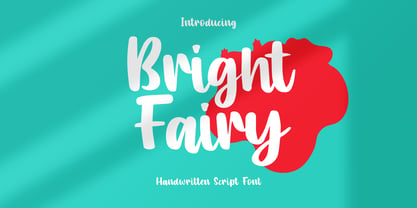 Bright Fairy is a handwritten script font. This stunning handwritten font is casual, classy, and Cool. It’s a great font for fashion, apparel projects, signature, album cover, logo, branding, magazine, social media, & advertisements, but also works great for other projects.
 - Sellfresh by Brithos Type,
$11.00 Sellfresh is a playful display font. It will add a very relaxed and childish touch to your designs. Add this beautiful display font to each of your creative ideas and notice how it makes them stand out! Caps Only Fonts.
 - Okra Cubo by Cool Fonts,
$24.00 OkraCubo in a distressed font with a cubist bent. This font work nicely for both grunge and modern styles. Used at large point sizes the cubist look really comes out. This font is as strange as Okra is a vegetable????
 - Dungeons by Rometheme,
$18.00 Dungeons font is vintage monoline script font. It has vintage, elegant, old school, classy, and cool. It’s a great font for fashion, apparel projects, signature, album cover, logo, branding, magazine, social media, & advertisements, but also works great for other projects.
 - Vapor by The Hiscott Foundry,
$35.00This font was inspired by the swirling steam drawn on a chalkboard at a coffee shop. Not actually a script font though it has a similar feel. This font dances and twirls the way a wisp of smoke or steam would. - Almost Broken by Rillatype,
$17.00 Almost Broken is a modern display font with bold and strong personality but charmful. this font comes with two version, regular and slanted. Almost Broken is perfect for headlines, logotypes, magazine, advertising, etc. this font also comes with multilingual support.
 - Wicked Steam by Krakenbox Studio,
$16.00 Wicked Steam is a handwritten script font. This stunning handwritten font is cute, fun, classy, and Cool. It’s a great font for fashion, apparel projects, signature, album cover, logo, branding, magazine, social media, & advertisements, but also works great for other projects.
 - Garalda by TypeTogether,
$49.00 Type designer Xavier Dupré’s Garalda is a charming 21st century family that renews a legacy of finesse. As paragraphs on a page, Garalda’s overall impression is of a workaday personality, committed to the main purpose of the job: easy long-form reading. But setting it in display sizes proves something different: This reinvented Garamond is anything but basic. The Garalda story begins with the serendipitous finding of a book typeset in a rare Garalde, called Tory-Garamond, with which Dupré was not immediately familiar. This Garamond was used in bibliophile books in the decades surrounding 1920, but after that it became déclassé for an unknown reason. Dupré found the italic styles especially charming and discovered the family was probably the mythical Ollière Garamond cut from 1914. He obtained low resolution scans of the typeface and used them, rather than high resolution scans, as the basis for his new type family. This allowed Dupré the mental freedom to experiment and remix as he saw fit, culminating in a contemporary family with heritage. As seen in the simplistic rectangular serifs, Garalda is a humanist slab serif, but with a mix of angles and curves to give the classic shapes a fresh, unorthodox feeling. While almost invisible in paragraph text, these produce a graphic effect in display work. The set of ligatures in the roman and italics lend themselves to unique display use, such as creating lovely logotypes. In the italics, some swashes inspired by different historic Garamonds are included, sometimes breaking their curves to be more captivating. Just look at how the italic ‘*-s’ ligatures create ‘s’ with a cursive formation rather than merely a flowing slant. And how the roman ‘g’ link swings as wide as a trainer’s whip. These are all balanced by squared serifs in the roman to keep an overall mechanised regularity. The Garalda family comes in eight styles, includes some of the original arrows and ornaments, and speaks multiple languages for all typesetting needs, from pamphlets to fine book printing. The complete Garalda family, along with our entire catalogue, has been optimised for today’s varied screen uses.
 - Fairbank by Monotype,
$29.99Monotype Bembo is generally regarded as one of the most handsome revivals of Aldus Manutius' 15th century roman type, but the original had no italic counterpart. The story is told that Stanley Morison commissioned Alfred Fairbank, a renowned calligrapher, to create the first italic for Bembo, which was released as metal fonts in 1929. Alfred Fairbank, however, claimed that he drew the design as an independent project and then sold his drawings to Monotype. According to him, the statement has been made that I was asked to design an italic for the Bembo roman. This is not so. Had the request been made, the italic type produced would have been different." Whichever version you believe, it was obvious that Fairbank's design - while undeniably beautiful - was not harmonious with Bembo roman. A second, more conventional italic was eventually drawn and added to the Bembo family. Fairbank's first design, which was based on the work of sixteenth-century writing master Ludovico degli Arrighi, managed to have a modest life of its own as a standalone font of metal type. It never made the leap into phototype fonts, however, and the face could have been lost, were it not for Robin Nicholas, Monotype Imaging's Head of Typography in the United Kingdom, and Carl Crossgrove, a senior designer for Monotype Imaging in the US. Nicholas and Crossgrove used the original drawings for Fairbank as the starting point for a new digital design, but this was only the beginning. They improved spacing, added subtle kerning and optimized the design for digital imaging. In addition, Nicholas created an alternative set of lowercase letters, fancy and swash capitals and enough alternate characters to personalize virtually any design project. By the time his work was complete, Nicholas and Crossgrove had created a small type family that included Fairbank, a revived version of the earlier metal font, and Fairbank Chancery, a more calligraphic rendition of the design. An additional suite of ornate caps, elegant ligatures, and beginning and ending letters accompanies both fonts, as does a full complement of lowercase swash characters. Now, instead of a failed Bembo italic, Fairbank emerges in its true glory: a sumptuous, elegant design that will lend a note of grace to holiday greetings, invitations, and any application where its Italianate beauty is called for." - Protrakt Variable by Arkitype,
$10.00 Protrakt is inspired by city life and sport. It has been designed as a variable font and is best to use as a variable font to get the full enjoyment of using this typeface. However, if you do not have access to variable technology through your software, there are nine widths in the font family so this will give you just as much access to the creativity this font can provide. By using the variable sliders in your design software you have a range of weight and width options. Play around with individual letters to give your type a unique look. Included in this family are alternate characters to add even more styling options. *Unfortunately there is no option to test out the variable capabilities on MyFonts as yet. Please have a look at the poster images to get a great idea of how I have used this font. By using the variable version you only need to install one font file instead of the entire family, this saves space and time to manually select individual styles.
 - Spectrum by Monotype,
$29.99Spectrum font is based on a design by Jan van Krimpen, who worked on his font from 1941 to 1943 for use in a Bible of the Spectrum publishing house in Utrecht. The bible project was later cancelled but the font was so beautifully formed and universal that the Monotype Corporation in London completed it. Distinctive are the reserved elegance and unmistakeable beauty of form. The italic was kept fine and is a wonderful complement to the other weights, making it perfect for emphasis in text. The form of the lower case italic g is reminiscent of van Krimpen's italic for Lutetia and Romanée. A similar font in form is the Perpetua from Eric Gill. It displays not only similar forms to those of Spectrum, both fonts also have uniquely designed old style figures. The 7 is particularly unusual with its slanted horizontal stroke and marked bend to the left in the lower third of the form. Spectrum is an extremely legible font even in smaller point sizes and is just as suitable for headlines as for long texts. - Mechline by Ditatype,
$29.00 Enter the future with Mechline, a visionary font that seamlessly blends futuristic aesthetics with artistic ingenuity. Mechline creates a cutting-edge look that pushes the boundaries of modern design. The characters in Mechline embody the essence of the future, with a weight that strikes the perfect balance between elegance and technological advancement. The artistic letter shapes evoke a sense of creativity, giving each character a distinct and avant-garde identity. Mechline's irregular outlines add an element of unpredictability, contributing to its futuristic allure. Enjoy the features here. Features: Stylistic Sets Multilingual Supports PUA Encoded Numerals and Punctuations Mechline fits in headlines, logos, posters, flyers, branding materials, greeting cards, print media, editorial layouts, and many more designs. Find out more ways to use this font by taking a look at the font preview. Thanks for purchasing our fonts. Hopefully, you have a great time using our font. Feel free to contact us anytime for further information or when you have trouble with the font. Thanks a lot and happy designing.
 - DT Partel by Dragon Tongue Foundry,
$9.00 DT Portal: This stylised, partially serifed font, made with a slightly rounded square form, may have been inspired initially by old cathode ray tubes and computer screens. Although not intended to be purely a ‘tech’ font, it can have a strong tech feel to it. More suited to being a headline font than body text. It also appears to have a monospaced look to it, since most letters, (other than letters like ‘i, l and t’), do have the same width. There is some automatic contextual shape adjustment happening in places, to avoid taking up too much space, so contextual ligatures should be turned on. As is the case with most of my fonts, when given the choice, ‘metric’ spacing should be used in preference to ‘optical’. Initially this font was going to be called ‘DT Portal’, because its form was similar to that of a window or doorway. But due to other fonts already having that name, I chose to rename it as ‘DT Partel’, for no reason other than it is only a very small change visually.
 - Neue Frutiger Paneuropean by Linotype,
$79.00During planning for the new Roissy Charles de Gaulle airport in Paris at the beginning of the 1970s, it was determined that the airport's signage system had to include the clearest and most legible lettering possible. The development of all signage was put into the hands of Adrian Frutiger and his studio. The team carried out their task so effectively that a huge demand for their typeface soon arose from customers who wanted to employ it in other signage systems, and in printed materials as well. The Frutiger® typeface not only established new standards for signage, but also for a range of other areas in which a clear and legible design would be required, especially for small point sizes and bread-and-butter type. The typeface family that which emerged as a result of this demand was added into the Linotype library as "Frutiger" in 1977. Frutiger Next, created in 1999, is a further development of Frutiger, not necessarily a rethinking of the design itself. It was based on a new concept, the most obvious visual characteristics of which is the larger x-height, as well as a more pronounced ascender height and descender depth for lower case letters in relation to capitals. This new design created a balanced image and included considerably narrower letterspacing. Frutiger Next meets the demand for a space-saving, modern humanist sans. 2009's Neue Frutiger is a rethink of the 1977 Frutiger family, now revised and improved by Akira Kobayashi in close collaboration with Adrian Frutiger. Despite the various changes, this "New Frutiger" still fits perfectly with the original Frutiger family, and serves to harmoniously enhance the weights and styles already in existence. The perfect mix, guaranteed Neue Frutiger has the same character height as Frutiger. As a result of this, already existing Frutiger styles can be mixed with Neue Frutiger where necessary. Likewise, Neue Frutiger is perfect for use alongside Frutiger Serif. Newly added are the "Neue Frutiger 1450" weights. Especially for the requirements of the newly released German DIN 1450 norm we have built together with Adrian Frutiger specific weights of the Neue Frutiger. The lowercase l" is curved at the baseline to better differentiate between the cap "I", additionally the number "0" has a dot inside to better differentiate between the cap "O", and the number "1" is now a serifed 1. The font contains additionally the origin letterforms from the regular Neue Frutiger font which can be accessed through an Opentype feature." - Neue Frutiger Cyrillic by Linotype,
$89.00During planning for the new Roissy Charles de Gaulle airport in Paris at the beginning of the 1970s, it was determined that the airport's signage system had to include the clearest and most legible lettering possible. The development of all signage was put into the hands of Adrian Frutiger and his studio. The team carried out their task so effectively that a huge demand for their typeface soon arose from customers who wanted to employ it in other signage systems, and in printed materials as well. The Frutiger® typeface not only established new standards for signage, but also for a range of other areas in which a clear and legible design would be required, especially for small point sizes and bread-and-butter type. The typeface family that which emerged as a result of this demand was added into the Linotype library as "Frutiger" in 1977. Frutiger Next, created in 1999, is a further development of Frutiger, not necessarily a rethinking of the design itself. It was based on a new concept, the most obvious visual characteristics of which is the larger x-height, as well as a more pronounced ascender height and descender depth for lower case letters in relation to capitals. This new design created a balanced image and included considerably narrower letterspacing. Frutiger Next meets the demand for a space-saving, modern humanist sans. 2009's Neue Frutiger is a rethink of the 1977 Frutiger family, now revised and improved by Akira Kobayashi in close collaboration with Adrian Frutiger. Despite the various changes, this "New Frutiger" still fits perfectly with the original Frutiger family, and serves to harmoniously enhance the weights and styles already in existence. The perfect mix, guaranteed Neue Frutiger has the same character height as Frutiger. As a result of this, already existing Frutiger styles can be mixed with Neue Frutiger where necessary. Likewise, Neue Frutiger is perfect for use alongside Frutiger Serif. Newly added are the "Neue Frutiger 1450" weights. Especially for the requirements of the newly released German DIN 1450 norm we have built together with Adrian Frutiger specific weights of the Neue Frutiger. The lowercase l" is curved at the baseline to better differentiate between the cap "I", additionally the number "0" has a dot inside to better differentiate between the cap "O", and the number "1" is now a serifed 1. The font contains additionally the origin letterforms from the regular Neue Frutiger font which can be accessed through an Opentype feature." - Neue Frutiger 1450 by Linotype,
$71.99 During planning for the new Roissy Charles de Gaulle airport in Paris at the beginning of the 1970s, it was determined that the airport's signage system had to include the clearest and most legible lettering possible. The development of all signage was put into the hands of Adrian Frutiger and his studio. The team carried out their task so effectively that a huge demand for their typeface soon arose from customers who wanted to employ it in other signage systems, and in printed materials as well. The Frutiger® typeface not only established new standards for signage, but also for a range of other areas in which a clear and legible design would be required, especially for small point sizes and bread-and-butter type. The typeface family that which emerged as a result of this demand was added into the Linotype library as "Frutiger" in 1977. Frutiger Next, created in 1999, is a further development of Frutiger, not necessarily a rethinking of the design itself. It was based on a new concept, the most obvious visual characteristics of which is the larger x-height, as well as a more pronounced ascender height and descender depth for lower case letters in relation to capitals. This new design created a balanced image and included considerably narrower letterspacing. Frutiger Next meets the demand for a space-saving, modern humanist sans. 2009's Neue Frutiger is a rethink of the 1977 Frutiger family, now revised and improved by Akira Kobayashi in close collaboration with Adrian Frutiger. Despite the various changes, this "New Frutiger" still fits perfectly with the original Frutiger family, and serves to harmoniously enhance the weights and styles already in existence. The perfect mix, guaranteed Neue Frutiger has the same character height as Frutiger. As a result of this, already existing Frutiger styles can be mixed with Neue Frutiger where necessary. Likewise, Neue Frutiger is perfect for use alongside Frutiger Serif. Newly added are the "Neue Frutiger 1450" weights. Especially for the requirements of the newly released German DIN 1450 norm we have built together with Adrian Frutiger specific weights of the Neue Frutiger. The lowercase l" is curved at the baseline to better differentiate between the cap "I", additionally the number "0" has a dot inside to better differentiate between the cap "O", and the number "1" is now a serifed 1. The font contains additionally the origin letterforms from the regular Neue Frutiger font which can be accessed through an Opentype feature."
 - Aaargh - 100% free

- Civilian - Unknown license

- TRACEROUTE - Unknown license

- greenbeans - 100% free

- Monoreal by Jonahfonts,
$30.00 Monoreal, a basic coding font. Unlimited Single Fractions can be had. The GOTHIC STYLE is NOT monospaced and is kerned, designed for subtitles and other various applications.
 - Monomania by Letterhead Studio-VG,
$39.00 Monomania — is the display font with the mood of monospaced typefaces. Please put your attention to Small Caps, Oldstyle Figures and Alternates. Good for posters and magazines.
 - Uertas by Sign Studio,
$15.00 Uertas font brings a modern calligraphy feel. It's perfect for freestyle urban typography, modern logotypes, product branding, or just a quote that you want to stand out.
 - XComputerBugs by Ingrimayne Type,
$14.95 XComputerBugs is a pictorial font of insects, mostly butterflies and moths. A few are based on actual species, but most are fanciful and meant only for decoration.
 - Alabama by peqpe,
$20.00 A "serious"(serif) font with a crazy touch. The idea was born on dozens of papers, thanks to a not-steady-at-all hand guided by coffee.
 - Invader by Yeahllow,
$20.00 Invader is a display font designed specifically for display, headline, logotype and similar applications. It is not intended for text use or for use at small sizes.
 - Podunk JNL by Jeff Levine,
$29.00The term "podunk" usually refers to a small, insignificant town. In this case, Podunk JNL refers to a bold and brash font that resembles cut-paper characters. - Holigan Style by Sensatype Studio,
$15.00 Holigan is a Modern Sport font that created special for Branding, Title and more stand out typography needs, with extra alternative styles that make your design more memorable. It's so perfect to add your style and headline overview for sport, technology, actions, and fighting theme. And specially for this font, we crafted for bold action style and modern feels so enjoy to create any project that will show your main idea out. Holigan Modern Sport font ready with: 4 Font variation characters prepared to get creative alternatives Preview as a inspirations that you can do with Holigan font Ready with All Uppercase characters Wish you enjoy our font. :)
 - Avega SS by Sensatype Studio,
$15.00 AVEGA is a Modern Sport font that created special for Branding, Title and more stand out typography needs, with extra alternative styles that make your design more memorable. It's so perfect to add your style and headline overview for sport, technology, actions, and fighting theme. And specially for this font, we crafted for bold action style and modern feels so enjoy to create any project that will show your main idea out. AVEGA Modern Sport font ready with: 4 Font variation characters prepared to get creative alternatives Preview as a inspirations that you can do with AVEGA font Ready with All Uppercase characters Wish you enjoy our font. :)
 - Layer by Sensatype Studio,
$15.00 Layer is a Layered Logo Modern Font that created special for Branding, Title and more stand out typography needs, with extra alternative styles that make your design more memorable. It's so perfect to add your style and headline overview for sport, technology, actions, and fighting theme. And specially for this font, we crafted for bold action style and modern feels so enjoy to create any project that will show your main idea out. Layer - Layered Logo Modern Font ready with: Font variation characters prepared to get creative alternatives Preview as a inspirations that you can do with Layer font Ready with All Uppercase characters Wish you enjoy our font. :)
 - Morality by Sensatype Studio,
$15.00 Morality is a Modern Elegant Sans Serif Font that perfect for branding, logotyp, poster design, etc A new San Serif Font that we created special for Headline, Title and more stand out typography needs. It's so perfect to add your style and headline overview. And specially for Headline font, we crafted for unique style and modern feels so enjoy to create any project that will show your main idea out. Morality Modern Elegant Sans Serif Font ready with: Any options to get creative variations Preview as a inspirations that you can do with Morality font Ready with All characters Wish you enjoy our font. :)
 - Exited by Sensatype Studio,
$15.00 A Modern Sport Font that perfect for technology, sport, racing, action design project. A new Sans Serif Font that we created special for Headline, Title and more stand out typography needs that will add your variations. It's so perfect to add your style and headline overview. And specially for Headline font, we crafted for futuristic style and modern feels so enjoy to create any project that will show your main idea out. Exited Modern Sport Font ready with: Any options to get creative variations Preview as a inspirations that you can do with Exited font Ready with All Uppercase characters Wish you enjoy our font. :)
 - Sweet Honey by BlackLotus,
$12.00 Sweet Honey is a display font inspired by the cuteness and joy of childhood. Any design made using this font will bring out a cheerful, cute, and unique feel that blends together. Each Uppercase and Lowercase character in this font is made as unique as possible, so that this font can stand out and be easy to remember whenever people look at it. This font has 2 styles, namely regular and bubble, these styles make this font more varied so that it adds inspiration to every design that is made. Sweet Honey is perfect for use in brochures, book titles, magazines, posters, announcements, and more.
 - Gotti by Resistenza,
$39.00 Introducing Gotti. Where Timeless Precision Meets Seventies Flair We are thrilled to unveil our latest creation, Gotti font family, born and meticulously crafted during an inspiring journey to Goteborg. This typeface seamlessly fuses the Bauhaus essence with the spirited vibes of the seventies, resulting in a font that's not just a visual treat but a design experience. Gotti draws its creative fuel from the geometric elegance of the Bauhaus movement, prioritising functional simplicity and razor-sharp lines. However, its design journey doesn't end there. Imbued with the unmistakable energy of the Seventies, Gotti emerges as a font family that encapsulates both nostalgic charm and contemporary boldness. At its core, Gotti boasts a geometric skeleton that has been intricately designed to redefine precision. Ranging from light to black, the weight variations offer a broad spectrum of expressive possibilities. Gotti is perfect for display use, advertising, and branding, it transforms your creative vision into a visual masterpiece. Stand out with confidence, whether it's a captivating logo, a compelling headline, or an unforgettable advertisement. Elevate your brand identity with Gotti. It brings strategic branding to life, communicating sophistication and modernity. Your advertising materials become memorable works of art, leaving a lasting impression on your audience. Curious about the magic Gotti can bring to your designs? Our showcase reveals real-world applications, demonstrating its adaptability and aesthetic appeal. See for yourself how this font family turns ordinary designs into extraordinary visual experiences. Follow us on social media for updates, inspiration, and a glimpse behind the scenes. Have questions or just want to share your thoughts? We're here for you!
 - Geometry Script Pro by CheapProFonts,
$10.00 The Geometry Pro family has been designed to be the final word in purely geometric fonts, and this rounded Script sub-family is a nod to the 50s style of connected logomarks. Words set with both the Regular and the Alternate (with its more flourished capitals and alternate stem connections) can be extended by using the underscore character between letters. You can freely mix and match glyphs from both fonts to create a little bit of variety, and finding that perfect combination. For a matching set of capitals (and disconnected lowercase letters): check out the Regular weights of the Geometry Soft Pro family. All the Geometry Pro fonts are strictly geometric (as drawn with a compass and a ruler fixed to 90 and 45 degree angles) but they are not slavishly modular. ALL fonts from CheapProFonts have very extensive language support: They contain some unusual diacritic letters (some of which are contained in the Latin Extended-B Unicode block) supporting: Cornish, Filipino (Tagalog), Guarani, Luxembourgian, Malagasy, Romanian, Ulithian and Welsh. They also contain all glyphs in the Latin Extended-A Unicode block (which among others cover the Central European and Baltic areas) supporting: Afrikaans, Belarusian (Lacinka), Bosnian, Catalan, Chichewa, Croatian, Czech, Dutch, Esperanto, Greenlandic, Hungarian, Kashubian, Kurdish (Kurmanji), Latvian, Lithuanian, Maltese, Maori, Polish, Saami (Inari), Saami (North), Serbian (latin), Slovak(ian), Slovene, Sorbian (Lower), Sorbian (Upper), Turkish and Turkmen. And they of course contain all the usual "western" glyphs supporting: Albanian, Basque, Breton, Chamorro, Danish, Estonian, Faroese, Finnish, French, Frisian, Galican, German, Icelandic, Indonesian, Irish (Gaelic), Italian, Northern Sotho, Norwegian, Occitan, Portuguese, Rhaeto-Romance, Sami (Lule), Sami (South), Scots (Gaelic), Spanish, Swedish, Tswana, Walloon and Yapese.
 - Makeba Retro Funky Groovy by Beast Designer,
$15.99 Makeba Retro Funky Groovy Font is a fun and funky display font that brings back the spirit of the 70s. Its bold, rounded letters feature groovy curves and playful embellishments that exude a retro vibe. This font is perfect for creating eye-catching titles and headlines for posters, album covers, and other retro-inspired designs. The font’s energetic and upbeat personality is sure to make any project stand out.
 - Dahlia Darling by Sulthan Studio,
$12.00 This beautiful handwritten font we made very attractive with a natural touch we worked back to clean smudges and into smooth lettering it's easy when you cut as well as print stickers and other cool work you're working on this font has 3 front swashes and 3 back swashes for lowercase and one alternative for uppercase, 98 ligature Fonts include uppercase and lowercase letters, punctuation numbers, and language support


