10,000 search results
(0.027 seconds)
- Vintage Comics JNL by Jeff Levine,
$29.00 Vintage Comics JNL was inspired by the way the word “comics” was hand lettered on many of the comic book covers of the 1940s, and is available in both regular and oblique versions.
 - Catalog Sheet JNL by Jeff Levine,
$29.00 Catalog Sheet JNL is the digital version of an extra condensed serif typeface from the 1892 MacKellar, Smiths & Jordan type foundry specimen book. The font is available in both regular and oblique versions.
 - Bucknord by Sibelumpagi,
$15.00 Bucknord is a cool and playful handmade marker font. This font is designed to help your needs such as logos, product packaging, invitations, branding, headlines, signage, labels, book covers, posters, quotes, and more.
 - Sragera by ffeeaarr,
$14.00 Sragera is a rounded and bubbly display font offering you lots of creative space! You can use it to design outstanding titles, posters, book covers, magazine headers, product packaging, and so much more
 - Diamond Lake by Rillatype,
$15.00 Introducing, Diamond lake! This font have strong and bold charasteristics that will make your design more standout from the others. this font is perfect for magazine, headline, packaging, branding, logotype, badge,book, etc.
 - Czech Stencil JNL by Jeff Levine,
$29.00 Czech Stencil JNL was modeled from examples of a 1930s-era typeface from Czechoslovokia called "Patrona Grotesk" as seen in the Steven Heller-Louise Fili book "Stencil Type" (published by Thames and Hudson).
 - Penumbra Sans by Adobe,
$29.00Penumbra is a capitals only design. Based on inscriptional capitals, the style progresses from a sans serif to a serifed design. The Penumbra font family is useful for posters, book jackets and labels. - English1707 by PojolType,
$12.00 English1707 comes from combining two thick and thin and dashed lines. We can use this font for book titles, billboards, posters, logo designs, clothes, t-shirts, and can also be used for brands.
 - Love Bug by PizzaDude.dk,
$20.00Yet another one of those romantic looking fonts. The lowercase looks pretty ordinary, while the uppercase swings around with a mixture of tagging / grunge / comicscript and casual handwriting. It works out extremely well with letters and stuff!. For fun, try writing in uppercase only...looks swell!! - Neutraface Slab Text by House Industries,
$33.00 From fine print and red ink in corporate annual reports to huge three dimensional signage, Neutraface has become the definitive designers’ workhorse. Now this geometric juggernaut boasts even more font firepower with the addition of the Neutraface Slab family. Neutraface Slab features five display weights, four text weights with italics plus a unique stencil style that work together like a typographic symphony or can stand alone like accomplished soloists. Just like its sans-serif counterparts, Neutra Slab Text includes small caps, seven figure styles and a host of other sophisticated OpenType features that have been integrated in a single seamless package. The complementary display weights afford an uncompromising statement that can range from thin and delicate to bold and bombastic. FEATURES: MORE ALTS: Neutraface Slab comes with several alternate characters, accessed through either OpenType stylistic sets or through the Stylistic Alternates feature. TITLING ALTERNATES: The distinctive lower crossbars of the original Neutraface are included in Neutraface Slab as the Titling Alternates OpenType feature. TEXT FIGURES: All variations of Neutraface Slab Text feature seven figure styles. Included are text figures for use in running text, lining figures for use with uppercase forms and small caps figures. Each of these styles is supplemented with tabular figures for use in columnar settings. Plus, superscript and subscript figures are included for use in fractions, footnotes, etc. NEUTRAFACE SLAB CREDITS: Typeface Design: Christian Schwartz, Kai Bernau, Susana Carvalho Typeface Production: Ben Kiel, Hannes Famira Typeface Direction: Christian Schwartz, Andy Cruz, Ken Barber Like all good subversives, House Industries hides in plain sight while amplifying the look, feel and style of the world’s most interesting brands, products and people. Based in Delaware, visually influencing the world.
 - Neutraface Slab Display by House Industries,
$33.00 From fine print and red ink in corporate annual reports to huge three dimensional signage, Neutraface has become the definitive designers’ workhorse. Now this geometric juggernaut boasts even more font firepower with the addition of the Neutraface Slab family. Neutraface Slab features five display weights, four text weights with italics plus a unique stencil style that work together like a typographic symphony or can stand alone like accomplished soloists. Just like its sans-serif counterparts, Neutra Slab Text includes small caps, seven figure styles and a host of other sophisticated OpenType features that have been integrated in a single seamless package. The complementary display weights afford an uncompromising statement that can range from thin and delicate to bold and bombastic. FEATURES: MORE ALTS: Neutraface Slab comes with several alternate characters, accessed through either OpenType stylistic sets or through the Stylistic Alternates feature. TITLING ALTERNATES: The distinctive lower crossbars of the original Neutraface are included in Neutraface Slab as the Titling Alternates OpenType feature. TEXT FIGURES: All variations of Neutraface Slab Text feature seven figure styles. Included are text figures for use in running text, lining figures for use with uppercase forms and small caps figures. Each of these styles is supplemented with tabular figures for use in columnar settings. Plus, superscript and subscript figures are included for use in fractions, footnotes, etc. NEUTRAFACE SLAB CREDITS: Typeface Design: Christian Schwartz, Kai Bernau, Susana Carvalho Typeface Production: Ben Kiel, Hannes Famira Typeface Direction: Christian Schwartz, Andy Cruz, Ken Barber Like all good subversives, House Industries hides in plain sight while amplifying the look, feel and style of the world’s most interesting brands, products and people. Based in Delaware, visually influencing the world.
 - Kidprint by Monotype,
$50.99The Kidprint font is designed to look like a child´s printing. Kidprint is useful any time a playful or whimsical look is required. - ALT Ayame by ALT,
$- Ayame is a display font which looks great on posters, logos, and titles. Ayame is a 6-weight family with a heavy retro look.
 - Kidprint Paneuropean by Monotype,
$92.99The Kidprint font is designed to look like a child´s printing. Kidprint is useful any time a playful or whimsical look is required. - Bisaya 1880 - Unknown license

- Geared Up - Unknown license

- Hurstmonceux by Anthony Prudente,
$20.00 Hurstmonceux is a distressed, antique Victorian-esque typeface. The eroded style is based on the aged quality of printed books from the Victorian time. Capitals are ornately decorated, with lowercase set in small caps.
 - Barbiela Script by Bosstypestudio,
$14.00 Barbiela Script is a modern calligraphy cute font, Can be used for various purposes. such as logos, product packaging, wedding invitations, branding, headlines, signage, labels, signatures, book covers, posters, modern, script, quotes and others.
 - Virile by Monotype,
$29.99The Virile and Virile Open fonts are late nineteenth-century typefaces in a rustic style. Use the Virile fonts to add charm to book covers and posters relating to natural history and decorative arts. - Friendly Christmas by Yoga Letter,
$18.00 "Friendly Christmas" is an elegant blackletter font. This font is equipped with uppercase, lowercase, numerals, punctuation, and multilingual support. Very suitable for Christmas, Halloween, invitations, book titles, posters, banners, stickers, tattoos, bras, and others.
 - Show Card Roman JNL by Jeff Levine,
$29.00 Art Nouveau serif capitals and numerals in the 1917 instructional book “A Roman Alphabet and How to Use It” were the inspiration for Show Card Roman JNL; available in both regular and oblique versions.
 - Hebrew Saphire Tanach by Samtype,
$189.00 Beautiful font, good for posters, books, and folders, Siddurim, Tehilim, and Tanakh. This is a complete font with all diacritic marks (Nikud and Taamim) and also Shevana, Kamatz Katan, Dagesh Chazak, and Holam chaser.
 - Revelry Deco JNL by Jeff Levine,
$29.00 The namesake for this type design was the dust jacket for the 1926 book “Revelry”. A classic Art Deco thick-and-thin design, Revelry Deco JNL is available in both regular and oblique versions.
 - See Saw by Jonahfonts,
$22.00 SeeSaw is a novelty bounced display font. Suitable for children's books, packaging and greeting cards as well as other creative possibilities. Pick and choose letter combinations between caps and lower case letters. Have Fun!
 - Headline Nouveau JNL by Jeff Levine,
$29.00 The hand lettered title for the 1890s book called “The Octopus” featured extra bold Art Nouveau lettering with rounded serifs. This is now available as Headline Nouveau JNL in both regular and oblique versions.
 - Chucklots by Maulana Creative,
$14.00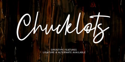 Give your designs an authentic brush handcrafted feel. "Chucklots Handwritten Script Font" is perfectly suited to signature, stationery, logo, typography quotes, magazine or book cover, website header, flyer, clothing, branding, packaging design and more.
 - Satinwoods by Maulana Creative,
$13.00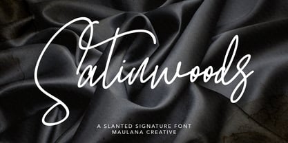 Satinwoods Slanted Signature Font Give your designs an authentic handcrafted feel. Satinwoods is perfectly suited to logo, stationery, branding, typography quotes, magazine or book cover, website header, clothing, branding, packaging design, restaurant and more.
 - Mayoritte by Maulana Creative,
$14.00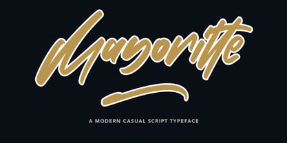 Mayoritte Modern Casual Script Typeface Give your designs an authentic handcrafted feel. "Mayoritte" is perfectly suited to signature, stationery, logo, typography quotes, magazine or book cover, website header, clothing, branding, packaging design and more.
 - Maeve by Bonez Designz,
$30.00 A didone style display typeface that draws inspiration from the fashion industry and also fuses vintage and contemporary. The font contains diacritic, Greek and Cyrillic. A specimen book for the typeface is available here
 - Boeuf Au Joost NF by Nick's Fonts,
$10.00Another in a series of typefaces (Joost a Gigolo and Modern Art) based on the works of comic-book artist Joost Swarte, which continues in a long-standing Dutch tradition of unconventional lettering design. - Crayon En Folie by Hanoded,
$15.00 Crayon En Folie ('Pencil Madness' in French) is a straightforward pencil font, created with an extra thick black pencil. Use it for books, posters and packaging. Comes with a coloring box full of diacritics.
 - Astylooms by Maulana Creative,
$14.00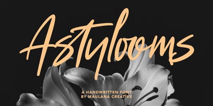 Give your designs an authentic brush handcrafted feel. "Astylooms Handwritten Brush Font" is perfectly suited to signature, stationery, logo, typography quotes, magazine or book cover, website header, flyer, clothing, branding, packaging design and more.
 - Aliya Jayner by Liartgraphic,
$15.00 Aliya Jayner was created by Liartgraphic Studio and is a modern script concept with many alternative, multi-lingual choices. This typeface is good for use on product brands, magazines, book covers, packaging, and others.
 - Young Gallant by Doyald Young,
$50.00 My intent in designing Young Gallant was to create as simple and elegant a formal script as possible. It was developed to illustrate my new book Learning Curves discussing the essence of formal script.
 - Ghouligoo by Magpie Paper Works,
$18.00 Ghouligoo from Magpie Paper Works is a spooky hand-drawn font perfect for comic books, Halloween decor and the zombie apocalypse. The font family includes solid, outline, and inner fill letterforms for maximum versatility.
 - Western Railway JNL by Jeff Levine,
$29.00Western Railway JNL was inspired by sample lettering found in an old sign painter's reference book published during the early part of the 20th Century and modified for today's digital applications by Jeff Levine. - Tralee by Tanincreate,
$12.00 Tralee Font family consist of 2 styles, regular with outline and bold filled with background colour. Originally designed for packaging typography, also would be suitable for titles, headlines, greeting cards, adverts, books and more.
 - Classic Grotesque by Monotype,
$40.99 Classic Grotesque by Rod McDonald: a traditional font with a modern face. The growing popularity of grotesque typefaces meant that many new sans serif analogues were published in the early 20th century. Setting machines were not compatible with each other but all foundries wanted to offer up-to-date fonts, and as a result numerous different typeface families appeared that seem almost identical at first glance and yet go their separate ways with regard to details. One of the first fonts created with automatic typesetting in mind was Monotype Grotesque®. Although this typeface that was designed and published by Frank Hinman Pierpont in 1926 has since been digitalised, it has never achieved the status of other grotesque fonts of this period. But Monotype Grotesque was always one of designer Rod McDonald’s favourites, and he was overjoyed when he finally got the go-ahead from Monotype in 2008 to update this “hidden treasure”. The design process lasted four years, with regular interruptions due to the need to complete projects for other clients. In retrospect, McDonald admits that he had no idea at the beginning of just how challenging and complex a task it would be to create Classic Grotesque™. It took him considerable time before he found the right approach. In his initial drafts, he tried to develop Monotype Grotesque only to find that the result was almost identical with Arial®, a typeface that is also derived in many respects from Monotype Grotesque. It was only when he went back a stage, and incorporated elements of Bauer Font’s Venus™ and Ideal Grotesk by the Julius Klinkhardt foundry into the design process, that he found the way forward. Both these typefaces had served as the original inspiration for Monotype Grotesque. The name says it all: Classic Grotesque has all the attributes of the early grotesque fonts of the 20th century: The slightly artificial nature gives the characters a formal appearance. There are very few and only minor variations in line width. The tittles of the ‘i’ and ‘j’, the umlaut diacritic and other diacritic marks are rectangular. Interestingly, it is among the uppercase letters that certain variations from the standard pattern can be found, and it is these that enliven the typeface. Hence the horizontal bars of the “E”, “F” and “L” have bevelled terminals. The chamfered terminal of the bow of the “J” has a particular flamboyance, while the slightly curved descender of the “Q” provides for additional dynamism. The character alternatives available through the OpenType option provide the designer with a wealth of opportunities. These include a closed “a”, a double-counter “g” and an “e” in which the transverse bar deviates slightly from the horizontal. The seven different weights also extend the scope of uses of Classic Grotesque. These range from the delicate Light to the super thick Extrabold. There are genuine italic versions of each weight; these are not only slightly narrower than their counterparts, but also have variant shapes. The “a” is closed, the “f” has a semi-descender while the “e” is rounded. Its neutral appearance and excellent features mean that Classic Grotesque is suitable for use in nearly all imaginable applications. Even during the design phase, McDonald used his new font to set books and in promotional projects. However, he would be pleased to learn of possible applications that he himself has not yet considered. Classic Grotesque, which has its own individual character despite its neutral and restrained appearance, is the ideal partner for your print and web project.
 - FF Casus by FontFont,
$51.99 FF Casus was drawn for print – but is also as natural for textual content in interactive design. It brings warmth and a subtle, handcrafted quality to pages in books and periodicals as well as banners and informational copy on large and small screens. It pairs flawlessly with a wide range of sans serif typefaces to create inviting and easy to read text copy. Drawn by Eugene Yukechev, FF Casus is a fresh take on the robust serif typefaces produced early in the 18th century. The FF Casus™ typeface family takes advantage of slightly narrowed proportions, moderate contrast in stroke weight and an ample x-height to achieve high levels of legibility and efficient use of space. Born in Novosibirsk, Russia, in 1980, Yukechev earned degrees in philology in addition to editorial and graphic design. He also graduated from the British Higher School of Design in Moscow, studying type and typographic design. Yukechev now runs the Moscow-based studio “Schrift Publishers” and the online “Type Journal” with his colleagues. The six weights of FF Casus – each with an italic complement – are available as OpenType® Pro fonts with an extended character set supporting most Central European and many Eastern European languages. Looking for something new – with the panache and warmth of an old book face? FF Casus may be the perfect choice.
 - Rotis Sans Serif Paneuropean by Monotype,
$98.99Rotis is a comprehensive family group with Sans Serif, Semi Sans, Serif, and Semi Serif styles. The four families have similar weights, heights and proportions; though the Sans is primarily monotone, the Semi Sans has swelling strokes, the Semi Serif has just a few serifs, and the Serif has serifs and strokes with mostly vertical axes. Designed by Otl Aicher for Agfa in 1989, Rotis has become something of a European zeitgeist. This highly rationalized yet intriguing type is seen everywhere, from book text to billboards. The blending of sans with serif was almost revolutionary when Aicher first started working on the idea. Traditionalists felt that discarding serifs from some forms and giving unusual curves and edges to others might be something new, but not something better. But Rotis was based on those principles, and has proven itself not only highly legible, but also remarkably successful on a wide scale. Rotis is easily identifiable in all its styles by the cap C and lowercase c and e: note the hooked tops, serifless bottoms, and underslung body curves. Aicher was a long-time teacher of design with many years of practical experience as a graphic designer. He named Rotis after the small village in southern Germany where he lived. Rotis is suitable for just about any use: book text, documentation, business reports, business correspondence, magazines, newspapers, posters, advertisements, multimedia, and corporate design.

