10,000 search results
(0.043 seconds)
- Rougon by VanderKeur,
$30.00 The reason for Nicolien van der Keur to design the Rougon font was the translation of twenty novels written by Emile Zola, a French writer, and translated by Martine Delfos. It follows the lives of the members of the two titular branches of a fictional family living during the Second French Empire (1852–1870) and is one of the most prominent works of the French naturalism literary movement. This series deserved a font with French roots and corresponded to the period in which Zola’s books were written and published, the period between 1870 and 1893, the end of the nineteenth century. Extensive research into French historical typefaces has led to a type specimen from the French type foundry Deberny et Cie in Paris around 1907. It turned out to be good and helpful source as it contained a sample of a typeface that reflected the content and style of the novels, but also represented the period in which the books were written in France. A large part of the novels are about the generations of Rougon, so it seemed a natural choice to give the font that name. It is available in one weight and contains stylized portraits of Emile Zola and the French Marianne. This font also contains various ornaments.
 - Squealer Embossed - Unknown license

- Teen - Unknown license

- Samson Classic SG by Spiece Graphics,
$39.00 Here is another classic design by Robert Hunter Middleton for the Ludow Foundry in 1940. Samson Classic is a very heavy display face with a wonderful medley of thick-and-thins. Developed just before World War II, this sturdy, chunky style gained popularity in newspaper advertising work. It appears as though it was created using a broad pen and retains the angled stroke endings. Goes great on certificates and diplomas where just a hint of calligraphy is appropriate. Samson Classic is also available in the OpenType Std format. Some new characters including decorative ornaments for creating certificates have been added to this OpenType version. Advanced features currently work in Adobe Creative Suite InDesign, Creative Suite Illustrator, and Quark XPress 7. Check for OpenType advanced feature support in other applications as it gradually becomes available with upgrades.
 - Hollywood Deco SG by Spiece Graphics,
$39.00 This is yet another Willard T. Sniffin deco-inspired original. Created for the American Type Foundry, Hollywood Deco remains a classic that is still as contemporary today as when it first appeared in 1932. Use this novelty gothic typeface on announcements and stationery. It is also well-suited for many advertising situations where a stylish retro look is desired. A useful set of alternate characters (including the illustrious “Overlapping O's”) is included with this version. Hollywood Deco Medium with Alternates is also available as an OpenType font. This version now contains small caps, lining and oldstyle figures, prebuilt fractions, stylistic alternates, word buttons and a wide assortment of f-ligatures. These advanced features currently work in Adobe Creative Suite InDesign, Creative Suite Illustrator, and Quark XPress 7. Check for OpenType advanced feature support in other applications as it gradually becomes available with upgrades.
 - Beware The Neighbors by Intellecta Design,
$23.90 Beware The Neighbors is based on “Personality Script”, a rough alphabet originally drawn by Ross F. George, and published in one of the Speedball series of lettering catalogs that ran from 1935 to 1948. The design is something of a minor classic, and several foundries have recreated digital fonts based on it. However, mostly of these interpretations are very “geometric”, formed using straight lines. Intellecta preferred to create a new interpretation using smoother, curved lines to create a creepy appearance. Also included are several ligatures and OpenType stylistic alternates. This version also has an extended character set for use in Central as well as and West European countries, plus Baltic, Turkish and Romanian. Check out Intellecta’s Clarvoyant for another creepy experience based on lettering from old Speedball catalogs. CLOSE THE DOORS AND WINDOWS AND BEWARE OF YOUR NEIGHBORS!
 - Lotto by Canada Type,
$24.95 Designed by expert ad artist Herbert Thannhaeuser for East German foundry Typoart in 1955, Lotto was until now one of the long lost gems of European sign and brush lettering faces. Unlike in Kurier (Thannhaeuser’s other brush face digitized by Canada Type as Puma), the forms’ brush construct uses a series of strokes that are mostly sudden, whimsical, and at times even look like great genius being born out of simple afterthought or straight-forward idiosyncracy. For instance, check out the simple brush pause that is the top of the f, the confident yet welcoming serifs on the T, the similarly-themed C/E and O/Q relationship, and much more. Lotto comes with over 400 glyphs, contains a few alternates and ligatures sprinkled throughout the character set, and includes support for the majority of Latin languages.
 - Cockle by Joy Studio,
$35.00 This friendly rounded display typeface is perfect for headlines and logos, its gentle curves and comfortable corners are reminiscent of forms found in nature. Inspired by the shapes found in leaves - soft curves forming gentle corners as they meet. Cockle pairs well with Arial for a body font. Includes over 500 characters; with Ligatures, small caps, old style figures, and mathematical symbols.
 - Miso by Mårten Nettelbladt,
$- Miso was designed for architects' drawings. It’s a clean and narrow typeface suitable for small text but also for headlines and logos. The spacing of Miso follows the logic of mono-stroke fonts as found in CAD software. The starting point for this typeface was the lettering style of the International Organization for Standarization found in ISO 3098-0:1997.
 - Teutonia by HiH,
$10.00 How can Teutonia be called “Art Nouveau” with all those straight lines? It seems like a contradiction. In fact, however, Art Nouveau embraces a rather wide variety of stylistic approaches. Five well-known examples in the field of architecture serve to illustrate the range of diversity in Art Nouveau: Saarinen’s Helsinki Railroad Station, Hoffman’s Palais Stocklet in Brussels, Lechner’s Museum of Applied Arts on Budapest, Mackintosh’s Glasgow School of Art and Gaudi’s Sagrada Familia in Barcelona. Only the last fits comfortably within the common perception of Art Nouveau. Whereas Gaudi would avoid the straight line as much as possible, Macintosh seemed to employ it as much as possible. The uniting factor is that they all represent “new art” -- an attempt to look things differently than the previous generation. Even when they draw on the past -- e.g. Lechner in the use of traditional Hungarian folk art -- the totality of the expression in new. Teutonia clearly shows its blackletter roots in the ‘D’ and the ‘M.’ Roos & Junge of Offenbach am Main in Germany produced Teutonia in a "back-to-basics" effort that has seen many quite similar attempts in the field of topography. In 1883, Baltimore Type Foundry released its Geometric series. In 1910, Geza Farago in Budapest used a similar letter design on a Tungsram light bulb poster. In 1919 Theo van Doesburg, a founder with Mondrian and others of the De Stijl movement, designed an alphabet using rectangles only -- no diagonals. In 1923 Joost Schmidt at Bauhaus in Weimer took the same approach for a Constructivist exhibit poster. The 1996 Agfatype Collection catalog lists a Geometric in light, bold and italic that is very close to the old Baltimore version. Even though none of these designs took the world by storm, they all made a contribution to our understanding of letterforms and how we use them. Teutonia is compact and surprisingly readable at 12 points in print, but does not do as well on the screen. Extra leading is suggested. Four ligatures are supplied: ch, ck, sch and tz. The numerals are tabular.
 - CA Sensuell by Cape Arcona Type Foundry,
$37.00 Stefan Claudius developed this font while he was sitting in a small chalet in Denmark with a hot wood-oven and nothing but snow outside. Probably the amount of white led him to make it so thin and to have as much space between the lines as possible. If you have that in mind, it looks best in large sizes.
 - Thrillers by Ndiscover,
$42.50 Thrillers is a typeface that evoques the visual landscape of Crime Novel Titles. This high contrast super condensed semi-serif design comprises 6 weights that provide you with a ton of options for your Headlines, Titles and Branding. Because of its minimal white space it is very punchy and its unusual texture captures our attention. End the suspense and go test it out!
 - Adrenalina by BRtype,
$25.00 Adrenalina was created in 2003-2007. In 2014 the project was revised and became a font family. The character set was drawn through digital manipulation from photos of pichações taken in São Paulo - Brazil. Pixação is a form of tagging that comes from Brazilian graffiti writers. This style of pichação (or pixação) is also known as tag reto (straight tag).
 - Soylent Blu by Tail Spin Studio,
$20.00 Soylent Blu is an original wedge serif, single font designed by Steve Zafarana. Its high contrast character style and bouncy baseline create a visual impact that makes it a good candidate for Signs, headlines, logos and advertisements. The full lowercase set with balanced white space also functions quite well in text. Soylent Blu, with OpenType features, is clearly an attention-getter!
 - Sugarloaf by Hanoded,
$15.00 A sugarloaf was a conical lump in which refined sugar was sold until the late 19th century. In Fryslân you can buy sûkerbôle - a yeasty white bread containing large chunks of sugar. I must have been dreaming about the latter when I named this font! Sugarloaf is a versatile, happy, handmade display font. It comes in an inline and a black style.
 - Impact by URW Type Foundry,
$35.99 Impact As its name suggests, Impact, a bold sans serif, is designed to make an impression on the reader. Obviously a display font, Impact makes use of its thick strokes and blocked style, to catch and hold the eye. Because Impact is so striking, it is best placed in plenty of white space so that it does not overwhelm any accompanying text.
 - Avalon by Lipton Letter Design,
$25.00 Friedrich Neugebauer is known for the cutting power of his calligraphic invention. As a prisoner of war in Egypt, he wrote with toothpaste when all else failed. The irrepressible style of this Austrian artist inspired Richard Lipton to capture his calligraphy as a typeface. Avalon plays sweeping freedom in the capitals against the vital discipline of a lowercase relieved by alternative ascending characters.
 - Metropolis CT by CastleType,
$29.00 Metropolis Bold was commissioned by Publish magazine for their 1990 redesign. Although other digital versions exist, I think this was the first one and is characterized by extremely pointy serifs. It is well to remember in laying out copy for Metropolis to allow plenty of white space in the layout. Metropolis is based on the 1932 Stempel cut as designed by W. Schwerdtner.
 - Character Sans by Brave Lion Fonts,
$14.00 Character Sans is a detail full sans serif typeface in 5 styles. It features all european languages, ligatures, arrows and minuscule numbers. It's characteristic style features are straightened ends and sharp curves. The lighter weights have great white spaces and their width is orientated on the heavier weights. Character Sans was made to have style and not to be uniform.
 - The Pea Marcie font, brought to life by Fonts For Peas, embodies a captivating charm that instantly warms the heart. It's a font that seems to have been crafted with love, bearing the marks of a tale...
- Neue Aachen by ITC,
$40.99 Impressed by the quality of the Aachen typeface that was originally designed for Letraset in 1969 and extended to include Aachen Medium in 1977, Jim Wasco of Monotype Imaging has extended this robust display design to create an entire family. Derived from the serif-accented Egyptienne fonts dating to the early 20th century, Aachen has serifs that are very solid but considerably shorter than those of its precursor. The incorporated geometrical elements, such as right angles and straight lines, provide the slender letters of Aachen with a slightly technological, stencil-like quality. Despite this, the effect of Aachen is by no means static; its dynamism means that this typeface, originally designed for use in headlines, has come to be used with particular frequency in sport- and fitness-related contexts. Jim Wasco, for many years a type designer at Monotype Imaging, recognized the potential of Aachen and decided to extend the typeface to create an entire typeface family. He appropriated the existing Aachen Bold in unchanged form and first created the less heavy cuts, Thin and Regular. Wasco admits that he found designing the forms for Thin a particular challenge. It took him several attempts before he was able to achieve consistency within the glyphs for Thin and, at the same time, retain sufficient affinity with the original Aachen Bold. But he finally managed to adapt the short serifs and the condensed and slightly geometrical quality of the letters to the needs of Thin. The weights Light, Book, Medium and Semibold were generated by means of interpolation. Supplemented by Extralight and Extrabold, the new Neue Aachen can now boast a total of nine different weights. Wasco initially relied on his predilection for genuine cursives in his designs for the Italic cuts. But it became apparent with these first trial runs that the soft curves of cursives did not suit Aachen and led to the loss of too much of its original character. Wasco thus decided to compromise by using both inclined and cursive letters. Neue Aachen Italic is somewhat narrower than its upright counterparts; the lower case 'a' has a closed form while the 'f' has been given a descender, but the letters have otherwise not been given additional adornments. The range of glyphs available for Neue Aachen has been significantly extended, so that the typeface can now be used to set texts not only in Western but also Central European languages. Wasco has also added a double-counter lowercase 'g' while relying on the availability of alternative letters in the format sets for the enhancement of the legibility of Neue Aachen when used to set texts. The seven new weights and completely new Italic variants have enormously increased the potential applications of Aachen and the range of creative options for the designer. While the Bold weights have proved their worth as display fonts, the new Book and Regular cuts are ideal for setting text. And the subtlety of Ultra Light will provide your projects with a quite unique flair. The new possibilities and opportunities in terms of design and applications that Neue Aachen offers you are not restricted to print production; you can also create internet pages thanks to its availability as a web font.
 - Trump Mediaeval Office by Linotype,
$50.99The Trump Mediaeval Office family is designed after the model of the original serif family produced by Georg Trump in 1954. Trump released this typeface through the C.E. Weber type foundry in Stuttgart, and Linotype quickly cut the face for mechanical composition. Thereafter it became popular around the world. One of the most prolific German type designers of the 20th century, Trump created numerous typefaces in several different styles, but Trump Mediaeval is often regarded as his best work. Trump Mediaeval is an old style serif typeface, with new inherent quality that could only have come about after centuries of variation on this theme. It bears some resemblance to the classic Garamond typefaces, yet its characteristic letters set it apart in a positive way. Akira Kobayashi, Linotype’s Type Director, released his own revived design, Trump Mediaeval Office, in 2006. Trump Mediaeval Office has two weights, each with an italic companion. Unlike the original design, Kobayashi has harmonized the varying letterforms across the two weights, allowing Regular and Bold text to stand side by side harmoniously. Trump Mediaeval’s numbers now match across weights as well, optimizing their legibility in sizes large and small. Decades ago, Trump Mediaeval was a popular choice for setting book texts, because of its robust serifs. These are exactly what make the face a good choice for office application today; on lower-resolution printers, these serifs will still remain a strong feature on the letterform, increasing legibility along the line of text. - Public Works JNL by Jeff Levine,
$29.00Public Works JNL emulates the hand-made lettering found on older signs printed by silk screen for local governments. - Pencil Pusher JNL by Jeff Levine,
$29.00 The unusual hand lettering found on a piece of 1940s sheet music forms the basis for Pencil Pusher JNL.
 - ST Gaidar by ShimanovTypes,
$9.00 The font "Gaidar" named in the honour of Arkady Gaidar. He was a Soviet writer, whose stories were very popular among Soviet children, and a Red Army commander. He died in combat fighting with German nazis in 1941. Few generations of Soviet kids are raised on his books and a number of films were made based on his stories. This font inspired by posters, movie titles and book covers of this writer. The letterforms are bold and gnarly and comes in 2 styles: uppercase and small caps. It has LATIN and Extended Eastern Europe CYRILLIC letters. "ST-Gaidar" created for titles, poster design, web design, branding and packaging works, illustrations, badges and other typography works. Pls, don't use it for for typing large arrays of text. ST Gaidar supports 15+ languages: Belarusian, Bosnian, Bulgarian, Croatian, Dutch, English, German, Macedonian, Norwegian, Russian, Serbian, Swedish, Spanish, Slovenian, Ukrainian and probably others
 - Wall Street Gothic by BA Graphics,
$45.00A new gothic with the great new look for today. Universal, works for all applications. - Kpop Vibes by Ronny Studio,
$19.00 Inspired by the emerging Korean culture that grabbing the worldwide actuation in so many realms of the industry. To bridge the vibes and to make it easier to consume, we found the gap to fill with simple things in life that are useful for it, and yes, it's a new day it's a new font. So without any further ado, please welcome Kpop Vibes. series of Korean vibes typefaces. It's a sans-serif font with bold and strong vibes to catch up with today's graphic design trends. 2 Font Style: - Regular - Italic Kpop Vibes Features: - Uppercase - Lowercase - Numbers & Punctuation - Alternate Style - Multilingual Support - Simple installation All features and special characters of this font are included in one file. So that it is easily accessible by using a program or software that supports opentype such as Adobe Illustrator, Adobe Photoshop, and Adobe Indesign). This font is also very easy to use as it is compatible for all supported software even for non-opentype. Please comment us if you have any questions Thank you and have a nice day. Thank You
 - HWT Roman Extended Fatface by Hamilton Wood Type Collection,
$24.95 The design of the first "Fat Face" is credited to Robert Thorne just after 1800 in England. It is considered to be the first type style designed specifically for display or jobbing, rather than for book work. The first instance of Fat Face in wood type is found in the first wood type specimen book ever produced: Darius Wells, Letter Cutter 1828. This style was produced by all early wood type manufacturers. The style is derived from the high contrast, thick and thin Modern style of Bodoni and Didot developed only decades previously. The extended variation makes the face even more of a display type and not at all suitable for text. This type of display type was used to compete with the new Lithographic process which allowed for the development of the poster as an artform unto itself. This new digitization by Jim Lyles most closely follows the Wm Page cut. The crisp outlines hold up at the largest point sizes you can imagine. This font contains a full CE character set.
 - Brothers of Metal - Unknown license

- Dead Letter Office - Unknown license

- Parisian Ornamentals by Celebrity Fontz,
$24.99Beautiful, richly ornamented shadowed letters in the Empire fashion, similar to the fonts of the Parisian type founder J. Gille', cut around 1810. Includes one set of A-Z ornamental initials conveniently assigned to both the upper and lower case alphabet characters. - Syntax by Linotype,
$29.99 Syntax was developed by Hans Eduard Meier in 1968 and presented by the font foundry D. Stempel AG. Its figures are based on Old Face characters but have a distinctive, modern design. The inclination to the right lends the font a dynamic feel.
 - Millrich Reading NF by Nick's Fonts,
$10.00The 1918 specimen book of the Miller and Richard Type Foundry of London and Edinburgh featured this endearing typeface. Both versions of this font include the complete Latin 1252 and Central European 1250 character sets, as well as a very tasty f_f_i ligature. - Page Printer JNL by Jeff Levine,
$29.00 Page Printer JNL was inspired by “Skeleton”, from the William H. Page Wood Type Foundry circa 1848. Its name is a play on both Page’s surname as well as contemporary desktop printers. Page Printer JNL is available in both regular and oblique versions.
 - Seminary by Solotype,
$19.95This began life as a European font that was copied in the United States by Bruce's Type Foundry in 1885. It was caps only and had a fine line "three-D" shadow. We scrapped the shadow, added a lower case, and voila! - Pique-Nique NF by Nick's Fonts,
$10.00 The 1895 specimen book from American Type Founders included the pattern for this face, originally called Outing—Art Nouveau with a laid-back vibe. Both versions of this font support the Latin 1262, Central European 1250, Turkish 1254 and Baltic 1257 codepages.
 - Emmy by Emily Lime,
$19.00 Emmy is the second family from this up and coming foundry. A versatile font, Emmy has many different styles to suit your needs. Easy to read and fun to use...it's perfect for a children's book, logo or other cool design project!
 - Bank Gothic by ParaType,
$30.00 Designed at American Type Founders in 1930-33 by Morris F. Benton. An all-capital sans serif featuring squared-off letters with rounded corners. For use in advertising and display typography. Cyrillic version was created at ParaType by Tagir Safayev in 1997.
 - Coronation Street NF by Nick's Fonts,
$10.00 Here's an unusual take on a "modern" typeface, based on a 1936 release from England's Stephenson, Blake foundry, which serves well for interesting headlines. Both versions of this font support the Latin 1252, Central European 1250, Turkish 1254 and Baltic 1257 codepages.
 - Spearmint by Qwrtype Foundry,
$14.00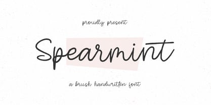 Introducing by Qwrtype Foundry Proudly Present, Spearmint Spearmint is a Brush Handwritten Font Spearmint is perfect for product packaging, branding project, megazine, social media, wedding, or just used to express words above the background. Spearmint also come with multilingual support. Thank you!


