10,000 search results
(0.037 seconds)
- 1st Ave by Design is Culture,
$39.00 1st Ave is the most experimental of my typefaces. I took a picture of a metal and neon sign in the East Village of New York City. These signs are slowly being replaced by LED and LCD displays, but if you look hard, you can still find quite a few in the city. The signs give a mid 20th century feel to the city. To design 1st Ave, I took a picture of the sign, scanned it and increased the contrast in Photoshop so that the photographic forms became line art. There weren't enough letterforms in the sign to create the whole alphabet, so I cut up the strokes and collaged them back together to finish the entire alphabet. Important Note: 1st Ave is an experimental typeface and is not compatible with certain software such as Microsoft Word.
 - Ciseaux by Wilton Foundry,
$29.00 Ciseaux was inspired and is dedicated to the art of paper cutting. Early paper cutting artists were often royalty, but it soon became a folk art practiced by commoners whose cutouts decorated their homes. By the seventeenth century it had spread throughout the world. The Japanese called it Mon-kiri, the German's Scherenschnitte and Turkey even boasted a guild devoted to the art form. In Poland the designs were traditionally symmetrical and often used layers of colors to form pictorial collages. When Russian invaders confiscated scissors, villagers were found to cut their intricate designs with sheep shears! The art form later developed into cutting out elaborate designs of nature scenes and people, celebrating special occasions and even decorating legal documents. Ciseaux letterforms mimic paper cutting art in its shapes with a rather loose and almost joyous rhythm. The overall effect is somewhat earthy and natural yet it has an element of sophistication that cannot be ignored. Just like paper cutting, Ciseaux can be used for special occasions like invitations, brochures, identities, restaurant menus, and if you dare, some awesome looking paper graffiti. Available in TT, PS and Opentype for Mac and Windows.
 - VTCTattooScriptTwo - Personal use only

- Serpentine by Image Club,
$29.99Dick Jensen (USA) designed Serpentine, is a contemporary-looking display font, for the Visual Graphics Corporation in 1972. With the rise of digital typesetting and desktop publishing, this typeface quickly became both popular and ubiquitous. This dynamic, wide, boxy design is identifiable via tiny triangular swellings at the stroke endings - what might be called semi-serifs. Serpentine is available in six different font styles: Light, Light Oblique, Medium, Medium Oblique, Bold, and Bold Oblique. Serpentine" is a greenish rock that sometimes resembles a serpent's skin, and is often used as a decorative stone in architecture. Though this font doesn't seem at all snaky or sinuous, it does have an architectural, stone-like solidity. The subtle, almost non-existent curves and semi-serifs keep it from being too stern or cold. Although the underlying strokes of each weight are similar, the six members of the Serpentine font family all present their own individual personalities. Serpentine Light lends itself well to text for onscreen displays, for instance, while the numbers from typeface's heavier weights are seen around the world on soccer jerseys! Additionally, the oblique styles convey a streamlined sense of speed, furthermore lending Serpentine well to sport and athletic applications (especially the faster, high-speed varieties). Because of its 1970s pedigree, Serpentine has come to be known as a genuine "retro" face. This makes the typeface even more appropriate for display usage, in applications such as logo design, magazine headlines, and party flyers. If you like Serpentine, check out the following similar fonts in the Linotype portfolio: Copperplate Gothic (similar serifs) Eurostile (similar width) Princetown (another "athletic" font) Insignia (similar "techno" feeling)" - Cursed Stone by Ditatype,
$29.00 Cursed Stone is a spine-chilling display font that will transport your designs to a realm of dark enchantment. Designed in large letters and with a bold weight, this typeface demands attention and exudes an aura of haunting mystery. Each letter is meticulously crafted with eerie stone texture details, adding an ominous and cursed touch to the font. The large size of the letters enhances the font's imposing presence, making it impossible to ignore. The stone texture details in each letter of this font bring an authentic and sinister feel, as if the font was chiseled from the depths of an ancient cursed monument. These haunting details add an element of mystique and darkness, immersing the viewer into a world of malevolent enchantment. The combination of bold weight and stone texture gives Cursed Stone a rugged and formidable look, evoking images of cursed relics and forbidden ruins. The letters appear to hold secrets from the past, carrying a haunting energy that captures the imagination. For the best legibility you can use this font in the bigger text sizes. Enjoy the available features here. Features: Alternates Multilingual Supports PUA Encoded Numerals and Punctuations Cursed Stone fits in headlines, logos, movie posters, flyers, invitations, branding materials, print media, editorial layouts, headers, and any horror-themed project. Find out more ways to use this font by taking a look at the font preview. Thanks for purchasing our fonts. Hopefully, you have a great time using our font. Feel free to contact us anytime for further information or when you have trouble with the font. Thanks a lot and happy designing.
 - Serpentine by Linotype,
$29.00Dick Jensen (USA) designed Serpentine, is a contemporary-looking display font, for the Visual Graphics Corporation in 1972. With the rise of digital typesetting and desktop publishing, this typeface quickly became both popular and ubiquitous. This dynamic, wide, boxy design is identifiable via tiny triangular swellings at the stroke endings - what might be called semi-serifs. Serpentine is available in six different font styles: Light, Light Oblique, Medium, Medium Oblique, Bold, and Bold Oblique. Serpentine" is a greenish rock that sometimes resembles a serpent's skin, and is often used as a decorative stone in architecture. Though this font doesn't seem at all snaky or sinuous, it does have an architectural, stone-like solidity. The subtle, almost non-existent curves and semi-serifs keep it from being too stern or cold. Although the underlying strokes of each weight are similar, the six members of the Serpentine font family all present their own individual personalities. Serpentine Light lends itself well to text for onscreen displays, for instance, while the numbers from typeface's heavier weights are seen around the world on soccer jerseys! Additionally, the oblique styles convey a streamlined sense of speed, furthermore lending Serpentine well to sport and athletic applications (especially the faster, high-speed varieties). Because of its 1970s pedigree, Serpentine has come to be known as a genuine "retro" face. This makes the typeface even more appropriate for display usage, in applications such as logo design, magazine headlines, and party flyers. If you like Serpentine, check out the following similar fonts in the Linotype portfolio: Copperplate Gothic (similar serifs) Eurostile (similar width) Princetown (another "athletic" font) Insignia (similar "techno" feeling)" - Hollenbeck JNL by Jeff Levine,
$29.00Hollenbeck JNL is the Art Deco, all-caps cousin of Jeff Levine's Hallandale JNL typeface. This version utilizes the thick-and-thin stroke weights so popular during the Art Deco era, while retaining the look of hand-lettered copy. Best suited at larger point sizes, this font is a nice alternative to the over-used display faces reminiscent of that time period. - AT Move Nath! by André Toet Design,
$75.00 NATH !* Is a peculiar typeface. It’s design came by the fascination of Optical Illusions and 3D on a flat surface, like with Holborn and Powerplay. The typeface is named after a girlfriend of André Toet. *Made in the UK, 1974, London (Central School of Art & Design). (Redesigned 2013 by André Toet / Jasper Terra). Concept/Art Direction/Design: André Toet © 2017
 - Miguelito by Balpirick,
$15.00 Miguelito is a Modern Handwritten Font. Miguelito is an elegant script font with a contemporary atmosphere and impeccable form. Not too thin and not too thick, balanced and varied, this font was designed to enhance the beauty of your projects. Miguelito also multilingual support. Enjoy the font, feel free to comment or feedback, send me PM or email. Thank you!
 - Nouveau Display JNL by Jeff Levine,
$29.00 Vintage sheet music for the 1920s song "Where Did Robinson Crusoe Go with Friday on Saturday Night?" yielded the hand lettered Art Nouveau alphabet for Nouveau Display JNL. Because the Art Nouveau movement was so influential in the graphic designs of the 1960s "Love Generation" counter culture, this typeface blends itself well with projects crossing many decades and varying styles.
 - Bs Landscope by Feliciano,
$37.92That’s what people call ‘an experimental typeface’. Yes it is! It consists in letterforms designed in very strict geometrical parameters. I was not thinking about ‘reading’ when I’ve drawn this typeface — rather on different way of projecting our mental image of the words. Do not try to set a book with this type, please! One single version, one single font designed in 2000. - Nickvic by Niamullah aqil,
$20.00 Nickvic is a font that you can instantly download. You can use this font in Photoshop, Illustrator, or any other program that will allow you to import fonts. This font is for personal and commercial use. Please note that this is a digital download, you will not be sent anything physical. All sales are final. Refunds or exchanges are not accepted.
 - Paku by Kah Khiong Design,
$13.00 Paku, a typeface that grow on the inspiration of fiddlehead (fern), taking Fibonacci curve as the base, with influence of Art Nouveau & Art Deco, it evolves into a simple yet magical typeface. The spiral’s characteristic in the typeface give the stylish impression of grace, rhythmic, classical & poetry. It’s unique & distinctive looks suitable for any surface printing, publishing, branding, packaging, advertising & digital content.
 - Song Stylist JNL by Jeff Levine,
$29.00 The 1907 novelty song "Since Arrah Wanna Married Barney Carney" (about an Irishman taking an Indian maiden as his bride) had its title hand-lettered in a sans serif style that reflected both the Art Nouveau flavor of the time and a hint of what was to come during the Art Deco movement. This is now Song Stylist JNL and it's oblique counterpart.
 - Paris Serif by S&C Type,
$8.00 Paris Serif is an avant-gardist serif handwritten font designed in Paris. It’s an all-caps thin font, with Art Deco ornaments and extended glyphs for many languages. But the little difference of Paris Serif from other handwriting typefaces is the Art Deco feeling that brings it a retro and directly familiar look. We hope you will enjoy our work. Merci beaucoup!
 - Solente by TypeFaith Fonts,
$12.00 Solente is an elegant slab serif font and was inspired from Early 1900's Art-Deco, Art Nouveau and Jugendstil fonts. Perfect for use as headline or sub-head text in you design. It perfectly represents vintage esthetics in a modern way. The font has stylistic alternates for all capitals and an extra set of ligatures to replace some combinations.
 - Ziggity by Pelavin Fonts,
$20.00 With its tall, slinky letterforms and perky switchbacks, Ziggity may not be your father's typeface, but don't let that fool you. It's ready and willing to step right up and say what's needed with a unique angle on things. Ready to use as-is or with any variety of angles, outlines or shadows, it will make your message memorable if not downright adorable.
 - Alea Weiqsaw by Sitintahitam,
$25.00 Alea Weiqsaw inspired from victorian era, art neuveau, psychedelic art and music. This font comes with unique trippy style, it will be interesting to make a headlines, packaging design and vintage style logotype like a cover album, sign logotype, vintage headline. Alea Weiqsaw also bring some alternative glyph and unique ornament. This combination allows you to easily develop awesome designs.
 - Vendetta by Emigre,
$69.00 The famous roman type cut in Venice by Nicolas Jenson, and used in 1470 for his printing of the tract, De Evangelica Praeparatione, Eusebius, has usually been declared the seminal and definitive representative of a class of types known as Venetian Old Style. The Jenson type is thought to have been the primary model for types that immediately followed. Subsequent 15th-century Venetian Old Style types, cut by other punchcutters in Venice and elsewhere in Italy, are also worthy of study, but have been largely neglected by 20th-century type designers. There were many versions of Venetian Old Style types produced in the final quarter of the quattrocento. The exact number is unknown, but numerous printed examples survive, though the actual types, matrices, and punches are long gone. All these types are not, however, conspicuously Jensonian in character. Each shows a liberal amount of individuality, inconsistency, and eccentricity. My fascination with these historical types began in the 1970s and eventually led to the production of my first text typeface, Iowan Old Style (Bitstream, 1991). Sometime in the early 1990s, I started doodling letters for another Venetian typeface. The letters were pieced together from sections of circles and squares. The n, a standard lowercase control character in a text typeface, came first. Its most unusual feature was its head serif, a bisected quadrant of a circle. My aim was to see if its sharp beak would work with blunt, rectangular, foot serifs. Next, I wanted to see if I could construct a set of capital letters by following a similar design system. Rectangular serifs, or what we today call "slab serifs," were common in early roman printing types, particularly text types cut in Italy before 1500. Slab serifs are evident on both lowercase and uppercase characters in roman types of the Incunabula period, but they are seen mainly at the feet of the lowercase letters. The head serifs on lowercase letters of early roman types were usually angled. They were not arched, like mine. Oddly, there seems to be no actual historical precedent for my approach. Another characteristic of my arched serif is that the side opposite the arch is flat, not concave. Arched, concave serifs were used extensively in early italic types, a genre which first appeared more than a quarter century after roman types. Their forms followed humanistic cursive writing, common in Italy since before movable type was used there. Initially, italic characters were all lowercase, set with upright capitals (a practice I much admire and would like to see revived). Sloped italic capitals were not introduced until the middle of the sixteenth century, and they have very little to do with the evolution of humanist scripts. In contrast to the cursive writing on which italic types were based, formal book hands used by humanist scholars to transcribe classical texts served as a source of inspiration for the lowercase letters of the first roman types cut in Italy. While book hands were not as informal as cursive scripts, they still had features which could be said to be more calligraphic than geometric in detail. Over time, though, the copied vestiges of calligraphy virtually disappeared from roman fonts, and type became more rational. This profound change in the way type developed was also due in part to popular interest in the classical inscriptions of Roman antiquity. Imperial Roman letters, or majuscules, became models for the capital letters in nearly all early roman printing types. So it was, that the first letters in my typeface arose from pondering how shapes of lowercase letters and capital letters relate to one another in terms of classical ideals and geometric proportions, two pinnacles in a range of artistic notions which emerged during the Italian Renaissance. Indeed, such ideas are interesting to explore, but in the field of type design they often lead to dead ends. It is generally acknowledged, for instance, that pure geometry, as a strict approach to type design, has limitations. No roman alphabet, based solely on the circle and square, has ever been ideal for continuous reading. This much, I knew from the start. In the course of developing my typeface for text, innumerable compromises were made. Even though the finished letterforms retain a measure of geometric structure, they were modified again and again to improve their performance en masse. Each modification caused further deviation from my original scheme, and gave every font a slightly different direction. In the lower case letters especially, I made countless variations, and diverged significantly from my original plan. For example, not all the arcs remained radial, and they were designed to vary from font to font. Such variety added to the individuality of each style. The counters of many letters are described by intersecting arcs or angled facets, and the bowls are not round. In the capitals, angular bracketing was used practically everywhere stems and serifs meet, accentuating the terseness of the characters. As a result of all my tinkering, the entire family took on a kind of rich, familiar, coarseness - akin to roman types of the late 1400s. In his book, Printing Types D. B. Updike wrote: "Almost all Italian roman fonts in the last half of the fifteenth century had an air of "security" and generous ease extremely agreeable to the eye. Indeed, there is nothing better than fine Italian roman type in the whole history of typography." It does seem a shame that only in the 20th century have revivals of these beautiful types found acceptance in the English language. For four centuries (circa 1500 - circa 1900) Venetian Old Style faces were definitely not in favor in any living language. Recently, though, reinterpretations of early Italian printing types have been returning with a vengeance. The name Vendetta, which as an Italian sound I like, struck me as being a word that could be taken to signifiy a comeback of types designed in the Venetian style. In closing, I should add that a large measure of Vendetta's overall character comes from a synthesis of ideas, old and new. Hallmarks of roman type design from the Incunabula period are blended with contemporary concerns for the optimal display of letterforms on computer screens. Vendetta is thus not a historical revival. It is instead an indirect but personal digital homage to the roman types of punchcutters whose work was influenced by the example Jenson set in 1470. John Downer.
 - Tempest-narrow - Unknown license

- Harpagan by Borutta Group,
$39.00 Harpagan is an experimental type family characterized by scalable construction from mono linear grotesk to display bold. I’ve designed this typeface after my trip to Kyrgyzstan, Uzbekistan and Kazachstan, where i’ve been impressed by the impact of arabic script in Asian style Cyrillics. The Harpagan type Family consist of 5 futuristic styles.
 - Muscle Cars by Vozzy,
$10.00 Introducing vintage label font duo named Muscle Cars. These two fonts has an additional characters and multilungual support (check out all available characters on previews). Bold and Script fonts has two styles: Clean and Aged. This font will look good on any vintage styled designs like a poster, T-shirt, label, logo, etc.
 - Beast Sketch by 38-lineart,
$19.00 "Beast Sketch" is an extraordinary handwritten font created with bold, untamed strokes using ink and a bamboo pen. It boasts a masculine aesthetic, an organic, natural feel, and extensive Latin character support. Perfect for book titles, magazine covers, logos, and more, it adds a raw, authentic, and compelling vibe to your projects.
 - Herman by Monotype,
$15.99 An edgy little number here; Herman was created using a chiselled marker pen and is handwritten as a slanted, bold font with a distinct marker contrast. Designed with two sets of all caps, and alternates that rotate the upper and lower case; Herman is a standout that’s charming and slightly retro, too.
 - Urban Dope 3d Graffiti by Sipanji21,
$15.00 "Urban Dope" is a graffiti font characterized by its bold letterforms and rounded corners. This font is ideal for a wide range of design projects, including headlines and various other creative endeavors. With its edgy and dynamic style, "Urban Dope" adds an urban flair to your typography, capturing the essence of street culture.
 - Hittedal by Edignwn Type,
$18.00 The font collection is called "Hittedal", it is a display font for logotype. These collections contain bold script and sans serif font. This script font includes some alternates and ligatures. The Hittedal matches apply in some designs such as the logo, poster, label, badge, packaging, t-shirt, branding, quotes and more custom design.
 - The Hungry by Zeenesia Studio,
$14.00 The Hungry font. It has a bold and smooth style and is perfect for making any design stand out. Best suitable for branding, packaging, print titles, tshirt design, food design, and similar projects. more than 50 stylistic alternates and some natural ligatures to make this font very classy and look so beauty.
 - Bakrie by 160 Std,
$20.00 Bakrie is a bold and incredibly unique display font. Masterfully designed to become a true favorite, this font has the potential to bring each of your creative ideas to the highest level! suitable for use in many design forms, for example Headline, Magazines, Postcards, Logos, DIY Projects, Brand, Apparel, Quotes, and much more.
 - Rockmore by Almarkha Type,
$29.00 Rockmore is a bold script font with a clear style and dramatic movements. This font is great for logos, printed quotes, invitations, cards, product packaging, headers, Logotype, Letterhead, Poster, Apparel Design, and much more! Rockmore comes with uppercase, lowercase, numerals, accents (Multilingual characters), punctuations and a lot of gorgeous variations on each character!
 - Sweet Party by Elysart,
$9.00 Sweet Party Font in 4 styles is a cute and bold handwritten font by @elysarto. Great for a fun and festive mood! The font will be awesome for many industries including : fashion, kids, school and many more! Here’s what you’ll get on the package : What's included? - Uppercase Characters - Lowercase Characters - Numbers and Punctuation
 - Alvardo by Tigade Std,
$15.00 Alvardo is a retro and vintage bold script font. This font is PUA encoded which means you can access all of the glyphs and stylistic alternates with ease! It is looking great on product, headlines, magazines, logos, poster, branding and many more!. Use this font to bring your design back to the oldies!
 - Volvoreta RG LG by LGF Fonts,
$17.00 Bolboreta Hollow is a revival of "Decorativa" font of Richard Gans Foundry .We've expanded the family with padded versions, striped versions (gray on other Gans fonts, in keeping with the days of lead fonts), and those same fills in separate font files, for graphic designer layered play. In addition to Bold versions.
 - Blacker Gothic by Letterara,
$25.00 Discover the allure of Blacker Gothic, an entrancing blackletter font that seamlessly blends bold elegance with distinctive character forms. Perfect for enhancing a variety of design projects, from product packaging to branding, its PUA encoding grants easy access to a wealth of unique glyphs and swashes, ensuring extraordinary results for your creative endeavors
 - Heifin by Daily Studio,
$16.00 Heifin is a beautiful bold typeface designed by Daily Studio. Contain unique upper and lowercase best for any purpose, especially to make a title, logo, and branding. This font will make your projects looks more stunning and amazing. Use your creativity to mix and match with other font to create a masterpiece.
 - Sortemun by Mandarin,
$15.00 Sortemun is a modernist display font based on heavy metal band graphics with a touch of horror movies from the 70/80’s. Bold, mysterious and vampiric it’s suitable for use in various projects such as rock/metal albums, scary games, horror movie titles, swag graphics, headlines, book covers, Halloween based parties etc.
 - Churchward Lorina by BluHead Studio,
$25.00 Churchward Lorina is a four weight typeface family originally designed in 1996 by New Zealand type designer Joseph Churchward. A personable geometric sans serif, it possesses some of Churchward's trademark quirkiness but reamins highly legible and readable on screen as well as in print. The family includes Light, Regular, Bold and Black.
 - Tropical Times by Sarid Ezra,
$19.00 Introducing Tropical Times - a handwritten tropical vibes font Tropical Times is a bold handwritten typeface with tropical and summer vibes. You can use this font for any purpose, especially for quotes, branding, book cover, or even merchandise. With stylish ligatures that will make your project more natural and handmade.This font also support multilingual.
 - Breakneck by Alphabet Agency,
$15.00 Breakneck Font Duo includes Breakneck and Breakneck Italic fonts. The fonts are excellent for expressing motion; ideal for racing themes. The sharp angles combined with the bold sport style create the expression of speed. Each font contains all basic Latin characters that includes uppercase, lowercase, numbers, punctuation plus much more (130+ characters).
 - Mightsilly by Qwrtype Foundry,
$14.00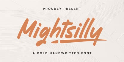 Proudly presenting Mightsilly Mightsilly is a bold handwritten font. Mightsilly is perfect for product packaging, branding project, magazine, social media, wedding invitations, or just used to express words above the background. Mightsilly also comes with multilingual support. Enjoy the font, feel free to comment or feedback, send me PM or email. Thank you!
 - Tenda Display by Attract Studio,
$18.00 Tenda Display is a simple font but a whimsical design that comes with a bold emotional character to read. Tenda Display uses the Opentype feature with the intention of multiplying other unique characters such as Alternate letters and Ligatures that suit your project. Include : Tenda Display Tenda Display Outline Tenda Display Extrude

