10,000 search results
(0.093 seconds)
- FS Joey by Fontsmith,
$80.00 Kangaroo FS Joey was the offspring of a project with Rudd Studio to develop a logotype for an online streaming TV service, in 2008. While under wraps, the secret project was code-named Kangaroo. The logotype led to a second project, to design a corporate typeface for the service. It was the first big project Fernando Mello had worked on with Jason Smith. “Like any designer who just joined a team, I was very excited about it, drawing and sketching lots of ideas. I remember Jason and I experimenting with lots of possibilities, for both the logo and the typeface.” Online As the font for a Spotify-style, internet-based service, FS Joey needed to be highly legible on-screen, including at very small sizes. There had to be a range of weights, and they’d have to work well in print, too. It was also important that it felt corporate, not too quirky, while still having a strong character of its own. Quirkiest “We designed three weights specifically for use on the Web,” says Jason Smith. “There was the usual fight between me and my team. I wanted at least one identifiable letter that was a quirk. As always I went straight for the lowercase ‘g’, and it was drawn numerous times with lots of variation. I got the quirkiest one accepted by the client.” But, later in 2009, the Competition Commission blocked Project Kangaroo, and Fontsmith were left with a couple of weights of an as yet unused font. From Kangaroo, Joey was born. A favourite “Straight away, people started to notice the typeface,” says Jason. “I can take the credit for pushing the art direction and standing up for the quirks. But it was Fernando who was the key to pulling it all together and adding his own distinct flavour. Now it’s one of my favourite designs in our library.” Fresh and friendly, geometric and energetic, Joey is available in five weights, all with italics, all finely-tuned for both screen and print.
 - Shiny Ink Display by Lloyd David Designs,
$14.99 Hi there, thanks for looking at my first typeface. It began as one of my original sketches back in 2019 as a freelance graphic designer trying to create unique letterforms that I could use for posters or websites with other possible use cases in mind for commercial use. The sketches were then passed on to and worked on with Vladimir Tsagolov who has more experience in creating professional typefaces, the experience for me was invaluable, and I have many more typefaces I'm now working on. Shiny Ink Display is a collection of hand drawn fonts based on the flow of reflective viscous ink with 7 styles, some styles can be interchangeable and used on top of each other. For example, Shiny Ink Display Plain, can be used with Shiny Ink Display Plain Lined to create shadows underneath it, at angles not available with the Shadow styles you'll see in the font collection. Shiny Ink Display has various use cases, maybe even infinite, but more specifically for posters or websites with large text, though it bodes quite well at smaller sizes, and is visually appealing to its viewers as long as it's at a legible font size. When it comes to font pairing, Shiny Ink Display works especially well with Monospace and sans-serif fonts. You can check the poster examples on this page to help you imagine what you could do with the font styles. I also had in mind manufactured products, but I could leave that to you to create your ideas with the available font styles. In regards to languages or typing on a keyboard, most of the English/European latin or cyrillic language keys are supported, so you'll have lots of glyph characters to play with for a number of ideas you may have. All the best with your projects using my fonts, if there are any issues, don't hesitate to contact me for support: lloyddaviddesigns.co.uk - Lloyd David
 - TT Bluescreens by TypeType,
$35.00 TT Bluescreens useful links: Specimen PDF | Customization options Please note! If you need OTF versions of the fonts, just email us at commercial@typetype.org Meet the upgraded TT Bluescreens! TT Bluescreens is a geometric sans serif with narrow proportions. The font has a memorable character, while remaining neutral, so it can be used in various design projects. The range of possibilities of the updated TT Bluescreens has become much wider! Condensed styles with narrowed proportions have been added. The classic styles of TT Bluescreens are universal and suitable for setting both in headings and in text arrays. Condensed styles are intended for non-standard design solutions. In small sizes, they are perceived as if having a texture, thanks to which they can become part of packaging or poster design. In large size they look extraordinary, but they are highly readable and convey information well. Variable font now changes along 3 axes: weight, width and slant. Even more options for those who love variety. The character set of TT Bluescreens was expanded, and additional extended Cyrillic and Latin characters were added. Expanded character set. Each style has 874 characters. This is 253 characters more than it there were in the previous version. New currency signs, arrows, punctuation and fractions were added. Number of OpenType features increased from 18 to 31! The font has become even more functional and convenient thanks to a large number of ligatures, stylistic alternatives and localizations. The quality of the contours has become even higher, diacritics were improved. The updated TT Bluescreens is suitable for the design of covers and posters, it will look aesthetically pleasing in packaging design. It can be used in the design of titles and disclaimers. Condensed styles are preferably used in large size. The TT Bluescreens font has 37 styles: 9 upright and 9 italics of standard width, 9 upright and 9 italics in Condensed, 1 variable style. Each style contains 874 characters. The font has 31 OpenType features, including ligatures, stylistic sets, and localizations.
 - Moritza Script by Max.co Studio,
$15.00 Moritza Script is a calligraphy script font that comes with a very beautiful character change, a kind of classic decorative copper script with a modern touch, designed with high detail, it took time since July 2019 - September 2020 to present an elegant style. Moritza Script is attractive as a typeface that is smooth, clean, feminine, sensual, glamorous, simple and very easy to read, because there are many fancy letter connections. I also offer a number of viable style alternatives for many letters. The classic style is perfect to be applied in various formal forms such as invitations, labels, restaurant menus, logos, fashion, make up, stationery, novels, magazines, books, greeting / wedding cards, packaging, labels or any type of advertising purpose. Moritza Script including various language support. With OpenType features with alternative styles and elegant ligatures. The OpenType feature does not work automatically. I highly recommend using a program that supports OpenType features and Glyphs panels such as Adobe Illustrator, Adobe Photoshop CC, Adobe InDesign, or CorelDraw, so you can see and access all Glyph variations. Moritza Script is encoded with Unicode PUA, which allows full access to all additional characters without having special design software. Mac users can use Font Book, and Windows users can use Character Map to view and copy one of the extra characters to paste into your favorite text editor / application. How to access all alternative characters using Adobe Illustrator: https://www.youtube.com/watch?v=XzwjMkbB-wQ How to access all alternative characters, using Windows Character Map with Photoshop: https://www.youtube.com/watch?v=Go9vacoYmBw If you need help or have questions, please let me know. I'm happy to help. Thanks & Happy Designing! New Update • Moritza Script! Moritza has now been updated to include 3 styles; bold version, regular & italic version. This gives you the option to completely change your font style with the click of the mouse, whether you're looking for a smoother style, a bold version, or an italic finish. And don't forget the elegant touch of ornament.
 - 99 Names of ALLAH Spiral by Islamic Calligraphy75,
$12.00 We have transformed the “99 names of ALLAH” into a font. That means each key on your keyboard represents 1 of the 99 names of ALLAH Aaza Wajal. The fonts work with both the English and Arabic Keyboards. We call this Calligraphy "Spiral" because of the spiral like design. The first "Alef" has a "hamzit wasel", this indicates that you can pronounce the names both ways, "AR-RAHMAAN" or "R-RAHMAN". (in the zip file you will find a pdf file explaining the differences in the "harakat", pronunciation and spelling according to the Holy Quran). The "Ye" doesn't have 2 dots at the end of a name, instead we chose to include a small "ye" on the letter "ye". Also, we used the traditional "soukoun" instead of the Quranic "soukoun". Decorative letters used in this calligraphy: "Mim, Aain, Sin, HHe, He, Kaf, Alef & Ye". Purpose & use: - Writers: Highlight the names in your texts in beautiful Islamic calligraphy. - Editors: Use with kinetic typography templates (AE) & editing software. - Designers: The very small details in the names does not affect the quality. Rest assured it is flawless. The MOST IMPORTANT THING about this list is that all the names are 100% ERROR FREE, and you can USE THEM WITH YOUR EYES CLOSED. All the “Tachkilat” are 100% ERROR FREE, all the "Spelling" is 100% ERROR FREE, and they all have been written in accordance with the Holy Quran. No names are missing and no names are duplicated. The list is complete "99 names +1". The +1 is the name “ALLAH” 'Aza wajal. Another important thing is how we use the decorative letters. In every font you will see small decorative letters, these letters are used only in accordance with their respective letters to indicate pronunciation & we don't include them randomly. That means "mim" on top or below the letter "mim", "sin" on top or below the letter "sin", and so on and so forth. Included: Pdf file telling you which key is associated with which name. In that same file we have included the transliteration and explication of all 99 names. Pdf file explaining the differences in the harakat and pronunciation according to the Holy Quran. --------------------------------------------------------------------------------------------------------------------------- Here is a link to all the extra files you will need: https://drive.google.com/drive/folders/1Xj2Q8hhmfKD7stY6RILhKPiPfePpI9U4?usp=sharing ---------------------------------------------------------------------------------------------------------------------------
 - Lektorat by TypeTogether,
$35.00 Florian Fecher’s Lektorat font family is one for the books, and for the screens, and for the magazines. While an editorial’s main goals are to entertain, inform, and persuade, more should be considered. For example, clear divisions are necessary, not just from one article to the next, but in how each is positioned as op-ed or fact-based, infographic or table, vilifying or uplifting. From masthead to colophon, Lektorat has six concise text styles and 21 display styles to captivate, educate, and motivate within any editorial purpose. Magazines and related publications are notoriously difficult to brand and then to format accordingly. The research behind Lektorat focused on expression versus communication and what it takes for a great typeface to accomplish both tasks. In the changeover from the 19th to 20th century, German type foundry Schelter & Giesecke published several grotesque families that would become Lektorat’s partial inspiration. Experimentation with concepts from different exemplars gave birth to Lektorat’s manifest character traits: raised shoulders, deep incisions within highly contrasted junctions, and asymmetrical counters in a sans family. After thoroughly analysing magazine publishing and editorial designs, Florian discovered that a concise setup is sufficient for general paragraph text. So Lektorat’s text offering is concentrated into six total styles: regular, semibold, and bold with their obliques. Stylistic sets are equally minimal; an alternate ‘k, K’ and tail-less ‘a’ appear in text only. No fluff, no wasted “good intentions”, just a laser-like suite to focus the reader on the words. The display styles were another matter. They aim to attract attention in banners, as oversized type filling small spaces, photo knockouts, and in subsidiary headings like decks, callouts, sections, and more. For these reasons, three dialed-in widths — Narrow, Condensed, and Compressed — complete the display offerings in seven upright weights each, flaunting 21 headlining fonts in total. If being on font technology’s cutting edge is more your goal, the Lektorat type family is optionally available in three small variable font files for ultimate control and data savings. The Lektorat typeface was forged with a steel spine for pixel and print publishing. It unwaveringly informs, convincingly persuades, and aesthetically entertains when the tone calls for it. Its sans serif forms expand in methodical ways until the heaviest two weights close in, highlighting its irrepressible usefulness to the very end. Lektorat is an example of how much we relish entering into an agreed battle of persuasion — one which both sides actually enjoy.
 - Skygirls by Typodermic,
$11.95 Picture it: a bustling city street in the 1920s, when the world was changing and women were fighting for their place in it. Billboards line the road, but one catches your eye—it’s Skygirls, a typeface that takes you back to a time when advertising was an art form. This typeface is no ordinary script. It’s a tightly wound, joined design that exudes elegance and urgency. Its steep angle draws the eye up, making your message impossible to miss. Skygirls is inspired by classic metal scripts like Herald, Signal, Hauser, Penflow, Veltro, Kurier, and Bison, so it’s no wonder it feels so timeless. With Skygirls, you’re not just writing a message—you’re making a statement. It’s the perfect typeface to convey the frantic, fast-paced style of the roaring twenties. Your words will flow seamlessly together, creating a sense of movement and momentum. And when you set it on an upward slope, it’s like your message is soaring to new heights. If you want to make an impression that lasts, Skygirls is the typeface for you. It’s a perfect fit for any project that requires a touch of vintage charm, and it will leave your audience with a lasting sense of style. So why settle for the ordinary when you can have something truly extraordinary? Choose Skygirls and let your message take flight. Most Latin-based European writing systems are supported, including the following languages. Afaan Oromo, Afar, Afrikaans, Albanian, Alsatian, Aromanian, Aymara, Bashkir (Latin), Basque, Belarusian (Latin), Bemba, Bikol, Bosnian, Breton, Cape Verdean, Creole, Catalan, Cebuano, Chamorro, Chavacano, Chichewa, Crimean Tatar (Latin), Croatian, Czech, Danish, Dawan, Dholuo, Dutch, English, Estonian, Faroese, Fijian, Filipino, Finnish, French, Frisian, Friulian, Gagauz (Latin), Galician, Ganda, Genoese, German, Greenlandic, Guadeloupean Creole, Haitian Creole, Hawaiian, Hiligaynon, Hungarian, Icelandic, Ilocano, Indonesian, Irish, Italian, Jamaican, Kaqchikel, Karakalpak (Latin), Kashubian, Kikongo, Kinyarwanda, Kirundi, Kurdish (Latin), Latvian, Lithuanian, Lombard, Low Saxon, Luxembourgish, Maasai, Makhuwa, Malay, Maltese, Māori, Moldovan, Montenegrin, Ndebele, Neapolitan, Norwegian, Novial, Occitan, Ossetian (Latin), Papiamento, Piedmontese, Polish, Portuguese, Quechua, Rarotongan, Romanian, Romansh, Sami, Sango, Saramaccan, Sardinian, Scottish Gaelic, Serbian (Latin), Shona, Sicilian, Silesian, Slovak, Slovenian, Somali, Sorbian, Sotho, Spanish, Swahili, Swazi, Swedish, Tagalog, Tahitian, Tetum, Tongan, Tshiluba, Tsonga, Tswana, Tumbuka, Turkish, Turkmen (Latin), Tuvaluan, Uzbek (Latin), Venetian, Vepsian, Võro, Walloon, Waray-Waray, Wayuu, Welsh, Wolof, Xhosa, Yapese, Zapotec Zulu and Zuni.
 - 99 Names of ALLAH Attached by Islamic Calligraphy75,
$12.00 We have transformed the “99 names of ALLAH” into a font. That means each key on your keyboard represents 1 of the 99 names of ALLAH Aaza Wajal. The fonts work with both the English and Arabic Keyboards. We call this Calligraphy "Attached" because the "alef" and "lam" are attached together. The first "Alef" has a "fatha", this indicates to pronounce the first letter. So instead of saying "R-RAHMAAN" you say "AR-RAHMAAN" (in the zip file you will find a pdf file explaining the differences in the "harakat", pronunciation & spelling according to the Holy Quran). You will also notice that the decorative letters in this font are bigger than usual, we also used the traditional "soukoun" instead of the "Quranic soukoun" & we were a little bit more generous than usual with the decorative symbols. Decorative letters used in this calligraphy: "Mim, Aain, Sin, HHe, He, Kaf, Alef, Tah & Saad". Purpose & use: - Writers: Highlight the names in your texts in beautiful Islamic calligraphy. - Editors: Use with kinetic typography templates (AE) & editing software. - Designers: The very small details in the names does not affect the quality. Rest assured it is flawless. The MOST IMPORTANT THING about this list is that all the names are 100% Error Free, and you can use them with your eyes closed. All the “Tachkilat” are 100% Error Free, all the "Spelling" is 100% Error Free, and they all have been written in accordance with the Holy Quran. No names are missing and no names are duplicated. The list is complete "99 names +1". The +1 is the name “ALLAH” 'Aza wajal. Another important thing is how we use the decorative letters. In every font you will see small decorative letters, these letters are used only in accordance with their respective letters to indicate pronunciation & we don't include them randomly. That means "mim" on top or below the letter "mim", "sin" on top or below the letter "sin", and so on and so forth. Included: Pdf file telling you which key is associated with which name. In that same file we have included the transliteration and explication of all 99 names. Pdf file explaining the differences in the harakat and pronunciation according to the Holy Quran. --------------------------------------------------------------------------------------------------------------------------- Here is a link to all the extra files you will need: https://drive.google.com/drive/folders/1Xj2Q8hhmfKD7stY6RILhKPiPfePpI9U4?usp=sharing ---------------------------------------------------------------------------------------------------------------------------
 - Kidnap Note - Personal use only

- EDGE - 100% free

- LAZYTOWN - Personal use only

- SHARKBOY & lavagirl - Personal use only

- Comic Relief - Personal use only

- Tomatoes Cake by Balpirick,
$15.00 Tomatoes Cake is a Cute Handbrushed Font. Whether you’re using it for crafts, digital design, presentations, or making greeting cards, this font has the potential to become your favorite go-to font, no matter the occasion! This font only has allcaps letters. - also multilingual support Enjoy the font! Feel free to comment or feedback! Thank you!
 - Pillow Fight by PizzaDude.dk,
$17.00 A pillow fight is usually quite refreshing, no matter what age you have. And here is a font which has the exact same effect on your designs! The Pillow Fight font is multilingual, handmade and is a kind of fresh unicase with a brushy breeze! Go for sayings, short messages or catching headlines when using Pillow Fight!
 - Eyeballs by Bitstream,
$29.99Eyeballs was designed at Bitstream by designer David Robbins. Its beginnings can be found in Bitstream’s Old Dreadful No. 7, where Mr. Robbins first conceived the capital I. He was later asked by Bitstream to develop the entire character set. The result is a humorous meld of cartoon and typography. A word of caution: Watch how you use it! - Abecedarian by The Type Fetish,
$10.00 Chank claims to have the fastest type design, we think we have the youngest. Samuel was merely four years old when he wrote out his first face. We are expecting many more brilliant typefaces from this upcoming designer. Please note that this font has no numbers or punctuation symbols; Samuel just did letters at that time.
 - Minigame by Gienlee,
$15.00 Description Yo! Welcome to gienlee cartoon, design, and Other artwork Minigame is Modern Font. Commonly used to promote any tech and modern stuff kind of life. It's a futuristic text for the Generation Alpha lifestyle and higher. Item Description Standard Glyphs (Uppercase, Lowercase, Numeral & Punctions) Works on PC & Mac No Special Software is required Do enjoy your download
 - Cupid Gummies by Balpirick,
$15.00 Cupid Gummies is a Sweet and Cute Handbrushed Font. Whether you’re using it for crafts, digital design, presentations, or making greeting cards, this font has the potential to become your favorite go-to font, no matter the occasion! This font only has allcaps letters. - also multilingual support Enjoy the font! Feel free to comment or feedback! Thank you!
 - Koning Display by LucasFonts,
$49.00 Koning transports high-contrast sans serifs into the present. Koning is the Dutch for king. Given the design’s elegance, this name should come as no surprise. It has been recognized with numerous awards: TDC Certificate of Typographic Excellence and Award of Excellence from Communication Arts both in 2018, and Gold from German Design Awards in 2020.
 - DF Staple Mono by Dutchfonts,
$33.00 DF Staple Mono is a personal answer on the archaic and ‘middle-of-the-road’-forms of typewriter typefaces like ‘Courier’ and ‘American Typewriter’. The form of a staple (office supply no. 1) and its transformations inspired me during the design process. The first four weights are all monospaced and are completed with a real italic.
 - Grand Prairie NF by Nick's Fonts,
$10.00This addition to the Whiz-Bang Woodtype series in based on a 100+ year-old typeface originally named Medallic. Due to the highly ornate nature of this font, it has a limited character set (no math operators or footnote accessories). The Opentype version of this font supports Unicode 1250 (Central European) languages, as well as Unicode 1252 (Latin) languages. - Vidalia Sunshine NF by Nick's Fonts,
$10.00A single line of type, identified as "Ornamented No. 5" and spelling out "ROPE ONIONS", from the 1888 MacKellar, Smiths & Jordan specimen book provided the pattern for this whimsical face. Offbeat yet elegant, graceful yet bold, it’s a natural choice for distinctive headlines. Both versions of the font include 1252 Latin, 1250 CE (with localization for Romanian and Moldovan). - Kasuga Brush by insigne,
$21.99 Kasuga Brush is a contemporary script with eastern influence and authentic brush drawn character. The script offers two variants. One is slightly distressed along the character's edges while the other is painted with a dry brush for interesting texture. Sixty-four optional ligatures add a realistic, hand-drawn effect and ensure that no two letters in a word repeat.
 - White Risolles by pentagonistudio,
$19.00 White Risolles Is Clean Script Font Inspired By Handwritting Characters. Font Features : White Risolles OTF ( Open Type ) White Risolles WOFF ( Web Font ) SOFTWARE REQUIREMENTS : Fonts and alternate : No special software required they may be used in any basic program /website apps that allows standard fonts That's it folks! You can go ahead and get cracking :) Have a Good Day !
 - LTC Hess Monoblack by Lanston Type Co.,
$24.95 A very rare metal face made a brief appearance in Lanston Specimen books and has all but vanished from use. In fact no examples of the font in use seem to exist. It shares some of the hand-rendered casual feel of Nicholas Cochin, but much heavier and well suited for bold headlines and package design.
 - Mykogae by ErlosDesign,
$15.00 Mykogae - Display Sans Serif by erlosDESIGN Mykogae is a display sans serif with modern style and trendy. No matter the topic, this font will be an incredible asset to your fonts’ library, as it has the potential to elevate any creation. It is perfect for book covers, social media post, logos, business card, quotes and so much more.
 - Yemeyi by AukimVisuel,
$9.00 Yemeyi family is a modern and daring display font. No matter the topic, this font will be an incredibly asset to your fonts’ library, as it has the potential to elevate any creation. Yemeyi is a simple and neat lettered sans serif font. Add this font to your creative ideas and notice how it will make them stand out!
 - De Vinne by Bitstream,
$29.99 This revival of the Bruce Foundry’s No. 11 is typical of the nineteenth century types derived from the work of Didot and Bodoni; the face remains popular with lawyers and government printers. In fact, Theodore Low De Vinne opposed this kind of design as hard to print and read; he had Century designed to replace it.
 - Purple Bread by Balpirick,
$15.00 Purple Bread is a Tall Handwritten Font. Whether you’re using it for crafts, digital design, presentations, or making greeting cards, this font has the potential to become your favorite go-to font, no matter the occasion! This font only has allcaps letters. - also multilingual support Enjoy the font! Feel free to comment or feedback! Thank you!
 - Queens Burger by Balpirick,
$15.00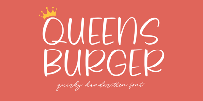 Queens Burger is a Quirky Handwritten Font. Whether you’re using it for crafts, digital design, presentations, or making greeting cards, this font has the potential to become your favorite go-to font, no matter the occasion! This font only has allcaps letters. - also multilingual support Enjoy the font! Feel free to comment or feedback! Thank you!
 - Sails Next by East end,
$16.30 This font was created from scratch in a simple, strong, and unique style. No other fonts were used as references. Its name was inspired by the shape of the first letter, A, that flashed into being. Sails next is perfect as a display font for posters, flyers, and magazine headings. The font family consists of the regular font only.
 - Bleecker Street NF by Nick's Fonts,
$10.00This late Victorian typeface flirts with Art Nouveau sensibilities, as evidenced by the graceful curves and the decorative crossmembers in several of the uppercase letters. The result is a font that combines simple, understated elegance with a no-nonsense, workmanlike stance. Both versions of the font include 1252 Latin, 1250 CE (with localization for Romanian and Moldovan). - Runaround Kid by Hanoded,
$15.00 I was listening to some old Smashing Pumpkins albums when I created this font. The name comes from a song called *** You (An Ode To No One). Runaround Kid is a hand painted typeface. I used Chinese ink and a cheap Chinese brush to create the inky look. Comes with double-letter ligatures and a whole bunch of diacritics.
 - Tadao by The Northern Block,
$19.30 A precise rounded typeface with a clean and linear appearance. The simple compact nature of the design allows for great economy of space across layouts. Also deliberate consideration has been paid to inner corners to ensure no dark areas are produced within texts. Details include 6 weights, an extended European character set, manually edited kerning and Euro symbol.
 - Bastinado by Elemeno,
$25.00Big, thick and chunky, Bastinado is imposing, but the bat-like, scalloped edges give it a sinister presence. Bastinado is an ancient Asian method of torture in which the bottoms of the victim's feet are beaten until he can no longer walk. This font looks like it wants to catch other fonts in a dark alley. - Nautical Doodles by Outside the Line,
$19.00 Sail the seas with Nautical Doodles. This seaworthy font has 32 illustrations of water craft, anchors, star, compass, flags, whale, shark, birds, starfish, seahorse, rope etc. Even a mermaid... and the scripted word Ahoy! If you would like the character chart go to the Gallery Tab and print. (PDFs are no longer downloaded with the font.)
 - Bareback by Solotype,
$19.95The devil does indeed find work for idle hands. This was designed by Dan X. Solo about with no excuse whatsoever. The name comes from the fact that a circus that we regularly did work for used it in one of their programs, the only time it was ever used as far as we can recall. - Karlisbad by Ingrimayne Type,
$9.95 Karlisbad is a monospaced font in which lines expand and contract to form letters. The No-Lines styles can be used alone but it was their use in layers that inspired their creation. They can be used to give the letters a different color than the lines or to create an outline or hollow-letter effect.
 - Silver Thunder by Olivetype,
$18.00 Looking for a unique and badass font to add some edge to your designs? Look no further than Silver Thunder. This graffiti-inspired font is a good option for apparel, posters, headlines, magazines, and more. With its cool black metal aesthetic, Silver Thunder will give your work a truly one-of-a-kind look. Thank You!


