10,000 search results
(0.038 seconds)
- Nasrallah by Arabetics,
$39.00 The Nasrallah family follows the guidelines of the Mutamathil Taqlidi type style. It has one glyph for every basic Arabic Unicode character or letter, as defined in Unicode Standards version 5.1, and one additional, final-position, glyph for each Arabic letter that is normally connected with other letters from both sides in traditional cursive Arabic strings. Nasrallah employs variable x-height values. It includes all required Lam-Alif ligatures and uses ligature substitutions and selected marks positioning but it does not use any other glyph substitutions or forming. Text strings composed using types of this family are non-cursive with stand-alone isolated glyphs. Tatweel (or Kashida) glyph is a zero width space. Keying it before any glyph will display that glyph isolated form. Keying it before Alif Lam Lam Ha will display the Allah ligature. Nasrallah family includes both Arabic and Arabic-Indic numerals; all required diacritic marks, Allah ligature, in addition to all standard English keyboard punctuations and major currency symbols. Fonts are available in regular and italic styles.
 - Toboggan by Jeremy Nelson,
$11.00 TOBOGGAN | Utility Display Typeface Toboggan is a utility display typeface with classically influenced proportions, calligraphic elements, and sporting roots. With 9 weights, upright, and true italics, Toboggan comes in a total of 18 fonts. With flexibility from a crisp Thin weight to an imposing Super in both upright and italic, Toboggan thrives as a utility font spanning the columns of extended text, in artful editorial layouts, eye-catching motion graphics, or commanding headlines in a title role. First drafted around the frame of a perfect circle, Toboggan evolved by taking inspiration from the sweeping contours of the automotive world, expanding into wider proportions, and adopting an abrupt set of constructed features. Sturdy with the spirit of sport, Toboggan’s final form preserves a human connection through features of the written hand, while minimal contrast and its chopped terminals bring a decisive tone with clinical precision. Features: - Nine weights and true Italics - Multilingual support (Extended Latin - Includes Western European coverage and more) - OpenType features including small-caps, stylistic sets, contextual punctuation & more - Extensive numeral sets including stylistic sets, circled, and squared numbers
 - Qedhenif by Twinletter,
$17.00 Qedhenif is a Serif Classic Modernism Font that boasts a retro classic style. With its sleek and sophisticated design, this font is perfect for creating a vintage look that’s both elegant and timeless. Its OpenType features include 53 stylish alternates and 47 beautiful ligatures, making it versatile and suitable for a variety of special projects. Whether you’re working on a branding project, packaging design, or editorial layout, Qedhenif’s alternate characters and ligatures add a touch of personality to your designs. And with its multilingual support, you can use this font for projects in different languages, reaching a wider audience. Explore the possibilities of Qedhenif and elevate your designs to the next level. What’s Included : - File font - All glyphs Iso Latin 1 - Alternate, Ligature - Simple installations - We highly recommend using a program that supports OpenType features and Glyphs panels like many Adobe apps and Corel Draw so that you can see and access all Glyph variations. - PUA Encoded Characters – Fully accessible without additional design software. - Fonts include Multilingual support -All Caps font
 - Muggsy by Missy Meyer,
$10.00 I do a lot of taller, narrower handwriting fonts; this time around, I was inspired to make a wider, shorter handwriting font! MUGGSY has everything you expect from one of my fonts: clean and smooth curves, a full set of alternates, and a feeling of fun! MUGGSY has two uppercase-height alphabets (with a few lowercase-style letters like a and e in the lowercase set), plus a full set of 63 "smallternates" -- the same letters, numbers, and ampersand sized down to 75%, and beefed up in weight so they can be mixed in with the full-size letters. Plus 30 double-letter ligature sets, and a few additional alternates for variety! You also get a ton of punctuation, and my usual 300+ extended Latin characters for language support, for a total of over 600 glyphs! And just because you may want things a bit heavier, I've also made Muggsy Heavy, a bolder weight of Muggsy with all of the same alternates and extras. Enjoy, my fonty friends!
 - Bayside Tavern by FontMesa,
$25.00 Bayside Tavern is a weathered version of our Tavern Alt font family. With its straight sides Bayside Tavern fits better in tight spaces and reads better at smaller point sizes than the regular Bay Tavern version. With three weights, open faced and outline versions to choose from you're sure to find the right style for your new project, restaurant menu, logo, t-shirt design or Pirate costume party. While our original Tavern Alt font has been increased to include five weights additional weights for Bay Tavern will have to wait for now, adding the notched cut in's were all done by hand which causes a lot of cramping so a long break is needed before creating the extra weights. The Fill fonts in the Bayside Tavern family are meant to be layered behind the Bayside Open fonts, if you're using Bayside Open select Bayside Fill, if you're using Bayside Open L select Bayside Fill L, if you're using Bayside Open S select Bayside Fill S and so on.
 - ITC Merss by ITC,
$29.99ITC Merss proves that sometimes accidents work out just fine. Late one evening Eduardo Manso, an Argentinean graphic and type designer, spilled coffee on his desk. When he began to wipe up the mess, he noticed that one of the splashes looked like a roman letter 'l' - complete with serifs. This triggered his imagination. “What if a complete alphabet was created with this same irregular flow to the character designs?” ITC Merss was the result of Manso's experiments with “fluid” letter shapes. The oddly handsome design looks aged and spontaneous at the same time. Its irregular texture is striking-the result of careful modeling of character shapes. While Manso wanted to maintain the free-form character of spilled liquid, he also knew the individual letters had to work together with an underlying harmony. When not experimenting with typefaces - or spilled coffee - Manso creates award-winning graphic and publication designs. A contributor to the design magazine el Huevo (the Egg), he also writes articles on type and typography and is part of the publication's design team. - Anbar by Arabetics,
$39.00 Anbar is an Arabetic typeface design with visually connected glyphs, named after the historical Iraqi province Anbar, which is traditionally believed to be the birthplace of the earliest Arabic script, Jazm. It follows the guidelines of the Mutamathil Taqlidi type style with one glyph for every basic Arabic Unicode character or letter, as defined in Unicode Standards, and one additional final form glyph for each Arabic letter that can connect with other letters from both sides in traditional cursive Arabic strings. Anbar employs variable x-height values. It includes all required Lam-Alif ligatures and selected marks. Tatweel (or Kashida) glyph is a zero width space. Keying it before any glyph will display that glyph isolated form, if desired. Keying Tatweel before Alif Lam Lam Ha will display the Allah ligature. Anbar typeface family includes both Arabic and Arabic-Indic numerals; all required diacritic marks, in addition to Standard English keyboard punctuations and major currency symbols. Anbar is available in regular and italic (slated to the left) styles.
 - Pepone by Storm Type Foundry,
$43.00 This typeface is primarily optimized for the setting of belles-lettres. The regular styles are balanced to suit small text sizes and enable the reading of long portions of text. The development of the typeface was guided by the goal of creating a contemporary, discreet book serif, with modern expression and numerous functions. Letters feature reduced contrast, the lighter styles may evoke wired letters, while the heavier ones bear distinct slab serif references. The extremes thus work in harmony and fulfil the demanding requirements of advertising and magazine layout. The typeface is suitable for bottle labels, invitations, exhibition catalogs and posters, for printed and online presentations alike. The name Pepone was chosen as an homage to Josef Kroutvor. Of course, the typeface isn’t solely reserved for the setting of the works of Josef K. On the contrary – we’d like to present a universal typeface suited for literature, catalogs and magazines. It wouldn’t be the first and the last example of a typeface created with a specific purpose in mind, which later became used universally.
 - Prillwitz Pro by preussTYPE,
$49.00 Johann Carl Ludwig Prillwitz, the German punch cutter and type founder, cut the first classic Didot letters even earlier than Walbaum. The earliest proof of so-called Prillwitz letters is dated 12 April 1790. Inspired by the big discoveries of archaeology and through the translations of classical authors, the bourgeoisie was enthused about the Greek and Roman ideal of aesthetics. The enthusiasm for the Greek and Roman experienced a revival and was also shared by Goethe and contemporaries. »Seeking the country of Greece with one’s soul«. All Literates who are considered nowadays as German Classics of that time kept coming back to the Greek topics, thinking of Schiller and Wieland. The works of Wieland were published in Leipzig by Göschen. Göschen used typefaces which had been produced by until then unknown punch cutter. This punch cutter from Jena created with these typefaces master works of classicist German typography. They can stand without any exaggeration on the same level as that of Didot and Bodoni. This unknown gentleman was known as Johann Carl Ludwig Prillwitz. Prillwitz published his typefaces on 12th April 1790 for the first time. This date is significant because this happened ten years before Walbaum. Prillwitz was an owner of a very successful foundry. When the last of his 7 children died shortly before reaching adulthood his hope of his works was destroyed, Prillwitz lost his will to live. He died six months later. His wife followed him shortly after. The typeface Prillwitz as a digital font was created in three optical styles (Normal, Book and Display). The typeface Prillwitz Press was created especially for a printing in small sizes for newspapers. »Prillwitz Press« combines aesthetic and functional attributes which make written text highly readable. It was originally designed for a newspaper with medium contrast to withstand harsh printing conditions. Its structure is quite narrow which makes this typeface ideal for body text and headlines where space is at premium. For the Normal – even more for the Book – a soft and reader-friendly outline was created through a so-called »Schmitz« and optimized in numerous test prints. The arris character and the common maximal stroke width contrast of the known classicist typefaces (Didot/Bodoni) were edited by the study of the original prints. This was also done in order to reach a very good readability in small type sizes. This typeface is perfectly suited to scientific and belletristic works. Accordingly it has three styles: Regular, Bold and Italic as Highlighting (1). The typeface Prillwitz is a complete new interpretation and continuing development of the conservated originals from 1790. They have been kept in the German Library in Leipzig. It was always given the priority to keep the strong roughness and at the same time optimizing the readability of this striking font. The type family has all important characters for an efficient and typographic high quality work. ----------- (1) Accentuation of particular words or word orders (e.g. proper names, terms etc.). Typographic means for Highlighting could be Italic, SmallCaps or semi-bold.
 - Remora Sans by G-Type,
$39.00 Remora is an extensive new humanist sans serif which comes in 2 style variations, the effervescent Remora Sans and its corporate business partner Remora Corp . Both styles include 5 individual width sets ranging from the condensed W1 to the extra-wide W5. Furthermore, with an impressive 7 weights (Thin to Ultra) and true matching italics in each pack Remora is an ultra versatile super family comprising 140 individual fonts, perfect for any typographic assignment or design brief. Remora was designed by G-Type founder Nick Cooke. Both the Sans and Corp families share the same proportions, with the exception of certain key characters that change the overall appearance. Remora Sans is an exuberant and characterful typeface while Remora Corp, as its name suggests, is a businesslike typeface more suited to corporate typography. Quite early on in the design process Nick decided to give Remora Corp equal billing instead of incorporating these glyphs as alternates or a stylistic set that may get overlooked. “I created two separate families after learning a valuable lesson with one of my earlier typefaces, Houschka”, says Nick. “Houschka contained distinctive rounded A’s W’s and w’s, with ‘straight’ styles as character alternates. Even though style sets and alternates are easy to activate they are rarely used, so after many requests for customised versions of the fonts with the straight characters as defaults it was decided to create the separate ‘Alt’ family. So I cut straight to the chase with the two Remora variants and created two complementary families.” Both sets contain many shared letterforms, but it is the alternate characters that significantly alter the appearance of each font. Remora has been carefully designed for optimum legibility at large and very small sizes. Although fairly monolinear in appearance, especially in the lighter weights, particular attention has been paid to optical correction like the overshoots of the curved characters. Open counters and painstaking attention to detail (e.g. weight contrast between horizontal and vertical strokes, junctions of shoulders and stems etc) all boost readability and make Remora a great choice across all media. Remora Sans and Corp are ‘humanist’ rather than ‘geometric’ in style, meaning they’re not strictly based on rectangles and circles, resulting in a warm and friendlier feel. The slightly ’super-elliptical’ rounded forms create generously attractive curves. Remora has very distinctive italics in that they are only inclined by 8 degrees, but are not just based on slanted uprights. The italic styles are very alluring when used for display at large sizes and the good news is they come bundled free with their respective uprights. Each family also contains many OpenType features including proportional and tabular numbers, small caps, discretionary ligatures, plus five stylistic sets for ultra versatile typography.
 - Type Maestro by VP Creative Shop,
$39.00 Type Maestro is an exquisite ligature serif font that exudes creativity and elegance. With over 100 meticulously crafted ligatures, this font is the perfect choice for designers looking to elevate their projects to new heights. One of the key features of Type Maestro is its extensive language support, boasting compatibility with 87 different languages. This makes it an incredibly versatile font that can be used for a wide range of projects, no matter where your audience is located. But what truly sets Type Maestro apart are its alternate glyphs. These unique characters add a touch of individuality and personality to your text, allowing you to create truly one-of-a-kind designs. Whether you're designing a logo, a website, or a social media post, Type Maestro has the flexibility and style to help you stand out from the crowd. Language Support : Afrikaans, Albanian, Asu, Basque, Bemba, Bena, Breton, Chiga, Colognian, Cornish, Czech, Danish, Dutch, Embu, English, Estonian, Faroese, Filipino, Finnish, French, Friulian, Galician, Ganda, German, Gusi,i Hungarian, Indonesian, Irish, Italian, Jola-Fonyi, Kabuverdianu, Kalenjin, Kamba, Kikuyu, Kinyarwanda, Latvian, Lithuanian, Lower Sorbian, Luo, Luxembourgish, Luyia, Machame, Makhuwa-Meetto, Makonde, Malagasy, Maltese, Manx, Meru, Morisyen, North Ndebele, Norwegian, Bokmål, Norwegian, Nynorsk, Nyankole, Oromo, Polish, Portuguese, Quechua, Romanian, Romansh, Rombo, Rundi, Rwa, Samburu, Sango, Sangu, Scottish, Gaelic, Sena, Shambala, Shona, Slovak, Soga, Somali, Spanish, Swahili, Swedish, Swiss, German, Taita, Teso, Turkish, Upper, Sorbian, Uzbek (Latin), Volapük, Vunjo, Walser, Welsh, Western Frisian, Zulu Ligatures : IS, FO, OD, FA, TY, EX, NN, EY, SS, LL, FU, US, UT, AS, AN, AM, CI, LO, ES, RO, ET, TE, CK, OH, OO, OE, OC, KO, KE, KC, CH, SE, EA, UR, RS, KS, TH, TU, TT, TK, TL, HE, RG, EP, ER, RE, RC, LE, ND, ED, OF, HA, EN, CT, ST, NT, ON, ME, MO, NG, NC, UG, UC, OU, GH, OR, OP, EE, YO, VE, IT, WE, TI, VO, WO, SA, MA, OL, VA, YP, YR, OX, XO, BA, OT, TO, BE, RU, KU, TW, EN, NT, FAS, FAST, CKS, OOD, FOOD, FOO, TEE, TOR, TOP, TWE, NTY, TYP, OUT, UST, URS, WAS, THE, WES, EST, EEN, ERS, EAS, LES, ENT, FOR, OUG, ERE, TER, YOU, VER, HER, THER, THA, AND, ITH, THI, MENT, WERE, WER, ROM, THE, ERG, ERE, ERC, ERU, ERO, NTH, FOU, HRO, HRE, HRC, HRU, TWO, GHT, OUR, OUP, STO, VEN, ORT, MEN How to access alternate glyphs? To access alternate glyphs in Adobe InDesign or Illustrator, choose Window Type & Tables Glyphs In Photoshop, choose Window Glyphs. In the panel that opens, click the Show menu and choose Alternates for Selection. Double-click an alternate's thumbnail to swap them out. Mock ups and backgrounds used are not included. Thank you! Enjoy!
 - Remora Corp by G-Type,
$39.00 Remora is an extensive new humanist sans serif which comes in 2 style variations, the effervescent Remora Sans and its corporate business partner Remora Corp. Both styles include 5 individual width sets ranging from the condensed W1 to the extra-wide W5. Furthermore, with an impressive 7 weights (Thin to Ultra) and true matching italics in each pack Remora is an ultra versatile super family comprising 140 individual fonts, perfect for any typographic assignment or design brief. Remora was designed by G-Type founder Nick Cooke. Both the Sans and Corp families share the same proportions, with the exception of certain key characters that change the overall appearance. Remora Sans is an exuberant and characterful typeface while Remora Corp, as its name suggests, is a businesslike typeface more suited to corporate typography. Quite early on in the design process Nick decided to give Remora Corp equal billing instead of incorporating these glyphs as alternates or a stylistic set that may get overlooked. “I created two separate families after learning a valuable lesson with one of my earlier typefaces, Houschka”, says Nick. “Houschka contained distinctive rounded A’s W’s and w’s, with ‘straight’ styles as character alternates. Even though style sets and alternates are easy to activate they are rarely used, so after many requests for customised versions of the fonts with the straight characters as defaults it was decided to create the separate ‘Alt’ family. So I cut straight to the chase with the two Remora variants and created two complementary families.” Both sets contain many shared letterforms, but it is the alternate characters that significantly alter the appearance of each font. Remora has been carefully designed for optimum legibility at large and very small sizes. Although fairly monolinear in appearance, especially in the lighter weights, particular attention has been paid to optical correction like the overshoots of the curved characters. Open counters and painstaking attention to detail (e.g. weight contrast between horizontal and vertical strokes, junctions of shoulders and stems etc) all boost readability and make Remora a great choice across all media. Remora Sans and Corp are ‘humanist’ rather than ‘geometric’ in style, meaning they’re not strictly based on rectangles and circles, resulting in a warm and friendlier feel. The slightly ’super-elliptical’ rounded forms create generously attractive curves. Remora has very distinctive italics in that they are only inclined by 8 degrees, but are not just based on slanted uprights. The italic styles are very alluring when used for display at large sizes and the good news is they come bundled free with their respective uprights. Each family also contains many OpenType features including proportional and tabular numbers, small caps, discretionary ligatures, plus five stylistic sets for ultra versatile typography.
 - 1456 Gutenberg by GLC,
$38.00 Font designed from that used by Gutenberg in Mayence to print the 42-line bible in 1456. The original font has too many characters for a true type font. Many of them have - in 2008 - no more utility. This font include "long s", naturally, as typicaly medieval, but also a lot of ligatures and abbreviations as "...us", "...rum" "...s" "...r...". A render sheet, added, help to identify them on keyboard. Uses include web-site titles, posters and flier designs, editing ancient texts or greeting cards as a very decorative font... This font support easily as enlargement as small size, remaining clear and easy to read.
 - Mollis Gothic by Quatype,
$25.00 Mollis Gothic is inspired by medieval gothic calligraphy. The gothic calligraphy is classical and traditional, I want to add something modern to it. So the letters are simplified as lines and without the handwriting feel, just like a sans font. Meanwhile, the gothic calligraphy visual look remained. It expands the usage area because of the modern feel of this font, such as the package, titles, logo, poster design, etc. In September 2021, we created the thin weight. Although Mollis Gothic Thin is from the font family, the kerning set and capital letters’ height are not as same as the regular weight for suiting the thin font’s usage situation.
 - Cullion by Greater Albion Typefounders,
$9.95 Cullion is a new departure for Greater Albion, being a modern Fraktur, embodying future trends sch as highly stylised glyphs, a single case of lettering and highly evolved letterforms. At the same time it can trace its inspiration back to blackletter traditions, and is inspired by the sort of ironwork to be found in a medieval portcullis. The resulting typeface can sit happily in traditional, modern or futuristic design work. As the gallery images suggest, it does rather lend itself to work with a 'horror' theme, but it could have many other uses too-even in religious work. Cullion is particularly effective in poster headings.
 - Trigot by Volcano Type,
$19.00 Trigot is a modular typeface. Every form and every character is constructed from the basic geometric form of the triangle. The simple construction trigot resembles strongly is a gothic blackletter font. The letters are inspired by the ductus and forms of medieval typefaces and have a similar complex expression. The main singularity of Trigot lies in the strong contrast between clear geometry and the complex expression of a blackletter typeface. The name, "Trigot", hints the gothic influence and the triangular modules. Trigot is a modern display font -- it can be used for posters, striking visuals and titles but also for longer phrases and quotes.
 - Herold by HiH,
$10.00 Herold is a bold Art Nouveau advertising face released by H. Berthold, Berlin, Germany in 1901. It is also seen under the name “Herold Reklame.” The design is attributed to Hermann Hoffmann by the Klingspor Museum. A herold (‘herald’ in English, ‘heraldus’ in Latin) is one who delivers proclamations and announcements. Medieval heralds are often pictured with a horn with which to get everyone’s attention prior to performing his function. His only PA system was his own voice. Left and right glyphs of a herald with horn may be found at positions 137 and 172. Herold is quite compact with a high x-height, just right for making -- what else? -- announcements.
 - Hupp Antiqua NF by Nick's Fonts,
$10.00An enchanting design by Otto Hupp for Gebr. Klingspor in 1909 provided the pattern for this timeless classic, which gracefully and seamlessly combines medieval inspiration with Art Nouveau flair. All versions of this font contain the complete Unicode Latin A character complement, with support for the Afrikaans, Albanian, Basque, Bosnian, Breton, Catalan, Croatian, Czech, Danish, Dutch, English, Esperanto, Estonian, Faroese, Fijian, Finnish, Flemish, French, Frisian, German, Greenlandic, Hawaiian, Hungarian, Icelandic, Indonesian, Irish, Italian, Latin, Latvian, Lithuanian, Malay, Maltese, Maori, Moldavan, Norwegian, Polish, Portuguese, Provençal, Rhaeto-Romanic, Romanian, Romany, Sámi, Samoan, Scottish Gaelic, Serbian, Slovak, Slovenian, Spanish, Swahili, Swedish, Tagalog, Turkish and Welsh languages, as well as discretionary ligatures and extended fractions. - P22 Yule by IHOF,
$24.95 P22 Yule is a series of display fonts inspired by a mélange of ancient inscriptional writing, with visual references to Anglo-Saxon, Celtic, medieval and even a bit of ancient Greek and roman letterforms. Yule is exotic yet familiar and evocative of winter holidays. It has an Alpine look, lending itself to the thoughts of chalets and fondue. Yule Heavy Snow is blanketed in the white stuff, while Yule Light Flurries is dusted with snowflakes. With the addition of the Klein style, which includes a lowercase, Yule becomes infinitely more usable. The Klein variations can work well as an alternative to Neuland when you need the versatility of a lowercase.
 - Sigillium by ave,
$9.00 Sigillium is a flare serif typefaces, which inspired by early XX centuries sign painting advertising. It has strong historical nature. Letters proportions are very closed to the Roman Capital Letters. Sharp flare serifs endings give special medieval style to the typeface. Sigillium includes: 4 types in Upper- and Lowercases Each style contains more than 250 glyphs which support Latin, Western European, Central European languages (Cyrillic is also included) Files description: regular, carved empty, - not filled 2 styles carved with shadow, - different "light" directions Hope you are enjoying using Sigillium. Please do not hesitate to ask me any questions about the product. (c) Photo credit - Unsplash
 - Prima Script by Wiescher Design,
$24.00 »Prima Script« was designed especially for use in Menus and Cook-books. One of my sons is a chef in Munich and he was always bugging me to make a new font for his menus. I already designed one for him »Konstantin« but he likes to have new stuff every couple of years what I understood. So here is the new »Prima Script« (that’s what he said when he first saw the font). To give it more usability I made alternate initials and end letters as well as medieval cyphers. Then I did a couple of swashes and a handdrawn Sans font to complete the set. Have fun!
 - Giacinta by Okaycat,
$29.50Giacinta is developed as a fresh alternate take on the traditional black-letter style. Rather than simply reproducing the standard uncial or Old English style, Luke William Turvey followed the tradition of Bastarda, making up his own scripted style with the Latin standards in mind. This style was conjured purely from imagination, so while it bares a resemblance to the standards, keeps its own original flavor. Giacinta is extended, containing the full West European diacritics & a full set of ligatures, making it suitable for multilingual environments & publications. Use Giacinta for medieval themed projects, certificates, awards, diplomas, anything that you want to look old fashioned and stately. - Abyssal Gothic by Abyssal Graphics,
$25.00 Introducing "Abyssal Gothic Textura," a hauntingly elegant blackletter font that reimagines medieval dark-fantasy with a modern twist. This font captures the allure of ancient calligraphy while preserving its historical aura. Meticulously crafted, each character exudes gothic grandeur, appealing to both traditionalists and forward-thinking designers. Ideal for sophisticated projects, it lends enigmatic allure to book covers, posters, and invitations. With support for multiple languages and stylistic alternates, "Abyssal Gothic Textura" empowers creativity in diverse designs. Let it guide you into the dark-fantasy realm, where it unveils hidden depths, bridging ancient charm and contemporary allure. Embrace the enigma of history with this captivating typographic gem.
 - Wellingborough by Greater Albion Typefounders,
$11.50 Wellingborough is a family of six late-Victorian inspired faces, principally for display work and headings but also including a text form suitable for use in ‘feature’ paragraphs and short documents. The regular, small capitals and italic forms provides good clear headings, with a modicum of individualism and flair about them, while the Flourish and capital faces carry the family to rather more elaborate-yet still readily legible- heights. The italic form also works well alone to suggest a sense of flow and movement. The whole family is ideally suited for poster and advertising work, as well as book and record covers and period themed signage.
 - Blue Typewriter by Ana's Fonts,
$16.00 Blue Typewriter is a bold typewriter font and scans pack (with graphics, text, paper) sampled from old documents, for an authentic vintage look. Use this set in any designs that needs a vintage touch: in long or short texts, in digital collages, branding and packaging, social media posts, logotypes, etc. Included in this product: Blue Typewriter font with variations: underlined, dashed, crossed-out and dashed underline, in SVG and vector versions (with the vector versions created separately, so that the two versions include subtle differences)
 - Felousia by Yahya Type,
$17.99 Felousia – This font have more than 30 unique alternate and ligature that to give your logo, business card and another project to a unique vintage look. Felousia – this style works well for branding projects, logo, wedding designs, social media posts, advertisements, product packaging, product designs, label, photography, watermark, invitation, or whatever project you’re working on. WHAT’S INCLUDED? Uppercase & lowercase letters. numbers. punctuation Ligature & Huge Stylistic alternate. Multilingual support. Still got a question? Send me a message and I’ll be happy to answer! qura.yahya@gmail.com
 - Holen Vintage by Attract Studio,
$17.00 Holen Vintage is a stylish blend of classic serif fonts with modern serifs with bold curves giving it a traditional groovy vibe, luxury and versatility. Holen Vintage is made with a high level of legibility and is perfect for nostalgic moodboard projects, vintage logos, wedding designs, social media posts, advertisements, product packaging, product designs, labels, photography, watermarks, invitations, stationery and any project. Holen Vintage Features: Multilanguange PUA Encoded OpenType features Stylistic alternates, ligatures Check out Sarlotte which is a great pair for Holen Vintage.
 - Denala by Attype Studio,
$16.00 Denala is a delicate signature font with ending swash. Fall in love with its incredibly versatile style and use it to create spectacular designs! Denala is perfect for branding, logo, invitation, stationery, social media post, product packaging, merchandise, blog design, game titles, cute style design, Book/Cover Title and more. What's Included : - Ending Swash - Ligatures - Multilingual Support - Made it into separated file to make it easier to use by beginner & separated file user can use the font with software which doesn't accept open type features.
 - Bosan by Twinletter,
$12.00 Introducing Bosan, our newest san serif that offers beautiful typography for your project needs. type of font that is relaxed and elegant when used both for title words, sentences and other writing. will seem comfortable to look at when reading the contents of the message you want to convey. This font is very suitable as text with displays for various kinds of branding, advertisements, posters, banners, packaging, news headlines, magazines, websites, logo design, banners, social media design and of course you can use a lot more.
 - Winter Bells by Attype Studio,
$10.00 Winter Bells is a delicate and incredibly distinct Christmas display font with dingbats character of bells. Perfect for christmas promotion and christmas design, Fall in love with its incredibly versatile style and use it to create spectacular designs! Winter Bells is perfect for branding, logo, invitation, stationery, social media post, product packaging, merchandise, christmas font, blog design, game titles, cute style design, Book/Cover Title and more. What's Included : - Winter Bells.otf - Winter Bells Display.otf - Beginning & Ending Dingbats - Multilingual Support --- Hope you enjoy with our font! Attype Studio
 - Chanilly by MC Creative,
$10.00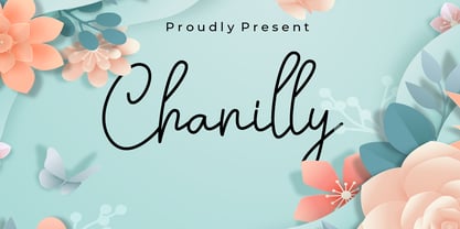 Chanilly is monoline script font which natural movement and elegant for signature style. is perfect for branding projects, logo, wedding designs, social media posts, advertisements, product packaging, product designs, label, photography, watermark, invitation, stationery and any projects that need handwriting taste. What’s Included : Standard glyphs Ligature Works on PC & Mac Simple installations Accessible in the Adobe Illustrator, Adobe Photoshop, Adobe InDesign, even work on Microsoft Word. PUA Encoded Characters – Fully accessible without additional design software. Fonts include multilingual support for; ä ö ü Ä Ö Ü ß ¿ ¡
 - Mix Blimp by Mix Fonts,
$13.00 Introducing BLIMP – a fun, playful, and charming handwritten font. Ideal for adding a personal touch to your social media posts, quotes, packaging, digital crafts, greeting cards, marketing materials, and more. This font was created using an iPad Pro and Apple Pencil for a truly authentic, digital handwriting style. Don’t let boring fonts weigh you down – add some bounce to your designs with BLIMP. – Mix Blimp includes the following characters: ABCDEFGHIJKLMNOPQRSTUVWXYZ abcdefghijklmnopqrstuvwxyz 0123456789 !@$#%^&*()`~♥❤✿•· ÷×+−±≈=≠[]<>‹›:;'",.|/?{}<>“”‘’-–—_…©®™<>«»°¹²³¡¿₱¢€£¥§† ÁÀÂÄÃÅĂĀĄÆĆČÇÐÉÈÊËĖĒĘIÍÌÎÏĪĮŁŃÑÓÒÔÖÕØŌŐŒŚŠȘȚÚÙÛÜŰŪŲÝŸŹŽŻÞ áàâäãåăāąæćčçðéèêëėēęıíìîïīįłńñóòôöõøōőœśšșțúùûüűūųýÿźžżþß Alternates: ff ll tt zz
 - Austaly by Multype Studio,
$14.00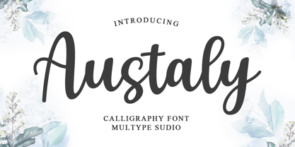 Austaly is a beautiful modern calligraphy font, featuring fun characters with their font characteristics. Austaly is perfect for branding projects, logo, social media posts, wedding designs, advertisements, product packaging, watermark, invitation, stationery and any projects that need handwriting taste. What’s Included : Standard glyphs & Ligature Works on PC / Mac Simple installations Accessible in the Adobe Illustrator, Adobe Photoshop, Adobe InDesign, even work on Microsoft Word PUA Encoded Characters, Fully accessible without additional design software. Multi-lingual support Thank you for your purchase! Hope you enjoy with our font!
 - Carputins by Maulana Creative,
$14.00 Carputins is a casual script font. With bold felt tip stroke, fun character with a bit of ligatures and has a two files lowercase alternates extra swashes. To give you an extra creative work. Carputins font support multilingual more than 100+ language. This font is good for logo design, Social media, Movie Titles, Books Titles, a short text even a long text letter and good for your secondary text font with sans or serif. Make a stunning work with Carputins font. Cheers, Maulana Creative
 - Lilypaly by Sronstudio,
$15.00 Lilypaly is a modern and elegant font with a lot of stylistic alternates for your beautiful project. I made this font carefully so that each letter could be connected well and elegantly either using alternate or not. Lilypaly includes start and ending swash, and middle swash for some letters, this is very easy to use. Lilypaly is perfect for many different project such as logos & branding, invitation, stationery, wedding designs, social media posts, advertisements, product packaging, product designs, label, photography, watermark, special events or anything.
 - Outedis by Twinletter,
$12.00 Outedis is a unique, cute, and charming handwritten font. you can use it for designs with various kinds of creations that require a touch of beauty, this font is the right choice for your elegant project. This font is designed with a natural touch of handwriting refined to create portions and compositions that suit your needs. So this font is perfect for crafts, kids writing, adventure posters, banner titles, wedding invitations, product packaging logos, quotes, social media page covers, furniture banner titles, book covers, and more.
 - Mykilove by Allouse Studio,
$16.00 Mykilove a Fun Lovely Font. Mykilove is perfect for any tittles, logo, product packaging, branding project, megazine, social media, wedding, or just used to express words above the background. Mykilove come with lovely stylistic alternates, ending swash, and Multi-Lingual Support. We highly recommend using a program that supports OpenType features and Glyphs panels like many of Adobe apps and Corel Draw, so you can see and access all Glyph variations. Enjoy the font, feel free to comment or feedback, send me PM or email. Thank You!
 - Monallesia by AEN Creative Studio,
$14.00 Monallesia is a sweet, soft hand-lettered font and monogram. Fall in love with its authentic feel and use it to create gorgeous wedding invitations, beautiful stationary art, eye-catching social media posts, Logo, Brand, and cute greeting cards. This display font is the perfect choice for making original and outstanding designs. This font is PUA encoded which means you can access all of the heart-themed glyphs and swashes with ease! It also features a wealth of special features including alternate glyphs and ligatures.
 - Big Sale by HIRO.std,
$14.00 Oneself is Handwritten Font This font describes about girly, feminist, elegant, dynamic, humanist, easy to use and will bring a good harmony when the letters are connected and paired each other. FEATURES - Uppercase and Lowercase letters - Support Ligatures - Numbering and Punctuations - Multilingual Support - Works on PC or Mac USE Oneself works great in any branding, logos, magazines, invitation, wedding designs, social media posts, advertisements, product packaging, product designs, label, photography, watermark, invitation, stationery, quotes and any projects that need handwriting taste. Enjoy using! Thanks. HIRO.std
 - Bhiver by Maculinc,
$14.00 Bhiver is a san serif font with an angled and curved style in every corner, we made it with a display style that is perfect for making product packaging such as: Coffee Packaging, Ice Cream Packaging, Beauty Packaging, and for Brochures, Templates, Social Media Post, and etc. Bhiver is also equipped with Swash which you can access according to what we have provided, form sentences as you like by combining Swashes to make it look more attractive like the example that I have previewed.