6,263 search results
(0.028 seconds)
- Chunky Nouveau JNL by Jeff Levine,
$29.00 Chunky Nouveau JNL was inspired by a circa-1928 water applied decal for the Top Most Insulated Jug. The plump, rounded hand lettering of the brand name was given a slightly thicker treatment to create a more poster-oriented display design. Chunky Nouveau JNL is available in both regular and oblique versions.
 - So Nouveau JNL by Jeff Levine,
$29.00 Three of the four letters of the name “Jane” on the cover of a vintage piece of sheet music inspired So Nouveau JNL. The free-form swoops emulating the pen lettering of the early 1900s adds a nostalgic charm to this typeface.
 - Nouveau Auto JNL by Jeff Levine,
$29.00 “The Auto Show” is the title of an early 1900s pieces of sheet music proving that America has had a fascination with cars since the earliest days of the automotive industry. The song sheet’s title was hand lettered in a casual Art Nouveau style which has been re-drawn digitally as Nouveau Auto JNL, and is available in both regular and oblique versions… and what’s better than a nouveau auto (a new car)?
 - Nouveau Arts JNL by Jeff Levine,
$29.00 The hand lettered title on sheet music for 1915's novelty song "Gasoline Gus and His Jitney Bus" by Byron Gay and Charley Brown offered up the lettering style which is now Nouveau Arts JNL.
 - Serif Nouveau JNL by Jeff Levine,
$29.00 Serif Nouveau JNL is a condensed type face based on the hand lettered title of a 1920s-era piece of sheet music for the song "Naturally".
 - Nouveau Impression JNL by Jeff Levine,
$29.00 Inspired by an image of some Art Nouveau wood type spotted online, Nouveau Impression JNL is available in both regular and oblique versions.
 - Nouveau Techno JNL by Jeff Levine,
$29.00 The French publication “La Lettre Dans le Decor et La Publicite Modernes” (“The Letter in the Modern Décor and Advertising”) was a 24-page booklet showcasing the then-current trends of the time (circa late 1930s-early 1940s). On one page was found a squared, extra bold sans serif alphabet set with strong Art Nouveau influences, yet it was ahead of its time by taking on the look and feel of 1980s techno typography. They say “everything old is new again”, and Nouveau Techno JNL is now available digitally in both regular and oblique versions.
 - Nouveau Calendar JNL by Jeff Levine,
$29.00 Inspired by the lettering on Koloman Moser’s poster design for Fromme’s Calendar (circa 1912), Nouveau Calendar JNL is available in both regular and oblique versions. According to Wikipedia: “Koloman Moser (30 March 1868 – 18 October 1918) was an Austrian artist who exerted considerable influence on twentieth-century graphic art and one of the foremost artists of the Vienna Secession movement and a co-founder of Wiener Werkstätte. Moser designed a wide array of art works, including books and graphic works from postage stamps to magazine vignettes; fashion; stained glass windows, porcelains and ceramics, blown glass, tableware, silver, jewelry, and furniture.”
 - Cartoon Nouveau JNL by Jeff Levine,
$29.00 Most of the lettering on a piece of sheet music for a song from the 1921 George M. Cohan musical comedy entitled “The O’Brien Girl” was hand lettered in a playful, casual Art Nouveau design with rounded ends. The characters on that page took on a look reminiscent of cartoon or comic strip wording, and the result is a digital typeface named Cartoon Nouveau JNL, which is available in both regular and oblique versions.
 - Nouveau Years JNL by Jeff Levine,
$29.00 Sheet music at the beginning of the 20th Century reflects both the musical and artistic tastes of the times in often colorful ways. It seemed to be a favorite thing amongst songwriters of that era to come up with very wordy song titles. The cover of the sheet music for 1907’s “Every Little Bit Added to What You’ve Got Makes Just A Little Bit More” checks in at fourteen words, but the hand lettered title (done in an Art Nouveau style) made it worthy of transposition into a digital type face. Nouveau Years JNL is available in both regular and oblique versions.
 - Quran Standard - Unknown license

- Bog Standard - Personal use only

- Standard Request by Bogstav,
$18.00 Standard Request is 100% handmade, and was inspired by both grafitti and comic book lettering. When viewed at large sizes, the handmade look and feel really stands out - at the same time, Standard Request, is super legible even at really small sizes. I've added 5 slightly different versions of each letter, and they automatically cycle as you type!
 - Signwriter Standard by Greater Albion Typefounders,
$16.50 Typeface for posters and signage. An extensive range of opentype features are incorporated:- Small Capitals, Title forms, stylistic alternates, old-style and lining numerals, ‘small capitals’ numerals, ligatures and so forth. A touch of flair an distinction is given to these solid letter forms by the provision of tiny serifs. Why not use Signwriter Standard and make an emphatic statement today!
 - Averta Standard by Intelligent Design,
$10.00 Averta Standard is the basic version of Averta. Bringing together features from early European grotesques and American gothics, Kostas Bartokas’ (Greek: ‘αβέρτα’ – to act or speak openly, bluntly or without moderation, without hiding) Averta is a geometric sans serif family with a simple, yet appealing, personality. The purely geometric rounds, open apertures, and its low contrast strokes manage to express an unmoderated, straightforward tone resulting in a modernist, neutral and friendly typeface. Averta Standard is intended for use in a variety of media. The central styles (Light through Bold) are drawn to perform at text sizes, while the extremes are spaced tighter to form more coherent headlines. The dynamism of the true italics adds a complementary touch to the whole family and provides extra versatility, making Averta Standard an excellent tool for a range of uses, from signage to branding and editorial design. Averta Standard comes with alternate glyphs, case sensitive forms and contextual alternates, in eight weights with matching italics and supports over two hundred languages with an extended Latin, Cyrillic (Russian, Bulgarian, and Serbian/Macedonian alternates), Greek and Vietnamese character set. It ships in three different packages offering different script coverage according to your needs: Averta Standard PE (Pan-European: Latin, Cyrillic, Greek), Averta Standard CY (Latin and Cyrillic), and Averta Standard (Latin and Greek). Averta's Cyrillic have received the 3rd Prize in the 2017 Granshan Awards in the Cyrillic Category.
 - Nuclear Standard by Zang-O-Fonts,
$25.00Strong, hard lines inspired the name of this font, based on the "nuclear standard" set by the U.S. and the Soviets during the cold war. - Standard Cap by Graffiti Fonts,
$19.99Standard Cap is rough font made to look like it was written with a "standard cap" (the cap that comes on a krylon, rusto or other spraycan). The font includes full uppercase and lowercase alphabets as well as a full array of numbers, symbols, punctuation etc. - Standard Jeglek by Allouse Studio,
$16.00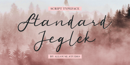 Standard Jeglek a Script Typeface Font. Standard Jeglek come along with Ligatures, Swash, and Multi-Lingual Support to fulfill your need. Standard Jeglek is perfect for any tittle, logo, product packaging, branding project, megazine, social media, wedding, or just used to express words above the background. Enjoy the font, feel free to comment or feedback, send me PM or email. Thank You!
 - Pacific Standard by Holland Fonts,
$30.00The Pacific Standard Bold was originally designed as a - capital only - poster typeface for a poster for the 30th International Film Festival Rotterdam in 2001 in the Netherlands. Theme of the festival was 'ports'. The design is inspired by the unpretentious typography often seen in ports. - Norden Standard by Asgeir Pedersen,
$23.99 The Standard version of the Norden font family (see Round and Display) is "a standard sans serif" font. However, the significant detail and difference is that it comes with slightly rounded end corners, which makes the font “easier on the eye”, especially at large sizes compared to traditional fonts with sharp-edge corners. This little but important difference gives the font a commanding yet poised presence, without it imposing itself, as it were.
 - Stylo Standard by Fonts of Chaos,
$10.00 With this font, you sure have the flow! Standard hand writing easy to apply in your designs and layouts. UPPERCASE lowercase Numerals Punctuation 198 characters
 - New Standard by ParaType,
$30.00 Designed at Polygraphmash circa 1940 (project manager Anatoly Shchukin). Based on the text typefaces of the late 19th and early 20th centuries of Obyknovennaya (Common) group. The digital version developed at ParaType in 1996 by Vladimir Yefimov. Initially designed for a collection of works by Lenin, this typeface was widely used in Soviet Union for technical and scientific books, both for text and display.
 - Pickle Standard by bb-bureau,
$65.00 Pickle Standard is the display version of bb-Standard rigorously built on a grid. Read the article by Madeleine Morley for Eye on Design: A Font as Crisp, Squat + Rounded as a Pickle 3 styles: italic, regular and reversed italic
 - Standard Poster by ParaType,
$25.00 Designed at Polygraphmash type design bureau in 1986. Based on "English" bold styles of the Ossip Lehmann type foundry (St.-Petersburg), of mid-19th century. The digital version was developed at ParaType in 1992 by Vladimir Yefimov. For use in advertising and display typography.
 - Standard CT by CastleType,
$59.00 CastleType was commissioned in 1991 by San Francisco Focus magazine to digitize three members of the Standard family. This is a Continental lineale that was popular in Switzerland in the 1950s and later in the United States. A cousin to the classic sans serifs, Standard is an alternative that is considerably warmer and a bit more idiosyncratic. In 2008, CastleType released additional members of the Standard CT family to make it a complete typographic solution with three widths (normal, condensed, extended) of four weights each (Regular, Medium, Bold, and Extra Bold). Some of the original Standard fonts, particularly Standard Regular, appear to have been hastily designed (or perhaps too closely imitated Helvetica); these have been greatly improved in the CastleType versions with more harmonious proportions and other refinements. The three lighter weights of the Extended subfamily were designed from scratch based on the new Standard CT Regular and Standard CT Extended Extra Bold. More recently, four light weights (Light, Extra Light, Ultra Light, and Hairline) have been added to each of the three widths. The entire Standard CT family includes support for most European languages, OpenType features, arbitrary fractions, and a collection of geometrics, dingbats & fleurons.
 - Arquitecta Standard by Latinotype,
$16.00 Arquitecta Standard. The humanist typography as a rational project. Since the experimentation from the Bauhaus through modern sans history we looked for a new mix to construct a rational geometric typeface with humanist proportions suitable for text layout and continuous reading. Inspired by American & European hand lettering from the first half of the past century, Arquitecta finds his own space as a great alternative for paragraphs in front of classics like Futura, Kabel or Avant Garde. The family contains 8 upright romans and 8 italics with the following features: - European accents. - Ink traps to avoid press impressing spots & hinting optimized. - Small X-height with accentuated ascenders and descenders. Arquitecta Standar update: Improvements of proportions and drawing. The set was extended to the current one of Latinotype.
 - Bernhardt Standard by Linotype,
$40.99Bernhardt Standard, which was designed in 2003 by Julius de Goede, is a flowing Bastarde script. Bastarde is one of the sub-categories of Blackletter typefaces. The term Blackletter refers to typefaces that have evolved out of Northern Europe’s medieval manuscript tradition. Often called gothic, or Old English, these letters are identifiable by the traces of the wide-nibbed pen stroke within their forms. Of all of the various sorts of Blackletter styles, Bastarde scripts are the most flowing, or Italic. The first Bastarde typefaces, cut in the late 1400s, were based on French handwriting styles, especially those styles popular in Burgundy. The flowing nature of Bernhardt Standard makes it similar to some other sorts of Blackletter typefaces as well. Bernhardt Standard, because of its handwritten roots, is also similar to Kurrent, a style of handwriting that was popular in Germany prior the 20th Century. Bernhardt Standard is a very calligraphic face, suitable for formal applications. This typeface would be an excellent choice for certificates or awards. The old style figures in the font allow for nice short settings of text as well. - Gold Standard by FontMesa,
$30.00 Gold Standard got its start from a few letters found on an old Gold Certificate from 1882. From those few letters spelling out the word GOLD, the rest of the alphabet was designed to match. The lowercase design was based on lettering found on an old silver certificate from approximately the same year.
 - Figgins Standard by Shinntype,
$39.00 To meet the burgeoning demands of commerce, type founders in 1830s London introduced a plethora of new fonts which abandoned the traditional nib-informed model. Most radical were bold, capital-only designs with almost no stroke contrast, stripped bare of serifs. To all intents and purposes these minimal expressions of utility were identical to 20th century functionalism. Recontextualizing one of the original sans fonts, Shinn offers an alternative proposition to the myth of modernism.
 - BB Standard by bb-bureau,
$60.00 Grid inspired typefaces in 6 weights: 20, 40, 60, 80, 100 and 120 language: all latin glyphs
 - Standard Typewriter by Intellecta Design,
$29.00 Standard Typewriter, one of the Intellecta's bestsellers, is a family of emulation typewriter fonts with a partocular thin and beautifuldesign to improve your artwork.
 - Grunge Standard by Scholtz Fonts,
$9.50 Grunge Standard is to grunge fonts what Jazz standards are to the world of Jazz – timeless, easy to use, great for every occasion. The font is easily recognized, clear and legible, just like the tune that everyone knows. Use Grunge Standard for contemporary display work, for fashion items, for event posters, movie posters, music posters, videos, DVD covers, in fact, anywhere that grunge fonts could possibly appear. Grunge Standard contains over 250 characters - (upper and lower case characters, punctuation, numerals, symbols and accented characters are present). It has all the accented characters used in the major European languages.
 - Tecna Standard by Descarflex,
$20.00 The Tecn@ Standard family was designed so that its characters are legible and easy to interpret in any writing; among them, the descriptive memory of plans for example. Tecn@ Standard complements the Tecn@ Background Light and Dark Square Triangle font family.
 - Stanford by profonts,
$41.99 The strong, geometric letterforms of this typeface incorporate a heavy outline and were inspired by college and university sportswear, making Stanford an excellent choice for work associated with sports in general.
 - Estandar by Latinotype,
$- Estandar is a retro and vintage wayfinding sans serif font, inspired by old signal in central park and Europe.
 - Fun Time Nouveau JNL by Jeff Levine,
$29.00 “One Hundred Alphabets for the Show Card Writer” was published in 1919 to afford sign artists the ability to create signs and show cards in then-contemporary lettering styles. One such alphabet was big, bold and representative of the Art Nouveau stylings popular in the early part of the 20th Century. Most likely it was applied to store sales and public events that were casual and informal, for its letter forms are free of any constraints. This design is now available as Fun Time Nouveau JNL in both regular and oblique versions.
 - Old Time Nouveau JNL by Jeff Levine,
$29.00 The 1914 sign lettering instruction book “Art Alphabets and Lettering” by J. M. Bergling showcased many hand lettered alphabets as an inspiration to both up-and-coming and established sign painters. One page in particular featured a classic free-form Art Nouveau style with rounded shapes. This style of lettering was emulated in the 1960s by designers of rock concert posters, so the style is reminiscent of the Art Nouveau period as well as the 1960s. Old Time Nouveau JNL is available in both regular and oblique versions.
 - Two Step Nouveau JNL by Jeff Levine,
$29.00 Popular music of the early 1900s included a genre called two step; round dances utilizing a sliding step with a tempo in either march or polka time. 1911's "Daughters of the American Revolution" was one such march/two step. The cover of the sheet music had the title hand lettered in a slightly rounded sans serif type design in the Art Nouveau style popular during that era. It is now available as Two Step Nouveau JNL, in both regular and oblique versions.
 - Nouveau To Go JNL by Jeff Levine,
$29.00 Nouveau To Go JNL is the digital version of the hand lettered title found on the 1915 sheet music for the song "Don't Bite the Hand That's Feeding You", and is available in both regular and oblique versions.
 - Bay Area Nouveau JNL by Jeff Levine,
$29.00 Bay Area Nouveau JNL is an ultra bold, Art Nouveau headline font inspired by hand lettering on the cover of a piece of 1911 sheet music entitled "The Only Pal I Ever Had Came from 'Frisco Town'".

