2,096 search results
(0.037 seconds)
- Nouveau Years JNL by Jeff Levine,
$29.00 Sheet music at the beginning of the 20th Century reflects both the musical and artistic tastes of the times in often colorful ways. It seemed to be a favorite thing amongst songwriters of that era to come up with very wordy song titles. The cover of the sheet music for 1907’s “Every Little Bit Added to What You’ve Got Makes Just A Little Bit More” checks in at fourteen words, but the hand lettered title (done in an Art Nouveau style) made it worthy of transposition into a digital type face. Nouveau Years JNL is available in both regular and oblique versions.
 - Astro 869 - Unknown license

- Vectroid Astro - 100% free

- Astro 867 - Unknown license

- Astro 868 - Unknown license

- FS Ostro by Fontsmith,
$80.00 Cosmopolitan Elegance Named after a southerly wind that blows over the Mediterranean Sea, FS Ostro breathes warmth into letterforms with their roots in colder, stark Modern typefaces. FS Ostro is a typeface imbued with balanced and sophisticated elegance. It’s discerning and sensitive, self-assured but understated. One for the well-travelled reader. Thoughtful contrast FS Ostro draws inspiration from a wide range of sources, such as 19th century British Scotch Roman designs, Italian modern style typefaces and highly contrasted display Spanish examples. Its text version offers a consistent rhythm and robust texture that is easy on the eye. This elegant, cosmopolitan typeface is characterised by its thoughtfully modulated contrasts between thick and thin, sharp angles, and sophisticated curves. Exaggerated touches in display “What is more restrained and sober in text, becomes purposefully prominent and more detailed in display,” says Fontsmith designer Alessia Mazzarella. These exaggerated details for the display version can be seen in the letter terminals, such as those in the ‘a’ and ‘g’ and the tail of the ‘Q’, as well as in the set of numerals, fractions, arrows, borders and ornaments, which can be used to build decorative framing elements. Fluid italics The less rigid and curvaceous italics of modern style typefaces were the inspiration for FS Ostro’s own subtle, flowing italic styles. The letterforms are confident and fluid, creating an overall sense of refinement and modernity.
 - Bisco Condensed by Galapagos,
$39.00Bisco Condensed is a small capital design inspired by hand lettered memorial wall art from the Harlem section of New York City. As a memorial, this design is dedicated to a type design colleague who lost his long battle with cancer. This font is a tribute to his strength and his liveliness. The original idea for Bisco Condensed was to capture the energy of those unique "streetforms" in a text/display design and encapsulate them into a lively & fluid type design with a high level of readability at all point sizes. Bisco Condensed is an excellent type for expressive display layouts. It works well as an independent design or a long with contemporary sans serifs that complement Bisco's irregular contours, weighting and bounce. - Nitro Chargers by Mevstory Studio,
$25.00 Nitro Chargers an awesome sports fonts, modern cutouts, and dynamic slant. Ideal for fast car racing sports titles, running matches, cycling, automotive game logos and monograms or other modern dynamic text. Nitro Chargerscompare favorably with legibility and size, creating the effect of power and speed. Designed as a fast and dynamic font, but with a slightly different font design, check it out and grab it right away.
 - Estro Venora by Ilhamtaro,
$32.00 ESTRO VENORA is a serif font with a vintage style of Victorian influence. A classic font that matches the vintage layout design combined with abstract leaf or floral ornaments. This font is an all caps font, with a letter height difference between the uppercase and lowercase. It is suitable for vintage logo designs such as liquor logos and label designs. To enable the OpenType Stylistic alternates, you need a program that supports OpenType features such as Adobe Illustrator CS, Adobe Indesign & CorelDraw X6-X7. Cheers!
 - Astro Bats by Greater Albion Typefounders,
$5.00 AstroBats is a fun set of ornaments with a 'Retro Sci-Fi' theme. Think of those 1950s Japanese tinplate robots, think ray guns, think spaceships! Have fun!
 - ITC Astro by ITC,
$29.99ITC Astro is the typeface that proves you can get your work done while watching cartoons. “It all started as a series of doodles while I was watching The Jetsons,” recalls Sasa Petricic. “The show's impossibly simplistic vision of the twenty-first century cried out for a font that fit into that world -- a world where everyday objects can carry far more fun and personality than they should.” ITC Astro is the first commercial typeface design from Petricic, whose “day job” is working as a reporter for the Canadian Broadcasting Corporation. Petricic has filed stories from across Canada and around the world for CBC's flagship evening newscast, The National. His reports have also appeared on CNN and BBC Television. Petricic's work as a correspondent and video journalist have taken him to six continents, covering everything from famine and genocide in Africa to the war in Iraq. With such serious matters filling the hours of Petricic's day as a journalist, it's not hard to see why he conceived Astro as a welcome blast of whimsy. “As I began to draw the design,” he says, “I decided that every part of Astro should be a cartoon character unto itself.” Each character has its own baseline shadow (or coaster, or circular antigravity generator, depending on how you look at things). The angular caps dance jauntily, rocking from left to right, while a suite of companion small caps provide backup. The end result is a design quite unlike any other, with surprising charm and versatility. ITC Astro comes in a two-weight family of White and Black. - Astro Serif by Typehead Studio,
$15.00 Introducing Astro, a charming serif font designed to bring an elegant and classic touch to your designs. Crafted with meticulous attention to detail and inspired by mid-millennium Serifs, Astro seamlessly blends traditional sophistication with contemporary elements, making it suitable for a variety of design projects, both print and digital. Enchanting Letter Shape Designs: Astro exudes charm with its letter design that is heavily inspired by the mid-millennium Serifs often found in European and American designs. Each letter is carefully carved to create a charming and luxurious impression. Unique Alternative Glyphs: Astro is not just a font; it is a standout typographic masterpiece. By offering several unique alternative glyphs, such as the letters a, g, and k, Astro gives designers the freedom to express their creativity in a unique and personal way. Mid-Millennium Serif Elegance: Astro features smooth lines and proportions, creating an elegant impression characteristic of mid-millennium Serifs. This design provides a timeless classic touch making it suitable for a variety of design needs, including books, magazines, posters and other printed materials. Ease Readability: While the Astro exudes striking elegance, its design also prioritizes readability and comfort. Each letter is created with balanced proportions and optimal contrast, ensuring text appears clear and easy to read, whether on a large or small scale. Flexible Use: Astro is designed to provide flexible use across a variety of design platforms. From the logo design to the magazine layout, Astro adapts beautifully, maintaining a consistent feel that enhances the aesthetic quality of the design. European and American inspiration: Astro creates a bridge between European and American typographic styles, combining the best elements of both traditions. This makes it the perfect choice for projects that combine elements from both continents. Astro is more than just a font, it is an artistic statement that leaves an unforgettable impression on any design project. Suitable for designers who appreciate classic beauty and modern uniqueness, Astro brings a special and charming feel to every character it creates.
 - Intro Rust by Fontfabric,
$25.00 Intro Rust is one of the biggest packages on the market, including 214 fonts. The font family is a rough version of the famous Intro. Intro Rust includes 4 sub-families - Intro Rust, Intro Script, Intro Head and Intro Goodies. It can be used to create almost all types of design projects like print materials and web design. Just use your imagination and your project will become more alive and vivid than ever with one of the Intro Rust fonts. You want to make a greeting card or a package design, or even a brand identity? Feel free to play with all the patterns and shapes, scripts or those cool fonts with the dots and that will lead you to your next successful project.
 - Intro Script by Fontfabric,
$19.00 Intro Script carries with it ideas of resurgence, renewal and unconditional freedom. An updated and expanded version of the Intro Rust sub-family, itself developed from the popular Intro type system, Script comes with 8 different weights and a whole slew of goodies and additional features for you to tinker with. These consist of 3 supplementary fonts with ready-made words, patterns and even banners, so you can put the spark back into your project. The set includes a large number of ligatures and contextual alternates, including both lower and upper case versions, as well as positional variations. The latter allow for symbols to connect at different joints, and help you dodge unnecessary voids, resulting in an efficient work process and a more natural flow. With its broad language support and wide range of OpenType features, Intro Script’s friendly, hand-crafted appearance makes it a suitable and flexible choice for any design. Features: • An updated and polished version of the famous multifaceted bundle • 8 refined monoline styles; • Extended language support; • Supplementary goodies - words, patterns, banners; • Additional ligatures and contextual alternates; • Stylistic positional variations;
 - Astro Jack by FHFont,
$19.00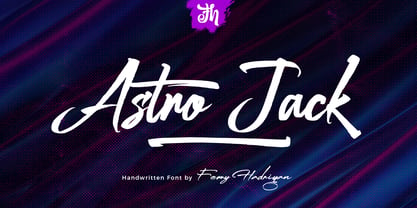 Astro Jack is script font with a hand-lettering, brush style and OpenType features. It is suitable for design, element design, weddings, events, t-shirts, logos, badges, stickers, and awesome work. Features Of The Font: - All Standard Character, Symbol, Multi-lingual Support, Ligature, Stylistic Set, and Swashes. - PUA Encode
 - ITC Intro by ITC,
$29.99 - Noveu by Fontfabric,
$35.00 Noveu is a custom font which is applicable for any type of graphic design - web, print, motion graphics etc and perfect for t-shirts and logos.
 - Futurex Distro - Wiped Out - Unknown license

- Couteau Suisse - Unknown license

- Art Nouveco by Ilhamtaro,
$23.00 ART NOUVECO is a cross between art nouveau and art deco fonts, this font will become a new and interesting trend to explore in a design, elegant art nouveau is made a little more masculine due to the influence of art deco, resulting in a slightly elegant but elegant font. Fonts that still match the art deco style but have a slight touch of grace, will be suitable for classic but elegant designs. To enable the OpenType Stylistic alternates, you need a program that supports OpenType features such as Adobe Illustrator CS, Adobe Indesign & CorelDraw X6-X7. Cheers!
 - Historism Border 2D by 2D Typo,
$36.00 Historism Border 2D is a collection of ornaments organized into four font files. The ornaments can be divided into two groups: Friezes (borders) and Rapports (patterns). All the ornaments attribute to the period of Historicism, which prevailed in art in the middle of the 19th century. The ornaments are based on elements of architectural decorations of Lviv buildings in Ukraine. The author personally collected the material and embodied it in the font. This makes the font exclusive and unique among other digital collections of ornaments. These patterns are perfectly suited to be used in the design of invitations, diplomas, certificates or other printed materials in classic-style design.
 - BR Nouveau Ramblings 2 - Personal use only

- Fun Time Nouveau JNL by Jeff Levine,
$29.00 “One Hundred Alphabets for the Show Card Writer” was published in 1919 to afford sign artists the ability to create signs and show cards in then-contemporary lettering styles. One such alphabet was big, bold and representative of the Art Nouveau stylings popular in the early part of the 20th Century. Most likely it was applied to store sales and public events that were casual and informal, for its letter forms are free of any constraints. This design is now available as Fun Time Nouveau JNL in both regular and oblique versions.
 - TA Bankslab Art Nouveau by Tural Alisoy,
$40.00 TA Bankslab graphic presentation at Behance The building of the Northern Bank of St. Petersburg's Baku branch was built in 1903-1905. It was the first Art Nouveau-style building in Baku, Azerbaijan. Later the bank was transformed into the Russian-Asian Bank. After the oil boom in Baku in the 19th century, branches of many banks and new banks were opened in the city. The branch of the Northern Bank of St. Petersburg was among the first banks that was opened in Baku. N.Bayev was the architect of the building for the branch of the Northern Bank of St. Petersburg located at Gorchakovskaya 3 in 1903-1905. The building currently houses the Central Branch of the International Bank of Azerbaijan. My purpose in writing this is not to copy and paste the information from Wikipedia. What attracted me to the building was the word "Банкъ" (Bank) written in Cyrillic letters, which was also used in Azerbaijan during the Soviet era. The exact date of the writing is not known. Every time I pass by this building, I always thought of creating a font of this writing someday. I had taken a photo of the building and saved it on my phone. I did a lot of research on the font and asked a lot of people. However, some did not provide information at all and some said they did not have any information. I was interested in the history of this font but I do not know if this font really existed or it was created by the architect out of nowhere. If there was such a history of this font, I wanted to recreate this font and make it available. If not, I had to create it from scratch in the same way, using only existing letters on the building. Finally, I made up my mind and decided to develop the font with all letters I have got. It was difficult to create a font based on the word, Банкъ. Because in the appearance of the letters, the midline of the letters on A, H, K was very distinct, both in the form of inclination and in more precise degrees. The serif part of the letters, the height of the upper and lower sides, differed from each other. I don't know whether it was done this way when the building was constructed or it happened over time. I prepared and kept the initial version of the font. I took a break for a while. I started digging on the story of the font again. Meanwhile, I was researching and got inspired by similar fonts. Unfortunately, my research on the font's history did not yield any results. I decided to continue finishing up the font. After developing the demo, I created the font by keeping certain parts of these differences in the letters. In addition, I had to consider the development of letters in the Cyrillic, as well as the Latin alphabet, over the past period. Thus, I began to look at the appearance of slab-serif or serif fonts of that time. In general, as I gain more experience in developing fonts, I try to focus on the precision of the design for each font. In recent years, I specifically paid attention to this matter. YouTube channel and articles by Alexandra K.'s of ParaType, as well as, information and samples from TypeType and Fontfabric studios on the Cyrillic alphabet were quite useful. I gathered data regarding the Latin alphabet from various credible sources. I do not know if I could accomplish what I aimed at but I know one thing that I could develop the font. Maybe someday I'll have to revise this font. For now, I share it with you. I created the font in 10 styles. 7 weight from Thin to Extra Black, an Outline, Shadow, and Art Nouveau. The Art Nouveau style was inspired by the texture in the background used for the text on the building. The texture I applied to capital letters adds beauty to the font. If you like the font feel free to use it or simply let me know if your current alphabet doesn't support this font.
 - Old Time Nouveau JNL by Jeff Levine,
$29.00 The 1914 sign lettering instruction book “Art Alphabets and Lettering” by J. M. Bergling showcased many hand lettered alphabets as an inspiration to both up-and-coming and established sign painters. One page in particular featured a classic free-form Art Nouveau style with rounded shapes. This style of lettering was emulated in the 1960s by designers of rock concert posters, so the style is reminiscent of the Art Nouveau period as well as the 1960s. Old Time Nouveau JNL is available in both regular and oblique versions.
 - PR Nouveau Ornaments 01 by PR Fonts,
$10.00 This is a set of ornaments inspired by the art nouveau style. Frames, corners, rules and flowers are included.
 - Two Step Nouveau JNL by Jeff Levine,
$29.00 Popular music of the early 1900s included a genre called two step; round dances utilizing a sliding step with a tempo in either march or polka time. 1911's "Daughters of the American Revolution" was one such march/two step. The cover of the sheet music had the title hand lettered in a slightly rounded sans serif type design in the Art Nouveau style popular during that era. It is now available as Two Step Nouveau JNL, in both regular and oblique versions.
 - Nouveau To Go JNL by Jeff Levine,
$29.00 Nouveau To Go JNL is the digital version of the hand lettered title found on the 1915 sheet music for the song "Don't Bite the Hand That's Feeding You", and is available in both regular and oblique versions.
 - Bay Area Nouveau JNL by Jeff Levine,
$29.00 Bay Area Nouveau JNL is an ultra bold, Art Nouveau headline font inspired by hand lettering on the cover of a piece of 1911 sheet music entitled "The Only Pal I Ever Had Came from 'Frisco Town'".
 - Nouveau Semi Stencil JNL by Jeff Levine,
$29.00 The cover on the sheet music for the 1922 song "If She Comes from Dixie" had the title hand-lettered in an Art Nouveau style with a semi-stencil effect. It's now available as Nouveau Semi Stencil JNL in both regular and oblique versions. The typeface is not considered a "pure" stencil because many of the letters were made solid; lacking the classic stencil "breaks" at key points found in more traditional stencil designs.
 - La Vie Nouveau JNL by Jeff Levine,
$29.00 Early 1900s songwriters had a penchant for devising lengthy titles for their compositions. A perfect example from 1909, "It Is Hard to Kiss Your Sweetheart When the Last Kiss Means 'Good Bye'" is a whopping fourteen words long. The sheet music for this piece has a hand lettered, Art Nouveau sans serif design which became the working model for La Vie Nouveau JNL [which translates to "the new life"], and is available in both regular and oblique versions.
 - Nouveau Stencil Ornate JNL by Jeff Levine,
$29.00 A 1902 publication entitled "Lettering for Schools & Colleges" had an example of an ornate, hand drawn stencil alphabet in the Art Nouveau style. This is now available digitally as Nouveau Stencil Ornate JNL, in both regular and oblique versions.
 - Art Nouveau 2 BA by Bannigan Artworks,
$19.95This is an original font designed in the Art Nouveau style. - Minya Nouvelle - Unknown license

- Minya Nouvelle - Unknown license

- Minya Nouvelle - Unknown license

- Minya Nouvelle - Unknown license

- Niveau Serif by HVD Fonts,
$40.00 Niveau Serif - the companion of Niveau Grotesk - is a type family of six weights plus matching italics & small caps. It was designed by Hannes von Döhren in 2013. Influenced by classical nineteenth century engravers faces, the fonts are based on geometric forms. Niveau Serif has a contemporary feel and combines the clearness of a Sans with the elegance of a typeface with serifs. Niveau Serif is equipped for complex, professional typography with alternate letters, arrows, fractions and an extended character set to support Central and Eastern European as well as Western European Languages.
 - Nouvelle Vague by Anatoletype,
$22.00Nouvelle Vague is a display script typeface of a distinguished look defined by a steady rhythm, only broken by its offbeat, dynamic uppercase initials. It's directly inspired by french advertising scripts from the fifties, particularly by Roger Excoffon's Mistral. In order to accentuate this influences and to reproduce their graphic impact, simply structured connections between letters are preferred over OpenType fanciness. - Niveau Grotesk by HVD Fonts,
$40.00 Niveau Grotesk—the companion of Niveau Serif —is a type family of six weights plus matching italics and small caps. It was designed by Hannes von Döhren in 2013. Influenced by classical nineteenth-century faces, the fonts are based on geometric forms. Because of its straight architecture, Niveau Grotesk has a “punch” in big sizes but is very legible in smaller sizes and longer texts—in print or on screen. Niveau Grotesk is equipped for complex, professional typography with alternate letters, arrows, fractions and an extended character set to support Central and Eastern European as well as Western European Languages.


