10,000 search results
(0.029 seconds)
- Simple Crush by Bogstav,
$15.00 Simple Crush is my down-to-earth-comic-font with no hassle! Well, actually Simple Crush might take you by surprise here and there - because there is no real rules to height, width, curves and thickness…or whatever. When it comes to Simple Crush, you’re in luck - because Simple Crush is legible and stands out as a strong comic font, ready for action…even though the mission is a party invitation, birthday, poster or products for kids and pets!
 - Explore Everyday by Anomieka,
$13.00 Explore everyday is authentic display three style font. You can take advantage of these with any program that supports OTF features. These can also be accessed via the glyphs panel in some programs. NOTE: Because the nature of overlapping glyphs alternates must be selected manually in the Outlines version from the Glyphs panel. Kerning is extremely tight and best displayed at larger sizes.Use it for sport, movie, game, racing designs, or nearly anything related to speed and power
 - VLNL Dream Meal by VetteLetters,
$6.00 Nowadays, everything is ‘In The Cloud’. So why not put information in clouds directly? Here it is: a happy dreamy cloudy font. It’s called Dream Meal. Don’t read, just dream away; about nice food and typographic sensations. You can set whole texts 'in the cloud'. Every character makes up a part of a cloud. The clouds can float to the left or to the right. It’s an Open Type font. Actually: This font is a dream!
 - Skapa by Fontoura,
$24.00 Skapa is all about creation (translation from Old Norse: "to create"). It's simply the font I always needed and wanted. A well balanced, modern with delicate round corners sans serif, comprised of 5 weights with matching italics. Great for varied graphic design projects and perfect for logos and headlines, print art, billboards etc. Extended support for Central, Eastern and Western European languages. OpenType layout features: Fractions, oldstyle figures, ligatures, slashed zero, superscript, subscript, numerator, denominator and combining diacriticals (Mark Positioning) plus tabular figures for standard figures ,oldstyle figures & currency symbols. Think. Design. Create.
 - Merlod by Stawix,
$30.00 Merlod has depicted its characters from Latin-American sign painting and reinterpreted them into modern approaches. This typeface is a friendly, fun and flexible family that is fun to use, consisting of 3 different styles that each comes with 7 weights. Each style of Merlod – Norme, Autre and Queue, possess a distinctive character but works together compatibly. Merlod also comes with a special stylistic set that allows the user to be creative and playful with the type, it helps enhance many different possibilities that certainly will spice up your design.
 - Recording Artist JNL by Jeff Levine,
$29.00 When 45 RPM records were the norm for a teenager’s music collection in the 1950s and 1960s, many discs had their labels printed by letterpress. Some record companies utilized a bold, condensed typeface set in all caps for the song’s title and other pertinent information. The digital version of this font is called Recording Artist JNL, and is available in both regular and oblique versions. A companion font loosely based on this type design [but with more original characters and a slightly lighter weight] is Promotional Copy JNL.
 - Melodica by Scholtz Fonts,
$19.95 Melodica was so named because the characters dance easily across the page as music wafts across a room. The font was designed to meet the need of designers that need clarity, sensuousness, a suggestion of the oddball, and a modicum of humor. With its boldly curvy caps, and large x-height lower case characters, Melodica suggests a boldness of purpose while enjoying a well modulated delicacy of line. Use Melodica for any purpose that wants a happy, vibrant, slightly quirky yet "not too far from the norm" solution. Language support includes all European character sets.
 - Marcione by Eko Bimantara,
$24.00 Marcione is the real deal, a contemporary and dynamic condensed display font family that blends the classic Deco and Grotesk styles in a playful and modern way. This font family got personality, you can see it right away in the lowercase letters, with a diagonal stem in characters like “a”, “h”, “m”, and “n” that gives it that extra kick. You can use Marcione to create some killer designs in editorial, branding, or advertising. This font family packs a punch with six distinct styles, ranging from Light to ExtraBold, and it’s got you covered with broad Latin language support. That means no matter where you’re from, Marcione can help you make a statement. This font is highly versatile and visually engaging, a true boss. With its condensed design, it takes up minimal space while still commanding attention and conveying a sense of sophistication. Trust me, you won’t regret having Marcione in your font library, it’s the real deal.
 - Sticky Fingers by Comicraft,
$19.00 LOOK OUT! It's kinda creepy, we know, but we're convinced that this font does whatever a spider can -- in fact, we believe it can actually spin a web of pretty much any size, and even catch thieves as if they were bugs of some sort -- let's say flies. In fact we'd almost go so far as to say that, in the chill of night (perhaps at the scene of a crime) this font may just arrive like a streak of light in the nick of time. We're releasing this font now not for wealth or fame, we ignore those things, action is our reward. Here at Comicraft we think of life as a great big bang up, and whenever there's a hang up, you won't find us climbing -- or crawling -- the walls... well, not without STICKY FINGERS anyway. Find yourself a pair of webshooters and this font is the perfect complement to any Halloween costume.
 - Ongunkan Younger Futhark by Runic World Tamgacı,
$45.00 The Younger Futhark, also called Scandinavian runes, is a runic alphabet and a reduced form of the Elder Futhark, with only 16 characters, in use from about the 9th century, after a "transitional period" during the 7th and 8th centuries. The reduction, somewhat paradoxically, happened at the same time as phonetic changes that led to a greater number of different phonemes in the spoken language, when Proto-Norse evolved into Old Norse. Also, the writing custom avoided carving the same rune consecutively for the same sound, so the spoken distinction between long and short vowels was lost in writing. Thus, the language included distinct sounds and minimal pairs that were written the same. The Younger Futhark is divided into long-branch (Danish) and short-twig (Swedish and Norwegian) runes; in the 10th century, it was further expanded by the "Hälsinge Runes" or staveless runes. The lifetime of the Younger Futhark corresponds roughly to the Viking Age. Their use declined after the Christianization of Scandinavia; most writing in Scandinavia from the 12th century was in the Latin alphabet, but the runic scripts survived in marginal use in the form of the medieval runes (in use ca. 1100–1500) and the Latinised Dalecarlian runes (ca. 1500–1910)
 - ATTACK OS by OS CORP,
$25.00 ATTACK OS font version: 1.0 is the first version, including 340 characters, there are 4 types of handwriting that are: Regular; Italic; Bold; Bold Italic. We work with agencies and brands on visual identities and custom type design. Do you need a new font? Or an adjustment of the existing one? We can handle it on a best technological and creative level. New font design We create a concept and drawing of a completely new font to emphasise the character of your brand or project. Modifications to our fonts We adjust one of our retail fonts to your needs. It usually means a small change in design, an extension of the language set or icons. Let’s discuss how we can work together
 - Bumble OS by OS CORP,
$3.00 BUMBLE OS font version: 1.0 is the first version, including 340 characters, there are 3 types of handwriting that are: Regular (Regular); Italic (Italic); Bold (Bold). We work with agencies and brands on visual identities and custom type design. Do you need a new font? Or an adjustment of the existing one? We can handle it on a best technological and creative level. New font design We create a concept and drawing of a completely new font to emphasise the character of your brand or project. Modifications to our fonts We adjust one of our retail fonts to your needs. It usually means a small change in design, an extension of the language set or icons. Let’s discuss how we can work together
 - Moho Script by John Moore Type Foundry,
$24.95 Moho Script introduces a decorative modern geometric of Japanese, sometimes german flavor for an unconventional script. It breaks the mold of the usual fonts to create a new visual impact of absolute contemporaneity with a retro touch. Moho Script, as all typefaces of this extended family, comes in five weights and an inline style, and it's been provided with a complete set of glyphs for languages of the Eastern and Western Europe. With the OpenType feature Swash you can make words with letter "t" that overlap to achieve what no meet in others typefaces. Moho Script is a perfect font for headlines display, menus, deals, logos, labels, outdoor advertising and publishing design, great for architecture, fashion, music, aviation and social affairs.
 - Comp Sans 226 by Type Associates,
$24.95 Once upon a time, in the days BC (that's Before Computers) there lived a very talented group of men and women whose job it was to render ads by hand. So skillful were these people that some say it was possible to actually identify the typefaces that the layout artists were emulating. Their renderings were swift and slick, no time for detail as it was necessary to do a whole bunch of variations, usually within ridiculous deadlines. Their only tools: bullet-tip markers and bond paper - often mistakes resulted but no time to re-do and white paint was totally unacceptable - just let the slipups be. Here's a simulation of their craft, we don't really know what typeface this was supposed to represent… any ideas?
 - Aros by Jonahfonts,
$40.00 Usage recommendations: Captions, fliers, packaging, cards, posters, ads, book jackets, manuals, menus, bulletins, magazines, greetings, announcements.
 - Juke Box by Jonahfonts,
$35.00 Usage recommendations: Captions, fliers, packaging, cards, posters, ads, book jackets, manuals, menus, bulletins, magazines, greetings, announcements.
 - Spencerian Palmer Penmanship by Intellecta Design,
$26.90 The concepts of this font come from the Palmer’s Penmanship guides and manual from XIX century.
 - Pinot Noir by Jonahfonts,
$40.00 Usage recommendations: Captions, fliers, packaging, cards, posters, ads, book jackets, manuals, menus, bulletins, magazines, greetings, announcements.
 - TELETYPE 1945-1985 - Unknown license

- Carbon Neutral by Okaycat,
$29.95 Carbon Neutral has a distinctly human style - lettering done cleanly with care -- not mass-produced nor mechanical. Get smooth typography which upon closer inspection is gritty & grassroots. The small details make this font friendly & inviting. Carbon Neutral has an exceptionally high level of detail which may cause your graphics program to operate slowly. Carbon Neutral is extended, containing West European diacritics & ligatures, making it suitable for multilingual environments & publications.
 - AT Move Herengracht by André Toet Design,
$39.95 HERENGRACHT (Patricians' Canal or Lord’s Canal) is the first of the three major canals in the city centre of Amsterdam. The canal is named after the heren regeerders who governed the city in the 16th and 17th century. The most fashionable part is called the Golden Bend, with many double wide mansions, inner gardens and coach houses on Keizersgracht. Former bureau of André Toet (SO)Design was situated there for over 32 years, it was about time to name one of our fonts to: HERENGRACHT. Concept/Art Direction/Design: André Toet © 2017
 - Eshajori by Zenmurai,
$25.00 Eshajori is an elegant and soft serif font. The primary challenge in designing this font was finding a balance between complexity and simplicity, while ensuring it could be used on both computer screens and in print. Another challenge was achieving harmony between the characters, punctuation, and numerals, creating a visually appealing and playful visual vocabulary overall.
 - Daguin by Konstantine Studio,
$18.00 Introducing DAGUIN, inspired by the medieval look and feel in fashion visual, fusion up with the contemporary modern serif to reach the wider range of visual trend possibilities. From past to the future. Perfectly fit for your logo, magazine, look book, social media branding and content, beauty blog, fashion branding, website, clothing, merchandise, mood board concept, etc.
 - ITC Freddo by ITC,
$29.99ITC Freddo is the work of New York designer James Montalbano and was inspired by a sign lettering manual from the 1930s. Montalbano liked the character shapes illustrated in this manual but found many of the proportions odd. So he reinterpreted them to produce capitals and lower case letters which, according to today's standards, better complement one another. - Graffix Impact by Sipanji21,
$15.00 Graffix Impact" is a 3D layered graffiti font that includes a break or interruption within the characters. Fonts like this offer a three-dimensional appearance by employing multiple layers to create depth and dimensionality. The "break" in characters can introduce a stylistic element, enhancing the overall visual impact. Utilizing "Graffix Impact" enables you to incorporate a unique and visually striking text style with a three-dimensional effect and character breaks. This font is suitable for various design applications, especially those seeking a bold and dynamic typographic look, such as in graffiti art, posters, or designs where a visually captivating text is required.
 - FP København Sans by Fontpartners,
$35.00 Copenhagen has been in need of a typeface that unites the city’s many visual expressions. The three designers Morten Rostgaard Olsen, Henrik Birkvig and Ole Søndergaard have designed and developed the typeface FP København. Now available from MyFonts in 44 styles: Serif & sans serif, uprights & italics, small caps, pictos-characters, stencils, sprayed style, OT-features, ligatures, contextual alternates etc. The shapes of the letters are inspired by the city’s culture and the visual environment and design in Denmark in the 20th century. It is relatively low and wide as the city itself and with rounded corners that give it a warm visual mood.
 - Bradley Type by ITC,
$40.99The details that work for ITC Bradley Hand™ at smaller sizes, might be a little too distracting for some at larger, display sizes. Bradley Type™, is a little softer, more refined, and a touch more condensed - especially useful if space is an issue. It can be used as a compliment or counterpart to Bradley Hand, or on its own for short bursts of text or headlines. Richard Bradley explains, I designed the family for casual home computer users as well as professional graphic communicators. For anyone who's looking for a handwriting typeface, Bradley Type can be used at a variety of sizes for diverse projects." For added versatility, it's available in three weights, from the lean Regular, through Bold, and Heavy; and a number of ligatures and alternates for variety, and that little added flair." - Brotherhood by 38-lineart,
$19.00 The current trend is social media, friendship connection applications and personal web portfolios. This media is used to tell about existence, most people like to upload photos on social media networks, even for personal web portfolios, sometimes people prefer to see the side of daily activities rather than products which are offered. Photos are visual responses, and there are many stories that can be told from a photo. But it will look more interesting if it is added with captions. The very appropriate caption is a text in handwriting. This is what inspired us to create attractive handwriting for social media and networking. We started to do a little research to see the trends of this type of font. Here are some of our notes; 1. Texts are usually in the form of relaxed, non-connected handwriting. 2. There are several connected glyphs, usually by the letters 'o', 'i' and 'y'. And double letters like ‘ll’ and ‘tt’. We anticipate this by making ligature for common texts written concatenated. 3. For personal web portfolio needs, provide affirmation as a characteristic. So the first letter is usually in the form of uppercase which is more prominent than the lowercase rhythm. Prominent but still in proportion. So this is "Brotherhood", a handwritten font that you can use for personal brands, captions and even paragraph writing. Expand your friendship and make your business more closely to your customers as a "Brotherhood" with this font.
 - Arkitech - Personal use only

- Optimisti by Juliasys,
$26.00 Optimisti is Finnish for optimist – and it’s an optimistic, light-hearted feeling that this trio of handwriting fonts transfuses into all kinds messages and identities. Casual, playful and character-strong as they are, the three of them make a perfect team for headlines, slogans, teaser texts and brand naming. Besides the two original fonts – “Optimisti Smooth” and “Optimisti Sparkling” differing in outline structure and texture – “Optimisti Decor” now joined the game. Optimisti Decor is loaded with a multitude of artful elements that can convey a very festive atmosphere – or, on the contrary, ironically make fun of it. Its features are is especially striking when used in all-caps setting. Use the Optimists separately or together to make a humorous – or serious but always cordial impression in print, on the web, on packaging or even on your shopping bag … All Optimisti fonts have a Western European, a Central European and an Extended Cyrillic character set. They support approximately 100 languages.
 - M Banquet P PRC by Monotype HK,
$523.99 M Banquet is a humanistic script written by a Chinese restaurant owner, which the name ‘Banquet’ comes from. It is a calligraphic style that always being seen in traditional Chinese banquet menu. Incorporated a feeling of masculinity, fill with strength and energy and attracts eyeballs of customers. It was written with a thin ball pen in a unique, personal and expressive writing style, such that it is realistic, natural and masculine. Contrast of strokes is low and the text is visible and eye-catching. Its light to medium stems (豎) make it suitable for small text to subheading with little conglutination. All strokes are irregular, inconsistent, irregularly oriented and tightly coupled. Spatial distribution, positioning, size and relative proportion of radicals fully reflect a natural and personal style. It is one of the few proportional-width font in a full scale. It is best suited for casual lively atmosphere, illustrations, set upright (non-slanted), non-condensed.
 - M Banquet P HK by Monotype HK,
$523.99 M Banquet is a humanistic script written by a Chinese restaurant owner, which the name ‘Banquet’ comes from. It is a calligraphic style that always being seen in traditional Chinese banquet menu. Incorporated a feeling of masculinity, fill with strength and energy and attracts eyeballs of customers. It was written with a thin ball pen in a unique, personal and expressive writing style, such that it is realistic, natural and masculine. Contrast of strokes is low and the text is visible and eye-catching. Its light to medium stems (豎) make it suitable for small text to subheading with little conglutination. All strokes are irregular, inconsistent, irregularly oriented and tightly coupled. Spatial distribution, positioning, size and relative proportion of radicals fully reflect a natural and personal style. It is one of the few proportional-width font in a full scale. It is best suited for casual lively atmosphere, illustrations, set upright (non-slanted), non-condensed.
 - Nosegrind by Scriptorium,
$24.00Nosegrind is a bit of a departure from our usual more traditional font offerings. It's based on skate-culture graffiti gleaned from various samples of similar style found on walls in Austin and online. The font includes two character sets, one which is plain and one which is enhanced with outlines. In normal usage the characters should nest, with slight overlap from one character to the next as shown in the sample to the right, but the lower case characters in the font are spaced evenly but not pre-nested, leaving the degree of overlap up to the user - nesting is easily adjusted with the tracking option in programs like Photoshop, Quark or InDesign. Ultimately Nosegrind will be added to our Modern Fonts collection, where it ought to fit in nicely. - Quiroga Serif Pro by TipoType,
$29.00 Quiroga Serif began in 2007 with the name Quadratta Serif. This typography was designed for continuous text, legible at medium and small sizes, with great saving of space, optimized for 6, 8, 10 and 12 points. The morphology is a mix between tradition and innovation; it has a vertical axis, thick serifs, tall x-height, light modulation and a lot of internal space between letters: key to improve legibility at small sizes. Formally, my idea was to make a serif type that had a unique color, this is visible due to the light modulation. This is also complemented with the incorporation of not common, alternative signs. Some parts of the letters that are usually curb or diagonal where made horizontal (for example: a, q, p, etc.), this makes the eye of each character to be wide and unique. The serifs (wedge type) suffered diverse variations during the process. At the begining they where thicker and ended vertically, but this caused a great deal of printing errors. And so we decided to modify them by giving them an angle to avoid visible errors in medium and small sizes. The ch, and ll ligatures where rescued because they are a part of our current spanish alphabet. The historic ligatures and stylistic alternates give different options to users who want different alternatives within a text. The accentuation signs were composed in a middle line above all signs to avoid visual shock. We also gave plenty of importance to small caps numbers, mathematical signs and currency signs so that the could interact well.
 - Camy by Scholtz Fonts,
$9.50 I wanted to create a "handwriting" font which could be used professionally. I have often needed such a font with a variety of weights and styles for a particular project and have had to resort to mixing fonts, creating a rather messy, amateur job. Camy is named for a little village in South West France where I did much of the initial work on this font. Camy is ideal for contemporary display work, comes in ten styles, and has a contemporary appeal with its casual, easy to read letters. Camy was designed as a total professional package for designers looking for a handwritten font suitable for all kinds of contemporary display work: the idea being that once you have the Camy Professional Pack you don't have to waste time searching for other handwritten fonts. The Family: LIGHT -- NARROW - light weight, condensed width, delicate line -- MEDIUM - light weight, delicate line -- WIDE - light weight, expanded width, delicate line NORMAL WEIGHT -- NARROW - of medium weight and condensed width - perfect for limited space -- MEDIUM - of medium weight -- WIDE - of medium weight and expanded width BLACK - for best readability -- NARROW - condensed width for bolder statements in small areas without losing legibility -- MEDIUM - for bolder statements -- WIDE - expanded width for bolder statements FAT -- WIDE - for maximum impact Use a combination of styles for product branding, book covers, invitations, greeting cards. The Camy combination works well for both headings and body text. Camy contains over 250 characters - (upper and lower case characters, punctuation, numerals, symbols and accented characters are present). It has all the accented characters used in the major European languages.
 - Chiripa by Huy!Fonts,
$25.00 Chiripa is a casual, handcrafted, display font that gets a semi-random effect rotating between three different sets of characters (with Contextual Alternates on). Chiripa means luck in Spanish, but if you do not trust in your Chiripa you can turn Contextual Alternates off and change the glyphs switching between sets in the OpenType menu of your application or in the Glyphs list. Chiripa is perfect for children's books, fresh advertising, food packaging and any use in large sizes.
 - Kloges by Maulana Creative,
$15.00 Kloges is a casual handwritten sans display font. With bold stroke, fun character with a bit of ligatures and alternates. To give you an extra creative work. Kloges font support multilingual more than 100+ language. This font is good for logo design, Social media, Movie Titles, Books Titles, a short text even a long text letter and good for your secondary text font with sans or serif. Make a stunning work with Kloges font. Cheers, Maulana Creative
 - Bastrid Script by Attract Studio,
$14.00 Bastrid Script is a feminine modern handwritten font, carefully handcrafted to become a true favorite. Its casual charm makes it appear wonderfully down-to-earth, readable and, ultimately, incredibly versatile. Bastrid Script will look outstanding in any context, whether it’s being used on busy backgrounds or as a standalone headline. Equipped with alternative letters for beginning and ending. and also "stylistic alternates" which makes this letter very beautiful and attractive. Thank you for your purchase! Happy creating!
 - Bleachys by Maulana Creative,
$12.00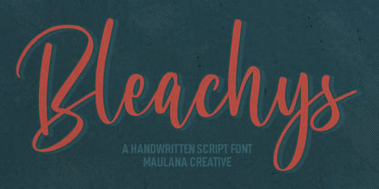 Bleachys is a modern casual script font. With high contrast stroke, fun character with a bit of ligatures and alternates. To give you an extra creative work. Bleachys font support multilingual more than 100+ language. This font is good for logo design, Social media, Movie Titles, Books Titles, a short text even a long text letter and good for your secondary text font with sans or serif. Make a stunning work with Bleachys font. Cheers, Maulana Creative
 - Tiffanky by Maulana Creative,
$11.00 Tiffanky is a Classic Cursive monoline font casual and clean stoke font includes alternate lowercase and opentype features Ligatures inspired by the late 80's sign board. It support multilingual more than 100+ language. This font is suitable for logo design and any awesome project you create. Make stunning work with Tiffanky Monoline font. Give your designs an authentic handcrafted feel. "Tiffanky Monoline Cursive Font" is perfectly suited to stationery, logos and much more. Thanks for Download, Maulana Creative

