10,000 search results
(0.041 seconds)
- DrumagStudioNF - 100% free

- 13_Fletcher - Personal use only

- PointsWest - 100% free

- BuenosAiresNF - 100% free

- MarchMadnessNF - 100% free

- 13_Ghosts - Unknown license

- 13_Misa - Unknown license

- I Heart It by Joanne Marie,
$40.00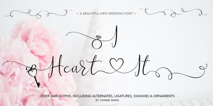 Welcome to swash heaven! Since it’s been a few years that I made the very first heart swash font (featherly), I thought its time to create a new one and boy, this is massive! Made with love, I Heart It has over 2600 glyphs, is extremely smooth and is packed full of romance. There are 25 different swashes which connect to, not only, the lowercase alphabet but also on the left of the uppercase letters and the ligatures too. That’s not all! I’ve added 26 ornaments which will come in very handy for that additional touch of elegance and creativity in your designs. It’s all about the love, making this beautiful script font perfect for wedding stationery, engagements, and baby, family and friends orientated themes. Not only that - it can be used for logos, tattoos, delicious food and drink, mugs, clothing, the list is endless! They say that love conquers all and I Heart It will go a long way in expressing that through it’s illustrative design versatility, making it the perfect addition to your font collection. Once you’ve used it you’ll wonder how you’ve ever managed without it!
 - Refresh by Scholtz Fonts,
$12.00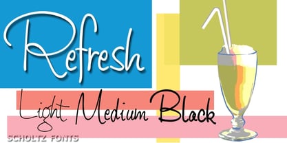 Refresh was inspired and partly based on handwritten text from advertisements for a popular cola-based soft drink from the 1950s. I designed the missing characters in the handwriting style of the original. The Refresh family comes in three styles: - Lite- possibly the most elegant of the three styles -- use at larger sizes for greater legibility; - Med -of intermediate weight - more legible than Lite; - Blak - for bolder statements and best readabilty. Refresh, with its three styles, is ideal for any display work needing a feminine, handwritten effect. Use it for product branding, book covers, invitations, greeting cards where you're looking for charm and movement. Refresh has not been designed to be used with capital letters placed next to one another: it is not advisable to use text in "ALL CAPS". The best effects for headings and subheads are obtained with an initial upper case letter followed by lower case characters. If you are using upper and lower case then it is not necessary to use kerning. Refresh contains over 250 characters - (upper and lower case characters, punctuation, numerals, symbols and accented characters are present). It has all the accented characters used in the major European languages.
 - Jugendstil Initials by HiH,
$16.00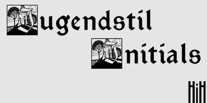 Jugendstil Initials were designed by Heinrich Vogeler around 1905, based on the German blackletter tradition. A similar set of initials by Vogeler, but based on roman letters was released by Rudhardsche Geisserei of Offenbach at about this time. I believe the originals were woodcuts. The backgrounds to the letterforms may be seen as examples of Heimatkunst, an art movement within Germany that drew deliberate inspiration from the rural countryside. Like the Arts and Crafts Movement in England a little earlier, Heimatkunst may be seen, in part, as a romantic rejection of urban industrialization, while at the same time representing a back-to-roots nationalism. Like any river, it was fed by many streams. Jugendstil Initials is an experiment with which I am most pleased. It is far and away the most complex font HiH has produced and I was uncertain whether or not it could be done successfully. To oversimplify, a font is produced by creating outlines of each character, using points along the outline to define the contour. A simple sans-serif letter A with crossbar can be created using as few as 10 points. We decided to make a comparison of the number of points we used to define the uppercase A in various fonts. Cori, Gaiety Girl and Page No 508 all use 12 points. Patent Reclame uses 39 and Publicity Headline uses 43. All the rest of the A’s, except the decorative initials, fall somewhere in between. The initial letters run from 48 points for Schnorr Initials to 255 for Morris Initials Two, with 150 being about average. Then there is a jump to 418 points for Morris Initials One and, finally, to 1626 points for Jugendstil Initials. And this was only after we selectively simplified the designs so our font creation software (Fontographer) could render them. The average was 1678, not including X and Y. There was no X and Y in the original design and we have provided simple stand-ins to fill out the alphabet, without trying to imitate the style of the orginal design. We did a lot of looking to find a compatible lower case. We decided that Morris Gothic from the same period was the best match in color, design and historical context. We felt so strongly about the choice that we decided to produce our Morris Gothic font for the purpose of providing a lower case for Jugendstil Initials. The long s, as well as the ligatures ch and ck are provided. at 181, 123 (leftbrace) and 125 (rightbrace) respectively. This font was a lot of work, but I think it was worth it. I hope you agree.
 - As of my last update in early 2023, the font "Detroit Ghetto" may not be widely known or recognized within mainstream typographic resources or among the broader design community. However, the intrigu...
- Austin Signature font by alphArt,
$21.00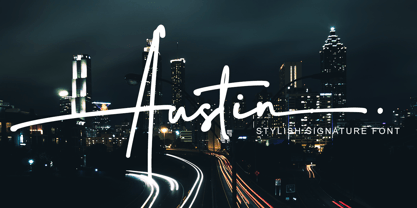 Austin is a natural Stylish signature font with signature font style, also the best natural Stylish signature font that we have ever created. If you want a logo with a natural signature font style, this signature font is the right choice for you. A long stroke at the end of the word that looks like the preview image is really looks like a professional signature, we also add dot in the end of name to make it really natural style. However this signature font is great for your next creative project such as watermark on photography, album cover, logo, business card, and many other design project. This signature font comes with uppercase letters, lowercase letters, alternate lowercase letters, multi lingual support, numbers and punctuation.
 - Moonless by Franzi draws,
$-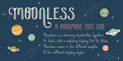 Moonless is a charming handmade font duo, designed for texts, with a matching display font for titles in four different styles. The text font has true-drawn small caps available as an OpenType feature. In case you have no access to OpenType features, there is "Moonless SC" - the small caps version of the font. Moonless is perfect for children's books, poetry, invitations and design magazines. Moonless for texts comes in four different weights: light regular semi bold bold Moonless SC the small caps version of Moonless Moonless SC Regular is free! :) The display font comes in four styles: regular ("night") engraved ("shine") with dots ("stars") outline ("space") The font name was inspired by one simple word from Farid Attar's poem "The Conference Of The Birds".
 - Allotrope by Kostic,
$40.00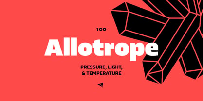 Allotropes are different structural forms of the same element and can exhibit quite different physical properties and chemical behaviors. The change between allotropic forms is triggered by the same forces that affect other structures – pressure, light, and temperature. From Wikipedia the Free Encyclopedia With ten weights in five widths plus Italics, this family comes to a total of 100 fonts. The large number of styles was made with the intent to cover most cases UI designers have to tackle, with one type family. Stylistic alternates were made to follow the same logic, so there is an optional single-story g, serifed capital I, and dotted zero – all available through the OpenType feature. The character set supports Western and Central European languages, as well as Turkish.
 - Intro Rust by Fontfabric,
$25.00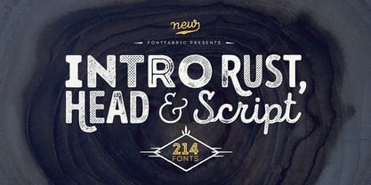 Intro Rust is one of the biggest packages on the market, including 214 fonts. The font family is a rough version of the famous Intro. Intro Rust includes 4 sub-families - Intro Rust, Intro Script, Intro Head and Intro Goodies. It can be used to create almost all types of design projects like print materials and web design. Just use your imagination and your project will become more alive and vivid than ever with one of the Intro Rust fonts. You want to make a greeting card or a package design, or even a brand identity? Feel free to play with all the patterns and shapes, scripts or those cool fonts with the dots and that will lead you to your next successful project.
 - Adelbrook by Vibrant Types,
$36.00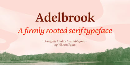 Adelbrook is a dynamic serif typeface that keeps calm. It enriches text with the archaic structure of humanist type, because its characters arrange in a harmonious rhythm with a dynamic stroke, asymmetric serifs and stems that lean in the direction of reading. These characters have gravity and are firmly on the baseline. The tapered stems define a heaviness that end in emphasized foot serifs. Actually all the details are heftier the lower they are. This is particularly evident in a subtle vertical hairline variation, light or unapplied head serifs, and clipped upper dots. The clearness of the semi-serif italics with a brushy nature integrates perfectly in a subtle way. All these details result in a sophisticated text typeface with a sharp contemporary design.
 - Ingram BT by Bitstream,
$50.99Ingram BT might be described as Deco, or Arts & Crafts, in style. Created by Alex Marshall, it is a very condensed design with high-waisted uppercase glyphs that feature dots rather than straight lines for the middle hairlines. There are two sets of alternate glyphs accessible via stylistic and contextual OpenType features. The contextual alternates offer the most interesting glyph substitutions. There are also oldstyle and tabular figures, superiors and inferiors, as well as unlimited fractions. Ingram is a very handsome, casual typeface, with a slightly rough finish. The compact lowercase remains very readable at text sizes and it is a pleasure to turn on the earth tone colors and typeset left and right justified paragraphs! The extended character set supports Baltic and Central European languages. - Martie by Canada Type,
$25.00From the heart of the Blue Ridge Mountains, by way of Toronto, comes Martie's handwriting. Martie Byrd is a school teacher in Roanoke, Virginia, and a friend of Canada Type's Rebecca Alaccari. After years of admiring the cheer and clarity of Martie's handwriting, we asked her to write out full alphabets for some cool font treatment. The intent was to do three different versions of her writing in two different pens, then use the auto-magic of OpenType to determine letter sequences and rotate character sets on the fly when the fonts are in use. A successful endeavor it was. Take a look at the images in the MyFonts gallery to see the character rotation in action, along with a visual explanation of why Martie is not just another handwriting font. Unlike other available felt tip and ballpoint handwriting fonts, the regular and bold variations are style-based, not weight-based. They are the handwritten expressions of two different Sharpie pens: The fine point one (Martie Bold), and the ultrafine one (Martie Regular). The style-based variation considerably helps the realism needed in design pieces that take advantage of the contrast of two different handwriting fonts. Weight thickening in handwriting is an obvious mechanical effect that only happens with computers. Weight changing by replacing pens is what happens in the real world. Martie Pro and Martie Pro Bold each contain three different character sets in a single font. Language support includes Western, Central and Eastern European languages for all three sets. This translates into each Pro font containing over 750 characters. Add OpenType code and stir, and you have true handwriting fonts with versatility unavailable out there in anything else of the genre. A software program that supports OpenType features is needed to use the randomization coded in Martie Pro and Martie Pro Bold. Current versions of QuarkXpress and Adobe applications (Photoshop, Illlustrator, InDesign) do contain support for the randomization feature. But if you don't have one of these apps, you can still use the interchangeable Type 1 or True Type fonts and change the characters manually to achieve the appearance of true handwriting. The Martie fonts come in a variety of price packages, from the affordable single fonts to value-laden complete sets. All the proceeds from these fonts received by Canada Type will be donated 50/50 to two primary schools: One in Roanoke (where Martie teaches), and one in Toronto (where the 10-year old, real Canada Type boss goes). So next time a design project needs a handwriting font, do the write thing and use Martie to keep it real. - FG Erin by YOFF,
$14.95FG Erin is simply perfect handwriting. I want it! Do you? - Selfie Neue Rounded by Lián Types,
$29.00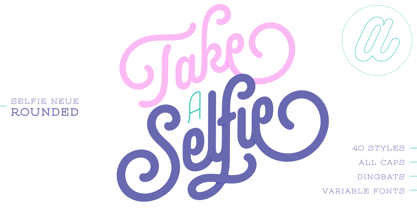 INTRODUCTION When I started the first Selfie back in 2014 I was aware that I was designing something innovative at some point, because at that time there were not too many, (if any) fonts which rescued so many calligraphy features being at the same time a monolinear sans. I took inspiration from the galerías’ neon signs of my home city, Buenos Aires, and incorporated the logic and ductus of the spencerian style. The result was a very versatile font with many ligatures, swashes and a friendly look. But… I wasn’t cognizant of how successful the font would become! Selfie is maybe the font of my library that I see the most when I finally go out, (type-designers tend to be their entire lives glued to a screen), when I travel, and also the font that I mostly get emails about, asking for little tweaks, new capitals, new swashes. Selfie was used by several renowned clients, became part of many ‘top fonts of the year’ lists and was published in many magazines and books about type-design. These recognitions were, at the same time, cuddles for me and my Selfie and functioned as a driving force in 2020 to start this project which I called Selfie Neue. THE FONT "Selfie for everything" Selfie Neue, because it’s totally new: All its glyphs were re-drawn, all the proportions changed for better, and the old and somehow naive forms of the first Selfie were redesigned. Selfie Neue is now a family of many members (you can choose between a Rounded or a Sharp look), from Thin to Black, and from Short to Tall (because I noticed the feel of the font changed notoriously when altering its proportions). It also includes swashy Caps, which will serve as a perfect match for the lowercase and some incredibly cute icons/dingbats (designed by the talented Melissa Cronenbold) which, as you see in the posters, make the font even more attractive and easy to use. You'll find tons of alternates per glyph. It's impossible to get tired with Selfie! Like it happened with the old Selfie, Selfie Neue Rounded was thought for a really wide range of uses. Magazines, Book-covers, digital media, restaurants, logos, clothing, etc. Hey! The font is also a VF (Variable Font)! So you can have fun with its two axes: x-height and weight, in applications that support them. Let me take a New Selfie! TECHNICAL If you plan to print Selfie Neue VF (Rounded or Sharp), please remember to convert it to outlines first. The majority of the posters above have the "contextual" alternates activated, and this makes the capitals a little smaller. I'd recommend deactivating it if you plan to use Selfie for just one word. Use the font always with the "fi" feature activated so everything ligatures properly. The slant of the font is 24,7 degrees, so if you plan to have its stems vertical, you may use Selfie with that rotation in mind. THANKS FOR READING
 - Lazy Rock - Personal Use - Personal use only

- Prisma - Unknown license

- Beautiful ES - 100% free

- Typographer Rotunda Alt - Personal use only

- Submerged - Unknown license

- Typewriter - a602 (dead postman 2004) - Unknown license

- Ganz Grobe Gotisch - Personal use only

- Gingerbread Initials - Unknown license

- GFWet - Unknown license

- GFWaterproof - Unknown license

- Heft by Device,
$39.00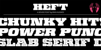 Heft is a heavy slab serif that packs a powerful punch. Available in square-cornered and rounded versions, each with italics, plus two distressed variants — an inky version that evokes the urgency of cheap hot-metal printing, and a worn, distressed version that suggests vintage woodtype or photocopied text.
 - HU Milksherbet KR by Heummdesign,
$25.00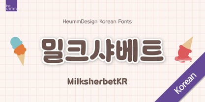 This typeface was inspired by milk sherbet, which is enjoyed cold on a hot summer day. Rounded shapes and soft stroke endings make the typeface look cute. Heavy works great for headlines with its extra-heavy stroke weight and size, while Regular and Light are best for body text.
 - ID Gotira by Izouuss Design,
$15.00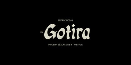 Inspired by many Blackletter styles, ID Gotira Blackletter is a contemporary take of the historic Blackletter, also sometimes referred to as Old English. Modern, versatile, while not losing it's classic touch, it's also equipped with multi-language support and works best for headlines, body text, branding, packaging and posters.
 - HU Milksherbet by Heummdesign,
$15.00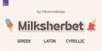 This typeface was inspired by milk sherbet, which is enjoyed cold on a hot summer day. Rounded shapes and soft stroke endings make the typeface look cute. Heavy works great for headlines with its extra-heavy stroke weight and size, while Regular and Light are best for body text.
 - High Society NF by Nick's Fonts,
$10.00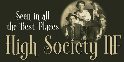 Blandford Press strikes again, with a delightful, delicious, de-lovely offering from their 1946 tome, Lettering for the Commercial Artist. The editor, A. H. Hunter, called this one simply "The Elegant Alphabet" and cautioned that it, "being neither quick nor easy, needs to be used with discrimination." Or not...
 - Noka by Blackletra,
$50.00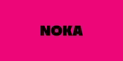 Noka is a powerful display geometric sanserif with a lot of personality. Its clean structure refers to a more digital and technological atmosphere. Letters P F T L are narrower than usual to create a distinct feeling. Diagonal strokes of letters V v W w A are parallel.
 - Lugo Rockwell by madeDeduk,
$16.00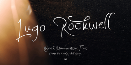 Introduce Lugo Rockwell is a brush vintage handwritten font to give an incredible impression for all your project design come with a lot ligatures and Alternative to make everything look realistic handmade handwritten. Included: Uppercase & Lowercase Number & Symbol International Glyphs Multilingual Support Ligature Alternative Hope you enjoy it.
 - Chorxy by PizzaDude.dk,
$20.00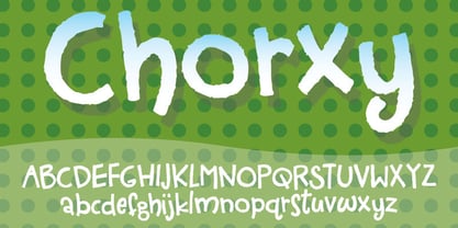 Crunchy and mildly rounded edges, mixed with an imaginative and romantic flair of elegance. Chorxy has got an almost steady x-height, mixed with various jumpy letters, slightly crazy, yet legible! Comes with fi and fl ligatures. You will need to use OpenType supporting applications to use the autoligatures.
 - Chills by Comicraft,
$19.00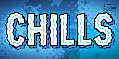 Is that the trees rustling, or the hinges on the gate? Pull up your covers as daylight grows dim... there is indeed a chill of fear in your heart and the blood in your veins is turning cold. Try your best not to shiver and shake... The Iceman cometh!
 - Softrobo by Koval TF,
$10.00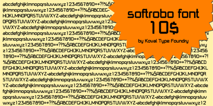 Fine-built, straight but not official, with soft corners is suitable for short texts, placards and advertising. It was inspired by 1970s when people were mad about robots, space and so on. I decided to create a font as if it was a progressive font of the 1970s.