6,424 search results
(0.014 seconds)
- Linotype Arab Stroke by Linotype,
$29.99Arab Stroke is an exotic typeface with an Arabian touch which makes a variety of applications possible. Whether for products from far away lands travel advertisements or anything needing a dynamic look, Arab Stroke is an excellent choice. The font is particularly eyecatching in headlines and combines well with sans serif fonts. - Simah pro Arabic by Zaza type,
$29.00 Simah pro Arabic is an Arabic typeface from simah family type family It has a warm and humane feeling. It's legible, soft, clear, flexible, simple, and contemporary. With a handful set of OpenType features and alternatives. It has an expressive character with its friendly shapes. It's legible, Clear, Flexible, Simple, Modern. With a handful set of Open Type features and alternatives. The design is inspired by the Kufic calligraphic style and influenced by the Naskh style. Simah is highly crafted in order to perform well both on screen and in print. it functions well even on small font sizes. It has a wide range of use possibilities headlines, logotypes, branding, books, magazines, motion graphics, and use on the web and Tv. Simah Simah pro Arabic consists of five weights
 - Neue Frutiger Arabic by Linotype,
$79.00 Neue Frutiger Arabic was created by Nadine Chahine and a team of designers and font engineers from the Monotype Studio, under the direction of Monotype type director Akira Kobayashi. The family is available in 10 weights from Ultra Light to Extra Black. Neue Frutiger Arabic embodies the same warmth and clarity as Adrian Frutiger's original design, but allows brands to maintain their visual identity, and communicate with a consistent tone of voice, regardless of the language. It is part of the Neue Frutiger World collection, offering linguistic versatility across environments – suited to branding and corporate identity, advertising, signage, wayfinding, print, and digital environments.
 - Remachine Script Arabic by Mans Greback,
$59.00 Remachine Script Arabic is a retro typeface with support for Arabian and Persian Languages, in addition to support for all Latin European languages. The font contains all characters you'll ever need, including all punctuation and all types of Arabic numbers.
 - Tanseek Modern Arabic by Monotype,
$187.99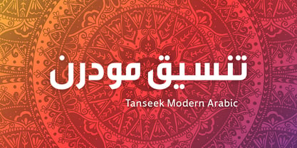
- URW Geometric Arabic by URW Type Foundry,
$35.99 URW Geometric is a sans serif typeface inspired by the German geometric typefaces of the 1920s but designed for modern usability. The character shapes have optimized proportions and an improved balance, the x-height is increased, ascenders and descenders are decreased. These design characteristics increase the usability and legibility tremendously. Accordingly to the URW Geometric, Boutros Fonts designed the URW Geometric Arabic. 10 weights, which harmonize perfectly with the Latin ones, were created – from Thin to Black.
 - Lobster 1.3 - 100% free

- 101! SWAK - Unknown license

- Path 101 - Unknown license

- Łucznik 1303 - Personal use only

- 123 and... - Unknown license

- 101! TulipZ - Unknown license

- DT 104 - Unknown license

- 101! Beaker - Unknown license

- Kaleko 105 by Talbot Type,
$19.50 Kaleko 105 is inspired by the classic, geometric sans-serifs such as Gill Sans, but has shallower ascenders and descenders for a more compact look. It’s a well-balanced, versatile, modern sans, highly legible as a text font and with a clean, elegant look as a display font at larger sizes. It includes old style non-aligning (lower case) numbers, both proportional and tabular as well as accented characters for Central European languages. The Kaleko 105 family comprises of six weights, and is closely related to Kaleko 205. The most notable differences between the two variations, are the single-storey lower case a and g in Kaleko 105, where they are two-storey in Kaleko 205.
 - Kessel 105 by Talbot Type,
$19.50 Kessel 105 is inspired by the classic, geometric sans-serifs such as Futura, but has shallower ascenders and descenders for a more compact look, and features an art deco influence with sharp points at the apex of many characters. It's a versatile, modern sans, highly legible as a text font and with a clean, elegant look as a display font at larger sizes. It includes old style non-aligning (lower case) numbers, both proportional and tabular as well as accented characters for Central European languages. The Kessel 105 family comprises of six weights and is closely related to Kessel 205, it’s more intensely Deco flavoured cousin.
 - Kinghorn 105 by Talbot Type,
$19.50 Kinghorn 105 is an Egyptian style slab-serif. The strokes are all of a roughly equal weight for an even, geometric look. Although original Egyptian slabs date from the early 19th century, the even look gives the font a balanced, contemporary look. It's intended mainly as a display font, but it's even strokes mean it remains legible even at smaller sizes. It's also available with some character variations as Kinghorn 205.
 - Moore 003 by FSD,
$6.15Moore 003 was inspired by Henryk Tomaszewski's poster lettering for the Moore Exibition (Warsaw, Poland 1959). The headline "Moore" is composed of paper collage. The lettering, in Tomaszewski's vision, contrasts in ways that recall the contrast of Moore's sculptures. It was my intention to continue this research using lettering in the form of a typeface. - Byte 105 by Talbot Type,
$15.00 Byte 105 is a modular font, resulting from experiments in creating a practical, legible font from a minimum set of geometric components on a uniform grid. It has full upper and lower case character sets and includes all accented characters for Western and Central European languages. It's available in three styles – 105, 205 and 305. Each style has different corners, 105 is square, 205 is bevelled and 305 is round. Each style is available in three weights, Light, Medium and Bold.
 - Kursk 105 by Talbot Type,
$19.50 A text and display font with square proportions, inspired by the type styles of soviet-era Russia. Very shallow ascenders and descenders and a large relative x-height, exaggerate the compact and geometric look. Related to Kursk 205 , its cousin with a rounder look.
 - Kettering 105 by Talbot Type,
$12.99 Kettering 105 is inspired by the classic, geometric slab-serifs such as Lubalin, but has shallower ascenders and descenders for a more compact look. It's a versatile, modern slab-serif, highly legible as a text font and with a clean, elegant look as a display font at larger sizes. It includes old style non-aligning (lower case) numbers, both proportional and tabular, as well as accented characters for Central European languages. The Kettering 105 family comprises of six weights and is closely related to Kettering 205, its more intensely Deco flavoured cousin.
 - Apogee 013 by zero-13,
$28.00 Apogee 013 is a contemporary yet futuristic typeface with a Sci-Fi aesthetic which contains subtle asymmetrical cues, this display font is ideal for illustrative work, logos, headlines and digital art.
 - Karben 105 by Talbot Type,
$19.50 Karben 105 is inspired by the classic, no nonsense DIN, and has a form that follows its highly legible function. Based on a lozenge, it has a clean and pure geometry with even stroke weights. Karben 105 is available in a family of five weights, and is also available with character variations as Karben 205. There are also monospaced variants of both Karben 105 and Karben 205 and a stencil version. All of the Karben fonts feature an extended character set, including accented characters for Central European languages.
 - Kamerik 105 by Talbot Type,
$19.50 Kamerik 105 is inspired by the classic, geometric sans-serifs such as Futura and Avant Garde, but has shallower ascenders and descenders for a more compact look. It's a versatile, modern sans, highly legible as a text font and with a clean, elegant look as a display font at larger sizes. It includes old style non-aligning (lower case) numbers, both proportional and tabular and accented characters for Central European languages. The Kamerik 105 family comprises of six weights, and is closely related to Kamerik 205. The most notable differences between the two variations, are the single-storey lower case a and g in Kamerik 105, where they are two-storey in Kamerik 205.
 - Kandel 105 by Talbot Type,
$19.50 Kandel 105 is a geometric, tri-line, display and headline font available in a family of three weights. Its bold, graphic styling gives it great stand-out qualities and a highly individual look. It’s particularly well suited to bringing energy to designs, or for designs with a sporting theme. It’s also available with character variations as Kandel 205 .
 - Klamp 105 by Talbot Type,
$19.50 Talbot Type Klamp 105 is an elegant and streamlined, geometric sans-serif. A legible text font, its narrow proportions mean it’s economical with space; while at larger sizes it makes a confident, modern display face. Klamp 105 is available in a comprehensive family of seven weights, featuring an extended character set to include old style numerals, as well as accented characters for Central European languages. It is also available with some character variations as Klamp 205, most notably featuring a traditional, double-storey lower case a and g.
 - Space 101 by Azure Studio,
$11.00 Introducing the first typeface by Azure studio, Space 101! Space 101 is a handcrafted chalkboard reminiscent typeface with irregular slender lines and a quirky personality. This typeface is perfect to add character and charm to bodies of text and heading where the slight imperfections tie your whole design together. The inspiration for Space 101 was found in an old signwriting book. The character shapes were updated and improved while still retaining the same charm. The typeface gave me interstellar space travel vibes reminiscent of early books based around space travel, which is why I decided to call it Space 101. I hope you enjoy this typeface and if you have any questions or comments get in touch. I'd love to hear from you. fonts@azurestudio.co.nz
 - EraMax 123 by Our House Graphics,
$15.00 EraMax 123 is a multi-layered display geometric sans serif, meant to be set BIG, for large, colourful statements. It's the perfect face for packaging, posters & branding, where a strong, colourful voice is needed... Did I mention posters? The "Max" in EraMax comes from the ultra bold weight, but also, and mainly as a tip of the hat to Peter Max, the designer and artist, known for creating so many images which have come to be emblematic of the sixties and seventies. The bold gradient effects in some of his posters were the inspiration behind the dotted and striped layers. This font's vintage flavour truly stand out in a retro setting, but also has a modern flavour that lends it the flexibility to work well in a more contemporary context. This is the second of what is to be an extended family of typefaces based on the original hand painted signage found in the T. H. & B Railway station in Hamilton Ontario, a classic Art Moderne building, designed by the New York architectural firm of Fellheimer and Wagner for the Toronto Hamilton and Buffalo Railway line and completed in 1933.
 - Crab Labs by Mightyfire,
$15.00 Crab Labs exudes a refined and modern aesthetic, characterized by its sleek and minimalistic design. This typeface features slender, unembellished letterforms that convey a sense of elegance and simplicity. The absence of serifs, or decorative strokes, imparts a clean and contemporary appearance, making it well-suited for a variety of design applications.
 - Larab Noire by Hakân Özsoy,
$5.99 L´arab noire. A unique handwritten font with a strong character. Elegant, quickly curved descenders combined with varying line widths. A unique handwritten font with a strong character. Perfecty suited for creative translucent implementations in ink style, branding projects, product designs, packaging signatures - or just as a stylish text overlay to any background image.
 - ITC Aram by ITC,
$29.99Jana Nikolic was finishing her degree program at the Faculty of Applied Arts, in Belgrade, with a final project that would combine her two majors: type and book design. Three stories from William Saroyan's My Name Is Aram would provide the text for the book, to be set in a typeface that Nikolic would design. Nikolic knew something special was happening the moment she put pen to paper. The letters just emerged," she recalls. "I started to explore a few new pens and found one I loved. I was able to make its tip bend with pressure." Like the family Saroyan writes about, the design flowing from Nikolic's pen would be simple but a little quirky. "When there were a whole bunch of little black letters around me," continues Nikolic, "I saw that this was going to be a very interesting typeface family." Nikolic drew Latin and Cyrillic letters, lowercase and capital letters, wide letters and narrow letters. She was surprised at how quickly and easily the design came. "There were no badly written letters," she says. "I hardly had to rework them and they fit together remarkably well." ITC Aram's standard character complement consists of one set of lowercase letters and two sets of capitals: one narrow and the other wide. The wide caps can be used with the standard lowercase, or mixed with the narrow caps for a variation on "cap and small cap" copy. The ITC Aram create the opportunity to mix and combine the letters into playful typographic expressions. Words and sentences that twinkle; text that seems light and alive - one runs the risk of creating work that is both delightful and charming when setting copy in ITC Aram." - GHEA Aram by Edik Ghabuzyan,
$40.00 GHEA Aram is a super family font. It has 10 upright weights and their Italics. GHEA Aram supports Central European, Armenian and Cyrillic language systems. The weights from Regular to Bold and their Italics can be used as text fonts. The weights thinner than Regular and thicker than Bold can be used as Display fonts. It is an easily readable two side serif high contrast font but the eyes don't get tired while reading.
 - Hermit Crab by Dhan Studio,
$16.00 Hermit Crab is a beautiful modern handwritten font specially designed for your current and future design needs. Hermit Crab Font is perfect for trending projects, modern, logos, blogs, branding, clothing, stationery designs, quotes, greeting cards, t-shirts, invitations, book titles, packaging designs, posters and more.
 - Hokuba Grabs by Afkari Studio,
$15.00 Hokuba Grabs - New Fun Display Font Hokuba Grabs is a New display font that creates with a very good concept and adjusted well to keep the legibility. Hokuba Grabs Display Font Comes with upper and lowercase Standard Characters, Punctuation, Numerals, And other Glyphs variation of the OpenType features/ Ligatures. Hokuba Grabs Display Font is suitable for logos, posters, school flyers, university banners, modern advertising design, product labels, cartoons, comics, kid books, custom mugs, pillows, t-shirts, youtube thumbnails/covers, subtitles, poster quotes, editorial design, book/cover Title, website/blog, social media post, packaging designs, and other designs. Features; - 2 Styles; Regular and Outline - Special Alternates - Uppercase, Lowercase, Number, and Punctuation - Works on PC & Mac - Simple installations - Accessible in Adobe Illustrator, Adobe Photoshop, Adobe InDesign, even work on Microsoft Word - Fully accessible without additional design software. - Mültîlíñgúãl Sùppört for; ä ö ü Ä Ö Ü ß ¿ ¡ Hope you enjoy our font and this font is useful font for your projects!
 - Fira Mono - 100% free

- Liberation Mono - 100% free

- Gill Sonos - Unknown license

- A.D. MONO - Unknown license

- Anarchy Mono - Unknown license

- Nolo Contendre - Unknown license


