10,000 search results
(0.054 seconds)
- Rude SemiCondensed by DSType,
$50.00 Rude was designed as a dichotomy between the Grotesque and Humanistic typographic shapes: a no-nonsense Sans and a very muscular Slab Serif companion. Showing the historically demanded consistency for such kind of typefaces, this is one of DSType's most wide-ranging and flexible type systems, introducing seven weights across seven widths, from Thin to Black and ExtraCondensed to ExtraWide, along with a wonderful set of Icons.
 - Gaude by Trustha,
$19.00 Gaude is a sans-serif typeface. Crafted with care, maximizing neatness in shape. With thickness balancing with negative space. Making it fitting when strung together into words, or sentences. Added with alternative glyphs, to make it more alive. Gaude comes with 3 widths, namely: normal, wide, and expanded. And also a soft version, making it 6 styles. Gaude is perfect for branding, titling, headline, and more.
 - Rude Slab SemiWide by DSType,
$50.00 Rude was designed as a dichotomy between the Grotesque and Humanistic typographic shapes: a no-nonsense Sans and a very muscular Slab Serif companion. Showing the historically demanded consistency for such kind of typefaces, this is one of DSType's most wide-ranging and flexible type systems, introducing seven weights across seven widths, from Thin to Black and ExtraCondensed to ExtraWide, along with a wonderful set of Icons.
 - Dustrialize by UICreative,
$23.00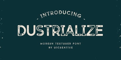 Introducing our new product the name Dustrialize Modern Textured Font. Modern Sans Serif font that feels beautiful classy, elegant, and modern. This font is perfectly suited for a wide variety of projects, such as signature, stationery, logo, wedding, typography quotes, magazine or book covers, website headers, clothing, branding, packaging design, and more. Also for fashion-related branding or editorial design and displays both masculine and feminine qualities.
 - Rude SemiWide by DSType,
$50.00 Rude was designed as a dichotomy between the Grotesque and Humanistic typographic shapes: a no-nonsense Sans and a very muscular Slab Serif companion. Showing the historically demanded consistency for such kind of typefaces, this is one of DSType's most wide-ranging and flexible type systems, introducing seven weights across seven widths, from Thin to Black and ExtraCondensed to ExtraWide, along with a wonderful set of Icons.
 - Acto by DSType,
$40.00 Acto is a type system designed as the sans serif counterpart of the previous released Acta. Both type families were designed in 2010 for the redesign of the Chilean newspaper La Tercera, but unlike some of our previous fonts (i.e., Leitura) Acto doesn't exactly match Acta in terms of structure, so they can live on their own. Acto is our first sans where the uppercase has the same height as the ascenders, so we decided to avoid common problems like the confusion between the I and the l, by drawing a curved l. We kept that spirit by removing the spurs on the b, g and q, resulting on a more warm typeface than Prelo, for instance. In the end it's a very powerful sans family, with eleven weights with matching italics, for editorial and corporate design.
 - Varisse by AVP,
$19.00 Varisse spans over two centuries of type design and draws its inspiration from well-loved classics that are as fresh today as they were when they were created. The range stretches from a quintessential 18th century transitional serif to an uncompromising 20th century sans. Think Baskerville, think Gill. The idea was to create a family that shared similar forms and the same vertical metrics, allowing them to be mixed to provide impact and readability as required. With a generous x-height and a host of options, the Varisse family is ideally suited to branding, packaging, magazines and editorial. It also provides a wealth of opportunity in website presentation. The fonts are divided into five subfamilies by degree of ‘serification’. Varisse Sans Varisse Soft Sans Varisse (normal) Varisse Soft Serif Varisse Serif Each subfamily contains six weights and accompanying italics.
 - FM Julie by FontMeister,
$19.95 ‘Julie’ was created with readability in mind, wide and with a handwritten touch. Julie gives a warm and friendly feeling to your layout. You can use these fonts to create posters, greeting cards, scrapbooks, CD labels, T-shirts, coffee mugs, digital videos websites and banners.
 - Christhine by Letterafandi Studio,
$14.00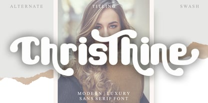 Christhine is a cool and interestingly designed display font. It will elevate a wide range of crafting ideas, from cards, to branding, labels and much more. This font is PUA encoded which means you can access all of the glyphs and swashes with ease!
 - Merlynea by Nissa Nana,
$23.00 merlynea is a delicate, elegant and flowing handwritten font. It has beautiful and well balanced characters and as a result, it matches a wide pool of designs. This font is PUA encoded which means you can access all of the glyphs and swashes with ease!
 - Bullvetti by Nissa Nana,
$25.00 Bullvetti is a delicate, elegant and flowing handwritten font. It has beautiful and well balanced characters and as a result, it matches a wide pool of designs. This font is PUA encoded which means you can access all of the glyphs and swashes with ease!
 - Jacky Hand by Open Window,
$4.95 Jacky Hand is a waxy new font totally drawn by my 6 year old son while practicing his handwriting. This is a totally diverse font perfect for a wide range of uses from horror posters to childlike naiveté, or to inject some preppy school spirit.
 - Max Stitch by Aboutype,
$24.99Similar to Erasurehead. Redrawn as in line, outline font for embroidery application. Works well with layers, colors, gradients and filters. Max was designed for all media and can be used in a wide range of point sizes. Max requires subjective display kerning and compensation. - Sophi Sophi by Daylight Fonts,
$50.00 This is a modern-day interpretation of the 1930s font. With a wide range of alternates, you can create Art Deco and Bauhaus style typography in one piece. People who see it will be fascinated by the stylish and feminine look of the font.
 - Novel Pro by Atlas Font Foundry,
$50.00 Novel Pro is the humanist Antiqua typeface family within the largely extended award winning Novel Collection, also containing Novel Sans Pro, Novel Sans Hair, Novel Sans Condensed Pro, Novel Display, Novel Display Condensed, Novel Display Extra Condensed, Novel Display Compressed, Novel Display Extra Compressed, Novel Mono Pro, Novel Sans Rounded Pro and Novel Sans Office Pro. Classic proportions of a Renaissance Antiqua combined with modern details let Novel appear as a friendly and elegant but functional typeface. The almost upright letters of the narrow Italics create a vital contrast to the generous construction of the roman. All typeface families of the Novel Collection have a carefully attuned character design and a well balanced weight contrast. The fine gradation of 12 weights enable designers to create fine legible typography and combine the design with other members of the Novel Collection to reach highest quality in typography. Novel Pro [914 glyphs] comes in 12 styles and contains small caps, an extra set of alternate glyphs, many ligatures, lining figures [proportionally spaced and monospaced], hanging figures [proportionally spaced and monospaced], small caps figures [proportionally spaced and monospaced], positive and negative circled figures for upper and lower case, superior and inferior figures, fractions, extensive language support, arrows for uppercase and lowercase and many more OpenType™ features.
 - Quintessential Pro by Stiggy & Sands,
$29.00 Our Quintessential Pro is based on the calligraphic lettering style known as the Italic Hand. As speed became more essential in writing hands, styles became less formal and more relaxed. Classic, clean, and casual, Quintessential fits a lot of design uses - hence its name. The SmallCaps and extensive figure sets only work to further expand the usefulness of the typeface across a wider breadth of applications.
 - Caslon #540 by Linotype,
$29.99The Englishman William Caslon punchcut many roman, italic, and non-Latin typefaces from 1720 until his death in 1766. At that time most types were being imported to England from Dutch sources, so Caslon was influenced by the characteristics of Dutch types. He did, however, achieve a level of craft that enabled his recognition as the first great English punchcutter. The original Caslon specimen sheets and punches have long provided a fertile source for the range of types bearing his name. Identifying characteristics of most Caslons include a cap A with a scooped-out apex; a cap C with two full serifs; and in the italic, a swashed lowercase v and w. A few of the many interpretations from the early twentieth century were true to the source, as well as strong enough to last into the digital era. These include two from the American Type Founders company, Caslon 540 and the slightly heavier Caslon #3. Both fonts are relatively wide, and come complete with small caps, old style figures, and italics. - Mixed Silhouettes by Intellecta Design,
$13.90 Mixed Silhouettes are inspired by people, animals and various situations. It includes a wide variety of topics and may be used individually or in combination with wide range of design possibilities.
 - KG One More Night by Kimberly Geswein,
$5.00 Tall, skinny handwritten letters in both a wide and a narrow version. The uppercase slots hold all of the wide versions, while the lowercase slots hold all of the narrow versions.
 - Trooper Roman Black by Wooden Type Fonts,
$15.00 Serif wide thin lines
 - VIP by Canada Type,
$29.95 VIP is a humanist sans serif uppercase and figures combined with a freshly redrawn revival of the classic Constanze initials originally designed by Joachim Romann for Stempel in 1956. As well as a vehicle to revive the Constanze initials, VIP was inspired by modern typography found in many artful books, on many product packages, and on the windows and literature of high-end restaurants, jewelry stores, haute couture fashion sellers, architecture firms and trendy brand name establishments. If you've walked through the soho or downtown of any major metropolitan, you've seen them: Widely tracked words or lines starting with a script majuscule and going on with clean and comfortable sans serif caps. If classy modern combination typography is your thing, you will find much pleasure in using VIP. VIP was updated with expanded language support in 2012. It now supports a very wide range of codepages, including Cyrillic, Greek, Central and Eastern European, Turkish, Baltic, Vietnamese, and of course Celtic/Welsh.
 - Marat by Ludwig Type,
$45.00 Although originally conceived as a magazine face – with strong serifs and open character shapes for good legibility in small sizes, and compact letter forms optimized for narrow columns and tight headlines – Marat evolved into a comprehensive family for general use. This specific construction and the round forms of the letters create an elegant, soft and friendly appearance. The typeface suits a wide range of typography, e.g. editorial, brochures, packaging and corporate design. In particular, in bold weights it works surprisingly well, which is not always the case with serif faces. Marat includes oldstyle and lining figures (both proportional and tabular), a wide range of language support and various OpenType features (e.g. ligatures, case-sensitive forms, fractions, superiors and inferiors). It is the perfect companion for Marat Sans, a clean and lively sans serif typeface. Marat has been selected by the Type Directors Club of New York to receive the Certificate of Excellence in Type Design 2008.
 - Nido by Latinotype,
$19.00 Nido is a cute and funny childish typeface, designed for logos, book titles, invitations, birthday cards, flyers, posters, advertising, etc. It comprises 5 styles: black, white, black italic, white italic and dingbats, which can be used nicely together. Nido is a new design by Sofía Mohr. See also Café Brasil http://www.myfonts.com/fonts/sofia-mohr/cafe-brasil/
 - Alfaline by Arkalandara,
$130.00 "Alfaline" is Italic style handwriting is a beautiful and sophisticated script characterized by its slanted and slightly cursive letterforms. Italic handwriting dates back to the Renaissance and has evolved into a popular choice for individuals seeking a refined and artistic script, elegant Italic style handwriting combines grace and legibility, making it a popular choice for formal invitations, personal correspondence, and artistic endeavors. Learning and mastering this script can be a rewarding pursuit for those who appreciate the artistry of handwriting.
 - Wedding Monograms by Kaer,
$19.00 Wedding monograms is a font family in elegant historical style. This family of two character monograms was inspired by “Course of women's needlework” published in 1887. You’ll get the set includes Wide and Narrow capitals, so you can make your own monogram, by combining letters you want. --- Please note, you should use graphic applications such as Adobe Illustrator or Photoshop, but not Microsoft Word. All you need is put Narrow initial on the top of Wide. You can use color fonts in PS CC 2017+, AI CC 2018+, ID CC 2019+, macOS 10.14 Mojave+ Please note that the Canva & Corel & Affinity doesn't support color fonts! --- Please feel free to request any help you need: kaer.pro@gmail.com Best, Roman.
 - Caslon #540 by ITC,
$29.00The Englishman William Caslon punchcut many roman, italic, and non-Latin typefaces from 1720 until his death in 1766. At that time most types were being imported to England from Dutch sources, so Caslon was influenced by the characteristics of Dutch types. He did, however, achieve a level of craft that enabled his recognition as the first great English punchcutter. Caslon's roman became so popular that it was known as the script of kings, although on the other side of the political spectrum (and the ocean), the Americans used it for their Declaration of Independence in 1776. The original Caslon specimen sheets and punches have long provided a fertile source for the range of types bearing his name. Identifying characteristics of most Caslons include a cap A with a scooped-out apex; a cap C with two full serifs; and in the italic, a swashed lowercase v and w. Caslon's types have achieved legendary status among printers and typographers, and are considered safe, solid, and dependable. A few of the many interpretations from the early twentieth century were true to the source, as well as strong enough to last into the digital era. These include two from the American Type Founders Company, Caslon 540 and the slightly heavier Caslon #3. Both fonts are relatively wide, and come complete with small caps, Old style Figures, and italics. Caslon Open Face first appeared in 1915 from the Barnhart Bros & Spindler Foundry, and is not anything like the true Caslon types despite the name. It is intended exclusively for titles, headlines and initials, and looks elegant whether used with the more authentic Caslon types or by itself. - TT Norms Pro Serif by TypeType,
$39.00 Introducing TT Norms® Pro Serif, version 1.100! The updated font now has new OpenType features and localization for the Serbian and Bulgarian languages. TT Norms® Pro Serif is a functional serif based on our studio's main bestseller—the versatile sans serif TT Norms® Pro. Together, they form an ideal font pair. Although these typefaces are made for each other, they can easily be used independently and paired with other fonts. So, TT Norms® Pro Serif is a self-sufficient and elegant serif, neutral at the same time. It is easy to recognize due to its gentle proportion dynamics, open aperture, slanted oval axis, and low stroke contrast. Another distinctive feature of this font is brutal serifs that adjust in length according to the weight of the font. As well as TT Norms Pro, there are Italic font styles in TT Norms® Pro Serif. However, for this serif, we have designed true italics instead of simple slanted font styles. Their key feature is the ability of the lowercase letterforms to change in reference to the roman font styles. They become more rounded, moving towards handwritten shapes. The nature of the italics turned out sharper than that of the roman font styles. It can be used to place accents that would attract attention without interfering with the process of reading. TT Norms® Pro Serif is capable of solving multiple design tasks. It is highly readable, which makes it convenient for small point sizes. This serif's application range is broad and diverse: it can be used for websites, printed materials, and packaging design. The font is well-suited for projects in the domains of culture, art, history, or literature and can be implemented into the designs of signs, posters, or premium products and services. TT Norms® Pro Serif, version 1.100, consists of: 24 font styles: 11 roman, 11 italic, and 2 variable fonts (one for the roman font styles and another—for italics); 1380 glyphs in each font style; 31 OpenType features, including options for localization.
 - Remora Corp by G-Type,
$39.00 Remora is an extensive new humanist sans serif which comes in 2 style variations, the effervescent Remora Sans and its corporate business partner Remora Corp. Both styles include 5 individual width sets ranging from the condensed W1 to the extra-wide W5. Furthermore, with an impressive 7 weights (Thin to Ultra) and true matching italics in each pack Remora is an ultra versatile super family comprising 140 individual fonts, perfect for any typographic assignment or design brief. Remora was designed by G-Type founder Nick Cooke. Both the Sans and Corp families share the same proportions, with the exception of certain key characters that change the overall appearance. Remora Sans is an exuberant and characterful typeface while Remora Corp, as its name suggests, is a businesslike typeface more suited to corporate typography. Quite early on in the design process Nick decided to give Remora Corp equal billing instead of incorporating these glyphs as alternates or a stylistic set that may get overlooked. “I created two separate families after learning a valuable lesson with one of my earlier typefaces, Houschka”, says Nick. “Houschka contained distinctive rounded A’s W’s and w’s, with ‘straight’ styles as character alternates. Even though style sets and alternates are easy to activate they are rarely used, so after many requests for customised versions of the fonts with the straight characters as defaults it was decided to create the separate ‘Alt’ family. So I cut straight to the chase with the two Remora variants and created two complementary families.” Both sets contain many shared letterforms, but it is the alternate characters that significantly alter the appearance of each font. Remora has been carefully designed for optimum legibility at large and very small sizes. Although fairly monolinear in appearance, especially in the lighter weights, particular attention has been paid to optical correction like the overshoots of the curved characters. Open counters and painstaking attention to detail (e.g. weight contrast between horizontal and vertical strokes, junctions of shoulders and stems etc) all boost readability and make Remora a great choice across all media. Remora Sans and Corp are ‘humanist’ rather than ‘geometric’ in style, meaning they’re not strictly based on rectangles and circles, resulting in a warm and friendlier feel. The slightly ’super-elliptical’ rounded forms create generously attractive curves. Remora has very distinctive italics in that they are only inclined by 8 degrees, but are not just based on slanted uprights. The italic styles are very alluring when used for display at large sizes and the good news is they come bundled free with their respective uprights. Each family also contains many OpenType features including proportional and tabular numbers, small caps, discretionary ligatures, plus five stylistic sets for ultra versatile typography.
 - Campuni by Identity Letters,
$29.00 A charming confidant. Italic, but without the slant. Campuni is a sans-serif typeface that can be described as an “upright italic”: its letters are modeled on the handwritten forms of italics—but without the slant. This gives Campuni a contemporary, charming, and trustworthy character. As with most modern sans-serif typefaces, Campuni’s design is based on low-contrast, almost monolinear strokes with a neat and clear appearance. This is where Campuni’s steep and tapered joints come in: with a bit of contrast, they provide the perfect foundation for a steady rhythm between characters—just like you’d find in meticulous handwriting. Careful spacing ensures that this rhythmic character is preserved on the page and on screen, making for a pleasant reading experience. It’s not just the letterforms that gain from Campuni’s calligraphic heritage, though. This typeface is packed with calligraphy-style swash capitals and end swashes on lowercase letters, as well as discretionary ligatures. These are available via OpenType, allowing you to spice up your logo or headline with a hint of calligraphy in a breeze. Despite its flawless legibility in body text, Campuni is definitely eye-catching in display sizes. (Decrease letterspacing for some additional punch.) Besides logo design, Campuni is a great choice for branding, advertising, packaging, corporate design, or even signage and wayfinding. The range of topics that Campuni excels in varies from food, leisure, retail, e-commerce, music, and travel to games, toys, childcare, and family-themed events. Campuni has got an Extended Latin character set, seven sets of figures, case-sensitive forms, arrows, and a few other advanced typographic features—622 glyphs in total. Its eight weights span from Thin to Black.
 - Cira Serif by Huerta Tipográfica,
$45.00 Cira is a superfamily with 7 weights and italics under two main styles: sans and serif. The original concept was created for Katachi Media as a corporate font for text and experimentation in an iPad magazine. It has a diversity of outlines with straight angles which create unusual shapes and counterforms. Its middle weights are suitable for text and can be combined with extreme weights at display sizes. Cira is a versatile superfamily with an original and modern feeling and it’s a great option for giving identity to your designs.
 - Gilroy by Radomir Tinkov,
$25.00 Gilroy is a modern sans serif with a geometric touch. A younger brother of the original Qanelas font family. It comes in 20 weights, 10 uprights and its matching italics. The Light & ExtraBold weights are free of charge, so you can use them to your heart’s content. Designed with powerful opentype features in mind. Each weight includes extended language support (+ Cyrillic), fractions, tabular figures, arrows, ligatures and more. Perfectly suited for graphic design and any display use. It could easily work for web, signage, corporate as well as for editorial design.
 - Autor by Latinotype,
$29.00 Autor is a medium-contrast sans serif font with a dynamic stroke modulation. Its clean look and angled terminals give your designs a ‘sharp’ and contemporary feel. Autor Family comes in 7 weights, ranging from Thin to Black, with matching italics, resulting in a total of 14 styles. Autor is well-suited for editorial design, body text in books and magazines, headers and titles. It can also be used—as a display font—for logotypes, branding, advertising and publishing. The font includes a character set containing more than 400 glyphs that support over 200 languages.
 - Dephion by Locomotype,
$15.00 In many ways, handmade items fit as collectibles, because they look unique and not boring. Dephion is one of the handmade fonts we made to give a casual and natural impression that brings modern style calligraphy made in a very manual way. We want to get out of the habit of seeing perfect font types by making the shape imperfect and irregular. Dephion presents three styles: Dephion Script Regular, Italic and Dephion Sans. You can pair them to create a variety of attractive designs with a sense of casual.
 - Laro Soft by Larin Type Co,
$15.00 Laro Soft this is a modern sans-serif font that includes nine weights from thin to black and nine weights in Italic style. This multi-purpose font captures a huge range for the design and creation of your project. Laro will perfectly cope with a variety of tasks and he will always look stylish and modern. With it, you can create logos, labels, use in advertising, packaging, branding, book covers and magazines, cosmetics, banners, posters, headings, descriptions and much more. This font is easy to use has OpenType features.
 - Yingyai by Jipatype,
$26.00 ฟอนต์ยิ่งใหญ่ เป็นอักษรแบบแซนเซอริฟ ที่มีความหนาของเส้นมากว่าปกติ สังเกตุได้จากน้ำหนัก Black ให้ความรู้สึกหนักแน่น หนา ใหญ่ และ ทันสมัย มีทั้งหมด 9 น้ำหนักและตัวเอียงของแต่ละน้ำหนักรวมทั้งหมดมี 18 สไตล์ รองรับหลากหลายภาษา เหมาะสำหรับการใช้ผาดหัว ป้าย เนื้อความ ฟอนต์ยิ่งใหญ่สามารถช่วยส่งเสริมให้งานของคุณดูสะดุดตาอย่างยิ่ง เหมาะกับผู้ที่ต้องการให้โฆษณาสินค้าและบริการดูสะดุดตากว่าใคร ๆ Yingyai is a sans serif typeface with a large line stroke thickness more than usually, especially Black weight. It gives a heavy, big and modern feel. Comes with 9 weights and italics of each weight total 18 styles. Support multi-languages. Suitable for headline, sub-headline or text body. Yingyai can make your work more eye-catching, for those who want to advertise products and services more eye-catching than others.
 - FF Sari by FontFont,
$65.99 German type designer Hans Reichel created this sans FontFont in 1999. The family has 12 weights, ranging from Light to Black (including italics) and is ideally suited for advertising and packaging, festive occasions, editorial and publishing, logo, branding and creative industries, poster and billboards as well as web and screen design. FF Sari provides advanced typographical support with features such as ligatures, small capitals, alternate characters, case-sensitive forms, fractions, and super- and subscript characters. It comes with a complete range of figure set options – oldstyle and lining figures, each in tabular and proportional widths.
 - Laro by Larin Type Co,
$15.00 Laro this is a modern sans-serif font that includes nine weights from thin to black and nine weights in Italic style. This multi-purpose font captures a huge range for the design and creation of your project. Laro will perfectly cope with a variety of tasks and he will always look stylish and modern. With it, you can create logos, labels, use in advertising, packaging, branding, book covers and magazines, cosmetics, banners, posters, headings, descriptions and much more. This font is easy to use has OpenType features.
 - Gunterz by Locomotype,
$22.00 If you like a bold and powerful all-caps sans-serif font to make your message stand out, Gunterz can be the choice to maximize your goals. Available in four weights and its matching italics, Gunterz is designed to meet font needs in a variety of different situations. To make it more attractive, Gunterz also provides opentypes features such as stylistic alternates and a stylistic set. Others, this font also supports Cyrillic language. Gunterz is suitable for poster titles, packaging design, headlines, logotypes, motion graphics, movie titles, sports promotion and future technology.
 - Corso by Dominik Krotscheck,
$7.99 Corso is a clean condensed sans serif font family. It comes in upright, slanted and italic, in six weights each. It includes useful typographic features such as fractions, ligatures and case sensitive forms. Also included are double- or single-storey versions of a and g, you can switch via stylistic OpenType sets. Other letters with alternative forms accessible the same way are ß and ampersand. Corso works especially great for larger size uses such as signage, headlines or posters. But that doesn’t mean that it isn’t also useable for short texts.
 - Force by Outras Fontes,
$24.00 Force is a contemporary sans serif ultra-black family designed by Ricardo Esteves. There are 4 font styles: Force Regular, with a upright roman structure; Force Italic, with more cursive lowercase forms; Force Shadow, that can be used alone or as a second layer to Force Regular; and Force Dingbats, containing some pictograms. Each font file has some OpenType features: discretionary ligatures, fractions, subscript and superscript. The Force family is suitable for big-size high impact situations like posters, headlines, titles, magazines, packaging and many others you may creatively think of.