10,000 search results
(0.039 seconds)
- GF Gesetz - Unknown license

- Miracle Boy by NJ Studio,
$9.00 Hi...Thank for your visit :) Miracle Boy a display font. It features fun characters that will take your projects to the next level! This font is PUA code which means you can easily access all the glyphs that are full of sans! It also features many special features including glyphs. font designs that are made for various vector designs, printing such as digital wedding blogs, online shops, social media, while printing can be used in the field of product clothing, accessories, bags, pins, logos, business cards, watermarks and many others ... so it can make your product look fun and attractive, and also Multilingual support!!! Happy design ...
 - Silver Miranda by Asenbayu,
$15.00 Silver Miranda is a sans serif font with an elegant and classy. Each typeface is crafted to produce a vintage modern font. This font features can direct you to access unique typeface collections. You can make works with clean elegant and professional writing, or make attractive decorative with alternative and ligature styles. This font is great for creating any desired projects such as logos, posters, headlines, albums, quotes, clothes and many more. This font is perfect for you if you want to come up with something interesting! Please see the pictures provided. I would like to know how you can get creative with this font. Thank you!
 - Hello Cute by NJ Studio,
$9.00 Hi...Thank for your visit :) Hello Cute a playpul font. It features fun characters that will take your projects to the next level! This font is PUA code which means you can easily access all the glyphs that are full of sans! It also features many special features including glyphs. font designs that are made for various vector designs, printing such as digital wedding blogs, online shops, social media, while printing can be used in the field of product clothing, accessories, bags, pins, logos, business cards, watermarks and many others ... so it can make your product look fun and attractive, and also Multilingual support!!! Happy design ...
 - Refinery by Kimmy Design,
$10.00 Refinery is the newest font in the Evanston Collection of square typefaces. With a similar capital structure to Tavern and Alehouse, Refinery includes both lowercase and small caps, making it an ideal typeface for paragraph text settings. It also comes in a wide array of weights and widths, with 85 font files in total. DESIGN Refinery has it’s roots in early 20th century signage and saloon typography, but has been modernized - even future-ized - to fit the 21st century digital landscape. The design was aimed at providing a type family that could work in many modern design fields, from sports, tech and military to gaming, HUD, virtual reality and augmented reality. ENGINEERING Essentially. Refinery is a simple mono-linear square design has been expertly refined into an easy-reading sans serif typeface. It was designed to be used in both display and text settings. From hairline to black in ultra-narrow or extended, the wide array of weight and width options makes it easy to find the right font for each text need. SPECS Refinery not only includes 85 font files, but each one include a wide array of Opentype Extras that allow even further customization. • Stylistic Alternatives: Letters A W Y have a styling variation that rounds the pointed apex into a square curve. The S and 2 variation straightens the spine, making all curves in the alphabet read as 90º angles. • Small Capitals: A shortened version of the capitals for alternate header settings. • Titling Alternatives: In this typeface, this feature turns on lifted small caps. Take the small capitals, raise them to level with capitals and underline at the baseline. When multiple lowercase or small capital letters are typed in a row, the underlines connect, creating unique ligatures. • Figures: There are different figure styles for different text needs. Options include, proportional lining, tabular lining (for math), old style and small capitals. • Discretionary Ligatures: A little funk to this otherwise serious typeface. Letters with a long baseline or cap height stem - F, L, T - get elongated to hug a small capital vowel. Other ligatures include Co. and No. • Catchwords: These are common words that bring emphasis to a design. In English these words include ‘and’ ‘as’ ‘by’ ‘in’ ‘of’ ‘the’ ‘to’ ‘when’, among others. Refinery also includes multilingual catchwords of ‘el’ ‘la’ ‘oder’ ‘go’ ‘para’ ‘pour’ ‘und’ ‘y’, among others. For the full list, please check out the specimen images. EXTRAS To round the typeface off, a set of over 150 ornaments, icons, arrows, patterns and line breaks is included to provide complimentary graphics. These can be found in the Ornaments labelled font, it is recommended to use the Glyphs panel to select which text glyph is needed.
 - Indie by Lián Types,
$37.00 A FEW THOUGHTS Indie is a trendy script, result of the wide range of possibilities that can be achieved using a pointed brush. (1) “You Only Live Once” say The Strokes, (to me, symbols of indie music) so, what would represent that sensation of volatility better than a brush? As you may already know, this time inspiration came from hipsters and indies around us: We may sometimes criticise them, we may sometimes want to be like them, but the truth is that the universo gráfico they generated these past years is gigantic, full of colour and variations. (2) Brush lettering and Sign painting are fields I've been fond of since I started as a designer. Nowadays, these styles are getting a lot of attention and maybe it’s due to the undeniable mark of life that is materialised when using a brush. This tool is so expressive that shows the passions and fears of the artist, and materialises that idea of “living the present”, so popular in this era. When you see Indie, you think of skaters, rollers, surfers, hiphop dancers, street artists, summer, and why not? California beaches. So if you feel life is only one, it’s high time you got Indie into your fonts' collection! STYLES Indie comes in 4 styles plus another one which consists only in capitals. Indie; Indie Shade; Indie Shade Solo; Indie Inline are all open-type programmed and have exactly the same glyphs and metrics, so you can combine them without probem. (I.E. You may use Indie Inline, then write the same word using Indie Shade Solo, and finally put them together). In applications such as Adobe Illustrator, the font has nice results when fi ligatures is activated. However, if you want a more casual look, activate the contextual and the decorative ligatures. NOTES 1. After several years of practicing calligraphy I can say that to me, there’s nothing more satisfying than being able to create fonts out of your own handlettering. I owe a lot of this brush-style to Carl Rohrs. He was the very first calligrapher who taught it to me. His style is unique and what he can do with a brush is truly marvelous. I'm serious. 2. In spite of some particular cases, I can say I'm happy to live in a present in which Typography is living a kind of Renaissance along with Lettering. Like it happened with W. Morris a hundred years ago, handcrafts are being revalued/reborn, and some of this may be happening thanks to these indie designers that, trying to be unique, gave new/fresh air to different areas of graphic design.
 - Mono Spec Stencil by Halbfett,
$30.00 Mono-Spec Stencil is a monospaced family of sans-serif type. At least in default settings, all characters across the typeface share a common width, which is immediately noticeable for its condensed nature. Mono-Spec Stencil is a sibling of a non-stencil family, simply named Mono-Spec. Characters in each are just as wide, allowing Mono-Spec Stencil to be used together with Mono-Spec, as a secondary typeface. As a typeface whose characters are stencil-shaped, this design channels the spirit of resistance and street culture. When you look at the family, remember that it ships in two different formats. Depending on your preference, you can install the typeface as a single Variable Font or use the family’s five static OpenType font files instead. Those weights run from Light through Bold. While the static-format fonts offer a good intermediary-step selection, users who install the Variable Font have vastly greater control over their text’s stroke width. The Mono-Spec Stencil Variable Font’s weight axis allows users to differentiate between almost 1,000 possible font weights. That enables you to fine-tune your text’s exact appearance on-screen or in print. Whatever format you choose, the Mono-Spec Stencil fonts are equipped with several OpenType features. The most striking of these can be activated via a Stylistic Set. That will replace several letters – like “B”, “E”, “F”, “H”, and “I” with double-width alternates. Those alternates take up as much space as two characters placed next to each other otherwise word. The effect of Mono-Spec Stencil’s double-width alternates is striking, and their use strikes a strong chord in any display typography applying them.
 - Maree by Ashton,
$5.00 If you want to write something sincere and genuine but not too formal then this is the font for you. It is based on real handwriting, not some artificial calligraphy made to be either too haphazard or spiky or have loads of elegant flourishes but an ordinary person's writing, and designed to look as natural and as close to the original lettering as possible. Like any person's writing it is individual and distinctive, but so easy going on the eye those differences sit comfortably with you. It is friendly and open with easy to read glyphs both as lowercase and uppercase. The letters are relatively wide with clearly shaped distinct outlines. This font may be ideal for projects where you expect a wide readership with different reading abilities from young to old. When you are using this font a slightly bigger point size usually gives a better result so for a standard letter or similar you should size up to 15 points or more. Maree has been individually crafted to the smallest detail. To create a realistic handwriting font that looks relatively simple but works in a wide variety of languages requires a complexity and attention to detail most fonts will never require. This font in any ordinary business environment would never have been made, the effort required to make it too great, the length of time too long. There have been no shortcuts in this font, no automatic scanning or tracing, no automatic generation, no class kerning. Not only is each glyph individual but the width of letters, the height, the accents and the positions of the accents are all different. Even the line weight of the letters is designed to have natural variation but yet similar enough that the font appears as though it were written effortlessly in the same pen. And in order to keep the spacing consistent even though the letters have different widths, heights, lengths of descenders and so on, there are a vast number of kerning pairs, letter to letter, number to number, letter to number... All kerning has been individually assessed with an eye to proportionality taking in character shape, size and weight. For instance if you write a telephone number the numbers all sit close together but if you write a number before a letter such as in a UK post code or before a unit of measurement an extra little bit of space has been added which makes the number more distinct and therefore readable. That space is so natural to the eye that you don’t even know it is there. However even in the spacing allowance has been made for the fact it can’t be too perfect because when you write by hand the spacing is inconsistent. There have to be some letters which are too close or far apart otherwise the font would look artificial. For similar reasons if you are going to print out this font for a letter, etc, check the print version before you make any letter spacing changes because with the zoom functions in modern applications that uneven spacing and lettering can seem more pronounced than it actually is. When this font is printed out you will find it is surprisingly neat. This font is what it is, simple clear handwriting. You will not go wow. But if you want something unique and different and looks good on the page you won’t be disappointed. This font is not a work of art but it is a work of love. This font has a soul. How many fonts can you say that about?
 - Barbou by Besnowed,
$19.99 Barbou was originally cut in 1925 by Monotype as a counterpart to Fournier, siblings that were different in design but both based on the work of Pierre-Simon Fournier. Whether by choice, accident or oversight, Fournier was preserved digitally, and Barbou was lost to history. Barbou was notably used by Stanley Morrison, in particular as the face of The Fleuron. I fell in love with Barbou when I saw it, and knew that I wanted to bring it to a new generation of designers and readers. This is a revival of Barbou, a faithful recutting with new weights, characters and many of the best features that modern font technology brings. Particular attention was paid to the original Monotype Barbou 178 specimen sheet. Originally only available in a single weight, Barbou has been recut with a variable weight, providing a large degree of flexibility between Regular and Bold. Barbou excels as a comfortable reading face for books, and the variable weight allows you to fine tune the darkness and texture of the page in a way never before possible. Barbou has a distinctive softness, and this revival of Barbou preserves much of the effect the medium of metal type had on the letterforms. This results in a subtly rounded yet defined type, elegant not worn, with the utmost attention and respect to the smallest of details. Barbou was originally cut with disparate x-heights for roman and italic, and this revival of Barbou features both the original italic, as well as a new italic redesigned at the same height as the roman. In Fournier’s time, roman and italic would not be mixed on the same line, but the type must change to meet the needs of a new generation. Barbou also features unique ligatures and alternates, old style numbers, small caps and a full Greek alphabet. Barbou is perfect for books and anywhere a comfortable reading face is required, and excels in flexibility.
 - Krete by BluHead Studio,
$29.00 BluHead Studio continues its collaboration with British designer Roy Preston by producing Krete, Roy’s latest text family. This first release of 12 weights includes Light, Book, Regular, Medium, Bold, and Black, each with a drawn italic.
 - Dandy JY by JY&A,
$29.00 Danielle Smith describes her friendly, hand-drawn typeface family, available in roman and italic, as ‘non-élitist and accessible’. Originally created for a theatre project at Massey University, Dandy is reminiscent of Pablo Ferro’s hand-lettering.
 - Spring#7 by Joey Maul,
$12.00 Spring#7 is a 1900s-style font based on text on postcards found after the turn of the century. Italic in nature, it works nicely for text and graphics that need a humble old-timey look.
 - Sunskin by Teweka,
$15.00 Sunskin is a fresh new font, Made in its own style,Sunskin Has 2 types of fonts namely Regular font and Italic font. Sunskin fonts are suitable for : Branding, Logotype, Posters, Social Media and many more.
 - Muirne by Typomancer,
$20.00 Muirne, a cheerful semi-serif inspired by a Celtic calligraphy and figure. Font family contains from Light to Black weights and suitable Italic. With a dozen of alternates to enhance your typesetting with a Celtic touch.
 - Wind Factor by Thaddeus Typographic Center,
$25.00Wind Factor is a display typeface with rough features and roman italic essences. This type features elements of crafting and design along with a bold elegance. Ideal for brochure design, menus, invitations, package design, and advertising. - Homage Condensed by GarageFonts,
$49.00 Paying homage to the 1960s and 1970s designs of Tom Carnase and Herb Lubalin, Homage Condensed is a digital revival and recutting of LSC Condensed in two weights along with italics and numerous stylistic alternate characters.
 - Eu Alonira by Hishand Studio,
$15.00 Eu Alonira is elegant serif font that look aesthetic Perfect for Logo brand, advertisement, product packaging, social media post, clothing brand, magazine headers and many more complete with ligatures alternates regular italic icon kerning multilingual support
 - Orange Cat by Atlantic Fonts,
$26.00 Like the cat that swallowed the canary, this font can't hide its mischievous nature. Orange Cat is moody, athletic, and likes to play.
 - Zar Casual by SzarDesign,
$19.95 ZarCasaul has a soft side with a bouncy attitude. Informal font works for taglines to logos, inspired by my background in showcard lettering.
 - Home Education by Hanoded,
$15.00 Just before the end of 2020 all schools in Holland closed for the second time, because of an increase in the number of COVID 19 cases. This means that my wife and I have to educate our three kids at home. The kids are great and take their tasks seriously, but it is difficult, as all three of them require different educational levels. I am sure you parents understand. Trying to get some work done is virtually impossible, so my wife and I made a schedule and we live by ‘on duty’ and ‘off duty’ days. I was thinking of this when I created this font (obviously on an ‘off duty’ day). Home Education is a handwritten scribble font. It was made with a Sharpie pen (possibly used by one of my kids, because I noticed tiny ink stains on my wooden dining table…). It comes with all the diacritics you can hope for and lovely double letter ligatures for you to play with.
 - Branden by Craft Supply Co,
$17.00 Branden – Casual Sans Serif Font is a modern sans serif font family whose design refers us to the style of casual sans serif. The distinctive features of Branden – Casual Sans Serif Font are the relatively low contrast of strokes, the slightly squarish shapes of round characters and the emphasized business like simplicity.
 - Mastadoni by Eclectotype,
$40.00 Mastadoni is a bold headliner/masthead typeface, with high vertical contrast in a Didone style. That's the starting point at least. There's much more to this font than another modern clone. It is a specialized (only one weight) typeface that comes in five optical grades. Use G1 at very large sizes and G5 at smaller sizes. The grades can be combined so that the thins of type set at different point sizes appear the same thickness - a very useful feature for magazine layouts. Optical grades could also be used in circumstances where a logo needs to be size-specific; the text on your bistro sign can afford to be more delicate than that on your coffee cups. This is a typeface with a big x-height, small cap-height and stubby ascenders and descenders, which contribute to an overall appearance somewhat different from must Didones, and make for some interesting layout possibilities in tight spaces. Mastadoni features a number of useful OpenType features. All fonts include standard ligatures and automatic fractions. In the discretionary ligature feature, you'll find the esoteric "percent off" glyph. Just type '%ff' with dlig engaged and there it is! Case-sensitive forms are available in all the fonts. The contextual alternates feature performs a subtle trick that resolves an optical illusion whereby two ascenders next to each other appear to be different heights. The Roman and Italic styles have a different group of stylistic sets as follows: Roman: SS01 substitutes a less decorative 4; SS02 is a different eszett; SS03 substitues the # with an attractive numero glyph; and SS04 gives an alternate K. Italic: SS01 and SS03 are the same as in the Romans; SS02 gives you more bulbous variants of v, w, and y letters; SS04 is a single storey g; SS05 changes C, G and S to non-ball-terminal varieties; and SS06 changes the swash versions of E, L, N and Q (when the swash feature is engaged). Speaking of the swash feature, the italic fonts feature swash capitals from A to Z, and swash variations for lower case h k m n v w and z. Lastly, the discretionary ligature feature in the italic fonts has vi, wi, KA and RA ligatures. Mastadoni is a typeface that would find itself immediately at home in glossy magazines, while offering a different aesthetic palette from the more standard choices of Didones.
 - Etrusco Now by Italiantype,
$39.00 Etrusco Now is the revival of a lead typeface originally cast in lead by Italian foundry Nebiolo in the early 1920s. Heavily inspired by the design of the Medium weight of Schelter & Giesecke's Grotesk, Etrusco was, like Cairoli, an early precursor of the modernist grotesque superfamilies: a solid, multi-purpose "work-horse" typeface family that could solve a wide range of design problems with its range of widths and weights. When designing the new incarnation of Nebiolo's Etrusco, the Italiantype team directed by Cosimo Lorenzo Pancini and Mario de Libero decided to extend the original weight and width range to keep this "superfamily" approach. Etrusco Now has twenty-one styles widths in three widths of seven weights each, with matching italics; the original weights for the typeface have been collected in the Etrusco Classic subfamily. Etrusco Now new widths allowed the team to include in the design many nods and homages to other vintage classics of Nebiolo. The lighter weights of the normal width have been heavily influenced by the modernist look of Recta, while the heavy condensed and compressed widths refer to the black vertical texture of Aldo Novarese's Metropol. This infuses the typeface with a slightly vintage mood, making Etrusco at the same time warmly familiar and unexpected to eyes accustomed to the formal and cold look of late modernist grotesques like Helvetica. Contemporary but rich in slight historical quirks, Etrusco Now is perfect for any editorial and branding project that aims to be different in a subtle way. Etrusco Now's deviations from the norm are small enough to give it personality without affecting readability, while its wide range of open type features (alternates, stylistic sets, positional numbers) and language coverage make it a problem solver for any situation. Like its cousin Cairoli, Etrusco is born out of love for lost letterforms and stands like its lead ancestor from a century ago, at the crossroads between artsy craftsmanship and industrial needs.
 - Quadrillion by Typodermic,
$11.95 Looking for a typeface that’s out of this world? Look no further than Quadrillion. With its wide, capsule-like design and futuristic aesthetic, Quadrillion is the perfect choice for designers who want to infuse their message with an otherworldly character. Inspired by the capital letterforms of Ethnocentric, a popular headliner from 1999, Quadrillion is a techno typeface with a distinctly plastic presence. Its six weights and italics allow for a wide range of design options, making it the perfect choice for any project that requires a bold, modern look. Whether you’re designing a cutting-edge website, creating eye-catching advertising materials, or putting together a sleek and stylish brand identity, Quadrillion is the typeface you need to make your message stand out. So why wait? Download Quadrillion today and start designing your future! Most Latin-based European, Vietnamese, Greek, and most Cyrillic-based writing systems are supported, including the following languages. Afaan Oromo, Afar, Afrikaans, Albanian, Alsatian, Aromanian, Aymara, Azerbaijani, Bashkir, Bashkir (Latin), Basque, Belarusian, Belarusian (Latin), Bemba, Bikol, Bosnian, Breton, Bulgarian, Buryat, Cape Verdean, Creole, Catalan, Cebuano, Chamorro, Chavacano, Chichewa, Crimean Tatar (Latin), Croatian, Czech, Danish, Dawan, Dholuo, Dungan, Dutch, English, Estonian, Faroese, Fijian, Filipino, Finnish, French, Frisian, Friulian, Gagauz (Latin), Galician, Ganda, Genoese, German, Gikuyu, Greenlandic, Guadeloupean Creole, Haitian Creole, Hawaiian, Hiligaynon, Hungarian, Icelandic, Igbo, Ilocano, Indonesian, Irish, Italian, Jamaican, Kaingang, Khalkha, Kalmyk, Kanuri, Kaqchikel, Karakalpak (Latin), Kashubian, Kazakh, Kikongo, Kinyarwanda, Kirundi, Komi-Permyak, Kurdish, Kurdish (Latin), Kyrgyz, Latvian, Lithuanian, Lombard, Low Saxon, Luxembourgish, Maasai, Macedonian, Makhuwa, Malay, Maltese, Māori, Moldovan, Montenegrin, Nahuatl, Ndebele, Neapolitan, Norwegian, Novial, Occitan, Ossetian, Ossetian (Latin), Papiamento, Piedmontese, Polish, Portuguese, Quechua, Rarotongan, Romanian, Romansh, Russian, Rusyn, Sami, Sango, Saramaccan, Sardinian, Scottish Gaelic, Serbian, Serbian (Latin), Shona, Sicilian, Silesian, Slovak, Slovenian, Somali, Sorbian, Sotho, Spanish, Swahili, Swazi, Swedish, Tagalog, Tahitian, Tajik, Tatar, Tetum, Tongan, Tshiluba, Tsonga, Tswana, Tumbuka, Turkish, Turkmen (Latin), Tuvaluan, Ukrainian, Uzbek, Uzbek (Latin), Venda, Venetian, Vepsian, Vietnamese, Võro, Walloon, Waray-Waray, Wayuu, Welsh, Wolof, Xavante, Xhosa, Yapese, Zapotec, Zarma, Zazaki, Zulu and Zuni.
 - Monire by Pandastock,
$12.00 Monire is a modern typeface with visual elegance, smooth curves, and beautiful ligatures clear, making your work look true and attractive. A very versatile font that works in both large and small sizes. This font is suitable for a wide variety of projects such as invitations, logos, branding, magazine, photography, card, product packaging, mugs, quotes, poster, labels, signatures, and more. Font which is perfect for all business
 - Are You Shaw NF by Nick's Fonts,
$10.00This decorative delight is based on a typeface discovered within the pages of "Schriftatlas: Alphabete von A bis Z," and originally named Pygmalion. The swash caps and plain caps in the lowercase positions allow for wide-ranging creativity in the composition of dramatic headlines. Both versions include the complete Latin 1252, Central European 1250 and Turkish 1254 character sets, as well as localization for Moldovan and Romanian. - Glamorise by UICreative,
$23.00 Introducing our new product the name Glamorise Classic Serif Font Font. Modern Serif font that feels beautiful classy, elegant, and modern. This font is perfectly suited for a wide variety of projects, such as signature, stationery, logo, wedding, typography quotes, magazine or book covers, website headers, clothing, branding, packaging design, and more. Also for fashion-related branding or editorial design and displays both masculine and feminine qualities.
 - Centrasone by UICreative,
$23.00 Introducing our new product the name CENTRASONE Vintage Ligature Serif Font. Modern Serif font that feels beautiful classy, elegant, and modern. This font is perfectly suited for a wide variety of projects, such as signature, stationery, logo, wedding, typography quotes, magazine or book covers, website headers, clothing, branding, packaging design, and more. Also for fashion-related branding or editorial design and displays both masculine and feminine qualities.
 - Frozenca Script Typeface by UICreative,
$23.00 Introducing our new product the name Frozenca Modern Serif Display Font. Modern Serif font that feels beautiful classy, elegant, and modern. This font is perfectly suited for a wide variety of projects, such as signature, stationery, logo, wedding, typography quotes, magazine or book covers, website headers, clothing, branding, packaging design, and more. Also for fashion-related branding or editorial design and displays both masculine and feminine qualities.
 - Organico by Meat Studio,
$17.50 Organico was created as an organic, hand made font. It is designed to be adaptable and useable across a wide range of markets, brands and disciplines. It has upper and lowercase characters with alternatives for all, as well as all the other glyphs you’d expect. It also utilises a number of opentype features, such as standard and discretionary ligatures, contextual alternates and stylistic sets.
 - Nala Junior by Sipanji21,
$16.00 Nala Junior is a chubby, fun and charming display font. Its simple and friendly style makes this design incredibly versatile, fitting a wide variety of creative ideas. If you have any queries, questions, or issues please don't hesitate to contact us direct. Download within a few clicks and use across a huge range of programs including Photoshop, InDesign, Illustrator, and Microsoft Word as well as many more.
 - Methadone by UICreative,
$23.00 Introducing our new product the name Methadone Modern Serif Font. Modern Serif font that feels beautiful classy, elegant, and modern. This font is perfectly suited for a wide variety of projects, such as signature, stationery, logo, wedding, typography quotes, magazine or book covers, website headers, clothing, branding, packaging design, and more. Also for fashion-related branding or editorial design and displays both masculine and feminine qualities.
 - Morona by Arterfak Project,
$24.00 Morona is a beautiful, classy, and chic font with an elegant and minimalist design, making it perfect for creating stunning design projects, especially in logos, displays, fashion, wedding, lifestyle, and branding. This font contains numerous special characters, providing satisfying results. Moreover, Morona includes a wide variety of ligatures, allowing you to achieve a magnificent look on your posters, cards, logos, quotes, invitations, books, prints, packaging, and more.
 - Anthelion by UICreative,
$23.00 Introducing our new product the name Anthelion Modern Retro Serif Font. Modern Serif font that feels beautiful classy, elegant, and modern. This font is perfectly suited for a wide variety of projects, such as signature, stationery, logo, wedding, typography quotes, magazine or book covers, website headers, clothing, branding, packaging design, and more. Also for fashion-related branding or editorial design and displays both masculine and feminine qualities.
 - Pertoneum by UICreative,
$23.00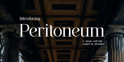 Introducing our new product the name Peritoneum Clasiss Serif Font. Modern Serif font that feels beautiful classy, elegant, and modern. This font is perfectly suited for a wide variety of projects, such as signature, stationery, logo, wedding, typography quotes, magazine or book covers, website headers, clothing, branding, packaging design, and more. Also for fashion-related branding or editorial design and displays both masculine and feminine qualities.
 - Valenzka by UICreative,
$23.00 Introducing our new product the name Valenzka Vintage Serif Fon. Modern Serif font that feels beautiful classy, elegant, and modern. This font is perfectly suited for a wide variety of projects, such as signature, stationery, logo, wedding, typography quotes, magazine or book covers, website headers, clothing, branding, packaging design, and more. Also for fashion-related branding or editorial design and displays both masculine and feminine qualities.
 - Distrampler by UICreative,
$23.00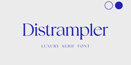 Introducing our new product the name Distrampler Luxury Serif Font. Modern Serif font that feels beautiful classy, elegant, and modern. This font is perfectly suited for a wide variety of projects, such as signature, stationery, logo, wedding, typography quotes, magazine or book covers, website headers, clothing, branding, packaging design, and more. Also for fashion-related branding or editorial design and displays both masculine and feminine qualities.
 - Poynter Old Style by Font Bureau,
$40.00 In the 1670s, Christopher Plantin was the largest publisher of his day. Hendrik van den Keere cut for him an astounding series of romans. As Stanley Morison once observed, such types adopted features of Flemish blackletter to strengthen elegant French romans. Large on the body, strong in color, economical in fit, widely (if anonymously) distributed, they established effective standards for all that followed; FB 1997–2000
 - Stanbriged by UICreative,
$23.00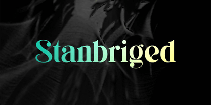 Introducing our new product the name Stanbriged Classy Vintage Serif Font. Modern Serif font that beautiful classy, elegant, and modern. This font is perfectly suited for a wide variety of projects, such as signature, stationery, logo, wedding, typography quotes, magazine or book covers, website headers, clothing, branding, packaging design, and more. Also for fashion-related branding or editorial design and displays both masculine and feminine qualities.
 - MANWARDS by UICreative,
$23.00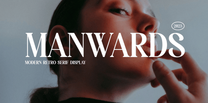 Introducing our new product the name Manwards Modern Retro Serif Font. Modern Serif font that beautiful classy, elegant, and modern. This font is perfectly suited for a wide variety of projects, such as signature, stationery, logo, wedding, typography quotes, magazine or book covers, website headers, clothing, branding, packaging design, and more. Also for fashion-related branding or editorial design and displays both masculine and feminine qualities.
