10,000 search results
(0.034 seconds)
- Kaushan Script - 100% free

- Grand Prix ES - 100% free

- Blazing - Unknown license

- Daville Condensed Slanted - Unknown license

- Avondale Outline - Unknown license

- Juan Miro - Unknown license

- Paddington - Unknown license

- HOUSEPIPES - Unknown license

- Portada by TypeTogether,
$35.00 For everyone wishing for a modern serif that’s as clear and readable as a sans in restrictive digital environments, meet Portada by Veronika Burian and José Scaglione. Sans serifs are commonly used on small screens to save space and carry a modern tone. Serifs may appear fickle and unsteady, pixel grids change from one product to another, and space is at a premium. Portada now provides a serif option for these restrictive digital environments, putting that old trope to rest. The screen has met its serif match. Portada was created from and for the digital world — from e-ink or harsh grids to Retina capability — making it one of the few serifs of its kind. Portada’s text and titling styles were engineered for superlative performance, making great use of sturdy serifs, wide proportions, ample x-height, clear interior negative space, and its subservient personality. After all, words always take priority in text. It’s not all business, though. Portada’s italics contain an artefact of calligraphy in which the directionality of the instrokes and the returning curves of the outstrokes give the family a little unexpected brio. Yet even the terminals are stopped short of flourished self-absorption to retain their digital clarity. When printed these details are downright comforting. Portada’s titling styles enact slight changes while reducing the individual width of each character and keeping the internal space clear. Titling italics have increased expressiveness across a few characters rather than maxing out the personality in each individual glyph. Digital magazines, newspapers, your favourite novel, and all forms of continuous screen reading benefit from Portada’s features. This family can also cover many of the needs developers have: user interface, showing data intensive apps on screen, even one-word directives and dialogs. And, as a free download, an exhaustive set of dark and light icons is included to maintain Portada’s consistent presence, whether as a word or an image. The complete Portada family (eight text styles, ten titling styles, and one icon set) is designed for extensive, clear screen use — a rare serif on equal footing with a sans.
 - Buddy Slender by Hackberry Font Foundry,
$24.95 Buddy Slender is the narrower version of the companion sans for Contenu, the book font family designed for a book on book family design called Practical Font Design. It's a loose, free, easy to read sans, so when my wife suggested Buddy, it clicked. This is the 2-font Buddy Slender family of Regular & Bold. I made a new more limited feature set for these fonts due to their designed usage.
 - Egyptian Oldstyle by Solotype,
$19.95Here's a wide, very light version of the widely known font P. T. Barnum (or French Clarendon, if you prefer). We have used this to good effect as secondary lines on old fashioned stationery. Reads well in very small sizes. - The Ruby by Vintage Voyage Design Supply,
$15.00 The Ruby Duo - a retro inspired font duo with a wide range of sans and script styles. Rugged and simple sans with a cool pair of mono line script. The main thing is the possibility of various combinations of using - from Condensed to Extra Expanded and from Light to Black. You will definitely find the best way to use in your projects with more than 50 styles. The sans has underline small caps alternates to use it with conjunctions. The script also has some alternates to change the script mood. Also, you will find a five graphic fonts with 130 elements total! A lot of vintage badge shapes and more than 100 vector vintage mood icons to use it in your badges or logos. PDF graphic navigation
 - Between by Monotype,
$40.99 Akira Kobayashi’s Between™ typeface comes in three main states. While different from each other, they all offer human-centered design to ensure that copy set in them is affable and approachable. An added benefit is the ability to transition “between” font designs, choosing different styles – or even individual characters – to create hierarchy, contrast or emphasis. Kobayashi designed the Between typeface in response to the current popularity of rounded, humanist sans serif designs over the cool grotesques of the 20th century. Between 1 melds industrial and humanist sans ethics. Between 2 represents a sans version of Kobayashi’s Cosmiqua® typeface, striking a balance between crisp and legible, organic and friendly. Between 3 is a freestyle sans with an uplifting sprightly mien. Between has 48 styles; each has eight weights of roman with its own italic counterpart. The family offers a large set of alternative glyphs and OpenType® features. A full interactive type specimen can be viewed here: http://www.monotype.com/fonts/between/ Featured in: Best Fonts for Logos
 - Preto Semi OT Std by DizajnDesign,
$- Preto Semi is an experiment. It is an attempt to create a readable type for text point sizes (other than sans-serif and serif). Preto Semi is not a Sans with added serifs or Serif with serifs removed. The use of the serifs is redefined and used for other purpose(s). The serifs became the extension of the stroke, they help to solve the spacing problem of sans-serif types and they use the primary function of serifs – keeping the eye on the baseline and emphasize the horizontal rhythm of the lines of text. Preto Semi is intended for magazines and editorial design, as other members of Preto family. Preto is an extensive type family, which explores the function of serifs on readability and legibility. Preto consist of three subfamilies: Sans, Semi and Serif. Preto is designed for multilingual typesetting. All of the subfamilies have equal gray value but different texture which can be use to differentiate languages. Preto sub-families have two text weights and two bold styles (Regular -> Bold, Medium -> Black). Every weight has a companion Italic style as well.
 - Preto Semi by DizajnDesign,
$24.00 Preto Semi is an experiment. It is an attempt to create a readable type for text point sizes (other than sans-serif and serif). Preto Semi is not a Sans with added serifs or Serif with serifs removed. The use of the serifs is redefined and used for other purpose(s). The serifs became the extension of the stroke, they help to solve the spacing problem of sans-serif types and they use the primary function of serifs – keeping the eye on the baseline and emphasize the horizontal rhythm of the lines of text. Preto Semi is intended for magazines and editorial design, as other members of Preto family. Preto is an extensive type family, which explores the function of serifs on readability and legibility. Preto consist of three subfamilies: Sans, Semi and Serif. Preto is designed for multilingual typesetting. All of the subfamilies have equal gray value but different texture which can be use to differentiate languages. Preto sub-families have two text weights and two bold styles (Regular -> Bold, Medium -> Black). Every weight has a companion Italic style as well.
 - Tazugane Gothic by Monotype,
$187.99 The Tazugane Gothic typeface family is the first original Japanese typeface created by Monotype. Designed by Akira Kobayashi, Kazuhiro Yamada and Ryota Doi of the Monotype Studio, the Tazugane Gothic typeface offers ten weights and was developed to complement the classic Latin typeface, Neue Frutiger. The design of the Tazugane Gothic typeface balances an original, humanistic style with elements of traditional Japanese handwriting. The two typefaces work together in a natural, seamless and adaptable manner so that Japanese and Latin texts can be used side-by-side for a wide range of applications, including in magazines, books and other print media; on digital devices; in branding and corporate identity systems; and in signage for buildings, highways and mass transit. Tazugane Gothic was updated to support the “Reiwa” new era symbol. Reiwa can be written as two kanji: 令和. This update to Tazugane Gothic includes Reiwa designed as a single ligature and is encoded as U+32FF. The inspiration for the Tazugane Gothic typeface is as elegant as its design. Since antiquity, cranes have been regarded in East Asia as auspicious birds for their noble appearance and elegance in flight. The typeface is named Tazugane Gothic in honor of the longevity of the crane, with the goal that it will be used for many years to come. The combination of the Tazugane Gothic typefaces’ traditional and humanistic elements, along with its intended ability to complement popular Latin typefaces, makes it one of the most uniquely flexible designs for applications where Japanese and Latin texts can be used together. The typeface family was created to have wide appeal, with a pleasing and consistent experience for readers, for use on screen, in print, in signage, packaging and advertising. Tazugane Gothic has 10 weights. The Light, Book, Regular, Medium and Bold weights are considered best for text sizes. The Ultra Light, Thin, Heavy, Black and Extra Black weights are recommended for headline sizes.
 - Mooono by Drawwwn,
$20.00 Mooono is retro futuristic monospaced font. The bright side (uppercase) is straight and to the point but the dark side (lowercase) is fat and funky. Mix up the upper and lower to create some serious spaced out vibes. I only saw the crescent, you'll see the whole of the mooono!
 - Geskal by Maulana Creative,
$11.00 Geskal is a wide strong sans display font. With bold stroke, fun character with a bit of ligatures. To give you an extra creative work. Geskal font support multilingual more than 100+ language. This font is good for logo design, Social media, Movie Titles, Books Titles, a short text even a long text letter and good for your secondary text font with script. Make a stunning work with Geskal font. Cheers, Maulana Creative
 - Gonero by Artisan Studio,
$12.00 Gonero is a sans font belonging to 81 font families, created in a very bold style. Gonero is a type font, comes in 81 upright weights. Gonero works well in all brands, logos, magazines, movies. The different weights give you a wide host of applications, while the outlined fonts give a real modern feel to any project. Multilingual support for multiple languages including: French, German, Spanish, Portuguese, Italian, Dutch, Finnish, Swedish and many more.
 - Newsweekly by UICreative,
$23.00 Introducing our new product the name Newsweekly Editorial Serif Display Font comes with 2 different weights. Modern Sans Serif font that beautiful classy, elegant, and modern. This font is perfectly suited for a wide variety of projects, such as signature, stationery, logo, wedding, typography quotes, magazine or book covers, website headers, clothing, branding, packaging design, and more. Also for fashion-related branding or editorial design and displays both masculine and feminine qualities.
 - Gymphow by UICreative,
$23.00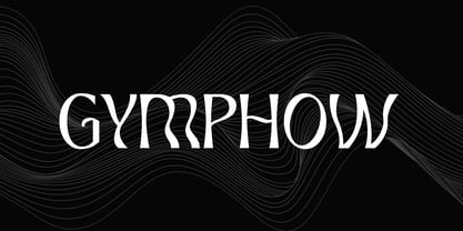 Introducing our new product the name is Gymphow Modern Serif Font Family comes with 9 different weights. Modern Sans Serif font that feels beautiful classy, elegant, and modern. This font is perfectly suited for a wide variety of projects, such as signature, stationery, logo, wedding, typography quotes, magazine or book covers, website headers, clothing, branding, packaging design, and more. Also for fashion-related branding or editorial design and displays both masculine and feminine qualities.
 - MBF Avee by Moonbandit,
$42.00 Presenting MBF Avee – a cutting-edge sans-serif font meticulously crafted to embody the essence of modernity and versatility. With its clean lines and minimalist design, MBF Avee offers a sleek typographic solution for a wide range of applications. Whether used in print or digital media, its timeless aesthetic ensures a sophisticated and impactful presentation. Elevate your design projects with MBF Avee, where clarity meets contemporary style for a truly refined visual experience.
 - Majorant by Emtype Foundry,
$69.00 Majorant is a geometric sans serif interpreted from a contemporary point of view. Its wide range of weights makes it a multipurpose family. The extreme weights work as a display typeface, from the mathematical rigour of the UltraThin to the expressive refinement of the Black. Thanks to the several alternates included, the font offers multiple personalities. From sharp and audacious in the default version, to the soft and classic in the stylistic sets. Majorant PDF.
 - Hogly by Maulana Creative,
$20.00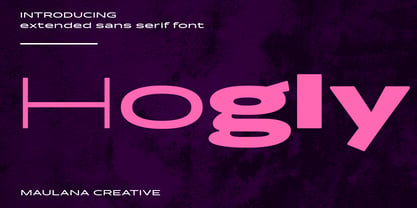 Hogly is a modern wide sans serif diplay font. With 3 weights stroke, fun character. To give you an extra creative work. Hogly font support multilingual more than 100+ language. This font is good for logo design, Social media, Movie Titles, Books Titles, a short text even a long text letter and good for your secondary text font with script or serif. Make a stunning work with Hogly font. Cheers, Maulana Creative
 - Mustachio by UICreative,
$23.00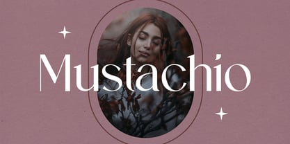 Introducing our new product the name is Mustachio Elegant Serif Font Family comes with 9 different weights. Modern Sans Serif font that feels beautiful classy, elegant, and modern. This font is perfectly suited for a wide variety of projects, such as signature, stationery, logo, wedding, typography quotes, magazine or book covers, website headers, clothing, branding, packaging design, and more. Also for fashion-related branding or editorial design and displays both masculine and feminine qualities.
 - Ghondes by IbraCreative,
$17.00 Ghondes is a contemporary sans-serif typeface that exudes a sleek and minimalist aesthetic, making it a quintessential choice for modern design projects. Characterized by its clean, geometric lines and well-balanced proportions, Ghondes strikes a harmonious balance between elegance and readability. The typeface’s versatile design lends itself to a wide range of applications, from branding and editorial work to digital interfaces, offering a timeless and sophisticated typographic solution for today’s design needs.
 - Calton Hosvesk by UICreative,
$23.00 Introducing our new product the name is Calton Hosvesk Stensil Sans Serif Font Family comes with 9 different weights. Modern Serif font that feels beautiful classy, elegant, and modern. This font is perfectly suited for a wide variety of projects, such as signature, stationery, logo, wedding, typography quotes, magazine or book cover, website header, clothing, branding, packaging design, and more. Also for fashion-related branding or editorial design and displays both masculine and feminine qualities.
 - Lagom Grotesk by S6 Foundry,
$20.00 Lagom Grotesk is a contemporary neo-grotesque sans serif typeface with strong stylistic geometric contrasts. Its distinctive wide-open stance was designed to give the right visual consistency for branding and communications, representing the shifting contemporary aesthetics. The distinctive stance gives the right visual consistency for branding and communications. Lagom Grotesk is perfectly suited for headlines, large-format prints, brand identities, social media, advertising, editorial design, posters, magazines, logos, headings, body copy, digital and more.
 - Nostalgic Whispers by UICreative,
$23.00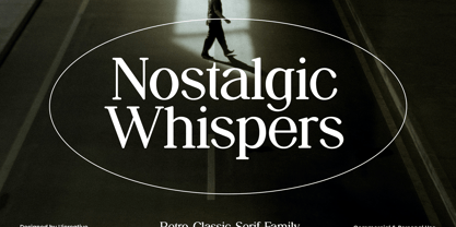 Introducing our new product the name Nostalgic Whispers Serif Font Family comes with 9 different weights. Modern Sans Serif font that beautiful classy, elegant, and modern. This font is perfectly suited for a wide variety of projects, such as signature, stationery, logo, wedding, typography quotes, magazine or book covers, website headers, clothing, branding, packaging design, and more. Also for fashion-related branding or editorial design and displays both masculine and feminine qualities.
 - Zuume Edge by Adam Ladd,
$25.00 Zuume Edge is a condensed, display sans serif ideal for eye-catching headlines, branding, packaging, logos, sports, and entertainment, and anywhere else you need maximum impact. The wide weight range offers versatility — the lighter weights bring a sharp, technical feel while the heavier weights pack a visual punch. The notched and extended ink traps add function and visual interest and the Cut styles have sliced horizontal strokes for more movement, aggression, and speed.
 - GHEA Granshan by Edik Ghabuzyan,
$40.00 GHEA Granshan is a super font family. It has 9 upright weights and their Italics. It supports Latin Pro, Armenian, Greek, Cyrillic, Bulgarian & Ukrainian alternatives alphabet systems. The weights from Regular to Bold and their Italics can be used as text fonts. The weights thinner than Regular and thicker than Bold can be used as Display fonts. It is an easily readable fond and the eyes don't get tired while reading. GHEA Granshan has a slight contrast style and at the same time is quite bright and clear.
 - Kickbox by Ahmad Jamaludin,
$19.00 Introducing KICKBOX Fonts - Unleash the Power of Nostalgia and Captivate Pop Culture, Lifestyle, and Music and Film Branding Looking to infuse your brand with a burst of retro charm and a dash of pop culture? Say hello to our KICKBOX Fonts! Designed with 3 styles: Narrow, Regular, Wide to make your brand stand out in the realms of pop culture, lifestyle, music, and film branding. These fonts are an absolute game-changer. KICKBOX transports you to the golden era of the past, evoking a sense of nostalgia that resonates with pop culture enthusiasts. Seamlessly blending boldness and authenticity, they captivate the hearts of your audience, adding a unique and irresistible touch to your brand identity. KICKBOX has 3 widths on each type: Narrow - Regular - Wide so can be perfect for any retro project like logotype, branding, title, packaging, and many more Features: Kickbox Main File Has 3 Variable: Narrow - Regular - Wide Instructions (Access special characters, even in Cricut Design) Unique Letterforms Works on PC & Mac Simple Installations Accessible in Adobe Illustrator, Adobe Photoshop, Microsoft Word even work on Canva! PUA Encoded Characters Fully accessible without additional design software. Embrace the captivating allure of our KICKBOX today and unleash a world of endless possibilities! Enjoy Designing! Dharmas Studio
 - Migae by Jolicia Type,
$25.00 Migae is a versatile and elegant display font designed to captivate and engage audiences across a wide range of design applications. With 14 distinct weight variants spanning from delicate Light to commanding Black, and complemented by a refined set of italics, Migae offers a harmonious balance of strength and elegance to fulfill your typographic needs. Key Features: 1. 14 Weight Variants: Migae's extensive weight range, including Light, Regular, Medium, Semi-Bold, Bold, Extra Bold, and Black variants, allows you to choose the perfect weight for your design, whether it's a subtle headline or a bold statement. 2. Italics: In addition to its standard upright styles, Migae boasts a comprehensive set of italics that adds versatility to your typography, conveying an air of sophistication and style. 3. Strong to Elegant Styles: Migae's design philosophy seamlessly combines strength and elegance. Its strong weights provide a bold and impactful presence, while the lighter weights exude an effortless elegance, making it suitable for a wide array of creative projects. 4. Modern Aesthetic: Migae's clean, contemporary lines and carefully crafted details make it an ideal choice for modern graphic and web design, editorial layouts, branding, and advertising. 5. Legibility: Migae prioritizes legibility across all weights and styles, ensuring that your messages are communicated effectively, regardless of the chosen variant. 6. Versatile Applications: From branding and packaging to posters, editorial design, and web headings, Migae adapts to various design contexts, making it a versatile choice for graphic designers, typographers, and creative professionals. Design Inspiration: Migae draws inspiration from the harmony of nature, where strength and elegance coexist. Its name, derived from the Korean word "미래" (miraee), meaning "future," reflects its forward-thinking design approach that is equally rooted in tradition and innovation. Ideal Usage: Migae is an ideal choice for those seeking a display font that can effortlessly transition between bold and delicate, exuding confidence and refinement in every style. It's perfect for branding, packaging, advertising, editorial layouts, and any design project where typography plays a pivotal role. Migae is more than just a font; it's a design companion that empowers creatives to achieve a perfect balance between strength and elegance in their visual communications. Explore the world of Migae and let your design projects shine with its captivating charm and versatility.
 - Rasheda by Keristyper Studio,
$14.00 Rasheda is a beautiful italic font. Inspired by classic cursive calligraphy from the Renaissance era in the 8th Century. This font is good for logo design, Social media, Movie Titles, Books Titles, short text even long text letters, and good for your secondary text font with script, sans, or serif. **Featured:** * Standard Uppercase & Lowercase * Numeral & Punctuation * Multilingual : ä ö ü Ä Ö Ü ß ¿ ¡ * Alternate & Ligature * PUA encoded We recommend programs that support the OpenType feature and the Glyphs panel such as Adobe applications or Corel Draw. so you can use all the variations of the glyphs. Hope you enjoy our fonts!
 - Mistafelga by Keristyper Studio,
$14.00 Mistafelga is an elegant Silky italic font designed for editorial use and inspired by calligraphy in the middle century. This font is good for logo design, Social media, Movie Titles, Books Titles, short text even long text letters, and good for your secondary text font with sans or serif. Featured: Standard Uppercase & Lowercase Numeral & Punctuation Multilingual : ä ö ü Ä Ö Ü ß ¿ ¡ Alternate & Ligature PUA encoded We recommend programs that support the OpenType feature and the Glyphs panel such as Adobe applications or Corel Draw. so you can use all the variations of the glyphs. Hope you enjoy our fonts!
 - Siro by Dharma Type,
$29.99 Siro is a large x-height sans-serif family for text designed by Ryoichi Tsunekawa and the whole family consists of 7 weights from ExtraLight to Heavy and their matching Italics. The basic skeleton of their letterform was designed simply to create neutral, natural and clean impression and their very large x-height makes this family legible and readable even on small size screen. Siro supports almost all European languages: Western, Central, South Eastern Europeans and afrikaans. And proportional figures, superior figures, inferior figures, denominators, numerators, fractions, ordinals and case-sensitive-forms can be accessed by using OpenType features.
 - AndrewAndreas by Ingrimayne Type,
$5.00 AndrewAndreas is a simple, clean, sans-serif font family that is highly legible and useful for both text and display purposes. The original three weights were designed in 1994 and three additional weights plus oblique styles were added in 2020. Also added were several OpenType features, including subscripts, superscripts, and fractions. The six oblique styles slant the upright styles but do not change the shape of the letters. However, three OpenType stylistic alternatives provide alternative letter forms for a, f, i, j, and l for five of the obliques and they can be used for a more traditional italics appearance.
 - Modica by Monotype,
$25.99 Modica is a strong and agile Geometric Sans type family comprising 18 fonts. This typeface began life as “Meccanica” – a quirky, heavy, engineering typeface, that later evolved into the more conservative “Technica” type family. And now, the typeface has been distilled down to its simplest and most perfect form to become “Modica”. Modica is a nimble typeface that can handle a multitude of applications – everything from body copy to retail fashion to corporate identities... why not put Modica to task today? Key features: • 9 weights in Roman and Italic • Full European character set (Latin only) • 450+ glyphs per font.
 - Harfesto by Keristyper Studio,
$14.00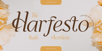 Harfesto is an elegant glamour and stylish italic serif with modern classy and feminine characteristic. This font is good for logo design, Social media, Movie Titles, Books Titles, short text even long text letters, and good for your secondary text font with the script, sans, or serif. Featured: Standard Uppercase & Lowercase Numeral & Punctuation Multilingual : ä ö ü Ä Ö Ü ß ¿ ¡ Alternate & Ligature PUA encoded We recommend programs that support the OpenType feature and the Glyphs panel such as Adobe applications or Corel Draw. so you can use all the variations of the glyphs. Hope you enjoy our fonts!
 - FF Marselis by FontFont,
$62.99 Danish type designer Jan Maack created this sans FontFont in 2012. The family has 8 weights, ranging from Light to Black (including italics) and is ideally suited for advertising and packaging, logo, branding and creative industries as well as web and screen design. FF Marselis provides advanced typographical support with features such as ligatures, alternate characters, case-sensitive forms, fractions, super- and subscript characters, and stylistic alternates.The typeface was selected as one of Typographica’s favorite typefaces of 2012. It comes with a complete range of figure set options – oldstyle and lining figures, each in tabular and proportional widths.


