10,000 search results
(0.141 seconds)
- Town Meeting JNL by Jeff Levine,
$29.00 Town Meeting JNL (available in both regular and oblique versions) is a modified version of Mud Creek JNL (which was based on Tuscan Egyptian – a classic wood type). The side spurs were removed and the split serifs were replaced by slab serifs.
 - Remachine Script Personal Use - Personal use only

- Bambinta by IbraCreative,
$17.00 Bambinta – A Chic Display Sans Serif Font Bambinta, a chic display sans-serif font, effortlessly combines sophistication with modernity, making it an ideal choice for contemporary design projects. With its clean lines, geometric shapes, and well-balanced proportions, Bambinta exudes a timeless elegance that enhances visual appeal. The font’s distinct characters strike a perfect balance between simplicity and stylish flair, making it versatile for various applications such as branding, editorial design, and signage. Bambinta’s unique aesthetic captures attention and communicates a sense of refinement, making it a go-to choice for designers seeking a sleek and fashionable typeface to elevate their creative endeavors. Bambinta is perfect for branding projects, logo, wedding designs, social media posts, advertisements, product packaging, product designs, label, photography, watermark, invitation, stationery, game, fashion and any projects. Fonts include multilingual support for; Afrikaans, Albanian, Czech, Danish, Dutch, English, Estonian, Finnish, French, German, Hungarian, Italian, Latvian, Lithuanian, Norwegian, Polish, Portuguese, Slovak, Slovenian, Spanish, Swedish.
 - Styled Up by Nicky Laatz,
$15.00 Are you looking for a font that says "I'm unique"? Say hello to Styled up! A new authentic hand-brushed, modern calligraphy font with a stylish flair and a quirky personality. "Styled up!" comes with a complimentary caps font, perfect for when you need to add extra text in those stubborn empty spaces in your type designs. Styled up! is super special in that it creates completely unique and individual designs - you can write one line in a million different ways thanks to it’s opentype features with 2 sets of extra alternate lowercase letters and an extra set of Uppercase alternate letters. Styled up! also comes with a comprehensive set of double letter ligatures to make your designs look even more naturally written. Styled up! is perfect for any project needing a unique hand lettered touch - branding, greeting cards, logos, websites, wedding signage, printables, and super stylish merch.
 - Ford's Folly by Ascender,
$50.99Ford's Folly is a lively yet sophisticated handwriting font designed by Ascender's Jim Ford. It captures the look and spirit of the designer's handwriting using a using a Sharpie™ Extra Fine felt pen. This casual script font evokes an energetic feeling, and has very legible letterforms without quirky distractions. Jim Ford took his hand global by creating a massive multilingual character set. The font features the WGL Pan-European character set (Eastern Europe, Cyrillic, Greek and Turkish) and advanced typographic features for use with OpenType-savvy applications. The font is a fun and attractive handwriting font that is great for greeting cards, menus, advertisements, scrapbooking and many other projects that can benefit a personal appearance. - Vintage Glader by Ditatype,
$29.00 Vintage Glader is a beautifully crafted script font that exudes a timeless elegance and sophistication. Designed with a fairly thick weight, this font makes a bold statement while maintaining a classic script style. Its well-balanced proportions ensure a consistent and harmonious look across all letters, making it both visually appealing and highly readable. One of the defining characteristics of Vintage Glader is its contrasting strokes, which add a dynamic rhythm to the text. This contrast not only enhances the overall aesthetic but also contributes to the font's excellent legibility, making it suitable for a wide range of design applications. Adding to its charm, Vintage Glader swinging ends on some letters, lending a playful yet refined touch to the script. In addition, enjoy the features here. Features: Ligatures Stylistic Sets Multilingual Supports PUA Encoded Numerals and Punctuations Vintage Glader fits in headlines, invitations, logos, posters, flyers, branding materials, greeting cards, print media, and many more designs. Find out more ways to use this font by taking a look at the font preview. Thanks for purchasing our fonts. Hopefully, you have a great time using our font. Feel free to contact us anytime for further information or when you have trouble with the font. Thanks a lot and happy designing.
 - Haboro Slab Soft by insigne,
$32.99 Haboro Slab Soft is a scion of the Haboro hyperfamily. This concept powers through with its well built, accommodating nature. Haboro Slab Soft’s serifs are rounded, giving it a softer look. The Haboro hyperfamily is a comprehensive design suite that provides solutions for many projects. The iconic angled wedge makes this family ideal for apparel, packaging, apps, corporate identities and advertising campaigns. Subfamilies in the hyperfamily include the original Haboro, a Didone face, Haboro Sans, Serif, Soft, and Slab. The Haboro hyperfamily is known for its ability to make your copy appear clear and simple. The Haboro typeface is built on a common underlying model. It has the same cap height, the same x-height, and the same basic character shape. This unification of shape and proportion results in a complementary set of typefaces. Haboro Slab Soft’s wide variety of ligatures and OpenType alternatives give your message the clarity it deserves. The Haboro Slab Soft family includes seven weights, from Thin to ExBold, three widths, and matching italics. There are over 550 glyphs per style and support for over 70 Latin-based languages. Haboro Slab Soft includes features such as small caps, ligatures, fractions, and alternatives. Haboro Slab Soft is there when you need to present information in a clear and friendly fashion.
 - Sybilla Multiverse by Karandash,
$28.00 Take a deep dive into the Sybilla Multiverse with this unique 294 style multi-versatile type family – a further creative exploration of the capabilities offered by our original warm and friendly slab design. Encompassing one body and six display sub-families, Sybilla Multiverse is a unique attempt to create a never before seen symphony of text and decorative type that spans in multiple usable widths and weights. Each sub-style consists of seven weights in three widths with complimentary true italics. Sybilla Multiverse is ideally suited for advertising and packaging, editorial and publishing, logo, branding and creative industries, poster and billboards, small text and signage as well as web and screen design. Every one of the styles offered (body or display) provides a broad range of advanced typographical features such as small caps, case-sensitive forms, fractions, scientific inferiors, super- and subscript characters. It comes with a complete figure range set of oldstyle and lining figures, each in tabular and proportional widths. Sybilla Multiverse has extensive multilingual support, covering more than 70 Latin-based languages and specially designed Cyrillic that works harmoniously with its Latin counterparts – a perfect choice for projects that need both writing systems running side by side.
 - Atlan by Latinotype,
$29.00 Atlan—a Latin ‘spin-off’ of classic geometric sans typefaces. Remembering typefaces like ‘Kabel’ by Rudolf Koch, while paying attention to current design needs, was the starting point for ‘Atlan’—a simple, elegant and appealing font. This typeface is based on highly expressive sans-serif geometric fonts of the 1920s. We challenged ourselves to reinterpret these characteristics, without losing expressiveness, in order to create a functional and versatile design. This process resulted in a font with display features, well-suited for light, uniform-coloured texts. The family offers a variety of styles from the elegant Thin weight—ideal for publishing and corporate websites—to the Heavy variant (perfect for logotypes and packaging), which reveals the stylistic elements of the typeface.
 - Canterbury Old Style Pro by Red Rooster Collection,
$79.00 Canterbury Old Style Pro is a two-weight serif font family with a small x-height. In 1920, Morris F. Benton designed the original weight for American Type Founders (ATF). Raymond Vatter and Steve Jackaman produced the digital version in 1992 and added a new “Bold” weight, and a full set of swash capitals were designed and released in 2003. Jackaman redrew and remastered the family in 2017, engineering the complete family into OpenType Pro format. Our OpenType fonts have extended character sets that support Western, Central, and Eastern European languages. Canterbury OS Pro has a whimsical, old-time feel, and handsomely distinguishes itself at all sizes. Canterbury Sans, its sans serif sister font, complements the family with its flowing forms.
 - Phlebodium by Fat Hamster,
$20.00 Phlebodium - geometric sans serif typeface, 16 fonts Phlebodium is a modern geometric sans serif font family. Nostalgic, soft and playful font in 80s 90s 2000s techno rave style. BONUS: vector cannabis / hemp leaf, sunflower, mushroom / fungus, meat, unicorn, heart, pizza, hot dog, sun, phlebodium, clover, dog, cat, bear, sun character mascot illustrations and t-shirt designs Phlebodium type family available in 16 styles. 8 Italics 4 weights: Thin, Regular, Medium and Bold 2 widths: Normal and Condensed This bold typeface is ideal for use in display sizes. Perfect for headlines and logos, text blocks, any type of graphic design, printing, t-shirts, posters, branding, web and applications, social media and many more Phlebodium typeface contains 4 weights, normal, condensed and italic styles
 - Linotype Gotharda by Linotype,
$29.99Linotype Gotharda is part of the Take Type Library, chosen from contestants of Linotype’s International Digital Type Design Contests of 1994 and 1997. This display font started as an experiment of the Croatian-German designer Milo Dominik Ivir. He wanted to design a font with characteristics of both sans serif and Gothic faces. From the Gothic he took the heavy strokes, the narrow letters, the exaggerated overmatter and the high x-height. The modern standard forms of the letters s, a, x and z, the clear capitals and the lack of serifs are the characteristics taken from sans serif faces. The result is a font with a constructed, old German feel. Linotype Gotharda is intended exclusivley for headlines in large point sizes. - Contra Slab by Wiescher Design,
$16.50 Contra Sans is the slab serif version of my Contra family.
 - Kruede by Gerald Gallo,
$20.00 Kruede is a sans serif family with an artsy informal feel.
 - TOMO Fango by TOMO Fonts,
$20.00 A sans serif typeface, designed to speak very happy and friendly.
 - Backstage by AVP,
$19.00Backstage is a bold sans serif stencil with subtly rounded corners. - Etched Fractals by Typotheticals,
$6.00Drawn in Illustrator, this plain sans serif was created in 2004. - Cyne by Typotheticals,
$8.00A plain sans serif that would be good for everyday use. - Weingut Script by FaceType,
$34.00 Blossoms, leaves, buds and tendrils create fragile objects of words and letters. · Weingut Script Flourish is a decorative display font with high contrasts, perfectly hand-drawn to the tiniest details. The font is trimmed to fairly large font sizes and is highly suitable for chapter titles or book jackets as well as Headlines, Invitations and wine labels :), although also impressing with an astounding legibility in small typesettings. Inspired by the handmade Blätterschrift from the 19th century Mettenleiter’s Schriftenmagazin, its basic structure is related to the English Script which makes it a perfect wedding font. The Weingut Family – noticable bouquet, beautiful structure with full fruit and a long finish. · Design with bicoloured capitals: In Weingut Script and Weingut Flourish, leaves and letters are available separately. You can stack them and apply different colours to the foreground and background. · Decoration and patterns: Weingut Swashes and Ornaments offers extra decorative elements in a separate font. Leaves, flourishes and borders available on their own or merged to ornaments. · Please make sure to use an application that supports the layering of text (two-coloured capitals) and OpenType features (contextual alternates). Be aware if you intend to combine Weingut Script Flourish and Weingut Flourish that these two do not go together. The floral outlines differ slightly and inaccurate overlaps will be the end result. · View other fonts from Georg Herold-Wildfellner: Sofa Serif | Sofa Sans | Mila Script Pro | Pinto | Supernett | Mr Moustache | Aeronaut | Ivory | Weingut · Language Report for Weingut Script / 151 languages supported: Abenaki, Afaan Oromo, Afar, Afrikaans, Albanian, Alsatian, Amis, Anuta, Aragonese, Aranese, Arrernte, Arvanitic, Asturian, Aymara, Basque, Bikol, Bislama, Breton, Cape Verdean, Catalan, Cebuano, Chamorro, Chavacano, Chickasaw, Cofan, Corsican, Danish, Dawan, Delaware, Dholuo, Drehu, Dutch, English, Estonian, Faroese, Fijian, Filipino, Finnish, Folkspraak, French, Frisian, Friulian, Galician, Genoese, German, Gooniyandi, Greenlandic, Guadeloupean, Gwichin, Haitian Creole, Han, Hiligaynon, Hopi, Icelandic, Ido, Ilocano, Indonesian, Interglossa, Interlingua, Irish, Italian, Jamaican, Javanese, Jerriais, Kala Lagaw Ya, Kapampangan, Kaqchikel, Kikongo, Kinyarwanda, Kiribati, Kirundi, Klingon, Latin, Latino Sine, Lojban, Lombard, Low Saxon, Luxembourgish, Makhuwa, Malay, Manx, Marquesan, Meriam Mir, Mohawk, Montagnais, Murrinhpatha, Nagamese Creole, Ndebele, Neapolitan, Ngiyambaa, Norwegian, Novial, Occidental, Occitan, Oshiwambo, Palauan, Papiamento, Piedmontese, Portuguese, Potawatomi, Qeqchi, Quechua, Rarotongan, Romansh, Rotokas, Sami Southern, Samoan, Sango, Saramaccan, Sardinian, Scottish Gaelic, Seri, Seychellois, Shawnee, Shona, Sicilian, Slovio, Somali, Sotho Northern, Sotho Southern, Spanish, Sranan, Sundanese, Swahili, Swazi, Swedish, Tagalog, Tetum, Tok Pisin, Tokelauan, Tshiluba, Tsonga, Tswana, Tumbuka, Tzotzil, Uzbek, Venetian, Volapuk, Voro, Walloon, Waraywaray, Warlpiri, Wayuu, Wikmungkan, Wiradjuri, Xhosa, Yapese, Yindjibarndi, Zapotec, Zulu, Zuni
 - Syntax Next by Linotype,
$50.99 Syntax was designed by Swiss typographer Hans Eduard Meier, and issued in 1968 by the D. Stempel AG type foundry as their last hot metal type family. Meier used an unusual rationale in the design of this sans serif typeface; it has the shapes of humanist letters or oldstyle types (such as Sabon), but with a modified monoline treatment. The original drawings were done in 1954; first by writing the letters with a brush, then redrawing their essential linear forms, and finally adding balanced amounts of weight to the skeletons to produce optically monoline letterforms. Meier wanted to subtly express the rhythmical dynamism of written letters and at the same time produce a legible sans serif typeface. This theme was supported by using a very slight slope in the roman, tall ascenders, terminals at right angles to stroke direction, caps with classical proportions, and the humanist style a and g. The original foundry metal type was digitized in 1989 to make this family of four romans and one italic. Meier completely reworked Syntax in 2000, completing an expanded and improved font family that is available exclusively from Linotype GmbH as Linotype Syntax. In 2009 the typeface family was renamed into a more logical naming of "Syntax Next" to fit better in the Platinum Collection naming." Syntax® Next font field guide including best practices, font pairings and alternatives.
 - 360 by Wilton Foundry,
$29.00Distorted fonts are great but are mostly not very practical - 360 is an attempt to create a simple distorted font that can be used far beyond a few logos or headlines. Each 360 character averages roughly half the number of sharp angles of a regular sans serif. This gives it an unusually fresh and timeless appeal and creates a dynamic presence across body text that is very legible and compact without looking overly condensed. 360 was chosen as a name because it can be used as an everyday font, all year round, and because 360 has so many unusual angles that don't conform to normal font conventions. 360 also happens to be a cool number: 360 makes a highly composite number. 360 is also a superior highly composite number and a colossally abundant number. A circle is divided into 360 degrees for the purpose of angular measurement. 360° is also called round angle. 360 is a convenient standard since, 360 being highly composite, it allows a circle to be divided into equal segments with each segment measured in integer degrees rather than fractional degrees. 360 is the sum of a twin prime (179 + 181). A year is roughly calculated as 360 days. - Ashemore Softened by insigne,
$32.00 Following the success of the Ashemore family, it became clear that a rounded version of Ashemore would be a great addition to the product line that would allow designers even more design choices. Ashemore Softened’s rounder forms compliment the face well as the original font eschewed straight lines. The rounded terminators give the face a sense of friendliness that is unsurpassed. The distinct and flamboyant style of Art Nouveau and the Arts and Crafts style remain, but the blunted terminators give the face a more technological and contemporary look and feel. The Ashemore Softened family has a full range of six weights from thin to black and includes condensed and extended options for a total of 36 fonts. The typeface also includes some unique OpenType alternates that make the superfamily even more versatile. Ashemore Softened is equipped for complex professional typography, including alternates, small caps and many alternate characters. The face also has a number of numeral sets, including tabular figures, fractions, old-style, lining figures and superiors and inferiors. OpenType-capable applications such as Quark or the Adobe Suite can take full advantage of automatic ligatures and alternates. You can find these features demonstrated in the .pdf brochure. Ashemore Softened also includes the glyphs to support a wide range of languages, including Central, Eastern and Western European languages. In all, Ashemore Softened supports over 40 languages that use the extended Latin script, making the new addition a great choice for multi-lingual publications and packaging. The original Ashemore was designed by Jeremy Dooley with production assistance from Lucas Azevedo and Marcelo Magalhaes. Kerning assistance from iKern.
 - Middle Thread by Maculinc,
$15.00 Middle Thread is a Script Font with a retro style. Soft curves are combined with high-contrast glyphs, conveying an attractive retro and vintage quality. This font consists of 4 Middle Thread Fonts Regular, Extrude, Swash and Swash Extrude, with many unique ligatures and alternatives provided. Great in layout design for quotes or body copy, best used as a display for posters, headings, logos, branding, magazines, product packaging, and a wide variety of things. Mix Regular and Swash to create a unique and very beautiful look, especially when you add the Extrude feature of the font, it really adds uniqueness and interest by looking even more amazing. What do you get: Middle Three Regular, Swash, Extrude and Swash Extrude OTF, this font is accessible in Adobe Illustrator, Adobe Photoshop, Adobe InDesign, it even works in Microsoft Word. Fully Encoded Characters are accessible without additional design software. Fonts include multilingual support. Images used : All photos/images/vectors used in the preview are excluded, for illustration purposes only. (www.vecteezy.com) Feel free to follow, like and share. thank you very much for checking my store!
 - Varidox by insigne,
$35.00 Varidox, a variable typeface design, allows users to connect with specific design combinations with slightly varied differences in style. These variations in design enable the user to reach a wider scope of audiences. As the name suggests, Varidox is a paradox of sorts--that is, a combination of two disparate forms with two major driving influences. In the case of type design, the conflict lies in the age-old conundrum of artistic expression versus marketplace demand. Should the focus center primarily on functionality for the customer or err on the side of advancing creativity? If both are required, where does the proper balance lie? Viewed as an art, type design selections are often guided by the pulse of the industry, usually emphasizing unique and contemporary shapes. Critics are often leading indicators of where the marketplace will move. Currently, many design mavens have an eye favoring reverse stress. However, these forms have largely failed to penetrate the marketplace, another major driving factor influencing the font world. Clients now (as well as presumably for the foreseeable future) demand the more conservative forms of monoline sans serifs. Typeface designers are left with a predicament. Variable typefaces hand a great deal of creative control to the consumers of type. The demands of type design critics, personal influences of the typeface designer and the demands of the marketplace can all now be inserted into a single font and adjusted to best suit the end user. Varidox tries to blend the extremes of critical feature demands and the bleeding edge of fashionable type with perceptive usability on a scalable spectrum. The consumer of the typeface can choose a number between one and one-thousand. Using a more conservative style would mean staying between zero and five hundred, while gradually moving higher toward one thousand at the high end of the spectrum would produce increasingly contemporary results. Essentially, variable fonts offer the ability to satisfy the needs of the many versus the needs of the few along an axis with a thousand articulations, stabilizing this delicate balance with a single number that represents a specific form between the two masters, a form specifically targeted towards the end user. Practically, a user in some cases may wish to use more conservative slab form of Varidox for a more conservative clientele. Alternatively, the same user may then choose an intermediate instance much closer to the other extreme in order to make a more emphatic statement with a non-traditional form. Parametric type offers a new options for both designers and the end users of type. In the future, type will be able to morph to target the reader, based on factors including demographics, mood or cultural influences. In the future, the ability to adjust parameters will be common. With Varidox, the level of experimentality can be gauged and then entered into the typeface. In the future, machine learning, for example, could determine the mood of an individual, their level of experimentality or their interest and then adjust the typeface to meet these calculated parameters. This ability to customize and tailor the experience exists for both for the designer and the reader. With the advent of new marketing technologies, typefaces could adjust themselves on web pages to target consumers and their desires. A large conglomerate brand could shift and adapt to appeal to a specific target customer. A typeface facing a consumer would be more friendly and approachable, whereas a typeface facing a business to business (B2B) customer would be more businesslike in its appearance. Through both experience, however, the type would still be recognizable as belonging to the conglomerate brand. The font industry has only begun to realize such potential of variable fonts beyond simple visual appearance. As variable font continues to target the user, the technology will continue to reveal new capabilities, which allow identities and layouts to adjust to the ultimate user of type: the reader.
 - PGF Caprina Pro by PeGGO Fonts,
$24.00 "PGF Caprina Pro" is an audacious and rough geometric sans-serif font inspired by the wild and untamed personality of mountain goats (the word "caprina"‘ in Spanish is related to or resembling ‘goats’)—amazing animals which can skilfully climb up slopes and withstand very cold temperatures. Was originally developed under the Latinotype team supervision and is now upgraded to this Pro version that comes in 20 font styles, with 739 glyphs each, supports now more than 200 Latin-based languages and includes a wider OpenType features range like: Stylistic Alternates ‘set 01’ for b, d, g, p, q, i, j, t, y, &, I, G, M Stylistic Alternates ‘set 02’ for d, g, j 4 Stylistic Alternate from ‘set 01’ to ‘set 04’ for Enclosed Numbers (circles and squares) Stylistic Alternate ‘set 05’ for curved 3 and ‘Zero with dot inside’ Contextual alternates automatically turns ‘zero’ into a ‘slashed zero’ in alphanumeric contexts Contextual alternates automatically turns “Il” into a serif for improve its legibility Case Sensitive when "All Caps" is activated for ß, ¡, ¿, () [] {}, ‹› «», •(bullet), *(asterisk), -(hyphen) Standard Ligatures for fi, fj, fl Discretionary Ligatures for tt, tr, www, LL, TT Lining Numbers Old Style Numbers Tabular Lining Tabular Old Style Numbers Slashed zero on every number figures Numerators and Denominators from 0 to 9 for any Fraction expression Superiors and Inferiors from 0 to 9 for any scientific notation Ordinal forms for ‘a’ and ‘o’ Localized language customization for German, Dutch, Polish, Catalan, Romanian, Moldavian, Turkish, etc. Every OpenType option is also accessible via Character Map allowing users and designers to choose an alternate design for a particular character. “PGF Caprina Pro” is well-suited for high-impact action publishing and advertising as well related with adrenalynic and extreme sport design stuff.
 - Rolie Twily by Jolicia Type,
$25.00 Introducing Rolie Twily, a font that effortlessly combines the elements of display and decorative styles to bring you a unique typographic experience. This font exudes an aura of Curly Elegant Modernity that is sure to make your designs stand out and leave a lasting impression. Key Features: Display and Decorative Fusion: Rolie Twily seamlessly blends the characteristics of display and decorative fonts, resulting in a versatile typeface that can be used for a wide range of creative projects. Curly Elegance: The graceful and whimsical curls in Rolie Twily's letterforms add a touch of sophistication and elegance to your text, making it perfect for invitations, posters, and branding materials where a touch of luxury is desired. Modern Aesthetic: While rooted in tradition, Rolie Twily maintains a contemporary edge, making it ideal for modern design trends. Its clean design ensure that your message remains clear and stylish. Versatile Usage: Whether you're designing wedding invitations, packaging, social media graphics, or any creative project, Rolie Twily brings a sense of charm and refinement to your typography. Attention-Grabbing: The unique and eye-catching nature of Rolie Twily ensures that your content won't go unnoticed. It's a font that demands attention and leaves a lasting impression. Rolie Twily is the perfect choice when you want to infuse your designs with a touch of Curly Elegant Modernity. Elevate your creative projects and make them truly memorable with this exceptional font. Download Rolie Twily today and watch your designs flourish with a newfound sense of style and sophistication.
 - Caslon #540 by ITC,
$29.00The Englishman William Caslon punchcut many roman, italic, and non-Latin typefaces from 1720 until his death in 1766. At that time most types were being imported to England from Dutch sources, so Caslon was influenced by the characteristics of Dutch types. He did, however, achieve a level of craft that enabled his recognition as the first great English punchcutter. Caslon's roman became so popular that it was known as the script of kings, although on the other side of the political spectrum (and the ocean), the Americans used it for their Declaration of Independence in 1776. The original Caslon specimen sheets and punches have long provided a fertile source for the range of types bearing his name. Identifying characteristics of most Caslons include a cap A with a scooped-out apex; a cap C with two full serifs; and in the italic, a swashed lowercase v and w. Caslon's types have achieved legendary status among printers and typographers, and are considered safe, solid, and dependable. A few of the many interpretations from the early twentieth century were true to the source, as well as strong enough to last into the digital era. These include two from the American Type Founders Company, Caslon 540 and the slightly heavier Caslon #3. Both fonts are relatively wide, and come complete with small caps, Old style Figures, and italics. Caslon Open Face first appeared in 1915 from the Barnhart Bros & Spindler Foundry, and is not anything like the true Caslon types despite the name. It is intended exclusively for titles, headlines and initials, and looks elegant whether used with the more authentic Caslon types or by itself. - Credit Crunch by Comicraft,
$29.00 Here in the heart of Santa Monica, in the disused 1940s aircraft hangar we like to call the Comicraft Studios, we know that times are tough. As we were driving to “work” in the back of our chauffeur driven Humvee limo, sipping martinis out of the navels of Playboy bunnies and wondering what font we should release next, we decided it was time to reach out to the poor people. Yes, we felt it was time to create a font for the huddled masses yearning to breathe free, for the wretched refuse of our teeming shores. A font, if you will, for the tempest-tossed. It’s a little skinny and might be described as pinched and starved, but it’s guaranteed to see you through this current economic crisis as only the 26 letters of the alphabet can. It was a tall order, but Jazzy JG Roshell created this one while he was in line at the bank, waiting for his personal bailout. Meticulously crafted using one of those ballpoint pens attached to the cashier’s station by elastic, Credit Crunch is the Hamburger Helper of comic book fonts. It’s kind of a hybrid -- just like the Priuses our trophy wives drive to their personal plastic surgeons -- and it’s solar powered and also comes with a tank full of good old fashioned Biro ink. The Recession, Climate Change AND Global Hunger will probably end mere minutes after you crack open your life’s savings to buy this font. How can you afford NOT to...? See the families related to Credit Crunch: Credit Extension.
 - Grate by Otto Maurer,
$7.00 Grate is a simple styled Font, it is best for Logo designing. How much we can cut down a Font till it is possible to reat it? That was the question, and this font is the answer. I think it is so much cut down but Human can read it. It is total simple Kerning inside. You can overlay the glyphs and it is almost readable.
 - Natural Heap by Gleb Guralnyk,
$14.00 Hi, introducing a decorative font – Natural Heap! It's a handcrafted typeface that consists of hundreds of leaves that are seamlesly combined in a flowing pattern. Natural Heap font will perfectly fit for various label and logo designs. It's working better with short big words, when all the details are visible. To create an organic begining and ending of the word, type underscore characters on both sides (contextual alternates feature must be turned on). Natural Heap font has a west european multilingual support, check out the screenshots with available characters. Thank you and have a nice day!
 - Storia Lettering by Gatype,
$10.00 he Storia Lettering Serif style is absolutely perfect for editorial headings. The full font type upright and italic makes it easy for you to use the 2 styles in many projects. This font is complete with symbols and is multilingual. This font style is bold, bold, and sleek, featuring Swash,n Ligature and Stylistic Alt & Stylistic Set features. making it perfect for editorial, web, posters, t-shirts and magazine covers. . etc. Including: Storia Lettering & Italics Uppercase Letters, Numbers, Punctuation & Symbols. Multilingual Support More about this source text Source text is needed to get additional translation information Send feedback Side panel
 - De Gozaru by Bejeletter,
$14.00 De Gozaru, is a classic calligraphy font with a beautiful arch. This font is available in several modern swirls that can make your work look elegant, sweet and perfect. This font also has several alternatives that can allow you to improvise your writing.
 - ITC Pino by ITC,
$29.99The ITC Pino™ typeface family is Slobodan Jelesijevic’s second suite of commercial fonts. Although a small family of three weights, it is remarkably versatile. Like many typefaces, Pino grew out of a desire for a particular kind of design. Jelesijevic was creating a series of illustrations for a children’s magazine and needed a typeface that was lighthearted, legible and would complement his illustrative style. Unable to find exactly what he needed, he decided to make his own font. “I spent the better part of a day looking for just the right typeface,” he recalls. “Of course, the hard part was finding something that would harmonize perfectly with my drawings. A custom font was not part of the project brief or budget, but I thought that perhaps I could use it again.” The regular weight of Pino became the solution to Jelesijevic’s problem. Jelesijevic did use the font again, but quickly realized that the single weight needed companion designs. Pino Bold and Black followed in quick succession. Before licensing the designs to ITC, the three-weight family provided headlines, book cover titles and even short blocks of text copy in several of Jelesijevic’s design projects. Born in Gornji Milanovac, Serbia, in 1951, Jelesijevic graduated with a degree in graphic communication and lettering from the Faculty of Applied Arts in the University of Arts in Belgrade. Currently, in addition to typeface design, he is sought out as a graphic designer and illustrator. When not working on design projects, he teaches graphic communications at the Faculty of Art in the University of Niš, Serbia. Pino is a stressed sans of slightly condensed proportions. Pino’s generous x-height, clearly defined counters and distinctive character shapes enable it to fulfill a wide variety of typographic applications. Friendly without being sanguine, the Pino type family will communicate with charm and vitality. - Seductive Height by Wildan Type,
$15.00 Seductive Height has been realised Seductive Height is sans serif font. It is unic font. all Character have hight stem. That make this font look simple but elegant. Seductive Family has 10 font style with different wieght. you also will get lowercase, uppercase, number, function, multilingual, and some alternate. Suitable for many project (formal or informal). Features Lowercase/Uppercase/ Numbers & Punctuation / Extensive Language Support/Alternate
 - Lamiran by RagamKata,
$14.00 Lamiran is a Distorted Wavy Font . You're not going to write a novel with this font, I will tell you that but... if you want something seriously psychedelic thats part art and part font, then this is the font for you. Using it sparingly to mix and match with a clean sans serif or go all out for a good time. Thanks, Have a wonderful Day. Ragamkata
 - Deustchen by Maulana Creative,
$12.00 Deustchen is a casual handwriting font. Deustchen inspired by the common people's handwritten. It included opentype features Ligature. Deustchen support multilingual more than 100+ language. This font is good for logo design, Movie Titles, Books Titles, a short text even a long text letter and good for your secondary text font with sans or serif. Make a stunning work with Deustchen font. Cheers, MaulanaCreative
 - Slowly Moment by Maulana Creative,
$11.00 Slowly Moment is a modern script font it's monoline and clean stroke with fun character. Slowly Moment support multilingual more than 100+ language. This font is good for logo design, Social media, Movie Titles, Books Titles, a short text even a long text letter and good for your secondary text font with sans or serif. Make a stunning work with Slowly Moment script font. Cheers, Maulana Creative
 - ITC Stone Informal by ITC,
$29.00 Sumner Stone worked together with Bob Ishi of Adobe to create the Stone family fonts, which appeared in 1987. Coincidentally, ishi is the Japanese word for stone, which precluded any squabbling about whose name the font would carry. The family consists of three types of fonts, a serif, a sans-serif and an informal style. The Stone fonts are very legible and make a modern, dynamic impression.
 - Minimalist Stylish by Java Pep,
$15.00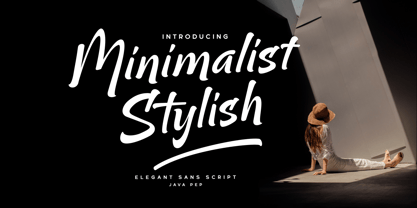 Proudly present the newest product Minimalist Stylish font. That font is inspired by brush script and modern sans, Minimalist Stylish font already has a feature in alternate, ligature, swash, and multilingual support. Minimalist Stylish font is perfect for headlines, logotypes, taglines, quotes, publishing, apparel, etc. Package includes Minimalist Stylish Minimalist Swash Uppercase, lowercase, punctuation, and numeral PUA encoded Multilingual Support in more than 25 languages
 - ITC Stone Serif by ITC,
$29.99 Sumner Stone worked together with Bob Ishi of Adobe to create the Stone family fonts, which appeared in 1987. Coincidentally, ishi is the Japanese word for stone, which precluded any squabbling about whose name the font would carry. The family consists of three types of fonts, a serif, a sans-serif and an informal style. The Stone fonts are very legible and make a modern, dynamic impression.
