10,000 search results
(0.015 seconds)
- Tulk's Victorian Banner by Greater Albion Typefounders,
$14.50 Tulk's Victorian Banner revives the tradion of 'Banner' typefaces-lettering within their own lozenge or cartouche, that made such an appealing feature in many old type foundries catalogues. Tulk's Victorian Banner makes a wonderful feature of lettering in any piece of period inspired design. It compleiments our recent Fitzgerald space especially well, but can be used alongside any typeface of your choice where you want to bring a touch of period flamboyance.
 - Turis by Punchform,
$29.00 Turis is meticulously designed to adapt its personality to any project. With 241 alternative characters and 20 stylistic sets, you get unlimited power to take your creativity to the next level. Turis is the smartest choice for any creative project. With a single click, you can change its typographic personality and adapt it to your desired style. Choose between 3 predefined styles or create your own style by combining the hundreds of alternate characters available.
 - Cosmata by MauldinType,
$15.00 Cosmata is geometric sans serif family of 10 fonts suitable for both display and reading use. Inspired by Futura, Cosmata developed its own complex, unique life. To that end, I've included alternate letterforms for a finely-tailored typographic experience. The rhythm, kerning, and spacing have been lovingly crafted for an elegant reading experience. I'm excited to share this release with you and hope you enjoy using it as much as I did creating it.
 - Diamond Bridge by Sarid Ezra,
$15.00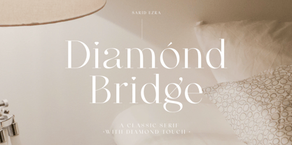 Introducing, Diamond Bridge - a classy serif with diamond touch! Diamond Bridge is an elegant and classy serif with a beautiful details that will make your presentation, logo or your wedding invitations more stunning and classy! You can use this font for several purposes such as a wedding invitations or even your own branding! This fonts support Multi Language and already PUA Encoded! Features Uppercase & Lowercase Number & Symbol Multi language PUA Encoded Thank You!
 - Troia by Ahmet Altun,
$10.00 Troia Font Family comes in three weights; normal and italic. In addition, with rounded corners, each weight has its own smoother version. Thanks to its large letters and added spaces between the letters, this font can be used to get perfect results and create great works such as web typography, banners, logos, texts, t-shirts and printings, and also presentations. Troia's eye-pleasing and nice-looking style makes writing much more pleasant.
 - Oblik by Tour De Force,
$25.00 Like Refused said in their song ”The Shape of new Punk to come”, Oblik could be “The Shape of new Fonts to come”, we present you our uprising star - Oblik - that could shine in your monitors. Modern family, stylish and secure, with its own personality (it’s photogenic, too), available for all kind of use, even you're an doctor or policeman or butcher or truck driver or maybe rock star, this font will rock your world.
 - Twist Cloud by Archer Wood,
$12.00 Twist Cloud Font Handwriting is the most expressive form of writing. Each letter has its own personality, which is what makes it so much fun to use in your branding. This Twist Cloud Font is unique handwriting font. Created with original handmade sketch. This font suit for personal & commercial project such a poster, letter, headline, web blog, social media post, stories, banner, Packaging, T-shirt design, pillow, wedding invitation, or even for logo design.
 - Qafidut by Twinletter,
$18.00 Qafidut Groovy is a psychedelic-inspired retro typeface with a bold and playful character. It’s ideal for branding, product packaging, or even just to add a little flair to your editorial work. This elegant typography has a simple and contemporary look but with a touch of beautiful simplicity to give a modern feel to every curve of the letter. what are you waiting for start using this font to create your own special project now!
 - HandVetica - 100% free

- Arsenale Blue - 100% free

- Jakobstad by Simon,
$9.00 A bulky and personal hand written script font. And an ode to my home town!
 - ITC Johnston by ITC,
$29.00ITC Johnston is the result of the combined talents of Dave Farey and Richard Dawson, based on the work of Edward Johnston. In developing ITC Johnston, says London type designer Dave Farey, he did “lots of research on not only the face but the man.” Edward Johnston was something of an eccentric, “famous for sitting in a deck chair and carrying toast in his pockets.” (The deck chair was his preferred furniture in his own living room; the toast was so that he’d always have sustenance near at hand.) Johnston was also almost single-handedly responsible, early in this century, for the revival in Britain of the Renaissance calligraphic tradition of the chancery italic. His book Writing & Illuminating, & Lettering (with its peculiar extraneous comma in the title) is a classic on its subject, and his influence on his contemporaries was tremendous. He is perhaps best remembered, however, for the alphabet that he designed in 1916 for the London Underground Railway (now London Transport), which was based on his original “block letter” model. Johnston’s letters were constructed very carefully, based on his study of historical writing techniques at the British Museum. His capital letters took their form from the best classical Roman inscriptions. “He had serious rules for his sans serif style,” says Farey, “particularly the height-to-weight ratio of 1:7 for the construction of line weight, and therefore horizontals and verticals were to be the same thickness. Johnston’s O’s and C’s and G’s and even his S’s were constructions of perfect circles. This was a bit of a problem as far as text sizes were concerned, or in reality sizes smaller than half an inch. It also precluded any other weight but medium ‘ any weight lighter or heavier than his 1:7 relationship.” Johnston was famously slow at any project he undertook, says Farey. “He did eventually, under protest, create a bolder weight, in capitals only ‘ which took twenty years to complete.” Farey and his colleague Richard Dawson have based ITC Johnston on Edward Johnston’s original block letters, expanding them into a three-weight type family. Johnston himself never called his Underground lettering a typeface, according to Farey. It was an alphabet meant for signage and other display purposes, designed to be legible at a glance rather than readable in passages of text. Farey and Dawson’s adaptation retains the sparkling starkness of Johnston’s letters while combining comfortably into text. Johnston’s block letter bears an obvious resemblance to Gill Sans, the highly successful type family developed by Monotype in the 1920s. The young Eric Gill had studied under Johnston at the London College of Printing, worked on the Underground project with him, and followed many of the same principles in developing his own sans serif typeface. The Johnston letters gave a characteristic look to London’s transport system after the First World War, but it was Gill Sans that became the emblematic letter form of British graphic design for decades. (Johnston’s sans serif continued in use in the Underground until the early ‘80s, when a revised and modernized version, with a tighter fit and a larger x-height, was designed by the London design firm Banks and Miles.) Farey and Dawson, working from their studio in London’s Clerkenwell, wanted to create a type family that was neither a museum piece nor a bastardization, and that would “provide an alternative of the same school” to the omnipresent Gill Sans. “These alphabets,” says Farey, referring to the Johnston letters, “have never been developed as contemporary styles.” He and Dawson not only devised three weights of ITC Johnston but gave it a full set of small capitals in each weight ‘ something that neither the original Johnston face nor the Gill faces have ‘ as well as old-style figures and several alternate characters. - 3 Prong Tree - Unknown license

- Geographica by Three Islands Press,
$29.00 Thomas Jefferys (ca. 1710–1771) was the best-known map maker in 18th-century England, chiefly because he won (and hyped) the title “Geographer to King George III.” Jefferys was really more an engraver/publisher than a geographer, since he mostly relied on the cartographic materials of others. Still, his maps of the North American colonies were well known. Geographica is a legible, four-style serif family modeled after the neat hand-lettered place names and peripheral text on Jefferys’s maps. With its long serifs, tall x-height, and robust curves, Geographica somehow combines classic elegance with a whiff of coastline and sea. The italic styles have the slant and warmth of the hand-drawn source materials. And the typeface comes with a slew of distinctive map-based ornaments—including compass wheels and sailing ships. This evocative serif works well in both display situations and long blocks of text, whether on paper or screen. OpenType features include small capitals, numerous ligatures, and two stylistic sets of titling caps. Geographica offers full support for Central and Eastern European languages—more than 1,200 glyphs in all.
 - FS Sammy by Fontsmith,
$80.00 Chalky Spritely and full of personality, FS Sammy is a hand-drawn font with a chalky texture, available in one weight only. Give Sammy a run in branding, packaging or billboard advertising for a fresh, informal, honest personality. Calligraphic Too many script fonts have a rushed and thrown-together feel about them. It’s a deceptively complex feat to achieve forms that hold together neatly in text yet still have the breezy, natural air of real handwriting. That’s FS Sammy: considered and crafted. Pencil FS Sammy was originally drawn for a drinks manufacturer by Fontsmith’s calligrapher, Sehmi Satwinder, who made handwritten impressions with a large soft pencil on textured watercolour paper. The digital interpretation of Sehmi’s letters was pushed to its limits and, after a lot of experimentation, a balanced alphabet was achieved. Texture and spirit FS Sammy’s success and uniqueness within the script font category is down to its versatility. In the large text of billboard advertising or headlines, all of its texture comes to life, and small, on menus or booklets, it conveys all of the spirit and personality of a considered piece of handwriting.
 - Uniform Italic by Miller Type Foundry,
$25.99 Now Uniform comes in Italics! Uniform is a multi-width geometric type family designed around the circle. The O of the Regular width is based on a circle, the O of the Condensed width is based on 1.5 circles stacked (with straight sides) and the O of the Extra Condensed width is based on two circles stacked with straight sides as well, and all other characters are derived from this initial concept. This unique idea creates a remarkably fresh type family that bridges the gap between circular geometric typefaces and condensed straight-sided typefaces. Uniform also includes many opentype features like Old Style Figures, Tabular Lining Figures, Alternate characters, Ligatures and more. Uniform was first drawn starting with the Black weight. This careful process allows each character to look consistent and balanced through all weights. As a result, the typeface does not ‘break down’ or lose its form in the boldest weights like many typefaces do. The three widths of Uniform Italic make an ideal type family for a host of various uses. From branding to web design, book covers to signage, Uniform is a very versatile solution to complex typographic needs.
 - Uniform by Miller Type Foundry,
$25.99 Uniform is a multi-width geometric type family designed around the circle. The O of the Regular width is based on a circle, the O of the Condensed width is based on 1.5 circles stacked (with straight sides) and the O of the Extra Condensed width is based on two circles stacked with straight sides as well, and all other characters are derived from this initial concept. This unique idea creates a remarkably fresh type family that bridges the gap between circular geometric typefaces and condensed straight-sided typefaces. Uniform also includes many opentype features like Old Style Figures, Tabular Lining Figures, Alternate characters, Ligatures and more. Uniform was first drawn starting with the Black weight. This careful process allows each character to look consistent and balanced through all weights. As a result, the typeface does not ‘break down’ or lose its form in the boldest weights like many typefaces do. The three widths of Uniform make an ideal type family for a host of various uses. From branding to web design, book covers to signage, Uniform is a very versatile solution to complex typographic needs.
 - Felfel Arabic by Boharat Cairo,
$20.00 Felfel is an Arabic typeface inspired by the rich history of the Arabic Ruq’ah, one of the most widely used Arabic calligraphy styles, but with a modern pinch influenced by the visual identity of Egyptian streets. Born from the fundamental need in the Arabic design scene, Felfel is made to celebrate the elegance and timeliness of Arabic calligraphy while solving the problem of the cascading nature of Ruq’ah that results in increased line spacing. Felfel is space-friendly, perfect for headlines and quotes. Felfel supports major Arabic-script-based languages and covers Arabic, Hindu, and Farsi numbers. Like Traditional Ruq'a, Felfel works with the same context, but it adjusts to your needs without the rigidity of Ruqa’ah’s slanted baseline to give you the flow, beauty, and richness of the Arabic calligraphy with a modern feel. Felfel is dynamic. A substantial part of the font is based on versatile components, that minimizes characters and maximizes possibilities. the dots are in motion! They rotate from and to horizontal and vertical form, based on the word to match the calligraphy and the context, also the dots and marks move up and down, left and right to prevent all kinds of overlapping.
 - Josefov by Ingo,
$28.00 A narrow, modern Slab Serif. JOSEFOV is directly derived from the sans serif text font ”Hedwig“. Therefore, of course, it pairs best with “Hedwig”. The basic thought was to create a font with heavy rounded serifs in the style of ”Clarendon“ but which hardly reminds one of that particular font. The form principle of rounded serifs is applied whenever possible — for example at the points where the individual strokes of the characters join one another. JOSEFOV seems very technical, very constructed (and truly is). In order to soften up the rigid impression, the serifs are applied at some points contrary to the tradition handed down, as with the upper case A C G K M V W and the lower case a b d h i j k l s t. Historically there is no example of the laterally oriented serifs of capital and small s (S) and C G. On the other hand, the double-sided serifs on the stems of b d h k l appear at the beginning of modern times in the very first serif types from five hundred years ago. The double-sided serifs of A M V W were also customary in the first decades of printing. JOSEVOV is particularly suitable for topics such as nature, folklore, culture, music, nutrition.
 - Alisal by Monotype,
$29.99 Matthew Carter has been refining his design for Alisal for so long, he says, that when he was asked to complete the design for the Monotype Library, it was almost as if he were doing a historical revival of his own typeface. The illusion even extended to changes in his work process: although he now does all his preliminary and final drawing on screen, the first trial renderings of Alisal were done as pencil renderings. Alisal is best classified as an Italian old style design. Originally created between the late 15th and mid-16th centuries in northern Italy, the true Italian old styles were some of the first roman types. They tend to be the most calligraphic of serifed faces, with the axis of their curved strokes inclined to the left, as if drawn with a flat-tipped pen or brush. These designs offer sturdy, free-flowing and heavily bracketed serifs, short descenders, and a modest contrast in stroke weight. Alisal has nearly all the classic Italian old style character traits, plus a few quirks of its own. It is calligraphic in nature, with more of a pen-drawn quality than faces like Palatino or Goudy Old Style. It is more rough-hewn than either Goudy's Kennerley or Benton's Cloister, and is generally heavier in weight than most of the other Italian old style designs. One place where Alisal makes a clean break with traditional old style designs is in the serifs. While sturdy and clearly reflecting pen-drawn strokes, Alisal's serifs have no bracketing and appear to be straight strokes crossing the main vertical. Like Caslon or Trajanus, Alisal is a handsome design when viewed as a block of copy. Ascenders are tall and elegant, and serve as a counterpoint to the robust strength of the rest of the design. Alisal is available as a small family of roman and bold with a complementary italic for the basic roman weight, providing all that is needed for the majority of text typography. Alisal is not as well-known as some of Carter's other typefaces, but this lovely and long-incubated design was certainly worth the wait.
 - Catalpa by TypeTogether,
$35.00 The Catalpa font family is José Scaglione and Veronika Burian’s wood type inspired design for an overwhelming headline presence. It has no regular weights, only four slender and four hulking weights. Catalpa wasn’t made to be normal; it was made to overwhelm, to stand out, to bellow. Catalpa is the first font family within a trilogy that will be released through 2020. Each of the three have a distinct purpose and their own look, but they serve a common goal: to act as a complete family covering an editorial’s wide array of needs. As the first of the three, Catalpa is the bookend font family with a headlining purpose. What requirements are there for a great headline typeface? Distinction, weight, and cohesiveness are a good start. Its distinctiveness must catch attention, it must have a range of weights applicable to its purpose, and its internal consistency and external look must create a cohesive family. Catalpa is a distinct and unified family whose weights are attuned to its single-minded purpose — headlines and large text. Catalpa has only eight styles that are divided into two ranges of weights — four very light weights (Hairline, Thin, Extralight, and Light ) and four very bold ones (Extrabold, Heavy, Black, and Extrablack). The thin and heavy ends of the spectrum also have their own variable fonts, each with one axis of weight so designers can fine-tune their work. The geometric influence of the design is more obvious in the light range, with their line thickness increasing in the classical manner. The bold weights increase more in width and substance to serve well in websites, mobile apps, posters, advertisements, and magazines that aim for impact more than spreading information. As a family, Catalpa gels in big headlines, short sentences, and isolated words. The family has many recognizable features, in the bolder weights especially, like the reversed contrast ‘S, s’ or the angular design of ‘Q, M, W, w, a, f, 2, 3’. Catalpa’s headlining mixture of geometry and quirkiness leaves an impression that is so characteristic of wood type, but designed for substrates and screens.
 - Econs by Tour De Force,
$20.00 Dangereous can on E, sharp grass on C, strong tree on O, drop of water on N and hand shovel on S = ECONS, set of 52 ecological symbols made after spending one day fishing on the river in my municipality and seeing so miscellaneous garbages in the water.
 - Chalk Hand Lettering by Fontscafe,
$39.00 If you are into the vintage feel, you will love this one. This is as vintage as it probably gets. There are probably only a handful of places in the world where schools still use blackboards and chalk – they’ve given way to their white board and marker counterparts for decades now. White boards are definitely more practical and less messy when compared to chalk, but then if you are creatively inclined you will agree that a little bit of mess is worth it if you are going to get the effects that you desired! Well, we can give you the effects minus the mess with our chalk hand lettering fonts! As the name suggests, this font gives you that distinctly unique chalk on slate feel, and if you are wondering what’s distinct about it; writing on slate or blackboard was a slow process which required deliberated and concentrated efforts resulting in a handwriting which was usually quite different to a person’s handwriting on paper. Typography of chalk on slate was an everyday event in the classrooms of yesterday, and today we hardly ever get to see one of these if it all. Writing on a black board with chalk was quite an interesting achievement in its own right, if you ended up with anything legible and if your writing remained focused and ‘in-line’! But of course like everything else, his took time to master and when you did get it right, chalk hand lettering was quite an enjoyable experience! For semi-permanent designs, say for example an eventful day at school; students of the day would create beautiful typography on the boards, and add a solidarity to it sometimes by shading one side of the lettering – usual y the right side towards which the lettering leaned. This is the effect our chalk hands lettering shaded variation gives you. You could get this font individually, but we strongly advise you check out the “chalk hand lettering pack” font. It includes the simple “chalk hand lettering” (minus the shading effect) and also a “chalk hand elements” bag of tricks. The elements is a collection of graphic art which resemble shapes and designs that used to be added to chalk art, to beautify the typography. If you enjoyed seeing the effects of our Chalk Hands font, and the shaded variant – you are simply going to go gaga over Chalk Hand Elements! The chalk hand font of course enables you to make typographic art similar to the effect of chalks on slates and black boards. This was quite the art form in the days gone by! The shaded variation added a bit of solidarity and the technique was commonly used to make semi-permanent designs say for example a welcome note when somebody important was to visit. Classic chalk hand designs, especially the semi permanent ones often had little pieces of art to help beautify the creation as a whole. It could simply be symmetrical graphics appearing before and after the title and headings, maybe just an interesting shape to fill in an empty area on the board, and such…our Chalk Hand Elements offers you a ton of such graphics. The two chalk hand variations and the elements are all included in the Chalk Hand Family, and this is strongly recommended if you want to make designs that are truly reminiscent of the days of chalk on slate.
 - Abigile by HansCo,
$15.00 Abigile is a beautiful and modern script font. It features an incredibly classic style, while still keeping a friendly feel. Abigile is the perfect font for making original and outstanding designs. Its casual charm makes it appear wonderfully down-to-earth, readable and, ultimately, incredibly versatile. Abigile will look outstanding in any context, whether it’s being used on busy backgrounds or as a standalone headline! Comes with a full uppercase, lowercase, numbers and punctuation + standard multilingual support. It’s great for branding, logo designs, lettering, logotype, craft, posters, packaging and much more. We recommend using Adobe Illustrator or Photoshop. Tutorial how to Install & use Alternate / Special Character : https://hanscostudio.com/tutorial/ Enjoy!
 - Omniscient by Comicraft,
$19.00 Omniscient is a narrative font that sees all… it’s everywhere and nowhere, the storyteller and the story, upper and lower case. This godlike font can be first person AND third person, friendly or serious, personable AND impersonal. It knows all the details but will only reveal them when it serves the narrative. The classical characters in Omniscient are all knowing, all seeing, and can even be all singing, all dancing on occasion. Even gods like to let their hair down and have fun. Features three weights with upper & lowercase alphabets, language support for Western & Central Europe, Automatic alternates, Stylistic Alternates & Crossbar I Technology™.
 - Madanira by HansCo,
$15.00 Madanira is a beautiful and modern handwriting font. It features an incredibly classic style, while still keeping a friendly feel. Madanira is the perfect font for making original and outstanding designs. Its casual charm makes it appear wonderfully down-to-earth, readable and, ultimately, incredibly versatile. Madanira will look outstanding in any context, whether it’s being used on busy backgrounds or as a standalone headline! Comes with a full uppercase, lowercase, numbers and punctuation + standard multilingual support. It’s great for branding, logo designs, lettering, logotype, craft, posters, packaging and much more. We recommend using Adobe Illustrator or Photoshop. Tutorial how to Install & use Alternate / Special Character : https://hanscostudio.com/tutorial/ Enjoy!
 - Hiragino Sans GB by SCREEN Graphic Solutions,
$200.00 Based on the Hiragino Sans (Kaku Gothic) design, this is the first Chinese-language font from a Japanese font manufacturer to be certified compliant with China’s GB 18030-2000 standard. Unique features are a contemporary typeface design that sets it apart from existing Chinese typefaces and a dedication to high quality down to the slightest detail. Multi-language composition using both Japanese and Chinese Hiragino fonts offer a sense of unity With demand growing rapidly in China, Hiragino Sans Simplified Chinese is the optimal font for uses in those fields that need both readability and contemporary vibe such as product packaging, catalogues, books, magazines, websites, and sign and displays.
 - Sea Cruise JNL by Jeff Levine,
$29.00 Years before the "Jet Age", and way before computers and satellite television turned us into jaded "armchair travelers", the ocean voyage aboard giant steamships to distant ports of call beckoned many to travel the Seven Seas. Far away lands had a magic and mysticism to them, for few Americans knew anything about those places unless they read about them in books or saw travelogs at their local theaters. Many songs were written with themes of romantic South Seas travel, and one vintage piece in particular entitled "Down Where the Trade Winds Blow" offered up the hand lettering which served as a model for Sea Cruise JNL.
 - Linotype Go Tekk by Linotype,
$29.00Linotype Go Tekk is a part of the Take Type Library, selected from the contestants of Linotype’s International Digital Type Design Contest. The font was designed by the German artist Critzler and is available in three weights, thin, medium and black. Go Tekk is a cool, constructed with unusual cross strokes, appearing in almost every character at exactly the same height. The capital letters do not end on the baseline, rather drop even farther down than the descenders of the lower case letters, making it necessary to allow for generous line spacing. Linotype Go Tekk is a relatively static font designed exclusively for headlines and displays. - Osovec by Dima Pole,
$27.00 This font is dedicated to the glory of the human spirit and honor. Osovec is a fortress of World War I. On the 6 August 1915, the defenders of the fortress, the Russian soldiers, against whom the enemy had used poison gas; though half-dead, were able to rise to the counter. Thus it was that 60 Russian soldiers routed the 2 thousand strong enemy army. This heroic episode has gone down in history as"Attack of the dead". The font contains more than 700 glyphs, support for all 104 European languages, all Slavic languages, a variety of OT features, including ligatures, old numerals, alternatives, ordinals, and many others.
 - Porcelain by Up Up Creative,
$16.00 Introducing Porcelain, a hand-lettered condensed sans serif font with subtle dip-pen texture and some fun OpenType features. Porcelain is perfect for invitations, branding, and editorial design and can be dressed up or down depending on your needs. Porcelain comes with more than 430 glyphs and includes OpenType features like stylistic sets, multilingual support (including multiple currency symbols), and discretionary ligatures. The OpenType features can be very easily accessed by using OpenType-savvy programs such as Adobe Illustrator and Adobe InDesign. (To access these awesome features in Microsoft Word, you'll need to get comfortable with the advanced tab of Word's font menu. If you need help with this, ask me!)
 - Sally Garden by Graphicfresh,
$16.00 Sally Garden - A Sweet Handwriting Font Duo. It comes with an elegant and modern style which is perfect to make any design stand out! This font ideal for elegant branding projects, greeting cards, packaging, social media, logo design and of course, wedding invitations. Sally Garden Type Features: Uppercase -Lowercase Numerals & Punctuations PUA Encoded Ligatures Suitable for Headlines, Logotypes, Signs, Posters, Letterhead, T-Shirt and many more. Support International Language Be sure to check out all the previews above by clicking on them and scrolling down to see all the fonts and ideas and inspiration for using this font duo. Hope you enjoy with our Font Thank You Graphicfresh
 - Bread Store by HansCo,
$15.00 Bread Store is a fun script font duo designed with an iconic curly and comical style. It perfectly represents elegance with its clean lines and modern swashes. Bread Store is the perfect font for making original and outstanding designs. Its casual charm makes it appear wonderfully down-to-earth, readable and, ultimately, incredibly versatile. Bread Store font will look outstanding in any context, whether it’s being used on busy backgrounds or as a standalone headline! Comes with a full uppercase, lowercase, numbers and punctuation + standard multilingual support. It’s great for branding, logo designs, lettering, logotype, craft, posters, packaging and much more. We recommend using Adobe Illustrator or Photoshop.
 - Marker Aid by PintassilgoPrints,
$24.00 This expressive face was drawn with a dry chisel felt-tip marker, resulting in two striking, detail-rich fonts. Beyond its remarkable face, Marker Aid is a generous one, packed with 4 alternates for each letter, 2 for each number and yet some handy ornaments for creating a convincing - and rather cool - organic look. It is also equipped with OpenType features to instantly cycle the alternate glyphs and access stylistic alternates and ornaments. Marker Aid is available in two cuts, upright and oblique, for added flexibility. Make your mark! * Please note that these fonts have complex outlines and quite a load of glyphs, which may slow down some applications.
 - Downhill Dive by Hanoded,
$15.00 I used to live in the English Lake District, where I worked in an outdoor gear store. I bought a bright red mountain bike and each day, after work, I cycled up the mountain and hurtled down - heavy metal blasting from my MP3 player. Of course, the bike was a regular MTB, so it got some serious damage after a while, but the adrenaline rush was great! Downhill Dive is a great brush font (made with actual brushes and ink on paper - no tablets involved here!). It is an ode to that wonderful time spent in England. Downhill Dive comes with some really nice ligatures.
 - spuknik - Unknown license

- Quirky by Fine Fonts,
$29.00 The origin of Quirky lay in the Duke Ellington number It don't mean a thing if it ain't got that swing. For some time I had wanted to create a font from expanded stroked lines. I wanted to produce a light-hearted font, but with some classic touches. One day, whilst doodling in Adobe Illustrator, Quirky’s letterforms just appeared on screen as if from nowhere. First I drew the test word ‘hamburgefonts’ and then just kept going, unable to stop. Character after character appeared as if by magic. From the start, Quirky had a life of its own. The letterforms are rather more sophisticated than merely outlined stroked lines. Subtle adjustments to compensate for optical effects have been been incorporated. For example, horizontal stems have thicknesses slightly less than vertical stems and where stems join together, the thickening effect has been reduced by cutting into the joint. Being almost monoline, Quirky works well reversed out of a solid background and for TV credits. The Quirky fonts are fun fonts, so set, laugh and enjoy! I hope Quirky will give you as much pleasure in using it as I got in creating it! Shortly after the roman version was born, an italic version and then a thin version were created to form a family of three fonts.
 - FS Ostro by Fontsmith,
$80.00 Cosmopolitan Elegance Named after a southerly wind that blows over the Mediterranean Sea, FS Ostro breathes warmth into letterforms with their roots in colder, stark Modern typefaces. FS Ostro is a typeface imbued with balanced and sophisticated elegance. It’s discerning and sensitive, self-assured but understated. One for the well-travelled reader. Thoughtful contrast FS Ostro draws inspiration from a wide range of sources, such as 19th century British Scotch Roman designs, Italian modern style typefaces and highly contrasted display Spanish examples. Its text version offers a consistent rhythm and robust texture that is easy on the eye. This elegant, cosmopolitan typeface is characterised by its thoughtfully modulated contrasts between thick and thin, sharp angles, and sophisticated curves. Exaggerated touches in display “What is more restrained and sober in text, becomes purposefully prominent and more detailed in display,” says Fontsmith designer Alessia Mazzarella. These exaggerated details for the display version can be seen in the letter terminals, such as those in the ‘a’ and ‘g’ and the tail of the ‘Q’, as well as in the set of numerals, fractions, arrows, borders and ornaments, which can be used to build decorative framing elements. Fluid italics The less rigid and curvaceous italics of modern style typefaces were the inspiration for FS Ostro’s own subtle, flowing italic styles. The letterforms are confident and fluid, creating an overall sense of refinement and modernity.
 - Meier Kapitalis by Elsner+Flake,
$39.00 As a late work the “Meier Kapitalis” forms an arch within the typographic creations of the Swiss type designer Hans Meier who died in 2014. The first sketches of this typeface can be found in the teaching manual “The Development of Script and Type” (German: “Die Schriftentwicklung”; French “Le développement des caractères”) which was published in 1994, however, under the title “Roman Lapidary, 1st Century”. The booklet was first published by the Syntax Press, Cham, Switzerland and contains an introduction by Max Caflisch in which he writes: „The present work, „The Development of Script and Type“ is a concise, authoritative textbook, concentrating on the essentials in a wide survey from ancient Greek inscriptions to the printer’s typefaces of the present day. His (Meier’s) 72 varieties of letterforms enable the student or general reader to understand the history of script and type, while more than 60 of his own calligraphic specimens provide excellent models for all who practice this art.“ Unfortunately, the “Meier Kapitalis” is one of the few typeface families in this publication which has been digitized. It was to be the last type project fully realized by Meier. In cooperation with Elsner+Flake, the typeface family was developed and expanded and now contains the four cuts: Roman, Medium, Demi Bold and Bold with either a complement of characters for 78 Latin-based languages (EL=EuropaPlus) or in West-Layout.
 - Kaizen by Colllab Studio,
$9.00 Presenting Kaizen! A Bold Handbrush Font in 2 Versions. This font made with the perfect combination of each character. You can combine with Extra to get a unique combination. It looks original and can be used for all your project needs. Each glyph has its own uniqueness and when meeting with others will provide dynamic and pleasing proximity. This font can be used at any time and in any project. You can see in the presentation picture above, Kaizen looks unique and Japanese style on design projects. So, Kaizen can't wait to give its touch to all your design projects such as quotes, poster design, personal branding, promotional materials, website, logotype, product packaging, etc. WHAT'S INCLUDED? 1. Kaizen Version One (Solid) • The first version comes with uppercase, lowercase, ligatures, numeral, punctuation, symbols, and Standard Latin Multilingual Support (Afrikaans, Albanian, Catalan, Danish, Dutch, English, French, German, Icelandic, Indonesian, Italian, Malay, Norwegian, Portuguese, Spanisch, Swedish, Zulu, and More). 2. Kaizen Version Two (Inline texture) • The first version comes with uppercase, lowercase, ligatures, numeral, punctuation, symbols, and Standard Latin Multilingual Support (Afrikaans, Albanian, Catalan, Danish, Dutch, English, French, German, Icelandic, Indonesian, Italian, Malay, Norwegian, Portuguese, Spanisch, Swedish, Zulu, and More). 2. Extra Swashes • Included 6 Underline Swashes. You can feature all with typing c_1 until c_6 (in both versions) A Million Thanks Colllab Studio


