10,000 search results
(0.118 seconds)
- Fadetho by Twinletter,
$17.00 Introducing Fadetho, a display font that captivates and brings elegance to each of your projects. With a relaxed and elegant theme, Fadetho is the perfect solution for creating charming and creative looks. Fadetho’s excellent features make it an attractive choice. With the available ligatures and alternates, you can combine beautiful characters and create unique and classy typography designs. Not only that, Fadetho is also multilingual, allowing you to reach an international audience and adapt this font to multiple languages. This gives you flexibility and expands the potential of your project. The elegant style and touch of elegance in every Fadetho lettering make it the perfect choice for projects that require a special feel. Let this font add an exclusive touch to your designs. Choose Fadetho as your loyal partner in creating stunning and classy looks. Get this font now and let its beauty and elegance inspire your creations. What’s Included : File font All glyphs Iso Latin 1 Alternate, Ligature Simple installations We highly recommend using a program that supports OpenType features and Glyphs panels like many Adobe apps and Corel Draw so that you can see and access all Glyph variations. PUA Encoded Characters – Fully accessible without additional design software. Fonts include Multilingual support
 - Phiz by Shinntype,
$29.00 Phiz is a diverse suite of 28 decorative fonts based on Figgins Sans Extra Bold. Classic (10 fonts), Rounded (7 fonts), Rough (4 fonts) and Particles (7 fonts). The Rough and Particles styles emerge as a unique niche—neither imitating distressed printing (e.g. the “rusty” look), nor casual, hand-drawn styles. These type designs are conceived and executed as complex algorithmically-generated graphic procedures, in which repetitive elements have been artfully applied to the Sans capitals, and manually nuanced. As such they also differ substantially from textured glyph shapes that have been cut out from larger pattern fields, for the constituent particles are disposed in relation to the specific shape of each character they define. The caps-with-small-caps format was chosen for two reasons. Firstly, titling display usage is predominantly capitals, and secondly, rather like optical scaling, having the same resolution of texture available in two different “sizes” (upper and lower case) should prove useful in the hierarchy of page layout—not primarily for setting upper and lower case text as caps-with-small-capitals, although this is of course an option. All figures and major symbols (punctuation and currency) are provided in both cap and small cap height.
 - AZ College Brushed by Artist of Design,
$25.00 AZ College Brushed font was inspired from a combination of typical collegiate t-shirts designs and also the current wave of A&F t-shirt designs (rough painted look). This font utilizes an "old look" to the line work which is designed to have a "worn feel" to it. It is designed to compliment it's sister font; AZ College. Ideal for use as headline or sub-head text in you design. Note: This font is somewhat detailed and is memory intensive. It is not recommended to use, unless you have a powerful computer.
 - Too Much by Comicraft,
$19.00If you've had too much coffee but not enough of Too Much Coffee Man you can now indulge in an excess of characters created by the hand of Too Much Coffee Man's creator, Mister Shannon Wheeler. Don't worry, in our efforts to ensure clean and confident lettering samples, we kept Shannon on decaf until he was done. Dip this font in your system folder and your hard drive will get a caffeine and sugar rush guaranteed to increase its memory partition and bring the images on your monitor into sharper focus. - Zosimo Pro by Delicious Type,
$49.00 Zosimo is a neo-grotesque typeface created by designer Ron Gilad (Delicious Type) in cooperation with renowned typographer Oded Ezer based on his ubiquitous Alchemist typeface. Carefully drawn curves, robust shapes and a range of OpenType features make Zosimo a great choice for designing logotypes, signage, titling, texts and more. Zosimo now comes in three families: Standard (full Latin support), Cyrillic (basic Latin and Cyrillic) and Pro (all included). Totalling in 9 weights, roman and italic, Zosimo can accommodate all your type-related design needs in one big happy family.
 - Squoosh Gothic by Thinkdust,
$10.00 Squoosh Gothic is a serious new contender in the arena of headline fonts. Upright and condensed, Squoosh’s whimsical name belies its true nature. Though, that’s not to say it’s totally devoid of a sense of merriment – it just values a more orderly, regulated kind of tomfoolery. Mad-libs for instance, or The Times cryptic crossword. Its mature but unmistakably witty attitude can go a great distance to lending a sense of culture and an air of scintillation to your designs. Don’t miss out on this sanguine new font, Squoosh Gothic from Thinkdust, available now.
 - Fox Kitty by Fox7,
$14.00 Fox Kitty is a cute and fun color font. This font is your go-to for crafting cute greeting cards that express affection and warmth. Whether you’re a designer, a social media influencer, or someone with a penchant for creative expression. Fall in love with its authentic feel and use it to create gorgeous invitations, beautiful stationary art, eye-catching social media posts, and cute greeting cards. Learn more about color font support on third-party apps here: https://www.colorfonts.wtf/ 🌺🌺 Please note that the Canva do not support color fonts! 🌺🌺
 - Bold Pen Lettering JNL by Jeff Levine,
$29.00 The title on the cover of Street & Smith’s “Wild West Weekly” for Jan. 27, 1934 made for an interesting contrast in terms. Here was a pulp magazine dedicated to stories of the Old West, but its title was hand lettered in an extra bold, squared shape style using a round pen nib – not exactly an alphabet that represented cowboys and desperados… This aside, this type style made for a good digital font revival, and it is now available as Bold Pen Lettering JNL in both regular and oblique versions.
 - Romany by Ascender,
$50.99 The Romany™ typeface family is a delightful typographic confectionary that will bring affability and charm to both print and interactive design projects. Be it an online game, digital app, hardcopy packaging, or larger than life poster, Romany will deliver. When first designed by A.R. Bosco for American Type Founders in 1934, Romany was a single weight design. Relatively popular as hand-set type, Romany was not made into digital fonts – until now. The septuagenarian design was updated, reimagined and enlarged into a small family by Terrance Weinzierl.
 - Golum by Type Innovations,
$39.00 Deep in the bowels of the earth a tortured creature tries to mimic the writings of mankind. It labors long and hard carving the letter forms on the walls of its cave. Many years later, rubbings where taken of these impressions and fashioned to create this hideous font. All kidding aside, with such a formal training in type design, it was not easy for me to create these ill-shaped letters. I kept wanting to smooth out the outlines. Anyway, it was a good exercise and we now have this antique heavy-weight.
 - Hip Hopper by Pink Broccoli,
$19.00 An offbeat typeface inspired by the lettering on an art poster by Patrick Owsley for the cartoon character Hoppity Hooper. This typeface goes beyond the basic opentype features you've seen (i.e. extended language character sets, stylistic alternate character variations, etc) and offers not only a ligature feature that automatically alternates between the Capitals & Lowercase (Alt Capitals) sets, but also a unique Contextual Alternates feature that enables an automatic alternating BOUNCING effect. All this piled into a single typeface with loads of personality, just waiting to be played with!
 - Alphaluxe by Poole,
$48.00Alphaluxe is a distinctive new typeface from Wesley Poole of Hawai’i. This vertical script packs a velvet punch. It compels attention like the best of the futuristic Moderne scripts from the 1930s, (refined by the 1950s) with none of the bulk. The shapes are strong, their rendering light. Fortunately, Mr. Poole can't break his addiction to elegance and sophistication. It's a classy alphabet. but not self-conscious or stereotypical. Contributing mightily to this effort is Rod Cavazos (Psy/Ops, San Francisco). Among today's typefaces, Alphaluxe is a rare achievement. - Rosarian by Laura Worthington,
$29.00 Rosarian celebrates the grace of the pointed brush, flowing expressively from thick, rounded downward strokes to thin, delicate hairlines to create graceful and unique letterforms. Contextual alternates help Rosarian look convincingly hand-lettered, while stylistic alternates allow you to customize Rosarian into a less formal, unconnected script. See what’s included! http://bit.ly/2bIG4Pc *NOTE* Basic versions DO NOT include swashes, alternates or ornaments These fonts have been specially coded for access of all the swashes, alternates and ornaments without the need for professional design software! Info and instructions here: http://lauraworthingtontype.com/faqs/
 - Mechanic Gothic DST by Red Rooster Collection,
$60.00 Based on character shapes with origins rooted in the work of 19th Century American wood type makers, DST Mechanic Gothic draws influence from the poster types found in the impactful advertising during the Industrial revolution. It has several classic condensed sans-serif elements, and although Darren Scott has injected a contemporary twist to refresh the character shapes, this typeface does not deny its roots. Darren Scott's original Mechanic Gothic design has been adapted and re-crafted to give a more conventional range of weights and italics for this exclusive re-release.
 - Gracela by Yukita Creative,
$14.00 Introducing the Gracella font in the Elegant Sans Serif style. A versatile font that can be used for both formal and casual. Gracela is a regular style font, not too thin nor too thick, and very suitable for the needs of logos, branding, websites, Features. - Supports all languages in the world (37) - Versatile Single Font. - One font for all needs. Make sure you test out the fonts using one of our examples before making any purchases to know what you're getting yourself into. Thank you for taking care when choosing fonts!
 - Minimaly by Luxfont,
$18.00 Introducing clean, minimalistic and actually fonts family. Balanced letter height and width - based on analysis of current design trends. Text typed in this font does not distract attention from design, but organically complements any design. Ideal for short phrases, footnotes and headlines. Font has High readability in large volumes of text. Branding with this font looks trendy and expensive. Minimaly font family is versatile in use and very modern. Features: Clean letters and absolute minimalism 6 fonts in family: - Thin, Thin Italic - Regular, Italic - Bold, Bold Italic Kerning ld.luxfont@gmail.com
 - Zosimo Cyrillic by Delicious Type,
$39.00 Zosimo is a neo-grotesque typeface created by designer Ron Gilad (Delicious Type) in cooperation with renowned typographer Oded Ezer based on his ubiquitous Alchemist typeface. Carefully drawn curves, robust shapes and a range of OpenType features make Zosimo a great choice for designing logotypes, signage, titling, texts and more. Zosimo now comes in three families: Standard (full Latin support), Cyrillic (basic Latin and Cyrillic) and Pro (all included). Totalling in 9 weights, roman and italic, Zosimo can accommodate all your type-related design needs in one big happy family.
 - Retro Nouveau JNL by Jeff Levine,
$29.00 Because of the large influx of Irish immigrants during the late 1800s and early 1900s, it was not unusual for songwriters of the day to craft songs around Irish themes, offering a nostalgic link to their homeland. One such 1917 piece entitled "You Brought Ireland Right Over to Me" had the title hand lettered on the sheet music cover in a sans serif design reflecting the popular Art Nouveau movement of the day. This design is now available digitally as Retro Nouveau JNL, in both regular and oblique versions.
 - Arquitecta Office by Latinotype,
$16.00 We have adapted the version of our Arquitecta font for use in Microsoft Office™. It only has 4 variants: regular, italic, bold and bold italic. Font weights have been named in a way that can be clearly shown up in the font list in Office™ programs for the sake of a good hierarchy (the bold variant is quite bold and does not look the same as the original font). Arquitecta Office update: Improvements of proportions and drawing. The set was extended to the current one of Latinotype.
 - Nelson by Laura Worthington,
$25.00 Evocative of paint on weathered wood, Nelson’s engraved capital letters are as rustic and confident as the Old West. Combine the engraved face with bold and rough versions to create handsome wordmarks, or use Nelson to captivate customers of food packaging, restaurant menus, and roadside attractions. See what’s included! Engraved • Ornaments • Rugged • Bold *NOTE* Basic versions DO NOT include swashes, alternates or ornaments These fonts have been specially coded for access of all the swashes, alternates and ornaments without the need for professional design software! Info and instructions here: http://lauraworthingtontype.com/faqs/
 - Geometrico Sans by FSdesign-Salmina,
$39.00 Are you looking for a modern typeface? Geometrico. Round without Compromises. Now 12 Italic Styles added. Even more futuristic than the classical Bauhaus typeface Futura, “Geometrico” is a geometric typeface based on round shapes as suggested by its name. Designed without compromises, neither in form nor in function: Geometrico is ideal for logotypes, headlines and other modern typographic purposes. Would Paul Renner be delighted? Or would he turn around in the grave? Make your own opinion. Try Geometrico for free. Download a free trial version of Geometrico with a reduced character set. Check it out!
 - Zosimo Std by Delicious Type,
$39.00 Zosimo is a neo-grotesque typeface created by designer Ron Gilad (Delicious Type) in cooperation with renowned typographer Oded Ezer based on his ubiquitous Alchemist typeface. Carefully drawn curves, robust shapes and a range of OpenType features make Zosimo a great choice for designing logotypes, signage, titling, texts and more. Zosimo now comes in three families: Standard (full Latin support), Cyrillic (basic Latin and Cyrillic) and Pro (all included). Totalling in 9 weights, roman and italic, Zosimo can accommodate all your type-related design needs in one big happy family.
 - Fruitcake Fanatics by Bogstav,
$18.00 I have had the name "Fruitcake Fanatics" in my mind for quite some time now...but I needed a font that suited the name...then one day...actually last Wednesday, I was playing around with some letters (which eventually would turn out to be this font!) and suddenly it struck me: I got the letters for my Fruitcake Fanatics font! Another story could be - what does the name mean?! Well, to tell you the truth, I don't know - but what I do know is that the font is playful and unpredictable and loads of fun!
 - Smorgasbord by TypeSETit,
$25.00 It’s an all occasion Smorgasbord in this collection of 17 fonts originally designed for the social expression industry— all ranging from juvenile/cute to masculine, to formal. Whether you want to send a nice note of thanks, or create a poster for a Renaissance Festival, you can find the right look in Smorgasbord. SAVE over 85%' when you purchase the entire Smorgasbord collection! The Smorgasbord collection is composed of fonts that have not been available for several years at MyFonts, but have been updated and improved to Professional standards.
 - ASTYPE Ornaments Accolades C by astype,
$40.00 Accolades C and C2 share the same main ornaments but differ in finishing. Accolades C uses pearls and diamonds, C2 does not. Accolades CX is an additional fitting set of borders. All fonts are available in two variations. A clean one and a distressed, grungy version (old). The layout samples from the PDF-specimen are included in the font packages and stored in InDesign CS3 format. Mostly all of the featured fonts of the specimen are available on MyFonts, too. Have a look at Secca Art Std, Secca Saloon Std, Gracia, Battista and Prillwitz.
 - TS Remarker by Vitaliy Tsygankov,
$9.90 The font accelerates the process of adding inscriptions and eliminates the need to redraw the same letters every time. The lettering is based on a simple felt-tip pen. The lines have minimal contrast and are not meant to be perfect. A simple and uncomplicated design goes great with a happy holiday mood. The font is suitable for small postcard texts, social media images, invitations, branding, mockups, packaging, ads, and captions. The TS Remarker typeface consists of 4 fonts: 2 upright (normal for regular lettering and alternative for a more colorful impression) and 2 italic.
 - Green Berry by Gassstype,
$28.00 Introducing of our new product Green Berry it is a unique font and also has vintage display 2 style font. Can make it easier to convey the message in your design. Use for awesome display, labeling, movie sceen, poster, movie title, gigs, album covers, logos, and much more.
 - Gokil by Eotype,
$12.00 Gokil is an unique bold display font with rounded edges. You can use this font in retro, vintage, and hipster designs. This font is perfect for a variety of projects, such as branding, poster displays, logo designs, magazines, headlines, stickers, and more.This font also has alternate and ligature features.
 - Sellebou by Creativemedialab,
$20.00 Sellebou is a modern display font. It consists of three weights, display, regular and text. Straight lines combined with a slight curve make Sellebou look modern and unique. Try uppercase for a simple look. Sellebou is perfect for website headers, logos, Instagram stories, magazines, or fashion-related branding.
 - Nadsat by Typogama,
$19.00 Nadsat is a unicase display typefaces with a condensed, art deco styling. Best suited for short texts or display settings, the lowercase and capital letters can be combined to offer more layout possibilities. The typeface also includes a series of ligatures and alternate characters for even more layout options.
 - Furriatt by DVType,
$16.00 Furriatt is a heavy weight bold all caps display typeface. It’s perfect for posters, logos, merch, covers and all stuff you want to print or display in larger format. Font also contain alternative characters set, you could match it with standard glyph to get the best rhythm of letters.
 - MBF Dimension Drive by Moonbandit,
$18.00 Dimension drive is a modern wide and quirky sans serif display font. Wavy lines paired with geometric and sharp edge to emphasize dynamic in the design. This typeface design is a perfect for a modern theme. Best usage on logo, poster, display, headline, t-shirt design and many more.
 - Rachee by Studio Sun,
$18.00 Rachee Display is a modern serif typeface. Inspired by late Renaissance-era type and intended for display font, perfect for logotype, logogram, title, caption, and more. Rachee comes with 6 weights with some opentype features (Linnning figure, full 'ff' ligature, luballin avantgarde ligature, stylistic set, fraction, and more).
 - The Monokill by Eldertype Studio,
$15.00 The Monokill is modern vintage display typefaces, This font has 2 styles, namely clean - textured which will make the display look good. Choose between varying texture strength for your desired effect. Already PUA Encoded and I think this font is perfect for Logos, Advertising, Apparel Design, Labels, Signage, Etc.
 - Somaton by ParaType,
$25.00 This original display family was designed by Vladlen Erium in 2000 for advertising and display typography, especially for advertising of teenage goods and services. The caps-only face has modern letterforms, dynamic slanted styles, and stable upright ones. It is very useful for creating a memorable product image.
 - Luruh Light by Sebeningjingga,
$5.00 Overview: Pixel perfect design. 1 style included. Works on PC & Mac Perfect for both printing and screen display. Usage: Luruh light font family is perfect for both printing and screen display, and is most suitable for modern design, technology, sci-fi, futuristic style, flat design and web design.
 - Chilia by Craft Supply Co,
$15.00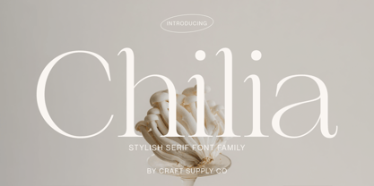 Chilia is a stylish serif font where contemporary upper serifs meet a feminine allure, making it ideal for beauty and display purposes. With its unique blend of modern and elegant features, Chilia adds a touch of sophistication with eye-catching presence that perfect for captivating displays that demand attention.
 - Wishful Gloria by Invasi Studio,
$17.00 With its loop, curly, & playful strokes, Wishful Gloria creates a display font. The font comes in uppercase all caps with OpenType features. Alternate characters and ligatures can be used to give the composition a unique feel. Suitable for display needs such as quotes, branding, logo, poster, cover design, etc
 - Bajt Rounded by Fontsphere,
$12.00 BAJT Rounded is a futuristic all-caps display font. It was created as a rounded version of the BAJT Font. Use for awesome display, illustrations, posters, logos, t-shirts, titles, and much more.. The font includes multilingual support (Latin-1), uppercase letters, numerals and a large range of punctuation.
 - Mindsight by Get Studio,
$23.00 Mindsight Funky Retro Display Font is a vibrant and energetic typeface that captures the essence of vintage aesthetics. With its playful curves and bold strokes, it adds a touch of nostalgia and creativity to any design project, making it perfect for eye-catching headlines, posters, and artistic displays.