10,000 search results
(0.027 seconds)
- Doomberg by Gatra Std,
$10.00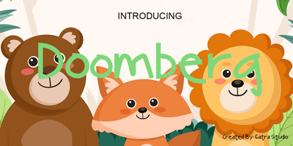 Introducing a cute handwriting "DOOMBERG" Handwritten Display Font! If you are needing a touch of casual modern display for your designs, this font was created for you! What's Included: Uppercase and Lowercase Number and Punctuation Support Language This font works best in a program that supports OpenType features such as Adobe Indesign, Adobe Illustrator CC and CS, or Adobe Photoshop CC and CS also CorelDraw More Questions? Here are some (potential) answers! Do not to resell this font in any way. Multilingual Support is included for Western European Languages Have a Wonderful Day, Gatra Std
 - Gentho by Gatra Std,
$10.00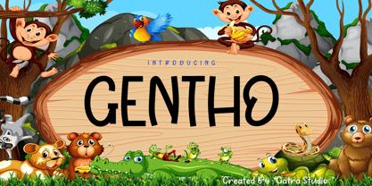 Introducing a cute handwriting "GENTHO" Handwritten Display Font! If you are needing a touch of casual modern display for your designs, this font was created for you! What's Included: Uppercase and Lowercase Number and Punctuation Support Language This font works best in a program that supports OpenType features such as Adobe Indesign, Adobe Illustrator CC and CS, or Adobe Photoshop CC and CS also CorelDraw More Questions? Here are some (potential) answers! Do not to resell this font in any way. Multilingual Support is included for Western European Languages Have a Wonderful Day, Gatra Std
 - Quirick by Gatra Std,
$10.00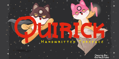 Introducing a cute handwriting "QUIRICK" Handwritten Display Font! If you are needing a touch of casual modern display for your designs, this font was created for you! What's Included: Uppercase and Lowercase Number and Punctuation Support Language This font works best in a program that supports OpenType features such as Adobe Indesign, Adobe Illustrator CC and CS, or Adobe Photoshop CC and CS also CorelDraw More Questions? Here are some (potential) answers! Do not to resell this font in any way. Multilingual Support is included for Western European Languages Have a Wonderful Day, Gatra Std
 - Limboek by Gatra Std,
$10.00 Introducing a cute handwriting "Limboek" Handwritten Display Font! If you are needing a touch of casual modern display for your designs, this font was created for you! What's Included: Uppercase and Lowercase Number and Punctuation Support Language This font works best in a program that supports OpenType features such as Adobe Indesign, Adobe Illustrator CC and CS, or Adobe Photoshop CC and CS also CorelDraw More Questions? Here are some (potential) answers! Do not to resell this font in any way. Multilingual Support is included for Western European Languages Have a Wonderful Day, Gatra Std
 - Guttie by Yukita Creative,
$14.00 Guttie Display Typeface says something about graphics and usability. People tell stories for a reason. We want to convey certain information, change a reader's opinion or make them feel something; Guttie Display Typeface helps you to do all this easily. --- It's all about visuals and functionality. For example, people will use words to convey information, convince readers of something specific, or share emotions they are feeling right now. --- - Fonts can be read from a much larger distance than regular fonts - Elegant letters give the impression of luxury - Smooth curves for elegant typography
 - MFC Phonograph Monogram by Monogram Fonts Co.,
$19.00 The inspiration source for MFC Phonograph Monogram is a vintage monogram specimen named “Kent” showing only a CBA sample. It was a style I could find no other reference for, but was desperate to recreate this record like styling of monogram. Finally, it all comes to life in MFC Phonograph Monogram. I even threw in a little dog and phonograph icons hidden in the font as decorative icons reminicent of old Victrola records. Phonograph Monogram supports two and three letter monograms, although the two letter style break from the circular record design and creates a zulu style shield design. MFC Phonograph Monogram uses the Ligatures feature, available in most OpenType savvy applications, such as Adobe Illustrator CS (see Fig. 1). The Ligatures feature is typically enabled automatically, but you may need to confirm this in your program if you are not certain. If any second lowercase letter typed does not automatically switch to form the right side of the rounded form, you do not have Ligatures enabled.
 - Bodoni Classic Cyrillic by Wiescher Design,
$55.00 One day shortly after Christmas 2004, the art-director of Vogue Moscow called me. Would I maybe make a Cyrillic version of my Bodoni Classic Text typeface? Well, since I had been thinking about doing it since a long time, this was the perfect reason to finally do it. It was not an easy venture, since I do not have the faintest idea of Russian but, together with those nice people in Russia and a fellow helpful type designer in Kiev, I managed. I did an enormous amount of kerning, thanks to the help of the Moscow Vogue office. Here the fonts are now for all of you: five text cuts, plus one standard roman cut that has no Cyrillic letters but an extra set of medieval numbers. At Vogue they are happy with the fonts, even though I did not quite adhere to Bodoni's originals in this case. Nastarowje (or whatever you say in Russia), Gert Wiescher
 - Coconut Punch by Hanoded,
$10.00 Health Warning! Coconuts are not that healthy!! I always thought that coconuts were the new quinoa, but apparently they’re not that good for you. They are furry balls of saturated fat, sugar and calories, so don’t go all out with your coconut eating habits! Of course, eating a bit of coconut now and then will not kill you, so enjoy! Coconut Punch is a handmade didone-ish font. Nice and rounded and full of saturated brush strokes. Comes with all the diacritics you need too!
 - Movie Star - Unknown license

- KlipJoint by Ingrimayne Type,
$14.95 KlipJoint is a novelty font in which all the characters are formed from paper clips. It does not have a true set of lower case letters, but in their place is a second and often different set of upper-case letters.
 - Aroma Garlic by Goodigital13,
$20.00 It’s perfect for Christmas cards, branding, stationery, blog design, custom art, custom stamps, custom embossers, book, apparel, packaging, headline, Crafting, Logo, or much more! It will add a unique feel and looks stunning to any design project! Does not contain Caps.
 - Quick Rest by wearecolt,
$19.00 Quickrest is a tall & quirky type with slight irregularities, Quickrest does not do conformity - each character is entirely individual. A fun looking family with its heart set in the handmade / crafty scene. The Quickrest family features five weights and slanted versions.
 - ITC Bolthole by ITC,
$29.99I fell in love at the age of twelve in Wales, recalls Bernard Philpot. "My father brought me to a small graveyard in the Welsh hills to show me two headstones carved by the great Eric Gill. I instantly fell in love with the beauty of the carving and the perfection of the letterforms. I still go back to marvel at these works of art." However, the ITC Bolthole™ design, Philpot's first commercial typographic endeavor, is quite unlike the works of Eric Gill that first captured his heart. Bolthole is a craggy sans serif with a definite grumpy attitude. It's not terribly legible, and, if more than a few words are set in the design, it's not very readable. To round out its cranky personality, Bolthole does not like to be set in small sizes. Like Cheez Whiz® and bullfights, you either love or hate this typeface. But whichever emotion dominates, there is no denying that Bolthole has a personality to be reckoned with - one with ample magnetism to ensure reader attraction. If used to set brief blocks of display copy, the typeface makes a powerful statement. Bolthole was originally designed to complement a whimsical ad for the Royal Society for the Prevention of Cruelty to Animals. As Philpot recalls, "although the ad didn't win any awards, the type attracted some very positive comments for its original look and feel." Philpot studied graphic design and typography at the London School of Printing, and soon after graduation found himself working in a large advertising agency in London. According to Philpot, "After designing type for everything from packaging to ads, I thought it time to convert one of my designs into a complete font - and Bolthole was born." ITC Bolthole could very well be the Shrek™ of typeface design - which might not be such a bad thing." - Homesteader by Jeff Levine,
$29.00Jeff Levine took Crown Heights JNL [named after his childhood neighborhood in Brooklyn, NY] and gave it a make-over; transforming it into a Western-style all-caps display face called Homesteader JNL. The point of interest being the rounded characters: C, G, O and Q - usually not as geometric in Old West typography. - Cluster by PintassilgoPrints,
$24.00A hand-drawn shadowed and textured display sans. Strong and stylish, definitely. Two glyphs per letter for a nice natural feel. And let's not forget to remark the hi-versatile solo versions. These fit many design applications, with the amazing ability of looking slightly serious or slightly fun. But always genuine, you bet! - Fabrics - Personal use only

- Alta by Intellecta Design,
$18.90Note: The Alta Bold, Italic, Lined and Outline styles are no longer available due their complexity and the resulting memory and performance issues. - Bambola by EdyType,
$60.00 BAMBOLA, Script put out by EdyType. Almost formal script, that gained a little weight. but she is taking care of that. BAMBOLA, a real doll, wants to be loved, she is trying hard to be popular. Is very conscious of her beauty, but trying not to be a show off. She'll be at ease in any place where normal faces gather, unpretentious, yet with a touch of class. Born to be readable, it’s ideal for packaging headlines and editorial work. Not thick, nor thin, just the exact weight, makes a good pattern at large texts, and reduces with no problems, her voluptuous initials makes it stand out always. A real romantic face, it belongs to the fashion world, where she’s come from. A real hip chick, she’s got what it takes!
 - Rozza by Serebryakov,
$49.00 Rozza is a single weight stencil cursive fat face font for extremal display use. Looking at this font the story of beauty and the beast comes to mind. That is how I would describe it. On the one hand prickly and dangerous, and on the other - pulsating beauty and passion. Try to combine Rozza together with Displace — great pair!
 - Banknote 1948 by Ingo,
$39.00 A very expanded sans serif font in capital letters inspired by the inscription on a bank note Old bank notes tend to have a very typical typography. Usually they carry decorative and elaborately designed markings. For one thing, they must be practically impossible to forge and for another, they should make a respectable and legitimate impression. And in the days of copper and steel engravings, that meant nothing less than creating ornate, shaded or otherwise complicated scripts. Designing the appropriate script was literally in the hands of the engraver. That’s why I noticed this bank note from 1948. It is the first 20 mark bill in the then newly created currency ”Deutsche Mark.“ All other bank notes of the 1948 series show daintier forms of typography with an obvious tendency toward modern face. The 1949 series which followed shortly thereafter reveals the more complicated script as well. For whatever reason, only this 20 mark bill displays this extremely expanded sans serif variation of the otherwise Roman form applied. This peculiarity led me in the year 2010 to create a complete font from the single word ”Banknote.“ Back to those days in the 40’s, the initial edition of DM bank notes was carried out by a special US-American printer who was under pressure of completing on time and whose engravers not only engraved but also designed. So that’s why the bank notes resemble dollars and don’t even look like European currency. That also explains some of the uniquely designed characters when looked at in detail. Especially the almost serif type form on the letters C, G, S and Z, but also L and T owe their look to the ”American touch.“ The ingoFont Banknote 1948 comprises all characters of the Latin typeface according to ISO 8859 for all European languages including Turkish and Baltic languages. In order to maintain the character of the original, the ”creation“ of lower case letters was waived. This factor doesn’t contribute to legibility, but this kind of type is not intended for long texts anyway; rather, it unfolds its entire attraction when used as a display font, for example on posters. Banknote 1948 is also very suitable for distortion and other alien techniques, without too much harm being done to the characteristic forms. With Banknote 1948 ingoFonts discloses a font like scripts which were used in advertising of the 1940’s and 50’s and were popular around the world. But even today the use of this kind of font can be expedient, especially considering how Banknote 1948, for its time of origin, impresses with amazingly modern detail.
 - Coranto 2 by TypeTogether,
$49.00 Now available as Opentype font with extended character set, Coranto 2. It is originally based on Unger’s typeface Paradox, and arose from a desire to transfer the elegance and refinement of that type to newsprint. Coranto 2 has a larger x-height and in many places has been made more robust. Over the past 25 years newspaper production has seen spectacular improvements in paper and print quality, the introduction of colour printing, and vastly better register. Newspaper production still demands a lot of letter forms, but advanced printing brings out details better and makes typography more appealing to readers. For text type the newspaper is no longer an environment in which survival is the chief assignment. Today, newspapers are not merely a matter of cheap grey paper, thin ink and super-fast rotary printing, and type design no longer has to focus on surviving the mechanical technology and providing elementary legibility. Now there is also room to create an ambience, to give a paper a clearer identity of its own; there is scope for precision and refinement. One consequence of this is that newspaper designers can now look beyond the traditional group of newsfaces. Conversely, a newsface can be used outside the newspaper — not an uncommon occurrence. The update to this beautiful font family, Coranto 2, includes the addition of over 250 glyphs featuring full Latin A language support, new ligatures, 4 sets of numerals, arbitrary fractions and superiors/inferiors. Furthermore, kerning was added and fine tuned for better performance.
 - Brecksville by OzType.,
$15.00 Brecksville is a condensed grotesk typeface that takes inspiration from early German designs of the mid-19th century. It was designed as part of my current research into grotesk typefaces and different letterforms, as part of my dissertation research, “Perfected Letters: German Grotesk in the Nineteenth Century”, which focuses on the role of German design in typography. The Brecksville font family provides a wide range of weights, ranging from light to bold for both its rounded display style and more rugged sharp style. Both its styles feature the same horizontal proportions and metrics so they can freely be combined with no spacing issues. Brecksville's visually punchy condensed style and sharp edges, allows it to stand out on the screen – at almost any size. Its black composition also brings out the details needed in magazine and tabloid headlines, while maintaining readability throughout. The rounded display version is ideal for posters and other uses where you want something eye catching but not too hard on the eyes.
 - Quidic by Ingrimayne Type,
$12.95 Quidic is an unusual display typeface. The upper-case letters are strongly vertical, condensed, and bold. Used by themselves, they make headlines and titles that stand out. The lower case letters do not have serifs similar to those on the upper-case letters, but rather have the serif shapes one expects from an italic style. The lower-case is also quite short compared to the upper-case letters. The italic styles of the family are unusual because the lower-case letters keep their shapes and the upper-case letters and numbers change. The family has three styles that differ more by width rather than by weight. Although some Bauhaus fonts have several letter shapes that are similar, there is no other typeface quite like Quidic. The family can be used for many things, but not for text. For a "normalized" version of this typeface, see Qwatick.
 - Manye by Craft Supply Co,
$20.00 Introducing Manye – Blackletter Font A Unique Display Typeface Manye stands out as a captivating Blackletter Font, adding a touch of distinctiveness to your display and design requirements. Distinctive Elegance Manye’s design exudes a distinctive elegance, making it the perfect choice for attention-grabbing displays. Versatile for Creative Projects Beyond its elegant design, Manye’s versatility shines, allowing it to seamlessly complement a wide range of creative endeavors. Captivating and Memorable Manye ensures that your content is not only captivating but also memorable, leaving a lasting and distinctive impression. In Conclusion To sum it up, Manye – Blackletter Font is the ideal choice for display and unique design needs in the world of typography. Its distinctive elegance and versatility make it a great fit for a variety of creative projects. Manye captivates your audience, leaving them with a memorable and distinctive experience, ensuring accessibility to a broad readership.
 - Alkalis by Craft Supply Co,
$20.00 Alkalis: Modernity Meets Elegance Meet Alkalis – Modern Elegant Serif, where modern meets timeless. This serif offers the perfect contrast for versatility. It’s crafted for both text and display needs. Alkalis brings a touch of elegance to any project. Balanced Contrast With Alkalis, experience the ideal balance in font design. The contrast is just right, not too sharp, not too soft. This balance makes it perfect for an array of uses. Plus, it’s designed to be as fitting for body text as it is for headers.
 - Azarosa by Trifásica Studio,
$9.00 Azarosa (a.sa.ˈɾo.sa) is a display font inspired by the work of the urban artist Arkano in Bogotá (Colombia). The orthogonal shapes of a continuos line adapt themselves pretty well to the architecture of the city, and the not common ductus of the letters gives a very attractive visual texture, which is always seen before read. Visually, Azarosa is related to the graffiti movement pichação in Brasil and with some nordic runes; this is why this visually "encrypted" font is not easy to read, ideal for underground purposes.
 - Poole by Poole,
$36.00Poole Standard is the "flagship" typeface from former wine label designer, Wesley Poole. It's a versatile friendly face, antique but not antiquated, elegant yet inviting. "I first used a hand lettered version of this look on the Carmenet label. I've had this alphabet designed in my head for some time. It's perfect for upscale work. Like wine, this font is well rooted in the past, but meant to be appreciated and used in the here and now. Poole Standard is a stylish headline face, yet works well as a text face because of its readability at smaller point sizes. (Other styles and weights are coming soon!) If you're looking for understated elegance, Poole Standard does the job. - Axion by Type Innovations,
$39.00 Axion is an original design by Alex Kaczun. It is a display font not intended for text use. It was designed specifically for display headlines, logotype, branding and similar applications. The entire font has an original look which is strong, dynamic, machine generated and can be widely used in publications and advertising. Axion is a futuristic, techno-looking and dynamic typeface with elements of machined-like parts containing sharp and rounded edges. This attractive display comes in roman with lower case and lining figures. The font is also available with true-drawn slant italics. Other design style variations include small capitals with old style figures. The large Pro font character set supports most Central European and many Eastern European languages.
 - Ekeras V2 by Type Innovations,
$39.00 Ekeras V2 Inline is an original design by Alex Kaczun. It is a display font not intended for text use. It was designed specifically for display headlines, logotype, branding and similar applications. Primarily a display, this extremely versatile font has generous proportions, large counters and loose fitting which also allow the font to work well across a wide range of text sizes. The entire font has an original look which is strong, dynamic, machine generated and can be widely used in publications and advertising. Ekeras is a futuristic, techno-looking and dynamic typeface with an appearance of machined-like parts with sharp and rounded edges. The large Pro font character set supports most Central European and many Eastern European languages.
 - Aklatanic TSO - Unknown license

- Bohemian typewriter - Personal use only

- Elsewhere by Comicraft,
$29.00 Someday, a long time from now, in a galaxy not so very far away, you'll find yourself Suddenly transported to the nether-realms of Elsewhere, bathed in the light of the mystic moons of Meanwhile... While you're waiting for that day, check out this font by John "JG" Roshell. It may not provide you with the same transcendental experience, but JG assures us that it really is the next best thing.
 - Iwan Stencil by Linotype,
$40.99 Iwan Stencil is a new revival of an old display typeface. Based on type originally designed by Jan Tschichold in 1929, the style was revived by Klaus Sutter in 2008. The letterforms in this peculiar design are very high contrast; all of the thin bits are much thinner than the thick parts. They have a modern, upright axis. All in all, the creation has a bit of a Bodoni-gone-crazy touch. The thin elements are the unique part of the design that binds this face together. They almost naturally fade away in the stencil gaps (or pylons), making you wonder if you are really looking at a stencil face at all. These thins contribute greatly to the typeface's overall serif-style, making the design at least a semi serif typeface, if not a full serif one. The lowercase n, for instance, has no serifs of its own, but many of the other letters have clear ones, or serif-like terminals. A serif stencil face is a peculiar variety, especially in this day and age, but in the past they were much more common, if not the norm, The Iwan Stencil typeface has only one weight. Naturally, this is just for display. Use Iwan Stencil to cut real stencils, or only to create the effect of stenciled type in your design work. Ivan Stencil includes all of the characters that you have come to expect in a font. Just because this design was originally made in 1929 does not mean that is has a 1929 character set. Instead, it includes a 21st century, with extended European language support Jan Tschichold, who we have to thank for today's Iwan Stencil inspiration, was a man of many faces. A trained calligrapher who went on to codify the New Typography, would go on to become a teacher, a classical book designer, and the creator of the Sabon typeface. Like all young designers, he was occasionally in need of money. Before his emigration from Germany in 1933, he took on many kinds of commissions. In the late 1920s, a time full of waves of economic turmoil within Germany and across the world, he began designing a typefaces for different European companies, mostly display things like this. For a time during the mid-1920s, Jan Tschichold went by the name Iwan" "
 - Molgen by Sealoung,
$17.00 Introducing Molgen Modern Display Serif Font Molgen Modern Display Serif Font is a distinctive and versatile typeface designed to make a statement. With a unique blend of classic serifs and contemporary display elements, it is a font that encapsulates the perfect balance between tradition and innovation. In the world of typography, Molgen is your gateway to elegance and modernity. Key Features: Serif Meets Display: Molgen is the epitome of a harmonious coexistence between the timeless serif font and the contemporary display style. Its serifs are pronounced yet not overwhelming, making it an ideal choice for a wide range of applications. Versatility: Whether you're designing a striking logo, crafting eye-catching headlines, or preparing an elegant invitation, Molgen can handle it all with grace and sophistication. Distinctive Characters: Each character in Molgen is meticulously crafted, ensuring that every letter oozes character and charm. From A to Z, you will find unique touches that set Molgen apart. Multilingual Support: Whether your audience speaks English, French, Spanish, or any other language, Molgen has comprehensive multilingual support, ensuring that your message is clear and effective worldwide.
 - Eva Antiqua SG by Spiece Graphics,
$39.00 Based on the 1922 Klingspor model by German designer Rudolf Koch, this hand-drawn quill roman has an informal and curiously delicate appearance. The typeface was known in Germany as Koch Antiqua and in the rest of Europe as Locarno. Eve, as it was called in the United States, continues to enjoy great popularity in advertising and book publishing circles. This deluxe version includes display light, display heavy, and display black as well as the hard-to-find display light and heavy (Koch Kursiv) italics. Eva-Paramount, which is based on Morris Benton's 1928 ATF Paramount, has also been included. It contains a set of alternates characters that are in keeping with the light and heavy display letter styles. Eva-Antiqua is also available in the OpenType Std format. Alternates are now merged together into each style as stylistic alternates or as swashes. These advanced features currently work in Adobe Creative Suite InDesign, Creative Suite Illustrator, and Quark XPress 7. Check for OpenType advanced feature support in other applications as it gradually becomes available with upgrades.
 - This Boring Party - Unknown license

- Christmas Come by Sakha Design,
$10.00 Christmas Come is a joyful and celebratory display font. Whether you’re using it for crafts, digital design, presentations, or making Christmas cards, this font has the potential to become your favorite go-to font, no matter the occasion!
 - Circula by Paragraph,
$16.50 Circula is a simplified geometric display typeface based on circles. It contains capitals and small capitals only (no lower case), basic symbols, superior and inferior numbers and common fractions. It supports Eastern European, Baltic and Turkish character sets.
 - Winter Cold by Sakha Design,
$10.00 Winter Cold is a sweet and adorable display font. Whether you’re using it for crafts, digital design, presentations, or making greeting cards, this font has the potential to become your favorite go-to font, no matter the occasion!
 - Morvien by Alit Design,
$19.00 Introducing Morvien Typeface - a bold and dynamic display font that brings a unique edge to your creative projects. With its distinctive torn shapes and powerful design, Morvien Typeface is the perfect choice for film titles, game interfaces, comic book lettering, superhero themes, and music posters. This font is not just a typeface; it's an artistic statement that adds a touch of drama and excitement to your visual creations. Torn Shapes Design: Morvien Typeface stands out with its edgy and torn shapes, giving your text a rebellious and energetic vibe. Each character is carefully crafted to convey a sense of dynamism and movement. Display Style: Morvien Typeface is designed specifically for display purposes, ensuring that your headlines and titles command attention. The bold and impactful strokes make it ideal for creating a strong visual impact. Ligatures and Alternatives: Morvien Typeface includes a rich set of ligatures and alternative characters, providing you with creative flexibility. Experiment with different combinations to customize your text and make it uniquely yours. 633 Characters: Morvien Typeface boasts an extensive character set with 633 characters, offering a wide range of options for your design needs. Whether you're working on a detailed project or a quick creative piece, Morvien Typeface has you covered. Multilingual Support: Morvien Typeface is crafted with global compatibility in mind, supporting multiple languages. Now you can express your creativity in various linguistic contexts without compromising on style. Versatile Usage: Morvien Typeface is well-suited for a variety of creative projects, including film titles, game interfaces, comic book lettering, superhero-themed designs, and music posters. Its versatility makes it a go-to choice for projects that demand a bold and expressive typographic style. Elevate your design projects with Morvien Typeface and let your text speak with intensity. Embrace the torn shapes, explore ligatures, and make a lasting impression with this powerful and versatile display font. Your creativity knows no bounds with Morvien!


