10,000 search results
(0.026 seconds)
- Waltari by HiH,
$12.00 Designed by Heinz Konig, Waltari was released by the Rudhard'schen Giesserei of Offenbach A.M., Germany in 1900, and reflects all the flamboyant exuberance of that period. Waltari is a Jugendstil rotunda, combining its blackletter roots with a strong Roman influence in an effort to achieve a broader appeal than the traditional forms. As a rotunda, Waltari is easily read by readers who are not comfortable with the schwabachers and frakturs in common use in German printing. Waltari, with its decorative flourishes, has the amazing ability to be both traditional and youthful at the same time. Especially useful for for scrapbooks and invitations. The Waltari ML package includes: 1. Glyphs for ANSI 1250 Central European, 1252 Western Europe, 1254 Turkish and 1257 Baltic code pages. Total 319 glyphs. 2. Total of 472 kerning pairs. 3. OpenType GSUB features: Salt, dlig, hist and ornm. 4. Proportional Numbers 5. Alternate w and z. 6. Original design decorative ornaments The zip package includes two versions of the font at no extra charge. There is an OTF version which is in Open PS (Post Script Type 1) format and a TTF version which is in Open TT (True Type)format. Use whichever works best for your applications.
 - Scripps College Old Style by Monotype,
$49.00The story of Scripps College Old Style is a heart-warming and inspiring chronicle about a young librarian, a handful of students, a wealthy grandmother, a dedicated educator -- and two eminent American type designers. The story begins in 1938, when Dorothy Drake, the newly hired librarian at Scripps College, a small women's college in southern California, became an impromptu dinner companion of the American type designer Fred Goudy. By the 1990s, the original fonts that Goudy had created for Scripps College in the 1940s had become prized -- but they were seldom-used antiques. Scripps needed digital versions of the metal fonts. This goal posed two immediate challenges: finding a designer familiar with letterpress printing who was skilled at creating digital fonts, and locating the money to commission the designer's services. The first challenge was the easiest to conquer. Sumner Stone was my first and only choice," recalls Kitty Maryatt, the current curator of the Scripps College Press. "I knew he had letterpress experience, was an accomplished calligrapher, and that his typeface designs were simply exquisite. The choice was easy."The second challenge was more difficult. It took the dedication, hard work and tenacity of Maryatt to bring the beautiful Goudy designs into the twenty-first century. While Stone was eager to begin work on the project, the college had no more money for new typeface designs in the 1990s than it did in the1930s. Years of lobbying, cajoling and letter writing were necessary to obtain the college's approval for the design project. Once she had the necessary funding, the design brief posed yet a third challenge. Goudy had provided two sizes of type to the Press: 14 point and 16 point. Which would serve as the foundation for Stone's work? In addition, the Goudy fonts were quite worn. Should Stone use printed samples as his design master, or base his work on the original Goudy renderings? The 14-point master drawings were the ultimate choice, with the stipulation that the finished fonts would provide both a seamless transition from the worn metal versions and a faithful representation of the original Goudy designs. Once the budget and design brief were established, the process of converting the original Goudy drawings into digital fonts took just a little over two months. Stone delivered finished products to Scripps in the fall of 1997. The first official use of the fonts was to set an announcement for a lecture by Stone at Scripps in February of 1998. But the story is not quite finished. Maryatt was so pleased with the new digital fonts, she wanted to share them with the graphic design community. At Stone's suggestion, she contacted Monotype Imaging with the hope that the company would add the new designs to its library. An easy decision! Now Monotype Imaging is part of the story. We are proud to announce the release of Scripps College Old Style as a Monotype Classic font. The once exclusive font of metal type is now available in digital form for designers around the world. " - Aphrodite Slim by Typesenses,
$57.00 Aphrodite Slim Pro is not just a lighter version of its sister Aphrodite Pro. Aphrodite Slim Pro has duplicated the quantity of characters of its partner, and that means more than 500 new glyphs, reaching a total of more than 1000. More delicate and meticulous, Aphrodite Slim Pro is once more a new typography with deep calligraphic ideals: We immersed ourselves into the world of each calligraphy ductus and each calligraphy masters by studying from decoration to lettering books. This was the key for the logic of Aphrodite Slim’s behavior. The new concept of Aphrodite Slim Pro was to join diverse styles of calligraphy in one in order to achieve an autonomous expressiveness, in fact, this is what calligraphy aims to, and we agreed to bring those ideals to the world of typography: It is justifiable to be inspired in hundred-year-old calligraphies, but it is even better if the results you obtain have a plus. A personal plus. During the creation process we were wondering whether it was possible to mix certain strokes of such rigid styles as uncial, (Li·n’s favourite style), with strokes of the copperplate, (Sav’s favourite style), and also to take and mix cualities of cancelleresca cursiva, formata and moderna; finally giving our creation a roman-transition italic look. So Aphrodite Slim takes ideals and aspects from those formal styles, following its own logic though, and emphasizing the fact of being a decorative typography. Calligraphy masters of our past are who we are in debt with. They are the cause we have lovely letters now. They have been spontaneous at the moment of creation, what differs from the type-designers of nowadays, whose spontaneity is more limited. Digital faces that we are used to see these days are a result of long hours of optical adjustments, grids, macros and inspirations of other existing typography, but without personal contributions. Aphrodite Slim wants to refute this. Its mission is to rescue de spontaneity of the artesanal lettering in order to obtain unique words; those which only calligraphy masters of our past or lettering artists of our present could give us. We have worked hard to achieve this, making Aphrodite the most universal font we could: It was necessary to study the most common words, focalizing more in the ones referring to “sensitivity”, of four of the most spoken languages in the world. Aphrodite Slim has an enormous quantity of decorative characters and special ligatures for phrases and words in English, French, Spanish and German. (See English, Français, Español, Deutsch PDF in the gallery section). We promise there is no existing type that decorates/ligates glyphs and words like Aphrodite Slim does: It is the first time a font like this really considers its purpose. -The way glyphs are ligated is insane- : Aphrodite Slim rescues some ideals of persons like Jan van den Velde (Italian cancilleresca writing of XVI Century) who understands ascenders and descenders as possibilities to beautify the lines of writing with curved strokes that seem to be dancing above and below of the words. This master also creates ascenders and descenders even where they are not necessary, on letters that do not actually need them: Aphrodite Slim takes this ideal. The font counts with a wide range of glyphs that seem not to be satisfied with its more primitive form and prefer to extreme their parts to be decorative. It also existed masters of calligraphy like José de Casanova of XVII Century, who, with a magnificant skill and a really personal mark, had the particularity of ligating words that were actually separated with spaces. This is another innovative feature in Aphrodite Slim. An investigation of the most common beginnings and endings words of the English language was done. Having that feature activated (discretionary ligatures), common words will start to ligate or to be decorated even when they are separated by spaces. Impossible to forget Francesco Periccioli of XVII Century and our experience us designers to face with works of him: His letters, that today are included in the group of cancellerescas modernas, have been a direct inspiration to the oldstyle figures and historical forms variables in Aphrodite Slim. Giovanni Antonio Tagliente (XVI Century) and his particular way of making tails and diagonals longer than usual, qualities that our creation reflects too. Finally, our adventures in Biblioteca Nacional and Barrio San Telmo, Buenos Aires, were essential for us to make Aphrodite Slim more complete and interesting: Sav did an excellent work when studying how the decorative miscellanea and swirls of early XX century were. She also investigated what particularities made those roman titling characters look antique so she could rescue some ideals for the oldstyle figures and historical forms variables. This also leaded her to create the ornaments variable in Aphrodite Slim. We are really proud of presenting Aphrodite Slim Pro, a typography that was the result of days and nights of working hard, because we do love what we do; and we are glad we are living in a present that gives us the possibility to spread this kind of art, because that is the way we consider our job: Aphrodite Slim Pro is Art. Hope you can appreciate the enormous work this type has. Features. Aphrodite Slim Pro is the most complete variable. It includes more than 1000 glyphs. Thanks to the Open-Type programming, it counts with a easy way to change/alternate glyphs if the application in which the font is used supports this. The variables contained in Aphrodite Slim Pro are also offered separately. Aphrodite Slim Text: It is the variable for lines and paragraphs. Thus it is the least ornamental and the most accurate to achieve a satisfying legibility. It has the Standard Ligatures feature in order to improve the possible conflicts some glyphs could have by others. Aphrodite Slim Contextual: It is the one that makes emphasis in decorating. It has the particularity of ligating/decorating words of common use in English, French, Spanish and German. It also has the quality of ligating common beginnings and endings of the common words in English. Aphrodite Slim Stylistic: With similar features of Slim Contextual. It includes a set of decorative numbers for a display use. Aphrodite Slim Swash: This one has special beginnings and endings to decorate words. Aphrodite Slim Endings: It makes words look as a signature. Aphrodite Slim Historical: It adds an antique look to the written word. It also has the special historical ligature function. Aphrodite Slim Titling: This one is the most decorative. Its copperplate inspired ornaments give words a special color, in order to handle the quantity of decoration, it comes with the standard ligature feature, which has the most common ligatures plus others that make decorative swirls not to be conflictive. Aphrodite Slim Ornaments: A set of 52 ornaments. Aphrodite Slim Pro includes all this features plus the Stylistic Set 1; Stylistic Set 2 and the possibility of Slashed Zero. We recommend you to check out the gallery in order to see all these features in action.
 - Kingsrow by Red Rooster Collection,
$45.00Designed by Les Usherwood. Digitally engineered by Steve Jackaman. Unofficially named ‘No Frills’ in the early stages of development, his widow Elsie decided that it would be called Kingsrow. - Gauntlet LGt by LGF Fonts,
$4.00 Gauntlet LGt is a geometric type, with a horizontal union of some of glyphs in the middle of the glyph, no lowercase, ideal for large holders, posters and banners.
 - Sillyheads by PizzaDude.dk,
$10.00 Need something VERY silly for your headlines and still keep the legibility?! Then Sillyheads could be your no. 1 choice! Sillyheads has got that funny, weird, cute, crazy look!
 - Ronduit Capitals Light - Personal use only

- Syntha - Personal use only

- Syntha - Personal use only

- Neogrey - Personal use only

- Sea Dreams - 100% free

- 2 Lines - Personal use only

- Prociono - 100% free

- Compass TRF by TipografiaRamis,
$29.00 Compass TRF is a reevaluation of an existing Compass typeface dated 2002. Compass is a geometric contrast serif typeface - "contemporary Didone". New Compass consists of four styles—regular, italic, alternate and flourish initials with small caps. Compass TRF is recommended for use as display typeface. It is suggested that flourish initials font to be used for decorative purpose only, not basic typesetting. Compass TRF generated as OpenType single master format with Western CP1252 character set.
 - P22 Daddy-O by P22 Type Foundry,
$24.95 Based on the lettering and graphic design of the Beat Generation era, Daddy-O was produced in conjunction with the Whitney Museum of American Art to coincide with the exhibition Beat Culture and the New America: 1950-1965. These way gone fonts and extras both capture and affectionately satirize the graphic design of the era. Package now features poet Rod McKuen in an updated version of the Beatsville album cover from 1959.
 - Linotype Automat by Linotype,
$29.99Distinguishing characteristics of Frank Marciulano’s Linotype Automat™ are its strictly constructed basis and its uniquely placed stroke contrasts. The emphasized vertical strokes are reminiscent of bars and give text a static feel. The forms of the letters are distinctly modern, an interpretation of a typeface meant for machines. Automat is not recommended for text but is particularly good for headlines in large point sizes, which allow its unusual forms to really stand out. - Chemin De Fer NF by Nick's Fonts,
$10.00The basic letterforms for this typeface were found on a 1920s French poster for Les Arts de Feu by an unnamed artist. The stark geometric forms have been dressed up with an outline treatment, a drop-up shadow and a non-traditional small cap arrangement to make it even more striking, in a spooky kind of way. Both versions of the font include 1252 Latin, 1250 CE (with localization for Romanian and Moldovan). - Fat Pleasure by JAF 34,
$9.90 Fat Pleasure is extremely wide serif typeface inspired by the modern consume society and is suitable for posters, magazines, massive headlines (also for a web presentation) and so on. For dynamic of ultra hairy and massive fat strokes is not suitable for comprehensive text. Fat Pleasure is also inspired and constructed in the sense of modern type design. Even though Fat Pleasure is pure and clean serif font is very catchy a fresh.
 - Ornata E by Wiescher Design,
$39.50 Ornata E is the fifth of a series of old ornaments that I am trying to save from oblivion. I am completely redesigning the ornaments from scratch, trying in this one to keep the rough "letterpress" character. These ornaments were designed around 1910, I could not find out by whom. This set is perfect to design flowery frames since it has an enormous amount of flowery things. Your digitizing type-designing savior, Gert Wiescher
 - Maga by DSType,
$40.00 Maga shares the skeleton with one of our first typefaces (Quaestor, from 2004), but we didn't want to simply expand an existent design, so we took a step forward—not just with improved features and new weights, but also making the italics more usable than its predecessor. The balance between the counters and the space between letters makes this a very space-saving typeface with plenty of legibility, yet stylish enough for contemporary magazine design.
 - ITC Atmosphere by ITC,
$29.00The Algerian designer Taouffik Semmad created the fonts in 1997. Taouffik Semmad grew up speaking Algerian-Arabic dialect and French, studied Russian, and is now living in Montreal. This could perhaps explain his current passion, to "find a universal writing", which he admits is a Utopian idea. Created with brush and Chinese ink, the characters of ITC Atmosphere came from Semmad's hand but only after they were fully formed in his mind's eye. - Homeward Bound by Hanoded,
$15.00 Homeward Bound is a fat, grungy slab serif font - all handmade and inspired by a well known 1934 font. Together with sidekick Homeward Bound II, this baby will lighten up your day, bring you your newspaper and do your dishes to boot. Well, that may not be an accurate description of Homeward Bound’s abilities, but I am sure it will make your work stand out, giving it that ‘handmade eroded vintage’ look.
 - Allergic to Waffles by PizzaDude.dk,
$15.00 Luckily, I am not allergic to waffles - but a guy named Ethan Tremblay is...and if you know the story about that guy, you know the name of this font is from! What can I say? A handmade font full of quirkiness and a rough outline. Comes in both Regular (outline) and Solid. Use both versions as they are, or combine them. I've added 4 different versions of each lowercase letter and multilingual support!
 - Colore by FSdesign-Salmina,
$39.00 Colore. Colourful and Modular. A happy and colourful New Year from the FSdesign team. In order not to lose the joy of playing, we provide the "Colore" font family: a modular font kit, that encourages to play. By superimposing the different font styles you can create a colourful typographical staging. This New Year's card was realized with the help of "Colore". Too wild? auto-referential? Try Colore and form your own opinion.
 - Goolage by Beary,
$15.00 Introducing Goolage: A Modern Serif Font for Elegance! Goolage is our latest font creation, blending the aesthetics of modern serif with an unmatched touch of elegance. Goolage is the top choice to elevate the look of your designs with a touch of elegant modern serif. Start using Goolage in your projects and let this font bring a unique and beautiful aesthetic to your work. Get Goolage now and witness how your designs become extraordinary!
 - Vekta Neo by Positype,
$22.00 The Vekta Type System is part of a larger, interconnected grouping of 3 families: Neo, Sans and Serif. The goal was to develop a family designed along a common skeleton and matrix that would allow for interchangeable usage along a cohesive visual system. It's About The Personality. Interchange type families to be as expressive as you want to be. Let the piece you are designing constrain your usage and not the typeface.
 - Stalker by Canada Type,
$24.95 Stalker is one of those necessary fonts in a designer's toolbox: Grungy sans serif caps that are most useful for entertainment project chores. Originally made in the summer of 2003 for set and prop design of an Alliance film, Stalker is now available in retail form for those who are particular about their entertainment design or those who use broken letters in their design as means of social commentary or statement on style.
 - Tuscaloosa by Greater Albion Typefounders,
$7.00 Tuscaloosa is a classic American 'Wild West' Tuscan typeface-we thought it would make a suitable Independence Day tribute to our many American clients. It's ideal for wherever that 'Western' feel is wanted. Posters, signage, the sides of stagecoaches etc... Three faces are offered, a pristine and sharp regular form, a somewhat distressed 'Rustic' face and the rather more distressed 'Extremely Rustic'. So why not mosey on down the saloon with Tuscaloosa!
 - Swingly Lours by Jolicia Type,
$21.00 Meet Swingly Lours, the epitome of serif elegance enriched with magnificent ligatures and a plethora of alternates. This font transforms your typography into a visual symphony, striking the perfect balance between classic sophistication and contemporary creativity. Swingly Lours is not just a typeface, it's a versatile tool for crafting unique and captivating designs. Elevate your projects with the charm of this serif font, where every detail tells a story of timeless sophistication and customizable creativity.
 - Utopia by Adobe,
$29.00Utopia, created by Robert Slimbach and presented by Adobe in 1992, was intended to solve a number of typographic problems related to office correspondence. This demanded versatility, so Slimbach created a font family with cuts for text, for titles, extra bold for headlines, small caps, all caps with numerals, old face numerals, fractions, ligatures and scientific markings. Not just its forms, but also its aesthetics make the balanced, elegant Utopia suitable for any use. - GL Miraflores by Fontbilisi,
$20.00 GL Miraflores is a nice slab serif font with the name of a Spanish village. It is an elegant vintage resource perfect for decorations, but also works perfectly for plain text, as you can see in the previews. The origin of the inspiration to create it is in the free font 'Molesk' as you can see in the capital letters. Hope it will be really useful for your arts from now on.
 - Hello Christmas by Zetafonts,
$39.00 Hello Christmas is the christmas-themed version of Zetafonts' Hello Script family including a set of Icons (designed by Cristiana Pezzatini), both featuring multilayer color fill. An high contrast calligraphic script designed by Cosimo Lorenzo Pancini, featuring monoline swashes and terminals and strong, round body shapes designed with a parallel nib. It covers over 40 languages that use the Latin alphabet, with full range of accents and diacritics, and comes with over ten different swashes.
 - Symbolic Prophecy by Hanoded,
$15.00 I am not one for prophecies of impending disaster and all that, don’t worry! I just liked the name and it seems to suit this handmade font quite well. Symbolic Prophecy was made with a broken bamboo satay skewer and Chinese ink. I quite like using broken satay skewers, as they give a fantastic ‘random’ effect. Use Symbolic Prophecy for your posters, your product packaging and, just maybe, a sign about the end of times… ;-)
 - Barito by Authentype,
$14.00 The Barito Serif 9 font is full of cursive typefaces with sharp, bold lines that create an optical illusion that appears to intimidate the reader. Barito serif font comes with many languages like Cyrillic • Greek • Latin and is perfect for designing books, magazines, titles for online advertising media websites and much more. The barito serif font not only comes with 9 weights, but is also accompanied by an italic for complement and confirmation.
 - Rito by Wilton Foundry,
$19.00 Rito Regular and Italic is a clean, crisp and modern monospaced font ready to make your work shine. Its distinctive ink-trap inspired chiseled glyphs create a unique flavor that is more pronounced in the italics. Rito is not your typical monospaced boring font - from the outset the goal was to develop an exuberant, dynamic and contemporary mono-spaced font. Ideal for coding, writing and has plenty of attitude to stretch into display formats!
 - Sports Wave by Funk King,
$10.00Sports Wave is a specialty font that can be used for sports-themed projects. Previously available as a free version with only the pictograms, Sports Wave has been a popular download. Now we offer you the added usability of a full and extended character set. Some glyphs have been provided to extend the height of the shorter “banner” glyphs. These glyphs are negatively kerned and appear near the end of the set. - Nada Fraktur by Johan Elmehag,
$19.00 Nada Fraktur is a modern geometrical blackletter made to serve your hip intentions. Think hip-hop album sleeves, your local t-shirt print shop, and Tumblr-boy action. The goal with this typeface is to blend medieval aesthetic with sharp modern cuts. You could say that the font is sort of monospaced, but it is not. The typeface includes an extended character set to support Central and Eastern European as well as Western European Languages.
 - Yume by Thinkdust,
$10.00Yume is a fun loving font with a cruel streak that can sometimes turn laughter into daggers. This wicked personality can lead to some aggressive turns of phrase, but when it’s not being mean, Yume can use its strength and sense of humour to do a lot of good. Either way, Yume is sure to have a big impact on your audience, shocking them into paying attention through crisp, sharp lines and chunky, bold characters. - Winky Milky by Graphicxell,
$19.00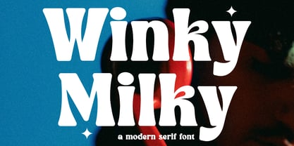 Winky Milky is a unique and very elegant font for branding and logo designs Elegant serif typeface combined with a classy and modern style. This type of font is very suitable for your various needs such as branding projects, logos, wedding designs, social media posts, advertisements, product packaging, product designs, labels, photography, watermarks, invitations, stationery, and any project, created with high level of readability. you will not be disappointed if you buy this font!!
 - Carmina BT by Bitstream,
$29.99A personal calligraphic series commissioned by Bitstream from Gudrun Zapf von Hesse. Although Carmina BT is a neutral design, optimized for use in digital publishing, Zapf von Hesse’s unique calligraphic spirit is still quite visible in the family’s letterforms. This is not surprising, as all of Zapf von Hesse’s typefaces are calligraphic in nature. Yet Carmina BT is suitable for almost any conceivable digital text application, from book design up through signage use.


