7,672 search results
(0.017 seconds)
- Francker Paneuropean by Linotype,
$103.99Francker is a sans-serif typeface family based on clean and simple principles of design. The letterforms' curves are inspired by the "super ellipse," a mathematical shape that is about halfway between an ellipse and a rectangle. Francker's lowercase letters appear somewhat reduced, as the a, b, n and u have no spurs. The family is available in nine weights, from Extra Light to Extra Black. Excellent areas of use for Francker signage, posters, magazines, advertisements, or logos; wherever a timeless, modern look is needed. Francker's fonts have a large character set that includes all glyphs in Linotype's W1G specification (World Glyph Set 1). Proportional figures are available as alternatives to the tabular defaults, via an OpenType feature. The Francker type was developed designed by Anders Francker (b. 1972), an engineer and designer living in Denmark. - Block Capitals by K-Type,
$20.00 BLOCK CAPITALS is a square, geometric, small caps display face that avoids fashionable foibles and exudes the neutral, unpretentious functionality of time-honoured block lettering. The family has three widths (Narrow, Normal and Wide), and the Bold weights are loosely based on well-used squared nets – 3x5, 4x5 and 5x5. However, the typeface escapes its grid origins whenever necessary with slightly modulated stroke weights, sensitive spacing and careful kerning. The aim is to retain the strength and simplicity of strictly geometric characters while introducing barely perceptible refinements that add elegance and usability. That said, letters and numbers line up horizontally without overlapping the capline or baseline, even the tail of the Q does not descend below the Baseline. Diacritics are modesty proportioned, accented characters extending no farther than necessary, allowing the leading on multiple lines of text to be kept to a minimum.
 - Sassoon Sans by Sassoon-Williams,
$48.00 A more mature font retaining the clarity of the Sassoon typefaces that accentuate word shape, while omitting the exit strokes. A more legible alternative to standard Sans serif typefaces - superb on the screen. Many alternative letters are included in each font. A typeface designed with the computer screen in mind. It retains maximum legibility even in the most unusual layout - ideal for multi media uses and giving unimagined clarity to menus and navigational aids. Avoid eyestrain with a typeface that accentuates word shape as well as the identity of individual letters. Legible in print at tiny point sizes so ideal for captions. Ideal for older pupils, perhaps at Secondary school, or adults, who no longer require ‘exit strokes’ to clump the letters together. Free to download resources: How to access Stylistic Sets of alternative letters in these fonts
 - Thronemy by Invasi Studio,
$19.00 This elegant condensed serif display typeface is perfect for designs that require a touch of class and nostalgia. Inspired by ancient concepts and the nostalgic classic era, Thronemy Font adds a timeless and sophisticated look to any design project. The condensed serif design of Thronemy Font is both elegant and easy to read, making it perfect for headlines, titles, and other design elements that need to be easily understood. Plus, its retro style is perfect for creating logos and headings that will make your designs stand out from the rest. Thronemy Font is a versatile font that can be used in a variety of design projects such as invitations, posters, book covers, packaging, magazine layouts, and more. No matter what your project requires, Thronemy Font can help you achieve a timeless and sophisticated design that will leave a lasting impression.
 - Atto Sans by Wilton Foundry,
$29.00I set out to design a contemporary font that is condensed with thick and thin strokes. The highly structured forms of this condensed font was made more interesting and softer by giving it a slightly calligraphic tone and by adding round corners. Atto's express purpose is to be both utilitarian, compact and technical but with a friendly face. The name "atto" was adopted since it refers to the measurement of "smallness" or detail. You will no doubt discover all the many pleasant nuances within Atto. Adopted in 1964, "atto" comes from the Danish "atten", meaning eighteen. Atto - (symbol a) a SI prefix to an unit and means that it is 10 to the power- 18 times this unit. Examples are one attosecond or one attometer/attometre. Atto is available in for Mac and Windows in Postscript, Truetype and Opentype. - Franklin Gothic Raw by Wiescher Design,
$19.50 When drawing a new font, there is a time when the final form is found – almost – but the curves are not slick and clean yet, that's what I call the "raw" form. Raw – no sweeteners added! In this family I tried to redefine this moment in type development for the eternally beautiful "Franklin Gothic". I call the design "Franklin Gothic Raw", not to be confounded with "rough". The family can be used like any good normal typeface, you hardly see any difference to a conventionally cut "Franklin Gothic" in small sizes. The charm of the design becomes obvious the bigger it becomes, then it enhances your design with its imperfections in the outline. "Franklin Gothic Raw" is therefore an extremely versatile family. I created the cuts, that I considered necessary for the seasoned designer who knows what he's doing. Enjoy!
 - ITC Rastko by ITC,
$29.99ITC Rastko began as a series of initial letters for a book of poetry. Serbian designer Olivera Stojadinovic had been working with a small publishing house creating a special series of books under the Masterpieces" brand. Her goal was to draw a new set of initial letters for each book. ITC Rastko, named after the Serbian poet Rastko Petrovic, was a project that required initial letters for the entire alphabet. Once Stojadinovic had drawn the majority of the capital letters, she realized that a companion lowercase would make a distinctive script typeface. Sketches of the letters were drawn quickly with a pointed pen. Stojadinovic then refined these, keeping the spontaneous, hand-drawn quality. Capitals are wide and flourished, while the lowercase letters are more condensed and subdued. It's no surprise that the capitals also make great initial letters." - Troubadour Pro by RMU,
$35.00 A script font of broad nib style, both plain and engraved.
 - Bikra by FaceType,
$18.00 Bikra Plain and Bikra Stencil are tough and curve-less fonts.
 - Etched Fractals by Typotheticals,
$6.00Drawn in Illustrator, this plain sans serif was created in 2004. - Cyne by Typotheticals,
$8.00A plain sans serif that would be good for everyday use. - KG Life Is Messy by Kimberly Geswein,
$5.00 A messy, markered, painted font in pure whimsical and messy style.
 - Handu by Alex Jacque,
$20.00 Handu, designed by Alex Jacque in 2012, is an affable hand-drawn sans-serif inspired by the hand-painted type and signage on the streets of Kolkata, India. Fitting then that it come to life with brush and paint. When used for display purposes the organic, painted texture of Handu's glyphs really shines. At smaller point-sizes the hand-drawn aesthetic still translates. Handu comes in two styles, regular and shadow. Use each independently or overlay them for a little youthful emphasis.
 - Vocaloid - Personal use only

- Vocaloid Oblique - Personal use only

- Advertisers Gothic by HiH,
$12.00 Advertisers Gothic is bold and brash, like the city it comes from, Chicago. It was designed by the accomplished German-American matrix engraver, Robert Wiebking, for the Western Type Foundry in 1917. As its name suggests, it was designed for commercial headliner work, much as Publicity Gothic by Sidney Gaunt for BB&S the year before. See our Publicity Headline. Alternate letters ‘A’ & ‘S’ are provided. The most popular ad words “Free!”, “New!” and “Sale” (with both esses) are provided at an angle for dramatic tension. Advertisers Gothic became quite popular because it was effective. It can work equally well for a flyer advertising a non-profit event as for a magazine product ad. This font refuses to be a wimp. Use it boldly. Advertisers Gothic ML represents a major extension of the original release, with the following changes: 1. A total of 335 glyphs (compare) with added glyphs for the 1250 Central Europe, the 1252 Turkish and the 1257 Baltic Code Pages. 2. Added OpenType GSUB layout features: pnum, ornm, liga, hist & salt ˜ with total 13 lookups. 3. Added 209 kerning pairs. 4. Revised vertical metrics for improved cross-platform line spacing. 5. The most popular ad words “Free!”, “New!” and “Sale” (with both esses) are provided at an angle for dramatic tension The zip package includes two versions of the font at no extra charge. There is an OTF version which is in Open PS (Post Script Type 1) format and a TTF version which is in Open TT (True Type)format. Use whichever works best for your applications.
 - Tenez by Plau,
$30.00 Big News! Tenez has been selected for the Tipos Latinos Biennial 2016 and Typographica’s Favorite Typefaces of 2015! Tenez is a Grand Slam display didone typeface from Plau. We designed it for a branding project, further developing the resulting logotype into a typeface we felt could solve many designers’ needs. Its origins are rooted in pointed nib calligraphy which can be seen in contemporary Didot and Bodoni inspired typefaces. But Tenez’s shapes are organic (these modern typefaces were originally cut by hand after all) – in fact that was the challenge we set from the start: to make a typeface as organic in construction as possible. This echoes some of late 19th century typefaces and advertising, yet we thought of it for contemporary uses. One of the several unique features of Tenez is its unusual Thin weight, in which the contrast between thin strokes and the black area left by the serifs makes for a typewriter-like personality. The italics provide a perfect counterpoint to the roman weights. Tenez was unapologetically conceived as a display typeface meant to be used large as in magazine openings, drop caps or everywhere there’s a need for elegant impact. The family includes support for almost all Latin languages available, figure sets for almost every conceivable occasion (tables, text, you name it), alternates for the quirky beautiful R (sometimes simpler is better, but not always!) and Q (with a nice big tail for that article opener). Tenez pairs really well with our no-frills sans-serif Motiva Sans and our cute vertical connected script Primot.
 - Nova Horst by PintassilgoPrints,
$35.00 Nova Horst is an amplified version of Horst, a highly original font (MyFonts Rising Star) based on etchings by the extraordinary artist and printmaker Horst Janssen. Nova Horst keeps all the amazing wilderness of the original font, while enriched with sharp OpenType programming, plus a whole new set of alternates, a handy set of ornaments and loads of cool unpredictable overlapping glyphs. Language support was also expanded. Now there are 5 sets of letters, 2 sets of numerals and a robust set of discretionary ligatures. OpenType functionalities now include an extremely playful Contextual Alternates feature and also Discretionary Ligatures and Stylistic Alternates. Nova Horst is an energizing blend of eccentric characters, cool OpenType features, loads of alternates and a meticulous kerning table. But be warned: as the original font, this one is quite addictive! A quick roadmap: • All features turned off: you can choose the different letterforms stored on upper- and lowercase sets. There are no overlapping letters. • Contextual Alternates turned on: you get alternating characters from 4 sets of glyphs, with loads of overlapping letters, all managed by a carefully handcrafted kerning table. The result is a very cool random effect on glyphs distribution. • Discretionary Ligatures turned on: now some additional glyphs enter the scene. There are more than 60 ligatures glyphs which substitute pairs of letters for some extra-coolness • Stylistic Alternates turned on: access the counterless glyphs from the Stylistic Alternates set. Use each feature alone or mix them up for added boldness. Gorgeous extravaganza guaranteed!
 - Guainne by Sensatype Studio,
$15.00 A Modern Classy Beauty Elegant Font that we created special for Luxury and Fashion branding needs, And specially for this font, We prepared any alternate characters to help you create unlimited variations for your creative needs. Guaine - Modern Beauty Elegant Font ready with: Any options to get creative variations (combination of Any Alternates) Preview as a inspirations that you can do with Guaine font Ready with Lowercase and Uppercase characters Wish you enjoy our font. :)
 - Nafta Brush Font by WildOnes,
$4.95 Nafta Extended Font is the Pro version of the free Nafta Font. It features a huge language support, from all European languages to even Cyrillic and Vietnamese. The Font features handwritten marker shapes with natural edges. Nafta Extended is a brush font which you can use and enjoy again and again, for anything from promotional material and handwritten quotes, to product packaging, merchandise, and branding projects. Made by Krisjanis Mezulis ar Wildones Type Foundry.
 - Stellafox by ZetDesign,
$15.00 Stella fox is a font with a neat brush stroke style. This font gives you a free and boundless impression. This font is available in two styles, regular and italic. and is equipped with an open type feature to give creative designers many style options to create stunning works. so you can use and enjoy again and again, for anything from promotional material and handwritten quotes, to product packaging, merchandise and branding projects.
 - Afterglow by Vintage Voyage Design Supply,
$18.00 Elegant and so stylish serif typeface full of contrast lines, a lot of Stylistic Alternates with thin swashes. Some letters has up to 12 of them. Use only capitals for headers or quotes, it looks strong and refined, or use Caps with lowercase for block texts, or subheaders. Design your art- or beauty blogs, t-shirts or websites, posters, magazines or cards, and logo's of course. You will return to this font again and again.
 - Motel Xenia by Fenotype,
$19.95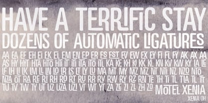 Motel Xenia is an OpenType font with dozens of automatic ligature pairs.
 - Platypus by Elemeno,
$15.00The sort of thing you used to see on hand painted signs. - Rise of Beauty by Kereatype,
$9.00 Rise of Beauty - Modern Variable Paired Duo A classy, contemporary pair of Script Signature and Sans Serif fonts. With a stylish expressive script companion, Rise of Beauty offers beautiful typographic harmony for a diversity of design projects, including logos & branding, wedding designs, social media posts, advertisements & product designs.
 - Sign Stencil JNL by Jeff Levine,
$29.00 Sign Stencil JNL was modeled from some vintage lettering stencils spotted in an online auction that were part of a store sign making kit. A variety of styles, sizes and designs were contained within a carrying case along with paints, brushes and instructions on how to paint attractive signs.
 - Jennerik by Ingrimayne Type,
$9.95 Jennerik is a plain, serifed face in which the strokes are uniform or monolinear. It has four weights and each weight has both upright and italics styles. Its name reflects its plain, simple design. It is slightly condensed and the regular style was originally designed for printing rough drafts.
 - Pinsher by Abbasy Studio,
$15.00Pinsher, is a font inspired by Signs Painting, This font is based on retro hand-painted paper signs primarily seen in grocery stores from the 1940s through today. With additional shadow font you will be able to create the beautiful combination and bring retro touch to your artworks! - Bellini by Red Rooster Collection,
$45.00An original design based on Progreso from the Gans foundry circa 1923. - Letterpress Assistants JNL by Jeff Levine,
$29.00 Letterpress Assistants JNL once again combines a choice of cartoons, embellishments, ornaments and sales helpers (all redrawn from vintage source material) into one handy digital font.
 - Logik by Monotype,
$25.00 Logik is a futuristic square sans serif typeface. Its personality is defined by squared-off corners that you would normally expect to be rounded, this sharpness gives the glyphs an eccentricity that the eye quickly adjusts to. Sharp, incised/stylised ink traps along with slightly tapered/curved horizontals and verticals add to the character of each letterform. These subtleties combine to give Logik a distinctively futuristic aura. Logik’s main use would be for headlines, short runs of text, branding and display purposes – ideally suited for film and book titles, Logik could be widely used for sports, media and recreation purposes also. Logik comes in 7 weights (from Thin to Black) across 3 widths – Regular, Wide, and Extended. Each font covers all European Latin-based languages and includes Old Style Figures, Small Caps, and some Case-Sensitive Forms. Key features: 7 Weights in Roman and Oblique 3 Widths – Regular, Wide, Extended Small Caps Old Style Figures European Language Support (Latin) 550+ glyphs per font.
 - Varia Display by Tomtype,
$6.00 Introducing Varia Display, a font that emerged from the renowned challenge of 36 Days of Type. In the 2023's edition, I embarked on a journey to explore a wide variety of styles, leading to infinite possibilities for crafting unique letterforms. The result is a meticulously crafted variable font with a single weight axis, designed to push the boundaries of typographic aesthetics across all characters. With each letter and number embodying a distinct and innovative approach, this font offers a captivating typographic experience. With its distinctive and varied letterforms, this font is ideally suited for eye-catching main headlines and complementary typography. Whether you seek diversity or a touch of uniqueness, this font is sure to meet your creative needs. Embrace the world of possibilities it presents and elevate your designs to new heights. Key features: Meticulously designed Variable Font Single Weight Axis Multilingual support 374 glyphs Contact: If you have any doubts or questions please ask me via mail or Instagram hello@tomascastiglioni.com @tomtype
 - Sathseed by Zamjump,
$17.00 Sathseed is a fun, lively, handwritten brush script created with the utmost care, love, and attention to detail. It's ideal for logos, titles, product packaging, merchandise, quotes... Try it for yourself in the preview section - what you see is what you get! To achieve an authentic handwritten feel, Sathseed comes with a full set of lowercase substitutions and ligatures to play with, giving you lots of variety. If you use software that supports OpenType, they are included in the main font that will be active as you type. If not, I've also included Alternate and Ligature as separate fonts for you to use. Your download will include the following files in TTF & OTF format. Litagure as well as alternate and extra swash. For web font use, a web font kit consisting of Awesomespill Regular fonts in WOFF, WOFF2 formats is also provided. Any question? Drop me a line and I'll be happy to answer!
 - Adagio Serif by Borutta Group,
$25.00 The Adagio Family is a part of Mateusz Machalski’s, Warsaw Academy of fine arts Master Degree Diploma in multimedia studio, conducted by Professor Stanisław Wieczorek and his brave PHD Jakub Wróblewski. Adagio is a modern type family. It consists of 3 main varieties: sans, serif and slab. Each one of them has its own “true italic” set. All of the styles together have over 400 characters in 9 different thicknesses. The Adagio family was created mostly for company identities. The idea was to create a wide range of different varieties which are stylistically consistent. Adagio Serif - Characterises with strong contrast and high detail in calligraphic character cuts, what gives it a light feeling. Unlike the Slab version, serif variety has asymmetrical serifs. Thanks to large X length, and highly stretched descenders, it also works correct in longer text, while its strong detail is good for headlines. The Serif version is a great complement for Adagio Sans and Adagio Slab.
 - Adagio Sans by Borutta Group,
$25.00 The Adagio Family is a part of Mateusz Machalski's, Warsaw Academy of fine arts Master Degree Diploma in multimedia studio, conducted by Professor Stanisław Wieczorek and his brave PHD Jakub Wróblewski. Adagio is a modern type family. It consists of 3 main varieties: sans, serif and slab. Each one of them has it's own “true italic” set. All of the styles together have over 400 characters in 9 different thicknesses. The Adagio family was created mostly for company identities. The idea was to create a wide range of different varieties which are stylistically consistent. Adagio Sans - In its character, inspired by classical English typefaces. Sharp chamfers add a strong character. Thanks to delicate contrast and proportions of capitals, this variety has features of humanist grotesque. Thanks to large x length, and highly stretched descenders, it also works correct in longer text, while it’s strong detail is good for headlines. The Sans version is a great complement for Adagio Serif and Adagio Slab.
 - Typologic by Ahmad Jamaludin,
$17.00 Introducing Typologic, a font that effortlessly fuses geometric simplicity with the vibrant pop culture styles of the swinging 60s and 70s. This versatile typeface offers not just one, but 8 distinct font families, each with its own unique character. You'll find Condensed, Normal, Semi Expanded, Expanded, and stylish shadow versions. But that's not all—when you choose Typologic, you also get a treasure trove of 56 FREE BONUS ASSETS, featuring retro mascot illustrations that perfectly complement your creative projects. Features: Typologic Main FIle 56 free bonus assets that are Retro Mascot Illustrations Has 8 fonts : Condensed, Normal, Semi Expanded, Expanded, Condensed Shadow, Normal Shadow, Semi Expanded Shadow, Expanded Shadow Instructions (Access special characters, even in Cricut Design) Unique Letterforms Works on PC & Mac Simple Installations Accessible in Adobe Illustrator, Adobe Photoshop, Microsoft Word even Canva! PUA Encoded Characters. Fully accessible without additional design software. Come and say hello over on Instagram! Thank you, Dharmas Studio
 - Karibu by ROHH,
$40.00 Karibu™ is a 100-font original, ultra versatile geometric grotesk family with a lot of character. It is designed for modern projects, to serve as display as well as paragraph text typeface. It is perfect for lots of design situations - from magazine editorial use, logo design & branding, to web design, user interfaces and mobile applications. Main features: - 5 widths (Narrow, Condensed, Normal, Expanded, Wide), each consisting 20 fonts - 10 weights for each width (from Hairline to Black) - handdrawn, carefully crafted italics - alternate stylistic set for more technical and minimalistic projects - pronounced ink traps and large x-height improving legibility in small sizes and adding strong personality to display sizes - flatten letter shapes adding vertical rhythm and elegance to narrow widths - extended latin language support - OpenType features (case sensitive forms, standard and discretionary ligatures, stylistic sets, contextual alternates, lining, oldstyle and tabular figures, slashed zero, fractions, superscript and subscript, ordinals, currencies and symbols)
 - Adagio Slab by Borutta Group,
$25.00 The Adagio Family is a part of Mateusz Machalski’s, Warsaw Academy of fine arts Master Degree Diploma in multimedia studio, conducted by Professor Stanisław Wieczorek and his brave PhD student Jakub Wróblewski. Adagio is a modern type family. It consists of 3 main varieties: sans, serif and slab. Each has its own “true italic” set. All of the styles together have over 400 characters in 9 different thicknesses. The Adagio family was created mostly for company identities. The idea was to create a wide range of different varieties that are stylistically consistent. Adagio Slab - Slab variety combines qualities of the Sans and Serif varieties. It has the same contrast as Sans. As distinct from Serif, Adagio Slab contains strong, beamy and symmetrical serifs in the form of pillows. Thanks to large X height, and highly stretched descenders, it also works correctly in longer text, while its strong detail is good for headlines. Slab version is a great complement for Adagio Serif and Adagio Sans.
 - Imperio by Juan I. Siwak,
$40.00 Imperio is a font inspired by old posters, especially those related to constructivism and futurism. It reflects both the rationalism of Bauhaus as a propagandist and revolutionary spirit of an era. On the other hand it is not nostalgic, but instead looks for its own way to get diagonals where there was rigidity. The poster itself is the language of graphic design, and geometry is its ally. This font aims for that goal. It has two variants that derive from its source. Imperio Giga Black attempts to be a negative typography, starting with the black and then searching for small windows in which they begin to uncover the morph. This is an extreme and modern font. Imperio West is a metamorphosis of the original one, with decorative details which transform it into a typeface of wood and saloon font. In all cases we recommend its use in large sizes (up to 20pt) and main titles. Imperio UltraBlack can work in smaller sizes than Imperio Regular.
 - P22 Vale by IHOF,
$24.95 The Vale Press was a contemporary of Willam Morris's Kelmscott Press. The types used by the Vale Press were designed by artist Charles Ricketts, who also supervised the design and printing of Vale Press books. The main type used, Vale, was based on the Jenson 15th century roman type style. The King's Fount was an experimental semi-uncial font based on the Vale type. The King's Fount was designed in 1903 for the Vale edition of the 15h century poem "The Kingis Quair". This semi-uncial font evokes old English and Anglo-Saxon lettering. P22 Vale Pro combines the two fonts P22 Vale Roman and P22 Vale King's Fount into one "Pro" font. This pro font also includes a Central European character set, old style figures, fractions, ornaments and a special faux "Middle English" feature to make "anee text appeer Olde." This feature is not known to exist in any other font.

