10,000 search results (0.006 seconds)
  1. Baskerville No. 1 SB by Scangraphic Digital Type Collection, $26.00
    Since the release of these fonts most typefaces in the Scangraphic Type Collection appear in two versions. One is designed specifically for headline typesetting (SH: Scangraphic Headline Types) and one specifically for text typesetting (SB Scangraphic Bodytypes). The most obvious differentiation can be found in the spacing. That of the Bodytypes is adjusted for readability. That of the Headline Types is decidedly more narrow in order to do justice to the requirements of headline typesetting. The kerning tables, as well, have been individualized for each of these type varieties. In addition to the adjustment of spacing, there are also adjustments in the design. For the Bodytypes, fine spaces were created which prevented the smear effect on acute angles in small typesizes. For a number of Bodytypes, hairlines and serifs were thickened or the whole typeface was adjusted to meet the optical requirements for setting type in small sizes. For the German lower-case diacritical marks, all Headline Types complements contain alternative integrated accents which allow the compact setting of lower-case headlines.
  2. Baskerville No. 1 SH by Scangraphic Digital Type Collection, $26.00
    Since the release of these fonts most typefaces in the Scangraphic Type Collection appear in two versions. One is designed specifically for headline typesetting (SH: Scangraphic Headline Types) and one specifically for text typesetting (SB Scangraphic Bodytypes). The most obvious differentiation can be found in the spacing. That of the Bodytypes is adjusted for readability. That of the Headline Types is decidedly more narrow in order to do justice to the requirements of headline typesetting. The kerning tables, as well, have been individualized for each of these type varieties. In addition to the adjustment of spacing, there are also adjustments in the design. For the Bodytypes, fine spaces were created which prevented the smear effect on acute angles in small typesizes. For a number of Bodytypes, hairlines and serifs were thickened or the whole typeface was adjusted to meet the optical requirements for setting type in small sizes. For the German lower-case diacritical marks, all Headline Types complements contain alternative integrated accents which allow the compact setting of lower-case headlines.
  3. Old Towne No. 536 by URW Type Foundry, $35.00
  4. Wood Heinz No. 4 by astype, $50.00
    Just Wood Heinz No.4 - the cool display font. Wood Heinz No.4 offering up to four "printed look" variations of all the Latin base letters and figures. An OpenType letter rotator is programmed into the fonts to emulate the randomness of wood type printing. You can switch manually to the alternate letters by using the Stylistic Sets 1 – 4. Stylistic Set 5 will activate the more common look of the capital letter R with a straight leg. PDF Specimen
  5. Old Dreadful No. 7 by Bitstream, $29.99
    Old Dreadful No. 7 is truly a unique typeface design. Bitstream’s designers and other employees all contributed individual letterforms to the character set. This typeface is definitely not recommended for long blocks of texts! David Robbins expanded his contribution of the capital I into a complete typeface, Eyeballs.
  6. Garamond No. 1 SB by Scangraphic Digital Type Collection, $26.00
    Since the release of these fonts most typefaces in the Scangraphic Type Collection appear in two versions. One is designed specifically for headline typesetting (SH: Scangraphic Headline Types) and one specifically for text typesetting (SB Scangraphic Bodytypes). The most obvious differentiation can be found in the spacing. That of the Bodytypes is adjusted for readability. That of the Headline Types is decidedly more narrow in order to do justice to the requirements of headline typesetting. The kerning tables, as well, have been individualized for each of these type varieties. In addition to the adjustment of spacing, there are also adjustments in the design. For the Bodytypes, fine spaces were created which prevented the smear effect on acute angles in small typesizes. For a number of Bodytypes, hairlines and serifs were thickened or the whole typeface was adjusted to meet the optical requirements for setting type in small sizes. For the German lower-case diacritical marks, all Headline Types complements contain alternative integrated accents which allow the compact setting of lower-case headlines.
  7. EF Bodoni No 1 by Elsner+Flake, $35.00
  8. ITC Modern No. 216 by ITC, $40.99
    Modern typefaces refer to designs that bear similarities to Bodoni and other Didone faces, which were first created during the late 1700s. Ed Benguiat developed ITC Modern No. 216 in 1982 for the International Typeface Corporation (ITC). Showing a high degree of contrast between thick and thin strokes, as well as a large x-height, this revival is more suited to advertising display purposes than the setting of long running text, or books. Many traits in Benguiat's design are worth further notice. The thick stems of the roman weights have a very stately, solid presence. Their thin serifs have been finely grafted on, a masterful solution to the challenge of bracketing presented by Modernist designs. The italic weights have a very flowing, script-like feel to them, and the letters take the form of true italics, not obliques. The ITC Modern No. 216 family contains the following font styles: Light, Light Italic, Medium, Medium Italic, Bold, Bold Italic, Heavy, and Heavy Italic.
  9. Fat Face No. 20 by Solotype, $19.95
    This is almost a necessity if you are doing reproductions of mid-19th century posters and playbills.
  10. KG One More Night - Personal use only
  11. You are the one - Unknown license
  12. Walk Da Walk One - Personal use only
  13. KR On The Farm - Unknown license
  14. KR Halloween Signs One - Unknown license
  15. KR Hole In One! - Unknown license
  16. KR Deco Caps One - Unknown license
  17. Written on His Hands - Personal use only
  18. KR Wings On High - Unknown license
  19. Put Another One In - Unknown license
  20. Oil On The Water - Personal use only
  21. Water on the Oil - Unknown license
  22. KR On The Go - Unknown license
  23. Florida Project Phase One - Unknown license
  24. KR Christmas Dings One - Unknown license
  25. Black boys on mopeds - Unknown license
  26. As seen on TV - Unknown license
  27. Balls on the rampage - Unknown license
  28. Three Dates, One Night - Unknown license
  29. Just One More Picture - Unknown license
  30. MFC Bruce Corners One by Monogram Fonts Co., $19.95
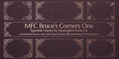
  31. One of the guys by PizzaDude.dk, $15.00
    One of the guys is a simple, highly legible, mono lined comic book font. Simple, yes, but full of personality! Use it as it is, or spice up your text by using the extra layer. The extra layer could be ghouly slime, birthday cake cream, snow or whatever your imagination figures out!
  32. GS Slim One Bestiary by GalaStudio, $15.00
    We, GalaStudio (Lilia & Galina) represent the SlimOne BESTIARY font from our MELTING FONTS collection. It is a decorative style version of the SlimOne font family, which we designed by playing with glyphs: we converted them into funny animals and thus created a "zoo". One can use the BESTIARY font for children's books and notebooks as well as for all kinds of funky advertising, social media, greeting cards and comics. INCLUDED: GS_SlimOne_Bestiary.otf GS_SlimOne_Bestiary.ttf Numbers, additional glyphs & basic punctuation are included. PERFECT FOR: using in books titles, textbooks, notebooks, different brochures and advertising, especially for kids, home-ware design, packaging design; magazines, posters and flyers titles; logos design, books design, fashion design, slogans etc. :) Multilingual support included for the languages based on Latin alphabet.
  33. KG Girl On Fire by Kimberly Geswein, $5.00
    The cute handwriting of a teen girl.
  34. On Your Mark JNL by Jeff Levine, $29.00
    Images of ‘lost’ or forgotten signs from the past are on a number of sites all over the web. One in particular partially revealed a vintage sign for “J. Yormark Shoes" behind a barbershop sign at 15 – 8th Avenue in New York City. The sign remained until 2014. The stencil effect made by the formation of the stained glass letters inspired On Your Mark JNL, which is available in both regular and oblique versions. The font’s name is a play on the shoe vendor’s name… “Yormark”.
  35. The Some One Retro by Sipanji21, $12.00
    "The Some One" is a display font with a retro theme, featuring several alternative styles that can help elevate your designs. It is ideal for a wide range of design projects, such as car decals, t-shirt designs, or logos for retro-themed branding. With its unique and stylish appearance, "The Some One" adds a touch of nostalgia and sophistication to your designs. The font's retro feel makes it perfect for designs that require a vintage or classic look, while the alternative styles allow for flexibility and customization. Whether you're creating a bold and eye-catching design or a more subtle and understated one, "The Some One" is the font you need to make your designs truly exceptional.
  36. Ongunkan Younger Futhark One by Runic World Tamgacı, $40.00
    A variant of the young futhark runic script.
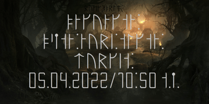
  37. On The Town JNL by Jeff Levine, $29.00
    On the Town JNL is a reworking of Parks Department JNL, giving it a classic "solid black Art Deco treatment". The wide monoline font of the original design was inspired by hand lettering on a WPA (Works Progress Administration) poster. Art Deco typography and the streamlined style it embraced often conjures up images of New York City in the 1930s and 1940s, thus On the Town JNL is named for the classic MGM musical starry Gene Kelly, Frank Sinatra and Jules Munchen that was filmed on location in "the city that never sleeps".
  38. MFC Franklin Corners One by Monogram Fonts Co., $19.95
  39. Castle On The Hill by Hanoded, $15.00
    When I started working on this font, I had the radio on. Ed Sheeran was singing his song ‘Castle On The Hill’ and when I looked at this new font of mine, I couldn’t help but notice it had a bit of a medieval look. So I named it Castle On The Hill. COTH is a very lively, messy handpainted serif. It was made with a Japanese brush pen. I actually had a different look in mind, but this is what came out of the pen and I quite liked its looks. It is especially useful for children’s book covers, apps and posters, but be my guest and use it as you like. All it needs is a designers’ touch, a nice tune and a sunset.
Looking for more fonts? Check out our New, Sans, Script, Handwriting fonts or Categories
abstract fontscontact usprivacy policyweb font generator
Processing