10,000 search results
(0.007 seconds)
- Mercedes1937 by scarab13,
$9.00 There is an interesting story about this vintage professional Mercedes typewriter I’ve used to make this font. My grandfather, who was a Yugoslavian partisan during the WWII captured it from a Wehrmacht command building during an attack, and he kept it in a perfect shape for so many years. After I inherited it, I wanted to share it’s uniqueness (as well as it’s story). I’ve intentionally kept it in it’s original condition - I haven’t replaced the ribbon that was some 34 years old (or more) before sampling the font, and it turned out really nice. One more important thing - I have used ONLY it’s original set of characters (Latin with some Balkan-based letters). With it’s untouched originality and uniqueness it fits to our modern culture perfectly. There are no compromises here - there are no popular @,#,$ and other characters you would expect in a font. You will get EXACTLY what’s on this genuine “Mercedes” typewriter with so much soul.
 - Ambrosia Demo - Personal use only

- Maze by Oporto Design,
$79.90 Maze is a modern font created from a single line with no interruption.
 - Baggage Claim JNL by Jeff Levine,
$29.00 Sometimes type designs are set aside as one project takes priority over another and occasionally it becomes overlooked. One such example is a set of extra bold, sans serif stencil characters drawn out in 2017. Regrettably, as much time has passed, no backstory can be applied to this typeface. It was checked against existing releases in the Jeff Levine Fonts library and didn’t seem to have been re-worked for any subsequent release. With this in mind, Baggage Claim JNL makes its belated appearance and is available in both regular and oblique versions.
 - Bhamious by Rometheme,
$18.00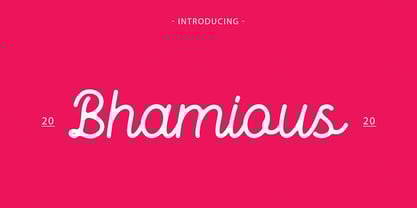 Bhamious is a Monoline Font, It has a elegant, classy look and cool. It’s a great font for fashion, apparel projects, signature, album cover, logo, branding, magazine, social media, & advertisements, but also works great for other projects. Highlights: Standard glyphs (Uppercase, Lowercase, Numeral & Punction) Work on PC or Mac PUA Encoded Support Fonts include multilingual support for; ä ö ü Ä Ö Ü ß ¿ ¡ No special software is required, The fonts can be opened and used in Adobe Illustrator, Adobe Photoshop, Adobe InDesign, even work on Microsoft Word.
 - Boola Boola NF by Nick's Fonts,
$10.00This typeface is a new and improved (really!) version of one of my most popular freeware fonts, Team Spirit, which has made appearances in the Tank McNamara comic strip and on Blue Collar TV. Add the “nose” at the front with an open parenthesis -(- and add the tail with a close parenthesis -). To continue the bar beneath between words, use the _underscore in place of a space. No math operators and limited punctuation, but complete accented characters for the Unicode 1252 (Latin) and Unicode 1250 (Central European) character sets, with localization for Romanian and Moldovan. - Creslina by Rometheme,
$22.00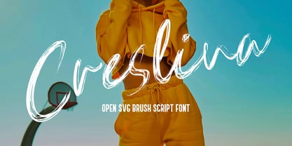 Creslina – Open SVG Brush Script font. It has a elegant, classy look and beauty. It’s a great font for fashion, apparel projects, signature, album cover, logo, branding, magazine, social media, & advertisements, but also works great for other projects. Highlight : Standard glyphs (Uppercase, Lowercase, Numeral & Punction) Work on PC or Mac PUA Encoded Support Fonts include multilingual support for; ä ö ü Ä Ö Ü ß ¿ ¡ No special software is required, The fonts can be opened and used in Adobe Illustrator, Adobe Photoshop, Adobe InDesign, even work on Microsoft Word.
 - Heraklion by Andrew Sinn,
$14.50 Heraklion letters are drawn with their gravity in the metric vertical – instead of resting on a baseline, they dance acrobatically on a string. This allows for a more drastic variation among the glyphs, which no longer have a fixed x-height. In order to create a simplistic and mathematic character, shapes are constrained to circles and straigh lines. The design principles result in a playful expressive set that is surprisingly clear. “A choreography where the individual actors freedom of expression is enclosed in foundational rules that create interconnectivity and belonging.”
 - Futura Black by Bitstream,
$39.99Josef Albers drew a stencil sanserif form at the Bauhaus in 1923 (published in 1926); Paul Renner and the Bauer design office made a similar design into a typeface in 1929, and rather confusingly included it in the Futura series. Many websites erroneously attribute the stencil design to Josef Albers, but there is no evidence that the two met or collaborated on Futura Black. In 1929 Josef Albers and Jan Tschichold corresponded on the “Transito” typeface (another very similar stencil typeface, while Paul Renner was working with Jan Tschichold. - STARSsoft Nika by STARSsoft,
$19.90 Currently, the STARSsoft NIKA font family is represented by two fonts - Bold & Bold Italic. The letters and numbers in the font are shown in such a way that there are no holes in the letters and the entire outline of the font consists of one closed line. The font has both a standard Latin set and an extended one. The font also has Cyrillic support. In addition to the Russian Cyrillic alphabet, the font has support for Ukrainian and Kazakh Cyrillic. In addition to standard character sets, the font has many additional letters with diacritics.
 - Stadium JNL by Jeff Levine,
$29.00 Block-style typefaces make excellent sports-themed fonts, and Stadium JNL is no exception-- but this lettering style is also filled with nostalgia for decades past. Modeled from one of the many classic designs found in the Speedball® Lettering Textbook, this style of alphabet was quite popular in signage of the 1920s and 1930s. Stadium JNL fills the bill either way-- a font that is just as much at home on a gridiron or baseball diamond, or as lettering for a garage, warehouse or attention-getting ad copy.
 - Bruce Influence by Intellecta Design,
$16.90Free interpretation of Great Primer Ornamented No. 30, from the Bruce's TypeFoundry 1869 catalog. - Lucas Brandis by Proportional Lime,
$9.99 In the early days of printing everything had to be worked out from scratch. This set of lettering is based on section headings used by the Printer Lucas Brandis (no known relation), the first printer to operate in the city of Lübeck around 1473. They remind me of a medieval version of the spray paint graffiti so often seen on the sides of trains. A bit on the crude side, but also and importantly extremely noticeable. So whether you use it for creating old styled printing or some wild modern eye grabbing text item, its robust and sturdy shapes will be certain to grab the eye.
 - Threepoints North by Type Associates,
$30.00 The Threepoints Series is the result of several years of work that bases three different sans serif type designs on one “shell”. Designed for optimal readability North, with its squarish shapes and rigidity are suggestive of an upright Swiss or Inserat typeface. The East variant takes on the look of another popular condensed grotesk with a softer, more rounded basic shape whilst maintaining the purpose of the original design. With minimal adjustments West leans towards more contemporary European designs. Although these are primarily display typefaces they function extremely well in text sizes in either upper or lowercase composition. Excellent for signage. Each variant comes with matched italic at no additional cost.
 - Excalibur Stone by Comicraft,
$19.00 After the death of Uther Pendragon, long before Arthur was King of the Britons and before Galahad was destined to find the Holy Grail, the mighty sword Excalibur appeared, thrust into a Stone bearing the inscription; “Whosoever Pulleth Out This Sword of this Stone and Anvil, is Rightwise King Born of England!” While no champion worthy of becoming king was able to pull the sword, England was plunged into the Dark Ages... the legend on the stone aged, and became cracked and weathered... much as one might find on your stone tablet, ipad or mobile device. See the families related to Excalibur Stone: Excalibur Sword.
 - Fournier by Monotype,
$29.99 Fournier was made by Monotype in 1924. The design is based on types cut by Pierre Simon Fournier circa 1742, some of the most influential designs of the eighteenth century. Fournier's types were among the earliest of the transitional" style of typeface and were a stepping stone to the more severe "modern" style made popular by Bodoni later in the century. They had more vertical emphasis than the old style types, greater contrast between thick and thin strokes and little or no bracketing on the serifs. Fournier has a light, clean look on the page, provides good economy in text and retains an even colour.
 - Threepoints West by Type Associates,
$30.00 The Threepoints Series is the result of several years of work that bases three different sans serif type designs on one “shell”. Designed for optimal readability North, with its squarish shapes and rigidity are suggestive of an upright Swiss or Inserat typeface. The East variant takes on the look of another popular condensed grotesk with a softer, more rounded basic shape whilst maintaining the purpose of the original design. With minimal adjustments West leans towards more contemporary European designs. Although these are primarily display typefaces they function extremely well in text sizes in either upper or lowercase composition. Excellent for signage. Each variant comes with matched italic at no additional cost.
 - Threepoints East by Type Associates,
$30.00 The Threepoints Series is the result of several years of work that bases three different sans serif type designs on one “shell”. Designed for optimal readability North, with its squarish shapes and rigidity are suggestive of an upright Swiss or Inserat typeface. The East variant takes on the look of another popular condensed grotesk with a softer, more rounded basic shape whilst maintaining the purpose of the original design. With minimal adjustments West leans towards more contemporary European designs. Although these are primarily display typefaces they function extremely well in text sizes in either upper or lowercase composition. Excellent for signage. Each variant comes with matched italic at no additional cost.
 - Janagrace by Jonahfonts,
$40.00 Janagrace is designed for birthday, holiday cards and can be used effectively in other applications for that calligraphy appearance. Regular: Contain ONLY Regular-Caps. Swash: Swash-Caps with NO Regular Caps. OT Swash: Contain BOTH Regular and Swash-Caps. Swash LIGHT: Swash-Caps with NO Regular Caps. Janagrace, Agile, Charming and Lovely.
 - Times New Romance - Unknown license

- AB FatChic - 100% free

- Porker by Ingrimayne Type,
$6.95 Porker was an experiment in making a barely readable but very simple and very bold typeface with no curves. It is caps only with some of the letters on the lower-case keys giving alternate versions. Include are three variants, a tall version, a striped version, and a randomized version. The striped version can be placed in a layer above the regular version to give two-colored letters.
 - Thorowgood Wide by Wooden Type Fonts,
$20.00 One of the original Clarendon types, an English design, here derived from a specimen taken from an American foundry, no identifying marks. With a tall x-height, wide version, unlike more traditional Clarendons, not a square serif but bracketed. Unique to this Clarendon are the rounded openings at the points where the horizontal and vertical stems meet in the capital B, D, P and R, not common in other Clarendons.
 - TEMPER Wide by OGJ Type Design,
$35.00 Temper Wide is an extended neogrotesque slab with unbracketed serifs and square dots. Its hard-working letterforms and industrial heritage make for a no-nonsense look, well suited to editorial design and advertising. It provides an energetic backdrop for fashion and accessories, whether on-product, in campaigns, or branding. Horizon’s the limit! This sturdy font family will be by your side. A neutral, unembellished typeface, ready to make an impact.
 - Lunar Outline by RagamKata,
$12.00 Lunar - Retro Serif Font Introducing Lunar, a charismatic font that seamlessly fuses playfulness with a touch of nostalgia. This unique typeface falls under the playful retro serif display category, offering not just one, but two distinctive personalities in its regular and outline versions. Features : - Regular & Outline - Ligatures & Alternates - Letters, numbers, symbols, and punctuation - No special software is required to use this typeface even work in Canva - Multilingual Support
 - Incarceration JNL by Jeff Levine,
$29.00 The hand lettered Art Deco title on the cover of the sheet music for “There Must be A Bright Tomorrow (for Each Yesterday of Tears)” inspired the font Incarceration JNL, which is available in both regular and oblique versions. Incarceration JNL earns its dubious name from the fact the song was written by Prisoner No. 3223 (Wallace Wysocki) who was held in the Marquette State Prison, Marquette, Michigan (1931)
 - Natalya Monoline by insigne,
$21.99 Natalya Monoline is the rounded monolinear companion to Natalya. Like its predecessor, Natalya Monoline has a smooth rhythm and flows fluidly, due in no small part to its reliance on the golden spiral for its ornate swirls. This makes for an especially harmonious script with timeless appeal. The typeface family includes five weights with three alternate variations of the ascenders and descenders and includes OpenType ligatures, oldstyle figures and ending swashes.
 - Etienne by ParaType,
$30.00 Designed for ParaType in 2002 by Tagir Safayev. Inspired by the letterforms of Antique No. 8 typeface and other similar fonts of the 19th century (Latin Antique, Wide Latin, Etienne Condensed, Wide Renaissance). A face of so-called Latin type has stout triangular serifs and rather unusual curls on several letters in the lower case. Nevertheless it is eminently suitable for a wide variety of settings in advertising and display typography.
 - Floopi - Unknown license

- Fontovision III - Unknown license

- LEFt - Unknown license

- DearTeacher-Normal - Unknown license

- Floopi - Unknown license

- Barnboard by BA Graphics,
$45.00A true rustic design to give the feeling of real wood (no press board used here). - Sleezy by BA Graphics,
$45.00Let you imagination go wild with this extreme font. No holds barred. It is cool stuff. - Headlined Solid by Thinkdust,
$10.00 Where Headlined creates bold statements, Headlined Solid states facts. Simple, sans serif and steady as a rock, Headlined Solid does what needs to be done, no more and no less. For pragmatism and clarity of form this font couldn’t be better. Alternatively if you're looking for something a little more filthy, check out the original Headlined.
 - Dominant Type by Hanoded,
$15.00 We’re in a lockdown of sorts (again) and things are pretty … uhm … boring at the moment. No going out for a coffee, no school (so the kids are at home), no meeting with friends… The new reality kinda sucks if I say so myself. Besides that, it turns out that we have a new dominant type of Covid in Holland.. wait, Dominant Type! Ahh, great name for my latest font! Dominant Type is a handmade all caps font. It comes with extensive language support (including Vietnamese) and 2 sets of alternate glyphs for that bit of ‘random awesomeness’!
 - Gusto Black by BA Graphics,
$45.00A real heavy weight, a chunky sans serif that packs some real Punch. No fancy frills here. - 1543 Humane Jenson by GLC,
$38.00 In 1543 the well-known “De humani corporis fabrica” treatise on anatomy by André Vesale, was printed by Johann Oporinus in Basel (Switzerland). Various typefaces were used for this work, mostly in Latin but including Greek characters. Its Jenson-type font was the one which inspired this font. It is a very elegant one, including the “long s”, a few abbreviation forms and ligatures. As it was a Latin text, there were no accented characters and a few capitals were absent. I had to reconstruct them. A render sheet, in the font file, makes all characters easy to identify on the keyboard. This font may be used as a “modern” one for web-site titles, posters and flier designs, publishing ancient texts... and anything else you want! One of the most elegant types ever cut, it stands up very well to enlargement, remaining as readable as in its original small size.
 - 99 Names of ALLAH Linear by Islamic Calligraphy75,
$12.00 We have transformed the “99 names of ALLAH” into a font. That means each key on your keyboard represents 1 of the 99 names of ALLAH Aaza Wajal. The fonts work with both the English and Arabic Keyboards. We call this Calligraphy "Linear" for obvious reasons. The first "Alef" has a "fatha", this indicates that the name can be pronounced only one way, "AR-RAHMAAN". (in the zip file you will find a pdf file explaining the differences in the "harakat", pronunciation and spelling according to the Holy Quran). This calligraphy is very clear and no letters overlap. Decorative letters used in this calligraphy: "Mim, Aain, Sin, HHe, He, Kaf, Ta & Saad". Purpose & use: - Writers: Highlight the names in your texts in beautiful Islamic calligraphy. - Editors: Use with kinetic typography templates (AE) & editing software. - Designers: The very small details in the names does not affect the quality. Rest assured it is flawless. The MOST IMPORTANT THING about this list is that all the names are 100% ERROR FREE, and you can USE THEM WITH YOUR EYES CLOSED. All the “Tachkilat” are 100% ERROR FREE, all the "Spelling" is 100% ERROR FREE, and they all have been written in accordance with the Holy Quran. No names are missing and no names are duplicated. The list is complete "99 names +1". The +1 is the name “ALLAH” 'Aza wajal. Another important thing is how we use the decorative letters. In every font you will see small decorative letters, these letters are used only in accordance with their respective letters to indicate pronunciation & we don't include them randomly. That means "mim" on top or below the letter "mim", "sin" on top or below the letter "sin", and so on and so forth. Included: Pdf file telling you which key is associated with which name. In that same file we have included the transliteration and explication of all 99 names. Pdf file explaining the differences in the harakat and pronunciation according to the Holy Quran.


