10,000 search results
(0.047 seconds)
- Cartoon Book by PojolType,
$12.00 I made this cartoon book font in my own handwriting. This type of font is great for writing comic stories, children's games, and is perfect for making cartoon movies.
 - Cartelle Inline by Stereo Type Haus,
$30.00 Cartelle is a sexy small caps bitmap design characterized by it's whimsical curls and ornate flourishes. It's inspiration came from a French poster design from the early 1900's.
 - Fleischmann Gotisch PT by preussTYPE,
$29.00 Johann Michael Fleischmann was born June 15th, 1707 in Wöhrd near Nuremberg. After attending Latinschool he started an apprenticeship as punchcutter in the crafts enterprise of Konstantin Hartwig in Nuremberg, which ought to last six years. For his extraordinary talent Fleischmann completed his apprenticeship after four and a half years, which was very unusual. 1727 his years of travel (very common in these days) began, during which he perfected his handcraft by working in different enterprises as journeyman. First location was Frankfurt/Main where he worked for nearly a year at the renowned type foundery of Luther and Egenolff. Passing Mainz he continued to Holland, where he arrived in November 1728 and stayed till he died in 1768. In Amsterdam he worked for several type founderies, among others some weeks for Izaak van der Putte; in The Hague for Hermanus Uytwerf. Between 1729 and 1732 he created several exquisite alphabets for Uytwerf, which were published under his own name (after his move to Holland Fleischmann abandoned the second n in his name), apparently following the stream of the time. After the two years with Uytwerf, Fleischmann returned to Amsterdam, where he established his own buiseness as punchcutter; following an advice of the bookkeeper and printer from Basel Rudolf Wetstein he opened his own type foundery 1732, which he sold in 1735 to Wetstein for financial reasons. In the following Fleischmann created several types and matrices exclusively for Wetstein. In 1743 after the type foundery was sold by Wetstein’s son Hendrik Floris to the upcoming enterprise of Izaak and Johannes Enschedé, Fleischmann worked as independent punchcutter mostly for this house in Haarlem. Recognizing his exceptional skills soon Fleischmann was consigned to cutting the difficult small-sized font types. The corresponding titling alphabets were mostly done by Jaques-Francois Rosart, who also cut the main part of the ornaments and borders used in the font examples of Enschedé. Fleischmann created for Enschedé numerous fonts. The font example published 1768 by Enschedé contains 3 titling alphabets, 16 antiquacuts, 14 italic cuts, 13 textura- and 2 scriptcuts, 2 greek typesets (upper cases and ligatures), 1 arabic, 1 malayan and 7 armenian font systems, 5 sets of musicnotes and the poliphonian musicnotesystem by Fleischmann. In total he brought into being about 100 alphabets - the fruits of fourty years of creative work as a punchcutter. Fleischmann died May 27th, 1768 at the age of 61. For a long time he was thought one of the leading punchcutters in Europe. A tragedy, that his creating fell into the turning of baroque to classicism. The following generations could not take much pleasure in his imaginative fonts, which were more connected to the sensuous baroque than to the bare rationalism of the upcoming industrialisation. Unfortunately therefore his masterpieces did not survive the 19th century and person and work of Fleischmann sank into oblivion. The impressive re-interpretation of the Fleischmann Antiqua and the corresponding italics by Erhard Kaiser from Leipzig, which were done for the Dutch Type Library from 1993 to 1997, snatched Fleischmann away from being forgotten by history. Therefore we want to place strong emphasis on this beautiful font. Fleischman Gotisch The other fonts by Fleischmann are only known to a small circle of connoisseurs and enthusiasts. So far they are not available in adequat quality for modern systems. Same applies the "Fleischman Gotisch", which has been made available cross platform to modern typeset-systems as CFF Open Type font through the presented sample. The Fleischman Gotisch has been proved to be one of the fonts, on which Fleischmann spent a good deal of his best effort; this font simply was near to his heart. Between 1744 and 1762 he created 13 different sizes of this font. All follow the same principles of forms, but their richness of details has been adapted to the particular sizes. In later times the font was modified more or less sensitive by various type founderies; letters were added, changed to current taste or replaced by others; so that nowadays a unique and binding mastercopy of this font is missing. Likewise the name of the font underwent several changes. Fleischmann himself probably never named his font, as he did with none of his fonts. By Enschedé this textura was named Nederduits, later on Nederduitsch. When the font was offered by the german type foundery Flinsch in Frankfurt/Main, the more convenient name of Fleischmann-Gotisch was chosen. In his "Masterbook of the font" and his "Abstract about the Et-character" Jan Tschichold refered to it as "Duyts" again. To honour the genious of Johann Michael Fleischmann we decided to name the writing "Fleischmann Gotisch PT" (unhyphenated). Developing the digital Fleischman Gotisch I decided not to use one of the thirteen sizes as binding mastercopy, but corresponding to the typical ductus of the font to re-create an independent use of forms strongly based on Fleischmann´s language of forms. All ascenders and descenders were standardised. Some characters, identified as added later on, were eliminated (especially the round lower case-R and several versions of longs- respectively f-ligatures) and others were adjusted to the principles of Fleischmann. Where indicated the diverse characters were integrated as alternative. They can be selected in the corresponding menu. All for the correct german black letter necessary longs and other ligatures were generated. Through the according integration into the feature-code about 85% of all ligatures in the type can be generated automatically. Problematic combinations (Fl, Fk, Fh, ll, lh, lk, lb) were created as ligatures and are likewise constructed automatically. A historically interesting letter is the "round r", which was already designated by Fleischmann; it is used after preceding round letters. Likewise interesting is the inventive form of the &-character, which is mentioned by Tschichold in his corresponding abstract. Nevertheless despite all interpretation it was very important to me to maintain the utmost fidelity to the original. With this digital version of a phantastic texturfont of the late baroque I hope to contribute to a blossoming of interest for this genious master of his kind: Johann Michel Fleischmann. OpenType features: - Unicode (ISO 10646-2) - contains 520 glyphes - Basic Latin - Latin-1 Supplement - Latin Extended-A - Latin Extended-B - Central European Glyhps - Ornaments - Fractions - Standard ligatures - Discretionary ligatures - Historical ligatures - Kerning-Table
 - Grand Hotel - 100% free

- Hexenhammer by Hanoded,
$15.00 The ‘Hammer of Witches’, ‘Malleus Maleficarum’ or ‘Hexenhammer’ in German is the best know and most important treatise on witchcraft. It was composed by Heinrich Kramer in 1487. I thought it was a rather apt name for my latest fairytale font! Hexenhammer is a rough, handwritten typeface with an attitude. It can be used for book covers, posters and even spells. Comes with a bunch of end ligatures and a pandemonium of diacritics.
 - Primavera Sans by UICreative,
$23.00 Introducing our new product the name Primavera Sans Serif Font Family comes with 9 different weights. Modern Sans Serif font that feels beautiful classy, elegant, and modern. This font is perfectly suited for a wide variety of projects, such as signature, stationery, logo, wedding, typography quotes, magazine or book covers, website headers, clothing, branding, packaging design, and more. Also for fashion-related branding or editorial design and displays both masculine and feminine qualities.
 - Gibbs by Typetanic Fonts,
$39.00 Gibbs is a tough, sophisticated sans, inspired by the unique cast aluminum signs found on board the 1950s luxury liner SS United States and named for its designer, William Francis Gibbs. The design is appropriately transatlantic, somewhere in between industrial American vernacular lettering and English humanist styles. The result is both uniquely stylish and comfortably readable in both text and display sizes. Gibbs received a Type Directors Club award for excellence in 2015.
 - Jams And Jellies JNL by Jeff Levine,
$29.00 Based on a vintage set of kitchen labels, Jams and Jellies JNL is a font containing 52 of the most common names for jams, jellies and preserves as well as a blank label for creating your own flavor choices. Note: While this font may be used in many commercial advertising applications, any manufacture for retail sale of a complete set (or portion thereof) of these labels requires a special license from the font's author.
 - Nicolas Cochin by Linotype,
$40.99Georges Peignot designed the font Nicolas Cochin based on copper engravings of the 18th century and Charles Malin cut the typeface in 1912 for the Paris foundry Deberny & Peignot. The font is named after the French engraver Charles Nicolas Cochin (1715-1790) although its style had little to do with that of the copper artist. Nicholas Cochin is a freer variation of another Peignot font, Cochin, a bit more balanced and elegant. - Copal by Adobe,
$29.00Inspired by the carvings on meso-American monuments, David Lemon of Adobe's type staff created Copal. It is named after a resin that was burned as incense by ancient cultures and which is used today as a binding agent in printer inks and varnishes. The fonts in Copal can be used individually or combined to achieve chromatic effects. Try the decorated letters in headlines when you are in need of a burst of primitive energy. - The Beautyline by Putracetol,
$14.00 The Beautyline is a modern monoline typeface. Like the font name, this font is made of beautiful lines with additional lines in some characters which makes this font more beautiful. It’s perfect for branding, logos, wedding designs, social media posts, advertisements, invitations, stationery and any projects. The Beautyline comes with uppercase, lowercase, numerals, punctuation and many variations on each character, including OpenType alternates and common ligatures to let you customize your designs.
 - Spindletop NF by Nick's Fonts,
$10.00One in the series of fonts called Whiz-Bang Wood Type, intended to be set large and tight. Spindletop’s ultra-condensed letterforms allow a lot of information to be packed into little horizontal space. Named for a famous East Texas oil field that made a lot of people rich in the early part of the twentieth century. Both versions of this font include the complete Unicode 1252 Latin and Unicode 1250 Central European character sets. - Result by Cloud9 Type Dept,
$55.00 Result, a grotesque sans-serif, is a typeface well-suited for multiple purposes. It’s easy to find a suitable weight of Result for all kinds of needs, being very suitable for packaging and identity design, magazine and newspaper headlines, signage, you name it. Result fonts have an extended character set to support Central and Eastern European as well as Western European languages, as well as OpenType features such as fractions and ligatures.
 - GL Miraflores by Fontbilisi,
$20.00 GL Miraflores is a nice slab serif font with the name of a Spanish village. It is an elegant vintage resource perfect for decorations, but also works perfectly for plain text, as you can see in the previews. The origin of the inspiration to create it is in the free font 'Molesk' as you can see in the capital letters. Hope it will be really useful for your arts from now on.
 - Symbolic Prophecy by Hanoded,
$15.00 I am not one for prophecies of impending disaster and all that, don’t worry! I just liked the name and it seems to suit this handmade font quite well. Symbolic Prophecy was made with a broken bamboo satay skewer and Chinese ink. I quite like using broken satay skewers, as they give a fantastic ‘random’ effect. Use Symbolic Prophecy for your posters, your product packaging and, just maybe, a sign about the end of times… ;-)
 - XXII HandTypeWriter by Doubletwo Studios,
$9.99 If you liked the XXII Marker you may like this small family too. The HandTypeWriter is, like the name might suggest, a playful handwritten typewriter font. And as already known from XXII Marker is this cool letter-replacing “Contextual Alternates” feature replacing every second glyph by an alternate character. This gives the HandTypeWriter a more natural and handwritten look. Just check it out. XXII HandTypeWriter – Your digital ink. For more detailed info: Behance.net
 - Rimogles by UICreative,
$23.00 Introducing our new product the name is Rimogles Modern Serif Font Family comes with 9 different weights. Modern Serif font that feels beautiful classy, elegant, and modern. This font is perfectly suited for a wide variety of projects, such as signature, stationery, logo, wedding, typography quotes, magazine or book covers, website headers, clothing, branding, packaging design, and more. Also for fashion-related branding or editorial design and displays both masculine and feminine qualities.
 - Bitumen by Hanoded,
$12.00 Bitumen is a sticky, black, and highly viscous liquid form of petroleum. When I created this font, it reminded me a bit of asphalt, hence the name. Bitumen is a handmade font based on Schmallfette Grotesk by Walter Haettenschweiler and Haettenschweiler font. The font was made with a Japanese brush pen, hence the bold lines. Bitumen comes in two styles: the regular, fat display font and a lighter version - both with italics.
 - MPI Tuscan Extra Condensed by mpressInteractive,
$5.00 Tuscan X Condensed (whose actual name is Gothic Concave Tuscan Extra Condensed) was first produced in wood type by William H. Page & Company around 1872. The design is derived from a Gothic Condensed typeface, but with vertical stokes bowing inwards at the center. We modified the weight of the uppercase characters (since the original wood type has a lowercase much thinner than the caps) to harmonize with the lowercase when used digitally.
 - Typewriter Sans JNL by Jeff Levine,
$29.00 At first glance, Typewriter Sans JNL seems to look like the pantograph lettering of an engraved sign or the rounded-end lettering from an architect's templates. It might also be mistaken for plastic pin-back lettering used on some bulletin boards. In actuality, the design is based on examples of an electric typewriter ball element with a sans font named "Dual Gothic", suggested for use "in credit reports and other financial applications".
 - Dom Casual by URW Type Foundry,
$89.99 Dom Casual is a very condensed script, almost monotone, with irregular vertical strokes ending at different heights, and which suggests a freehand effect. It was designed by Pete Dom in 1951 for American Type Founders. As its name suggests, the Dom Casual font gives the appearance of a quick brush-like lettering and is suitable for setting titles, subheadings and short copy. There is some variations of stress in the rounded letters.
 - Silent Film JNL by Jeff Levine,
$29.00 Built in 1928 in Wichita, Kansas, the Uptown Theater started out as a movie house, but today still exists as a dinner theater. Online images of this vintage venue’s perpendicular wall sign show the theater’s name in an Art Nouveau influenced angular style with rounded terminals – similar to that of pen drawn sign lettering of the era. Adapted as a digital type font, Silent Film JNL is available in both regular and oblique versions.
 - Fashionable JNL by Jeff Levine,
$29.00 For years, the print ads for the Hickok Jewelry Company [renowned for their line of men's belts, suspenders, wallets, cufflinks, etc.] featured its name and related main line ad copy hand-lettered in a condensed monoline with Art Deco styling. This has been reproduced in Fashionable JNL, available in both regular and oblique versions. For those of you who are wondering: yes, the founder of the company was a distant relative of "Wild Bill" Hickok.
 - Gigantic by Eclectotype,
$40.00 Gigantic, as the name suggests, should be set large. The type is spaced "tight-not-touching" so you really don't want to go under 72 points. The font is intended to be used to create an impact - a chunk of text will have a graphic aesthetic while maintaining legibility. Because it's so bold, it's a great face to use with images showing through. Ideal for magazine headlines and posters, not so ideal for setting novels.
 - Newsweekly by UICreative,
$23.00 Introducing our new product the name Newsweekly Editorial Serif Display Font comes with 2 different weights. Modern Sans Serif font that beautiful classy, elegant, and modern. This font is perfectly suited for a wide variety of projects, such as signature, stationery, logo, wedding, typography quotes, magazine or book covers, website headers, clothing, branding, packaging design, and more. Also for fashion-related branding or editorial design and displays both masculine and feminine qualities.
 - Booden by Lithographe,
$36.00 Booden is a name not to boo but to use in display type situations. but as texts funtion s to be read its functionality ges beyond a Cyber-tech font single weight single time use. it can be used for branding purposes or any type of editorial text because of its readability. Be it a logo, or a Title headliner, web or print booden typeface can certainly entertain your need for simple variation.
 - Molika by Khaiuns,
$13.00 ay hello to "molika" :) molika has two types of fonts namely sans serif and handwritten, both have a firm character and also elegant-lettered font - perfect for casual type in greeting cards, illustrations, quotes, quaint branding, book covers, social media posts, packaging and so much more :) The duo fonts consist of all uppercase letters and remain elegant for your project. I hope you have a blast using Molika. Thanks for use this font ~ Khaiuns
 - Umbilical Noose by Hanoded,
$15.00 Umbilical Noose is a rather scary typeface. It is quite similar to an older font of mine: Nyctophobia. The name comes from a Nirvana song called Heart Shaped Box, in which Kurt Cobain sings: "throw down your umbilical noose, so I can climb right back". I have always liked that phrase a lot. Umbilical Noose is an all caps font, but upper and lower case are different and you can easily interchange the glyphs.
 - Gymphow by UICreative,
$23.00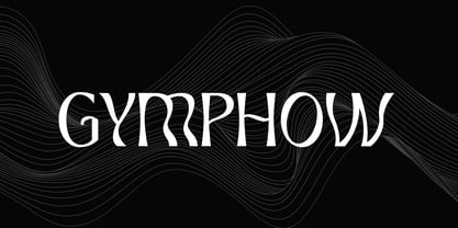 Introducing our new product the name is Gymphow Modern Serif Font Family comes with 9 different weights. Modern Sans Serif font that feels beautiful classy, elegant, and modern. This font is perfectly suited for a wide variety of projects, such as signature, stationery, logo, wedding, typography quotes, magazine or book covers, website headers, clothing, branding, packaging design, and more. Also for fashion-related branding or editorial design and displays both masculine and feminine qualities.
 - Black Asylum by KC Fonts,
$14.00 Black Asylum from KC Fonts is a handmade font that’s inspired by the title names of slasher horror movies of the 70’s and 80’s. Nothing else resembles it in the slightest, as it’s a font that demands respect, it’s a font that instills fear from deep within & it’s perfect for all of your horror needs! Black Asylum has an extended character set for multilingual support to scare the pants off of everyone worldwide!
 - DeLumary by FadeLine Studio,
$15.00 DeLumary is a new unique and funny display font. This font adopts a bold, cute, firm, and trendy style. Very suitable to meet your various design needs that are trending now. With a style like this, this font will be suitable in use for comics, logos, branding projects, homeware designs, product packaging, mugs, quotes, posters, shopping bags, t-shirts, book covers, name card, invitation cards, greeting cards, and all your other lovely projects.
 - DF Dudok by Dutchfonts,
$33.00 The DF Dudok is a minimal bitmap typeface which works very well in small sizes both on your screen and on paper. I am connected in a culinary way with the architects’ name W.M. Dudok. It was the first restaurant where I cooked under the critical eye of my chef Gerhard Braun. (Now La Stanza in Rotterdam) Well, it is incidently getting into my typeface work, the cook, the architect, his wife and...who knows
 - Susan by ParaType,
$30.00 An original text and display type family was designed for ParaType in 2007 by Manvel Shmavonyan. The face was named after the designer’s wife. This is an open sans serif font with soft letterforms distinguished by rounded details resembling rudimentary serifs. The family contains true italics developed like in humanist sans serif fonts. Susan is well suited for short and middle range text composing as well as for use in advertising and display typography.
 - Chicago Darling Serif by Gatype,
$14.00 Chicago Darling is a modern and classy minimalist design typography that features more alternative characters and lots of ties. Lifestyle friendly fonts with on-trend designs. The Chicago Darling is designed to be versatile, to match all your designs. This alternative makes the Chicago Darling very versatile. You can design beautiful, elegant and diverse typographic elements with it. It's perfect for logos, lettering artwork, t-shirt designs, editorial illustrations to name a few.
 - The Maggie Nut by Hydric Design,
$10.00 The Maggie Nut is a font with a retro style made to make your designs look more attractive. The Maggie Nut has 2 styles, namely Light (shining) and Regular, It will be very easy to use and will save you time on designing. The Maggie Nut also has many opentype features such as ligature, and alternate. This will be very suitable for use as a logo, poster, packaging, merchandise, social media & greeting cards.
 - Collage BB by Posterizer KG,
$24.00 Collage BB font was created for visual imitating of cuted paper Serif letters. The idea was to imitate kid’s clumsiness and irregular shape of letters. Good readability allows using this font for making some long texts. The font contains all the Latin and Cyrillic glyphs. BB - Bajina Bašta (Bašta in English means Garden) is the name of the small town where I spent my carefree childhood. That’s why I was inspired by Peter Pan.
 - The New Elegance by Great Studio,
$18.00 The New Elegance is a new editorial serif with all clean and soft lines, tight curves, and a trendy elegant look! The New Elegance has two versions of the font, namely serif & Sans Serif which are equipped with an italic version style, very suitable for your design needs such as very suitable for creating nostalgic designs but still clean and elegant such as headlines, magazines, logos, packaging, editorial, and much more. Thank you, Great Studio
 - Aestero by Craft Supply Co,
$20.00 Aestero Futuristic Typeface Cutting-Edge Inspiration Aestero Futuristic Typeface, drawing from Gundam and sci-fi aesthetics, embodies a cutting-edge design for a bold display impact. Sleek Sci-Fi Elegance Named Aestero, this font seamlessly blends Gundam inspiration with sci-fi elegance, presenting sleek characters with a futuristic charm. Dynamic and Bold Presence Aestero commands attention with dynamic and bold letterforms, making it an ideal choice for projects seeking a strong visual presence.
 - Roundy by Linotype,
$29.99Roundy was designed by F.K. Sallwey and appeared with Linotype in 1993. This calligraphy font is true to its name with its soft, round characters. The regular strokes give text an easy, relaxed feel. For variation and emphasis, Sallwey included swash capitals in this font. As initials, the swash characters add zest to texts and can be combined with other alphabets. The calligraphic elegance of Roundy is a perfect contrast to constructivist typefaces. - Vogue Sans by Fenotype,
$20.00 Vogue Sans is a luxurious high contrast sans serif well suited for fashion and haute couture design or glamorous headlines. Try typing any word or name with Vogue Sans and it'll look great. Vogue Sans is equipped with several interlocking ligatures - CC, CO, LA, LC, LL, LE, OO & TT. Vogue Sans also has Swash & Titling Alternates for letters A K L T X Q R and Stylistic Alternates for letters K and R. Go chic!
