6,770 search results
(0.011 seconds)
- Magic World by Mozatype,
$13.00 MAGIC WORLD is embodied in fun and joyfulness. It is a bold and thick lettered display font. This font is perfect for children-themed designs, especially when combined with bright colors. No matter the topic, this font will be an incredible asset to your fonts’ library, as it has the potential to elevate any creation. Get creative with its childlike playfulness, and use it to brighten up any kids and school project! Use this font for any crafting project that requires a personalized look! What’s Included : - Works on PC & Mac - Easy to use ( Installations ) - Compatibility Windows, Apple, Linux, Cricut, Silhouette, and Other cutting machines Thank you for purchasing this font. Please appreciate it, if you like this. ENJOY it :)
 - Edito by Wiescher Design,
$39.50 Edito is a completely new bodycopy font. The special thing about this font is, that all serifs have the same height. So no matter if you take the thinnest cut (A) or the fattest (F), you will always have aligning serifs. I started Edito as an experiment. I tried to enhance the classic and sturdy Times font. But I soon dicovered, that it would be more efficient to take only the basic idea behind Times (the robust design) and start from scratch. It turned out a real solid and useful typeface for everyday use. In due time I will add a couple of extra cuts. Yours in a journalistic mood Gert Wiescher
 - Old Sport JNL by Jeff Levine,
$29.00 The 1930s era French textbook on lettering "100 Alphabets Publicitaires déssinés par M. Moullet" featured a hand lettered chamfered alphabet with slab serifs reminiscent of sports lettering. Although intended for advertising and signage inspiration, only a partial lower case was illustrated along with the capitals and no numbers or other characters existed. These had to be created from scratch. The finished result is not only a bit of classic lettering from the past, but the font also doubles as a typeface with a sports look and feel. A traditional (rather than stylized) M and N are located on the solid bar key and the broken bar key respectively. Old Sport JNL is available in both regular and oblique versions.
 - Grandheron Sans by André Simard,
$11.99 If you are looking for a font with very good readability, even with its square appearance and condensed design, Grandheron is for you. You should find attractive the design of some glyphs like those one: a,f,k,l,v,y and also AJKMNVXY to name a few. Grandheron could be use as well in small size as in huge size. You will certainly like its Thin or Light font which give an awsome effect for titles, subtitles, caption for magazines related to fashion, architecture or even cultural in general. You could easily mix Grandheron with serif typeface as Harfang Pro. There is no limit to create great designs with this large typeface family, so enjoy!
 - Clearface Gothic by Linotype,
$29.99 Clearface Gothic first appeared in 1910, designed by Morris Fuller Benton, the world-famously prolific typeface artist. In addition to Clearface Gothic, Benton also designed classics like Franklin Gothic, Century Expanded, and many other types. Clearface Gothic is a sans serif face with light forms displaying the Zeitgeist of the turn of the 20th century. Distinguishing characteristics are the open forms of the a" and "c," the arched "k," and the upward-tilting horizontal stroke of the "e." The relatively narrow typeface, with its open inner white spaces, is extremely legible even in small point sizes. There is no accompanying italic. This digital version of Clearface Gothic was made in 1984 by the Linotype Design Studio."
 - Redsema by Twinletter,
$18.00 Looking for a unique, stylish, and fun font for your next project? Look no further than this one. Meet Redsema groovy font. With an anatomical shape between thin and thick lines, beautiful from any angle. It also features alternative lettering, ligatures, and decorative elements to add a unique flair to your work. Make the most of your designs using this font today! What’s Included : Standard glyphs Iso Latin 1 Simple installations We highly recommend using a program that supports OpenType features and Glyphs panels like many Adobe apps and Corel Draw, so you can see and access all Glyph variations. PUA Encoded Characters – Fully accessible without additional design software. Fonts include Multilingual support
 - Verathrine by Nathatype,
$29.00 Ready to enchant your audience and enhance your branding? A beautiful and spirited design like this is a great way to grab everyone’s attention! Wait no more, this beautiful font can be yours right now! Verathrine-A Handwritten Font This font is all about elegance and style. The curvature of the Verathrine was fully thought out to easily meld inside your designs. These fonts make a good foundation of what you want it to be! Great to be used on headings, logos, business cards, printed quotes, cards, packaging, resumes, and even your website or social media branding. Features: Ligatures Stylistic Sets Swashes PUA Encoded Numerals and Punctuation Thank you for downloading premium fonts from Nathatype
 - Dreams Note PS by pentagonistudio,
$14.00 Dreams Note Is A Modern Family Font Serif Including 8 Font Style. Font Features : Dreams Note Thin Dreams Note Extra Light Dreams Note Light Dreams Note Regular Dreams Note Medium Dreams Note Semi Bold Dreams Note Bold Dreams Note Black SOFTWARE REQUIREMENTS : Fonts and alternate: No special software is required they may be used in any basic program /website app that allows standard fonts That's it, folks! You can go ahead and get cracking :) Follow My Shop For Upcoming Updates Including Additional Glyphs And Language Support. And Please Message Me If You Want Your Language Included or If There Are Any Features or Glyph Requests, Feel Free to Send me A Message. Have a Good Day!
 - Melania by Letterhend,
$12.00 Melania is a script font that is created by natural hand writing and gives you the feminine touch that you've been looking for. The irregular spacing brings the personal and unique feels which is very suitable for signatures, wedding invitations, fashions, headlines, quotes, and more. It also comes in uppercase, lowercase, punctuations, symbols & numerals, stylistic set alternates, ligatures, and more, as well as including multi-lingual support. This font have 2 styles: Script and Monoline. The Script version gives you feel the brush stroke with thin and thick. The Monoline version gives you the consistency feel on every stroke, so it only has one weight from start to end, no weight difference.
 - Instant Harmony by Hanoded,
$15.00 Wouldn’t it be nice to have a pack of Instant Harmony in your cupboard? Just add water and *poof* - all strive and struggle have gone, having been replaced by peace and quiet. The grass seems greener, the sky bluer and the air smells like a fresh mowed lawn. Ahhhh! Zap! Back to reality. There is no instant harmony, don’t go looking for it in your local supermarket! If you want a taste of something resembling instant harmony, then add this super-duper font family to your collection and use it for your designs. You may find that your creativity levels are up, your morning coffee tastes better and your designs look exactly like you had in mind. Pinky promise!
 - My Left Hand by Breauhare,
$35.00 My Left Hand is exactly what it is...well, not my actual flesh-and-blood left hand but my actual handwriting, and I know that it really is My Left Hand because people tell me all the time, "You're left-handed!" When I hear people say that, it always reassures me that I am left-handed, in case I am ever doubtful about it. Five of the last eight U.S. presidents have been left-handed, so we're in good company, no matter which political party you're a fan of. This font has an appealing rough look at large sizes, but at smaller sizes it looks smooth as silk. Digitized by John Bomparte.
 - Steampunk by Kustomtype,
$25.00 The Steampunk font is inspired on sixties hand lettered French movie poster of Charles Bronson. This style of type is instantly associated with advertising and design for high-end products with a touch of Arts & Crafts. Steampunk is carefully drawn for quality and readability. Steampunk is great for display, logos, branding, packaging, advertising, food, sports, titles, film, tv, and more. Steampunk comes in 2 styles witch match perfectly together. Steampunk is a great display family with roots in the past century advertising and sign painting industry, and no wits but smooth polished wit hall the features a good designer needs. Steampunk is designed by Coert De Decker in 2018 and published by Kustomtype Font Foundry.
 - Latino Gothic by Latinotype,
$39.00 “Latino Gothic” is the result of two years of hard work by the Latinotype design team under the artistic direction of Alfonso García. We are really proud to present a superfamily with the magnitude and characteristics of "Latino Gothic". A very complete typographic font made up of no less than 90 styles. "Latino Gothic" offers a new interpretation of the original design totally focused on the needs of visual communication of the 21st century. «Latino Gothic» is designed to respond to the most varied communication needs thanks to its 5 widths and 9 weights, with their respective italics. 90 different styles make it the most versatile and complete gothic family on the market!
 - Senko Hanabi by Hanoded,
$15.00 Senko Hanabi (線香花火 - Japanese: incense-stick fireworks) is a type of Japanese sparkler. These traditional sparklers are said to evoke “mono no aware” - “an empathy toward things”; the flash of sadness when reminded of the fleeting nature of life. I am always a bit melancholic this time of the year, so when I created this font, I wanted to give it a suitable name. Senko Hanabi was made using a brush and Chinese ink. It is a beautiful font, which comes with stylistic alternates, discretionary ligatures and a sparkling amount of diacritics. Remains for me to wish you all a very happy new year. Let’s do our best to make it one worth remembering!
 - Albollón by Salsipuedes,
$16.00 In the last years our society has change a lot. Nowadays cities and countries are no longer static territories with well-drawn borders and a population perfectly defined. Globalization is a fact and the best consequence of it is the mixture of races, ideas and cultures, and this is exactly what this typography aims to show. Albollón is at once a semi-serif and a semi-sans serif typeface; it is a mixture made with the best parts from both sides. This way is how I understand a healthy society and a healthy design too. Albollón is designed to work in all types of text, both long and shorts, big and small ones.
 - Axaxax by Typodermic,
$11.95 Attention fellow beings of the universe, do you seek a typeface that embodies the essence of futuristic design? Look no further than Axaxax! With its detached, rounded lines reminiscent of neon tubes, plotters, circuitry, and lasers, this font will bring a touch of intergalactic flair to your message. The stark, precise design of Axaxax is perfect for those seeking a technologically advanced voice. Available in a variety of weights from Ultra-Light to Bold, Axaxax is the font of choice for those seeking to boldly go where no font has gone before. Most Latin-based European writing systems are supported, including the following languages. Afaan Oromo, Afar, Afrikaans, Albanian, Alsatian, Aromanian, Aymara, Bashkir (Latin), Basque, Belarusian (Latin), Bemba, Bikol, Bosnian, Breton, Cape Verdean, Creole, Catalan, Cebuano, Chamorro, Chavacano, Chichewa, Crimean Tatar (Latin), Croatian, Czech, Danish, Dawan, Dholuo, Dutch, English, Estonian, Faroese, Fijian, Filipino, Finnish, French, Frisian, Friulian, Gagauz (Latin), Galician, Ganda, Genoese, German, Greenlandic, Guadeloupean Creole, Haitian Creole, Hawaiian, Hiligaynon, Hungarian, Icelandic, Ilocano, Indonesian, Irish, Italian, Jamaican, Kaqchikel, Karakalpak (Latin), Kashubian, Kikongo, Kinyarwanda, Kirundi, Kurdish (Latin), Latvian, Lithuanian, Lombard, Low Saxon, Luxembourgish, Maasai, Makhuwa, Malay, Maltese, Māori, Moldovan, Montenegrin, Ndebele, Neapolitan, Norwegian, Novial, Occitan, Ossetian (Latin), Papiamento, Piedmontese, Polish, Portuguese, Quechua, Rarotongan, Romanian, Romansh, Sami, Sango, Saramaccan, Sardinian, Scottish Gaelic, Serbian (Latin), Shona, Sicilian, Silesian, Slovak, Slovenian, Somali, Sorbian, Sotho, Spanish, Swahili, Swazi, Swedish, Tagalog, Tahitian, Tetum, Tongan, Tshiluba, Tsonga, Tswana, Tumbuka, Turkish, Turkmen (Latin), Tuvaluan, Uzbek (Latin), Venetian, Vepsian, Võro, Walloon, Waray-Waray, Wayuu, Welsh, Wolof, Xhosa, Yapese, Zapotec Zulu and Zuni.
 - Hype vol 2 by Positype,
$20.00 Hype lives up to its name. An energetic attempt to blow past previous sans’ descriptive words of massive, large, extensive, super and others. Hype transcends the everyday marketing terms and rests solely atop them all with a jaw-dropping current offering of 432 fonts that spans 18 widths and 12 weights. Insert a long pause and mic drop here, because nothing compares. Hype Volume 2 includes 6 of the 18 subfamilies that comprise the full Hype Collection. Each of these subfamilies represent 1 of the 18 available widths and each width contains 12 weights and matching italics. Volume 2 contains 144 fonts. Families included in Volume 2: Hype 0200, Hype 0500, Hype 0800, Hype 1100, Hype 1400, and Hype 1700. If you would like to complete your collection be sure to view and purchase Hype vol 1 and Hype vol 3. Hype’s bombastic approach meant supplying everything it could within each typeface: including small caps, yes small caps, a full numeral set that includes inferiors and superiors, super- and subscripts, full fraction support, case-sensitive forms, stylistic alternate letterforms, and more while touting a full Western, Central and South Eastern European character support. Embracing a Univers-esque bravado and a willingness to push the envelope, Hype leaves even more room to grow. No corners were cut, no shortcuts taken with a focus on sensible, efficient letter construction and functional reliability that ignores any one classification and instead looks to form an amalgam of classic sans styles influenced by wood type, movie showcards, and urban industrial letterforms.
 - Hype vol 3 by Positype,
$20.00 Hype lives up to its name. An energetic attempt to blow past previous sans’ descriptive words of massive, large, extensive, super and others. Hype transcends the everyday marketing terms and rests solely atop them all with a jaw-dropping current offering of 432 fonts that spans 18 widths and 12 weights. Insert a long pause and mic drop here, because nothing compares. Hype Volume 3 includes 6 of the 18 subfamilies that comprise the full Hype Collection. Each of these subfamilies represent 1 of the 18 available widths and each width contains 12 weights and matching italics. Volume 3 contains 144 fonts. Families included in Volume 3: Hype 0300, Hype 0600, Hype 0900, Hype 1200, Hype 1500, and Hype 1800. If you would like to complete your collection be sure to view and purchase Hype vol 1 and Hype vol 2. Hype’s bombastic approach meant supplying everything it could within each typeface: including small caps, yes small caps, a full numeral set that includes inferiors and superiors, super- and subscripts, full fraction support, case-sensitive forms, stylistic alternate letterforms, and more while touting a full Western, Central and South Eastern European character support. Embracing a Univers-esque bravado and a willingness to push the envelope, Hype leaves even more room to grow. No corners were cut, no shortcuts taken with a focus on sensible, efficient letter construction and functional reliability that ignores any one classification and instead looks to form an amalgam of classic sans styles influenced by wood type, movie showcards, and urban industrial letterforms.
 - Francisco by Homelessfonts,
$49.00 Homelessfonts is an initiative by the Arrels foundation to support, raise awareness and bring some dignity to the life of homeless people in Barcelona Spain. Each of the fonts was carefully digitized from the handwriting of different homeless people who agreed to participate in this initiative. Please Note: these fonts include only the latin alphabet; no accented characters, no numbers or punctuation. MyFonts is pleased to donate all revenue from the sales of Homelessfonts to the Arrels foundation in support of their mission to provide the homeless people in Barcelona with a path to independence with accommodations, food, social and health care. The world is a very big place, the world is for travelling. And that’s what Francisco did, travel. Though born in Spain, he was raised in Brazil, where he worked as a graphic designer. He spent years hitchhiking round South America, his eagerness to see and learn new things preventing him from settling in one place. He returned to Spain an old man, to find his roots. Francisco never dreamed he’d end up in the street: “The experience of the street has taken away my vanity,” or that he would grow as a person there. “The only thing I’ve learnt in life is that in life you have to learn, because if you spend your life without learning you haven’t lived.” In Barcelona, the street changed his life and taught him just how tough it can be. Tough, but full of good people. He says that’s the best thing about the street.
 - Coranto 2 by TypeTogether,
$49.00 Now available as Opentype font with extended character set, Coranto 2. It is originally based on Unger’s typeface Paradox, and arose from a desire to transfer the elegance and refinement of that type to newsprint. Coranto 2 has a larger x-height and in many places has been made more robust. Over the past 25 years newspaper production has seen spectacular improvements in paper and print quality, the introduction of colour printing, and vastly better register. Newspaper production still demands a lot of letter forms, but advanced printing brings out details better and makes typography more appealing to readers. For text type the newspaper is no longer an environment in which survival is the chief assignment. Today, newspapers are not merely a matter of cheap grey paper, thin ink and super-fast rotary printing, and type design no longer has to focus on surviving the mechanical technology and providing elementary legibility. Now there is also room to create an ambience, to give a paper a clearer identity of its own; there is scope for precision and refinement. One consequence of this is that newspaper designers can now look beyond the traditional group of newsfaces. Conversely, a newsface can be used outside the newspaper — not an uncommon occurrence. The update to this beautiful font family, Coranto 2, includes the addition of over 250 glyphs featuring full Latin A language support, new ligatures, 4 sets of numerals, arbitrary fractions and superiors/inferiors. Furthermore, kerning was added and fine tuned for better performance.
 - Guillermo by Homelessfonts,
$49.00 Homelessfonts is an initiative by the Arrels foundation to support, raise awareness and bring some dignity to the life of homeless people in Barcelona Spain. Each of the fonts was carefully digitized from the handwriting of different homeless people who agreed to participate in this initiative. Please Note: these fonts include only the latin alphabet; no accented characters, no numbers or punctuation. MyFonts is pleased to donate all revenue from the sales of Homelessfonts to the Arrels foundation in support of their mission to provide the homeless people in Barcelona with a path to independence with accommodations, food, social and health care. Guillermo was born in Argentina. And after crossing four continents and travelling in more than twenty countries, he still has his accent. His luck ran out on the streets of Barcelona. But despite his circumstances, he hasn’t lost a bit of his wit or articulacy. “The worst thing about the street is something that touches your heart, your brain. Not being able to have sex, not having any privacy until it leaves you empty.” On the street he follows his passion for art and writing as best he can, using old cardboard when he can’t find paper and listening to the music that comes to him. His way of thinking and expressing himself leaves people wide-eyed and open-mouthed, but even so he admits he’s a solitary man. “Solitude is an individual word. A solitary type like me can’t bring the word solitude to the whole world.”
 - Encercle Draft by Typodermic,
$11.95 With Encercle Draft, you can create circles and other shapes containing numbers up to 999999. Here's how it works: hold shift and type the number of digits, followed by a number. If you want the number 25, hold shift, type 2 followed by 25. If you want the number 250, hold shift, type 3 followed by 250. You can also type letters, periods, slashes, hyphens, question marks and exclamation points. Create an inverse white-on-black effect using your application's Bold feature. Easily change shapes by selecting a different font style from your application's font menu. Encercle Draft is available in the following shapes. Circle Square Box (wide rectangle) Box with rounded ends (tab) Diamond Circle inside a diamond Hexagon Hexagon rotated Octagon Triangle up Triangle down Triangle right Triangle left Quote bubble with left tail Quote bubble with right tail Quote bubble with no no tail Cloud (thought bubble) Encercle Draft uses OpenType technology. Most current graphic design applications support basic OpenType features but there are a few exceptions including AutoCAD, SketchUp, Solidworks and Canva. Encercle Draft will work in Affinity, Inkscape, GIMP, Adobe apps (not Photoshop Elements), Microsoft apps (not Powerpoint), Sibelius and more. Encercle Draft includes a PDF manual with examples. There's also an advanced feature which allows you to create solid-colored backgrounds. For a thicker, sans-serif style, check out Encercle Sans. For more complex layered effects with a different selection of typefaces and shapes, check out Numbers with Rings. Encercle PDF user manual.
 - Hype Vol 1 by Positype,
$20.00 Hype lives up to its name. An energetic attempt to blow past previous sans’ descriptive words of massive, large, extensive, super and others. Hype transcends the everyday marketing terms and rests solely atop them all with a jaw-dropping current offering of 432 fonts that spans 18 widths and 12 weights. Insert a long pause and mic drop here, because nothing compares. Hype Volume 1 includes 6 of the 18 subfamilies that comprise the full Hype Collection. Each of these subfamilies represent 1 of the 18 available widths and each width contains 12 weights and matching italics. Volume 1 contains 144 fonts. Families included in Volume 1: Hype 0100, Hype 0400, Hype 0700, Hype 1000, Hype 1300, and Hype 1600. If you would like to complete your collection be sure to view and purchase Hype vol 2 and Hype vol 3. Hype’s bombastic approach meant supplying everything it could within each typeface: including small caps, yes small caps, a full numeral set that includes inferiors and superiors, super- and subscripts, full fraction support, case-sensitive forms, stylistic alternate letterforms, and more while touting a full Western, Central and South Eastern European character support. Embracing a Univers-esque bravado and a willingness to push the envelope, Hype leaves even more room to grow. No corners were cut, no shortcuts taken with a focus on sensible, efficient letter construction and functional reliability that ignores any one classification and instead looks to form an amalgam of classic sans styles influenced by wood type, movie showcards, and urban industrial letterforms.
 - Encercle Sans by Typodermic,
$11.95 With Encercle Sans, you can create circles and other shapes containing numbers up to 999999. Here's how it works: hold shift and type the number of digits, followed by a number. If you want the number 25, hold shift, type 2 followed by 25. If you want the number 250, hold shift, type 3 followed by 250. You can also type letters, periods, slashes, hyphens, question marks and exclamation points. Create an inverse white-on-black effect using your application's Bold feature. Easily change shapes by selecting a different font style from your application's font menu. Encercle Sans is available in the following shapes. Circle Square Box (wide rectangle) Box with rounded ends (tab) Diamond Circle inside a diamond Hexagon Hexagon rotated Octagon Triangle up Triangle down Triangle right Triangle left Quote bubble with left tail Quote bubble with right tail Quote bubble with no no tail Cloud (thought bubble) Encercle Sans uses OpenType technology. Most current graphic design applications support basic OpenType features but there are a few exceptions including AutoCAD, SketchUp, Solidworks and Canva. Encercle Sans will work in Affinity, Inkscape, GIMP, Adobe apps (not Photoshop Elements), Microsoft apps (not PowerPoint), Sibelius and more. Encercle Sans includes a PDF manual with examples. There's also an advanced feature which allows you to create solid-colored backgrounds. For a thinner, classic architecture/drafting style, check out Encercle Draft. For more complex layered effects with a different selection of typefaces and shapes, check out Numbers with Rings. Encercle PDF user manual.
 - Alisal by Monotype,
$29.99 Matthew Carter has been refining his design for Alisal for so long, he says, that when he was asked to complete the design for the Monotype Library, it was almost as if he were doing a historical revival of his own typeface. The illusion even extended to changes in his work process: although he now does all his preliminary and final drawing on screen, the first trial renderings of Alisal were done as pencil renderings. Alisal is best classified as an Italian old style design. Originally created between the late 15th and mid-16th centuries in northern Italy, the true Italian old styles were some of the first roman types. They tend to be the most calligraphic of serifed faces, with the axis of their curved strokes inclined to the left, as if drawn with a flat-tipped pen or brush. These designs offer sturdy, free-flowing and heavily bracketed serifs, short descenders, and a modest contrast in stroke weight. Alisal has nearly all the classic Italian old style character traits, plus a few quirks of its own. It is calligraphic in nature, with more of a pen-drawn quality than faces like Palatino or Goudy Old Style. It is more rough-hewn than either Goudy's Kennerley or Benton's Cloister, and is generally heavier in weight than most of the other Italian old style designs. One place where Alisal makes a clean break with traditional old style designs is in the serifs. While sturdy and clearly reflecting pen-drawn strokes, Alisal's serifs have no bracketing and appear to be straight strokes crossing the main vertical. Like Caslon or Trajanus, Alisal is a handsome design when viewed as a block of copy. Ascenders are tall and elegant, and serve as a counterpoint to the robust strength of the rest of the design. Alisal is available as a small family of roman and bold with a complementary italic for the basic roman weight, providing all that is needed for the majority of text typography. Alisal is not as well-known as some of Carter's other typefaces, but this lovely and long-incubated design was certainly worth the wait.
 - Lisbeth by TypeTogether,
$39.00 Louisa Fröhlich’s Lisbeth is the charming all-italic trailblazer that handles branding and text with internal vividness. With no roman style, it’s an italic-only family whose creation was guided by imagination instead of restrictive writing tools. Some type families aren’t sure what they want. Lisbeth proceeds with the utmost confidence on its own terms — it’s a feisty three-dimensional thespian amidst the cast of strait-laced characters you’re used to. With branding and magazine usage in mind, Lisbeth addresses the distinct challenges of text and display in a characterful way. The curves of the text weights show a soft angularity, emphasising the handwritten quality and the subtle twist inside the letters. The stroke’s carefully balanced contrast is more pronounced in the vibrant heavier weights but almost absent in the graceful structure of the thin weight. The angle of the letters is almost upright and the x-height is relatively large, so longer texts can be read comfortably and without effort. Lisbeth is slightly condensed and so uses a smaller area to efficiently impart much information. So if a type design can be thought of as the clothing letters wear, then Lisbeth is an energetic, freely flowing stroke wrapped around practical and efficient letter proportions. Another highlight of the family is the quirky high-contrast display style, easily catching every eye. The design concept of the twisted stroke shows at the extreme here and makes the letters dance a little on the page. Even though the shapes behave wildly, every letter is carefully balanced in itself so that the rhythmic repetition of the lettershapes results in an even and harmonic total picture. Lisbeth’s five text weights (from thin to bold) perform excellently in text settings, and its funky display style amps up the internal shimmer within each glyph. It supports numerous languages (Latin-A extended) and comes with ligatures and contextual alternates to produce beautiful typography. The character set contains proportional lining and oldstyle figures, tabular figures, subscripts, superscripts, and fractions. The complete Lisbeth family, along with our entire catalogue, has been optimised for today’s varied screen uses.
 - Bree by TypeTogether,
$37.50 The Bree font family is a spry sans serif by Veronika Burian and José Scaglione that delivers a spirited look and feel for branding and headline usage. As an upright italic, Bree shows a pleasant mix of rather unobtrusive capitals with more vivid lowercase letters, giving text a lively appearance. Bree is clearly influenced by handwriting. As such, some of its most characteristic features are the single-story ‘a’, the cursive ‘e’, the outstroke curves of ‘v’ and ‘w’, the flourished ‘Q’, and the fluid shapes of ‘g’, ‘y’, and ‘z’. Alternates of these letters are available when a more neutral look is desired. Bree has a touch of cheekiness, a wide stance for each character, and an extra-large x-height. All this adds up to a big personality, so even when set in small text there is no skimming past the words Bree voices. In 2019, the Bree font family got a huge update. A few shapes were updated or added (the ‘k’ and German capital ‘ß’), two entirely new weights were added (Book and Book Italic), and spacing was perfected. More than that, Vietnamese support was added to Bree Latin, and the Bree Greek and Bree Cyrillic scripts were designed from scratch to parallel the Latin’s tone. Additionally, Bree was designed in variable font format for those who want complete control over the font’s appearance while simultaneously saving digital weight in the form of kilobytes and megabytes. Bree is in the perfect position for the next digital revolution. The complete Bree font family, along with our entire catalogue, has been optimised for today’s varied screen uses. Bree has been chosen for such wide-ranging uses as Breast Cancer Awareness Month in the US, the branding for the country of Peru, and numerous layouts including mobile apps, magazines, newspapers, and books. Awards – Tipos Latinos exhibition 2008 – Several best-of-the-year typeface lists of 2008 MyFonts Top 10 Fonts of 2008 Smashing Magazine: 60 Brilliant Typefaces For Corporate Design https://www.smashingmagazine.com/2008/03/60-brilliant-typefaces-for-corporate-design/ Die besten Schriften 2008 http://www.fontwerk.com/619/die-besten-schriften-2008/ – Selected for Typographica’s Best Typefaces of 2008 – Won Bronze for Original Typeface in the 2009 European Design Awards
 - TE Warsh Tharwat Emara by Tharwat Emara,
$49.00 Introducing "TE Warsh Tharwat Emara," an exquisite Naskh font designed to elevate your typography to the next level. Our font features intricate calligraphic strokes, elegant curves, and graceful flourishes that bring a touch of sophistication and elegance to your text. Designed with the utmost attention to detail, every character in "TE Warsh Tharwat Emara" is beautifully crafted and easy to read. "TE Warsh Tharwat Emara" is perfect for typesetting the Holy Quran, with its beautifully crafted curves and strokes. The Naskh script is one of the most popular calligraphic styles used in Arabic typography and is known for its clarity, making it perfect for Quranic typesetting. With "TE Warsh Tharwat Emara," you can create stunning, high-quality typography that is perfect for publishing the Quran, as well as other religious texts. In addition to its suitability for Quranic typesetting, "TE Warsh Tharwat Emara" is versatile and can be used in a variety of contexts. Its elegant and sophisticated design makes it perfect for book covers, posters, branding, and web design. "TE Warsh Tharwat Emara" supports a wide range of languages, including Arabic, Persian, Urdu, and many others, making it ideal for multi-lingual projects. "TE Warsh Tharwat Emara" includes a range of special features that take your typography to the next level. The font includes ligatures and alternate characters, which allow you to create more natural and fluid connections between characters. The alternate characters provide a variety of stylistic choices, giving you even more control over the typography. "TE Warsh Tharwat Emara" is compatible with a wide range of platforms and software, including Adobe Creative Suite, Microsoft Office, and many others. This means that you can use "TE Warsh Tharwat Emara" in your favorite design software, without worrying about compatibility issues. "TE Warsh Tharwat Emara" comes with a multi-user perpetual license, which allows you to use it for commercial and personal projects. The perpetual license means that you can use the font indefinitely, without having to worry about renewing your license. We also offer a range of licensing options, including a single-user license, to suit your needs. In conclusion, "TE Warsh Tharwat Emara" is a must-have for designers and typographers who are looking to create stunning, high-quality typography that is perfect for publishing the Holy Quran, as well as other religious texts. With its intricate calligraphic strokes, elegant curves, and graceful flourishes, "TE Warsh Tharwat Emara" will elevate your typography to the next level. It's versatile, easy to use, and comes with a range of special features that make it perfect for all kinds of projects. So, whether you're designing book covers, posters, or websites, don't miss out on "TE Warsh Tharwat Emara." Purchase now and experience the beauty of our Naskh font for yourself.
 - Sirkle by Invasi Studio,
$19.00 Sirkle is a semi-serif typeface for display, constructed with sharp and curvy characters. All Letters are handcrafted and made to fit each other perfectly without exception, with a modern and edgy style that gives them a unique look. Sirkle comes with ligatures, alternates, and supports 60+ Latin-based languages. The Sirkle is ideal for logotype, signage, posters, packaging, and much more! Features: Uppercase & Lowercase Numerals & Punctuation Alternates and Ligatures Multilanguage Supports 60+ Latin based languages
 - Neo Phalanx by Zenmurai,
$18.00 Neo Phalanx is a rectangular, circular & curvy modern display sans inspired by Ancient Greek mass military formation. The difficulty of make this font is balancing rounded corner & sharp edge. There are letters like "M W A H R N K S Z" provides a unique personality in the title display. Numbering and punctuations also designed in unique styles to deliver different visual language. This font is suited for variety of applications from poster to branding, advertising, digital.
 - Verdure by Sanyukt Foundry,
$12.00 The roundness of fresh Dewey leaves, the bending branches of canopy trees and the curvy luscious greens of dense forests; are all the things that inspire this clean display font. Its effortless and natural aesthetic makes it perfect for organic and luxurious brands. The strokes have a great contrast to give it a beautiful end to a long journey. The easy and elegant flow of the font brings one back right into the comforting arms of nature.
 - Penicillin AOE by Astigmatic,
$19.95 Penicillin is a psuedo thematic/destructive typestyle, looking more like a grunge/deteriorated or stencil typestyle, but actually a typestyle made to look as if formed of bacteria cells. From the fungus that breeds the bacteria that heals, comes a highly readable typestyle to add a little offbeat degeneration look to any design. The end result, a little funky fungus of a font, easy to read and fun to look at...let Penicillin cure your design ailments!
 - Fortunelimes by Maulana Creative,
$13.00 Fortunelimes is curvy casual script font, with felt-tip stroke, slant and fun character. It has Opentype features ligatures of character, To give you an extra creative work. Fortunelimes script font support multilingual more than 100+ language. This font is good for logo design, Social media, Movie Titles, Books Titles, a short text even a long text letter and good for your secondary text font with sans or serif. Make a stunning work with Fortunelimes font. Cheers, MaulanaCreative
 - Addie by Jim Godfrey Design,
$19.95 This typeface is a monoline geometric script, meaning it has some qualities of scripts but is based on geometric shapes like ovals, circles, rectangles, etc. It is decorative and versatile and works well for projects that need to look both elegant or a little whimsical. There are 26 ligatures and 28 alternate glyphs that allow some of the letterforms to curl to the left or the right. Addie has been designed for use as a display typeface.
 - ITC Connectivities by ITC,
$29.99Some words from the designer... West coast artist Teri Kahan developed a "design font" of 68 pictographs capturing the sentiments of relationship, connection and synchronicity. Many of the characters were created with phrases in mind like, "handing you the world on a platter", "howling at the moon", and "message in a bottle". Others represent life experiences. The clean, simple illustration style originates from the look of hand-carved rubber stamps, and lends itself beautifully to logos and graphics. - Delegat by GRIN3 (Nowak),
$16.00 Delegat is a comic book lettering font inspired by handwritting of Frank Ching. The family includes Regular, Italic and Bold version. Delegat contains two variations for each letter and ligatures to swap out any two identical letters that appear next to one another for a pair that is slightly different. Delegat Extra can be used to disguise curse words in comics. Language support includes Western, Central and Eastern European character sets, as well as Baltic and Turkish languages.
 - Reverb by Carmel Type Co.,
$15.00 Designed with the gig poster in mind, Reverb is a throwback to the Fillmore West golden age of psychedelic rock and summertime fun. With 5 distinct weights, this workhorse of a display face has you covered from light and airy to bold and curvy. Concave stems. short descenders with a tall x-height, and a generous helping of stroke contrast define this humanist sans face that's built to shine as a headliner or to spice up some secondary copy.
 - Oilvare by Adam Ladd,
$25.00 Oilvare is a hand-drawn, layered typeface inspired by vintage painted signs and oil cans. While sturdy, it also has a softer side—wide proportions, oval-inspired forms, curled angle strokes, and a medium contrast all help give it a little bit of distinction from the typical sans serif. Mix, match, and layer the styles to your liking. Carefully drawn, when you enlarge the typefaces, the subtle irregularities become more apparent and harken to hand lettering of the past.
 - Cliquelly by Maulana Creative,
$12.00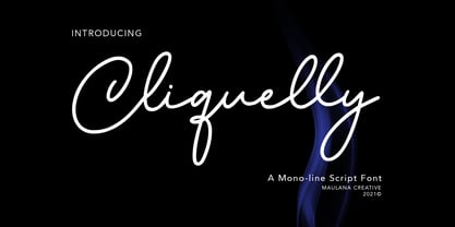 Cliquelly is a curvy script font, with a clean mono-line stroke, slanted and fun character. It has Opentype features ligatures of character, To give you an extra creative work. Cliquelly font support multilingual more than 100+ language. This font is good for logo design, Social media, Movie Titles, Books Titles, a short text even a long text letter and good for your secondary text font with sans or serif. Make a stunning work with Cliquelly font. Cheers, MaulanaCreative
 - Toothpaste by Eclectotype,
$15.00 Toothpaste is a font based on the idea of a continuous line creating connected script, as if written by a squeezed tube of toothpaste. Every letter and number connects, and there are 48 contextual alternate characters and ligatures to make the script flow even more smoothly. There's also some swirls and curls included as ornaments. This is a fun, decorative font. It would look good on kids' websites, scrapbooks, or maybe it's the perfect font for a dentist's logo.