10,000 search results
(0.035 seconds)
- Typist Code Mono by VanderKeur,
$25.00 The typeface Typist originated during an extensive research on the origin and development of typewriter typestyles. The first commercially manufactured typewriter came on the market in 1878 by Remington. The typestyles on these machines were only possible in capitals, the combination of capitals and lowercase came available around the end of the nineteenth century. Apart from a few exceptions, most typestyles had a fixed letter width and a more or less unambiguous design that resembled a thread-like structure. A lot of this mechanical structure was due to the method the typestyles were produced. Looking at type-specimens for print before the first typewriters were good enough to came on the market we can see that in 1853 and in 1882 Bruce’s Type Foundry already had printing type that had a structure of the typewriter typestyles. Of course printing types were proportional designed as typewriter typestyles had a fixed width. So it is possible that except from the method of production for typewriter typestyles, the design of printing types were copied. In the design of the Typist, the purpose was – next to the monospace feature – to include some of the features of the early typewriter typestyles. Features such as the ball terminals and the remarkable design of the letter Q. This new typeface laks the mechanical and cold look of the early typewriter typestyles. The Typist comes in six weights with matching italics in two versions. One that resembled the early typewriter typestyles (Typist Slab) and a version designed with coding programmers in mind (Typist Code).
 - AB Ticena by Andres Briganti,
$20.00 Elegant and idiosyncratic, AB Ticena is a display and extended typeface inspired by the ancient forms of Lombardic capitals. The sometimes quirky and capricious letterforms take their inspiration from medieval forms found in inscriptions and manuscripts where latin Roman capitals were taken to new stylistic and even extreme expressions. The ultra-wide horizontal proportions and its modulated, humanistic strokes gives it a more refined and contemporary edge. AB Ticena works best for logotypes, short and striking headlines, and editorial purposes. A set of ligatures and stylistic alternates is also available for selected characters and pairings.
 - Mitram by JAM Type Design,
$14.00 The Mitram family has 7 weights, ranging from Thin to ExtraBold (including italics) and is ideally suited for advertising and packaging, book text, logo, branding and creative industries, small text, way finding and signage as well as web and screen design. Mitram provides advanced typographical support with features such as ligatures, alternate characters, case-sensitive forms, fractions, and super—and subscript characters. It comes with a complete range of figure set options—old style and lining figures, each in tabular and proportional widths. The typeface supports Western, Central and South-Eastern European and Vietnamese languages.
 - Masio by IbraCreative,
$37.00 Masio is a vibrant and captivating display font that embodies the essence of fun and excitement. Its bold and exaggerated letterforms command attention and make a powerful visual statement. With its playful curves and dynamic angles, Masio injects a sense of energy and liveliness into any design. The exaggerated serifs and unique character shapes add a touch of whimsy and personality, making Masio an ideal choice for headlines, logos, and eye-catching signage. Whether used in print or digital mediums, Masio captivates viewers with its exuberant charm and creates a memorable and enjoyable visual experience.
 - Calevor by DM Studio,
$15.00 The Calevor Elegant Font is a sophisticated and refined typeface that embodies timeless beauty and a touch of class. With its graceful letterforms and stylish design, this font adds an air of elegance and professionalism to your branding, invitations, editorials, and various design projects. Features: Elegant and Timeless Style: The Calevor Elegant Font exudes a timeless and sophisticated aesthetic. Its graceful letterforms, balanced proportions, and stylish design create an atmosphere of refined elegance, making it perfect for projects that demand a touch of class and sophistication. Refined Design: The font's design is characterized by its clean lines and harmonious curves. It's meticulously crafted to ensure every detail reflects the epitome of elegance, making it suitable for projects that require a polished and professional look. Versatile Application: This font is versatile and well-suited for a wide range of design projects where an elegant and timeless typeface is needed. Use it in branding, invitations, editorial design, luxury packaging, and more to add an element of sophistication and class to your designs. Uppercase and Lowercase Letters: The font includes both uppercase and lowercase letters, providing flexibility and creative freedom in your designs. Mix and match the cases to create visually appealing and balanced typography. Punctuation and Symbols: In addition to the alphabet, the Calevor Elegant Font includes a comprehensive set of punctuation marks, numerals, and common symbols. This ensures consistency and ease of use when incorporating the font into your design projects. Easy to Use: Installing and utilizing the Calevor Elegant Font is hassle-free. It is compatible with both Windows and Mac operating systems and seamlessly integrates into popular design software such as Adobe Photoshop, Illustrator, and InDesign. This ensures a smooth and efficient design workflow. Elevate your designs with the timeless elegance of the Calevor Elegant Font. Let its graceful letterforms and refined design add an air of sophistication and professionalism to your branding, invitations, and various design projects. Embrace the classic beauty of this font and create designs that exude elegance and style.
 - Afrobeat Light by Resistenza,
$39.00 Inspiration The pounding tribal rhythms of Afrobeat music is expressed through this psychedelic brand new font, Afrobeat. Every letter becomes art as every letter is elegantly placed side by side, like music notes, creating music for the eyes. Afrobeat is a musical style performed by many African artists such as Fela Kuti, Femi Kuti, Antibalas and many more, which is a fusion of jazz,funk, and psychedelic rock, originating from the 60s and was based on the political movements of Nigeria. The Font This font is perfect for when you want to use eye-catching big texts for anything from posters and flyers for concerts, events, parties, to CD covers, advertisements, and art, but it´s especially striking for printed projects. Afrobeat Light thinks green Think green. With Afrobeat light you save up to more than 35% of your ink toner. Being green in no longer a luxury, but an an essential. By using Afrobeat light you openly demonstrate that your company integrates the 3 Ps into its operations: People, Planet. Profit. Go ahead - be green! Check out also the original ‘Afrobeat’
 - Open Book ING by Ingrimayne Type,
$9.00 OpenBookING is a gimmick or novelty font that has letters on pages of a book. It is caps only and monospaced. The letters on the upper-case keys are on the left-handed pages of an open book and the letters on the lower-case keys are the same letters but on the right-handed pages of an open book. One could alternate upper and lower case keys to get letters on complete books, but the Opentype feature of contextual alternatives (calt) does this automatically. Several previous typefaces from IngrimayneType used the calt feature to alternate shapes that fit together in an interlocking pattern, such as alternating concave and convex shapes. OpenBookING uses the calt feature in a different way, to alternate two halves of a symmetrical shape. To provide two copies of numbers and common symbols, some non-alphabetical characters are unavailable because their slots were taken by the second form of the number or common symbol. If stylistic set one (ss01) is turned on, spaces are replaced with empty pages. This may leave you with unwanted spaces at the end of lines, and to eliminate them, turn off the feature (or change the font) for these spaces. The empty pages can be used in a layer to add color to the text. There is also a second set of empty pages with a filled page that can also be used in layers. (See poster for examples.) These pages are on the (logicalnot multiply) and (register divide) characters for the first set and on the (ordmasculine ellipsis) and (macron trademark) keys for the second set. Finally, OpenBookING has a large set of accented characters if anyone should need them. The letters used on the books were derived from the font Myhota-Bold. For a related typeface of letters on book covers, see NewLibrary. OpenBookING has limited uses and is priced accordingly.
 - Rival Sans by Mostardesign,
$25.00 A sans serif with a dynamic look for complex typographic work. Rival Sans is a sans serif font family possessing many strengths. Its 32 fonts and 2 styles, make Rival Sans a very versatile family and suitable for many graphic design projects such as branding, signage, editorial creation, advertising, packaging, broadcasting or logo creation. With the endings cut at 10 degrees and sharp cuts on the top of the stems of certain characters (like the l, b or the d) Rival Sans gives dynamism and readability to the lengthiest of editorial content. This beveled font design also gives rhythm to a text's sentences as well as a very functional look. All these design details give this new font family a modern, energetic and humanistic look. Rival Sans also has many powerful OpenType features such as case sensitivite forms, small capitals, old style and tabular figures, slashed zero, ligatures, fractions,and alternative characters to give personality to graphic design projects. Designed also for complex editorial content, this typeface has a powerful home kerning system called "Pro Kerning". With more than 2500 pairs of glyphs and many languages, Pro Kerning optimizes headlines, subtitles, texts as well as long paragraphs in real time. In addition to these extended features, the italic styles of this fonts family have been drawn as fully-fledged styles with different designs from their regular version so that the italic texts look like calligraphic phrases. Rival Sans has an extended character set with over 930 glyphs. This family covers over 130 languages from Western Europe, Eastern Europe and Central Europe. In addition to all the features of its kind, Rival Sans is part of a very complete "type system" with style variants such as the serif version Rival Serif or the slab version Rival Slab. With all these typefaces, you have 62 styles to make your own vibrant and professional graphics or web creations while maintaining consistency in your creations.
 - Zamoka by Eraky,
$9.00 ZAMOKA font is a display font of 2 weights Regular and Rounded, ideally suited for advertising and packaging, festive occasions, editorial and publishing, logo, branding and creative industries, poster and billboards as well as web and screen design. ............................................................................ ZAMOKA font provides advanced typographical support with features such as ligatures, case-sensitive forms, fractions, super and subscript characters, and stylistic alternates. It comes with a complete range of figure set options – oldstyle and lining figures, each in tabular and proportional widths.
 - FF Eboy by FontFont,
$41.99 German type designer Kai Vermehr created this display FontFont between 1998 and 1999. The family has 12 weights and is ideally suited for advertising and packaging, film and tv, poster and billboards as well as software and gaming. FF Eboy provides advanced typographical support with features such as ligatures, case-sensitive forms, and super- and subscript characters. It comes with proportional lining figures.
 - Diamond by Monotype,
$29.99The Diamond Negative and Diamond Positive fonts feature sans serif capitals and figures in a diamond shaped background, in positive and negative form. Diamond Negative and Diamond Positive are useful in labelling, on invitations and certificates and for short headlines and intros in advertising. Diamond Bodoni features condensed Bodoni-style capitals and figures reversed on to a diamond shaped background. - Selini Display by Eliezer Grawe,
$9.00 Selini Display is a font that incorporates the classic and the modern: “mathematical” curves, classic proportions, thin body, needle-like serifs. It brings the lightness and modernity present in the Didot style, with more classic and wide forms. It is composed of capitals and small capitals, and an extensive set of ligatures, initial and terminal swashes. It came in five widths: condensed, semi condensed, regular, semi expanded and expanded. Selini Display is a thin, elegant and light font ideal, for luxury-related designs, traditional events, fashion magazines and brands and any material that needs a delicate, light and refined touch. Its use is recommended for large sizes and short texts, such as titles, logos, banners and posters.
 - FF Unit Rounded by FontFont,
$104.99 German type designer Erik Spiekermann and American type designer Christian Schwartz created this display and sans FontFont in 2008. The family has 6 weights, ranging from Light to Ultra and is ideally suited for advertising and packaging, editorial and publishing, logo, branding and creative industries, poster and billboards as well as wayfinding and signage. FF Unit Rounded provides advanced typographical support with features such as ligatures, small capitals, alternate characters, case-sensitive forms, fractions, and super- and subscript characters. It comes with a complete range of figure set options – oldstyle and lining figures, each in tabular and proportional widths. This FontFont is a member of the FF Unit super family, which also includes FF Unit and FF Unit Slab.
 - Pantra by Nicolas Deslé,
$19.90 Pantra is a minimal and clear geometric sans. Pantra is clear, approachable, and effective in both headings and paragraphs and comes in 4 weights: light, regular, medium and bold.
 - Ruthyne by DM Studio,
$25.00 The Ruthyne Handwritten Font is a captivating and versatile typeface that embodies the beauty and warmth of human handwriting. With its flowing strokes and authentic character, this font adds a personal and elegant touch to your designs, making it perfect for greeting cards, invitations, branding, and various creative projects. Features: 1. Authentic Handwritten Style: The Ruthyne Font captures the authenticity and charm of natural handwriting. Its flowing strokes and genuine character lend an intimate and genuine feel to your text, making it suitable for projects that require a personal and human touch. 2. Versatile Application: This font is versatile and well-suited for a wide range of design projects. Use it in greeting cards, invitations, social media graphics, branding materials, and more to add a touch of personal elegance to your designs. 3. Uppercase and Lowercase Letters: The font includes both uppercase and lowercase letters, providing flexibility and creative freedom in your designs. Mix and match the cases to create visually appealing and balanced typography. 4. Punctuation and Symbols: In addition to the alphabet, the Ruthyne Font includes a comprehensive set of punctuation marks, numerals, and common symbols. This ensures consistency and ease of use when incorporating the font into your design projects. 5. Ligatures and Special Characters: The font offers a variety of ligatures and special characters that add character and uniqueness to your text. These unique glyphs create interesting connections between letters and decorative elements, allowing you to create personalized and visually appealing typography. 6. Easy to Use: Installing and utilizing the Ruthyne Handwritten Font is user-friendly. It's compatible with both Windows and Mac operating systems and seamlessly integrates into popular design software such as Adobe Photoshop, Illustrator, and InDesign. This ensures a smooth and efficient design workflow. Elevate your designs with the authentic and personal touch of the Ruthyne Handwritten Font. Let its flowing strokes and genuine character add a touch of elegance and human warmth to your greeting cards, invitations, and branding materials. Embrace the natural beauty of this font and create designs that resonate with sincerity and authenticity.
 - HOH Forgetmenot by HOHOHtype,
$19.99 ‘Forgetmenot’ is a feminine handwritten font. It has a small x-height, and long descender. It was designed with applications such as advertising and packaging, editorial and publishing, logo, branding and creative industries, poster and social media, and marketing in mind.
 - FF Cartonnage by FontFont,
$41.99 Israeli type designer Yanek Iontef created this display FontFont between 2003 and 2011. The family contains 2 weights and is ideally suited for advertising and packaging, film and tv, logo, branding and creative industries, poster and billboards as well as sports. FF Cartonnage provides advanced typographical support with features such as ligatures, alternate characters, case-sensitive forms, fractions, super- and subscript characters, and stylistic alternates. It comes with proportional oldstyle and proportional lining figures.
 - Cattini Script by Eurotypo,
$22.00 Cattini Script is a casual and organic font, perfect combination between elegance and informality! The OpenType features include standard and contextual alternates, swatches, initial forms and ligatures. All this makes the text lively and bouncy, without the monotony of obviously repeated letterforms. Cattini font can be the option to create headlines, logos and posters for branding and packaging, invitations, greeting cards, magazines and book covers, children's material, fashion, and where you want it.
 - Grandison by Francev,
$10.00 The Grandison Family is a geometric sans-serif grotesque. Originally conceived as a font for logos. It has 9 weight ranges from Light to Black. It is ideal for advertising and packaging, editorial and publishing, logos, branding and creative industries, posters and billboards, small text, pathfinding and signage, and web and screen design. Grandison provides advanced typographic support with features such as case-sensitive forms, fractions, super-and subscript characters, and stylistic alternatives.
 - Samantha by Laura Worthington,
$75.00Samantha is a bright and cheerful font based on pointed-pen lettering and featuring slightly condensed characters and a measured rhythm. Samantha is available in upright or italic variants, each with regular and bold weights and features over 1,100 alternates and swash characters that vary in size and complexity. Samantha includes 60 ornaments and 45 catchwords, lining numerals and oldstyle and swash numerals. See what’s included! Upright, Upright Bold • Italic, Italic Bold *NOTE* Basic versions DO NOT include swashes, alternates or ornaments These fonts have been specially coded for access of all the swashes, alternates and ornaments without the need for professional design software! Info and instructions here: http://lauraworthingtontype.com/faqs/ - Tomato by Canada Type,
$22.95Tomato is the digitization and quite elaborate expansion of an early 1970s Franklin Photolettering film type called Viola Flare. This typeface is an obvious child of funk, the audio-visual revolution that swept America and put an end to the art nouveau period we now associate with the hippy era. Funk is of course little more than jazz with a chorus and an emphatic beat. Nevertheless, it became the definition of cool in the 1970s, thanks to blaxploitation movies with excellent soundtracks like Shaft and Superfly. Funk began as a commercial audio experience, then later expanded its signature to cover everything, from design to fashion to the later birth of disco, which is really a further simplification of funk. Funk had very strong and unique typographical elements, particularly a kind of titling with an essentially western, wooden core that suddenly changed and flared in unexpected areas until a very individual brand was achieved. Everything that can be tacked on to the alphabet was used towards that individuality. Things like curls, swirls, swashes, ligatures were always plentiful in funk, sometimes giving the titling a specific gender, sometimes bulging, sometimes speeding, sometimes fading in the distance, sometimes doing nothing but crazily aligning with other design elements, but the result was always a fascinating creature that seemed to invariably want to dance and have fun. Tomato was built in exactly that spirit. The original film type certainly had enough swashes and curls to be an unmistakable funk font in itself, but our further expansion of it cements it and makes it the definite font for the genre. With as many as 12 different possibilities for some letters, the designer's choices for a titling set in Tomato are virtually limitless. The Postscript and True Type versions of Tomato come in five fonts, including two fonts for alternates, one font for ligatures, and one font for swashes. These are split into two affordable packages. The entire family package is also available at an even more affordable price, and includes complimentary Cyrillic, Greek, Turkish, and Central European versions of Tomato. A Tomato Pro OpenType version is also available. It is a single font that includes over 650 characters, glued together with extensive programming for convenience of use in OpenType-friendly applications, where you can watch the letters morph and dance as you push the buttons and change the options of your OT palette. Now you know which font will come to mind when someone says the word "funky". - Weingut Script by FaceType,
$34.00 Blossoms, leaves, buds and tendrils create fragile objects of words and letters. · Weingut Script Flourish is a decorative display font with high contrasts, perfectly hand-drawn to the tiniest details. The font is trimmed to fairly large font sizes and is highly suitable for chapter titles or book jackets as well as Headlines, Invitations and wine labels :), although also impressing with an astounding legibility in small typesettings. Inspired by the handmade Blätterschrift from the 19th century Mettenleiter’s Schriftenmagazin, its basic structure is related to the English Script which makes it a perfect wedding font. The Weingut Family – noticable bouquet, beautiful structure with full fruit and a long finish. · Design with bicoloured capitals: In Weingut Script and Weingut Flourish, leaves and letters are available separately. You can stack them and apply different colours to the foreground and background. · Decoration and patterns: Weingut Swashes and Ornaments offers extra decorative elements in a separate font. Leaves, flourishes and borders available on their own or merged to ornaments. · Please make sure to use an application that supports the layering of text (two-coloured capitals) and OpenType features (contextual alternates). Be aware if you intend to combine Weingut Script Flourish and Weingut Flourish that these two do not go together. The floral outlines differ slightly and inaccurate overlaps will be the end result. · View other fonts from Georg Herold-Wildfellner: Sofa Serif | Sofa Sans | Mila Script Pro | Pinto | Supernett | Mr Moustache | Aeronaut | Ivory | Weingut · Language Report for Weingut Script / 151 languages supported: Abenaki, Afaan Oromo, Afar, Afrikaans, Albanian, Alsatian, Amis, Anuta, Aragonese, Aranese, Arrernte, Arvanitic, Asturian, Aymara, Basque, Bikol, Bislama, Breton, Cape Verdean, Catalan, Cebuano, Chamorro, Chavacano, Chickasaw, Cofan, Corsican, Danish, Dawan, Delaware, Dholuo, Drehu, Dutch, English, Estonian, Faroese, Fijian, Filipino, Finnish, Folkspraak, French, Frisian, Friulian, Galician, Genoese, German, Gooniyandi, Greenlandic, Guadeloupean, Gwichin, Haitian Creole, Han, Hiligaynon, Hopi, Icelandic, Ido, Ilocano, Indonesian, Interglossa, Interlingua, Irish, Italian, Jamaican, Javanese, Jerriais, Kala Lagaw Ya, Kapampangan, Kaqchikel, Kikongo, Kinyarwanda, Kiribati, Kirundi, Klingon, Latin, Latino Sine, Lojban, Lombard, Low Saxon, Luxembourgish, Makhuwa, Malay, Manx, Marquesan, Meriam Mir, Mohawk, Montagnais, Murrinhpatha, Nagamese Creole, Ndebele, Neapolitan, Ngiyambaa, Norwegian, Novial, Occidental, Occitan, Oshiwambo, Palauan, Papiamento, Piedmontese, Portuguese, Potawatomi, Qeqchi, Quechua, Rarotongan, Romansh, Rotokas, Sami Southern, Samoan, Sango, Saramaccan, Sardinian, Scottish Gaelic, Seri, Seychellois, Shawnee, Shona, Sicilian, Slovio, Somali, Sotho Northern, Sotho Southern, Spanish, Sranan, Sundanese, Swahili, Swazi, Swedish, Tagalog, Tetum, Tok Pisin, Tokelauan, Tshiluba, Tsonga, Tswana, Tumbuka, Tzotzil, Uzbek, Venetian, Volapuk, Voro, Walloon, Waraywaray, Warlpiri, Wayuu, Wikmungkan, Wiradjuri, Xhosa, Yapese, Yindjibarndi, Zapotec, Zulu, Zuni
 - We The People by K-Type,
$20.00 This typeface is extrapolated from the ‘We the People’ calligraphy of the handwritten US Constitution Preamble which employed a style based on German Text and Square Text exemplars from George Bickham’s penmanship copy-books, the most celebrated being The Universal Penman published in 1743. The original Constitution document was transcribed onto parchment by Jacob Shallus, a Pennsylvania Assistant Clerk, over a weekend in 1787. Shallus’s biographer, Arthur Plotnik (The Man Behind the Quill, 1987), notes that he was paid $30, a modest monthly wage at the time. He also suggests that the calligraphic headings, ‘We the People’ and ‘Article’, may have been inserted by Shallus’s 14 year old trainee son, Francis, “The manner in which the ‘Article’ headings are squeezed into the space Shallus allowed for them suggests a second hand—and perhaps not a very experienced one.” The unconventional backslant of the headings would seem to support this contention, and at the end of the document there is perhaps a novice’s inconsistency in the structure of the letter n between that used for ‘done’ and those used for ‘In Witness’. However, one has to admire the elegant swagger of the wavy t, h and l which the K-Type font extends to the b, f and k. Also, the simpler, Schwabacher-style W, an enlarged version of the lowercase w, is a little less flamboyant than the capital W from the German and Square texts in Bickham’s manuals. For designers using OpenType-aware applications, the typeface includes some Alternates, including a Bickham-style W, the letters t, h and n with added flourishes, two simpler forms of the A, and a few roman numerals for numbering articles. Also some ornamental flourishes and a round middle dot/decimal point. Punctuation marks are drawn in square, calligraphic style, but an alternative round period/full stop, for use with currency and numerals, is available at the period centered position (though placed on the baseline), accessed by Shift Option 9 on a Mac, or Alt 0183 on Windows. The full phrase, ‘We the People’, has been placed at the trademark keystroke and can be accessed by Option 2 (or Shift Option 2) on a Mac, or Alt 0153 on Windows. For designers who find the backslant awkward or unpleasant, the licensed typeface also includes two additional fonts which have a vertical aspect that may be more conducive to graphic design layouts. ‘We The People Upright’ and ‘We The People Upright Bold’ both retain the distinctive style, and the heavier weight is only slightly emboldened, just enough to add some punch.
 - Kiranna by Ably Creative,
$10.00 Kiranna is a classic handwritten font nd combination with Hand Lettering style. we make with personality touch every single curve. I hope this can make inspire you from your work. and a very bouncy. Ideal for logos, handwritten quotes, product packaging, header, poster, merchandise, social media & greeting cards.. This font is suitable for wedding invitation, branding, invitation, t-shirt, mailing and other suitable design you can think of. To enable the OpenType Stylistic alternates, you need a program that supports OpenType features such as Adobe Illustrator CS, Adobe Indesign & CorelDraw X6-X8. There are additional ways to access alternates, using Character Map (Windows), Nexus Font (Windows), Font Book (Mac) or a software program such as PopChar (for Windows and Mac).
 - Linotype Bix by Linotype,
$29.99Linotype Bix Plain, from Argentinian designer Victor Luis Garcia, is part of the Take Type Library, chosen from the entries of the 1999 International Digital Type Design Contest for inclusion on the Take Type 3 CD. The font is composed exclusively of capital letters. The figures have constructed basic forms and show the influence of the advertisement types of the 1920s, with all their well-mannered details. The lower sections of the graceful letters are white and set against a black background, the upper sections are black on white. This makes the overall picture look as though written on stripes and gives the delicate letter stability. The nostalgic-modern Linotype Bix Pleain is best for headlines in point sizes of 18 or larger. - Calling Cards by Ana's Fonts,
$12.00 Calling Cards is simple and clear, slightly condensed sans serif font family in 3 styles: Regular, Italic and Bold. Each font includes ligatures and stylistic alternates. Calling Cards looks great in quotes, logos, print, and social media, and is perfect for both short and long texts, at small and large font sizes.
 - Tom's Headache - Unknown license

- Fleur Bleue by DM Studio,
$30.00 The Fleur Bleue Beautiful Romantic Font is a graceful and elegant typeface that encapsulates the beauty and romance of delicate flowers. With its flowing letterforms and intricate details, this font brings a touch of sophistication and romance to your designs, making it perfect for wedding invitations, love letters, branding, and other projects that require a touch of enchantment. Features: Romantic and Elegant Style: The Fleur Bleue Font exudes a romantic and enchanting aesthetic. Its graceful letterforms and delicate details create an air of elegance and beauty, making it ideal for projects that require a touch of romance and sophistication. Beautiful Floral Design: The font’s intricate details and floral elements add a touch of enchantment and whimsy to your typography. It captures the essence of delicate flowers, bringing a sense of natural beauty to your designs. Versatile Application: This font is versatile and well-suited for various design projects that aim to evoke emotions of love and romance. Use it in wedding invitations, love letters, branding, packaging, and more to add a touch of beauty and enchantment to your designs. Uppercase and Lowercase Letters: The font includes both uppercase and lowercase letters, providing flexibility and creative freedom in your designs. Mix and match the cases to create visually appealing and harmonious typography. Stylistic Alternates: The Fleur Bleue Font offers a selection of stylistic alternates that enhance the visual interest of your text. These special characters create unique connections between letters and alternate forms, allowing you to create beautiful and captivating typography. Punctuation and Symbols: In addition to the alphabet, the Fleur Bleue Font includes a comprehensive set of punctuation marks, numerals, and common symbols. This ensures consistency and ease of use when incorporating the font into your design projects. Easy to Use: Installing and utilizing the Fleur Bleue Font is hassle-free. It is compatible with both Windows and Mac operating systems and seamlessly integrates into popular design software such as Adobe Photoshop, Illustrator, and InDesign. This ensures a smooth and efficient design workflow. Infuse your designs with the grace and romance of the Fleur Bleue Beautiful Romantic Font. Let its flowing letterforms and intricate details bring a touch of sophistication and enchantment to your wedding invitations, love letters, and branding. Embrace the timeless beauty of this font and create designs that evoke feelings of love and admiration.
 - Quanton by Mans Greback,
$49.00 Quanton is a clear serif typeface in a modern style. Its sharp edges and soft curves combines to the perfect balance of tradition and innovation. Quanton has character and personality, while keeping regular and maintaining its legibility, making for an optimal headline and bodytext style. The Quanton family consists of eight typeface styles: The weights Thin, Medium, Bold and Black, and each thickness as Italic. The font is built with advanced OpenType functionality and has a guaranteed top-notch quality, containing stylistic and contextual alternates, ligatures and more features; all to give you full control and customizability. It has extensive lingual support, covering Arabic and all Latin-based languages, from North Europe to South Africa, from America to South-East Asia. It contains all characters and symbols you'll ever need, including all punctuation and numbers.
 - Kiddy by Gaslight,
$20.00 Kiddy is simple and slightly rough on one side and light and funny on other side. Kiddy have two set initials (realised as Contextual and Titling Alternates) and numerous decorative elements.
 - FF Prater Serif by FontFont,
$62.99 German type designers Henning Wagenbreth and Steffen Sauerteig created this display and serif FontFont in 2000. The family contains 2 weights: Regular and Bold and is ideally suited for advertising and packaging, festive occasions, film and tv, editorial and publishing as well as poster and billboards. FF Prater Serif provides advanced typographical support with features such as ligatures, alternate characters, and case-sensitive forms. It comes with tabular lining and proportional lining figures. This FontFont is a member of the FF Prater super family, which also includes FF Prater Block, FF Prater Sans, and FF Prater Script.
 - FF Olsen by FontFont,
$65.99 Danish type designer Morten Olsen created this serif and slab FontFont in 2001. The family has 6 weights, ranging from Light to Bold (including italics) and is ideally suited for advertising and packaging, book text, editorial and publishing, logo, branding and creative industries, poster and billboards as well as web and screen design. FF Olsen provides advanced typographical support with features such as ligatures, small capitals, alternate characters, case-sensitive forms, fractions, and super- and subscript characters. It comes with a complete range of figure set options – oldstyle and lining figures, each in tabular and proportional widths.
 - FF Prater Sans by FontFont,
$62.99 German type designers Henning Wagenbreth and Steffen Sauerteig created this display and sans FontFont in 2000. The family contains 2 weights: Regular and Bold and is ideally suited for advertising and packaging, festive occasions, film and tv, editorial and publishing as well as poster and billboards. FF Prater Sans provides advanced typographical support with features such as ligatures, alternate characters, and case-sensitive forms. It comes with tabular lining and proportional lining figures. This FontFont is a member of the FF Prater super family, which also includes FF Prater Block, FF Prater Script, and FF Prater Serif.
 - FF Suhmo by FontFont,
$68.99 German type designer Alex Rütten created this serif and slab FontFont in 2010. The family has 8 weights, ranging from Light to Black (including italics) and is ideally suited for advertising and packaging, film and tv, editorial and publishing, logo, branding and creative industries as well as web and screen design. FF Suhmo provides advanced typographical support with features such as ligatures, small capitals, alternate characters, case-sensitive forms, fractions, and super- and subscript characters. It comes with a complete range of figure set options – oldstyle and lining figures, each in tabular and proportional widths. In 2011, FF Suhmo received the TDC2 award.
 - Iwan Zaza Arabic by Zaza type,
$29.00 Iwan Zaza is a high-contrast modern Arabic typeface designed by Ahmed Zaza. The design is inspired by the Kufi calligraphic style and influenced by the Naskh style. Iwan balances classic and contemporary tastes with wide open counters and short ascenders and descenders that minimize the hight. And has a high - contrast between the vertical and the horizontal to line up in harmony with Latin. And openType alternates and ligatures set. This makes it suitable for branding, editorial, packaging and advertising. Iwan features five weights from Light to Black, and supports OpenType features for Arabic, and has a wide glyph set.
 - Millik by Zealab Fonts Division,
$12.00 Millik is multipurpose and unique display font, you can use it in modern and vintage design. This font will suitable for any project, like branding, print template, logo and etc. Millik include uppercase and lowercase, ligature and alternate style,and also multilingual support.
 - Rigeko by Zealab Fonts Division,
$10.00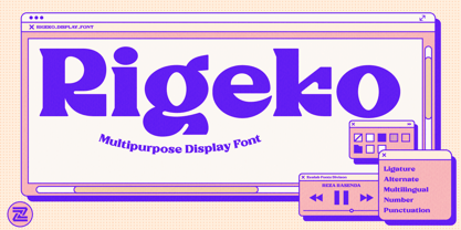 Rigeko is multipurpose and unique display font, you can use it in modern and vintage design. This font will suitable for any project, like branding, print template, logo and etc. Rigeko include uppercase and lowercase, ligature and alternate style, and also multilingual support.
 - Chillion by Zealab Fonts Division,
$10.00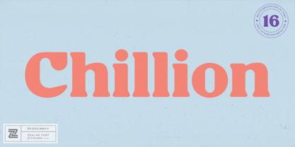 Chillion is multipurpose and unique display font, you can use it in modern and vintage design. This font will suitable for any project, like branding, print template, logo and etc. Chillion include uppercase and lowercase, ligature and alternate style,and also multilingual support.
 - Matao Serif by Identitype Co,
$15.00 Mataö is a bold and gorgeous and is great for headlines and elegant designs with a vintage and classic flair. Mataö's contrasting lines and curved terminals give a sleek, elegant look to logos, holiday cards, wedding invitations, quotes, advertisements, and more. Mataö is a versatile typeface that's full of character and one you'll come back to time and again. Make your awesome design layout with Mataö.
 - Sweet blink play by Sulthan Studio,
$10.00 Sweet Blink is a cute and friendly handwritten font duo that is perfect for creating charming and playful designs. Its delicate and whimsical letters feature playful curves and loops, giving it a warm and inviting personality. This font is perfect for invitations, greeting cards, and other projects that require a personal and charming touch. The font’s cute and friendly personality is sure to make viewers smile.
