10,000 search results
(0.122 seconds)
- Wingfead by Letterena Studios,
$17.00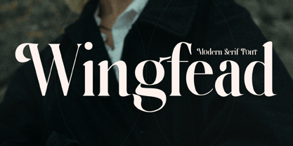 Wingfead is a bold and thick lettered serif font. It is perfect for any branding project such as logos, t-shirt printing, creative products, and more. Wingfead is PUA encoded which means you can access all glyphs and swashes with ease!
 - The Reyden by onlyfontyouandme,
$15.00 The Reyden is a retro and bold display font. This font is PUA encoded which means you can access all of the glyphs and alternates with ease! It would look great on headlines, magazines, logos, branding and so much more!
 - P22 Art Nouveau by P22 Type Foundry,
$24.95 The Art Nouveau styles of the late 19th century exhibited a bold approach to organic lines and lavish decoration. This new style was spread throughout the world and helped usher in a new era that led to modern art and design.
 - Highrise by Michael Hill Design,
$6.00Highrise is a sans serif typeface inspired by tall industrial structures. Works great as both bodycopy and logotype, as the lowercase is clear and concise, but the statuesque caps letters can grab full attention. Available in Regular, Light and Bold. - Bakari by Letteralle,
$18.00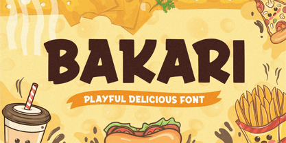 Introducing, Bakari! An attractive, bold, and playful display font. This font gives a charming and strong impression. Bakari is very suitable for various design needs such as merchandise, packaging, social media, ads, T-shirts, logos, events, and many more. Thank you!
 - Flared by Graphicfresh,
$25.00 A groovy, bold typeface that transports you back to the 70s and 80s. Its sleek curves and sharp angles evoke the spirit of neon signs and vintage design. Get ready to captivate with this striking font that exudes nostalgic coolness.
 - Dime by Produce,
$29.00 Intended to create a typeface that contain both two dimensional and three dimensional elements, Dime gives a very bold optical illusion effect. It is so intense and masculine that it is still macho in pink. Available in both Solid and Lined.
 - Racing Foner by Multype Studio,
$24.00 Racing Foner is a racing sport display font. A strong, bold and unique style instantly gives your design power and uniqueness. This font perfect font for sport or racing themed projects, such as logo, poster, games, product design and much more.
 - Dianda by RagamKata,
$14.00 Hello, new retro serif called Dianda! Dianda is a stylish font that is both retro and bold font. Works great for logos, magazine, social media. It come with a unique lower and uppercase plus numbers, punctuation & multilingual letters, alternates and ligatures.
 - Toma Sunny by Letterena Studios,
$17.00 Toma Sunny is a modern and classic serif font with a unique style and bold look. This typeface is perfect for an elegant & luxury logo, book or movie title design, fashion brand, magazine, clothes, lettering, quotes, and so much more.
 - Magical Night by Viswell,
$19.00 Magical Night is an another retro serif font inspired by classic sixties and seventies bold typeface, comes with alternate and ligature make this font more stylish with retro style. This font will be suit for heading, logotype, poster, and many more.
 - Astralaga by SG Type,
$19.00 Elegant, graceful, and timeless. Astralaga is a versatile font family with a timeless, classic appeal, over 50 alternates & ligatures and multilingual support. Every letter has been hand-drawn and crafted with the upmost care. The variety of weights provide a range of choices that will help you find the best typographic character for your project. All 5 weights are well-suited for large display uses and high impact headlines. The available stylistic alternates and ligatures offer a number of different options that give your project a unique look. This high contrast serif typeface features a total of 1850 glyphs and offers comprehensive language support. THE 5 WEIGHTS OF ASTRALAGA Astralaga Light – very delicate and elegant Astralaga Regular – a classic beauty with gorgeous shapes Astralaga Medium – a great midground between lights and bolds Astralaga Semibold – high contrast and high impact Astralaga Bold – pure boldness and elegance FEATURES 5 weights High contrast 40 ligatures per weight 11 alternate glyphs per weight 1850 glyphs Comprehensive language support OpenType features: Access All Alternates, Discretionary Ligatures, Fractions, Kerning, Standard Ligatures, Stylistic Alternates, Stylistic Set 1, Superscript
 - Times Eighteen by Linotype,
$29.00In 1931, The Times of London commissioned a new text type design from Stanley Morison and the Monotype Corporation, after Morison had written an article criticizing The Times for being badly printed and typographically behind the times. The new design was supervised by Stanley Morison and drawn by Victor Lardent, an artist from the advertising department of The Times. Morison used an older typeface, Plantin, as the basis for his design, but made revisions for legibility and economy of space (always important concerns for newspapers). As the old type used by the newspaper had been called Times Old Roman," Morison's revision became "Times New Roman." The Times of London debuted the new typeface in October 1932, and after one year the design was released for commercial sale. The Linotype version, called simply "Times," was optimized for line-casting technology, though the differences in the basic design are subtle. The typeface was very successful for the Times of London, which used a higher grade of newsprint than most newspapers. The better, whiter paper enhanced the new typeface's high degree of contrast and sharp serifs, and created a sparkling, modern look. In 1972, Walter Tracy designed Times Europa for The Times of London. This was a sturdier version, and it was needed to hold up to the newest demands of newspaper printing: faster presses and cheaper paper. In the United States, the Times font family has enjoyed popularity as a magazine and book type since the 1940s. Times continues to be very popular around the world because of its versatility and readability. And because it is a standard font on most computers and digital printers, it has become universally familiar as the office workhorse. Times™, Times™ Europa, and Times New Roman™ are sure bets for proposals, annual reports, office correspondence, magazines, and newspapers. Linotype offers many versions of this font: Times™ is the universal version of Times, used formerly as the matrices for the Linotype hot metal line-casting machines. The basic four weights of roman, italic, bold and bold italic are standard fonts on most printers. There are also small caps, Old style Figures, phonetic characters, and Central European characters. Times™ Ten is the version specially designed for smaller text (12 point and below); its characters are wider and the hairlines are a little stronger. Times Ten has many weights for Latin typography, as well as several weights for Central European, Cyrillic, and Greek typesetting. Times™ Eighteen is the headline version, ideal for point sizes of 18 and larger. The characters are subtly condensed and the hairlines are finer. Times™ Europa is the Walter Tracy re-design of 1972, its sturdier characters and open counterspaces maintain readability in rougher printing conditions. Times New Roman™ is the historic font version first drawn by Victor Lardent and Stanley Morison for the Monotype hot metal caster." - Times Europa LT by Linotype,
$29.99In 1931, The Times of London commissioned a new text type design from Stanley Morison and the Monotype Corporation, after Morison had written an article criticizing The Times for being badly printed and typographically behind the times. The new design was supervised by Stanley Morison and drawn by Victor Lardent, an artist from the advertising department of The Times. Morison used an older typeface, Plantin, as the basis for his design, but made revisions for legibility and economy of space (always important concerns for newspapers). As the old type used by the newspaper had been called Times Old Roman," Morison's revision became "Times New Roman." The Times of London debuted the new typeface in October 1932, and after one year the design was released for commercial sale. The Linotype version, called simply "Times," was optimized for line-casting technology, though the differences in the basic design are subtle. The typeface was very successful for the Times of London, which used a higher grade of newsprint than most newspapers. The better, whiter paper enhanced the new typeface's high degree of contrast and sharp serifs, and created a sparkling, modern look. In 1972, Walter Tracy designed Times Europa for The Times of London. This was a sturdier version, and it was needed to hold up to the newest demands of newspaper printing: faster presses and cheaper paper. In the United States, the Times font family has enjoyed popularity as a magazine and book type since the 1940s. Times continues to be very popular around the world because of its versatility and readability. And because it is a standard font on most computers and digital printers, it has become universally familiar as the office workhorse. Times™, Times™ Europa, and Times New Roman™ are sure bets for proposals, annual reports, office correspondence, magazines, and newspapers. Linotype offers many versions of this font: Times™ is the universal version of Times, used formerly as the matrices for the Linotype hot metal line-casting machines. The basic four weights of roman, italic, bold and bold italic are standard fonts on most printers. There are also small caps, Old style Figures, phonetic characters, and Central European characters. Times™ Ten is the version specially designed for smaller text (12 point and below); its characters are wider and the hairlines are a little stronger. Times Ten has many weights for Latin typography, as well as several weights for Central European, Cyrillic, and Greek typesetting. Times™ Eighteen is the headline version, ideal for point sizes of 18 and larger. The characters are subtly condensed and the hairlines are finer. Times™ Europa is the Walter Tracy re-design of 1972, its sturdier characters and open counterspaces maintain readability in rougher printing conditions. Times New Roman™ is the historic font version first drawn by Victor Lardent and Stanley Morison for the Monotype hot metal caster." - Times Ten by Linotype,
$40.99In 1931, The Times of London commissioned a new text type design from Stanley Morison and the Monotype Corporation, after Morison had written an article criticizing The Times for being badly printed and typographically behind the times. The new design was supervised by Stanley Morison and drawn by Victor Lardent, an artist from the advertising department of The Times. Morison used an older typeface, Plantin, as the basis for his design, but made revisions for legibility and economy of space (always important concerns for newspapers). As the old type used by the newspaper had been called Times Old Roman," Morison's revision became "Times New Roman." The Times of London debuted the new typeface in October 1932, and after one year the design was released for commercial sale. The Linotype version, called simply "Times," was optimized for line-casting technology, though the differences in the basic design are subtle. The typeface was very successful for the Times of London, which used a higher grade of newsprint than most newspapers. The better, whiter paper enhanced the new typeface's high degree of contrast and sharp serifs, and created a sparkling, modern look. In 1972, Walter Tracy designed Times Europa for The Times of London. This was a sturdier version, and it was needed to hold up to the newest demands of newspaper printing: faster presses and cheaper paper. In the United States, the Times font family has enjoyed popularity as a magazine and book type since the 1940s. Times continues to be very popular around the world because of its versatility and readability. And because it is a standard font on most computers and digital printers, it has become universally familiar as the office workhorse. Times™, Times™ Europa, and Times New Roman™ are sure bets for proposals, annual reports, office correspondence, magazines, and newspapers. Linotype offers many versions of this font: Times™ is the universal version of Times, used formerly as the matrices for the Linotype hot metal line-casting machines. The basic four weights of roman, italic, bold and bold italic are standard fonts on most printers. There are also small caps, Old style Figures, phonetic characters, and Central European characters. Times™ Ten is the version specially designed for smaller text (12 point and below); its characters are wider and the hairlines are a little stronger. Times Ten has many weights for Latin typography, as well as several weights for Central European, Cyrillic, and Greek typesetting. Times™ Eighteen is the headline version, ideal for point sizes of 18 and larger. The characters are subtly condensed and the hairlines are finer. Times™ Europa is the Walter Tracy re-design of 1972, its sturdier characters and open counterspaces maintain readability in rougher printing conditions. Times New Roman™ is the historic font version first drawn by Victor Lardent and Stanley Morison for the Monotype hot metal caster." - Times Ten Paneuropean by Linotype,
$92.99In 1931, The Times of London commissioned a new text type design from Stanley Morison and the Monotype Corporation, after Morison had written an article criticizing The Times for being badly printed and typographically behind the times. The new design was supervised by Stanley Morison and drawn by Victor Lardent, an artist from the advertising department of The Times. Morison used an older typeface, Plantin, as the basis for his design, but made revisions for legibility and economy of space (always important concerns for newspapers). As the old type used by the newspaper had been called Times Old Roman," Morison's revision became "Times New Roman." The Times of London debuted the new typeface in October 1932, and after one year the design was released for commercial sale. The Linotype version, called simply "Times," was optimized for line-casting technology, though the differences in the basic design are subtle. The typeface was very successful for the Times of London, which used a higher grade of newsprint than most newspapers. The better, whiter paper enhanced the new typeface's high degree of contrast and sharp serifs, and created a sparkling, modern look. In 1972, Walter Tracy designed Times Europa for The Times of London. This was a sturdier version, and it was needed to hold up to the newest demands of newspaper printing: faster presses and cheaper paper. In the United States, the Times font family has enjoyed popularity as a magazine and book type since the 1940s. Times continues to be very popular around the world because of its versatility and readability. And because it is a standard font on most computers and digital printers, it has become universally familiar as the office workhorse. Times™, Times™ Europa, and Times New Roman™ are sure bets for proposals, annual reports, office correspondence, magazines, and newspapers. Linotype offers many versions of this font: Times™ is the universal version of Times, used formerly as the matrices for the Linotype hot metal line-casting machines. The basic four weights of roman, italic, bold and bold italic are standard fonts on most printers. There are also small caps, Old style Figures, phonetic characters, and Central European characters. Times™ Ten is the version specially designed for smaller text (12 point and below); its characters are wider and the hairlines are a little stronger. Times Ten has many weights for Latin typography, as well as several weights for Central European, Cyrillic, and Greek typesetting. Times™ Eighteen is the headline version, ideal for point sizes of 18 and larger. The characters are subtly condensed and the hairlines are finer. Times™ Europa is the Walter Tracy re-design of 1972, its sturdier characters and open counterspaces maintain readability in rougher printing conditions. Times New Roman™ is the historic font version first drawn by Victor Lardent and Stanley Morison for the Monotype hot metal caster." - Times by Linotype,
$40.99In 1931, The Times of London commissioned a new text type design from Stanley Morison and the Monotype Corporation, after Morison had written an article criticizing The Times for being badly printed and typographically behind the times. The new design was supervised by Stanley Morison and drawn by Victor Lardent, an artist from the advertising department of The Times. Morison used an older typeface, Plantin, as the basis for his design, but made revisions for legibility and economy of space (always important concerns for newspapers). As the old type used by the newspaper had been called Times Old Roman," Morison's revision became "Times New Roman." The Times of London debuted the new typeface in October 1932, and after one year the design was released for commercial sale. The Linotype version, called simply "Times," was optimized for line-casting technology, though the differences in the basic design are subtle. The typeface was very successful for the Times of London, which used a higher grade of newsprint than most newspapers. The better, whiter paper enhanced the new typeface's high degree of contrast and sharp serifs, and created a sparkling, modern look. In 1972, Walter Tracy designed Times Europa for The Times of London. This was a sturdier version, and it was needed to hold up to the newest demands of newspaper printing: faster presses and cheaper paper. In the United States, the Times font family has enjoyed popularity as a magazine and book type since the 1940s. Times continues to be very popular around the world because of its versatility and readability. And because it is a standard font on most computers and digital printers, it has become universally familiar as the office workhorse. Times™, Times™ Europa, and Times New Roman™ are sure bets for proposals, annual reports, office correspondence, magazines, and newspapers. Linotype offers many versions of this font: Times™ is the universal version of Times, used formerly as the matrices for the Linotype hot metal line-casting machines. The basic four weights of roman, italic, bold and bold italic are standard fonts on most printers. There are also small caps, Old style Figures, phonetic characters, and Central European characters. Times™ Ten is the version specially designed for smaller text (12 point and below); its characters are wider and the hairlines are a little stronger. Times Ten has many weights for Latin typography, as well as several weights for Central European, Cyrillic, and Greek typesetting. Times™ Eighteen is the headline version, ideal for point sizes of 18 and larger. The characters are subtly condensed and the hairlines are finer. Times™ Europa is the Walter Tracy re-design of 1972, its sturdier characters and open counterspaces maintain readability in rougher printing conditions. Times New Roman™ is the historic font version first drawn by Victor Lardent and Stanley Morison for the Monotype hot metal caster." - Anultra Slab by Eclectotype,
$40.00 Anultra Slab is, you guessed it... An ultra bold slab serif! Anultra Slab is a hard hitting headliner, designed to be set LARGE. Because it's a single weight typeface, no compromises were necessary to get it interpolatable with other weights, so it is as bold and tight as I intended. Features include automatic fractions, case-sensitive forms, ligatures, stylistic alternates for non-descending J and Q, and a 3D 'xtrude' style, which can be layered behind the regular to create two colour, photo-lettering style text. Very seventies. Very cool. A companion typeface, Alight Slab , is available at the other end of the weight scale, but there are no weights in between. You're no middle-weight designer, so why use middle-weight fonts?!
 - SF Droob Pro by Sultan Fonts,
$19.99 Droob Pro is a Latin Arabic typeface for print and web, an upgraded version of the Droob7 font, featuring clarity and high readability. The Droob Pro font family contains two weights: Regular and Bold. This font supports Arabic, Latin, Farsi, Urdu, and Kurdish.
 - Leopoldo Sans by Tiposureño,
$25.00 Leopoldo Sans is a modern sans serif typeface. He has a small family and its members are: light, regular and bold. Each weight includes small caps, ligatures, and tabular numbers. It could work perfectly in your design, web, editorial and corporate works.
 - Edkies by Holis.Mjd,
$10.00 A cute chubby and bubbly font for your design projects. Edkies is one of the bold, cute and funky collection fonts, a unique style and a bit messy is the concept of this font, it is available in uppercase only and multilingual supports.
 - Lino by Kmaz,
$10.00 Lino is a unique typeface with elegant modern edge, designed by Khalid Al-Mazrouei and published by Kmaz. Lino packs a complete set of uppercase and lowercase letters, numbers and punctuation, it comes in 5 weights: Regular, Thin, Extra Thin, Bold and Solid.
 - Falcon Sport by QubaType,
$8.00 Falcon Sport is a square typeface with a bold, easy design. The typeface includes Latin and Cyrillic uppercase, numbers and punctuation. Falcon Sport comes two styles and includes italics. This typeface works great for logos (also sport logos), packaging and other display settings.
 - Junglegym by Atlantic Fonts,
$26.00 Junglegym provides a playful structure for an energetic project. Climb on and see what you can do! Junglegym family includes regular and bold and ensures extra movement with discretionary ligatures, including double letters and a handful of others to keep play lively.
 - Amity Signature by Lemonthe,
$13.00 Amity Signature is a stylish and versatile font family featuring four distinct weights: Light, Regular, Medium, and Bold. This collection offers an elegant impression and flexibility for all design needs, such as logos, branding, signatures, posters, labels, product packaging, invitation designs, and more.
 - Looney by Bhubbiberry Studio,
$16.00 Looney, a handmade font! This bold, free-flowing and casual font is designed to be easily customisable. Looney is a font which you can use and enjoy, for anything from promotional material and handwritten quotes, to product packaging, merchandise and branding projects.
 - Dutche by Craft Supply Co,
$20.00 Dutche: Boldly Defined Meet Dutche – Display Serif, where boldness takes center stage. This thick, low-contrast serif font stands out. Added serifs on stems enhance its masculine aura. It’s eye-catching, making a statement with every word. Masculine Appeal Dutche offers a sturdy, masculine look to your text. The extra serifs bring a unique toughness. Its bold nature catches the eye immediately. This font doesn’t just say; it declares. Furthermore, it works great for headlines and logos.
 - Andhibath by Sabrcreative,
$17.00 Introducing Andhibath Bold Script Font, a captivating script typeface that exudes elegance and versatility. With its bold strokes and graceful curves, this font is perfect for adding a touch of sophistication to your design projects. Whether you're creating invitations, branding materials, packaging, or any other creative work, Andhibath will elevate your designs with its unique charm. The Andhibath font features both uppercase and lowercase letters, allowing you to mix and match different letterforms for a customized look. It also includes numbers and punctuation, ensuring that your compositions are comprehensive and well-rounded. With multilingual support, you can effortlessly incorporate various languages into your designs, making it suitable for projects with a global reach. One of the standout features of Andhibath is its PUA encoding. This means that accessing the font's special ligatures and glyphs is a breeze, giving you even more creative possibilities. The ligatures add a natural and handcrafted feel to your text, enhancing its visual appeal. With its script style, Andhibath captures the essence of handwritten elegance. It is ideal for a wide range of design applications, from wedding stationery and logos to social media graphics and advertising materials. The versatility of this font allows you to adapt it to different themes and moods, whether you're aiming for a classic, modern, or whimsical look. Experience the beauty and versatility of Andhibath Bold Script Font. Let its graceful curves and bold presence make a lasting impression in your designs.
 - Prisma Grotesk by TOMO Fonts,
$20.00 Discover TOMO Prisma Grotesk, a contemporary typeface that beautifully blends elegance and functionality, making it perfect for a wide range of applications. This typeface is a polyglot of design, speaking the language of both modernity and classic taste, ideal for corporate branding and advertising. Its geometric construction and modest design lend a sense of understated sophistication. With its sans serif styling, Prisma Grotesk is incredibly legible, suitable for everything from body text to headlines. Whether you're crafting an editorial piece or designing a magazine layout, its neutral yet striking appearance adapts seamlessly. Designed for the digital age, Prisma Grotesk is a neo-grotesque typeface, providing flexibility and adaptability across various media. It's perfect for identity and package design, where a distinctive and memorable appearance is key. In the realm of branding, Prisma Grotesk stands out with its neo-grotesque style, offering a contemporary twist on the grotesk tradition. A casual, approachable feel, suitable for both corporate and creative environments. Prisma Grotesk is not just a font but a comprehensive tool for designers seeking a reliable, elegant, and functional typeface. Elevate your design work with Prisma Grotesk – where contemporary style meets classic elegance, and versatility meets functionality. This typeface is not just a choice; it's a statement in design excellence. www.tomofonts.com
 - Distance by Maulana Creative,
$14.00 Give your designs an authentic handcrafted feel. "Distance Bold Script Font" is perfectly suited to signature, stationery, logo, typography quotes, magazine or book cover, website header, clothing, branding, packaging design and more.
 - Lutfey by NamelaType,
$17.00 Lutfey is a chunky & cute typeface, visually featuring bold, firm and gentle characters. It’s has smooth lines on each side, especially on the outside, with subtle ink-trap details at every corner.
 - Keitana MF by Masterfont,
$59.00 A practical font family with 2 weights for all your day by day headlines, signage etc. An extended sans serif typeface with rounded endings that provides unique bold appearance without losing legibility.
 - Catalog JNL by Jeff Levine,
$29.00 Catalog JNL is based on a set of vintage wood type. Its uniform, block-style appearance is perfect for projects where bold, readable titling will apply. Available in regular and oblique styles.
 - Mariosa by Letterara,
$12.00 Mariosa is an elegant font with a romantic appeal; this font is for those who are in need of an elegant and appropriately modern calligraphy script. Get inspired by its bold swashes.
 - Grateful Everyday by Crumphand,
$12.00 Hello, Introducing Bold and Cute Fonts Grateful Everyday. this font rounded good for your Graphic. Frendly use, Easy to Read. What's Character Included ? Uppercase Lowercase Symbols Numerals Multilingual Support Thank You, Regards.
 - Gostyk by Saxofont,
$18.00 Gostyk is a bold and stylish font. Perfect for use in a variety of purposes, such as writing articles, magazines, branding projects or simply as stylish text to display on your screenshots.
 - Albeit Grotesk Caps by Cloud9 Type Dept,
$40.00 Albeit Grotesk Caps is a graphic geometric all caps display font family of four weights (Light, Regular, Medium and Bold) with slightly exaggarated diacritics for better readability making it ideal for headlines.
 - Rail Service JNL by Jeff Levine,
$29.00 The extra bold, squared Art Deco sans hand lettering found on a 1940s travel poster for the Pennsylvania Railroad inspired Rail Service JNL, which is available in both regular and oblique versions.
 - Outrage by AVP,
$19.00Outrage is highly disfigured to the verge of illegibility. The base font is Fiendstar Bold Condensed and the distress pattern is derived from a series of semi-abstract paintings. The result screams. - Chyali by Din Studio,
$29.00 Chyali is a bold script. It especially made for branding packaging especially for food packaging. the design can elevate your project design. Featured : Many Alternates Many Swash Multilingual Support Numerals and Punctuation