10,000 search results
(0.046 seconds)
- Maildore by Maulana Creative,
$15.00 Maildore is a soft round sans serif display font. With regular round edges stroke, fun character with a bit of ligatures. To give you an extra creative work. Maildore font support multilingual more than 100+ language. This font is good for logo design, Social media, Movie Titles, Books Titles, a short text even a long text letter and good for your secondary text font with sans or serif. Make a stunning work with Maildore font. Cheers, Maulana Creative
 - MC Cartinz by Maulana Creative,
$16.00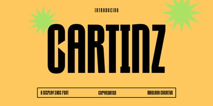 Cartinz is a modern sharp condensed sans display font. With bold consist stroke, fun character with a bit of ligatures and alternates. To give you an extra creative work. Cartinz font support multilingual more than 100+ language. This font is good for logo design, Social media, Movie Titles, Books Titles, a short text even a long text letter and good for your secondary text font with sans or serif. Make a stunning work with Cartinz font. Cheers, Maulana Creative
 - Salda Soft by Hurufatfont,
$19.00 Salda Soft; It is a modern sans serif family that blends old and new generation sans serif fonts in the same body. It has a wide usage area with its light narrow structure, soft and clean lines, humanist touches. It provides clean and smooth visuals in vertical screens, mobile applications and block texts. It consists of a total of 20 styles. Ideal for all kinds of editorial design, packaging, corporate identity, brand, application, web and desktop.
 - Coplette by Maulana Creative,
$15.00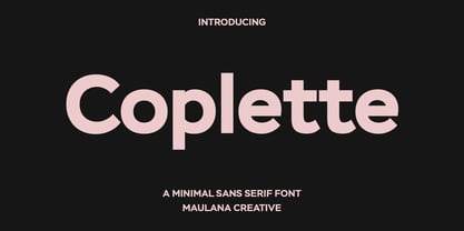 Coplette is a minimal semi geomtric shape sans serif font. With medium low contrast stroke, fun character with a bit of ligatures and alternates. To give you an extra creative work. Coplette font support multilingual more than 100+ language. This font is good for logo design, Social media, Movie Titles, Books Titles, a short text even a long text letter and good for your secondary text font with sans or serif. Make a stunning work with Coplette font.
 - WT Volkolak by Wraith Types,
$50.00 Volkolak is the ultimate serif-sans-grotesque tribrid, its numerous cuts will give you many options represent a typesetter's dream! Designed as one, it offers a serif, a contrasted sans serif and a grotesque style. The numerous typesetting options offered this way gives it a ton of usability and functionality in many different mediums, editorial design, books, magazines, posters, visual identity, web design... You won't find a project in which you can't use this true workhorse superfamily!
 - Rock Star by AlfaBravo,
$25.00 Rock Star is a original sans serif family with a distinct personality. The family has 36 font styles, ranging from ExtraLight to UltraBlack in normal and narrow styles (including italics). A wide range of weights and widths offering tremendous typographic flexibility. Rock Star is a contemporary typeface with roots in the past. It based on the sans-serifs of the late 19th and early 20th century. It would look great for corporate branding, in books and magazines.
 - Youngsters by UICreative,
$23.00 Introducing our new product the name is Youngsters Classy Display Sans Serif Font Family comes with 9 different weights. Modern Sans Serif font that feels beautiful classy, elegant, and modern. This font is perfectly suited for a wide variety of projects, such as signature, stationery, logo, wedding, typography quotes, magazine or book covers, website headers, clothing, branding, packaging design, and more. Also for fashion-related branding or editorial design and displays both masculine and feminine qualities.
 - Phonk by Slava Antipov,
$39.00 Phonk is a bold and wide sans serif. It's great for logos, packaging, posters, advertising and other tasks requiring strong and bold typography. The font family contains the following 4 styles: Regular, Regular Italic, Contrast, Contrast Italic. Contrast styles are characterized by increased readability in small font sizes. Phonk has very wide language support (80+ languages). The font includes Latin and Cyrillic scripts. I recommend you check out the new and improved version of this font! Phonk Sans
 - D Blues by W Type Foundry,
$29.00 D Blues its a sans serif typefamily of 9 weights plus matching italics. It is inspired by the neo humanist typefaces with a mix of 20st grotesque sans typeface. D Blues serve very well in web & print design areas, body text, excellent web-font legibility etc… D Blues is equipped with a complete set of opentype features including alternative glyphs, fractions, ligatures and many more. It is perfectly suited for highlighting lettering, magazines, web, interaction design, advertising & logotypes.
 - Darling Duo Script by Haksen,
$13.00 Darling Duo include two font styles with full set of handwritten style draw for script and cute style letters for sans. Numerals, a large range of punctuation and ligatures giving realistic hand-lettered style. In order to use the beautiful ligatures for script also all uppercase for sans serif, you need a program that supports OpenType features such as Adobe Illustrator CS, Adobe Photoshop CC, Adobe Indesign and Corel Draw. Thanks and have a great day :) Haksen
 - Lemmy by Maulana Creative,
$14.00 Lemmy is a simply rounded sans serif font. With bold stroke, fun character with a bit of ligatures and alternates. To give you an extra creative work. Lemmy font support multilingual more than 100+ language. This font is good for logo design, Social media, Movie Titles, Books Titles, a short text even a long text letter and good for your secondary text font with sans or serif. Make a stunning work with Lemmy font. Cheers, Maulana Creative
 - Magret by Maulana Creative,
$13.00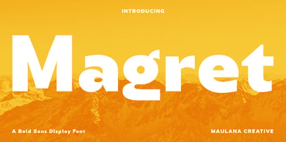 Magret is a unique eye-catchy sans serif font. With bold stroke, fun character with a bit of ligatures. To give you an extra creative work. Magret font support multilingual more than 100+ language. This font is good for logo design, Social media, Movie Titles, Books Titles, a short text even a long text letter and good for your secondary text font with sans or serif. Make a stunning work with Magret font. Cheers, Maulana Creative
 - Sardo by SD Fonts,
$34.00 Not serif, nor sans, partly soft, partly crude, but highly individual. Sardo comes with a vivid slanted look resulting from the contrast of its common classic stroke difference and straight thin serifs, adding a rigid component to its appearance. Thus Sardo shows a strong character projecting a huge amount of individuality. A new display font made to draw attention where classic serifs and sans serifs appear just dull. So please meet Sardo, a cosy wild cat showing Sharpe claws.
 - Malto by Maulana Creative,
$15.00 Malto is a condensed sans serif font. With semi bold soft edge stroke, fun character with a bit of ligatures and alternates. To give you an extra creative work. Malto font support multilingual more than 100+ language. This font is good for logo design, Social media, Movie Titles, Books Titles, a short text even a long text letter and good for your secondary text font with sans or serif. Make a stunning work with Malto font. Cheers, Maulana Creative
 - Kamerik 105 Cyrillic by Talbot Type,
$19.50 Based on the popular Talbot Type Kamerik 105 , this Cyrillic variation is now available for the first time. Kamerik 105 is inspired by the classic, geometric sans-serifs such as Futura and Avant Garde, but has shallower ascenders and descenders for a more compact look. It's a versatile, modern sans, highly legible as a text font and with a clean, elegant look as a display font at larger sizes. The Kamerik 105 Cyrillic family comprises of five weights.
 - Cresta by James Todd,
$40.00 Loaded with personality and functionality, Cresta is built to look good while surviving the worst conditions. It is at home on screen and in a magazine. Its six weights are intended to be used everywhere. Unlike most typefaces, Cresta was built without a reference. For this project, everything design choice was based on what worked best for a workhorse sans serif family. Cresta was originally created as the primary typeface for this website. This meant it needed to work in copy, headlines, and navigation across all devices, browsers and operating systems. This meant it needed to be sturdy and have enough character to make it stand out from other UI typefaces. With its large x-height, ample counters, and giant apertures, Cresta is meant for easy utility in rough conditions. Even with all of this, that doesnít mean that its dull; as the weights increase, the style of Cresta becomes more appearant. This style is defined most apparently by the terminals on the lowercase r and the angle of the joins between the curved and straight strokes (such as in the connection on the n).
 - FF Nort by FontFont,
$72.99 FF Nort™ has all the design attributes that make for an exceptionally versatile print and web typeface – and it benefits from a distinct personality. Equally at home in long-form text copy or billboard size headlines, the family knows few boundaries. There is also a handcrafted neo-grotesque quality to the design, giving FF Nort a friendly mien and separating it from other industrial strength sans serif typefaces. Terminals are clipped at 90° angles to the stroke and counters are slightly condensed, saving space with no loss of legibility. The light weights have a subtle elegance, while the bold are commanding. All eight weights, and their italic companions, enjoy a large character set, with support for most Central and several Eastern European languages – including Cyrillic and Greek. Drawn by Jörg Hemker, the inspiration for FF Nort came from Transport, the typeface designed for Britain’s highway signage. Transport is formal, intellectual, and a model for modern street signage, but it was not intended for small sizes or continuous reading. Hemker took the basic structure of Transport and rebuilt it into a design that’s perfect for a wide range of contemporary hardcopy and digital imaging projects.
 - Fixture by Sudtipos,
$39.00 Fixture is our massive 72-font take on plentiful offerings of the late 19th century’s typefaces, posters and wood letterpress sundry done in the Grotesk genre. Four widths ranging from Ultra Compressed to Expanded each come in nine weights and accompanying italics. Some common sans-serif alternates, such as the a and g, are included in all the fonts. The idea with this design was to put together a workhorse font family with enough functional flexibility to work in multiple environments, from the subtlety of magazine layout or film credits to the visual drama of billboards or packaging. Aesthetically speaking, it is quite interesting — though in retrospect quite unintentional — that each different width and/or weight of this face ended up pulling a different dominant trait from the melting-pot origins of the entire family. It’s almost like a tribute album to some famous band’s covers of older songs. It may also be a good conversation piece on our tools shaping the very things for which they’re used. Can’t really get any more post-Grotesk than this. In the 21st century, this is the one genre to rule them all.
 - Hornsea FC by Studio Fat Cat,
$18.00 Hornsea FC is a super condensed font family that designed for display purposes. 14 styles of Hornsea FC font will let you to explore more your creativity. Related keywords: modern font, branding font, logo font, magazine font, display font, packaging font, logotype font, contemporary font, elegant font, poster font, headline font, geomatric font, corporate font, serif font, sans serif font, classic font, advertising font, fashion font, editorial font, design font, vintage font, identity font, book font, text font, legible font, grotesk font, grotesque font, technical font, clean font, swiss font, webfont, web font, wordmark font, serif font, retro font luxury font, unique font, typography font, title font, playful font, signage font, german font, workhorse font, versatile font, neutral font, condensed font, expanded font, slab serif font, college font, sports font, sport font, slab font, football font, baseball font, athletic font, varsity font, soccer font, soccer font, basketball font, american font, ligatures font, wedding font, feminine font, classy font, chic font, script font, opentype font, contemporary font, oriq font, handwriting font, handwritten font, urban font, stylish font, fashion font, bold font, handmade font, casual font, trendy font, signature font, marker font, street font, font family,
 - MVB Solano Gothic by MVB,
$39.00MVB Solano Gothic Bold was originally designed as a display face for the City of Albany, California (located on the San Francisco Bay facing the Golden Gate Bridge and bordering Berkeley). Named for the City’s main street, the typeface needed to work on signage in proximity to early 20th Century buildings, and in contemporary settings. Rather than creating a neutered design to cover all bases, Mark van Bronkhorst chose to develop a simple, strong, condensed face that would offer flexibility of style by providing both retro and more contemporary forms. Solano Gothic has since been expanded to a family offering five weights from Light to Bold. The basic fonts provide upper- and lowercase forms, with figures designed to harmonize within upper- and lowercase settings (the standard figures are not full cap height). The same figures are provided with Small Caps, and align to small cap height. For all-cap settings requiring figures and monetary symbols of full-cap height, there are the “Cap” fonts. An alternate tabular “1” is provided in all fonts so that both fitted and tabular settings of figures are possible (access to alternate characters subject to system or application support). - Thorngumbald by Fettle Foundry,
$10.00 Thorngumbald is a quirky and playful sans-serif typeface designed to provide a high level of differentiion between glyphs, aiding with reading fro dyslexic and vision impaired users. It’s also a great option for any organistaion or designer looking to use something a little different. There are five weights, ranging from thin to black, with matching italics. Thorngumbald features 885 glyphs, supporting a large nuber of latin languages, with thorough kerning for accented character combinations, polish alternatives for acute accents, oldstyle and tabular figures, expanded currency symbols, contextual, discretionary, and standard ligatures, mathmatical symbols, contextual alternatives, and more. Thorough kerning has been undertaken for non-English languages, making Thorngumbald the perfect choice for organisations that need to display information in different latin-based languages. Originally launched in 2022, Thorngumbald has been through a robust process of updates and refinements and is stronger than ever. Originally featuring a core RIBBI font set, the family has grown to include additional styles for when the occasion calls for something extra. Language support includes: Bosnian, Catalan, Czech, Danish, German, English, Spanish, Estonian, Finnish, French, Irish, Croatian, Hungarian, Icelandic, Italian, Lithuanian, Latvian, Maltese, Dutch, Norwegian, Polish, Portuguese, Romanian, Slovak, Slovenian, Albanian, Swedish, Turkish.
 - MCapitals - 100% free

- Letterboard by Sunday Creative Co.,
$12.00 Creatives understand the compulsion to make something of worth. And each creative person has a toolbox they grab from often. Letterboard Lite is the narrow geometric sans that can headline or support whatever project is next on your list — the one unfussy tool you’ll use time and again. With its geometric shapes, Letterboard is a ground-floor sans that stabilizes the foundation upon which everything else will be built. It cements the context unobtrusively without begging to be acknowledged. Pair Letterboard with any script typeface and it will highlight that script’s qualities, whether capricious or elegant. Pair it with a serif or slab serif for an obvious change of tone: With a modern slab, trends will be respected, but it will act more coy with an old-school chunky slab. Letterboard’s geometry is easily subsumed as a partner to a range of serifs, from classics to the latest releases. These qualities and its narrowness make it easy for Letterboard to be used as a large display font in headlines or branding applications. Letterboard comes with 270 characters necessary for setting over 150 Latin-based languages: A–Z with diacritics, lining numerals, and the most common punctuation and symbols.
 - Standing Flower by Din Studio,
$25.00 A must have item for your design, here's the Standing Flower. Standing Flower is a handcrafted script font combined with a refined sans serif font which suit your needs. Together, these complementary fonts portray elegant and modern vibes. The script font has natural feel to it, thanks to the handwritten letters not always connecting-much like when someone is written in cursive for a while and adds their unique spin to it. Besides that, the sans serif brings a flare of modern and sense of elegance. The organic feel of this font duo is enhanced by the amazing features provided. Easy to work with and pleasant to look at what else can you possibly need? Features: Ligatures Stylistic Sets Multilingual Supports PUA Encoded Numerals and Punctuation It works perfectly for for many design projects, such as poster, logo, book cover, branding, heading, printed product, merchandise, quotes, social media campaign, etc. Learn more about how to use it by seeing the font preview. Thank you for purchasing our fonts. Please don’t hesitate to contact us, if you have any further question or issues. We’re happy to help. Happy Designing.
 - Fibra by Los Andes,
$26.00 The font is actually not a revival of ‘Avant Garde’—by Herb Lubalin—but it takes its spirit. Fibra is a geometric sans serif, yet without the typical structural strictness of these kind of fonts, that represents experimental type design. This can be seen in the contrast between curves and straight lines in some characters such as ’n’ and ‘h’ unlike rounded ones such as ‘a’ and ‘d’; details of some display characters (e.g. three upper terminals in ‘W’ and projection off the stem in ‘A’); and exaggerated terminal in ‘R’. All these features give Fibra a strong personality—a sans serif typeface that ‘gives you the chills’. Fibra was specially designed for display use. The font has a very generous x-height that allows for use in corporate text, thanks to its good readability. Fibra comes with 2 subfamilies—a more ’normal’ Basic family, with a smaller amount of stylistic features, for use in subheadings or any other type of text that requires formality, and an Alt family that shows off the true potential of the font, making it the perfect choice for magazine headlines, posters and logotypes.
 - Haboro Serif by insigne,
$- The polls are in. Now here by customer request--Haboro Serif, the newest edition of the Haboro Hyperfamily. The Haboro fonts are an outstanding upstart success from the first part of 2016. Following the release of the popular Haboro, Haboro Sans and Haboro Slab have both been welcomed additions to the family, too. Now, Haboro Serif continues to build on the base of these related designs. Serif maintains the unique, script-like terminals of the original. These terminals, along with the optimized stroke weight of this face, make it useful for text settings. Prefer standard serifs? These are also available as OpenType alternates within the font, giving you a wider variety of options without compromising its effectiveness in the same text settings.. Haboro Serif works with many other members of the Haboro family as well. Try the original Haboro for your headlines, and pair your Serif text with Haboro Sans for a balanced design that appeals to the reader. Add Serif to your box today, and try this all-around “Renaissance man” of a typeface for a touch of practical elegance on your next job.
 - Axeo by Asritype,
$13.00 Axeo is a freeform serif typeface. With more than 500 glyphs for each cut, Axeo supporting wide Latin Base Languages. The font structures is sans-serif typeface. Then, the fonts is made into serif (serifed) using rhombus and adapted/modified rhombus (before remove overlaps) placed on its appropriate positions. This fonts is released first, while the sans-serif is being in process. There are 10 fonts; 5 weight in normal width: Light, Regular, Medium, Bold, and Black; and 4 in semi-condensed: Light, Regular, Medium, Bold and Black, too. The fonts has some minor character variations, all are sets in SS01.There are also standard and discretionary ligatures, arrow, some geometric shapes and ornaments. With its sansserif structure, the Medium, Bold and Black fonts is playful with text effect in various applications such MS Word, CorelDraw or others to enhance the appearance. Its serif form will make unique enhancements. Thus, the fonts is suitable for Branding, logos, cards, advertisements, banners, display and more; for the main texts or its companions. While the light, regular and medium fonts can also be used as description text, card text, note, caption and longer non-formal texts or other usages.
 - Hoax by More Etc,
$18.00 Introducing Hoax – a pre-worn sans serif with spirit, personality and distinction. This bold and semi-condensed sans serif is inspired by old copy machines and vintage prints. It is lively and eye-catching, ideal for where and when you want to make a lasting impression. Hoax is a celebration of character, a tribute to curiosity. Use this typeface and let everyone know that you mean business. OPENTYPE FEATURES: This font includes over 40 discretionary ligatures of prepositions and common words in English. These OpenType features can be accessed using OpenType friendly applications that allow the use of discretionary ligatures and stylistic sets. MULTILINGUAL SUPPORT: With over 700 glyphs, it has support for more than 150 languages, including Cyrillic script. List of discretionary ligatures: AND, ARE, AT, BY, FOR, EST, FEAT., FROM, IN, IS, OF, ON, OR, OUR, THAN, THAT, THE, TO, WITH, YOUR, CO. Each word is available in both upright and slanted versions. How to use: Activate the discretionary ligatures as you normally do in your OpenType friendly application. When activated, the words are in upright versions. To access the slanted versions, activate the first stylistic set (“Slanted Ligatures”). Happy typing!
 - Areplos by Storm Type Foundry,
$53.00To design a text typeface "at the top with, at the bottom without" serifs was an idea which crossed my mind at the end of the sixties. I started from the fact that what one reads in the Latin alphabet is mainly the upper half of the letters, where good distinguishableness of the individual signs, and therefore, also good legibility, is aided by serifs. The first tests of the design, by which I checked up whether the basic principle could be used also for the then current technology of setting - for double-sign matrices -, were carried out in 1970. During the first half of the seventies I created first the basic design, then also the slanted Roman and the medium types. These drawings were not very successful. My greatest concern during this initial phase was the upper case A. I had to design it in such a way that the basic principle should be adhered to and the new alphabet, at the same time, should not look too complicated. The necessary prerequisite for a design of a new alphabet for double-sign matrices, i.e. to draw each letter of all the three fonts to the same width, did not agree with this typeface. What came to the greatest harm were the two styles used for emphasis: the italics even more than the medium type. That is why I fundamentally remodelled the basic design in 1980. In the course of this work I tried to forget about the previous technological limitations and to respect only the requirements then placed on typefaces intended for photosetting. As a matter of fact, this was not very difficult; this typeface was from the very beginning conceived in such a way as to have a large x-height of lower-case letters and upper serifs that could be joined without any problems in condensed setting. I gave much more thought to the proportional relations of the individual letters, the continuity of their outer and inner silhouettes, than to the requirements of their production. The greatest number of problems arose in the colour balancing of the individual signs, as it was necessary to achieve that the upper half of each letter should have a visual counterbalance in its lower, simpler half. Specifically, this meant to find the correct shape and degree of thickening of the lower parts of the letters. These had to counterbalance the upper parts of the letters emphasized by serifs, yet they should not look too romantic or decorative, for otherwise the typeface might lose its sober character. Also the shape, length and thickness of the upper serifs had to be resolved differently than in the previous design. In the seventies and at the beginning of the eighties a typeface conceived in this way, let alone one intended for setting of common texts in magazines and books, was to all intents and purposes an experiment with an uncertain end. At this time, before typographic postmodernism, it was not the custom to abandon in such typefaces the clear-cut formal categories, let alone to attempt to combine the serif and sans serif principles in a single design. I had already designed the basic, starting, alphabets of lower case and upper case letters with the intention to derive further styles from them, differing in colour and proportions. These fonts were not to serve merely for emphasis in the context of the basic design, but were to function, especially the bold versions, also as independent display alphabets. At this stage of my work it was, for a change, the upper case L that presented the greatest problem. Its lower left part had to counterbalance the symmetrical two-sided serif in the upper half of the letter. The ITC Company submitted this design to text tests, which, in their view, were successful. The director of this company Aaron Burns then invited me to add further styles, in order to create an entire, extensive typeface family. At that time, without the possibility to use a computer and given my other considerable workload, this was a task I could not manage. I tried to come back to this, by then already very large project, several times, but every time some other, at the moment very urgent, work diverted me from it. At the beginning of the nineties several alphabets appeared which were based on the same principle. It seemed to me that to continue working on my semi-finished designs was pointless. They were, therefore, abandoned until the spring of 2005, when František Štorm digitalized the basic design. František gave the typeface the working title Areplos and this name stuck. Then he made me add small capitals and the entire bold type, inducing me at the same time to consider what to do with the italics in order that they might be at least a little italic in character, and not merely slanted Roman alphabets, as was my original intention. In the course of the subsequent summer holidays, when the weather was bad, we met in his little cottage in South Bohemia, between two ponds, and resuscitated this more than twenty-five-years-old typeface. It was like this: We were drinking good tea, František worked on the computer, added accents and some remaining signs, inclined and interpolated, while I was looking over his shoulder. There is hardly any typeface that originated in a more harmonious setting. Solpera, summer 2005 I first encountered this typeface at the exhibition of Contemporary Czech Type Design in 1982. It was there, in the Portheim Summer Palace in Prague, that I, at the age of sixteen, decided to become a typographer. Having no knowledge about the technologies, the rules of construction of an alphabet or about cultural connections, I perceived Jan Solpera's typeface as the acme of excellence. Now, many years after, replete with experience of revitalization of typefaces of both living and deceased Czech type designers, I am able to compare their differing approaches. Jan Solpera put up a fight against the digital technology and exerted creative pressure to counteract my rather loose approach. Jan prepared dozens of fresh pencil drawings on thin sketching paper in which he elaborated in detail all the style-creating elements of the alphabet. I can say with full responsibility that I have never worked on anything as meticulous as the design of the Areplos typeface. I did not invent this name; it is the name of Jan Solpera's miniature publishing house, in which he issued for example an enchanting series of memoirs of a certain shopkeeper of Jindrichuv Hradec. The idea that the publishing house and the typeface might have the same name crossed my mind instinctively as a symbol of the original designation of Areplos - to serve for text setting. What you can see here originated in Trebon and in a cottage outside the village of Domanín - I even wanted to rename my firm to The Trebon Type Foundry. When mists enfold the pond and gloom pervades one's soul, the so-called typographic weather sets in - the time to sit, peer at the monitor and click the mouse, as also our students who were present would attest. Areplos is reminiscent of the essential inspirational period of a whole generation of Czech type designers - of the seventies and eighties, which were, however, at the same time the incubation period of my generation. I believe that this typeface will be received favourably, for it represents the better aspect of the eighties. Today, at the time when the infection by ITC typefaces has not been quite cured yet, it does absolutely no harm to remind ourselves of the high quality and timeless typefaces designed then in this country.In technical terms, this family consists of two times four OpenType designs, with five types of figures, ligatures and small capitals as well as an extensive assortment of both eastern and western diacritics. I can see as a basic text typeface of smaller periodicals and informative job-prints, a typeface usable for posters and programmes of various events, but also for corporate identity. Štorm, summer 2005 - Hagrid by Zetafonts,
$39.00 Crypto-typography - the passion for unknown, weird and unusual character shapes - is a disease commonly affecting type designers. Cosimo Lorenzo Pancini has celebrated it in this typeface family, aptly named Hagrid after the half-blood giant with a passion for cryptozoology described by R. K. Rowling in her Harry Potter books. Extreme optical corrections, calligraphic counter-spaces, inverted contrast, over-the-top overshoots: all the inventions that abound in vernacular and experimental typography have been lovingly collected in this mongrel sans serif family, carefully balancing quirky solutions and solid grotesque design. Hagrid is a typeface designed for editorial & display use, bringing dynamism to the printed and digital page thanks to its extreme contrast and unique details. It has been developed in a range of six display weights ranging from the monolinear and more traditional thin to the expressive heavy weight. For better readability in small sizes and on the web, a companion text family has been developed, with a slightly different selection of weights, wider metrics, and fine adjustments to keep the dynamic expressivity of the design without sacrificing legibility. This is evident in the design of italics: while the display italics sport a cursive feel with calligraphic terminals to lowercase letters, the text design is more restrained, with a more classical geometric grotesque slanted look. Given the crypto-typographer love for foreign specimens of letters, special care has been put into making Hagrid ready for multilingual projects, giving it an extended character sets covering over two hundred languages that use Latin, Cyrillic and Arabic alphabets and adding a selected range of OpenType features to handle alternate forms and stylistic sets.
 - Innerspring JNL by Jeff Levine,
$29.00 A silk screened sign promoting a mattress sale that was spotted on Flickr features Art Deco-influenced sans serif lettering that is the basis for Innerspring JNL.
 - Artica Lt by Green Type,
$28.00 Artica is an elegant sans serif typeface, offered in five weights. It was inspired by classic Roman letterforms. Artica Lt includes a Unicode Latin 1252 character set.
 - Valiante by Gerald Gallo,
$20.00 Valiante is a bold contemporary sans serif font. It is ideal for headlines, titles, branding, small blocks of text or wherever a fresh new look is desired.
 - Highriser by Nicolas Deslé,
$19.90 Highriser is a highly legible, uppercase-only bold condensed sans. Designed to be used for headlines, or visual identities, both digital and print. One weight, fits all.
 - Kal08 by Solokarir,
$15.00 Kal08 is a Sans Serif Font, this font consists of Uppercase, Lowercase Letters & multilingual support. Kal08 is perfect for Logotype, Print Design, labels, Products, Text, and more.
 - Richard Miller by Miller Type Foundry,
$19.00 Richard Miller started out as just a logo for a website/business card. It is a modular sans that works well in both print and web design.
 - Aborm by Nirmana Visual,
$19.00 Aborm a classy, contemporary of Sans Serif font, Inspired by 1980’s. Ideally suited for advertising and packaging, festive occasions, editorial and publishing, creative industries and posters.
 - Super Head Club by Fonts of Chaos,
$10.00 Super head Club is a font made with line. The shape of the letters is a sans-serif style round and bold. Works perfectly for vintage artworks.
 - Grunt Grotesk by Tkachenko design,
$30.00 Grunt Grotesk is a modern Ukrainian sans-serif typeface with a number of distinct characteristics, which make it unboring but still great in the massive text blocks.
 - Party Invite JNL by Jeff Levine,
$29.00 Party Invite JNL is a thin, condensed Art Deco sans based on lettering from a letterpress holiday stock cut (the predecessor to clip art) from the 1940s.
