10,000 search results
(0.018 seconds)
- Castle On The Hill by Hanoded,
$15.00 When I started working on this font, I had the radio on. Ed Sheeran was singing his song ‘Castle On The Hill’ and when I looked at this new font of mine, I couldn’t help but notice it had a bit of a medieval look. So I named it Castle On The Hill. COTH is a very lively, messy handpainted serif. It was made with a Japanese brush pen. I actually had a different look in mind, but this is what came out of the pen and I quite liked its looks. It is especially useful for children’s book covers, apps and posters, but be my guest and use it as you like. All it needs is a designers’ touch, a nice tune and a sunset.
 - Bulkr by Hackberry Font Foundry,
$24.95 Over the years, I've used Impact a lot. But, not because I liked it—rather because it was the only font I could find with the bulk I needed for a given title or whatever. I finally decided to make my own. It was originally built off Librum Sans Bold, but I quickly made a mask of Impact for the widths, bumped the x-height way up, made the horizontals much heavier, and on and on. You know how it is when you start designing. The result is a black sans with the bulk of Impact and much more interesting character shapes. I suspect I'll use it a lot. My hope is that you like it as much as I do. Have fun!
 - Coarse Grind by Hanoded,
$15.00 I bought a new coffee machine - the piston variety. It is shiny, made in Italy and I can make a killer espresso or latte with it. I usually start off the day with a pour over coffee and save my milky coffee for later. I also have two grinders: one for a coarse grind (pour over) and one for a finer grind (espresso and latte). Yes, you will probably say that it’s quite extravagant to have two grinders, but I do like my coffee! Anyways, this is what I thought of when I worked on Coarse Grind. Coarse Grind is a well balanced all caps display font. It comes with extensive language support and a set of alternates for the lower case letters.
 - Or Halevana MF by Masterfont,
$59.00 Pure romantic and personal with lots of grace and tender designed curves.
 - Fligerish by PizzaDude.dk,
$20.00Fligerish is a true romantic font, without being too fancy or swirly. - Novantico by Typofactura,
$14.00 Novantico is an all capitals typeface, influenced mainly by roman inscriptional capitals and renaissance typefaces. Classicly designed forms give text a noble and elegant feel. It is intended to be used for relatively short and important texts, titles, headings, quotes, etc.
 - Columna by Linotype,
$29.99Columna is an all-caps, Classical Roman-inspired typeface designed by the renowned Swiss typographer Max Caflisch (interesting fact: Columna is Caflisch's only typeface). Caflisch's Columna adds a stately elegance to any application, and is best used in large sizes. - Fifteen36 by Grummedia,
$24.00Inspired by 16th century Venetian roman book texts, Fifteen36 has a traditional elegance and lots of character. Whether used at larger sizes for headings or at book sizes with plenty of leading Fifteen36 has a very attractive old school letterpress appearance. - Sassoon Book by Sassoon-Williams,
$48.00 Semi-Serif Roman and Italic for typefaces for setting legible children’s reading books. A gentle introduction for young readers to seriffed letterforms they will encounter. Free to download resources: How to access Stylistic Sets of alternative letters in these fonts
 - Bluebeard by Canada Type,
$24.95Named after the famous French fairy tale, Bluebeard is a surprisingly legible, slightly worn-out mix of majestic blackletter majuscules and roman minuscules. Perfect for designs of old settings, like books of fairy tales, old war books, or anything historical. - Bushwhacked NF by Nick's Fonts,
$10.00Central Type Foundry of St. Louis issued this quirky little gem under the name of Quaint Roman around the turn of the twentieth century. This version is a little less gnarly than the original, but retains all of its eccentric charm. - Oddlini by sugargliderz,
$44.00 I have a lot of options to choose from, and it's hard to decide. For example, if I use "Thin" for the body text, I might make the title slightly larger and use "ExLight," and for the headings, I could use "Regular" or something similar. I could also stick to one font weight, like "Light," and differentiate the text using various sizes. This font is designed for enjoying the process of "indecisiveness," so please feel free to wander and deliberate extensively.
 - Fingerfood by Hanoded,
$15.00 I made this font using my index finger and Chinese ink. I thought the ink would come off easily, but I can tell you: it doesn’t. I have been walking around with a black stained finger for a week now and I do get strange looks from people every so often… Fingerfood, of course, is hand made. It is a rather playful font - all caps, but lower and upper case differ and like to mingle. Comes with a full diacritics palette.
 - Bosk Hand by Andrew Footit,
$12.00 Bosk Hand is a vintage inspired handmade display font family that consists of 4 fonts and 4 font elements. It has a raw and authentic look and feel about it and is great for those vintage, hand drawn typographic pieces. Use the elements to add a unique hand lettered touch to your layouts. This font family is versatile for use in desktop publications, packaging, logotypes that need that hand made authentic feel.
 - Calling Code by Dharma Type,
$- Calling Code — very nice monospaced font — 1. is a monospaced font family for coding and tabular layout. 2. simply consists of 4 style, Regular, Italic, Bold and Bold Italic. 3. is ready in both OpenType and TrueType formats. 4. has slightly condensed width for more useful space. 5. has good distinguishability and legibility and cute curly tails. 6. brings a fresh sensitivity to boring old existing monospaced fonts. You can try Regular style for free.
 - Calarosta by Chunlettering,
$10.00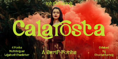 Calarosta - is a versatile unique, beautiful and clean serif font family, created with precision in each glyphs character. This font is perfect for logo branding, product designs, quotes, posters, display, website, invitation card, greeting card, headline, website, magazine, and your various other design projects with an outstanding style. Calarosta includes 4 weight styles which each include 225 glyphs. Features: 4 Font Weight Uppercase & Lowercase Multilingual Support Number & Punctuation Alternatives & Ligatures Thank you, for supporting us.
 - Yaro by VladB,
$24.00 Yaro is a modern sans serif geometric font, includes upper and lower case characters, Latin, Cyrillic, Latin Extended symbols and other. The Yaro family consists of 20 fonts, divided into 4 subgroups (according to the type of style - St, Op, Rg, Cut, Bl), and have the 4 types of thickness in each subgroup. Yaro fonts will be useful in developing a brand, creating posters and other graphic products, and for word processing.
 - Panderman by theulum studio,
$10.00 panderman is a simple modern san serif font with 4 font styles. Simplicity and modernity are the basis for making this font. Perfect for branding, logos, invitations, mastheads, and more. The panderman also includes the full set: Uppercase and Lowercase Multilingual Symbol Number Punctuation Alternative multilingual 4 font styles (Regular, Italic, Bold, & Bold Italic) Hope you enjoy our fonts and if you have any questions feel free to message & I'm happy to help. Thank you.
 - Rundeck by Edignwn Type,
$12.00 The Rundeck perfectly represents crafted stuff of serif display. This project was inspired by a beautiful retro music poster. The product includes 4 styles (regular, smooth, rough and texture). This matches applies in some designs such as the logotype, poster, label, badge, packaging, branding, and more custom design. Rundeck includes : 4 style typefaces (regular, smooth, rough and texture) Uppercase, lowercase, numeral, punctuation and symbol Multilingual PUA Encoded Thank you for your support and choosing us.
 - Rezerv by Gaslight,
$25.00 Reserv was inspired by a logo, which I crated for the company, EVROTERM. Once I saw this logo I asked myself: "Why not font based on this? In two or three weight?" For use in advertising and display typography.
 - Jelly Bean by Typadelic,
$19.00I attempted to emulate children's handwriting with this typeface. As a kid, I remember trying to create "fancy" handwriting and I ended up with something like Jelly Bean. Ideal for all designs where a happy uplifting look is desired. - De Rotterdam by Roland Hüse Design,
$20.00 This font is a clean, modern sans serif bold. Named after “De Rotterdam”* this huge and super cool building (read the story below). Great for headlines, Posters, Flyers but also well legible at small size in large texts. Contains All European language accents and characters. --- The Story --- *This complex is located in the Kop Van Zuid district of Rotterdam, on Wilhelminapier. I was lucky to see this building from the beginning (2009) growing up (2013) That time when I was working and living here. I was always amazed by the design and how huge it is every time I took a look at it while driving or walking on the Erasmus Bridge. When I was going to work or just hiking around the city. It has a special meaning and message for me: I started creating fonts in my free time in 2010 when I came to this city to work. I was factory worker, dishwasher etc. I grew together with this amazing construction from brick to brick, step by step. By the time its construction finished, I was able to quit my day job and become a full time freelance designer.
 - Bangkok Restless by Roland Hüse Design,
$25.00 I have been walking around the streets of Bangkok with my good old film camera taking photos the way like back in the day. I think there is something magical and authentic in it. Guess what, the first day I went out with that camera I stumbled upon a place is called Fotoclub BKK they develop film rolls how cool is that! I shoot all the 36 photos at the Silom area, taking random photos most came out off centred subject, wrong settings, blurry just like the way I wanted! Soon after I was working on a handwritten script that is a perfect match to the overall topic of my stay in Bangkok so I named it after this exceptional adventure I have had here. The font contains all European diacritics and special characters, some double letter ligatures and stylistic alternates for better flow and more organic and natural look. I hope you guys like it and it will add some spiciness to your next creative project! Any feedback or questions, character request please don't hesitate to contact me either in email or on social.
 - Square Beat by Hanoded,
$15.00 After a lot of time sitting at my desk, creating fonts and trying to figure out how my new software works, I really like to work out a bit. The only thing that I do not like is the music they play at the gym; it is usually a selection of poppy tunes that appeals to a large audience. But not to me. I prefer my death metal - and eighties music, as it brings back a lot of good memories. So, I bought myself some ear buds and installed a music streaming app on my phone. Yes, I know, I am probably the last person on earth who discovered streaming... One day, during a workout session, I listened to a list of eighties music and one song that I had forgotten about started playing: Rappers Delight by The Sugarhill Gang. When I started working on the font, I had to think about the song and named it Square Beat. Square Beat font, other than the name implies, is a rounded, handmade font, ideally suited for books and magazines aimed at a young audience, toy packaging or posters. It comes with great language support, including Vietnamese.
 - Spacy Avocado by PizzaDude.dk,
$15.00 Due to some grease on a menu, I misread "Spicy Avocado" as "Spacy Avocado" which led me to the name of this font. I love Avocados and I love things that are a bit spacy, and I love the combination of these two! Space Avocado is my handdrawn, layered headline font. Mix the layers or use them as a single font - you choose!
 - Brush With Death by Cyberian Khatru,
$20.00 This font was made possible by creating a custom brush in Illustrator. I started with a flat brush dipped in India ink to create the stroke. From a scan of that stroke I made a vector tracing which I then I altered as necessary to get the desired dimensions. The lower case letters have a thinner stroke than the capitals.
 - Sauerkrauto Pro by Martin Lexelius Core,
$33.00 In the late 90’s, there were many German cars coming into Malmö (where I lived at the time). I was blown away by the font on the license plates. So strange, so strong, peculiar – but still macho. I built the uppercase from my own photos. After this I completed the font with my own lowercase, small caps and punctuation.
 - Crowd Pleaser by Hanoded,
$15.00 Crowd Pleaser is a pleasant, handmade font. I hoped its lively looks, slightly crooked glyphs and overall happy appearance would appeal to many people - so I named it Crowd Pleaser. Well… not entirely true, as I have a list of font names and Crowd Pleaser was the next one up… ;-) I do hope, however, that you will like this font!
 - Neue Haas Unica by Linotype,
$53.99 The Neue Haas Unica™ family is an extended, reimagined version of the Haas Unica® design, a Helvetica® alternative that achieved near mythical status in the type community before it virtually disappeared. Originally released in 1980 by the Haas Type Foundry and designed by Team ’77 — André Gürtler, Erich Gschwind and Christian Mengelt— for phototypesetting technology of the day, the design was never successfully updated for today’s digital environments – until now. Toshi Omagari of Monotype Studio has given this classic a fresh, digital facelift with more weights, more languages and more letters to meet today’s digital and print needs. Available in 18 styles, the Neue Haas Unica family is remarkably appropriate for a wide range of applications, possessing a delicate gradation of weights and clear character shapes. The family's lighter weights are perfect for headlines and other large settings, as well as small blocks of copy at typical text sizes. The regular, medium and bold weights know no boundaries and the heavy and black designs are ideal for when typography needs to be powerful and commanding. Like the Neue Helvetica and Univers Next typefaces, the Neue Haas Unica family can be used just about anywhere – or for any project. In addition to its 9 tailored weights and complementary italics, the Neue Haas Unica family also possesses additional characters for Eastern and Central European, Greek and Cyrillic language support, which did not exist in the original design. A cosmopolitan typeface for today's modern, discerning design needs, the Neue Haas Unica collection is a new classic in the making—one that every designer should surely have at their disposal.
 - Super Sabretooth by Set Sail Studios,
$13.00 Take your typography to the next level with Super Sabretooth. A vigorous, rebellious brush font designed to bring the noise, start the fun, and leave any inhibitions at the door. It pushes lettering limits to the extreme and breaks down any boundaries on it's journey there. Super Sabretooth is packed full of great features & added extras, providing everything you need to create highly charged typography designs. Here's what this family consists of: Super Sabretooth • A high energy brush font containing upper & lowercase characters, numerals and a large range of punctuation. Super Sabretooth All Caps • This is a second version of Super Sabretooth, with all lowercase characters replaced with a brand new set of small-caps. Use this font as a larger & louder alternative to the regular version. Quick Tip! If you want more freedom, you can combine the two font sets together to create truly awesome customised typography, they will work in harmony as well as being strong standalone fonts. There are no rules with it - play around, mix it up, have fun, and enjoy the ride! Super Sabretooth Swashes • Still looking for even MORE features? Alrighty, check out this extra font containing 17 swashes and 9 paint splatters, designed to add the perfect finishing touch to underline & exaggerate your Super Sabretooth lettering. Simply type any a-z character in this font to generate the extras. Fonts include multilingual support for the following languages; English, French, Italian, Spanish, Portuguese, German, Swedish, Norweigen, Danish, Dutch, Turkish, Polish, Finnish, Romanian, Hungarian, Estonian, Filipino, Indonesian, Icelandic, Romansh, Welsh Thanks for checking it out, and remember: Push the Limits.
 - Parisine Plus Std by Typofonderie,
$59.00 A playfull fancy sanserif typeface in 16 fonts Parisine Plus was designed in 1999 as an informal version of Parisine. A reaction to the subjective functionalism of Parisine. In fact, when Parisine try to express neutrality (a typeface is never neutral), Parisine Plus has fun with contrasts and not-so-obvious additions for a sans family. Parisine Plus is a precursor in the way it offers many ligatures and strange forms we generally find more in serif typefaces families that express historical connotations. The various Parisine Plus typeface subfamilies Parisine Plus is organised in various weight subsets, from the original family Parisine Plus (4 compatible fonts), Parisine Plus Gris featuring lighter versions of the usual Regular and Bold (4 compatible fonts), Parisine Plus Claire featuring extra light weights (4 compatible fonts), to Parisine Plus Sombre with his darker and extremly black weights as we can seen in Frutiger Black or Antique Olive Nord (4 compatible fonts). About Parisine Parisine helps Parisians catch the right bus Parisine Plus and its fancy type effects Observateur du design star of 2007
 - Spoonbread by Hanoded,
$15.00 I originally wanted to call this font Instant Pudding. When I was a kid, we sometimes had instant pudding (the ‘add cold milk and rest in the fridge’ kind) for dessert. My brother and I loved the stuff, especially when some of the pudding powder had not dissolved and had turned into brightly coloured speckles! But this font, alas, did not ‘feel’ like instant pudding, so I hunted the internet for other, more obscure, puddings. I found Spoonbread. Apparently it is a pudding-like Southern American dish, made from cornmeal. I have never tasted it, nor do I particularly like corn (most of it is GMO anyway), but the font and the name became friends. And who am I to tear this beautiful relationship asunder? Spoonbread - use it for your packaging, your books, your posters and your games. And when you make Spoonbread, use organic cornmeal!
 - Aure Zeritha by Aure Font Design,
$23.00 Aure Zeritha emotes the unassuming charm of fairytale romance. The modestly adorned forms of this decorative serif font engage the reader with a subtext of innocence. Zeritha brings an ingenuous romance to text and titles and a guileless promise of adventure to astrological expressions and chartwheels. The breadth of typographic textures revealed in its bold and italic forms is given depth by the charm of its small-caps and the delight of its curly alternates. Zeritha is an original design developed by Aurora Isaac, first released in the LP glyphset in 2011. After more than a decade in development, 2018 marks the release of the CJ and KB glyphsets, available in regular, italic, bold, and bold-italic. The CJ glyphset is a full text font supporting a variety of European languages. A matching set of small-caps complements the extended lowercase and uppercase glyphsets. Supporting glyphs include standard ligatures, four variations of the ampersand, and check-mark and happy-face with their companions x-mark and grumpy-face. Numbers are available in lining, oldstyle, and small versions, with numerators and denominators for forming fractions. Companion glyphs include Roman numerals, specialized glyphs for indicating ordinals, and a variety of mathematical symbols and operators. The CJ glyphset also includes an extended set of glyphs for typesetting Western Astrology. These glyphs are also available separately in the KB glyphset: a symbol font re-coded to allow easy keyboard access for the most commonly used glyphs. Aure Zeritha stands its own as a text font, but for extended text, try pairing Zeritha with its distant cousin, Aure Declare. Use Zeritha where the fairytale romance is needed; use Declare for tight text and practical contrast. Give Aure Zeritha a trial run! You may discover a permanent place for this font family in your typographic palette. AureFontDesign.com
 - ITC Tempus Sans by ITC,
$29.99ITC Tempus is the work of British designer Phill Grimshaw. He claims that every calligrapher's aspiration is to draw perfect roman capitals with a pen, but admits that this is extremely difficult. For this typeface, Grimshaw used a fountain pen on cheap, porous paper and, of course, the ink bled. The resulting forms are classic but their rugged edges deviate from the perfection of roman type. And Tempus Sans is just Tempus with the serif surgically removed, yet the proportions of the characters work nicely," says Grimshaw. Because of its rough quality, the typeface works best in larger point sizes, yet maintains its characters even in smaller sizes." - English Grotesque by Device,
$39.00 English Grotesque is based on the proportions of an early 20th century signwriter’s sans, emphasising the characteristic idiosyncrasies of type of the period. Sharing a similar Roman circle-and-square construction as Gill Sans or Johnston Railway, it has a wide T and W, a narrow S, and a long-tailed R. The Roman alphabet did not include a lower-case, and therefore early sans-serifs tended to base theirs on handwritten or cursive models, resulting in more even character widths. English Grotesque, by contrast, carries the more characterful proportions of the capitals through to the lower case. Available in six weights, with optional alternative versions for the Q, &, £ and J.
 - Castellar MT by Monotype,
$29.99 Castellar is a capital letter typeface from John Peters, named after a location in the Alps. It first appeared in 1957 with Monotype. Peters modelled the design on the Roman script Scriptura Quadrata as it was used in the first two centuries of the Roman Empire. One distinguishing characteristic is the quadratic proportions of many letters, which are however mixed with circular and narrow forms. The original script was called Scriptura Quadrata because the ancient engravers used rectangular stone plates for their work. Castellar is a typical title typeface and is best used in large and very large point sizes to highlight its classic elegance.
 - ITC Tempus Serif by ITC,
$29.99ITC Tempus is the work of British designer Phill Grimshaw. He claims that every calligrapher's aspiration is to draw perfect roman capitals with a pen, but admits that this is extremely difficult. For this typeface, Grimshaw used a fountain pen on cheap, porous paper and, of course, the ink bled. The resulting forms are classic but their rugged edges deviate from the perfection of roman type. And Tempus Sans is just Tempus with the serif surgically removed, yet the proportions of the characters work nicely," says Grimshaw. Because of its rough quality, the typeface works best in larger point sizes, yet maintains its characters even in smaller sizes. - Mateo by Linotype,
$29.99 Linotype Mateo is part of the Take Type Library, which features the winners of Linotype’s International Digital Type Design Contest from 1994 to 1997. Jürgen Ellenberger included three styles in his font, roman, bold and outline. The characters of Mateo consist exclusively of lines, giving the font an extremely angular look. However, Mateo retains a certain handwritten style somewhat reminiscent of the graffiti left on wooden grade school desks by previous classes. The bold and outline styles have emphasized stroke contrasts but keep the angular, consciously irregular look. The roman style is best for smaller texts and the bold and outlines styles for headlines.
 - Revival 565 by ParaType,
$30.00 Revival 565 is the Bitstream version of type Berling. The face was created by Karl-Erik Forsberg for the Swedish Berling foundry in 1951, with other weights added in 1958. The design is an old style roman, particularly useful for books, journals, and other text applications. Despite the fact that it has higher contrast than most old style typefaces, Berling has the classic features of old style romans with its small x-height, and ascenders that exceed the height of the capital letters. Berling is good for text settings as well as display work. Cyrillic version was developed for ParaType by Manvel Shmavonyan in 2008.
 - Herculanum by Linotype,
$36.99Herculanum is a part of the 1990 program “Type before Gutenberg”, which included the work of twelve contemporary font designers and represented styles from across the ages. Herculanum is a work of Swiss typeface designer Adrian Frutiger. It takes its name from the city of Herculaneum, an ancient Roman resort town destroyed by volcanic pyroclastic flows from Mt Vesuvius in 79 AD (the same eruption that destroyed the nearby city of Pompeii). Herculaneum's ruins are located today in the commune of Ercolano, Campania, Italy. Ancient Roman writings of the 1st century influenced the font's design. Herculanum is distinguished by its broad characters with narrow strokes and its willful character.