10,000 search results
(0.018 seconds)
- Retroline. Retro Style by Luxfont,
$18.00 Introducing color Retro font family. Modern retro design dictates its own rules and graphic techniques - one of which is fonts with outlines. Retroline font family embodies this. 4 fonts with black stroke and white fill, and 4 fonts with only black stroke are perfect for retro illustrations. Color scheme of colored fonts is convenient and easy to recolor in graphics programs. Retroline fits comic illustrations or designs from the 90s Features: 8 fonts in family: - 4 color fonts with fill & outline - 4 fonts with outline only 2 weights of fonts 2 weight of outline Kerning IMPORTANT: - OTF SVG fonts contain vector letters with gradients and transparency. - Multicolor OTF version of this font will show up only in apps that are compatible with color fonts, like Adobe Photoshop CC 2017.0.1 and above, Illustrator CC 2018. Learn more about color fonts & their support in third-party apps on www.colorfonts.wtf - Don't worry about what you can't see the preview of the font in the tab "Individual Styles" - all fonts are working and have passed technical inspection, but not displayed, they just because the website MyFonts is not yet able to show a preview of colored fonts. Then if you have software with support colored fonts - you can be sure that after installing fonts into the system you will be able to use them like every other classic font. Question/answer: How to install a font? The procedure for installing the font in the system has not changed. Install the font as you would install the classic OTF | TTF fonts. How can I change the font color to my color? · Adobe Illustrator: Convert text to outline and easily change color to your taste as if you were repainting a simple vector shape. · Adobe Photoshop: You can easily repaint text layer with Layer effects and color overlay. ld.luxfont@gmail.com
 - PsyType - Unknown license

- WW2 BlackltrAlt - Unknown license

- Budmo Jiggler - Unknown license

- Carmen - Unknown license

- Dancing_DL1.0 - Unknown license

- KR Get Well Dings - Unknown license

- Da Vincian - Unknown license

- Akashi MF - Unknown license

- Varah - Unknown license

- Frozen Dog Treats - Unknown license

- BE CROSS - Unknown license

- Roller Coaster - Unknown license

- Earthquake MF - Unknown license

- Wittenbach Demo - Unknown license

- Cross Stitch Solid by Gerald Gallo,
$20.00 Cross Stitch Solid is based on upper case characters 14 stitches tall and contains the characters A-Z, numbers 0-9, and ampersand.
 - Trajan 3 by Adobe,
$35.00Since its initial release in 1989, Trajan has risen to international popularity as a distinctive and versatile display typeface. First released as a Roman, and later a contemporary and stylish sans. - Solid Serif JNL by Jeff Levine,
$29.00 Solid Serif JNL adds tiny serifs to the letter forms of Parkitecture JNL and changes the look and feel into an Art Deco Roman face for display, titling and period pieces.
 - Trajan Sans by Adobe,
$35.00Since its initial release in 1989, Trajan has risen to international popularity as a distinctive and versatile display typeface. First released as a Roman, and later a contemporary and stylish sans. - Arsis by URW Type Foundry,
$35.99 Arsis Regular Font was designed by Gerry Powell in 1937. It is a Serif (Antiqua) Modern Style font. Arsis Regular font attributes include roman serif, Didone, elegant, formal, modern style, feminine.
 - Gazeta Stencil Ds by Vanarchiv,
$31.00 This display stencil typeface is extension from Gazeta font family, where the letterform cuts are more mechanical without loosing their own natural structure. Italic versions are not available, only roman characters.
 - Moving Van JNL by Jeff Levine,
$29.00Moving Van JNL is a classic sign painter's block Roman with angled [instead of rounded] corners and slab serifs. This style of lettering was most popular in the 1920s and 1930s. - Duesenberg by Zang-O-Fonts,
$25.00Duesenberg was designed to be similar to turn of the century fonts used primarily in newspapers. It has roman characteristics, yet is clearly not, and really doesn't fall under any category. - Vampire by Otto Maurer,
$17.00 Inspired by a famous vampire movie. This font is based on the character shapes of Free Serif, a sample font bundled with FontLab applications; it is quite similar to Times Roman.
 - Tenez by Plau,
$30.00 Big News! Tenez has been selected for the Tipos Latinos Biennial 2016 and Typographica’s Favorite Typefaces of 2015! Tenez is a Grand Slam display didone typeface from Plau. We designed it for a branding project, further developing the resulting logotype into a typeface we felt could solve many designers’ needs. Its origins are rooted in pointed nib calligraphy which can be seen in contemporary Didot and Bodoni inspired typefaces. But Tenez’s shapes are organic (these modern typefaces were originally cut by hand after all) – in fact that was the challenge we set from the start: to make a typeface as organic in construction as possible. This echoes some of late 19th century typefaces and advertising, yet we thought of it for contemporary uses. One of the several unique features of Tenez is its unusual Thin weight, in which the contrast between thin strokes and the black area left by the serifs makes for a typewriter-like personality. The italics provide a perfect counterpoint to the roman weights. Tenez was unapologetically conceived as a display typeface meant to be used large as in magazine openings, drop caps or everywhere there’s a need for elegant impact. The family includes support for almost all Latin languages available, figure sets for almost every conceivable occasion (tables, text, you name it), alternates for the quirky beautiful R (sometimes simpler is better, but not always!) and Q (with a nice big tail for that article opener). Tenez pairs really well with our no-frills sans-serif Motiva Sans and our cute vertical connected script Primot.
 - Haarlemmer by Monotype,
$29.00 Haarlemmer is a recreation of a never-produced Jan Van Krimpen typeface that goes one step beyond authentic: it shows how he wanted it to be designed in the first place. The original, drawn in the late 1930s, was created for the Dutch Society for the Art of Printing and Books and was to be used to set a new edition of the Bible, using Monotype typesetting. Hence the problem: fonts for metal typesetting machines like the Linotype and Monotype had to be created within a crude system of predetermined character width values. Every letter had to fit within and have its spacing determined by a grid of only 18 units. Often, the italic characters had to share the same widths as those in the roman design. Van Krimpen believed this severely impaired the design process. The invasion of Holland in World War II halted all work on the Bible project, and the original Haarlemmer never went into production. Flash forward about sixty years. Frank E. Blokland, of The Dutch Type Library, wanted to revive the original Haarlemmer, but this time as Van Krimpen would have intended. Blokland reinterpreted the original drawings and created a typeface that matched, as much as possible, Van Krimpen's initial concept. While Van Krimpen's hand could no longer be on the tiller, a thorough study of his work made up for his absence. The result is an exceptional text family of three weights, with complementary italic designs and a full suite of small caps and old style figures. Van Krimpen would be proud.
 - Bohema by Onrepeat,
$14.40 Bohema is an Art Deco font with a modern twist, available in 8 distinct styles + 4 alternative ones as a bonus in the full pack and ideal for headlines, branding, merchandising and a special occasion that requires a different typeface. By buying the full pack you will receive, free, 4 alternative families which include alternative characters.
 - Angela Love Sans by Fargun Studio,
$12.00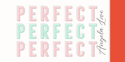 Introducing Angela Love Sans, a modern combination of 4 fonts, each carefully designed to naturally complement one another. With 4 clean sans styles, Angela Love Sans gives you a hugely versatile collection of fonts - ideal for experimenting with striking & modern typographic designs in any modern design brief. It is so beautiful and classy for your projects.
 - Maglisan by Kartiny Type,
$12.00 Maglisan is a beautiful script perfect for branding, wedding invitations, and other romantic projects. This love centered look makes it perfect for use in all your design projects be it logos, labels, packaging designs, blog titles, posters, wedding designs, social media posts, Instagram designs, etc. Font Features: Lowercase letters start and end swash swipe up and down 2 Style Connect hearts You will get : Contains full set: -Uppercase -Lowercase -Alternative -Ligatures -Punctuation -Number -Multilingual support. I hope you enjoy this font. If you have any questions, feel free to message me :) Thank you for your purchase!
 - Anggie Display by Gatype,
$18.00 Anggie Display is an elegant script with a creative mood and perfect form, inspired by today's beautiful serif Display. thick, balanced and varied, born for luxury and beauty. In my example I show how this script can be used. It's great for logotypes, branding, wedding invitations, romantic cards, alcohol labels, packaging, name spelling and more. Anggie Displaycomes with beautiful uppercase and lowercase letters, numbers, and punctuation. In addition to the main character set, there are many alternative characters, early and late sweeps. Available Fonts: . Multilingual. . Ligature. . Swash. . Stylistic Set. If you have any questions don't hesitate to contact me! Thank you,
 - Coralis Elegant by Gatype,
$14.00 Coralis Elegant serif with a creative atmosphere and perfect shape, inspired by today's beautiful Display serifs. thick, balanced and varied, born for luxury and beauty. In my example I show how this script can be used. It's great for logotypes, branding, wedding invitations, romantic cards, retro labels, packaging, name spelling and more. Coralis Elegant comes with beautiful uppercase and lowercase letters, numbers, and punctuation. In addition to the main character set, there are many alternative characters, start and end sweeps. . Multilingual. . SWASH. . Ligature. . Style Set. If you have any questions please feel free to contact me! Thank You,
 - Edensor by Factory738,
$15.00 Edensor is a playful yet romantic serif. It teases your eyes with its curves yet still able to maintain its classy composure. The variety of weights provide a range of choices that will help you find the best typographic colour. The available stylistic Ligature and Alternate offer a perfect font for anything your creativity takes you. 2 Styles (Regular and Italic) Basic Latin A-Z and a-z Numerals & Punctuation Stylistic Alternates & Ligatures Multilingual Support for ä ö ü Ä Ö Ü ... Free updates and feature additions Thanks for looking, and I hope you enjoy it.
 - With Love by Pen Culture,
$17.00 Introducing "With Love Calligraphy Font" With Love is a beautiful calligraphy font that features elegant and flowing letterforms. This font come with ligature and beginning and ending swashes, which are ornamental flourishes that extend from the first or last letter of a word, adding an extra touch of elegance and sophistication to your designs. These swashes are perfect for adding a romantic and intimate feel to your designs. With love also has a unique set of swashes that are shaped like the love sign. These swashes add a romantic and playful touch to the font, and are perfect for projects that require a bit of whimsy and charm. What will you get: With Love OTF With Love TTF With Love WOFF I really hope you enjoy it – please do let me know what you think, comments & likes are always hugely welcomed and appreciated. More importantly, please don’t hesitate to drop me a message if you have any issues or queries. Thank you
 - Tanglewoods by Nicky Laatz,
$10.00 A romantic little modern calligraphy font duo that will all whisk you off your feet! It comes with an extra dingbat font with oodles of sweet little flourishes and embellishments too! Tanglewoods Script has a lovely whimsical character with the natural organic flow from a real calligraphy pen. It’s perfect for weddings, feminine logos, branding, invitations, quotes, social media, websites, and well....just about anything pretty! :) It includes opentype features - stylistic alternates for the lowercase letters, and a comprehensive set of natural looking Ligatures to add to the natural nature of the typeface. The Complimentary sans serif font, Tanglewoods Sans, is a whimsical and light-hearted uppercase font. The extra dingbat font, Tanglewoods Extras, has 62 beautiful flourishes and embellishments, all available by hitting the keystrokes A-Z, a-z and 0-9.
 - Kazincbarcika Script by Roland Hüse Design,
$9.00 An elegant calligraphy script. I named it after my hometown, Kazincbarcika. I think it looks interesting written down.The first letter I designed was the initial "K" and I have built the whole set around that.
 - Evoque by Monotype,
$40.00 Evoque is a humanist serif type family designed for both text and display purposes. Its appearance is crisp and modern while echoing a classical Garamond heritage. The inspiration for Evoque came after reminiscing over Apple’s advertising of the eighties and nineties that utilised incredibly tightly-spaced headlines set in Apple Garamond. I wanted to create a typeface that evoked nostalgia of those times and that distinctive typographic style. A number of swash alternates and discretionary ligatures enhance Evoque, giving you the opportunity to add more flair and personality to your title and branding designs. Simply activate Stylistic Sets to start adding these flourishes to your typography. Other useful features include Small Caps at the click of a button, and Old Style Figures are an option to the default proportional figure style. There are 36 fonts altogether, with 6 weights in roman and italic from Thin to Heavy weights across Condensed, Narrow, and Regular widths. Evoque has an extensive character set (900+ glyphs) that covers every Latin European language. Please also take a look at Evoque Text which is specifically designed for the publishing sector. Key features: 6 weights in both roman and italic 3 widths – Regular, Narrow, Condensed 80 Alternates 26 Ligatures Small Caps Full European character set (Latin only) 900+ glyphs per font.
 - Michiana Pro by BluHead Studio,
$39.00 Michiana Pro is my new, hand-crafted connecting script! I've been hand lettering cards and envelopes to my wife and family in this type style for years and decided it was time to make a font based on it. I typically start with a single thin stroke for each letter, then build up the weight of the heavy stroke, so there ends up being a lot of charming variations in terms of style and color. The overall finish is rough, yet friendly. Perfect for invitations, place cards, love notes, and with its large x-height, it sets nicely for text. I grew up running around the dunes and beaches along Lake Michigan in northwest Indiana, and I think the shoreline and dune grass has inspired my aesthetic. Michiana Pro takes the name from a small area along the lake between the Indiana and Michigan state lines. There are a lot of nice, modest homes nestled in the duneland forests. Thinking about what it's like back there, it's like having a bowl of steaming hot comfort food. So I hope Michiana Pro feels that way to you too. Michiana Pro features include: + extended character set for Western European language support + 1,205 glyphs + lowercase beginning and ending swashes + contextual initial and final letterforms + alternates for L, R, Z, f, g, p, t and y + 140+ ligatures + superior and inferior figures for unlimited fractions + ordinals (st, nd, rd, th) + 4 ornamental swashes + available in both OTF and TTF formats
 - Affair by Sudtipos,
$99.00 Type designers are crazy people. Not crazy in the sense that they think we are Napoleon, but in the sense that the sky can be falling, wars tearing the world apart, disasters splitting the very ground we walk on, plagues circling continents to pick victims randomly, yet we will still perform our ever optimistic task of making some little spot of the world more appealing to the human eye. We ought to be proud of ourselves, I believe. Optimism is hard to come by these days. Regardless of our own personal reasons for doing what we do, the very thing we do is in itself an act of optimism and belief in the inherent beauty that exists within humanity. As recently as ten years ago, I wouldn't have been able to choose the amazing obscure profession I now have, wouldn't have been able to be humbled by the history that falls into my hands and slides in front of my eyes every day, wouldn't have been able to live and work across previously impenetrable cultural lines as I do now, and wouldn't have been able to raise my glass of Malbeck wine to toast every type designer who was before me, is with me, and will be after me. As recently as ten years ago, I wouldn't have been able to mean these words as I wrote them: It’s a small world. Yes, it is a small world, and a wonderfully complex one too. With so much information drowning our senses by the minute, it has become difficult to find clear meaning in almost anything. Something throughout the day is bound to make us feel even smaller in this small world. Most of us find comfort in a routine. Some of us find extended families. But in the end we are all Eleanor Rigbys, lonely on the inside and waiting for a miracle to come. If a miracle can make the world small, another one can perhaps give us meaning. And sometimes a miracle happens for a split second, then gets buried until a crazy type designer finds it. I was on my honeymoon in New York City when I first stumbled upon the letters that eventually started this Affair. A simple, content tourist walking down the streets formerly unknown to me except through pop music and film references. Browsing the shops of the city that made Bob Dylan, Lou Reed, and a thousand other artists. Trying to chase away the tourist mentality, wondering what it would be like to actually live in the city of a billion tiny lights. Tourists don't go to libraries in foreign cities. So I walked into one. Two hours later I wasn't in New York anymore. I wasn't anywhere substantial. I was the crazy type designer at the apex of insanity. La La Land, alphabet heaven, curves and twirls and loops and swashes, ribbons and bows and naked letters. I'm probably not the very first person on this planet to be seduced into starting an Affair while on his honeymoon, but it is something to tease my better half about once in a while. To this day I can't decide if I actually found the worn book, or if the book itself called for me. Its spine was nothing special, sitting on a shelf, tightly flanked by similar spines on either side. Yet it was the only one I picked off that shelf. And I looked at only one page in it before walking to the photocopier and cheating it with an Argentine coin, since I didn't have the American quarter it wanted. That was the beginning. I am now writing this after the Affair is over. And it was an Affair to remember, to pull a phrase. Right now, long after I have drawn and digitized and tested this alphabet, and long after I saw what some of this generation’s type designers saw in it, I have the luxury to speculate on what Affair really is, what made me begin and finish it, what cultural expressions it has, and so on. But in all honesty it wasn't like that. Much like in my Ministry Script experience, I was a driven man, a lover walking the ledge, an infatuated student following the instructions of his teacher while seeing her as a perfect angel. I am not exaggerating when I say that the letters themselves told me how to extend them. I was exploited by an alphabet, and it felt great. Unlike my experience with Ministry Script, where the objective was to push the technology to its limits, this Affair felt like the most natural and casual sequence of processions in the world – my hand following the grid, the grid following what my hand had already done – a circle of creation contained in one square computer cell, then doing it all over again. By contrast, it was the lousiest feeling in the world when I finally reached the conclusion that the Affair was done. What would I do now? Would any commitment I make from now on constitute a betrayal of these past precious months? I'm largely over all that now, of course. I like to think I'm a better man now because of the experience. Affair is an enormous, intricately calligraphic OpenType font based on a 9x9 photocopy of a page from a 1950s lettering book. In any calligraphic font, the global parameters for developing the characters are usually quite volatile and hard to pin down, but in this case it was particularly difficult because the photocopy was too gray and the letters were of different sizes, very intertwined and scan-impossible. So finishing the first few characters in order to establish the global rhythm was quite a long process, after which the work became a unique soothing, numbing routine by which I will always remember this Affair. The result of all the work, at least to the eyes of this crazy designer, is 1950s American lettering with a very Argentine wrapper. My Affair is infused with the spirit of filete, dulce de leche, yerba mate, and Carlos Gardel. Upon finishing the font I was fortunate enough that a few of my colleagues, great type designers and probably much saner than I am, agreed to show me how they envision my Affair in action. The beauty they showed me makes me feel small and yearn for the world to be even smaller now – at least small enough so that my international colleagues and I can meet and exchange stories over a good parrilla. These people, whose kindness is very deserving of my gratitude, and whose beautiful art is very deserving of your appreciation, are in no particular order: Corey Holms, Mariano Lopez Hiriart, Xavier Dupré, Alejandro Ros, Rebecca Alaccari, Laura Meseguer, Neil Summerour, Eduardo Manso, and the Doma group. You can see how they envisioned using Affair in the section of this booklet entitled A Foreign Affair. The rest of this booklet contains all the obligatory technical details that should come with a font this massive. I hope this Affair can bring you as much peace and satisfaction as it brought me, and I hope it can help your imagination soar like mine did when I was doing my duty for beauty.
 - Karlotte by Dora Typefoundry,
$18.00 Karlotte is an elegant Modern Serif Font giving a romantic feel to every curve having a smooth edge. This typeface has been carefully crafted to ensure premium quality and a luxurious feel. With 46 Ligatures included, it is a great help in creating the title of any of your projects: such as fashion, magazines, logos, branding, photography, invitations, wedding invitations, quotes, blog headers, posters, advertisements, postcards, books, websites, etc. Features • Full set of uppercase, lowercase letters • 56 Ligatures • 20 Alternates • Numbers, symbols & punctuation • Characters with accents • Supports Multiple Languages • PUA Encoded WHAT’S INCLUDED • Karlotte – Regular • Karlotte – Italic This type of family has become a work of true love, making it as easy and enjoyable as possible. I really hope you enjoy it! I can't wait to see what you do with Karlotte! Feel free to use the #Dora Typefoundry tag and # Karlotte font to show what you've done Thank You!
 - Dracula by Storm Type Foundry,
$37.00 The best way to radicalize your typographic expression is to use Blackletter! Gothic calligraphy had been used throughout all historical periods without much of the principal development the Latin typefaces underwent. However, since the invention of movable type, even now its slight variations over time can be seen. Blackletters are always used where emotions are required, be it spiritual literature, romantic novels, decadent poetry or extreme music. Dracula is a typeface dedicated to classical horror. I started to draw its letters along with my illustrations for Argo publishers in spring 2017. I needed a specific typeface for book cover and chapter titles to emphasize the mysterious atmosphere of the text. Sharp teeth and claws on a thin blackletter skeleton shall remind of the early vampirism in literature. Its slightly narrowed face enhances a thrilling feel of anguish and despair, whereas the darkest cut may work well on funeral announcements.


