10,000 search results
(0.061 seconds)
- Satin Blues by PizzaDude.dk,
$18.00 Satin Blues is my easy going and very legible sans. Actually I drew this by hand and then traced each letter digitally, leaving a super steady, yet funky, comic font. I've made two versions: the Regular and Soft. The Soft version has rounded edges, which gives a smoother look. The font is very suitable for anything that needs a clear but wild comic look.
 - Benn Beckman by Factory738,
$15.00 Beckman is a modern and minimalist sans-serif font family. The combination of minimal and geometric elements renders a modern design. Beckman includes 6 fonts, clean and modern caps, thereby creating more variability. This is irreproachable sans serif to diversify your headlines, branding visual identity, poster, logo, magazines and etc. Six weights Alternate glyphs Latin alphabets Thanks for looking, and I hope you enjoy it.
 - Southima by Motokiwo,
$15.00 Southima modern script font has something cool to deliver your words with a cute and sweet feeling. It's not complex typeface with many OpenType features, Southima only has a little ligature. Southima is simple and casual signature font, but Southima has a soul and I believe it will give a soul to your project for various purpose such as weddings, posters, magazines, novels, and more.
 - Sutro Initials by Parkinson,
$20.00 A two-font chromatic (or layered) set. The Primary font, which is the old Sutro Inlined Initials. Salvaged from the wreckage of my Type1 font library, the inlined initials have been in the shop for some repairs and detailing. I just added the fill font to support the inlined version. Each font works on it’s own but they work very well together. Caps only. Open Type.
 - Janda Stylish Script by Kimberly Geswein,
$5.00 I love the trends in handwritten calligraphy and wanted to play with playful lettering. I've heard from many of my customers that they don't use Open Type software and feel limited in the cool features of OT scripts because of this, so I've replaced the | (bar key) with a left-sided tail to start the lowercase r and s in words that begin with those letters.
 - Bargenia by Letteralle,
$23.00 Introducing, Valery! a serif display font with a modern yet luxurious style. Aesthetic and unique letterforms, as well as soft curves are the hallmark of this font. Valery is a versatile and multigender font. Perfect for editorial projects, Logo design, Wedding, Clothing Branding, product packaging, magazine headers, or simply as a stylish text overlay to any background image. I hope you enjoy! Letteralle Studios
 - Ayumi Pro by Positype,
$9.00 Ayumi is one of those precocious sans. At first glance, I wanted it to look simple...basic characters, moderate modulation, common structure...but at closer inspection, it is filled with all kinds of fun and expressive details. The italics are...well, fun. They're curvy and expressive and truly compliments the face. The new Pro version includes a tightened character set, Central European glyphs, and remastered kerning.
 - Callient by Ergibi Studio,
$20.00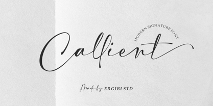 Callient is a Modern signature font presentation from Ergibi Studio. This font includes uppercase, lowercase letters, numbers, punctuation, symbols, binders and multilingual support. Callient is perfect for branding, photography, invitations, quotes, watermarks, advertisements, product designs, social media posts, stationery, labels, and more! I hope you enjoy this font. If you have any questions please don't hesitate to drop me a message :) Thank You, Ergibi Studio
 - Grate by Otto Maurer,
$7.00 Grate is a simple styled Font, it is best for Logo designing. How much we can cut down a Font till it is possible to reat it? That was the question, and this font is the answer. I think it is so much cut down but Human can read it. It is total simple Kerning inside. You can overlay the glyphs and it is almost readable.
 - Farson Family by Garisman Studio,
$20.00 Proudly Present Farson - Vintage Typeface Farson born from an inspiring vintage display. This font gives a feel of a vintage, classic, old, and based on handmade. Already PUA Encoded and I think this font is perfect for people looking for vintage aesthetic or logo-type. Suitable for any graphic designs such as branding materials, t-shirt, print, business cards, logo, poster, t-shirt, photography, quotes .etc.
 - Foreign Skies by PizzaDude.dk,
$17.00 Foreign Skies is that hastily written brush font you're going to need, if you're looking for an authentic brush font. I am aware that Foreign Skies doesn't always meet the criteria of a professional signletteres demands of "perfect strokes" - but that is the basic idea! It is super legible, even at small sizes, but at the same time it is uneven, bouncy, clumsy and rough!
 - Heroism Theory by Arendxstudio,
$15.00 Heroism Theory - Cute Handwritten Font with sharp and beautiful letters that create fonts that are modern, trendy and elegant. Came with opentype features such stylistic alternates, stylistic sets & ligatures good for logotype, poster, badge, book cover, tshirt design, packaging and any more. Features : • Character Set A-Z • Numerals & Punctuations (OpenType Standard) • Accents (Multilingual characters) • Ligature • Alternate There it is! I really hope you enjoy it
 - Agoesa Display by Mega Type,
$16.00 Agoesa is a modern display font with a positive character that is bright, unique and elegant. Its curves give off a friendly and fun personality. Perfect for creating a welcoming atmosphere in any design. -Multilingual Support -Free future updates Have fun using Agoesa Display!!! I really hope you enjoy it! Feel free to follow, like and share. Thank you so much for checking out my shop!
 - Green Narcu by Graphicfresh,
$8.00 Hey Guys! My new typeface Green Narcu is a playful and elegant display font, perfect for branding projects, headlines, posters and packaging!. I make this font to remind you that freshness is needed in this life. So, greenery must be cool to be seen. Therefore, we make a natural font, beauty, freshness and coolness. We hope you will feel excited when using this font.
 - Ohex by kome.studio,
$12.00 Contemporary geometric typeface. Ohex™font family consists of 5 unique font styles — thin, light, regular, bold and black + VARIABLE version. Opentype features including stylistic alternates, ligatures and kerning pairs. Currency glyphs and stylish digits. Capital letters are designed on the shape of a hexagon. Lowercase letters to cooperate with them, refers to the street style look. Great for logos, posters, magazine layouts, headers, apparel and prints. - Multilanguage support covering Western, South and Central Europe. 1256 Latin 1 / 1250 Latin 2: Eastern Europe / 1254 Turkish / 1257 Windows Baltic / Macintosh Character Ser (US Roman) 1256 Latin 1: Afrikaans, Basque, Catalan, Danish, Dutch, English, Faeroese, Finnish, French, Galician, German, Icelandic, Irish, Italian, Norwegian, Portuguese, Scottish, Spanish, and Swedish. 1250 Latin 2: Eastern Europe / 1254 Turkish / 1257 Windows Baltic : Czech, Polish, Hungarian, Croatian, Romanian, Estonian, Latvian , Lithuanian, Turkish, Slovak and Slevenian -
 - Stellar Classic SG by Spiece Graphics,
$39.00 Designed by the renowned Robert Hunter Middleton of Chicago’s Ludlow Typograph Company, this “serifless roman” was first introduced in 1929. Middleton has created a transitional face linking the traditional thick and thin serifs of the times with the new Futura and Kabel design imports. With its slightly flared main strokes, Stellar predates in many respects Hermann Zapf's Optima by thirty years. Highly effective where an elegant and warm feeling is desired. This typeface is faithful to the original letterforms of the Stellar design. Stellar Classic is also available in the OpenType Std format. Some new characters have been added as stylistic alternates in this new version. Stylistic alternates and other advanced features currently work in Adobe Creative Suite InDesign, Creative Suite Illustrator, and Quark XPress 7. Check for OpenType advanced feature support in other applications as it gradually becomes available with upgrades.
 - Winner by sportsfonts,
$19.00 Winner™ and Winner Sans™—Classic athletic aesthetics, finally as a versatile contemporary super family. Just when you thought there was nothing left to add to the classic sports design, we lifted it to a whole new level. Whatever you want to set in whatever space, with seven weights in seven widths both with or without serifs, you’ll definitely find the right proportions for it! Winner supports not only most Latin-based languages but also Greek. Its extensive character set also contains currency signs, arrows, as well as a wide range of numerals from small figures to Roman numerals. Furthermore, its sophisticated OpenType layout features give you access to alternative letter shapes, fractions, tabular figures, and contextual alternates. With more than 24,000 glyphs in 49 fonts, Winner leaves nothing to be desired. Grab Condensed Regular for free and give it a spin!
 - Frontis by Tipo Pèpel,
$24.00 Inspired by the Roman lettershapes that Asensio y Mejorada drew in 1780, Frontis is a text typeface that takes this reference just as a starting point. The delicate appearance of Neoclassical fonts becomes confidence in Frontis. The characters have a solid skeleton, and the text looks classy in the condensed half of the family. A style that shines especially at display sizes. A collection of vegetal motifs and some stylistic uppercase ligatures complete the character set. These extra shapes serve to frame and bring together all the weights and styles in the type family. The lapidary ligatures and the ornaments underline the 18th-century roots of the design. There is a connection between Frontis and those classic letters that were once engraved on stone. And yet, the design is daring enough to make it a perfect choice for contemporary use.
 - ITC Elan by ITC,
$29.99 ITC Élan combines a gothic simplicity with elegance in a distinctive yet subtle typeface design. There is also a feeling of architectural strength which is derived primarily from an optically even line-weight and a sense of vertical stress. The small, almost Latin, serifs add distinction at both display and text sizes. The large x-height, minimum stroke variance, and open counters are ideal design traits for typeface legibility. Additional characteristics which distinguish ITC Élan are the splayed M" and bowls which do not quite close in the "a," "b" and several other letters. In contrast to the roman, there is almost a calligraphic playfulness to the italic. ITC Élan is the second ITC typeface from Albert Boton of France, who also designed ITC Eras. ITC Élan comes in four weights, book, medium, bold, and black, each with a corresponding italic."
 - Dante by Monotype,
$39.00 Dante was designed by Giovanni Mardersteig. Mardersteig started work on Dante after the Second World War when printing at the Officina Bodoni returned to full production. He drew on his experience of using Monotype Bembo and Centaur to design a new book face with an italic which worked harmoniously with the roman. Originally hand-cut by Charles Malin, Dante was adapted for mechanical composition by Monotype in 1957. The new digital font version has been re drawn, by Monotype's Ron Carpenter, free from any restrictions imposed by hot metal technology. The Dante font family was issued in 1993 in a range of three weights with a set of titling capitals. Dante is a beautiful book face which can also be used to good effect in magazines, periodicals etc. Dante® font field guide including best practices, font pairings and alternatives.
 - Bluset Now Mono by Elsner+Flake,
$35.00 Bluset Monospaced enlarges the re-worked and expanded text- and headline typeface family Bluest Now with 6 new cuts. The concept for Bluest Now was based, in its original form, on a corporate design typeface by Elsner+Flake in 2004, ordered by the Landor Agency for a large German energy corporation. Regularly re-worked and brought up to modern standards, the typeface is still used to this day. Because of its large x-height and its well-balanced appearance, Bluset Now Mono is also excellent for use in small typesizes. The three Roman cuts, Regular, Medium and Bold, and the corresponding obliques, allow a clear differentiation of base- and display applications for every typesize. The character complement has been created for 72 Latin-based language areas and thus allows a neutral text exchange across language borders. Translation Inga Wennik
 - Merrivaux by Greater Albion Typefounders,
$18.00 Some time ago, when we were working on our Merrivale family, it occurred to us that an adaptation of the design, incorporating selected Blackletter elements, would be in the best traditions of 19th and 20th century blackletter revivals, which combine all the spirit of the middle ages with modern legibility-think of Goudy Medieval as an example. In the case of Merrivaux (best quality faux-medieval name there!) we've produced a typeface which has the ready legibility of Roman titling, but which gives a subtle blackletter feel. The regular form of Merrivaux is incised with a visible midline, a solid form with identical metrics is also offered. Both forms include a range of opentype features including ligatures, fractions, old style numerals and terminal forms. Merrivaux is ideal for posters, signage and design work, where a touch of that 'Olde-Worlde' feel is needed.
 - Hellenic Typewriter by Polytype,
$20.00 Hellenic Typewriter is a slab serif for text and display, combining the typewriter aesthetic's balance of elegance and pragmatism with some of the extended western flavour of Hellenic Wide. Rounded strokes, some unorthodox slab details and playful, looping tails all add to Hellenic Typewriter’s warmth and approachability, while its typewriter-inspired proportions and clean forms provide rythym and an honest, confident voice. The lightest weights, laying bare the simple, partly-geometric and optically-monolinear construction, embody an assertive elegance. Ball terminals feature extensively throughout the design, in both lower and uppercase. This miroring of details creates a greater harmony between the cases and ensures that the true character of Hellenic Typewriter is not lost when setting in all-caps. Expressive true italics elaborate upon and emphasise some of the freer, more decorative elements of the roman styles.
 - Volantene Script by Catharsis Fonts,
$- Volantene Script is a fully equipped display typeface inspired by the fine penmanship of Lady Talisa Maegyr-Stark. The lowercase letters are crafted to be as faithful as possible to the lady�s hand-written forms, while the uppercase, figures, symbols, and punctuations are original designs by Catharsis Fonts (Christian Thalmann) matching the lowercase in style. Volantene Script comes with an extensive character set and OpenType features like ligatures and contextual alternates. The common romanization of High Valyrian uses macrons (??????) to mark long vowels. Since these are difficult to type with most keyboard mappings, Volantene Script offers macron-shaped diaereses (������), which are easily accessible. Volantene Script was completed within a week�s time. The name is derived from the free city of Volantis, where Lady Talisa grew up and learned to write. This font is dedicated to Simone. Geros ilas!
 - Segoe Print by Microsoft Corporation,
$39.00The Miramonte™ Pro Family was designed by Steve Matteson in 2006 as a friendly sans serif design suitable for user-interface design, corporate branding and publishing. The name means 'behold the mountains' in Spanish, suggesting the rustic, unrefined type design. Miramonte™ Pro Family is based on Stanislav Marso's humanist sans serif released by Graphotechna in 1960. This revival includes a cursive style italic rather than a sloped roman. Miramonte Pro Family includes an extensive character set for publishing Central and Eastern European languages. Its OpenType features include the euro symbol, alternates, old style figures, proprtional lining figures, diagonal fractions, stacked fractions, superscript/subscript and scientific inferiors. Character Set: Latin-1, CE, OpenType Pro features. View Miramonte Pro Type Specimen (PDF)NOTE: An OpenType-savvy application such as Adobe Creative Suite, Mellel or QuarkXPress is required to access the OpenType typographic features. - P22 Dearest by IHOF,
$24.95 Dearest is a distinct flowing script based on handwritten characters found in a 19th Century German book chronicling a history of the Middle Ages. Originally released in 2001 as a set containing two styles, Script and Swash, Dearest is now expanded in 2014 as a pro font with several hundred new characters including support for Central European, Cyrillic and Greek languages. Other Opentype features include ligatures, fractions and figures, Roman numerals, alternate letterforms and more swashes to expand the possibilities of this designer-friendly font. In addition to the Dearest Pro font, a new companion font has been added- P22 Dearest Alternates. The characters contained in this font are part of the pro font, but are also designed to be used with Dearest Script and Dearest Swash and is intended for those who have applications that do not support Opentype features.
 - Ante Cf by Creative17studio,
$9.00 Introducing Ante Cf Fonts. A font that's modern, clean, and bold like the roman sans serif font. This font comes in many weights up to 18 weights. The contrasts between thick and thin make this font unique. This font is made with modern characteristics which can give a bold impression in each character, making this font suitable for corporate needs for larger business needs. For branding purposes? Sure. This font is also made for the needs of this field, so that your branding seems more modern. And this font is also useful for news editorial purposes. Coupled with serif types and scripts are also very suitable. You can see all the examples of using this font above. Ante cf also supports various languages, so that it can make it easier for all countries to use and language usage.
 - Winslow Book by Kimmy Design,
$25.00 Winslow Book is a playfully modern typeface with 6 weights and packed with styling features. Delicate features give it a playful feel while keeping Scotch Modern attributes of vertical stress, bracket serifs and ball terminals, while unique features give it a personality of its own. Winslow was designed to be a perfect typeface for text and display purposes. Because optionality is always fun, Winslow comes with an array of alternative features that add an extra bit of flair. From stylistic alternatives to tail serifs (in K, k, d, h, m, n) to complete new character designs (for g, y and &) a designer can choose which style they need for any project. Discretionary ligatures also create alternatives to all capital letter combinations. The family also comes with a playful set of italics that compliment the roman as well as their own set of alternatives.
 - Anabella by RNS Fonts,
$33.00 Anabella is a typeface made for the Master’s Degree in Typography at the University of Buenos Aires. It is inspired by the posters of pizzerias located in Naples, Italy; in order to be used in the pizza franchise Giuseppe in Buenos Aires, Argentina. The font preserves and rescues gestural features of these posters, adding a vertical axis and high contrast, typical of the Italian types that arrived in the city product of the immigration. The stroke with brush provides a more organic quality to the sign and provides connotative features. The family has three variables for the different applications that may be required in a pizza place: Italic for bodies greater than 16 pt, Roman for short texts up to 14 pt, and Stencil for use in brands and titles. Anabella was selected to participate in the eighth typography biennial Tipos Latinos.
 - Albrecht Fraktur by New Renaissance Fonts,
$20.00 In his 1538 book on measurement, Albrecht Dürer gave clear descriptions and drawings about the proportions of the letters in both Roman and 'fraktur' alphabets (from Latin 'fractura', meaning that it's broken up with lots of different angles rather than smooth curves). Here is the fraktur alphabet as a font completed for use today, with a few characters modernised and some gaps filled. Of course there are countless examples of fraktur fonts already circulating, and indeed one foundry even has another version of this particular one; but we have different approaches to some of the questions raised, we have aimed at a more even tracking (horizontal spacing), and the 260 glyphs in our version include accents and other diacritics, and the modern symbols which Dürer would surely have embraced if he had had access to the internet.
 - Rusch by Proportional Lime,
$9.99 Adolf Rusch von Ingweiler, was in the 19 th century known mysteriously as the “R'' printer. He was the first printer North of the Alps to introduce the new Roman style of type known now as Antiqua. He was active in the city of Strasbourg from around the early 1460's to 1489. One wonders if the unusual form of “R'' was a personal conceit. This font is, therefore, an Antiqua style font and has over a 1000 defined glyphs with wide support for medieval characters that have since fallen out of use. The baseline was slightly tidied up in order to give the printed text an even cleaner look than the original. The letters are very close approximations of the original type catalogued by the “Veröffentlichungen der Gesellschaft für Typenkunde des 15. Jahrhunderts” as Typ.1:103R GfT1197.
 - Fansan by W Type Foundry,
$25.00 Organic and sublime, Fansan is an Art Nouveau type family that includes roman, italic, and optical sizes. Its roots can be found in famous works such as Benguiat, Windsor, and Melbourne — worldwide typographic references which all have a sense of being imperfectly appealing. The aesthetic influence of Art Nouveau on Fansan can be seen in the top-heavy stress found in most characters. Applying this stress consistently throughout the character set was a significant challenge in the design of the family. The sharp terminals of numerous lowercase characters — including the a, f and g — provide a visual link between the upper and lowercase forms. As a result, Fansan is able to be elegant and pointed in its lighter weights, and playful and full of character in its heavier styles. Fansan is ideally suited for use at display sizes where personality is needed.
 - Slightly Hollow - Unknown license

- Koomerang by Type Associates,
$21.95 I arrived this concept as a means to fulfil a need for a simple yet radical semi-sans with rounded terminals. My concept called for a modular approach so a single weight font family resulted, the monoline stroke weights being one-eighth of the cap height and the x-height five-eights, the descent two units. Within these constraints I found it was simple to devise an alphabet which met my need for quirkiness whilst retaining its legibility. As for the outline, shadow and contour variants - well they just seem to work. If you are wondering - and you don't hail from the "Land Downunder" - Canberra is our nation's capital; Bondi - "water breaking over rocks" a beautiful beach in Sydney; Uluru is the name given to the world's largest pebble, (formerly known as Ayers Rock); Kakadu is a national park in the "Top End" and Koomerang means "hill of clouds" - all place names in their respective Australian indigenous languages. Come on down - the natives are friendly.
 - Al Sinerva by Aluyeah Studio,
$120.00 This font is the result of my play with letters. Inspired by Indonesia's great cultural heritage, Batik. I wanted to create a font that has an alternative that highlights a small part of Indonesian batik culture by taking a shape like a bird's feather which is often applied to Batik. A simple, yet distinctive, elegant font that can be applied to many areas of design. Sinerva is a quilly display typeface. Coming with 130+ stunning and super easy to use alternates. Very suitable for magazine, headline, website, ads, product package and all type of design project you have. Features: OpenType support Multilingual support (15 languages) PUA Encoded Super Easy to Use alternates - It's OpenType support but you can easily call alternates character using special combination like A.2 R.3 h.5 etc. so you don't need special software. To get results like the preview just type S.4INERV.3A.8 Thanks for checking out my font. I really hope you enjoy using it!
 - Lovely Sunday by Asd Studio,
$15.00 Introducing the new font Lovely Sunday - Modern Calligraphy Font. This font suitable for use in a variety of design fields, such as event advertisements, vintage design, product promotions, mug design, book titles, activity titles, logos, and others. This font can when paired with serif font types will make your design project more beautiful and perfect. Features: - Uppercase - Lowercase - Number & punctuations - Multilingual Accents - 3 StylisticSet - Contextual Alternates - PUA encoded I highly recommend using a program that supports OpenType featuresand Glyphs panels such as Adobe Illustrator, Adobe Photoshop, or CorelDraw, so you can see and access all Glyph variations. This font is encoded with Unicode PUA, which allows full access toall additional characters without having special design software. Mac users can use Font Book, and Windows users can use Character Map to view and copy one of the extra characters to paste into your favorite text editor/ application. I hope you enjoy the font, thank you.
 - Amirtha by Asd Studio,
$12.00 Introducing the new font Amirtha - A Beauty Calligraphy. This font suitable for use in a variety of design fields, such as event advertisements, product promotions, book titles, activity titles, logos, adventure, and others. This font can when paired with serif font types will make your design project more beautiful and perfect. Features: - Uppercase - Lowercase - Number & punctuations - Multilingual - Ligatures, swashes and alternates character - PUA encoded I highly recommend using a program that supports OpenType featuresand Glyphs panels such as Adobe Illustrator, Adobe Photoshop CC, Adobe InDesign, or CorelDraw, so you can see and access all Glyph variations. This font is encoded with Unicode PUA, which allows full access toall additional characters without having special design software. Mac users can use Font Book, and Windows users can use Character Map to view and copy one of the extra characters to paste into your favorite text editor / application. I hope you enjoy the font, thank you.
 - Smashed Display by Raquel Fernandes,
$17.49 Smashed Typeface is a reversed-contrast, slab serif, display font. Was inspired by the old west days that we can often see in printing, circus posters and wanted notices in western movies, even tho the style was really used in many parts of the world during that period. This style is sometimes called as "circus letter" too. Was designed to have a modern look, using straighter lines and an extended style, can be used on various situations like posters, logos for restaurants, alternative business like an old washing station (as you can see on the next images), music bands etc. I believe that is a promising typography that can be used by various designers in a lot of diverse project. It counts with 226 multi language characters, one weight on version 1.0, on a next version I hope to take this project to another level, creating a variable typeface from condensed to really extended weights. It would complete this typography and eliminate the limits of use.
 - ITC Japanese Garden Ornaments by ITC,
$29.99ITC Japanese Garden Ornaments is a symbol font designed by Akira Kobayashi (before Kobayashi became Linotype's Type Director in 2001, he worked as an independent typeface designer in Tokyo). The images in Japanese Garden are, as the name suggests, mostly floral or herbaceous, derived from designs used in Japanese indigo stencil dyeing. In Japanese Garden," Kobayashi says, "I tried to create a set of type fleurons that are very familiar to a Japanese eye, but not too exotic to people in other countries." Several of the designs fit together seamlessly in repeating patterns; others work either together or as isolated ornaments, a flexibility that also characterizes traditional Western type fleurons. "The original illustrations," notes Kobayashi, "were mostly cut from white paper squares, about two by two inches in size, and were simply scanned and traced. That is why there are few smooth curves and perfectly straight lines in the illustrations. I simply liked the ragged textures of them."" - Mansheen by Dora Typefoundry,
$10.00 Mansheen is a simple and sweet display font. Authentic beautiful & delightful touches make it the perfect partner to present funny and childish feelings in any design. It's perfect for children's books, funny greeting cards, meal package designs, logos and many others, where simple abstract cartoons or graphics are used. But clearly, its use can be more extensive. I did a few design examples, so you can see how it works. WHAT YOU GET - Uppercase and lowercase letters are full - Numbers, Punctuation, Multilingual Accents - Alternates glyphs I highly recommend using a program that supports OpenType features and Glyphs panels such as Adobe Illustrator, Adobe Photoshop CC, Adobe InDesign, or CorelDraw, so you can see and access all Glyph variations. We really hope you enjoy and are interested in our offer. If you want to upgrade or need a license or ask questions, you can send me a message and you can immediately start your service doratypefoundry@gmail.com. Thank You
