2,392 search results
(0.013 seconds)
- Storyline by Comicraft,
$19.00 It starts slowly, gently drawing you in... you're introduced to a number of strangely interesting and compelling characters. The plot seems at first to be satisfyingly predictable, then -- suddenly -- the narrative takes a completely unexpected turn! The protagonist is thrown into a series of devastating and alarming twists and turns! The antagonist triumphs -- evil trounces good, mass hysteria seizes the city streets! Our Hero is separated from his One True Love, and it seems that she has fallen for The Villain of the Piece! Will Good Prevail? Will Evil Perish? Will Love Conquer All?!? I don't know yet -- that's as far as I've got. Don't worry, it has a Great Ending.
 - Geographica Hand by Three Islands Press,
$39.00 Geographica Hand replicates the neat hand-lettering typical of engraved British maps of the 18th century, including the work of cartographers Emanuel Bowen (circa 1694–1767), Geographer to King George II, and Thomas Jefferys (circa 1719–1771) Geographica ro King George III. A kindred font to our Geographica serif family, Geographica Hand exhibits long serifs, irregular edges, and a genuinely hand-made character. Use to simulate historical materials, vintage documents, or other time-worn text. The OpenType release of Geographica Hand comes with true small capitals, contextual and historical ligatures, a series of sketchy map ornaments (e.g., trees, churches, windmills, boats), and full Latin support.
 - ITC Ludwig by ITC,
$29.99ITC Ludwig has an edge. It's nervous, tense - maybe even a little scary. Drawn by Italian designer Giuseppe Errico, ITC Ludwig refuses to be confined to a traditional baseline. Its twisted lowercase g" and an "e" that could double as an upside-down "a" both add to the design's spooky personality. As a young man, Errico studied to be a fine artist. He became a graphic designer only after a “long reflection period,” he says. His early training is evident in many of ITC Ludwig's suggestive qualities. There is far more to this face than cranking up the “distort” knob in Fontographer. Reflection and personal expression are at its core." - Albiona by Device,
$39.00 A contemporary slab-serif which revisits aspects of Robert Besley’s all-time classic Clarendon, designed around 1842 for Thorowgood and Co. and named after the Clarendon Press in Oxford. The original design was subsequently extended by Sheffield foundry Stephenson Blake in the 1950s into a widely-used, robust workhorse family. Albiona uses the inwardly curved stroke terminals of the same foundry’s Grotesque series, while rationalising or removing entirely Clarendon’s ball serifs, flicked tails and other eccentricities to make it more functional in contemporary settings. The family consists of five weights plus italics and a stencil, and includes oldstyle and tabular numerals. Its clean readable style suits both text and headline setting.
 - Girga by DSType,
$40.00 Triumphant, vigorous and strong. These were the keywords for the design of Girga, named after an Egyptian city in the Sohag Governorate. The power and strength of the Egyptian letterforms were balance with a few sans serif forms so the darkness of the text and the fatness of the overall glyphs could be kept. We never intended to design a revival of the nineteen century egyptian typefaces, but we included a series of features that can be found in many wood letters from that era. With five styles divided in Regular, Italic, Stencil, Engraved and Banner, Girga is full features that allow many design possibilities.
 - Program by Emigre,
$49.00 Program is a type designer’s typeface. It’s about the craft of typeface design and the particular details and effects that type designers fret over when they design type. It mixes different structures, stem endings, and weight distributions not usually employed in a single family of fonts. It features both rounded edges evoking the effects of reproduction, and ink traps, the technique used to counteract that effect. The idea was to create a series of fonts with strong individualistic features, challenging the constraints of a central theme that is usually imposed on a family of fonts, while still relating to each other in terms of overall look and feel.
 - F2F Madame Butterfly by Linotype,
$29.99The techno sound of the 1990s, a personal computer, font creation software, and some inspiration all came together to inspire the F2F (Face2Face) font series. Alessio Leonardi and his friends had the demand to create new unusual typefaces, which would be used in the leading German techno magazine of the day, Frontpage. Even typeset as small as 6-points, in nearly undecipherable layouts, it was a pleasure for the kids to read and try to decrypt the messages. F2F Madame Butterfly is a font with a heavy, or dark, appearance. The darkness is brought about by the overlapping bits of glyph forms that make up each letter in the typeface. - Crypt by Hanoded,
$15.00 Crypt is a seemingly lovely font that will look good in just about any design. But if you take a closer look, then Crypt is actually quite a scary font: it has jagged edges and a sinister undertone, making the letters jump from your computer and eat you alive! Whoohahaha…!! No, it won’t eat you, I’m just kidding. I just threw that in for some dramatic effect in an otherwise quite boring piece of text. Use Crypt for book covers, posters, product packaging and magazines. I promise you that the result will be quite haunting. Needless to say, Crypt comes with an otherworldly amount of diacritics.
 - Nophine by Mantype Studio,
$18.00 Nophine is a typeface conceived by Sulai Man specifically for intensive editorial use, mainly in newspapers, magazines, and online, its personality and flexibility make it a true multipurpose typeface. The intermediate weights deliver a neutral look when used in text sizes, providing the usual robustness expected in a newspaper font. The unobtrusive appearance, excellent texture, and slightly colour allow it to behave flawlessly in continuous text, even in the most unforgiving editorial applications. As it becomes larger in print,Nophine shows its personality through a series of measured particularities which make it easy to remember and identify. Its energetic character, becomes evident when used for subheadings and headlines.
 - F2F Tagliatelle Sugo by Linotype,
$29.99The techno sound of the 1990s, a personal computer, font creation software, and some inspiration all came together to inspire the F2F (Face2Face) font series. Alessio Leonardi and his friends had the demand to create new unusual typefaces, which would be used in the leading German techno magazine of the day, Frontpage. Even typeset as small as 6-points, in nearly undecipherable layouts, it was a pleasure for the kids to read and try to decrypt the messages. Bubbly black letterforms dancing across the line: this is F2F Tagliatelle Sugo, a funky font from Alessio Leonardi. Try it out in a big headline today! - Ongunkan Death Space by Runic World Tamgacı,
$50.00 Dead Space is a science fiction/horror media franchise created by Glen Schofield and Michael Condrey, developed by Visceral Games, and published and owned by Electronic Arts. The franchise's chronology is not presented in a linear format; each installment in the Dead Space franchise is a continuation or addition to a continuing storyline, with sections of the storyline presented in prequels or sequels, sometimes presented in other media from the originating video game series, which includes two films and several comic books and novels. This font is related to the video game Death Space, I redrawn this font to make it a font with a minimum character set.
 - Makro by Tokotype,
$50.00 Makro is a family of extended display sans fonts with an imposing profile with six weights, ranging from Light to Black. This series is distinguished by the excessively contrasting shapes and tones of the shapes on each opening joint and adjusted open counter. This font was designed primarily for large display text that demands more space, such as on out-of-home graphics, headings, titles, or another similar application. The most recent version of Makro supports variable weight and italic axes, as well as OpenType features such as alternatives, circled numbers, etc. In addition, the family has enlarged its linguistic repertoire to incorporate Cyrillic in addition to Latin.
 - Fantasy by Typesenses,
$49.00 Fantasy draws on a series of historical calligraphic traditions: Roman capitals, Lombardic initials, enlightenment era ornamentation and refinement. The user is invited to deploy their imagination playing with the alternates, ornaments and frames in different universes like publications and stationery. Fantasy Pro is the fully-featured OpenType version with two styles of capitals and plenty of swash alternates and ornaments. Each of these varieties is available as a separate font in addition to Fantasy Std, a set of unadorned standard characters for smaller settings. Use professional software that widely support Open Type features. Otherwise, you may not have access to some glyphs. Give a touch of magic to your work!
 - The Holler by Javatypestd,
$10.00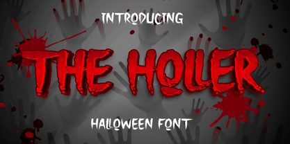 Introducing The Holler Font with a scary Halloween theme. Masterfully designed to become a true favorite, this font has the potential to bring each of your creative ideas to the highest level To access the alternate glyphs, you need a program that supports OpenType features such as Adobe Illustrator CS, Adobe Photoshop CC, Adobe Indesign, and Corel Draw. What’s Included : - Web Font - Standard glyphs - Ligature and Alternate - Works on PC & Mac - Simple installations - Accessible in Adobe Illustrator, Adobe Photoshop, Adobe InDesign, even work on Microsoft Word. - PUA Encoded Characters – Fully accessible without additional design software. - Fonts include multilingual support Thank you for your purchase! Hope you enjoy our font!
 - F2F Prototipa Multipla by Linotype,
$29.99The techno sound of the 1990s, a personal computer, font creation software, and some inspiration all came together to inspire the F2F (Face2Face) font series. Alessio Leonardi and his friends had the demand to create new unusual typefaces, which would be used in the leading German techno magazine of the day, Frontpage. Even typeset as small as 6-points, in nearly undecipherable layouts, it was a pleasure for the kids to read and try to decrypt the messages. The glyphs in F2F Prototypia Multipla have been turned into mini letter collages. Text set in this font will take on a quilt-pattern-like appearance. - Threepoints North by Type Associates,
$30.00 The Threepoints Series is the result of several years of work that bases three different sans serif type designs on one “shell”. Designed for optimal readability North, with its squarish shapes and rigidity are suggestive of an upright Swiss or Inserat typeface. The East variant takes on the look of another popular condensed grotesk with a softer, more rounded basic shape whilst maintaining the purpose of the original design. With minimal adjustments West leans towards more contemporary European designs. Although these are primarily display typefaces they function extremely well in text sizes in either upper or lowercase composition. Excellent for signage. Each variant comes with matched italic at no additional cost.
 - Eccles by Greater Albion Typefounders,
$14.50 Eccles is another of our 'Early Victorian' typefaces, a series we started with the Wolverhampton family a little while ago. It might be described as 'extreme-Tuscan' in style but has a delicacy that many other Tuscan faces seem to lack. It's ideal for giving design projects a clear period feel, particularly in design and advertising work. We also see it having considerable application in preparing invitations to a certain type of happy event. At the other extreme, some of our younger associates have described it as 'your latest Steampunk font'. So perhaps we'll just have to settle on it having a split personality...
 - P22 Yule by IHOF,
$24.95 P22 Yule is a series of display fonts inspired by a mélange of ancient inscriptional writing, with visual references to Anglo-Saxon, Celtic, medieval and even a bit of ancient Greek and roman letterforms. Yule is exotic yet familiar and evocative of winter holidays. It has an Alpine look, lending itself to the thoughts of chalets and fondue. Yule Heavy Snow is blanketed in the white stuff, while Yule Light Flurries is dusted with snowflakes. With the addition of the Klein style, which includes a lowercase, Yule becomes infinitely more usable. The Klein variations can work well as an alternative to Neuland when you need the versatility of a lowercase.
 - Bornholm Tejn Low by Trine Rask,
$25.00 Bornholm Tejn is named after a village »Tejn« on the only rocky island in Denmark »Bornholm« Bornholm Tejn Low is the lowercase variant of Bornholm Tejn, released in 2012, the first face in a series of rough stone cut typefaces, that shares proportions, but differs in any other aspect like different pieces of rock. It is a powerful face, but still very friendly. Good for very big sizes, but can be used for small texts, movie titles, cartoons … Bornholm Tejn Low has a large x-height which supports the heavy and black look of the typeface. It contains tabular and proportional old style and lining figures.
 - IMA ISO GPS Frame by Iain Macleod Associates Ltd,
$27.00 ISO GPS framed font for producing geometrical tolerances and other ISO GPS specifications in different documents types such as CAD, word processor documents, spreadsheets or slideshow presentations. Full set of symbols and modifiers from ISO 1101:2017, ISO 1660:2017 and ISO 17863:2013. Includes recently added symbols such intersection plane indicators and collection plane indicators. Fully compliant with ISO 3098 series and ISO 7083. Use this in conjunction with the IMA ISO GPS No Frame font to cover all ISO GPS specification indications. Single user licence is provided with this font. Contact Iain Macleod Associates Ltd (www.macleod.co.uk) for multiuser licences, site-licences or corporate licences.
 - Eckhardt Bold JNL by Jeff Levine,
$29.00 Eckhardt Bold JNL continues a series of sign painter-inspired type designs and is named in honor of the late Al Eckhardt, a talented sign man who was a good friend of Jeff Levine for about 18 years until his passing. The font is available in both regular and oblique versions and was inspired by an example found in the 1928 edition of E.C. Mattthews' "How to Paint Signs and Sho' Cards". Both squat and wide for maximum use in wall and window applications, the original name for the design is "Heavy Plug". Plug was the sign painter's term at the time for describing this type of letter form.
 - Blackers by Black Studio,
$15.00 Blackers Serif is a modern vintage serif font packaged in a modern and classy style, complete with access to your OpenType features to access a large selection of alternative letters and ligatures, the choice of letters you like from various upper and lowercase letters for a luxurious and elegant look. A unique, fun and versatile series of serifs with 60 ligatures and 101 alternatives to perfect any design you like. This font is perfect for branding projects, logo design, clothing branding, packaging, magazine titles, advertisements, t-shirts, postcards and more. Features • All upper and lowercase letters • Numbers & Symbols • Supported Languages • Alternatives and Ligatures • PUA Encoded
 - Gerdika by Mantype Studio,
$22.00 Gerdika is a typeface conceived by Sulai Man specifically for intensive editorial use, mainly in newspapers, magazines, and online, its personality and flexibility make it a true multipurpose typeface. The intermediate weights deliver a neutral look when used in text sizes, providing the usual robustness expected in a newspaper font. The unobtrusive appearance, excellent texture, and slightly colour allow it to behave flawlessly in continuous text, even in the most unforgiving editorial applications. As it becomes larger in print,Gerdika shows its personality through a series of measured particularities which make it easy to remember and identify. Its energetic character, becomes evident when used for subheadings and headlines.
 - Threepoints West by Type Associates,
$30.00 The Threepoints Series is the result of several years of work that bases three different sans serif type designs on one “shell”. Designed for optimal readability North, with its squarish shapes and rigidity are suggestive of an upright Swiss or Inserat typeface. The East variant takes on the look of another popular condensed grotesk with a softer, more rounded basic shape whilst maintaining the purpose of the original design. With minimal adjustments West leans towards more contemporary European designs. Although these are primarily display typefaces they function extremely well in text sizes in either upper or lowercase composition. Excellent for signage. Each variant comes with matched italic at no additional cost.
 - Aviano by insigne,
$24.99 Aviano is an extended titling face with influence from the power and timeless beauty of classical letterforms. Aviano features extended characters for a formal feel, sharp, powerful looking serifs and geometric and consistent letterforms. Use Aviano as an alternative to Trajan. Aviano includes a number of advanced OpenType features including alternates, 40 unique ligatures and old style figures. The Aviano family was updated in 2008 to include a light and black weight. Be sure to check out the rest of the Aviano series, including Aviano Serif, Aviano Sans and Aviano Slab. Aviano is named for a small town at the base of the Alps in northern Italy.
 - Foxes Storm by Sipanji21,
$25.00 "Foxes Storm" is a black metal-themed font with a menacing and scary look, making it perfect for a wide range of dark and horror-themed design projects. Whether you're designing a metal band's album cover, a horror movie poster or logo, or any other project that requires a dark and edgy aesthetic, "Foxes Storm" is the font you need. Its sharp and jagged letterforms, combined with the bold and intense appearance, make this font perfect for designs that require a powerful and impactful look. With "Foxes Storm," you can create designs that are both memorable and terrifying, bringing your dark and metal-inspired visions to life.
 - Bike Power by PizzaDude.dk,
$19.00 I love my bike, and I couldn't dream of not using it on a daily basis - I use my bike in rain, sun, snow, and windy days...all year, in other words! This font is dedicated to my bike, and is the first in a series of handmade fonts! Play around with the three layers and your favourite colours, for awesome effects. All versions comes with Contextual Alternates, which means several versions of each letter. In this case, every letter has 5 different versions that automatically cycles as you type! A quite awesome thing, because it makes your text more lively and natural looking!
 - Rama Slab by Dharma Type,
$19.99 Rama Slab is an antique slab serif designed inspired by 1800s-style wood type. All glyphs have been designed carefully to be retro-looking to fill the viewer with nostalgia. This condensed font family with 18 styles is a great solution for posters, titles and anywhere you need impact. To complete your work perfectly, Gothic Extras family is ready for free. They include borders, ornaments and frames designed using vintage catalog of Hamilton in 1800s as a model. Incidentally, -r- has its alternative glyph that can be used with OpenType salt feature. Be sure to check out the sans serif style of this Rama series named Rama Gothic.
 - Bike Jam by PizzaDude.dk,
$17.00 I love my bike, and I couldn't dream of not using it on a daily basis - I use my bike in rain, sun, snow, and windy days...all year, in other words! This font is dedicated to my bike, and is the second in a series of handmade fonts! Play around with the 5 layers and your favourite colours, for awesome effects. All versions comes with Contextual Alternates, which means several versions of each letter. In this case, every letter has 7 different versions that automatically cycles as you type! A quite awesome thing, because it makes your text more lively and natural looking!
 - Threepoints East by Type Associates,
$30.00 The Threepoints Series is the result of several years of work that bases three different sans serif type designs on one “shell”. Designed for optimal readability North, with its squarish shapes and rigidity are suggestive of an upright Swiss or Inserat typeface. The East variant takes on the look of another popular condensed grotesk with a softer, more rounded basic shape whilst maintaining the purpose of the original design. With minimal adjustments West leans towards more contemporary European designs. Although these are primarily display typefaces they function extremely well in text sizes in either upper or lowercase composition. Excellent for signage. Each variant comes with matched italic at no additional cost.
 - Mayfair by Canada Type,
$24.95The long awaited and much requested revival of Robert Hunter Middleton's very popular classic is finally here. Mayfair Cursive was an instant hit for Middleton in 1932, and it went on being used widely until late into the 1970s, in spite of it never having crossed over to film type technology. Like a few of its contemporary designs, most notably the work of Lucien Bernhard, Mayfair is a formal script that is somewhat based on traditional italic forms with swash uppercase, but also employs subsidiary hairline strokes in some of its lowercase as an emphasis to the script's cursive traits. Why these gorgeous letters never made the leap into photo typesetting is a mystery to us. But here they are now in digital form, almost three quarters of a century since they first saw the light in metal. Mayfair was redrawn from original 48 pt specimen. It also underwent a major expansion of character set. Plenty of swash characters and ligatures were added. An alternate set of lowercase was also made, in order to give the user a choice between connected and disconnected variations of the same elegant script. Mayfair ships in all popular font formats. While the Postscript Type 1 and True Type versions come in two fonts (Mayfair and Mayfair Alt), the OpenType version is a single font containing all the extra characters in conveniently programmed features that are easily accessible by OpenType-supporting software applications. We are quite sure today's graphic designers will be appreciative of having access to the face that all but defined menus, romance covers, wine and liquor labels and chocolate boxes for almost two 20th century generations. - Botanika by Suitcase Type Foundry,
$75.00The motivation behind the Botanika family was the desire to create a text version of the Magion font. Although the glyphs were originally drawn using the same proportions, they were subsequently adjusted in order to improve legibility. The font retains certain characteristics of the original, such as the top serif on the “i” and the similar bottom serif on the “l”. Lowering the x-height lent the family a new and original character. The italics are slightly more condensed than the regular weight, without losing the austere grace of the regular weight. They are distinct enough to stand out in the text. Alternative characters can be selected to spice up the setting, or conversely to subdue headlines by using more traditional letter shapes. Small caps are available as well. The monospace version is a 10 pitch font: at 10 pt type size 10 characters fit exactly into the width of one inch, meaning that individual letters Take up 60 % of an em in width. The family is provided with matching italics. The modifications made during the OpenType transition included the addition of missing glyphs to cover the Suitcase Standard set and adding relevant kerning pairs, plus redrawing the bold weight and the accents. Despite its lower x-height, the font is often used for setting medium to long texts. Its slightly archaic feel lends text set in Botanika an air of novelty, which may be the reason why it is so popular in extensive corporate identity systems. If you are looking for an alternative to the cold, neutral sans serifs which are so popular these days, Botanika is the perfect choice. - Iskra by TypeTogether,
$49.00 A practical sans serif need not appear dry, constructed, or derivative. It can excel in its sensible role and yet possess a distinct flair. Iskra (spark or flash) is a new sans serif designed by Tom Grace. It was conceived to challenge the limits between utilitarian and decorative. Sporting a low-contrast profile, it is a study of bridled energy in the Cyrillic and Latin scripts. Its eye-catching forms are an oblique tribute to the less-predictable style of brush lettering, and contain daring, elegant curves, economical proportions, and a slight top-heavy asymmetry. Its warmth comes from the subtle emphasis on the structures and details of individual letterforms, whereas its solidity is demonstrated through its balanced rhythm over long spans of text. Each font supports over 75 languages and is hand-tuned for a pleasing legibility and aesthetic both in print and on screen. This type family makes an excellent choice for presentations, articles, branding, and advertising. Available in 14 styles, Iskra represents a fresh, stimulating, forward-looking perspective on how we see both the vitality of the particular letter and the overall harmony of text. Iskra is available in three different character repertoires: Iskra, complete set — Iskra CYR, Cyrillic-based subset with a Latin supplement — Iskra Cyr, Latin-based subset. Both the LAT and CYR series conform to most standard codepages used by typical software covering their respective scripts. All three series have similar OpenType functionality."
 - PF Stamps Pro by Parachute,
$79.00 PF Stamps covers a wide range of applications which require the stamp effect. This is a form of lettering which was very popular in the mid-twentieth century for product labeling. Special machinery was developed by mainly two companies, one in the United States and the other in Germany. This machinery produced paper die cuts which were later used as a base for the marking with a paintbrush. PF Stamps Paint was developed to simulate this type of lettering. Two other styles, Metal and Flex, have been very popular since its original release. The first one was developed from a metallic stamp imprint, whereas the second one with its slight 3-D look simulates letters stamped on plastic. To insure realistic results, uppercase letters are different from lowercase. This is very useful when two similar letters sit next to each other. There 3 more styles: Solid (the stencil in its regular clean form), Rough and the very interesting Blur. The all new “Pro” version comes to complete this series with what was missing: 93 matching frames and frames parts which will satisfy the most demanding designer. This is a bonus font which is available only with the purchase of the whole family. Use these frames “as is” at any size, or connect the frame parts to each other to create longer frames. Finally, this series supports more than hundred languages which are based on the Latin, Greek or Cyrillic scripts.
 - Zira by Artcity,
$10.00 Zira is a playful hand-drawn font family designed by Daniel Bak (Artcity). It is available in three handy weights: regular, bold and screaming. It contains international language accent marks and diacriticals, including Greek and Cyrillic. Zira can be considered as smoothed serif version of Cornelius font. Zira as Cornelius as well is a chimpanzee character in the novel and movie series Planet of the Apes. Dr. Zira is a chimpanzee psychologist and veterinarian, who specializes in the study of humans, in the novel and subsequent movie series Planet of the Apes. Zira was played in the first three Apes movies by actress Kim Hunter. Unique among the Apes characters, Zira has blue eyes. Zira is the fiancée (later wife) of Cornelius, and both are ultimately responsible to the Minister of Science, Dr. Zaius. Zira's character and role are essentially the same in both the novel and the movies, though some story details differ. Her work in each involves both working with humans under laboratory conditions (e.g. learning and behavioural experiments), and working on them physically (lobotomy and other brain surgeries, vivisection, physical endurance and tolerance experiments, and subsequent autopsies). Zira is an outspoken liberal by nature, deploring war and militancy (and despising the gorillas, who seem to make both a way of life), and eager to seek and develop intelligence anywhere it can be found. Zira literally stands for her principles - or refuses to stand, as the case may be.
 - Aviano Contrast by insigne,
$22.00 The Aviano series returns, refined and sophisticated with an extended, high-contrast sans-serif family. Aviano Contrast is a contemporary typeface radiating with luxury. It's classic elegance makes it perfect for high-end applications such as cosmetic, jewelry or fashion brands. Aviano Contrast's extended forms give the face a smart look, and the curves are carefully honed to be sinuous and seductive. This high-contrast face is in a class of its own, composed in the style of a classic Didone but lacking the typical serifs. Aviano Contrast comes in six different weights and is packed with OpenType features. Need swash forms? Ball terminals? Art Deco alternates inspired by the inscriptions and signage of the '20s and '30s? Aviano Contrast includes 230 alternate characters. Twelve style sets are available, including four complete sets of art deco-inspired alternates, small forms, swash, titling and a wide array of other alternates to make your designs unique. As a complement to these characters, Aviano Contrast also includes 40 discretionary ligatures for artistic typographic compositions. Please see the informative .pdf brochure to see these features in action. OpenType capable applications such as Quark or the Adobe Creative suite can take full advantage of the automatically replacing ligatures and alternates. This family also includes the glyphs to support a wide range of languages. The rest of the Aviano series pairs very well with this face. These include Aviano, Aviano Serif, Aviano Sans, Aviano Didone, Aviano Flare, Aviano Future and Aviano Slab.
 - As of my last update, there isn't a commercially recognized or widely distributed font specifically known as "Jonny Quest Classic" within standard typographic repositories or among the major font fou...
- Movella by Greater Albion Typefounders,
$8.00 Remember those 1970s science fiction dramas which had such charming futuristic sets and backdrops? Remember the intriguing future lettering and signage the set designers would devise-often coupled with interesting futuristic spellings? Movella is a family of three typefaces inspired by that design ethos. The three faces- regular, italic and the 3D solid form are all capitals faces which combine a feeling of retro-futuristic design with easy legibility. Take your next project into the age of the Apollo Launches, sci-fi action drama and fun!
 - P22 Tyndale by IHOF,
$24.95Quill-formed roman/gothic with an olde-worlde flavor. Some background in the designer's own words: "A series of fonts came to mind which would be rooted in the medieval era -for me, a period of intense interest. Prior to Gutenberg's development of commercial printing with type on paper in the mid-1400s, books were still being written out by hand, on vellum. At that time, a Bible cost more than a common workman could hope to earn in his entire lifetime. Men like William Tyndale devoted their energies to translating the Scriptures for the benefit of ordinary people in their own language, and were burned to death at the stake for doing so. Those in authority correctly recognized a terminal threat to the fabric of feudal society, which revolved around the church. "This religious metamorphosis was reflected in letterforms: which, like buildings, reflect the mood of the period in which they take shape. The medieval era produced the Gothic cathedrals; their strong vertical emphasis was expressive of the vertical relationship then existing between man and God. The rich tracery to be seen in the interstices and vaulted ceilings typified the complex social dynamics of feudalism. Parallels could be clearly seen in Gothic type, with its vertical strokes and decorated capitals. Taken as a whole, Gothicism represented a mystical approach to life, filled with symbolism and imagery. To the common man, letters and words were like other sacred icons: too high for his own understanding, but belonging to God, and worthy of respect. "Roman type, soon adopted in preference to Gothic by contemporary printer-publishers (whose primary market was the scholarly class) represented a more democratic, urbane approach to life, where the words were merely the vehicle for the idea, and letters merely a necessary convenience for making words. The common man could read, consider and debate what was printed, without having the least reverence for the image. In fact, the less the medium interfered with the message, the better. The most successful typefaces were like the Roman legions of old; machine-like in their ordered functionality and anonymity. Meanwhile, Gutenberg's Gothic letterform, in which the greatest technological revolution of history had first been clothed, soon became relegated to a Germanic anachronism, limited to a declining sphere of influence. "An interesting Bible in my possession dating from 1610 perfectly illustrates this duality of function and form. The text is set in Gothic black-letter type, while the side-notes appear in Roman. Thus the complex pattern of the text retains the mystical, sacred quality of the hand-scripted manuscript (often rendered in Latin, which a cleric would read aloud to others), while the clear, open side-notes are designed to supplement a personal Bible study. "Tyndale is one of a series of fonts in process which explore the transition between Gothic and Roman forms. The hybrid letters have more of the idiosyncrasies of the pen (and thus, the human hand) about them, rather than the anonymity imbued by the engraving machine. They are an attempt to achieve the mystery and wonder of the Gothic era while retaining the legibility and clarity best revealed in the Roman form. "Reformers such as Tyndale were consumed with a passion to make the gospel available and understood to the masses of pilgrims who, in search of a religious experience, thronged into the soaring, gilded cathedrals. Centuries later, our need for communion with God remains the same, in spite of all our technology and sophistication. How can our finite minds, our human logic, comprehend the transcendent mystery of God's great sacrifice, his love beyond understanding? Tyndale suffered martyrdom that the Bible, through the medium of printing, might be brought to our hands, our hearts and our minds. It is a privilege for me to dedicate my typeface in his memory." - FS Pele by Fontsmith,
$50.00 Iconic Conjuring memories of chunky typefaces from the late-60s and early-70s, and named after the world’s greatest footballer of that and probably any other era, FS Pele is one of a set of Fontsmith fonts designed specifically for headlines and other prominent applications. “We wanted to create fonts that could be integral to the design of posters, album covers and magazines,” says Jason Smith. Welcome to FS Pele, iconic, like its namesake (though, perhaps, a little less nimble). Big Pele, little Pele There was only one Pele. But there are two sizes of FS Pele. FS Pele One, with the finer counters and details, adds considerable weight and style at large sizes, especially in big block headlines on posters. FS Pele Two’s thicker “slots” make it a better choice for smaller-sized text. A load of blocks FS Pele began as an exercise by Phil Garnham in turning squares into legible letters, via the least means necessary. The idea extended his ideas about logo-making, and the search for a stamp-like brand mark that lends authority, stability and instant identification. “The thought that the type was a 2D/3D jigsaw of slotted, architectural pieces was almost an after-thought. I wanted to create a strong, stacking, block aesthetic for the most contemporary poster design. “At the time there were a lot of designers creating their own versions of the same thing but I wanted to take the blocker forms to the next step, and infer a more legible text without sacrificing the idea.”