10,000 search results
(0.016 seconds)
- Eskorte Latin by Rosetta,
$60.00 Eskorte is a diligently designed Latin type family with an uncomplicated, engaging poise that conveys a crisp, businesslike tone. Its precise range of styles looks to no-nonsense efficiency and ease of use by non-designers in the office and text-intensive professional environments. Eskorte supports over ninety languages in a full range of weights, with both upright and matching italics. The italics are lively, fluid forms that infuse their charms into text settings or take on their own personality in large, dominant headlines. In concert with the hardworking upright styles, the two fit smartly into a range of publications, from corporate to casual. All of the weights and styles offer an adept set of features like small caps, case-sensitive punctuation, and both tabular and proportional figures to make short work of any typographic task. Whether employed in enterprise reports, lifestyle publications, or identity work, Eskorte is ready for business.
 - Umba Soft by TypeThis!Studio,
$54.00 The best thing about Umba is its surprise! UMBA Soft is a mellow sans serif typeface designed by Anita Jürgeleit. Your creation should be soft and gentle and you need a suitable font? Something that should be cuddly, sweet and soft but a serious type family that covers all your concerns? Umba Soft is your match! Your typographic composition will improve with your new favourite font. Thirty styles from thin to bold and matching italics helps you to create a highly appealing design product. Alternates and small caps are accessible in separate styles. There is no need for any special software to use them. The styles will appear in your font menu to make sure you stay aware of the many possibilities that your new font offers. 30 styles Italics Alternates Small Capitals Predefined Fractions Sub-/Superscript Numerator/Denominator Old style figures Tabular figures Ligatures Let’s get in touch! www.typethis.studio
 - Fleete by Greater Albion Typefounders,
$5.95 Fleete is a modern homage to the many late 19th century typefaces; often used for book titles, posters and newspaper headlines; which have an extreme contrast between hairline horizontal stems and serifs and heavy vertical stems. Greater Albion Typefounders have taken this basic idea, to be found across very many faces of the period and used just that one concept as the basis of a new typeface design, which manages to be elegant yet modern all at once. IF you need something for a section heading which stands out from body text, this is the font family for you. If you need headings on a poster or large scale web-page headings, this is the face you should try. If you need several weights of heading-no problem; Fleete comes in Regular, Bold and Shadowed, as well as a newly designed Sans Serif form.
 - Atto Serif by Wilton Foundry,
$29.00I set out to design a contemporary font that is condensed with thick and thin strokes. The highly structured forms of this condensed font was made more interesting and softer by giving it a slightly calligraphic tone and by adding round corners. Atto's express purpose is to be both utilitarian, compact and technical but with a friendly face. The name "atto" was adopted since it refers to the measurement of "smallness" or detail. You will no doubt discover all the many pleasant nuances within Atto. Adopted in 1964, "atto" comes from the Danish "atten", meaning eighteen. Atto - (symbol a) a SI prefix to an unit and means that it is 10 to the power- 18 times this unit. Examples are one attosecond or one attometer/attometre. Atto is available in for Mac and Windows in Postscript, Truetype and Opentype. See also the companion font Atto Sans. - Italiko by Luca Bolognese,
$11.00 Italiko is a calligraphic font. The letters have been hand-drawn individually to extract the common strokes. The strokes have then been re-composed to give the font a more unified appearance. It comes in Black, Bold, Regular, and Thin. The Thin version is different as the extreme contrast in the font makes the thinner lines disappear. It is likely best used as a display font. There are ligatures for the combination of letters that can be written more quickly by using a single stroke and letters that are slightly different from the ‘Italic canon.’ You can select which one to use in your application (i.e., Word) using combinations of italic/bold: No selection -> Regular Bold -> Bold Italic -> Thin Bold Italic -> Black If you end up using the font, get in touch at https://github.com/lucabol/Italiko. Feel free to suggest improvements or let me know if you encounter problems.
 - Ongunkan South Arabian Script by Runic World Tamgacı,
$49.99 The Ancient South Arabian script (Old South Arabian 𐩣𐩯𐩬𐩵 ms3nd; modern Arabic: الْمُسْنَد musnad) branched from the Proto-Sinaitic script in about the 9th century BCE. It was used for writing the Old South Arabian languages Sabaic, Qatabanic, Hadramautic, Minaean, and Hasaitic, and the Ethiopic language Ge'ez in Dʿmt. The earliest inscriptions in the script date to the 9th century BCE in Yemen. There are no letters for vowels, which are marked by matres lectionis. Its mature form was reached around 800 BCE, and its use continued until the 6th century CE, including Ancient North Arabian inscriptions in variants of the alphabet, when it was displaced by the Arabic alphabet In Ethiopia and Eritrea, it evolved later into the Ge'ez script, which, with added symbols throughout the centuries, has been used to write Amharic, Tigrinya and Tigre, as well as other languages (including various Semitic, Cushitic, and Nilo-Saharan languages).
 - Sedoya by Twinletter,
$13.00 Introducing “SEDOYA Font” – Where Handwriting Meets Elegance. SEDOYA Font is the epitome of graceful handwriting. With its exquisite handwriting theme, this font adds a touch of sophistication to your creative projects, making it the ideal choice for those seeking refined and elegant script. Whether you’re designing invitations, branding materials, or anything in between, SEDOYA Font effortlessly captures attention and infuses your designs with timeless charm. Crafted with meticulous detail, SEDOYA Font exudes the elegance and allure of handwritten script, forging an immediate connection with your audience. Its versatility knows no bounds, making it suitable for a wide array of applications, from wedding invitations to luxury branding. SEDOYA Font elevates both legibility and style with its flowing strokes and refined lines, lending a natural and enchanting appearance to your text. It also offers multilingual support, ensuring it resonates with a global audience. – PUA Encoded Characters – Fully accessible without additional design software.
 - Sunrise Till Sunset by Comicraft,
$19.00 Between twilight and daybreak it is said that the dark side of the human psyche eclipses the sun that shines from the depths of our souls. Certainty turns to doubt, clarity becomes confusion, man turns into wolf, the dead wake, vampires seduce the young are restless and milk boils over on the stove. Those that seek only to bathe in the light of a romantic new moon often end their tragic lives soaked in nothing other than their own blood, and the milk spilt on the stovetop has no one left to cry over it. There are fifty shades of grey during those hours after sunset and I think just as many in my porridge this morning. Yes, okay, I admit it, I spoiled the milk! This porridge tastes like it was left in a graveyard overnight. Death warmed over. Gothic and lumpy. Just like the Buried weights of this font.
 - Neuzeit Grotesk by URW Type Foundry,
$39.99 Neuzeit Grotesk was originally designed by Wilhelm Pischner (1904-1989) and was released by the font foundry D. Stempel in 1928-1939. In 1970, the German Standards Committee advised the standard use of Neuzeit-Grotesk for official signage and traffic directional systems, and the abbreviation DIN was added to the name of the font. DIN" stands for Deutsches Institut für Normung (The German Institute for Industrial Standards). Neuzeit Grotesk was also once the standard in the German printing industry. It has been seen as a straightforward and utilitarian typeface, with no unusual or distracting features. Like other typefaces from the 1920s, it reflects the philosophy of those times, "Form is Function." Today, however, because of its familiarity and practicality, Neuzeit™ Grotesk has acquired an almost cheerful and reassuring aura. Try it out for signage, magazine headlines, or flyers. See also Neuzeit S for text weights of Neuzeit Grotesk.
 - Style Script by TypeSETit,
$79.00 No word describes this font better than STYLE... TypeSetIt has taken things just a step further. It takes the look and simplicity of 1950s and 60s advertising and combines it with up to date design characteristics. With three main styles, Plain, Script and Formal, StylePro transforms the Retro look into a versatile, and powerful font that can be used for nostalgic work, or 21st Century design. Style Script is a beautiful upright script with looks that vary from Casual to Formal in appearance. If you're a professional graphic designer, use Adobe Illustrator®, or InDesign®, to access Style Script Pro’s Opentype features. With over 1275 Glyphs, the OTF programming gives a powerful solution to the needs of design professionals. Special thanks to Maximiliano Sproviero (my good friend) for his keen eye and design suggestions, and a note of appreciation to Mark Simonson for helping with technical issues. :)
 - ALS Klinkopis by Art. Lebedev Studio,
$63.00 Yana Klink is an illustrator at Art. Lebedev Studio, whose works are often accompanied by lines of fancy text written in her own recognizable manner with long strokes and “beauty spots.” Once we needed to apply that style to a number of pieces of text, we decided to design a decorative script called Klinkopis. It comes in one weight (regular). Text set in Klinkopis looks best when arranged in waves, like the original. It is recommended to use large sizes—from 24 pt and up—and have no more than just a couple of lines that become an essential part of the artwork. Klinkopis is designed to use OpenType Contextual Alternates. To beautify your project even further, some characters can be manually replaced with their more intricate or plainer variations depending on the neighboring letters. Klinkopis features long descenders and ascenders, which requires large leading to avoid congestion.
 - Lemonite by Typotheticals,
$3.00 Lemonite (Regular and Expanded) is a self examination in whether, after five years without attempting to design any new fonts, I was still capable of creation. Lemonite is the result, and even though its plain, it showed me I could still work. I have made two of the face free to anyone who wishes to have a look, so please feel free, no obligations, to take them and use them if you have a use. Why so long ? Well, we do age, and with age comes the usual benefits, like Glaucoma and a touch of Arthritis in the old digits, and that's made computer work a little… interesting for me over the past couple of years. Anyway, if you don't find my humble offering of any use, please search the fontbase on Myfonts, and you will sure to find a suitable font from one of the fantastic designers there.
 - Maiers Nr. 8 Pro by Ingo,
$27.00 A handwritten ”font for technicians“ from ca. 1900. Very geometrical, rigid forms borrowed from the typical characteristics of Jugendstil / Art Nouveau. This script is found in an old magazine which was issued sometime in the years shortly before WWI. The original copy, produced by means of a galvanized plate, is just 7 centimeters wide. It served as the model for technical professions in which, at that time, the captions of drawings were still done by hand. ingoFonts has not only digitized this beautiful typeface, we have also extended it to a whole family. In »Maier’s Alte Nr. 8« special attention was given to ensure the ”uneven“ edges, typical of handwritten script, remained effectively noticeable even in the digitized form. As a result, this ”technical“ font retains a handmade touch, while »Maier’s Neue Nr. 8« is the clean version with exact contours. The Art Nouveau forms, which are characteristic for the period of origin around the turn of the century around 1900, look especially pretty. The high degree of abstraction also seems strange in Maier's No. 8, especially when the age of the original is known. It is generally assumed that it was not until the Bauhaus in the late 1920s that such "modern" typefaces were created. Maier's No. 8 is a generation older! So many of today's supposedly "ultramodern" typefaces look quite old in comparison. In addition to the original two weights, Light and Bold, the Maiers Neue Nr. 8 got a regular and a extra-bold weight. Furthermore, the Neue is also available in italics. Although this is only a slanted version, unlike common practice, it is inclined to the left. Maier’s Nr. 8 Pro is suitable for all European languages. It includes ”Latin Extended-A,“ for Central and Eastern Europe incl. Turkish, and even Cyrillic and Greek, too. The font includes several stylistic alternates as well as a number of ligatures.
 - Olympukes 2012 by Barnbrook Fonts,
$30.00 Released on the occasion of the 2012 London Olympics, Olympukes 2012 was a new set of pictograms telling the ‘real’ story of the Olympics and extending the unofficial project that began in 2004. The occasion of the London games provided an opportunity to revisit the complex contradictions of the modern Olympics and to acknowledge the geopolitical shifts of the intervening eight years. The 2012 games arrived at a time of great economic and political uncertainty for the nation and Europe. Greece – the host of the 2004 games – was now located at Ground Zero of a disintegrating Eurozone and the United Kingdom was two years into a programme of austerity enacted by the coalition government of Conservatives and Liberal Democrats. Given that the previous London Olympics had been held in 1948, in a climate of recovery and austerity after a devastating World War (1948’s Olympiad was dubbed the ‘Austerity Games’) there was a sick irony to the 2012 games' arrival. The suppression of human rights in order to deliver the perfect games for PRoC’s Beijing games shocked no-one and yet, in London, the security measures seemed grossly excessive. Then again, in a country with an estimated 1.8 million cctv cameras, perhaps we shouldn’t have been so surprised. Another aspect of the Olympics that returned for 2012 was the unfettered commercialism – if you think the Games are about pure sport, about noble human endeavour, think again. Please note that Barnbrook Fonts is in no way affiliated with, or has received any endorsement from, the International Olympic Committee, the organising committees of the Olympic Games, or any national Olympic committee.
 - Archemy by Sonic Savior,
$90.00Archemy is a restricted and obscure branch of Alchemy that deals specifically with the life, generation and transmutation of Metals. The Archemy font is primarily a magical and alchemical alphabet. It was created on initiative of Senior Zadith, in order to properly quote older alchemical manuscripts, without the need to insert handwritten symbols. The font combines a unique and elegant Roman alphabet with a set of the most frequently used planetary and alchemical symbols that are common in the Western Mystery Tradition, and as used by those involved in the Royal Art. The Archemy font contains a selection of symbols that are still used by practitioners of the Art today, and for the sake of completeness, a selection of less used and more arcane symbols that can be found in older alchemical texts. In addition a Hebrew Alphabet is included, which will supply practitioners of the Art with the glyphs related to Cabalistic studies. The Hebrew Alphabet in this font does not include vowel points, since they have no place in ancient Hebrew, nor in the Western Mystery Tradition. A selection of the most distinct glyphs as used in the Antediluvian font family - the Alphabet of the Ancients - is included for those that wish to include the archetypal and arcane quality of these glyphs from the dawn of history. By our knowledge there exists at this time no font that includes a selection of Alchemical symbols, let alone combines all of the above mentioned archetypal symbols of occult language in a single package. In that respect Archemy can be considered to be an “Arch” font. - Dever by insigne,
$24.00 Dever’s brute, industrial lines are rounded up in this new typeface from Jeremy Dooley. Dever combines plenty of inspirations. It’s the flair of the Wild West melded with a shout out to the sign painters and package lettering artists of the 1800s. Dever’s big, bold, and handy frame moves through all three of the family’s strapping members. First is the sans. No doubts on what this brother’s like. Dever Sans is as straight-forward as you’ll find in this family with its four separate weights and numerous distressed options. The second of the kin’s a bit of half-breed, you might say. Pointed serifs bring a sharpness to this outfit. Rounding out the family is Dever Wedge, a bit of wild rodeo all its own. This poke’s a quick draw with any of its 107 font, and with it’s auto-replacing alternates, no two repeating characters are alike. You’re guaranteed a great show anytime Dever leaves the chute. The route to Dever was long, with many a switchback. The Wedge variant was designed first, shelved, then developed into Plathorn. But I wanted to return to those brutish forms and decided to round out the family with a sans, serif and plenty of other options. Any of the Dever family have an extended character set including Central and Eastern European languages. The strong faces have specially adapted sub-families, too, so they’re bound and determined to have an outstanding impact at whatever size you use ‘em. It’s a hard ride ahead corralling all those words. Be sure and add these able-bodied boys to your posse today!
 - Birdcage by FontMesa,
$30.00Birdcage was designed from a very short lettering sample in Rob Roy Kelly's American Wood Type book, from the image I created a complete font plus a regular version with lowercase. In the past banner style fonts would limit you to a monospaced look, so how do you kern a banner font? Well, with today's OpenType font format the solution is simple, draw the kerning pairs together as one character glyph and place them inside the font then use auto substitution to access those characters when needed. Birdcage (OpenType version) includes 249 auto ligature kerning pairs, to use this feature you will need an application that takes advantage of OpenType features such as Adobe CS products. - Douglas Adams Hand - Unknown license

- Royante - Personal use only

- Promocyja - Unknown license

- SAVE THE HONEYBEE - Personal use only

- Nyctophobia - Personal use only

- Weekend Warrior - 100% free

- SexyRexy - Unknown license

- Grand Haven by pentagonistudio,
$21.00 Grand Haven Is An Vintage Display Font Inspired By Nostalgic Characters. SOFTWARE REQUIREMENTS : Fonts and alternate : No special software required they may be used in any basic program /website apps that allows standard fonts That's it folks! You can go ahead and get cracking :) Follow My Shop For Upcoming Updates Including Additional Glyphs And Language Support. And Please Message Me If You Want Your Language Included or If There Are Any Features or Glyph Requests, Feel Free to Send me A Message. Have a Good Day !
 - Jaque PS by pentagonistudio,
$19.00 Jaque Is A Vintage Serif Character Inspired By Stylish and Retro Style. SOFTWARE REQUIREMENTS : Fonts and alternate : No special software required they may be used in any basic program /website apps that allows standard fonts That's it folks! You can go ahead and get cracking :) Follow My Shop For Upcoming Updates Including Additional Glyphs And Language Support. And Please Message Me If You Want Your Language Included or If There Are Any Features or Glyph Requests, Feel Free to Send me A Message. Have a Good Day !
 - Eastlane by Stawix,
$35.00 Meet Eastlane, the resilient yet robust typeface. A san-serif with a humanist touch, a steady combination of seriousness and merriment, Eastlane is like no other. Eastlane works well as texture in small sizes, while at the same time claim its space on the display. With its distinctive characteristic, Eastlane can catch anyone’s attention whenever and whenever. Eastlane is the right font at the right place and certainly at the right time. Eastlane includes 18 styles and also comes with variable option. Stawix Ruecha
 - Kuano by pentagonistudio,
$19.00 Kuano Is Classy Display Serif Character Inspired By Modern and Ligature Characters. SOFTWARE REQUIREMENTS : Fonts and alternate : No special software required they may be used in any basic program /website apps that allows standard fonts That's it folks! You can go ahead and get cracking :) Follow My Shop For Upcoming Updates Including Additional Glyphs And Language Support. And Please Message Me If You Want Your Language Included or If There Are Any Features or Glyph Requests, Feel Free to Send me A Message. Have a Good Day !
 - Marlone PS by pentagonistudio,
$19.00 Marlone PS Is A Display Typeface Inspired By Retro and Vintage Style. SOFTWARE REQUIREMENTS : Fonts and alternate : No special software required they may be used in any basic program /website apps that allows standard fonts That's it folks! You can go ahead and get cracking :) Follow My Shop For Upcoming Updates Including Additional Glyphs And Language Support. And Please Message Me If You Want Your Language Included or If There Are Any Features or Glyph Requests, Feel Free to Send me A Message. Have a Good Day !
 - Joyfish by pentagonistudio,
$19.00 Joyfish Is An Lovely Serif Font Inspired By Luxury and Feminine Character. SOFTWARE REQUIREMENTS : Fonts and alternate : No special software required they may be used in any basic program /website apps that allows standard fonts That's it folks! You can go ahead and get cracking :) Follow My Shop For Upcoming Updates Including Additional Glyphs And Language Support. And Please Message Me If You Want Your Language Included or If There Are Any Features or Glyph Requests, Feel Free to Send me A Message. Have a Good Day !
 - Gracias PS by pentagonistudio,
$19.00 Gracias Is A Vintage Display Typeface Inspired By Blackletter Characters. SOFTWARE REQUIREMENTS : Fonts and alternate: No special software is required they may be used in any basic program /website app that allows standard fonts That's it, folks! You can go ahead and get cracking :) Follow My Shop For Upcoming Updates Including Additional Glyphs And Language Support. And Please Message Me If You Want Your Language Included or If There Are Any Features or Glyph Requests, Feel Free to Send me A Message. Have a Good Day!
 - Kugile by pentagonistudio,
$19.00 Kugile Is An Classy Serif Font Inspired By Luxury and Elegant Character. SOFTWARE REQUIREMENTS : Fonts and alternate : No special software required they may be used in any basic program /website apps that allows standard fonts That's it folks! You can go ahead and get cracking :) Follow My Shop For Upcoming Updates Including Additional Glyphs And Language Support. And Please Message Me If You Want Your Language Included or If There Are Any Features or Glyph Requests, Feel Free to Send me A Message. Have a Good Day !
 - Intervogue by Miller Type Foundry,
$25.99 Released by Intertype in the 1930’s, Vogue was a geometric sans serif rival to Futura and Kabel. Vogue had many unique quirks such as its distinctive G, that striking Q with a vertical tail, and many others. Almost ninety years later there has been no decent digital revival of this wonderful typeface... until now. Intervogue brings this classic to life in the modern age. Seven weights complete with true obliques and an alternate cut give Intervogue the versatility to be a true workhorse.
 - Quaro by pentagonistudio,
$19.00 Quaro Is Modern Display Sans Inspired By Stylish Round Font. SOFTWARE REQUIREMENTS : Fonts and alternate : No special software required they may be used in any basic program /website apps that allows standard fonts That's it folks! You can go ahead and get cracking :) Follow My Shop For Upcoming Updates Including Additional Glyphs And Language Support. And Please Message Me If You Want Your Language Included or If There Are Any Features or Glyph Requests, Feel Free to Send me A Message. Have a Good Day !
 - Desert Sands JNL by Jeff Levine,
$29.00 The February 19, 1923 issue of The Film Daily contained an ad for Mack Sennett's new Ben Turpin comedy entitled "The Shriek of Araby". No doubt this was a spoof of the popular Rudolph Valentino film "The Sheik". The ad tries to emulate Mideastern or Arabic typography via a standard Western alphabet. It somewhat captures the flavor, but its free-form hand lettering comes off as more of a novelty-type style. This is now available digitally as Desert Sands JNL in both regular and oblique versions.
 - Glister PS by pentagonistudio,
$19.00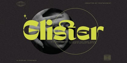 Glister Is An Stylish Display Character Inspired By Cheek Style. SOFTWARE REQUIREMENTS : Fonts and alternate : No special software required they may be used in any basic program /website apps that allows standard fonts That's it folks! You can go ahead and get cracking :) Follow My Shop For Upcoming Updates Including Additional Glyphs And Language Support. And Please Message Me If You Want Your Language Included or If There Are Any Features or Glyph Requests, Feel Free to Send me A Message. Have a Good Day !
 - Hebrew Alter Rebbe of Liadi by Samtype,
$385.00 This is the Alter Rebbe of Liadi Ksav. This is a complete font with all diacritic marks (Nikud and Taamim) and also shevana, kamatz katan, dagesh hazak and holam chaser. There are 2 alternatives kinds of Lamed. The Nikud and the Trop are completily independent of the letters. You can use diferent colors in them. There is no combination of letters except for Alef-Lamed ligature. Two diferents kinds of "He" appears in the Tetragramation. You can make any kind of prayer book with this font.
 - Grim N Gritty by Comicraft,
$49.00 Thought Balloons. No use for them any more. You can't be taken seriously when your thoughts are floating above your head in cute, puffy clouds. Doesn't look good. When the streets are extended gutters and the gutters are full of blood, a thought bubble just isn't noir enough, is it? It's gotta be GRIM. It's gotta be GRITTY. Let's face it... It's gotta be GRIM'N'GRITTY. In Italic and Bold Italic. Also Regular and Bold. But I've little use for them either. Talk is cheap.
 - Intervogue Soft by Miller Type Foundry,
$25.99 Released by Intertype in the 1930’s, Vogue, was a geometric sans serif rival to Futura and Kabel. Vogue had many unique quirks like its distinct G, that striking Q with a vertical tail, and many others. Almost ninety years later there has been no decent digital revival of this wonderful typeface... until now. Intervogue Soft brings this classic to life in the modern age. Seven weights complete with true obliques and an alternate cut give Intervogue Soft the versatility to be a true workhorse.
 - Cattyfox by Popskraft,
$19.00 Everyone loves black, strict stylish and elegant shapes. We strive to be perfect. Right? But ... don't you think we have lost something? Maybe childish spontaneity? The Cattyfox font will take you back to those wonderful times when there was no need to be serious, when the whole world was not so serious. If you want to have some uncompromising fun, hover above the crowd to show everyone how free you are, just create something in Cattyfox font and you will understand what true freedom is.


