10,000 search results
(0.088 seconds)
- Yassitf by Ingrimayne Type,
$6.00 Yet another san serif typeface, Yassitf is a generic sans, a font meant to blend in rather than stand out. It has little contrast and is almost monoline. It includes three widths: condensed, narrow, and regular. The widths have four to six weights: ultra thin, thin, light, plain, bold, and extra bold. Further, each width and weight combination has both upright and italics styles. The thirty fonts in the family contain several open-type features, including both proportional and tabular (monospaced) numbers.
 - Fox Grotesque by TipografiaRamis,
$29.00 Fox Grotesque is another member of the Fox Family and stylistically finds itself between Fox TRF (with some extreme curly lowercase letters), and Fox Sans (a cold geometric sans-serif). While the typeface is intended for use in display sizes, it is also quite legible in text and is well suited for editorials. Fox Grotesque is released in OpenType format with extended support for most Latin languages and includes some opentype features – proportional/tabular, lining/oldstyle figures, slashed zero, ligatures, fractions.
 - Wendys by Jafar07,
$17.00 Wendys | Modern and Chic Sans Serif a modern and stylish style that has unique stroke characters, which is very easy to combine with other fonts, this will be very useful for designers making logo and layout designs. What are you get? Numbers & Punctuation Multilingual Support Works on PC & Mac Simple Installations Enjoy using the Wendys Sans Serif font and it will make a perfect addition to your font collection. If you have some questions, don't hesitate to drop a message!
 - MC Gogat by Maulana Creative,
$22.00 Gogat is a simply semi-geometric sans serif font. With medium low contrast stroke, fun character with a bit of ligatures and alternates. To give you an extra creative work. Gogat font support multilingual more than 100+ language. This font is good for logo design, Social media, Movie Titles, Books Titles, a short text even a long text letter and good for your secondary text font with sans or serif. Make a stunning work with Gogat font. Cheers, Maulana Creative
 - MC Erinko by Maulana Creative,
$14.00 Erinko is a simply semi-geometric sans serif font. With medium low contrast stroke, fun character with a bit of ligatures and alternates. To give you an extra creative work. Erinko font support multilingual more than 100+ language. This font is good for logo design, Social media, Movie Titles, Books Titles, a short text even a long text letter and good for your secondary text font with sans or serif. Make a stunning work with Erinko font. Cheers, Maulana Creative
 - Borchy by Maulana Creative,
$14.00 Borchy is a display sans with reverse contrast font. With medium low contrast stroke, fun character with a bit of ligatures and alternates. To give you an extra creative work. Borchy font support multilingual more than 100+ language. This font is good for logo design, Social media, Movie Titles, Books Titles, a short text even a long text letter and good for your secondary text font with sans or serif. Make a stunning work with Borchy font. Cheers, Maulana Creative
 - Giriton by Hazztype,
$18.00 Giritron is a modern geometric sans-serif typeface that effortlessly blends elegance with a contemporary aesthetic. With its precise, angular forms and minimalist design, Giritron offers a perfect balance between readability and visual impact. Giritron is the perfect choice for contemporary branding, editorial layouts, websites, and any design project where a sophisticated, modern look is desired. Its geometric sans-serif nature ensures a timeless quality, while its attention to detail sets it apart as a distinctive and visually pleasing typeface.
 - Farmhand by Adam Ladd,
$25.00 Farmhand is a textured, hand drawn family featuring serif, sans, inline, italic, and extras styles suited for display titling. An all-caps typeface with individually drawn small caps for lowercase. Experiment by mixing and matching the casing for titling effects. Great for packaging and branding. The sans adds a different look but still has the vintage appeal. Try the inline styles to add a little more distinction to your type or the matching catchwords and ornaments to add typographic interest.
 - MC Bonica by Maulana Creative,
$14.00 Bonica is a casual modern condesned sans serif font. With medium low contrast stroke, fun character with a bit of ligatures and alternates. To give you an extra creative work. Bonica font support multilingual more than 100+ language. This font is good for logo design, Social media, Movie Titles, Books Titles, a short text even a long text letter and good for your secondary text font with sans or serif. Make a stunning work with Bonica font. Cheers, Maulana Creative
 - Kajiro by Maulana Creative,
$13.00 Kajiro is a fancy modern condensed all Caps sans serif font. With bold tall and sharp stroke, fun character with a bit of ligatures and alternates. To give you an extra creative work. Kajiro font support multilingual more than 100+ language. This font is good for logo design, Social media, Movie Titles, Books Titles, a short text even a long text letter and good for your secondary text font with sans or serif. Make a stunning work with Kajiro font. Cheers, Maulana Creative
 - Redtrails by Maulana Creative,
$13.00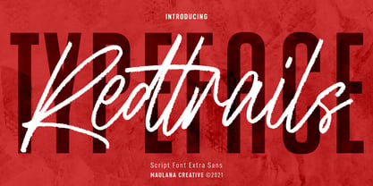 Redtrails is a medium brush stroke and combine with Sans serif display font, fun character with a bit of ligatures and has a two files lowercase alternates. To give you an extra creative work. Redtrails font support multilingual more than 100+ language. This font is good for logo design, Social media, Movie Titles, Books Titles, a short text even a long text letter and good for your secondary text font with sans or serif. Make a stunning work with Redtrails font. Cheers, MaulanaCreative
 - MC Frikel by Maulana Creative,
$16.00 Frikel is a simply semi-slab sans serif font. With medium low contrast stroke, fun character with a bit of ligatures and alternates. To give you an extra creative work. Frikel font support multilingual more than 100+ language. This font is good for logo design, Social media, Movie Titles, Books Titles, a short text even a long text letter and good for your secondary text font with sans or serif. Make a stunning work with Frikel font. Cheers, Maulana Creative
 - Modena JW Font Duo by Jen Wagner Co.,
$16.00 Modena is a beautiful high fashion font duo that makes for gorgeous logos, posters, wedding invitations, blog posts, social media, and more! I love using them together with layer masks in Photoshop, so it looks like the script is running through the lines of the sans serif. The sans looks stunning with tracking set to 220, as well as where it falls normally at 0! Modena Script includes over 50 ligatures to make everything look totally hand-done, and alternates for each letter.
 - MC Binello by Maulana Creative,
$17.00 Binello is a simply semi-geometric sans serif font. With medium low contrast stroke, fun character with a bit of ligatures and alternates. To give you an extra creative work. Binello font support multilingual more than 100+ language. This font is good for logo design, Social media, Movie Titles, Books Titles, a short text even a long text letter and good for your secondary text font with sans or serif. Make a stunning work with Binello font. Cheers, Maulana Creative
 - EB Mensch by Eko Bimantara,
$19.00EB Mensch is a complete humanist sans and serif font family. EB Mensch emphasize expressive and fun characters that visualized by it's letterforms; Large x height, low caps, spacious counters and apertures, characterized by diagonal and sunken stroke ends. Perfect for large display and also to be read in small size. Mensch contain 32 fonts consist of sans and serif styles with 8 weight from thin to black with each matching italics. Its contain more than 440 glyphs which support broad latin languages. - Neulis by Adam Ladd,
$25.00 Neulis is a geometric sans and modern script hybrid offering a unique blend of characters inspired by script letterforms (like the l, k, r, s) along with script-style exit strokes (like the a, n, u) that blend into the geometric skeleton. Neulis Alt adds more of a restrained option by keeping with more classic sans letterforms. With a monoline appearance, the type looks clean and modern. Neulis provides a distinct, creative, and expressive message for branding, advertising, packaging, and more.
 - Dickson by Groen Studio,
$16.00 Dickson is a sans font belonging to 10 font families, made in a very bold style. Dickson is a sans font that has a skinny upright style, comes in 10 upright weights. Dickson works well in all brands, logos, magazines, movies. The different weights give you a wide host of applications, while the outlined fonts give a real modern feel to any project. Multilingual support for multiple languages including: French, German, Spanish, Portuguese, Italian, Dutch, Finnish, Swedish and many more.
 - Mihaly Display by Alfab,
$55.00 Mihaly is a geometric sans serif with a low contrast. It was designed with care to conserve the feeling of geometric rigor, referring to the constructivist ideal of the 20s. But the homogeneity of its proportions gives it a very modern neutrality, making Mihaly an interesting alternative to classic low-contrasted sans-serif like Din or Interstate. Designed for display setting, Mihaly Display is the first in a family of fonts, with the rest to be completed in the coming future.
 - Sunday Morning by Resistenza,
$39.00 Easy like a Sunday Morning… with the new Sunday Morning Font Duo featuring a smooth signature-style script and an elegant wide Sans Serif Font specially designed to get along. THE SCRIPT : Designed with a crayon to get the grain texture from this drawing technique and captivate this natural feeling to your designs. This subtle texture imperfections will add a more realistic feeling to your text. THE SANS : Perfect for headlines, weddings cards, instagram posts, product design, stationery and logos
 - Abi by Bohloul Arabic Type Design,
$30.00 For everyone wishing for a modern serif that’s as clear and readable as a sans in restrictive digital environments, meet ABI by Reza Bohloul. Sans serifs are commonly used on small screens to save space and carry a modern tone and Abi is the best one. Abi now provides a serif option for these restrictive digital environments. The screen has met its serif match. Abi was created from and for the digital world. Abi supports Arabic, Persian, Urdu and Kurdish languages.
 - Chennai by insigne,
$24.99 Updated in 2009, Chennai has new weights and OpenType features. Chennai is a simplified sans-serif with a full complement of OpenType alternates. The typeface is rounded, slightly extended and geometric. Over fifty OpenType alternate characters are available, including swashed lower forms, traditional caps and a traditionally formed lowercase. Chennai also includes seven style sets, oldstyle figures, and small caps. Please see the sample PDF to see these in action. Use Chennai whenever you need a contemporary and versatile sans serif.
 - KG Belfort by Krismagraph,
$19.00 Belfort is a modern sans serif family font with a neo-Grotesk touch, it is a sans serif typeface that tends to be easily accepted by readers, has wide usage possibilities, and shows a simple, bold, and strong personality. The Belfort font contains 2 basic shapes: upright and round. Each has 10 different weights (Thin, Extra Light, Light, Regular, Medium, Semibold, Thick, Extrabold, Black, and Heavy). with ligatures and alternating in several letters. and is equipped with a multilingual accent.
 - Reckless by Ana's Fonts,
$12.00 Reckless is a thick brush font with rough edges. It’s perfect to make a statement and will look great in quotes, logos, titles, postcards, tags. This handlettered font includes: - A-Z, a-z, 0-9, accents, punctuation and symbols - Ligatures and Contextual and Stylistic Alternates - An extra set of 26 splatters and swashes - A bonus faded version & an all caps sans serif font The sans serif font is the small caps version of my font A Pompadour in both regular and bold.
 - Luck Flag by Maulana Creative,
$13.00 Luck Flag is a retro stamp effect sans serif font. With medium low contrast stroke, fun character with a bit of ligatures and alternates. To give you an extra creative work. Luck Flag font support multilingual more than 100+ language. This font is good for logo design, Social media, Movie Titles, Books Titles, a short text even a long text letter and good for your secondary text font with sans or serif. Make a stunning work with Luck Flag font. Cheers, Maulana Creative
 - Config Rounded by Adam Ladd,
$25.00 Config Rounded is a condensed geometric sans with rounded corners. Config’s sibling, this typeface was influenced by geometric sans with circular forms on the tops and bottoms of characters, but the proportions have been condensed by incorporating straight sides for a design that is efficient yet friendly. Use it for a subtle softness that still looks modern and strong. With 10 weights, there are options to fit the need—black and thin for extreme uses and intermediates for more common needs.
 - Faston by Flawlessandco,
$9.00 Faston is a Modern Display Sans Serif Font. Unleash the power of contemporary design with Faston, a dynamic and versatile display sans serif font that elevates your projects to the cutting edge. There's some connected letters and some alternates that suitable for any graphic designs. This font support for some multilingual. Also contains uppercase A-Z and lowercase a-z, alternate character, numbers 0-9, and some punctuation. If you need help, just write me! Thanks so much for checking out my shop!
 - Groen California by Fargun Studio,
$19.00 Introducing Groen California Font. It’s a cool and fancy font duo. When combined, these two fonts will add a unique spark to any design project! Here’s a run through everything included in this product: Groen California Sans is a modern and bold sans serif typeface featuring characters that stand out from every background. Groen California Script is a brush font with beautiful and natural brush stroke with Alternates and Ligatures, that perfect for logo, poster, product, apparel, packaging and many more.
 - Colby by J Foundry,
$20.00 Colby is a hand-drawn workhorse sans serif family. It consists of a wide range of weights and widths for a variety of applications. Colby balances the quirkiness of hand-drawn letters with the legibility of a clean sans serif. This combination provides authentic warmth with functional benefits. The fonts feature plenty of alternates, icons and arrows to add character and customization. Colby is perfect for packaging, restaurant menus, children’s books, digital applications, but will be comfortable in any situation.
 - Freik by Maulana Creative,
$13.00 Freik is a wide strong headlines display sans font. With bold sharp edge stroke, fun character with a bit of ligatures and alternates. To give you an extra creative work. Freik font support multilingual more than 100+ language. This font is good for logo design, Social media, Movie Titles, Books Titles, a short text even a long text letter and good for your secondary text font with sans or serif. Make a stunning work with Freik font. Cheers, Maulana Creative
 - Kalesi by Craft Supply Co,
$20.00 Kalesi - The Elegant Sans Serif Font strikes a perfect balance between modern simplicity and timeless sophistication. Its clean, sans-serif style features subtle contrasts that add a touch of refined elegance. Ideal for projects demanding a contemporary, minimalist aesthetic with a touch of class. Whether it's branding, web design, or editorial work, Kalesi effortlessly enhances your project's appeal with its understated yet captivating look. With Kalesi, your designs exude contemporary elegance, leaving a lasting impression with its carefully crafted contrast and minimalist charm.
 - Surfers South by Maulana Creative,
$13.00 Surfers South is an expressive signature font combine with extra sans display. With light mono-line stroke, fun character with a bit of ligatures. To give you an extra creative work. Surfers South font support multilingual more than 100+ language. This font is good for logo design, Social media, Movie Titles, Books Titles, a short text even a long text letter and good for your secondary text font with sans or serif. Make a stunning work with Surfers South font. Cheers, Maulana Creative
 - Patron by Milieu Grotesque,
$99.00 Patron is a sans serif influenced by two dissimilar type designers, Günther Gerhard Lange and Roger Excoffon. Patron is a sans serif influenced by two dissimilar type designers, Günther Gerhard Lange and Roger Excoffon. Patron unites their contradictory approaches to create an expressive, yet versatile grotesk. As a result, Patron is characterised by a generous x-height, flared stroke endings and an unconventional shift in balance, inspired by Excoffon and a rigorously precise, modern interpretation for which Lange was most famous.
 - Hillstown by Letterhend,
$13.00 Hillstown Font Family is a font collection that contains three different styles that will perfectly complement each other. You will get script, sans, and condensed sans in a clean and aged version for each style. The classic feel is really perfect when you need a typeface for a logotype, apparel, invitation, branding, packaging, advertising, and more. Hillstown comes in uppercase, lowercase, with punctuations, symbols and numerals, 09 stylistic set alternate, ligatures. There is multi-lingual support and Hillstown is already PUA encoded.
 - Merchons by Maulana Creative,
$16.00 Merchons is a fancy line style Display sans serif font. With two line soft stroke, fun character with a bit of ligatures and alternates. To give you an extra creative work. Merchons font support multilingual more than 100+ language. This font is good for logo design, Social media, Movie Titles, Books Titles, a short text even a long text letter and good for your secondary text font with sans or serif. Make a stunning work with Merchons font. Cheers, Maulana Creative
 - DT Skiart by Dragon Tongue Foundry,
$30.00 Looking for something between a Serif and Sans Serif font? Try the DT Skiart font. This high quality, versatile font has the professional feel of a Serif, but has the open readability of a Sans Serif. A smart crisp font with smooth simple lines. It has a medium to strong stroke contrast, with the vertical line being heavier than the horizontal line, and no serifs. The DT Skiart family is made up of 5 weights in both italic and normal.
 - Bilgraf by Patria Ari,
$24.00 Introducing Bilgraf, a cursive craft sans serif combination font. This typeface opens up a world of creative possibilities, offering a harmonious balance between the traditional and the contemporary. With Bilgraf, you get the best of both worlds – the timeless charm of cursive calligraphy and the contemporary appeal of a sans-serif display font. Whether you're an experienced designer or just starting your creative journey, Bilgraf is the tool you need to add a touch of elegance and modernity to your projects.
 - Woly Wonka by Flawlessandco,
$9.00 Introducing "Woly Wonka" - A Display Sans Font. Step into a world of whimsy and imagination with "Woly Wonka," a captivating display sans font that adds a touch of playfulness to your designs. There's some connected letters and some alternates that suitable for any graphic designs. This font support for some multilingual. Also contains uppercase A-Z and lowercase a-z, alternate character, numbers 0-9, and some punctuation. If you need help, just write me! Thanks so much for checking out my shop!
 - Rum Silhouette by Trine Rask,
$30.00 Rum Silhouette is developed as a display face within the type family »Rum« Rum Silhouette is a decorative all caps font, with uppercase letters based on Rum Soft Sans Black and a thin companion has replaced lowercase letters. It is suitable for posters and editorial design in large sizes. Includes two sets of numbers & punctuation marks that are in betweens. The complete family consists of Sans Serif & Serif in both sharp and soft version + the display fonts Rum Plakat & Rum Silhouette.
 - Optima Cyrillic by Linotype,
$65.00Many typefaces are distinctive or attractive at the expense of legibility and versatility. Not so the Optima® family. Simultaneously standing out and fitting in, there are few projects or imaging environments outside of its range. Although Optima is almost always grouped with sans serif typefaces, it should be considered a serifless roman. True to its Roman heritage, Optima has wide, full-bodied characters – especially in the capitals. Only the E, F and L deviate with narrow forms. Consistent with other Zapf designs, the cap S in Optima appears slightly top-heavy with a slight tilt to the right. The M is splayed, and the N, like a serif design, has light vertical strokes. The lowercase a and g in Optima are high-legibility two-storied designs. Optima can be set within a wide choice of line spacing values – from very tight to very open. In fact, there are few limits to the amount of white space that can be added between lines of text. Optima also benefits from a wide range of letter spacing capability. It can be set quite tight, or even slightly open – especially the capitals. If there are any guidelines, Optima should be set more open than tight. It’s not that readability is affected that much when Optima is set on the snug side; it’s just that the unhurried elegance and light gray typographic color created by the face are disrupted when letters are set too tight. Optima is also about as gregarious as a typeface can be. It mixes well with virtually any serif design and a surprisingly large number of sans serif faces. The Optima family is available in six weights, from roman to extra black, each with an italic counterpart. In addition, the family is available as a suite of OpenType® Pro fonts, providing for the automatic insertion of small caps, ligatures and alternate characters, in addition to offering an extended character set supporting most Central European and many Eastern European languages. When you’re ready to find its perfect pairing, browse these fantastic matches: Monotype Century Old Style™, Dante®, Frutiger® Serif, Joanna® Nova, Malabar™, and Soho®. - Optima by Linotype,
$45.99 Many typefaces are distinctive or attractive at the expense of legibility and versatility. Not so the Optima® family. Simultaneously standing out and fitting in, there are few projects or imaging environments outside of its range. Although Optima is almost always grouped with sans serif typefaces, it should be considered a serifless roman. True to its Roman heritage, Optima has wide, full-bodied characters – especially in the capitals. Only the E, F and L deviate with narrow forms. Consistent with other Zapf designs, the cap S in Optima appears slightly top-heavy with a slight tilt to the right. The M is splayed, and the N, like a serif design, has light vertical strokes. The lowercase a and g in Optima are high-legibility two-storied designs. Optima can be set within a wide choice of line spacing values – from very tight to very open. In fact, there are few limits to the amount of white space that can be added between lines of text. Optima also benefits from a wide range of letter spacing capability. It can be set quite tight, or even slightly open – especially the capitals. If there are any guidelines, Optima should be set more open than tight. It’s not that readability is affected that much when Optima is set on the snug side; it’s just that the unhurried elegance and light gray typographic color created by the face are disrupted when letters are set too tight. Optima is also about as gregarious as a typeface can be. It mixes well with virtually any serif design and a surprisingly large number of sans serif faces. The Optima family is available in six weights, from roman to extra black, each with an italic counterpart. In addition, the family is available as a suite of OpenType® Pro fonts, providing for the automatic insertion of small caps, ligatures and alternate characters, in addition to offering an extended character set supporting most Central European and many Eastern European languages. When you’re ready to find its perfect pairing, browse these fantastic matches: Monotype Century Old Style™, Dante®, Frutiger® Serif, Joanna® Nova, Malabar™ and Soho®.